Want to supercharge your web design process? Here are 5 powerful quotes to inspire your next project:
- “People ignore design that ignores people.” – Frank Chimero
- “Design isn’t finished until somebody is using it.” – Brenda Laurel
- “Design creates culture. Culture shapes values. Values determine the future.” – Robert L. Peters
- “Great design is the iteration of good design.” – M Cobanli
- “If you want a great site, you’ve got to test.” – Steve Krug

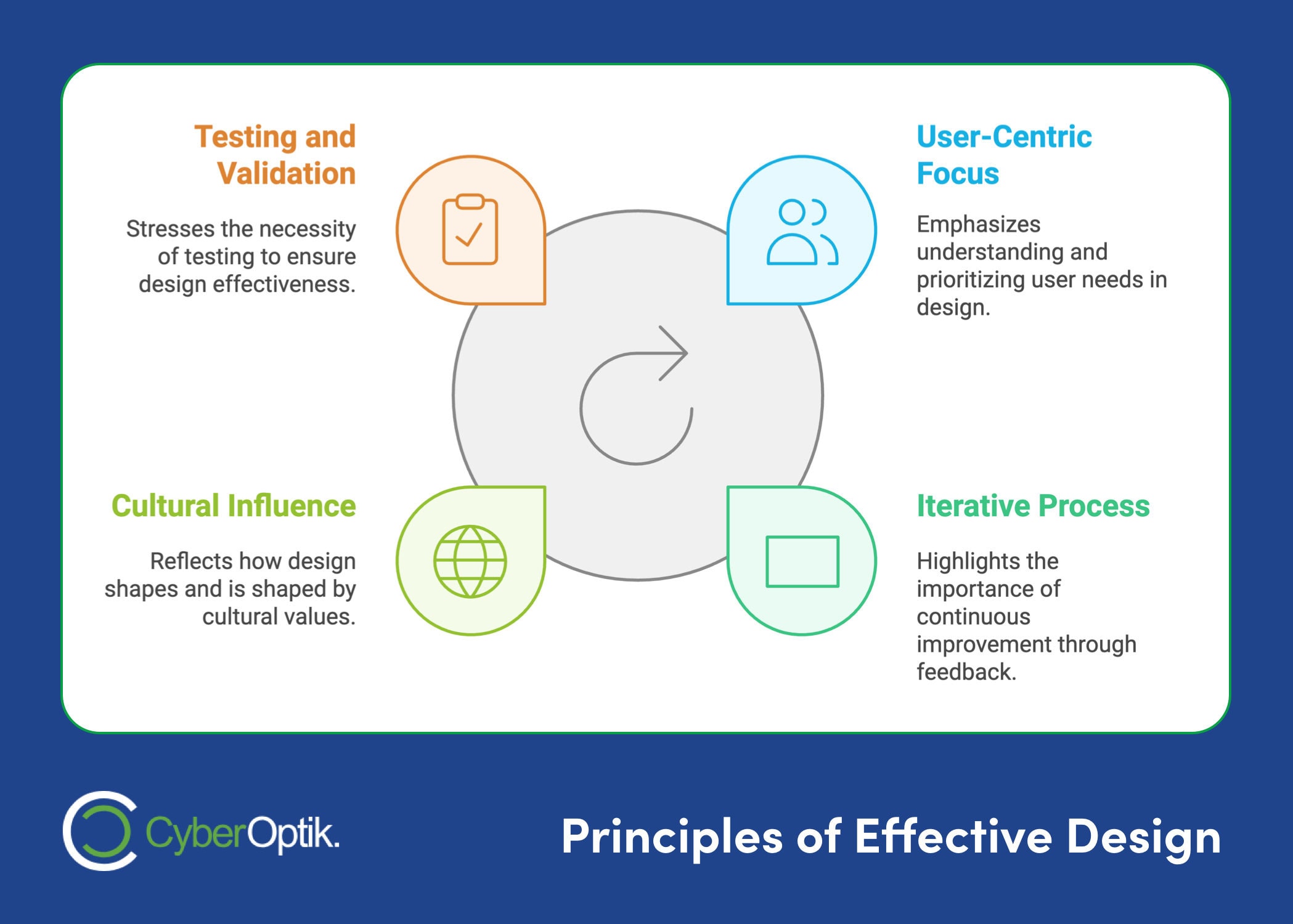
These quotes emphasize:
- Putting users first
- Keeping designs simple yet functional
- Pushing creative boundaries
- Embracing an iterative process
- Constantly testing and improving
Why care? Because 59% of consumers say website design impacts their view of a brand (Top Design Firms).
To apply these insights:
- Start a daily quote habit
- Use them to spark team discussions
- Let them guide your design decisions
Remember: Great web design isn’t just pretty – it solves problems and drives results.
| Key Principle | Main Idea |
|---|---|
| User-Centered | Design for your audience |
| Simplicity | Strip down to essentials |
| Innovation | Solve problems creatively |
| Iteration | Keep refining your work |
| Testing | Get real user feedback |
Now go make something awesome.
30 Web Design Tips in 11 Minutes
30 Web Design Tips in 11 Minutes
1. User-Centered Design
User-centered design puts the user first. It’s not just a fancy term – it’s a key approach that can make or break your website project. Frank Chimero, co-founder of Abstract, nails it:
“People ignore design that ignores people.”
This quote gets to the heart of user-centered design. Your website might look amazing or have cutting-edge tech, but if it doesn’t meet your audience’s needs, it’s going to flop.
So, how do you really do user-centered design?
First, dig deep into user research. Get to know your users’ goals, pain points, and what drives them. This info will shape your design choices.
Next, build user personas. These are detailed profiles of your typical users. Keep them in mind throughout your design process.
Then, design, test, repeat. Keep refining based on what users tell you. As Brenda Laurel puts it:
“Design isn’t finished until somebody is using it.”
Finally, make usability your top priority. Your website should be a breeze to use. Think about Alan Cooper’s advice:
“If we want users to like our software, we should design it to behave like a likeable person: respectful, generous and helpful.”
2. Design Simplicity
The Power of Less: Stripping Down to Essentials
Think simplicity is just about looking clean? Think again.
In web design, simplicity is your secret weapon. It’s not about being minimal. It’s about creating a smooth, intuitive experience that clicks with users instantly.
Dan Saffer, a design expert, puts it this way:
“True simplicity is achieved not by removing all complexity, but by understanding complexity and optimizing for the most common users and use cases.”
So how do you nail this simplicity thing? Here’s the deal:
- Cut the fluff: Every element on your page needs to earn its place. If it’s not helping users or your business, it’s out.
- Embrace the void: White space isn’t wasted space. It’s a powerful tool to highlight what matters.
- Make navigation a breeze: Clear menus and logical categories help users find stuff fast.
- Keep it readable: Choose fonts that are easy on the eyes, use good contrast, and keep your content snappy.
Want proof that simplicity works? Look at Google. When they launched, their homepage was practically empty – just a search bar. And boom! They crushed the competition.
David Lewis, an industrial designer, sums it up nicely:
“Truly elegant design incorporates top-notch functionality into a simple, uncluttered form.”
Remember: simplicity isn’t about dumbing things down. It’s about making the complex feel effortless.
3. Design Innovation
Pushing Boundaries Through Creative Problem-Solving
Innovation in web design isn’t just about using the latest tech or following trends. It’s about solving problems in creative ways that boost user experience.
Tim Brown, CEO and president of IDEO, says:
“Where you innovate, how you innovate, and what you innovate are design problems.”
This quote nails it: innovation itself is a design challenge. It’s not just dreaming up new ideas, but strategically applying creativity to fix real user problems.
Want to boost design innovation in your projects? Here’s how:
Embrace constraints: Don’t see limitations as roadblocks. View them as chances for creative solutions. Aza Raskin, a top interface designer, puts it this way:
“Design is the beauty of turning constraints into advantages.”
Tell a story: Great design should communicate a narrative. Lorinda Mamo, a graphic designer, notes:
“Every great design begins with an even better story.”
Think long-term: Your designs can shape culture and values. Robert L. Peters, a graphic designer and author, says:
“Design creates culture. Culture shapes values. Values determine the future.”
Learn from failure: Innovation often means taking risks and learning from mistakes. Steve Jobs, co-founder of Apple Inc., advises:
“Sometimes, when you innovate, you make mistakes. It is best to admit them quickly and get on with improving your other innovations.”
4. Design Process
Iterative Design: Making Great Websites
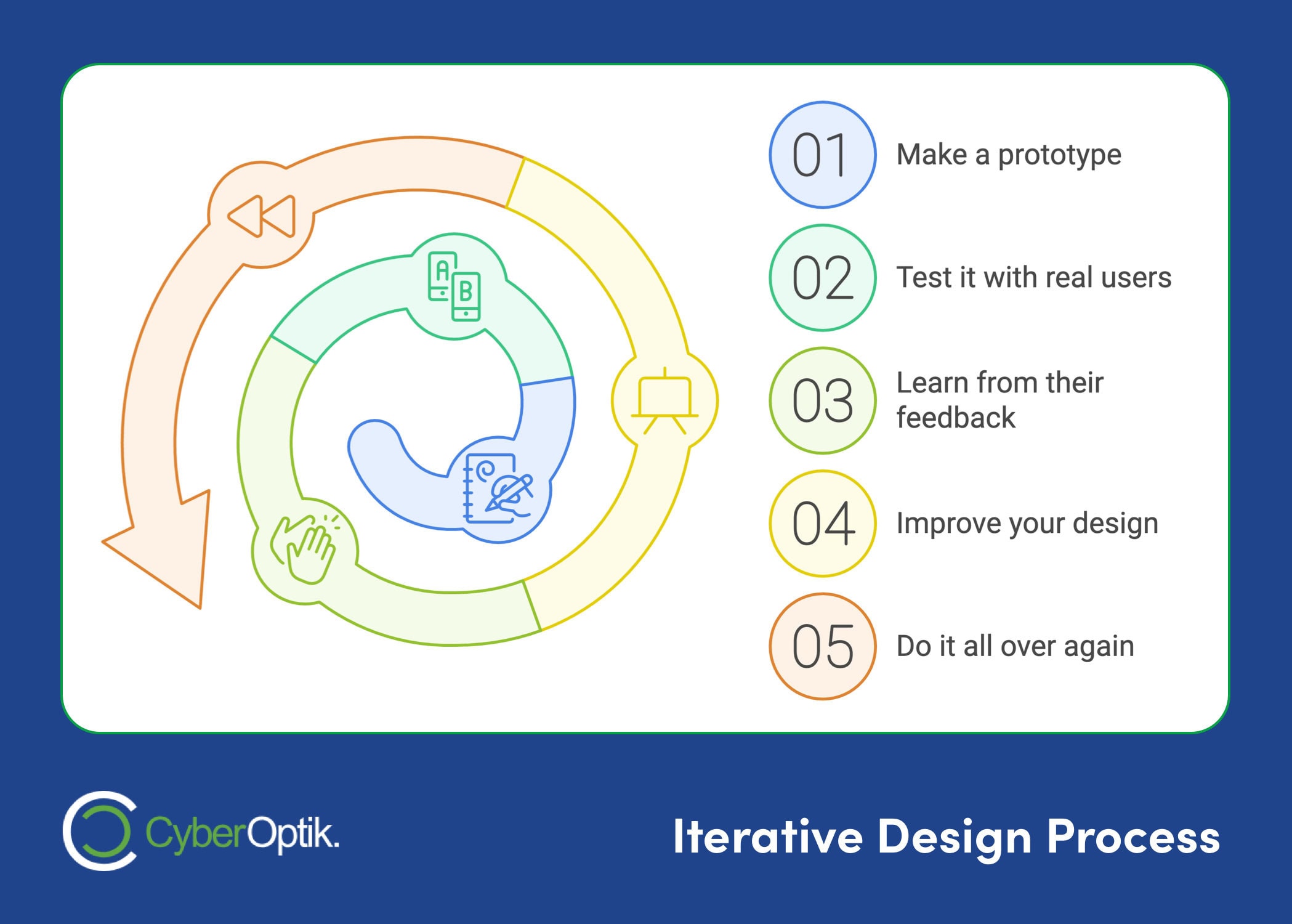
Designing a website isn’t a one-and-done deal. It’s more like a cycle of constant tweaking and improving. This approach is called iterative design, and it’s key to building websites people actually want to use.
“Great design is the iteration of good design.” – M Cobanli, Founder of OMC Design Studios
This quote nails it. You don’t have to get everything perfect right off the bat. Instead, you keep refining your work until it shines.
Here’s how iterative design works:
- Make a prototype
- Test it with real users
- Learn from their feedback
- Improve your design
- Do it all over again

Designers call this “rapid prototyping” or “spiral prototyping.” It’s smart to start this process early because it’s way cheaper and easier to fix a prototype than to overhaul a finished website.
Iterative design goes hand-in-hand with putting users first. As Jesse James Garrett, a user experience pro, puts it:
“User-centered design means understanding what your users need, how they think, and how they behave – and incorporating that understanding into every aspect of your process.”
By constantly testing and tweaking your design, you make sure you’re always focusing on what users really need.
And guess what? The work doesn’t stop once your site goes live. Steve Krug, a usability expert, says:
“If you want a great site, you’ve got to test. After you’ve worked on a site for even a few weeks, you can’t see it freshly anymore. You know too much. The only way to find out if it really works is to test it.”
So, embrace the iterative design process. It’s your ticket to creating websites that not only look good but actually work for your users.
5. Practical Applications
Integrating Inspirational Quotes into Your Design Process
Want to boost your creativity and productivity? Try adding web design quotes to your workflow. Here’s a simple way to do it:
Start a “Quote of the Day” habit. Before you dive into your design work each morning, pick an inspiring quote to set the mood. For instance, you might choose Frank Chimero’s reminder:
“People ignore design that ignores people.”
This quick practice can do wonders:
It keeps user-centered design at the forefront of your mind. It can spark new ideas for your current project. And it can give you a fresh burst of energy to tackle challenges.
Here’s how to make it happen:
Build a list of powerful web design quotes. Set a daily reminder to check your quote. Think about how it applies to what you’re working on right now. And don’t forget to share it with your team – it’s a great way to kick off some creative discussions.
Conclusion
Web design quotes pack a punch. They’re not just clever sayings – they’re concentrated wisdom that can supercharge your creativity and steer your projects. Let’s break down the key takeaways:
- User-Centered Design
Put your users first. Always. Frank Chimero nailed it:
“People ignore design that ignores people.”
This should be your North Star for every design decision.
- Simplicity
Aim for clean, intuitive designs. But remember, it’s not about stripping everything away. Dan Saffer explains:
“True simplicity is achieved not by removing all complexity, but by understanding complexity and optimizing for the most common users and use cases.”
- Innovation
Don’t be afraid to push boundaries and solve problems creatively. Tim Brown’s insight is spot-on:
“Where you innovate, how you innovate, and what you innovate are design problems.”
Approach innovation strategically.
- Iterative Process
Embrace the cycle of constant improvement. M Cobanli puts it perfectly:
“Great design is the iteration of good design.”
Keep refining until your work truly shines.
- Practical Application
Don’t just read these quotes – use them. Start a “Quote of the Day” habit to keep these principles fresh and spark new ideas.
Here’s the thing: great web design isn’t just about making things pretty. It’s about creating experiences that click with users and drive results. Need proof? Adobe found that 38% of people will bounce from a website if the content or layout is unattractive. That’s a big deal.
So, as you dive into your next web design project, keep these quotes in your back pocket. Let them push you to create websites that look great AND deliver real value.
Thomas Watson Jr. said it best:
“Good design is good business.”
Now it’s your turn. Take these insights and run with them. Pick one area where you can level up your design process based on these quotes. Maybe focus more on user needs, simplify your layouts, or embrace a more iterative approach. Small tweaks can lead to big wins in your web design projects.
So whether it’s on your own, or with an expert web design partner at your side like CyberOptik, go make something awesome, have fun and good luck in achieving your website goals!

