While web design trends come and go, certain principles remain timeless. Let’s explore the foundational elements that separate successful websites from digital disappointments.
Web design principles are the fundamental guidelines that govern how to create effective, user-friendly, and visually appealing websites. These principles ensure your website not only looks professional but also delivers results for your business.
- The Foundation: Consistent Design Elements
- Typography That Communicates
- Navigation That Makes Sense
- Visual Hierarchy: Guiding the Eye
- The Power of White Space
- Content Strategy and Minimalism
- User-Centered Design Approach
- Color Theory in Web Design
- Responsive Design Essentials
- Optimization and Continuous Improvement
The Foundation: Consistent Design Elements
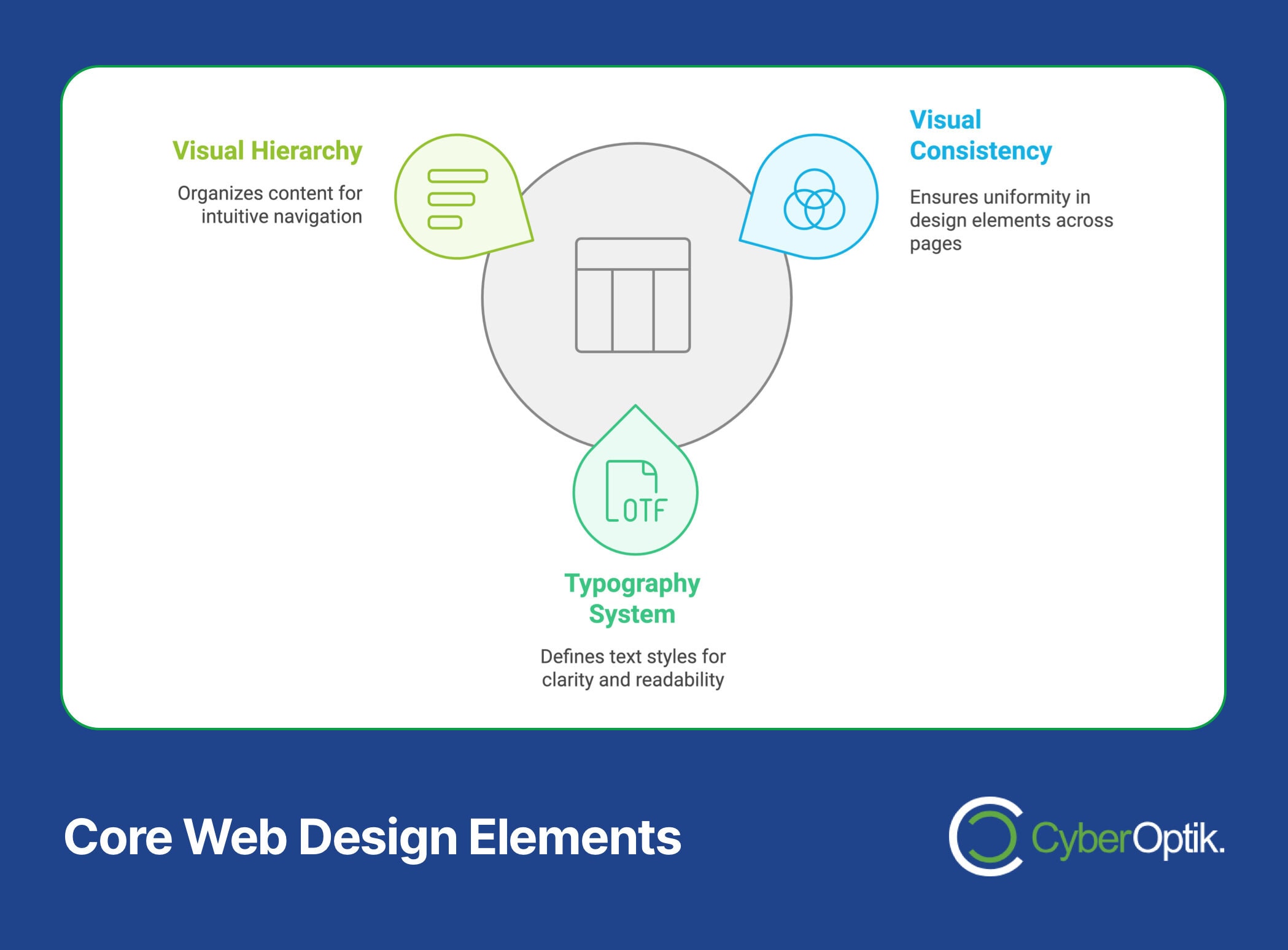
Consistency in web design isn’t just about aesthetics—it’s about creating a cohesive brand experience that builds trust and recognition. As noted by design experts at Loop Digital, “design elements such as colors, fonts, and layout should be consistent across all pages.”
Before diving into complex design elements, let’s understand what makes a design consistent:
- Visual Elements: Maintain the same color scheme, typography, and button styles throughout your site
- Layout Structure: Keep navigation, headers, and footers consistent across pages
- Brand Voice: Maintain consistent messaging and tone in all content
- Spacing: Use uniform padding and margins throughout your design
Understanding these fundamentals is crucial for creating a professional website. For a deeper dive into the web design process, check out our comprehensive guide to the web design process.
Pro Tip: Create a design system document that outlines your consistent elements, making it easier to maintain uniformity across your entire website.
New to web design terminology? Our guide to essential web design terms will help you communicate effectively with design professionals.

Typography That Communicates
Typography is more than just choosing attractive fonts—it’s about ensuring your content is easily readable and accessible to all users. According to Hotjar’s web design principles, successful websites “use clear, easy-to-read fonts and maintain appropriate sizes and spacing.”
Essential Typography Guidelines:
- Font Selection
- Choose no more than 2-3 font families
- Use serif fonts for headlines and sans-serif for body text
- Ensure fonts match your brand personality
- Text Sizing
- Body text: 16-18px minimum
- Headlines: 1.96x larger than body text
- Subheadings: 1.52x larger than body text
- Spacing Considerations
- Line height: 1.5-1.6 for body text
- Paragraph spacing: 1.5x the text size
- Letter spacing: Normal for body, -1px for headlines
Remember: The goal of typography isn’t to be noticed—it’s to serve your content and enhance readability.
Understanding how typography affects user experience is crucial. Learn more about the relationship between design and user experience in our guide to web design vs. UX design.
Navigation That Makes Sense
Intuitive navigation is the backbone of user-friendly websites. Your site’s navigation should guide visitors effortlessly to their desired destination without confusion or frustration.
Navigation Best Practices:
| Element | Best Practice | Why It Matters |
|---|---|---|
| Menu Items | Limit to 7±2 items | Prevents cognitive overload |
| Labels | Use clear, familiar terms | Reduces user confusion |
| Structure | Maintain hierarchy | Improves findability |
| Mobile Design | Use hamburger or bottom menus | Enhances mobile usability |
Effective navigation directly impacts your conversion rates. Discover more ways to improve your website’s performance in our article about design tactics that boost conversion rates.
Mobile Navigation Considerations:
- Keep touch targets at least 44×44 pixels
- Provide clear visual feedback for interactions
- Ensure menus are easily accessible with one thumb
- Include a search function for larger sites
Pro Tip: Test your navigation with real users to identify and eliminate potential points of confusion.
Visual Hierarchy: Guiding the Eye
Visual hierarchy determines how users process information on your website. According to Webflow’s design experts, effective visual hierarchy uses “size, color, and placement to guide users’ attention to the most important elements first.”
Creating Effective Visual Hierarchy:
- Size and Scale
- Larger elements draw attention first
- Use size variations to indicate importance
- Maintain proportional relationships between elements
- Contrast and Color
- High contrast elements stand out
- Use color to highlight key information
- Ensure sufficient contrast for accessibility
- Placement and Layout
- Important elements go above the fold
- Follow natural reading patterns (F-pattern, Z-pattern)
- Group related elements together
Understanding these principles is crucial for creating intuitive interfaces. Learn more about effective UI design in our comprehensive UI design guide.
Key Insight: Visual hierarchy isn’t about making everything stand out—it’s about guiding users through your content in order of importance.
The Power of White Space
White space (or negative space) is a crucial design element that many beginners overlook. As noted by design professionals, white space isn’t empty space—it’s a powerful tool that improves readability and user focus.
Strategic Use of White Space:
- Macro White Space
- Margins between major elements
- Padding around content sections
- Space between different content blocks
- Micro White Space
- Space between lines of text
- Padding between list items
- Space between letters and words
The impact of white space on user experience cannot be overstated. Discover why this matters in our article about website user experience.
Common White Space Mistakes to Avoid:
- Overcrowding content – Reduces readability and comprehension
- Inconsistent spacing – Creates visual confusion
- Insufficient margins – Makes content feel cramped
- Too much space – Can disconnect related elements
Pro Tip: Use the squint test—if your design is still clear when squinting, you’ve likely achieved good use of white space.
Remember: White space isn’t wasted space—it’s a fundamental design element that helps your content breathe and your message resonate.
Content Strategy and Minimalism
Effective content strategy balances information delivery with user engagement. According to Smashing Magazine, successful websites “keep text brief and relevant” while avoiding information overload.
Content Organization Principles:
- Information Architecture
- Organize content in logical categories
- Use clear headings and subheadings
- Create natural content flow
- Content Hierarchy
- Most important information first
- Break long content into digestible chunks
- Use progressive disclosure when appropriate
Learn more about creating user-friendly content in our guide to making web content user-friendly.
Minimalist Content Strategies:
| Strategy | Implementation | Benefit |
|---|---|---|
| Concise Writing | Use short paragraphs and clear language | Improved readability |
| Visual Balance | Balance text with visual elements | Better engagement |
| Focused Messaging | One main idea per section | Clear communication |
Remember: Every word should earn its place on your website.
User-Centered Design Approach
User-centered design puts your audience’s needs at the forefront of every design decision. This approach ensures your website not only looks good but actually serves its intended purpose.
Key Components of User-Centered Design:
- User Research
- Conduct user interviews
- Create user personas
- Map user journeys
- Design Implementation
- Create user-focused layouts
- Design intuitive interactions
- Implement feedback mechanisms
- Testing and Iteration
- Conduct usability testing
- Gather user feedback
- Make data-driven improvements
For more insights on creating engaging content that resonates with users, check out our article on website content tips.
User-Centered Design Checklist:
- ✓ Understand your users’ goals
- ✓ Design for accessibility
- ✓ Create clear user flows
- ✓ Implement feedback loops
- ✓ Test with real users
Pro Tip: Always validate your design decisions with actual user feedback rather than assumptions.
Color Theory in Web Design

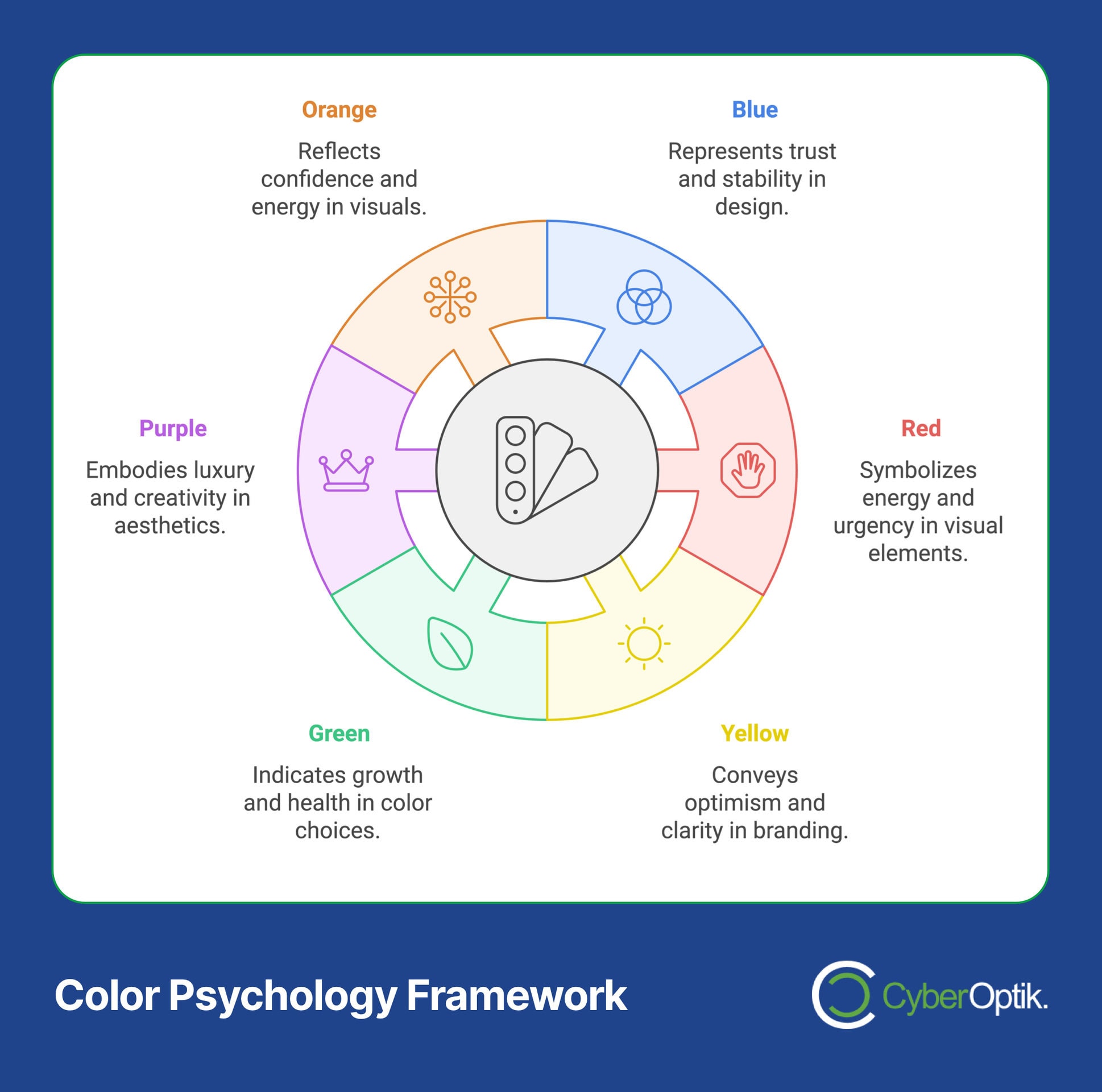
Color choices can make or break your website’s effectiveness. As highlighted by Webflow’s design experts, successful websites use color palettes that balance brand identity with readability and user experience.
Color Psychology in Web Design:
- Primary Colors
- Blue: Trust, professionalism, stability
- Red: Energy, urgency, passion
- Yellow: Optimism, clarity, warmth
- Secondary Colors
- Green: Growth, health, harmony
- Purple: Luxury, creativity, wisdom
- Orange: Confidence, friendliness, innovation
Color Accessibility Guidelines:
| Element | Requirement | Why It Matters |
|---|---|---|
| Text Contrast | Minimum 4.5:1 ratio | Ensures readability |
| Interactive Elements | Clear color distinction | Improves usability |
| Background Colors | Neutral base tones | Enhances content focus |
Pro Tip: Always test your color combinations across different devices and lighting conditions to ensure consistent visibility.
Responsive Design Essentials
In today’s multi-device world, responsive design isn’t optional—it’s essential. Your website must adapt seamlessly to various screen sizes and devices while maintaining functionality and visual appeal.
Core Responsive Design Principles:
- Fluid Grids
- Use relative units (%, em, rem)
- Implement flexible grid systems
- Maintain proportional relationships
- Flexible Images
- Set max-width properties
- Use appropriate image formats
- Implement lazy loading
- Media Queries
- Define appropriate breakpoints
- Adjust layouts for different screens
- Optimize touch targets
Understanding mobile-friendly design is crucial. Learn more in our guide about what makes a website mobile-friendly.
Responsive Design Checklist:
- ✓ Mobile-first approach
- ✓ Touch-friendly navigation
- ✓ Optimized images
- ✓ Readable text without zooming
- ✓ Fast loading times
Performance is crucial for responsive design. Discover how to optimize your website in our article about fixing website performance problems.
Remember: A truly responsive design considers not just how the site looks, but how it performs across all devices.
Optimization and Continuous Improvement
A successful website is never truly “finished.” As noted by industry experts, regular optimization based on user feedback and analytics is crucial for maintaining and improving website performance.
Key Areas for Ongoing Optimization:
- Performance Monitoring
- Page load speed tracking
- User behavior analysis
- Conversion rate monitoring
- User Feedback Integration
- Feedback form implementation
- User testing sessions
- Analytics review
- Technical Updates
- Regular security patches
- Plugin maintenance
- Content updates
Website speed is crucial for user experience. Learn more about optimization in our guide to improving website loading speed.
Optimization Checklist:
| Area | Action Items | Frequency |
|---|---|---|
| Performance | Speed testing, cache clearing | Monthly |
| Content | Updates, relevance check | Quarterly |
| User Experience | Testing, feedback review | Bi-monthly |
Pro Tip: Set up regular maintenance schedules to ensure consistent website performance and user experience.
Conclusion: Putting It All Together
Successful web design is a combination of artistic vision and technical expertise, guided by proven principles that enhance user experience and drive business results. Let’s recap the essential elements:
- ✓ Consistent design creates trust
- ✓ Typography enhances communication
- ✓ Navigation guides users effectively
- ✓ Visual hierarchy organizes content
- ✓ White space improves readability
- ✓ Content strategy drives engagement
- ✓ User-centered design ensures relevance
- ✓ Color theory influences emotions
- ✓ Responsive design reaches all users
- ✓ Continuous optimization maintains effectiveness
Ready to implement these principles in your website? Check out our web design pricing guide to learn about professional web design services that can transform your online presence.
Remember These Key Takeaways:
- Start with user needs and business goals
- Maintain consistency across all design elements
- Test regularly and iterate based on feedback
- Keep optimization as an ongoing process
Your website is often the first impression potential customers have of your business. Make it count with professional, principle-driven design.


