Just looking for our Best Window Repair Website examples list?
Creating an effective restoration website involves more than just aesthetics; it requires strategic design and optimization to build trust, enhance visibility, and drive conversions. Here are the key takeaways:
Prioritize User Experience (UX): Ensure your website is mobile-friendly, loads quickly, and offers intuitive navigation to keep visitors engaged and reduce bounce rates.
Implement Clear Calls-to-Action (CTAs): Use prominent and persuasive CTAs to guide visitors toward desired actions, such as requesting a quote or contacting your team.
Showcase Trust Signals: Display certifications, client testimonials, and before-and-after project galleries to build credibility and reassure potential clients of your expertise.
Optimize for Local SEO: Incorporate location-specific keywords and maintain an up-to-date Google Business Profile to improve visibility in local search results
Utilize High-Quality Content: Regularly update your website with informative blog posts, service descriptions, and FAQs to address client concerns and improve search engine rankings.
Leverage Visual Storytelling: Use compelling images and videos to illustrate your restoration projects, making your services more relatable and memorable to visitors.
Ensure Accessibility Compliance: Design your website to be accessible to all users, including those with disabilities, to broaden your audience and comply with legal standards.
By focusing on these elements, your restoration website can effectively attract and convert visitors, setting your business apart in a competitive market.
Why Restoration Website Design Matters More Than Ever
When disaster strikes, your clients need help fast. Whether it’s fire or water damage, or another emergency, the first place they turn to is the internet. In this high-stakes industry, having a fast, professional, and optimized restoration website isn’t optional—it’s essential. For restoration companies, your website is more than just a digital brochure. It’s your 24/7 sales team, your first impression, and often your single best opportunity to capture new leads.
Too often, restoration businesses settle for generic templates or outdated web design that doesn’t reflect the quality of their services. But a high-performing site tailored to restoration services can dramatically increase visibility in search results, attract your target audience, and convert visitors into loyal customers. By focusing on responsive design, user experience, and strong offerings, you can optimize your online presence and outshine the competition.
In this guide, we’ll walk you through the key elements of effective site design for restoration companies, including digital marketing tips, SEO best practices, and content strategies that make it easy for clients to find and trust your brand. Whether you’re rebuilding after years of neglect or launching a brand-new restoration business, this blog post will help you build a site that works as hard as you do.
Website Planning & Purpose
Before the first design element is sketched, restoration companies must begin with a clear planning phase that aligns their digital goals with business objectives. This foundational step is often overlooked but plays a critical role in determining the effectiveness of your future website. Restoration services cover a wide array of urgent needs, so the planning process must address how your site will serve homeowners, property managers, and insurance adjusters alike.
Start by defining the primary purpose of your website. Is your goal to generate leads, showcase completed projects, provide educational content, or all of the above? For most restoration businesses, lead generation is paramount, but planning should also factor in SEO, the page layout for your services, and calls-to-action that guide users through a seamless experience.
Another key step is understanding the journey of your target audience. When someone experiences a water or fire emergency, they need fast answers, proof of expertise, and an easy way to get in touch. Your site must make this journey effortless. Consider what questions your visitors will have and map out the pages needed to address them. Will you have an FAQ page? What about a blog to highlight expertise and improve search engine rankings?
Establishing a strong sitemap during planning helps avoid content gaps and design inefficiencies. Think of your sitemap as the blueprint for your digital storefront. It ensures that nothing critical is overlooked, from homepage messaging to individual service details.
For a deeper look into how this planning phase is applied in related industries, check out this comprehensivehome builder website design guide. Though geared toward builders, many of the strategic principles—like defining goals, mapping user journeys, and aligning content with business value—apply directly to restoration websites as well.
Proper planning leads to a purpose-driven design that communicates trust, improves user flow, and sets your business up for long-term success online.
Design Principles for High-Impact Restoration Websites
Once the planning is in place, it’s time to build your website with design principles that prioritize clarity, conversion, and credibility. Unlike retail or entertainment sites, restoration websites serve people in urgent situations. Your design should reflect professionalism, dependability, and a clear path to assistance.
First, prioritize simplicity. A cluttered design overwhelms visitors and makes it harder for them to find the information they need. Use white space strategically to guide the eye, keep navigation straightforward, and eliminate any unnecessary distractions.
Second, use visual hierarchy to communicate your message. Headlines should be bold and clearly convey what you do. Supporting text should explain the value of your services, and visuals—especially before-and-after images—should tell a compelling story of transformation and results.
Third, design with mobile devices in mind. Most users will visit your site from their phone during or shortly after an emergency. Responsive design ensures your content displays properly across all screen sizes, providing a seamless user experience no matter the device.
Fourth, reinforce trust. Use design to highlight certifications, affiliations, and customer testimonials. Include recognizable badges, security icons, and licensing logos. These trust elements should be placed prominently on high-traffic pages like your service and homepage.
Fifth, include conversion-focused features throughout your site. Every page should have a clear call-to-action, whether it’s a contact form, a phone number, or a “Request a Quote” button. These elements should stand out and be accessible without excessive scrolling.
Finally, stay consistent. Use a cohesive color palette, fonts, and button styles to unify the visual experience. Consistency strengthens your brand identity and helps build recognition across multiple channels.
For additional tips on how to approach visual design in service-based industries, see our detailedcontractor website design guide. It offers valuable insights on how layout and functionality intersect with lead generation goals—principles that are just as critical for restoration businesses.
By applying these core design principles, you can create websites that are both beautiful and functional, inspiring trust and encouraging action from the very first visit.
Content & Navigation Strategy That Converts
A website should be easy to navigate and structured with content that speaks directly to the needs of customers facing emergencies. The layout and flow of your content aren’t just about aesthetics—they’re directly tied to how quickly visitors can find what they need and take action.
Begin with a clear, organized navigation menu that’s accessible from every page. Key links should include Home, About, Services, Testimonials, FAQs, Blog, and Contact. Under Services, break out individual offerings like Water Damage Restoration, Fire Damage Repair, and Mold Remediation. This helps with SEO and gives visitors immediate access to the exact service they need.
The homepage should provide a high-level overview of your services, a strong call-to-action, and quick links to your most visited web pages. Use attention-grabbing headlines and concise content to guide users deeper into your site. Include trust-building elements like testimonials, client logos, and emergency contact information upfront.
Each service page should include detailed descriptions, clear benefits, common customer concerns, and a strong call-to-action. This content builds trust and boosts search engine ranking by targeting specific keywords related to each service.
Incorporate a blog to educate your audience on restoration topics and demonstrate your authority in the field. A well-maintained blog can answer common questions, highlight case studies, and improve your site’s ranking in search results. Internal linking between blog posts and service web pages also strengthens your SEO strategy.
Make sure your website structure supports fast access to information. Use clear headings, bulleted lists, and short paragraphs to keep content digestible. Every page should serve a purpose and lead users toward the next step—whether it’s reading more, requesting a quote, or calling your team.
For more inspiration on structuring content for service-based industries, take a look at ourremodelling company website design guide. It covers best practices that apply equally well to restoration companies, from intuitive layouts to persuasive content strategies.
When your content is relevant, your navigation is intuitive, and your structure supports real user needs, your website becomes a true growth engine for your restoration business.
Visual Elements That Enhance User Experience and Brand Trust
Visual elements do more than make a website look attractive—they support usability, clarify your brand identity, and build confidence with site visitors. For companies handling emergency situations, the right visuals can mean the difference between a client reaching out or bouncing to a competitor.
Start with custom imagery. Avoid generic stock photos whenever possible and opt for real project images that show the quality of your work. Before-and-after shots of restoration jobs are especially impactful, demonstrating transformation and results that words alone cannot convey.
Use icons and graphics to make content easier to understand. Visual indicators help break up dense information and guide users toward the most important details, such as certifications, emergency services, or contact buttons. These can also make your service offerings easier to scan on mobile devices.
Incorporate video content when possible. A quick walkthrough of a past restoration project, client testimonials, or a meet-the-team video adds a human touch to your site. Videos help establish trust and give visitors a feel for your professionalism and communication style.
Color scheme matters too. Restoration businesses often benefit from calm, trustworthy colors like blues, grays, and earth tones, which signal reliability and stability. Avoid loud or overly bright palettes that might feel off-brand or jarring during a crisis-related search.
Typography should be readable on all devices. Choose clean fonts with clear spacing and size variations for hierarchy. Use bold headings to draw attention to key sections and ensure all body text is accessible on both desktop and mobile platforms.
Finally, keep branding consistent. Use your company’s logo, color palette, and visual style consistently across all pages. Every visual touchpoint—from buttons to icons—should reinforce who you are and what your company stands for.
By thoughtfully using visual elements to communicate your message, support usability, and strengthen brand identity, your website becomes a trusted resource that earns attention and converts visitors into clients.
Ongoing WordPress Maintenance for Restoration Websites
Building a website is only the beginning. For restoration companies using WordPress, ongoing maintenance is essential to ensure the site stays secure, functional, and optimized for performance. A neglected website risks security vulnerabilities and undermines the trust you’ve worked hard to build with your clients.
Regular software updates are critical. WordPress core, theme, and plugin updates are released frequently to fix bugs, improve features, and patch security holes. Failing to keep these updated can expose your site to malware or cause compatibility issues that break key functionality.
Backups should be scheduled automatically. If your site goes down due to a technical failure or cyberattack, having a reliable backup can mean the difference between quick recovery and a major disruption to your lead generation. Cloud-based backups ensure your data is secure and recoverable.
Security measures must be proactive. Install firewalls, malware scanners, and login protection plugins to shield your site from attacks. Restoration websites are often targeted because they handle emergency leads and sensitive contact information. Reinforcing security is not optional.
Performance optimization should be part of routine maintenance. This includes monitoring site speed, image compression, database cleanup, and removing outdated plugins or files. A slow-loading site can frustrate users and hurt your rankings in search engines.
Ongoing SEO tasks help maintain your status in search results. This includes checking for broken links, updating outdated content, and ensuring your Google Business Profile is integrated and accurate. SEO is not a one-time task—search engine algorithms evolve, and your site must keep pace.
Accessibility and mobile compatibility should also be re-evaluated regularly. As devices and user behaviors change, your site must adapt to meet modern standards and user expectations.
Website care plans that bundle these maintenance tasks are an ideal solution for companies that want peace of mind while focusing on their core services. A well-maintained WordPress site ensures your digital storefront is always online, up to date, and working hard for your business.
Best Restoration Company Website Examples
Here are 20 outstanding restoration company websites, including four designed by our agency, each demonstrating excellence in design, user experience, and functionality:
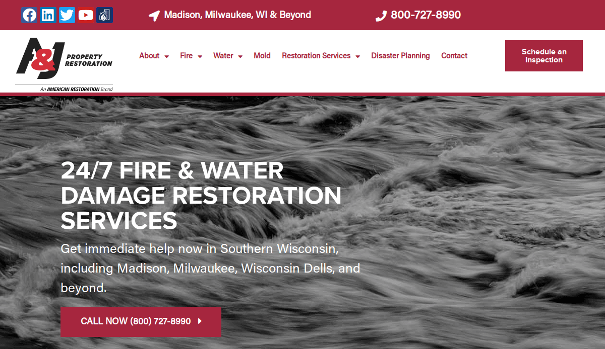
1. A&J Property Restoration
Location: Madison, WI
Key Takeaways:
- Clean, modern design with intuitive navigation.
- Prominent call-to-action buttons for immediate engagement.
- Comprehensive service pages detailing various restoration services.
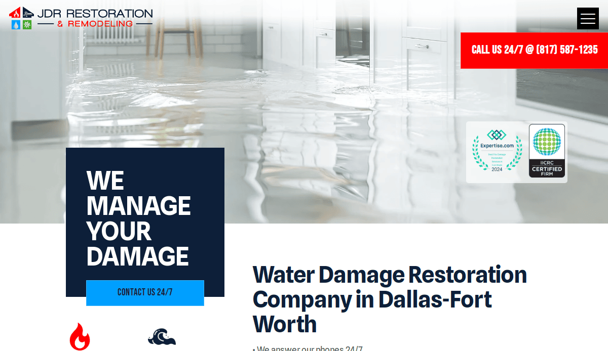
2. JDR Restoration & Remodeling
Location: Tarrant County, TX
Key Takeaways:
- Boasts over four decades of experience in home restoration and remodeling services.
- Specializes in addressing water and fire damage, mold issues, and more.
- Offers financing options to assist when insurance coverage falls short.
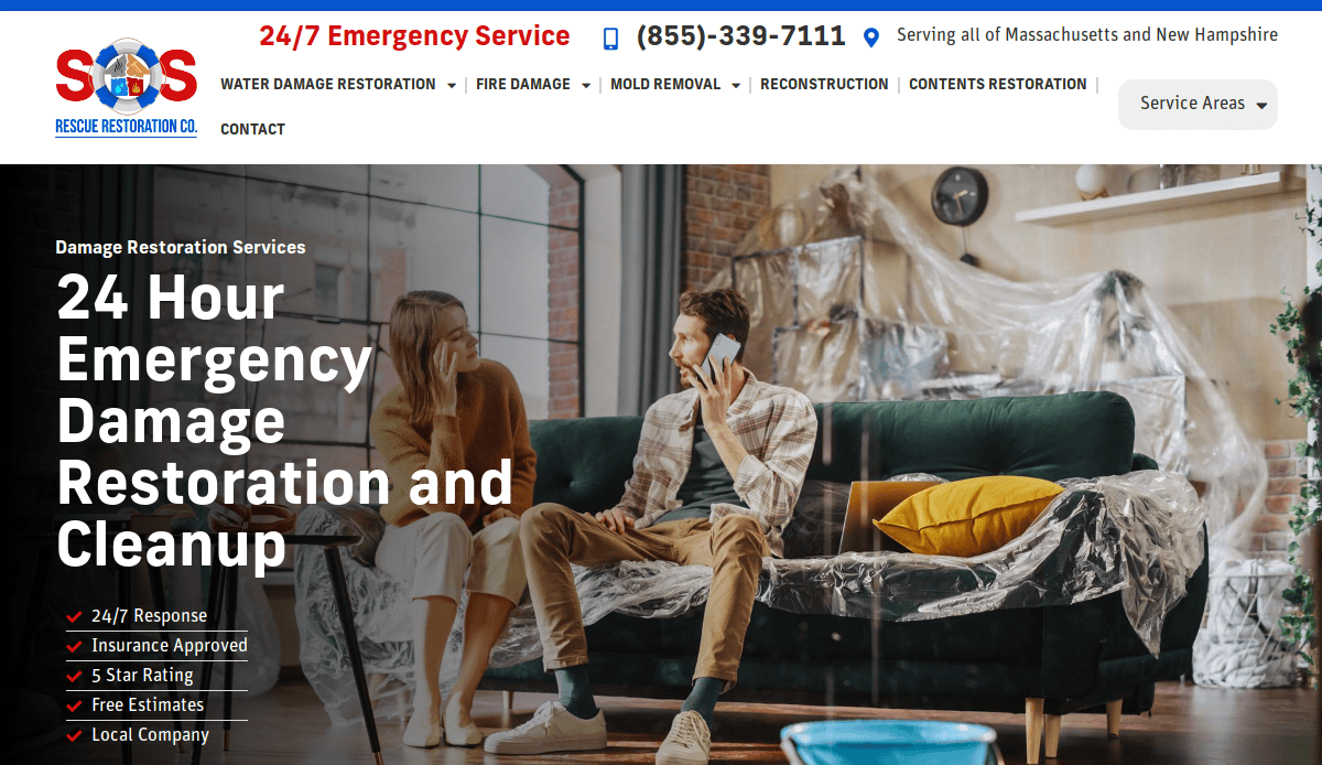
3. SOS Rescue Restoration
Location: Massachusetts
Key Takeaways:
- User-friendly layout with easy access to service information.
- Strong emphasis on customer testimonials and reviews.
- Effective use of color schemes to convey trust and reliability.
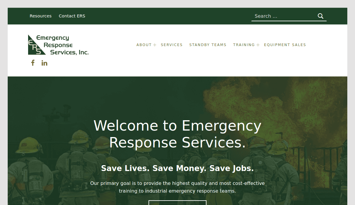
4. Emergency Response Services, Inc.
Location: Scottsboro, AL
Key Takeaways:
- Comprehensive overview of services offered, including fire and water damage repair.
- Integration of blog content to improve SEO and provide valuable information.
- Accessible contact information for quick response.
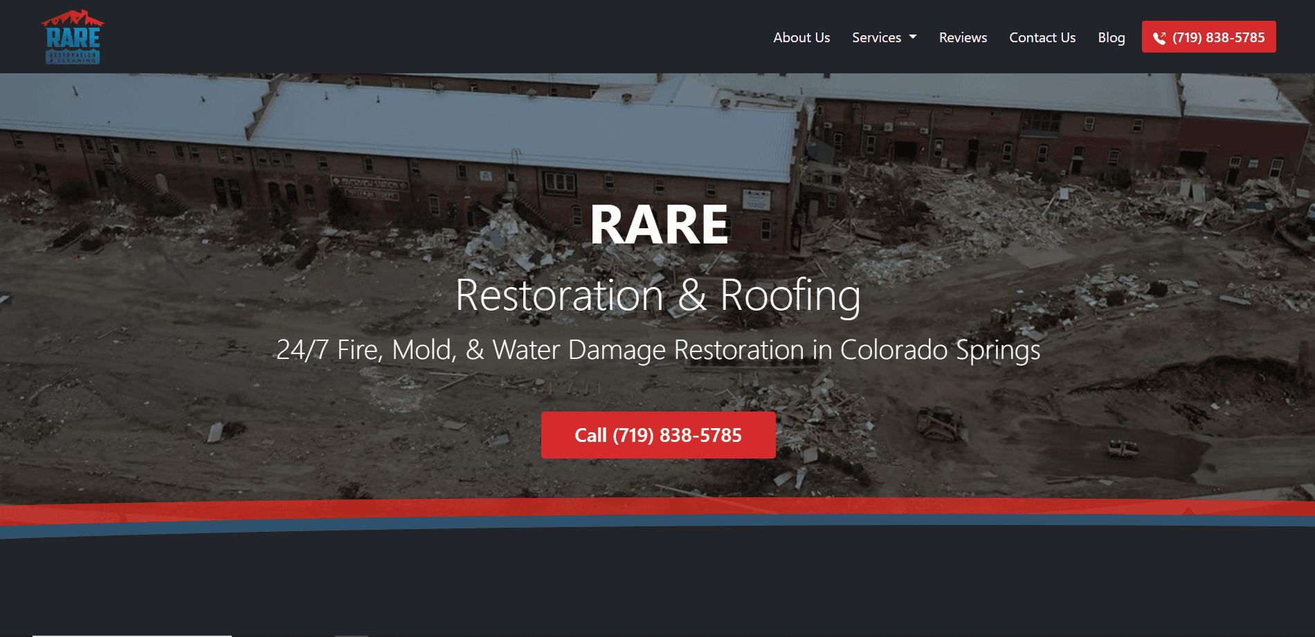
5. Rare Restoration
Location: Colorado Springs, CO
Key Takeaways:
- Minimalistic design focusing on essential information.
- High-quality images showcasing restoration projects.
- Clear calls-to-action guiding users to request services.
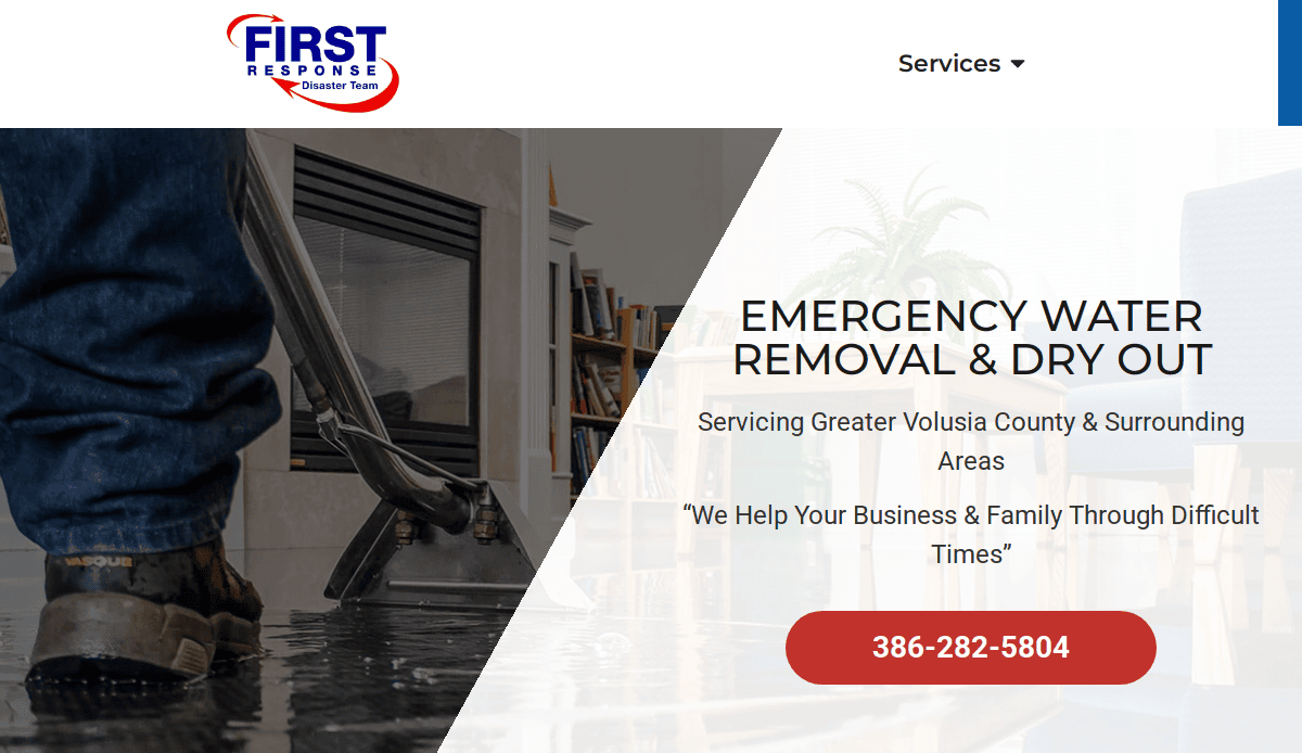
6. First Response Disaster Team
Location: Orlando, FL
Key Takeaways:
- Engaging homepage with immediate access to emergency services.
- Detailed service pages with relevant keywords for SEO.
- Mobile-optimized design for users on the go.
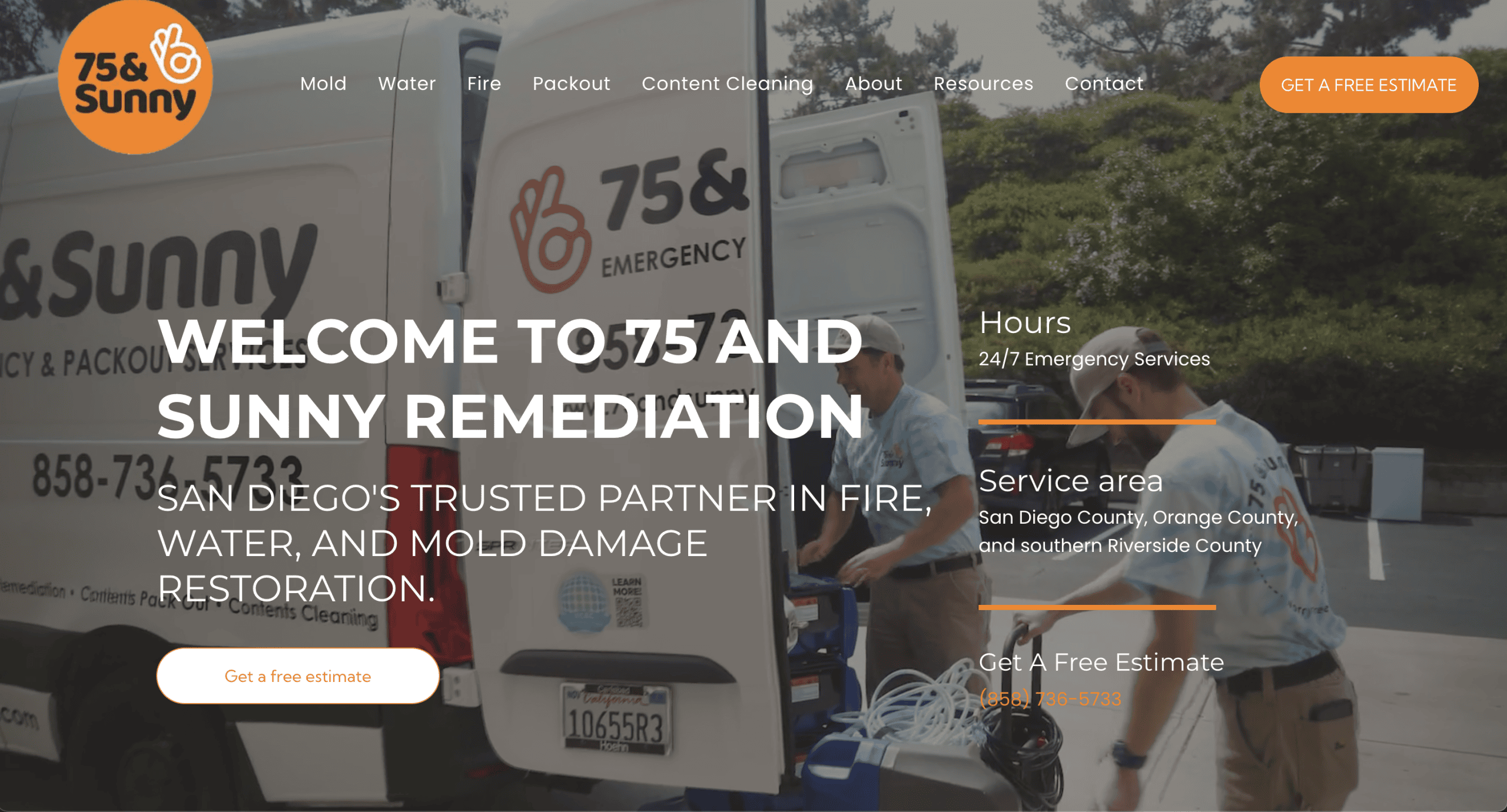
7. 75 & Sunny
Location: San Diego, CA
Key Takeaways:
- Bright, inviting design reflecting the company’s branding.
- Interactive elements enhancing user engagement.
- Informative content outlining the restoration process.
8. Team K Services
Location: Denver, CO
Key Takeaways:
- Professional layout with easy navigation.
- Strong emphasis on community involvement and trust.
- Detailed FAQs addressing common customer concerns.
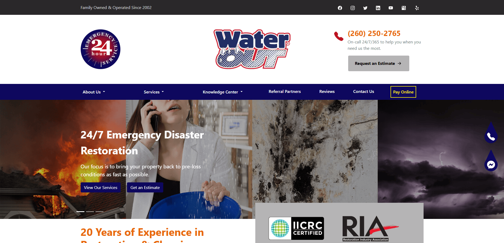
9. Water Out Fort Wayne
Location: Fort Wayne, IN
Key Takeaways:
- Clear presentation of services with concise descriptions.
- Use of customer testimonials to build credibility.
- Effective use of visuals to demonstrate service quality.
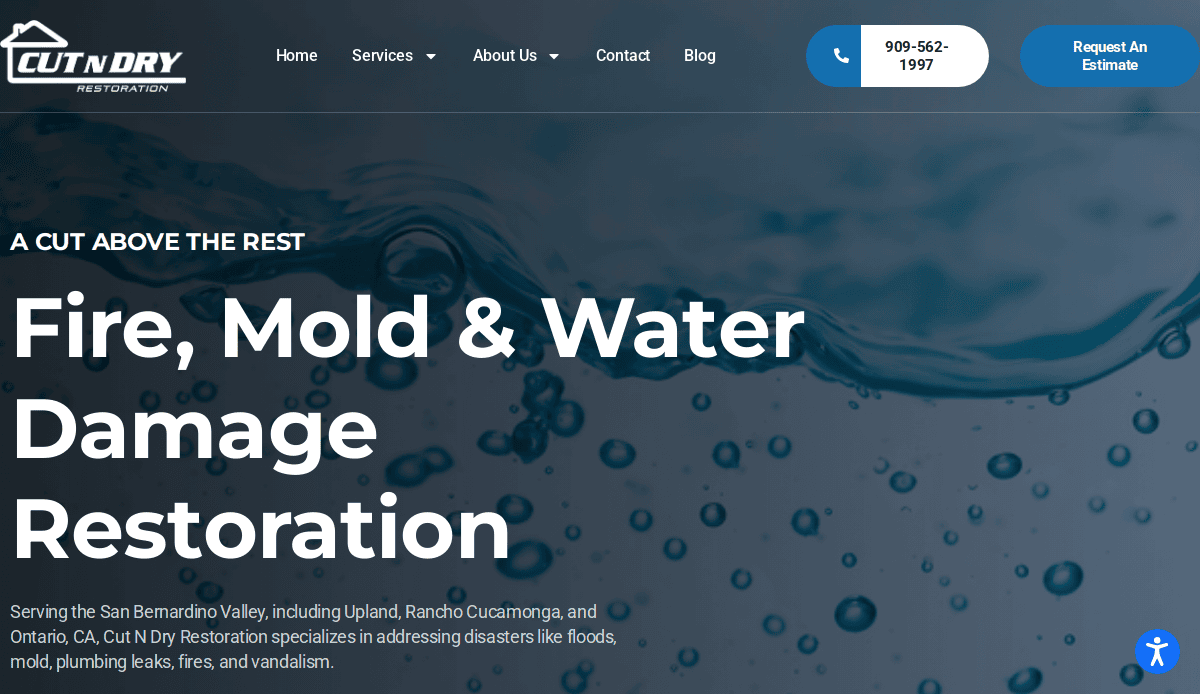
10. Cut N Dry Restoration
Location: Rancho Cucamonga, CA
Key Takeaways:
- Offers 24/7 emergency services with a focus on water, fire, mold, and vandalism restoration.
- Utilizes state-of-the-art equipment and technology to restore homes to their original condition.
- Provides free on-site evaluations and financing options for customers.
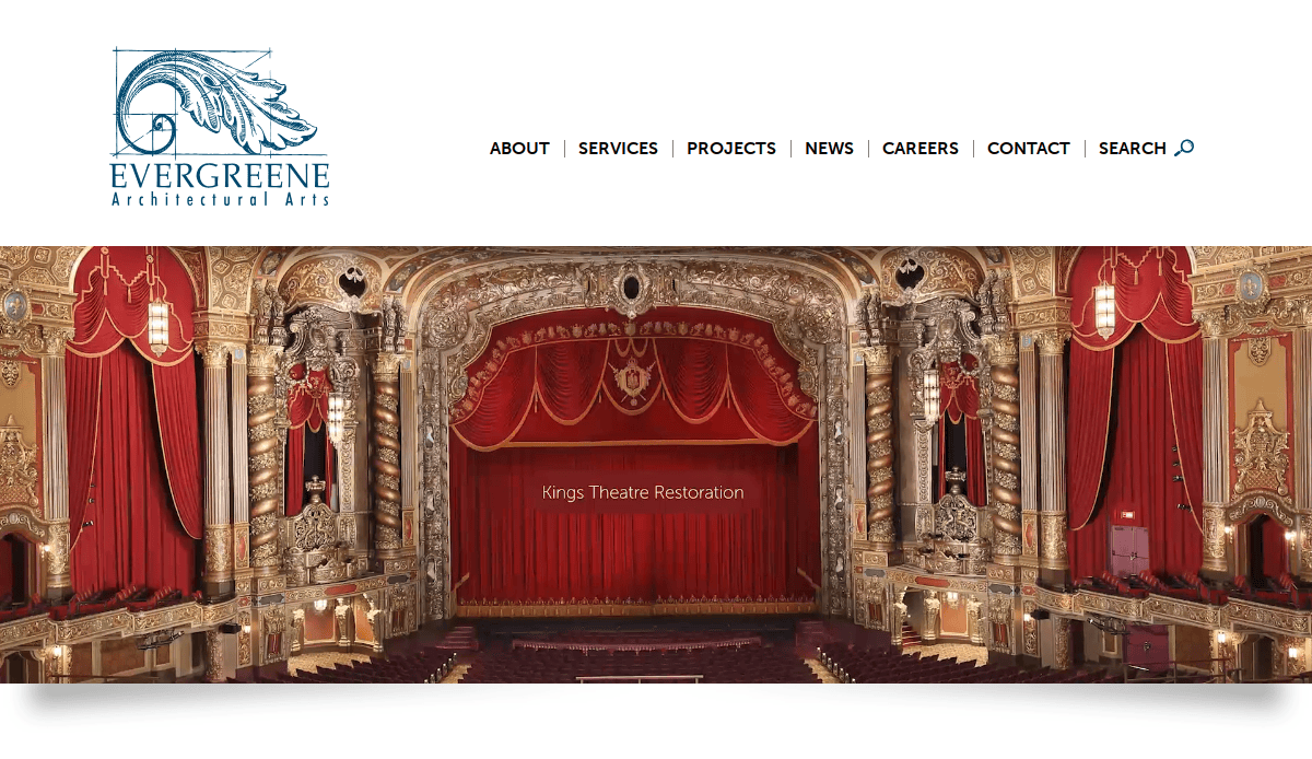
11. EverGreene Architectural Arts
Location: Brooklyn, NY
Key Takeaways:
- Sophisticated design reflecting the company’s expertise in restoration.
- Extensive portfolio showcasing a range of projects.
- Informative content detailing the restoration process.
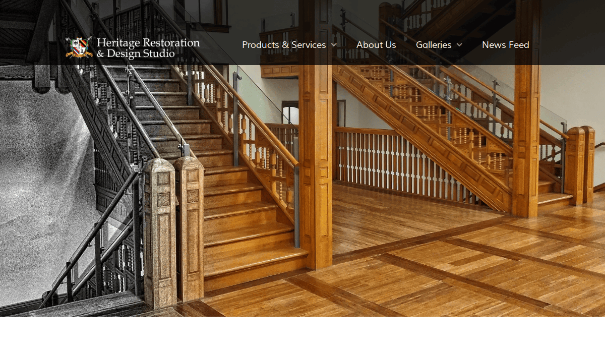
12. Heritage Restoration and Design Studio
Location: Peoria, IL
Key Takeaways:
- Classic design emphasizing the company’s long-standing history.
- Detailed service pages with high-quality imagery.
- Clear navigation guiding users through the site.
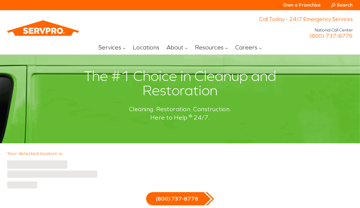
13. Servpro
Location: Gallatin, TN
Key Takeaways:
- Comprehensive national presence with localized service pages.
- Consistent branding across all franchise locations.
- User-friendly interface with easy access to emergency services.
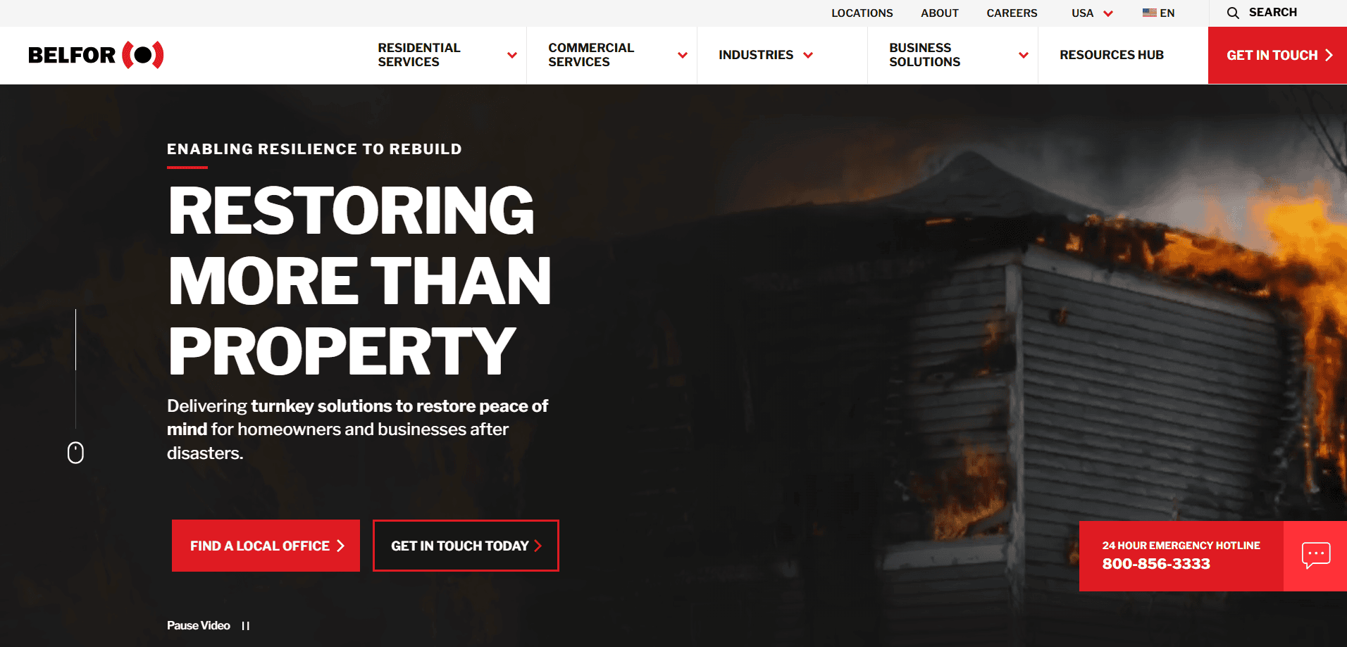
14. BELFOR Property Restoration
Location: Birmingham, MI
Key Takeaways:
- Global reach with detailed information on various services.
- Professional design conveying trust and reliability.
- Accessible resources for clients and partners.
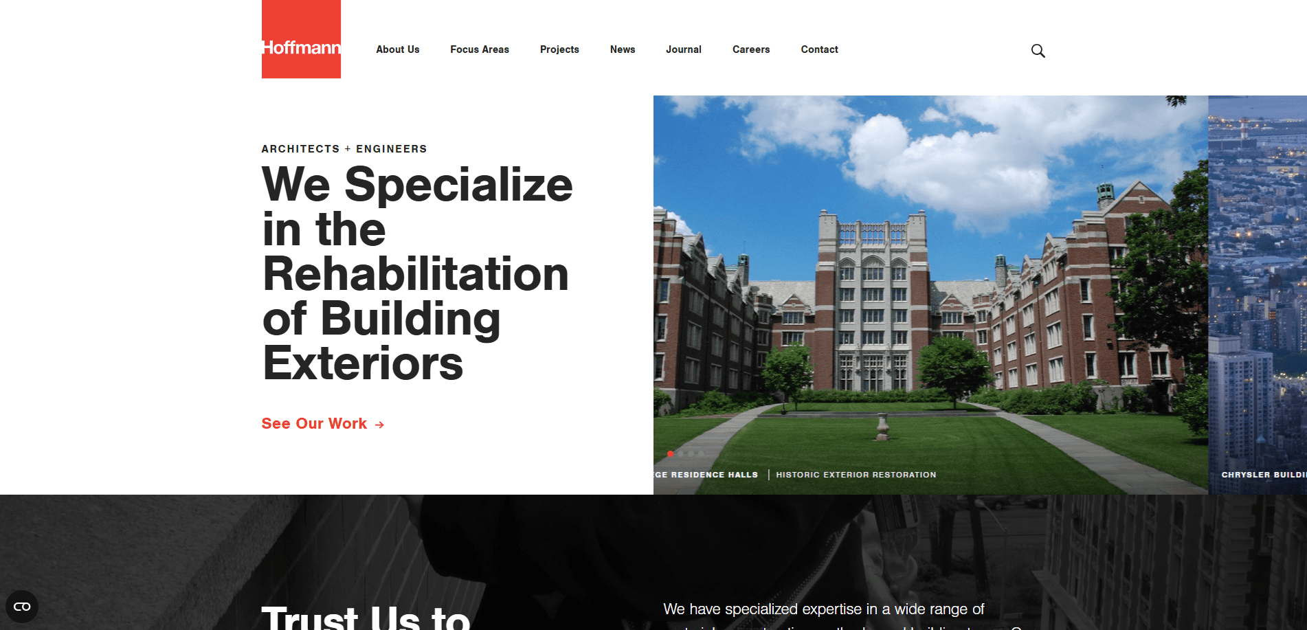
15. Hoffmann Architects
Location: New Haven, CT
Key Takeaways:
- Specialized focus on building envelope rehabilitation.
- Clean, professional design with detailed project information.
- Comprehensive service descriptions catering to various sectors.
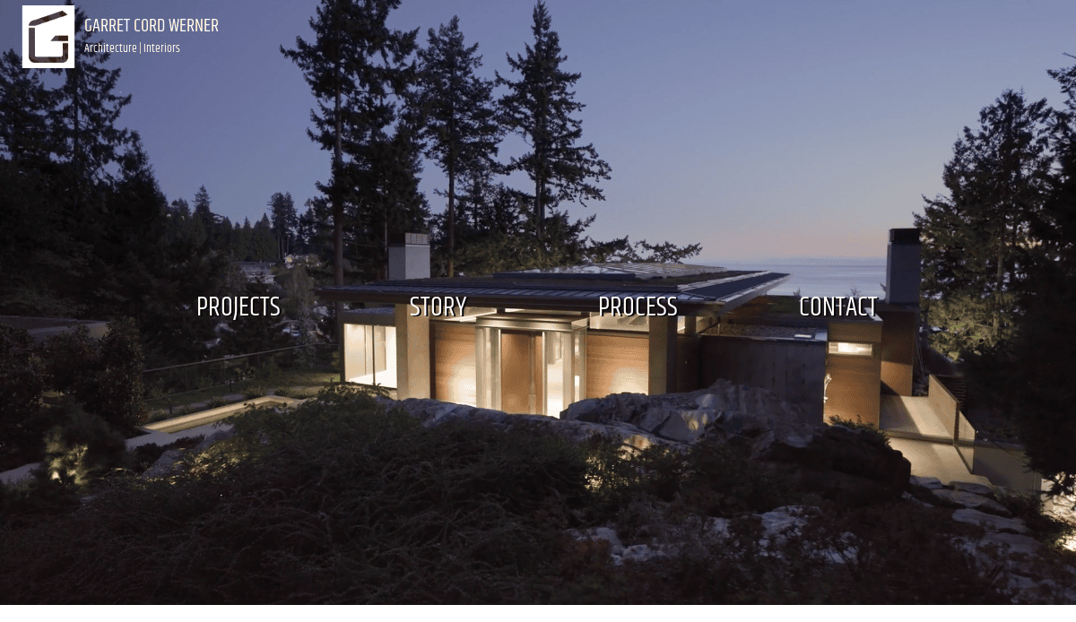
16. Garret Cord Werner Architects & Interior Designers
Location: Seattle, WA
Key Takeaways:
- Elegant design reflecting high-end restoration services.
- Extensive portfolio showcasing diverse projects.
- Informative content detailing the firm’s approach and philosophy.
17. Tallgrass Restoration (designed by CyberOptik)
Location: Schaumburg, IL
Key Takeaways:
- Custom design highlighting the company’s environmental restoration services.
- Interactive features enhancing user engagement.
- Optimized for both desktop and mobile devices.
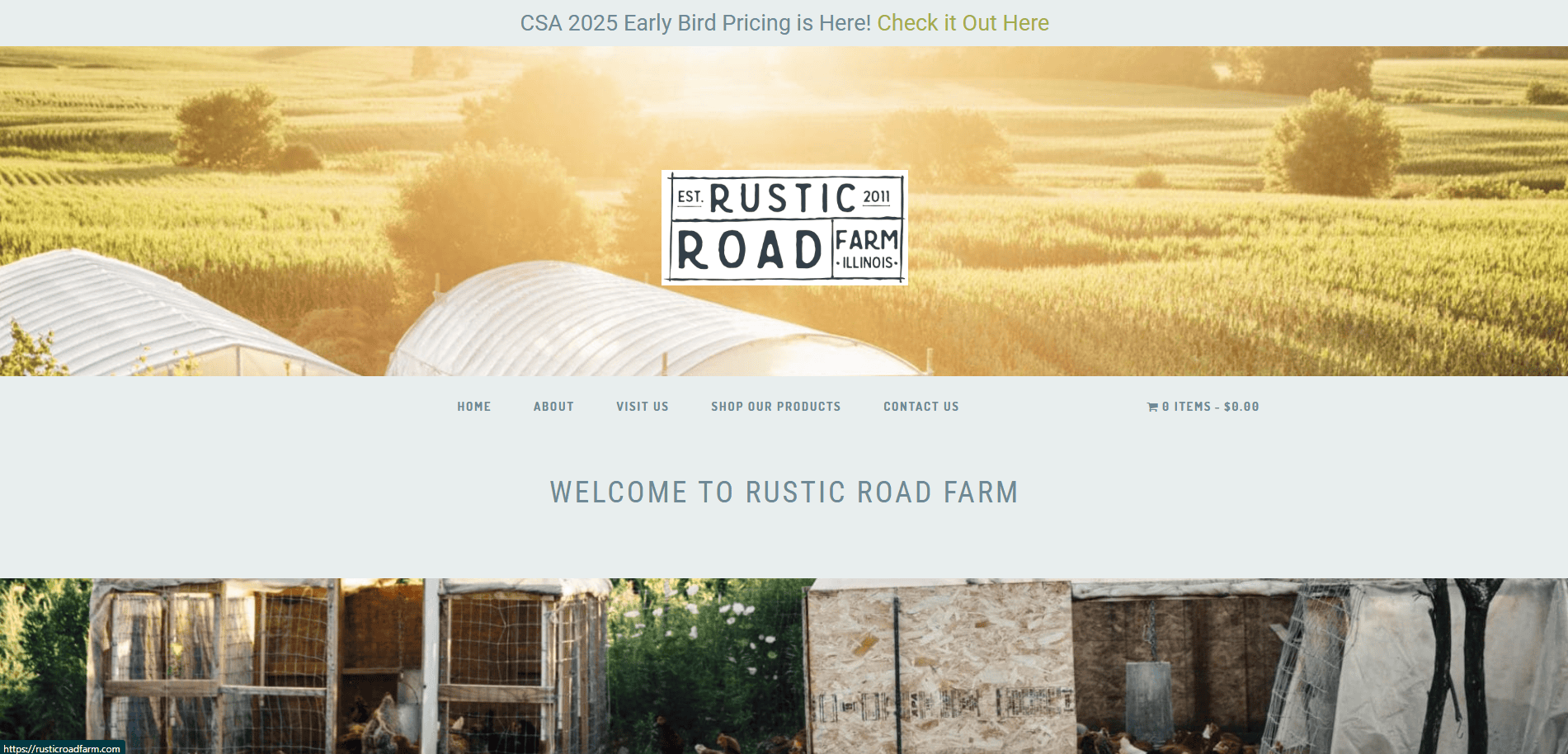
18. Rustic Road Farm (designed by CyberOptik)
Location: Elburn, IL
Key Takeaways:
- Modern design with a focus on user experience.
- Clear presentation of services and offerings.
- Integration of SEO best practices for improved visibility.
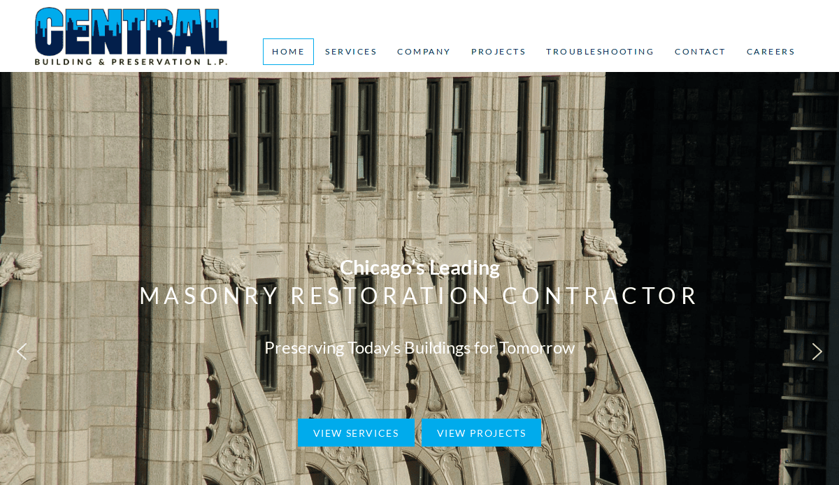
19. Central Building & Preservation (designed by CyberOptik)
Location: Chicago, IL
Key Takeaways:
- Showcases a portfolio of historic masonry restoration projects with compelling visuals.
- Features dedicated galleries with detailed case studies for each project.
- Highlights the company’s expertise in preserving and restoring historic structures.
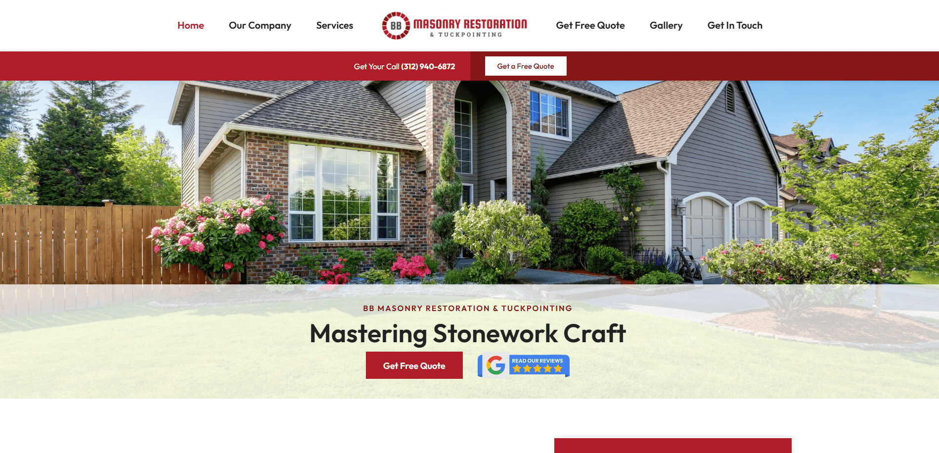
20. Chicago Masonry Restoration Contractor
Location: Chicago, IL
Key Takeaways:
- Professional design tailored to the masonry restoration industry.
- Clear presentation of services offered, including tuckpointing and brick repair.
- Responsive layout ensures optimal viewing across devices.
These websites exemplify best practices in restoration company web design, offering inspiration for creating a compelling online presence.
Ready to Build a Website That Drives Restoration Leads?
Your website is often the first place potential clients go when they search for restoration services. Whether someone is looking for fire or water damage restoration and repair, or general property restoration, your site’s design and content must help them quickly and easily find what they need. A strong online presence isn’t just helpful—it’s essential in the competitive restoration industry.
If your current site doesn’t reflect the quality of your services, isn’t driving enough traffic to your website, or lacks a clear restoration marketing strategy, it’s time to take the next step. Partnering with a team that understands how to make your website a lead-generation tool will help you grow your restoration business, improve your search engine rankings, and enhance brand awareness across all your marketing channels.
Our top-tier digital marketing agency specializes in building high-performance websites for restoration professionals. From SEO-driven design services to custom content and ongoing support, we’ll help you build your restoration company’s digital presence from the ground up.
Request a free consultation today, and let’s get started on your website for your restoration company.
Common Questions About Site Design for Restoration Businesses
What makes a great restoration company website?
A great restoration company website is fast, mobile-friendly, and designed to convert visitors into leads. It uses a modern design that emphasizes trust, showcases before-and-after photos, includes service-specific content like water damage restoration and repair from fire, and clearly guides users to take action. It should also align with your business goals and be built for scalability as you grow.
How do I improve restoration SEO to rank higher on search engines like Google?
Improving restoration SEO starts with using relevant keywords across your website content, optimizing your pages for specific restoration services, and keeping your site technically sound. Include location-specific keywords, speed up mobile and desktop versions, and maintain a blog targeting restoration searches. For a full SEO approach, check out ourGoogle Business Profile Management service.
Should I include before-and-after photos on my site?
Absolutely. Including before-and-after photos is one of the most effective ways to establish credibility and build trust. These visuals help users understand the results of your emergency restoration services and highlight your work across various areas of your website. They also help you stand out from the competition and keep your website visually compelling.
What are some key pages I should include when creating a website for restoration services?
Start with a homepage, about page, and individual service pages like water damage restoration, fire damage restoration, and mold remediation. Add a gallery with project visuals, testimonials, a blog, and a contact page. Each page should target relevant keywords and contribute to your overall digital strategy.
How can a website help drive traffic to your site and increase online visibility?
Your website helps build online visibility by ranking for restoration SEO terms, attracting users through blog content, and converting them with clear CTAs. Search engines like Google prioritize structured, keyword-rich content, especially when paired with consistent activity like posting blog updates and updating pages in full.
What makes the best restoration websites stand out?
The best restoration websites combine user-centric design with search engine optimization and strong brand messaging. They show examples of the best restoration projects, including content related to property damage, and maintain high performance across devices. Many restoration leaders use custom-built platforms instead of generic templates to ensure their site matches their professional image.
How do I align my restoration company website with my marketing strategy?
Your website is the central hub for all your marketing channels. Align it by making sure all messaging is consistent, content supports your sales funnel, and analytics (like Google Analytics) are in place to track conversions. Each section of the site should support your broader marketing goals, whether it’s improving search visibility, generating leads, or supporting paid campaigns.
What are the common mistakes in building a restoration website?
Common mistakes include failing to optimize for mobile, ignoring restoration SEO, using outdated visuals, lacking clear calls-to-action, and neglecting local SEO. You should also avoid cluttered layouts and thin content. Your goal is to build a site that’s not just beautiful but functional, converting users into customers.
How often should I update my website content?
Keep your website content current with monthly blog posts, seasonal service updates, and refreshed testimonials. Updating content helps your site stay relevant for search engine searches and improves rankings over time. You should also review your homepage and service pages quarterly to ensure they reflect your latest offerings.
Why is mobile responsiveness important for a restoration and construction website?
Most users are visiting your website from mobile devices, especially during emergencies. A mobile-friendly site improves the user experience, reduces bounce rate, and can help your pages rank higher on search. It ensures that users can contact you easily, whether they’re on-site or at home researching services in their area.

