In the window cleaning industry, a well-designed website is more than just a digital presence—it’s a vital asset that can significantly influence your business. Serving as the first point of contact for potential customers, a great website provides essential information and establishes trust in your services. Creating a lasting impression with a professional, user-friendly, and visually appealing site is crucial.
The best window cleaning websites are designed to exhibit the unique selling points of your business, such as expertise, reliability, and commitment to quality, is essential. The inclusion of high-quality images of your work, customer testimonials, and transparent service descriptions builds credibility and attracts more clients. Additionally, a well-structured website ensures visitors can easily navigate, find necessary information, and contact you for services.
In an industry where word-of-mouth and online reviews are crucial, having a standout website can set you apart from the competition. It showcases your professionalism and boosts your online visibility through effective SEO strategies. A top-tier website can convert visitors into loyal customers, driving growth and success for your window-cleaning business.
Examples of the Best Window Cleaning Website Designs
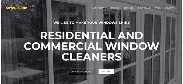
- Dutch Shine: The website’s design is visually appealing, with a clean, modern style that immediately conveys professionalism. The selection of a relaxing color scheme dominated by blue and white represents the purity of clean windows while also exuding a feeling of trustworthiness and dependability. The menu layout is well-organized, allowing for effortless user navigation. The sticky header ensures that navigation options are constantly accessible, improving the user experience. The use of high-quality photos throughout the website successfully demonstrates the company’s work and attention to detail. The website excels in directing users to desired behaviors via clear and thoughtfully placed calls to action (CTAs). Buttons like “Get a Free Quote” and “Contact Us” are visually distinct and intuitively positioned, encouraging user interaction without being intrusive.
- Shine Window Cleaning: The website’s smooth and modern design quickly draws attention. The bold colors, especially red, blue, and white, convey a sense of cleanliness and professionalism, ideally aligned with the company’s services. The main menu displays the essential services, such as home and commercial cleaning, facilitating swift access to pertinent information for visitors. The design elements are unified, creating a visually pleasing and harmonious experience. The website contains thorough information about various services, including window cleaning, pressure washing, and holiday lighting installation. It also emphasizes the company’s ideals, customer satisfaction guarantee, and community involvement, which contribute to trust and credibility. Consumer trust and engagement are further augmented by incorporating client testimonials and a blog area.
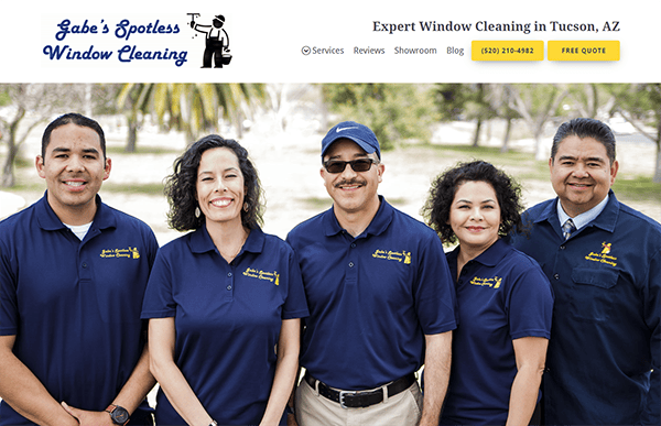
- Gabes Spotless Window Cleaning: The website oozes professionalism and welcomes visitors, effectively using a clean and modern design. A modest color choice with gold and blue accents creates an appealing contrast, highlighting crucial places without overwhelming the visitor. The high-quality photographs of completed work on the homepage immediately build credibility and demonstrate the company’s skill. The layout is well-organized, with plenty of white space to allow information to breathe and improve readability. The content is concise and informative, conveying the company’s offerings, values, and expertise. Each part provides extensive details without overwhelming the user with information. It has a responsive design, which ensures that all elements resize and reorganize themselves correctly, preserving usefulness and aesthetics across all screen sizes.
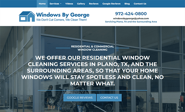
- Windows by Goerge: The website’s sleek, modern, and visually appealing design draws visitors in. The use of high-quality photographs of windows and doors on the site effectively communicates the company’s primary offers. The color palette of soothing blues and whites offers a relaxing and professional ambiance, making the site easy to explore. The navigation is straightforward, with a well-organized menu. The structure is logical and user-friendly, with clear headings and short sections that help readers navigate the text. The presence of customer testimonials and a portfolio of completed projects significantly boosts the site’s credibility. The call-to-action elements are well-placed and effectively designed. Button like “Contact Us” is prominently displayed and easy to find, encouraging users to take the next step.
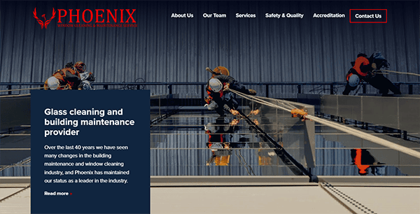
- Phoenix Window Cleaning: Its website is distinguished for its clean, professional, and visually appealing design. The use of high-resolution photos of windows and doors on the site makes a solid first impression while emphasizing the quality and range of services available. The color palette, primarily white with touches of blue and red, creates a fresh and modern appearance that is inviting and easy on the eyes. The website provides a fantastic user experience, with easy navigation and a well-structured style. The primary menu is neatly defined and easily accessible, allowing visitors to obtain information about services and company details quickly. The website’s content is top quality, well-organized, and quite instructive. Each part gives detailed information without overpowering the reader, achieving an ideal mix of depth and brevity.
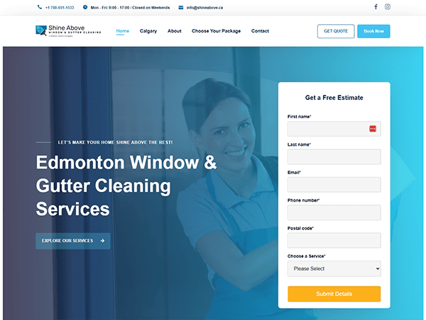
- Shine Above Window: Its website is immediately noticeable for its clean, modern, and visually appealing design. The homepage has high-quality photos and a dynamic color scheme of blues and whites, reflecting the company’s emphasis on cleanliness and professionalism. The layout is simple but elegant, creating a refreshing and friendly visitor environment. The user experience on its website is excellent, with easy navigation and a well-organized style. The website makes it easy for clients to contact Shine Above. The “Contact” page is well-designed, with a basic form, phone number, and email address. The “Get a Quote” feature is simple, allowing visitors to inquire about prices and services without hassle. Customer testimonials are prominently displayed, offering social proof of the company’s dependable and high-quality services.
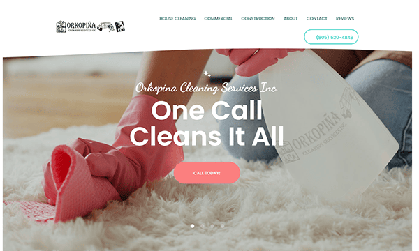
- Orkopina Cleaning Services: The website’s visually appealing design mixes professionalism and warmth. The mix of relaxing hues and high-quality photos creates a welcoming environment. The whole design is clean and uncluttered, which contributes to a sense of trust and dependability—essential traits for a cleaning service company. The website’s material is simple, concise, and compelling. The content clearly expresses the company’s services, values, and commitment to client satisfaction. Essential information is highlighted, allowing visitors to quickly comprehend the company’s offers and why they should use their services. The service pages on the website are well-organized and helpful. Visitors can readily access thorough explanations of the services available, such as house cleaning, workplace cleaning, and window cleaning. The website strategically places visible call-to-action (CTA) buttons, encouraging user participation. The website works seamlessly on various platforms, including smartphones and tablets. This establishes that users can easily access the site and its content, regardless of their device.
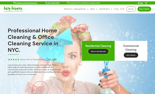
- Lazy Susans Cleaning Service: Its website has an appealing, modern design that draws visitors in from the moment they enter. The combination of bold colors and high-quality photographs fosters an inviting and professional environment. The sleek, contemporary style emphasizes the company’s dedication to offering high-quality cleaning services. The high-quality visuals were another thoughtful feature we appreciated on this custom cleaning site. The unique background graphics added a distinctive and appealing touch. It distinguishes out for its simple and user-friendly navigation. The simple and accessible menu options at the top of the homepage allow users to rapidly obtain the required information, such as services offered, pricing details, and contact information. The website uses strong call-to-action (CTA) features that direct visitors to engage with the company. Whether booking a cleaning, seeking a price, or contacting the team, these CTAs are prominently displayed and promote user participation.
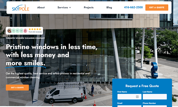
- Skypole Window Cleaning: The website immediately impresses with its sleek and modern design. The clean lines and professional layout offer a sense of sophistication and experience, which is appropriate for a company specializing in high-reach window washing. The use of high-quality photos and a consistent color scheme improves visual appeal and strengthens the brand’s identity. The use of distinctive and stunning backdrop graphics, together with excellent images of the squad in action, gives the site a dynamic and visually appealing element. The addition of customer testimonials on the website enhances credibility and confidence. These genuine reviews from delighted customers serve as social proof of the company’s good service and reliability. A standout element is the homepage section labeled “Hundreds of organizations trust us.” This part effectively develops credibility and trust by highlighting the company’s large client base. It gives visitors confidence that SkyPole is a trustworthy and reliable partner with many delighted customers.
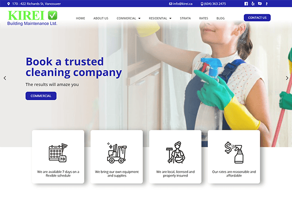
- Kirei: The site has a clean, minimalist look with a beautiful color scheme of whites, blues, and green accents representing cleanliness and professionalism. High-resolution photographs of their services are prominently shown, which increases visual engagement. The homepage includes a prominent slider that showcases their services with high-quality images and clear calls to action. The navigation is straightforward, with separate areas for commercial, residential, and strata cleaning services. Information is well-organized and follows a logical flow. The usage of sections such as services, testimonials, and blog entries ensures that users can quickly locate what they’re searching for without getting overwhelmed. The contact information and a free estimate form are easily accessible, ensuring potential clients can quickly get in touch.
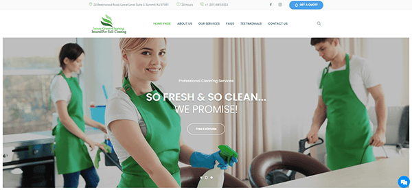
- Jersey Green Cleaning: The website has a clean, professional, and user-friendly design that successfully promotes its services. The homepage quickly draws attention with its bold and enticing call to action for a free estimate. The navigation is simple, providing quick access to information about their residential, commercial, and specialty cleaning services. The devotion to eco-friendly techniques is publicly displayed, attracting environmentally conscientious clients. Testimonials and a section dedicated to natural cleaning goods help to build confidence and trustworthiness. Customers can quickly contact the company through its website. The “Contact” page is well-designed, with a basic form, phone number, and email address. Furthermore, adding a live chat option or a visible customer care link could improve the user experience by giving immediate assistance.
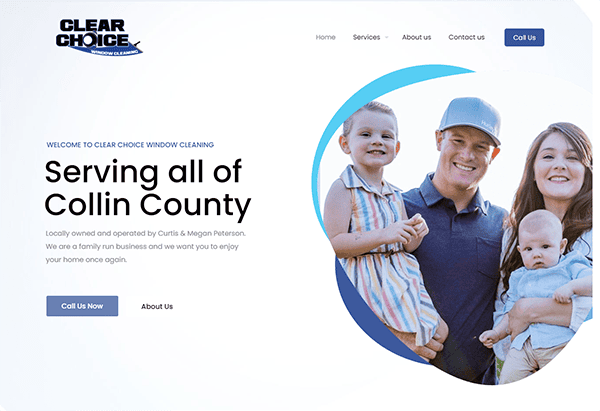
- Clear Choice Window Cleaning: The website’s design is clear and compelling. It has a clean and modern layout with a simple color palette that is pleasing to the eye. The usage of high-quality photos throughout the site draws attention and effectively promotes their services. The menu appears prominently at the top of each page. The use of clear and descriptive labels ensures that viewers can easily find the information they require. The website’s content is informative and well-organized. Each service is clearly stated. The contact information, including a phone number and an email address, is easily accessible on every page. The website’s full responsiveness guarantees that it appears excellent on any device, making it available to a large audience. The website excels in guiding user interaction with well-placed and easily accessible call-to-action buttons strategically positioned throughout the pages.
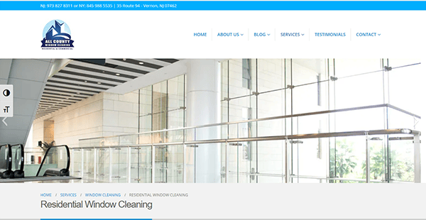
- All County Window Cleaning: Its website has a slick and professional appearance that immediately inspires trust. The layout is clear and well-organized, with a color palette that complements readability and visual appeal. High-quality photos efficiently promote their services, providing visitors with a clear picture of what to expect. The menu is visible and logically organized, making it simple to access information about services, service areas, testimonials, and contact information. The usage of dropdown menus guarantees that users may rapidly go to specified pages without making unnecessary clicks. Its website has a clean, modern design, easy navigation, insightful information, and strong calls to action. The responsive design enables accessibility across all devices, which improves the user experience.
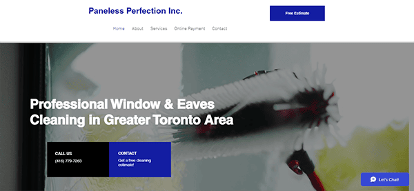
- Paneless Perfection Inc.: The website has a clean and modern style that quickly catches the eye. The blue and white palette is peaceful and professional, making it ideal for their window cleaning service. The navigation is straightforward, with a well-organized menu that makes accessing information simple. The website is responsive and fast-loading, offering a consistent experience across all devices. High-quality photos demonstrate their competence and clear calls to action encourage visitors to contact them directly. Detailed service descriptions, client testimonials, and a robust blog boost trustworthiness and provide helpful information. The inclusion of a chat box is a great enhancement since it enables visitors to obtain prompt support and responses to their inquiries without leaving the current page.
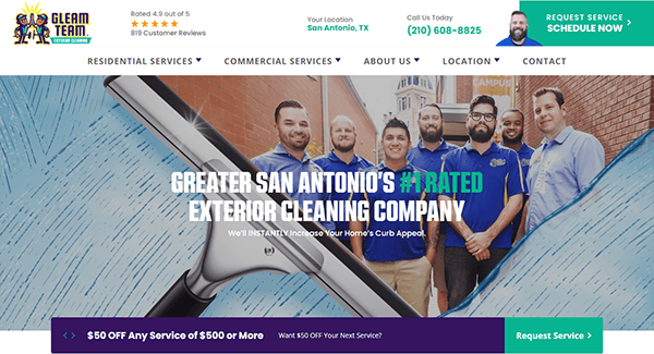
- Gleam Team: The website greets visitors with a sleek, professional design that exudes trust and dependability. The color choice of purple and white with a green accent is new and consistent with their brand image. High-quality photos of their work are prominently featured, highlighting their tremendous accomplishments. Visually, the website is remarkable. The use of large, high-resolution photographs of clean buildings and shining windows effectively communicates the excellence of their work. Each page has clear calls to action, making it easy for visitors to get a free estimate or contact us for further information. Contact information is readily displayed, making for a more user-friendly experience and encouraging potential clients to contact us. Each page has clear calls to action, making it easy for visitors to get a free estimate or contact us for further information. Contact information is readily displayed, making for a more user-friendly experience and encouraging potential clients to contact us.
- Benchmark Cleaning Services: The design is sleek and modern, with a soothing color palette that conveys cleanliness and professionalism. The use of white space is superb, making the website easy to navigate and allowing the content to shine. The typography is straightforward to read, which is essential for a service-oriented website. Navigation is simple, with a well-organized menu that allows users to find the information they require. The presence of a prominent contact button and a phone number in the header makes it simple for potential customers to take action. The website’s content is educational and well-written, providing a clear and complete summary of the comprehensive services available. Each service has its dedicated website that details the specifics and highlights the benefits, giving potential consumers a clear picture of the outstanding value they will get.
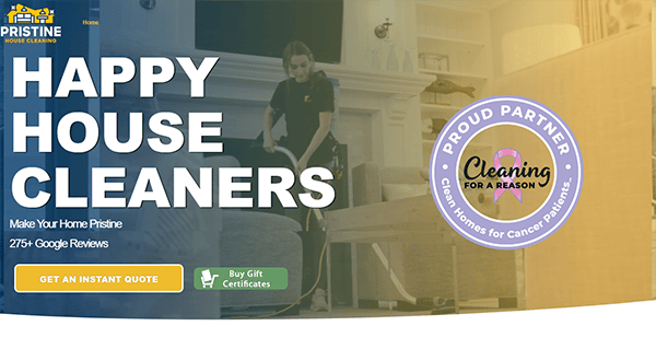
- Pristine House Cleaning: The website has a slick, professional, modern design consistent with its brand image. The layout is clean and minimalistic, emphasizing its cleaning services’ cleanliness and attention to detail. The hero page stands out with a fascinating video that shows its cleaning services in action, giving visitors a lively introduction to the company. The navigation is simple and user-friendly, with a well-organized menu that allows visitors to quickly access information about their services, service areas, and contact information. The website carefully distributes CTAs throughout, allowing visitors to easily take the next step, whether getting a price, booking a service, or contacting them personally. The CTAs are visible without being too intrusive.
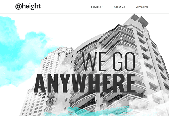
- Height: The hero section of its website provides a straightforward but appealing manner for the organization to highlight its statement of purpose and strength successfully. The minimalist and clean homepage design oozes professional elegance, highlighting its experience in height access and rope access services. The layout is neat and structured, with a simple color scheme that exudes safety and professionalism. The choice of white and blue hues improves legibility and maintains the brand’s identity. The navigation system is intuitive and user-friendly, with a well-organized menu that enables users to explore various services and sectors catered to effortlessly. The website is designed to be entirely responsive, guaranteeing a smooth and uninterrupted user experience on all platforms, from desktop computers to smartphones.
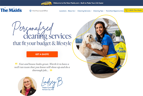
- The Maids: Its website has a modern and friendly design that emphasizes the cleanliness and professionalism that come with its cleaning services. The layout is clean, structured, and simple to browse, with a color scheme that incorporates soothing blues, oranges, and yellow lines to improve the overall user experience. The website has high-quality photographs that show their cleaning services in action. The pictures are bright and sharp, emphasizing its cleanliness and attention to detail. The usage of images on the website increases interaction and informs potential clients about their services. It also excels in providing extensive information about its cleaning services, such as full descriptions of its cleaning processes, customizable cleaning programs, and special discounts. They prominently display client evaluations and testimonials, which lend legitimacy and reliability to their business.
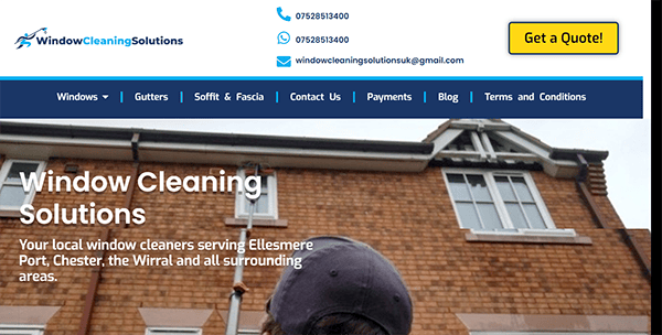
- Window Cleaning Solutions: The website’s design is simple and uncomplicated, immediately putting visitors at ease. Soothing blue colors and white spaces foster a professional and trustworthy ambiance. The interface is straightforward, making it simple to locate information quickly. Each page contains important information regarding their services, coverage areas, and testimonials. The material is well-structured and easy to read, allowing users to understand what the organization has to offer easily. Numerous testimonials and evaluations from delighted customers are prominently posted on the website. It’s apparent that it appreciated client feedback and had a strong reputation. Each page offers clear calls to action, encouraging visitors to contact or learn more about their services. This proactive strategy helps to turn visitors into customers.
Exploring the best window-cleaning websites can provide valuable insights into what makes a site effective in this industry. These examples typically feature engaging designs, user-friendly navigation, and comprehensive service information. They also often include customer testimonials, before-and-after photos, and easy-to-find contact details, all persuading and encouraging potential clients to contact them.
Engaging in a high-quality website is an investment in your company’s future. As more customers search online for reliable window cleaning services, your online presence becomes crucial to your success. A professional website that conveys your brand’s values and demonstrates your skills will help you stand out in a competitive market.
At CyberOptik, we specialize in creating stunning, effective websites tailored to the needs of window-cleaning businesses. Our team understands this industry’s unique challenges and opportunities and is ready to help you build a website that drives growth and success. Contact us today for a free consultation about your window cleaning website, and let’s transform your online presence together.

