In the present era of technology and computers, having a strong online presence is important for businesses in every industry, and window and door contractors are no exception. A well-designed website is the cornerstone of your digital marketing strategy, helping you attract new clients and retain existing ones. It showcases your work, builds credibility, and provides potential customers with the information they need to make informed decisions.
An excellent website for a window and door contractor highlights the quality and variety of your products and demonstrates your commitment to customer service. High-quality images, detailed product descriptions, and client testimonials contribute to a professional and trustworthy image. In addition, the website’s straightforward navigation, explicit calls to action, and mobile responsiveness guarantee a smooth user experience regardless of the device used.
Additionally, an effective website is designed to be search engine optimized, guaranteeing that future clients may effortlessly locate your services online. By incorporating relevant keywords and maintaining an active blog, you can significantly enhance your search engine ranking, driving more traffic to your site. In a competitive market, a top-notch website distinguishes you from other contractors and positions your business as an industry leader.
Examples of the Best Window and Door Website Designs
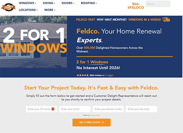
- Fledco: The website’s consistent color palette of blues, whites, and orange lines creates a clean and professional appearance. It uses high-quality photographs and videos to explain product features and benefits, which makes the content more engaging and informative. The navigation is straightforward, with a well-organized menu and effective breadcrumbs. A prominent search bar lets visitors quickly locate certain products or information, increasing the user experience. It offers thorough information about its products and services, such as windows, siding, doors, and roofing. The inclusion of client testimonials and extensive descriptions promotes trust and reliability. The website includes large call-to-action buttons that direct users to purchase or get a quote, effectively driving conversions. The website was developed with accessibility so users, including those with impairments, can easily navigate and interact with the content.
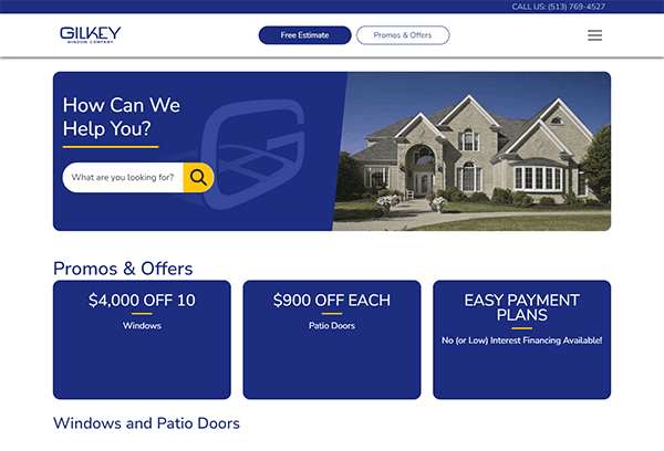
- Gilkey: The website skillfully uses high-quality photographs to highlight its products, producing a powerful visual impact. The color palette is consistent and complements the brand’s identity, instilling trust and professionalism. The homepage has banners showcasing promotions and special offers, which are visually appealing and strategically placed to attract visitors. The content is straightforward, educational, and well-written. It provides visitors with all required product and service information without overwhelming them. Including customer reviews and case studies increases credibility and assists potential consumers in making informed purchasing decisions. The navigation is fluid, with clear, detailed labels guiding users across the site. Furthermore, the site’s responsiveness guarantees an ideal browsing experience on various platforms, including PCs and smartphones.
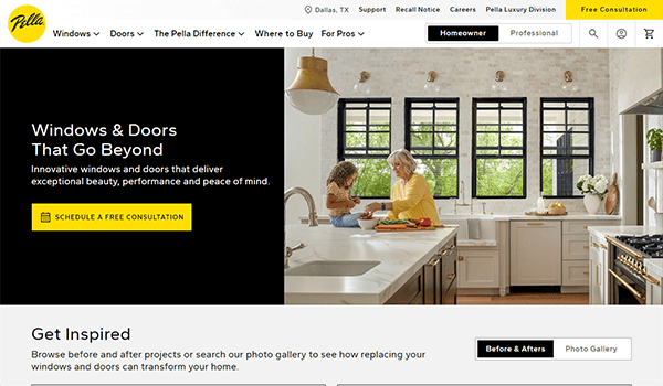
- Pella: The website has a modern and professional appearance, with high-quality photos and a consistent color scheme that matches the corporate identity. Large, engaging images highlight the beauty and functionality of products, improving the overall browsing experience. The website design is notable for its user-centered approach and clean, intuitive layout. The site skillfully mixes visual appeal and functional design, providing a consistent user experience. Key product categories, such as windows and doors, are displayed, allowing visitors to find what they need quickly. The site’s navigation is simple and well-organized, with a main menu that separates various parts, such as windows, doors, and the Pella difference. The website skillfully uses before and after photographs to demonstrate the transforming power of their window and door solutions. This feature improves the user experience by showing visual examples of how its products can improve a home’s beauty and practical aspects.
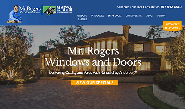
- Mr. Rogers Window and Door: The website has a clean, modern style that is visually appealing. The blue and white combination is relaxing and easy on the eyes, conveying a professional and trustworthy image. The use of high-quality photographs to showcase their items helps to express the quality and craftsmanship that they provide. The website’s content is well-organized and informative. Each page includes thorough information on the products and services supplied, such as features, benefits, processes, and available options. Customer testimonials and case studies are prominently featured, emphasizing the company’s commitment to exceptional service and customer happiness. The website contains a chat box function to increase user involvement and support. It enables users to ask real-time questions, get rapid help, and receive personalized recommendations.
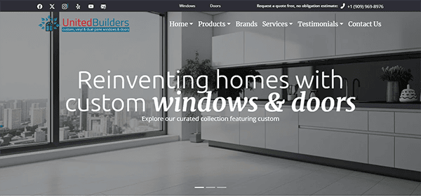
- United Builders: The website has a professional and attractive design that successfully highlights their services and experience in window and door installation. The layout is simple and intuitive, resulting in a smooth user experience. Navigation is simple, with distinct categories that help users get the information they need. The webpage quickly draws attention with high-quality photographs of finished work, demonstrating the company’s skill and attention to detail. The site’s testimonials boost trust by offering thorough reviews from delighted customers who laud the company’s competitive price, excellent service, and high-quality products. Furthermore, the website’s contact information is prominently presented, allowing users to request prices or consultations quickly. The addition of a chat window provides real-time customer service, encouraging user interaction.
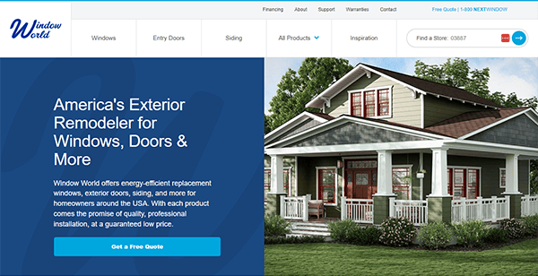
- Window World: Its website effectively blends a modern design with functionality, making it user-friendly and visually appealing. Using blues and whites adds refinement to the design while remaining simple. The webpage efficiently showcases their product line, which includes windows, doors, siding, and more, using clear, high-quality photos. Navigation is simple, with well-organized menus and sections that let consumers quickly access specific products or information. The website also stresses its commitment to quality and customer satisfaction by displaying certifications and relationships with renowned organizations. Testimonials and case studies provide social proof of their dependability and expertise. The simple “Get a Free Quote” function and extensive product descriptions increase user engagement, resulting in a smooth and informative browsing experience.
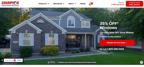
- Champion: The website is well-designed and practical, offering a great user experience. The homepage includes a dramatic hero video that immediately attracts visitors’ attention and highlights their essential products and services, such as windows, sunrooms, siding, and doors. The navigation is simple, allowing visitors to explore different parts and find information quickly and easily. The site has straightforward navigation, extensive product pages, and a prominent “Schedule your Free Quote” button. The site prominently displays current specials, which encourages user participation. Detailed product pages with detailed explanations and images assist customers in making educated judgments. The integrated chat box and location finder add to the site’s functionality, offering immediate customer support and helping users locate the nearest service center.
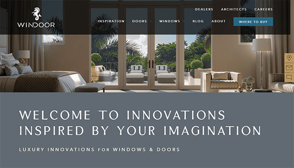
- Windoor: The website has a basic design with plenty of white space, allowing the products to stand out. This simple structure improves the user experience by minimizing clutter and simplifying navigation. The homepage is well-organized, making navigation simple and natural. Users may quickly navigate different product categories, such as doors, windows, and personalization options. Each section includes thorough information about the materials, series, and features, which improves the user experience. A prominent consultation scheduling option allows visitors to communicate directly with WinDoor’s professionals, resulting in a more personalized client experience. Contact information and social media links are also readily available, encouraging additional interaction. Furthermore, the website’s ability to adapt to different devices guarantees an excellent viewing experience, demonstrating its dedication to excellence and originality.
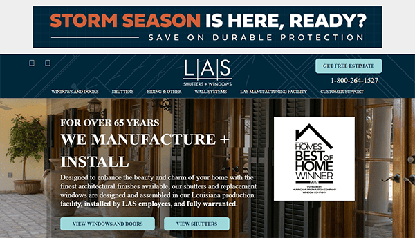
- LAS: The website has a clean and modern layout that makes it easy to navigate and visually appealing. High-quality photographs and videos of their items are prominently featured, demonstrating their selection of shutters, windows, and other offers. Users may easily access items and information using clear, simple navigation menus. Windows, doors, shutters, and siding are prominently displayed, allowing visitors to navigate the selections easily. Customization choices are also clearly defined, enhancing the individual buying experience. The website offers elements such as an easy-to-use consultation scheduling and a request for a free estimate, which encourages visitor participation. Furthermore, the blog provides valuable insights and recommendations for house remodeling.
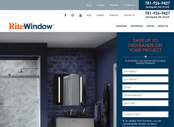
- Rite Window: The website has a simple and straightforward design that makes navigation easy. The layout is well-organized, with clear choices and easy access to information. High-quality photos throughout the website effectively highlight their products and services. Its content is concise yet educational, outlining the advantages of working with the organization. The text is well-written and entertaining and effectively communicates their knowledge of window solutions. The website effectively highlights their honors, qualifications, and affiliations, emphasizing their trustworthiness and dedication to maintaining high-quality standards. Their contact information is prominently displayed on each page, along with a user-friendly contact form, making it simple for visitors to get in touch. The call-to-action buttons, such as “Get Our Price” and “Schedule a Consultation,” are strategically positioned to encourage active user participation.
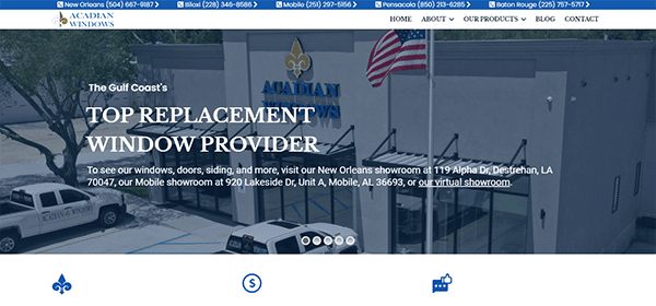
- Acadian Window: The sleek and modern design quickly grabs your attention, with colorful photos showcasing their remarkable selection of window solutions. The clean navigation menus and properly positioned call-to-action buttons simplify learning about their products and services. Whether you’re a homeowner seeking energy-efficient windows or a contractor looking for dependable suppliers, the website provides a streamlined browsing experience for everyone. Its website also succeeds in providing helpful information to users. Each page contains educational and inspirational content, from extensive product descriptions to instructive blog articles. The color scheme is well-chosen, conveying a sense of warmth and professionalism consistent with the brand. Furthermore, the straightforward contact form is a notable feature, allowing visitors to quickly contact the organization for estimates, inquiries, or consultations.
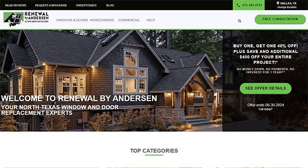
- Renewal by Andersen: The site uses high-quality photos and a clean, modern layout to grab visitors’ interest immediately. Adopting a uniform color scheme and good photos improves the overall visual appeal. The homepage instantly showcases essential offerings, such as custom-made, energy-efficient windows and elegant patio doors, using visually appealing images and clear, concise writing. The navigation is straightforward, with well-organized categories such as “Replacement Windows,” “Patio Doors,” and “Get Inspired,” making it simple for consumers to locate information and inspiration. The presence of client evaluations and testimonials increases legitimacy and confidence. These are publicly exhibited as social proof of the company’s quality and service. CTAs are strategically positioned across the website, prompting visitors to arrange consultations, seek quotes, or read more about the items. These call-to-actions are simple and appealing, guiding users to conversion.
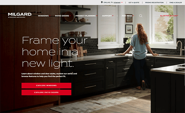
- Milgard Window and Doors: The website provides a good user experience with its clean, straightforward design and extensive content. The homepage immediately engages visitors with its high-quality images and simple navigation. The continuous red and white palette is visually appealing and complements the company’s identity. The user-friendly interface makes browsing their extensive windows and doors sorted by style and material simple. A fixed menu bar ensures easy navigation, and a chat box provides real-time customer service, improving user interaction. The search option provides quick access to specific information, making browsing more efficient. Customer evaluations and testimonials enhance credibility and foster confidence. It has a mobile-friendly design that ensures a seamless experience across all devices.
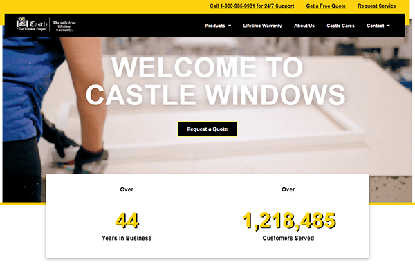
- Castle Window: The website impresses with a visually appealing and functional professional design. The style is clean and modern, with high-quality photos highlighting their large selection of window goods. The color scheme of blacks and yellows and the typography selections convey a sense of professionalism and trust, consistent with the company’s reputation for excellence. The homepage effectively introduces the company’s offers, giving visitors a thorough grasp of their products and services. The site is easy to use, with well-organized navigation allowing users to access the required information. Each section is professionally structured, with thorough product descriptions and characteristics to help you make an informed decision. Adding customer testimonials and case studies increases reliability and assures potential clients about the quality of the company’s services. In addition, the website includes a simple and easy-to-use contact form, allowing visitors to request quotations or further information.
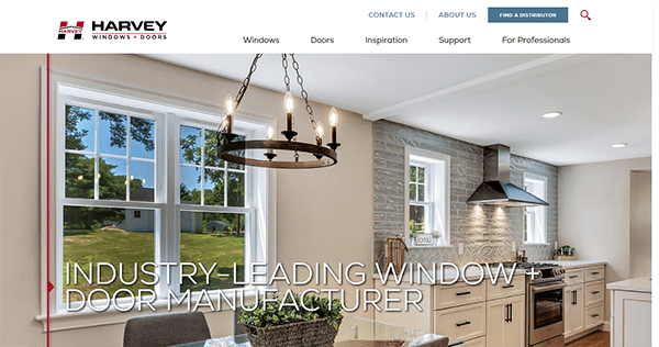
- Harvey Windows + Doors: The company’s homepage offers a clean, modern appearance that is welcoming and simple. Using a consistent and appealing color palette enhances the brand’s professional and trustworthy image, making the site visually appealing and providing a consistent user experience. The site’s navigation is simple, with well-organized menus and clear calls to action that lead visitors seamlessly through the various parts. The website makes excellent use of high-quality photographs and videos. These photos highlight the items and inspire by showing how the windows and doors look in real homes. The gallery and inspiration sections are valuable for customers who want to imagine their home improvement projects. The support section has comprehensive resources such as installation guides, warranty information, and FAQs. Furthermore, the availability of customer support contacts guarantees that users can get assistance when necessary.
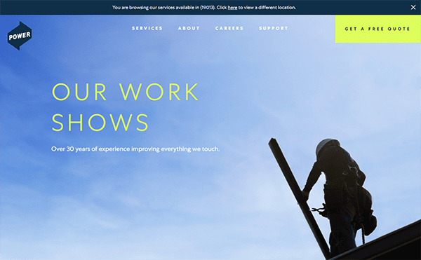
- Power Home: The website is clean, modern, and visually attractive. The color scheme is professional and appealing, with shades of blue and white that convey integrity and dependability. The website uses high-quality photographs to highlight its work and depict its services. The website’s content is both instructive and engaging. It successfully conveys the company’s mission, values, and commitment to quality. The website offers interactive features to improve the user experience. The “Get a Free Quote” button is displayed, prompting visitors to take action. Including client testimonials and case studies provides social proof of their skill and customer pleasure.
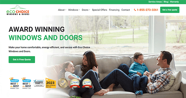
- Eco Choice: The website’s design is clean, modern, and visually appealing. The color scheme is harmonious, with shades of green and white reflecting their eco-friendly business image. High-quality photos of their windows and doors demonstrate their products and craftsmanship. The website’s navigation is simple and easy. The content is informative, well-written, and concise. It effectively communicates the advantages of their products, their dedication to quality and sustainability, and the knowledge of their team. The website has various elements that improve the user experience. The CTA buttons and live chat box are prominently displayed, prompting visitors to take action. Testimonials from delighted customers increase credibility and confidence. The presence of a blog adds value by sharing recommendations, insights, and industry news.
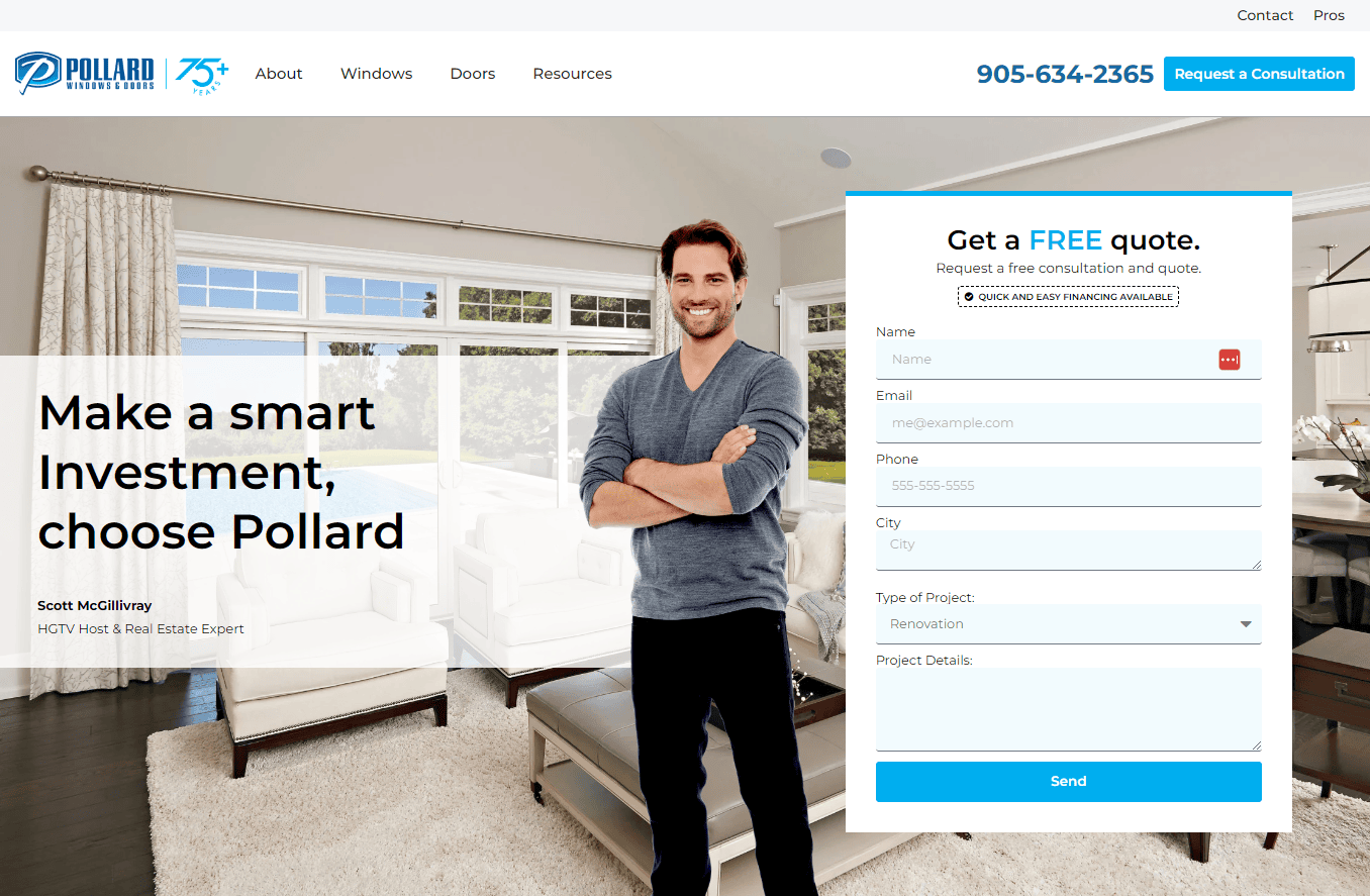
- Pollard Windows and Doors: The website is very appealing, with high-quality photographs displaying their selection of window items. The website’s color scheme is well-chosen and consistent with the brand. The prominent colors are relaxing and professional, which is essential for a company providing home renovation products. Using large, clear images allows prospective buyers to see the products up close and imagine them in their homes. The design choices are sleek and professional, reflecting the high quality of its products. The streamlined, contemporary, and user-friendly design facilitates effortless navigation and retrieval of necessary information. The elegant design and intelligent layout provide for a more enjoyable browsing experience. The website has compelling calls to action (CTAs) that direct viewers to obtain a price, schedule a consultation, or explore more information.
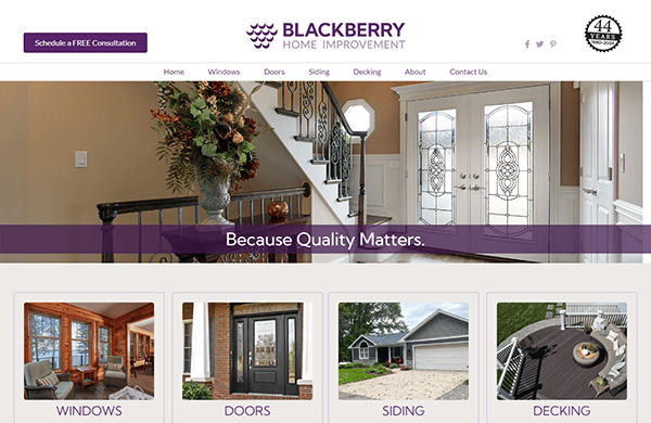
- Blackberry Home Improvement: The overall appearance and feel of the website are professional—the color palette appeals to the eye. The hero page has an eye-catching slider graphic that immediately captures visitors’ attention. The use of high-quality photographs and intriguing visuals in the slider improves the website’s aesthetic appeal while also conveying the professional nature of its services. The website provides extensive content and resources relating to its services. The information is well-presented; informative articles and frequently asked questions provide valuable insights. It also includes prominently featured customer testimonials on the website, providing social proof and instilling confidence in new buyers. The incorporation of trust badges and certificates enhances their legitimacy.
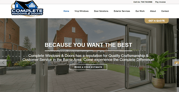
- Complete Windows and Doors: Its website has a clean, modern style that quickly captures the eye. The color palette is relaxing, with a perfect balance of white, blue, and gray tones, resulting in a professional and welcoming ambiance. The website features an intuitive UI and effortless navigation. The website makes excellent use of white space, which helps to keep the material structured and the design uncluttered. The usage of high-quality graphics throughout the website is impressive. The photographs attractively represent their items and provide visitors with a clear understanding of what they offer. The pictures are clear and visually appealing, which improves the entire design. The calls-to-action (CTAs) are prominent and strategically positioned throughout the website. Customer testimonies and reviews can provide social evidence while strengthening the company’s reputation.
Your website is the gateway to your business and plays an integral part in creating first impressions. It must convey professionalism, reliability, and expertise to turn visitors into loyal customers. By prioritizing user experience, high-quality content, and search engine optimization, you can make a website that attracts visitors and persuades them to choose your services over your competitors.
Furthermore, consistently refreshing your website with up-to-date content, recent project displays, and customer testimonials will help maintain its relevance and captivate visitors. An interactive blog or news section can provide vital information to your audience by answering frequent inquiries and demonstrating your business expertise. This continuous involvement fosters confidence and positions your company as an authoritative figure in the window and door sector.
If you’re all set to elevate your online presence and generate more leads, CyberOptik is here to assist you. We craft the best window and door website designs customized to meet your needs. Contact us today for a complimentary consultation and explore how we can revolutionize your website into an influential asset for your business.

