A well-crafted website is the cornerstone of your turf design firm, helping you attract new clients and retain existing ones. It showcases your portfolio and services and builds credibility and trust with potential customers. A great website can effectively communicate the quality and range of your turf products and the expertise and reliability of your services.
A well-designed and intuitive website is critical for generating a solid first impression. High-quality images, detailed product descriptions, and client testimonials contribute to a polished and trustworthy image. Moreover, a website with intuitive navigation, clear calls to action, and mobile responsiveness ensures a smooth user experience across all devices. This level of professionalism can set you apart from competitors and position your business as a leader in the industry.
In addition to aesthetics and usability, search engine optimization (SEO) is a vital component of an effective turf website. Incorporating relevant keywords and keeping an active blog will raise your search engine position and increase traffic to your website. An optimized website helps potential clients find your services online, offering a competitive advantage.
Examples of the Best Turf Website Designs
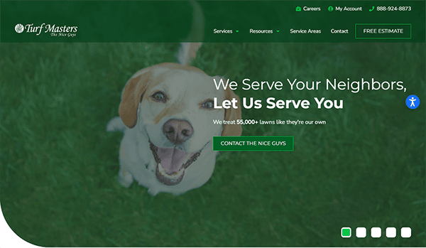
- Turf Masters: The website provides an excellent user experience. Its clean, professional design immediately communicates dependability and skill in lawn care services. It employs high-quality, bright photos of beautiful lawns to demonstrate the company’s skills. The color scheme, dominated by green and white, conveys a sense of freshness and growth. The main menu is well-organized, with separate services, resources, and contact information sections. The sticky header provides quick access to crucial links as users scroll. The site also includes important information about various grass species, lawn care suggestions, and a blog, increasing users’ worth. Additionally, the “Free Estimate” call-to-action is prominently displayed, encouraging potential clients to use their services.
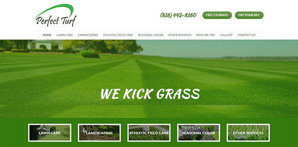
- Perfect Turf: The website has a professional and visually appealing design that displays the company’s lawn and landscaping services. It is clean and structured, making it simple for users to explore and access information. It features vivid, high-resolution photographs highlighting their work, increasing visual appeal and giving potential consumers a clear notion of their service quality. The main menu is well-organized, with categories for services, testimonials, and contact information, allowing users to find what they need quickly. The homepage includes apparent calls to action like “Free Estimate” and “Pay Your Bill,” which increases user engagement. High-quality photos and testimonials increase credibility and attractiveness. The clean and visually appealing layout gives potential clients a consistent user experience.
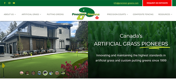
- Precision Greens: The website’s clean, modern aesthetics and user-friendly layout make it an excellent web design example. The homepage captivates visitors with high-resolution photos and a clean style, prominently highlighting their artificial grass items. The navigation bar is simple, with easy links to important sections such as “Synthetic Lawns,” “Putting Greens,” and “Composite Fencing.” Each product page is well-organized, with thorough descriptions, benefits, and maintenance advice, all accompanied by bright photographs. The addition of customer testimonials and a project gallery increases trust, while the “Request an Estimate” call-to-action is deliberately placed to encourage user interaction. The site’s responsive design provides a consistent experience across all devices, increasing accessibility and usefulness.
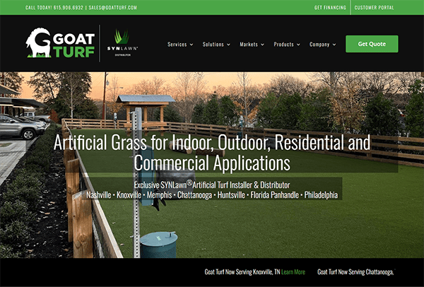
- Goat Turf: Its website stands out for its slick and modern design, which ensures a pleasant surfing experience. The webpage initially draws attention with high-quality photographs of beautiful artificial turf installations. Using black, white, and green accents adds sophistication and elegance to the visual appeal. The well-organized menu allows customers to access information on residential, commercial, and sports grass solutions. The website provides detailed information on their projects and the advantages of artificial grass, highlighting their expertise and dedication to quality. It gives thorough information on artificial grass’s benefits, installation procedures, and care tips, allowing potential customers to make informed judgments.
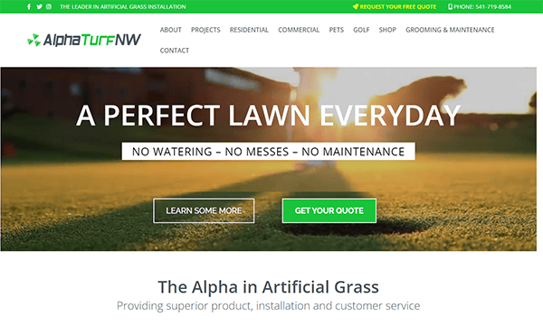
- Alpha Turf NW: The website features a clean, modern design that is visually appealing and simple. The navigation menu is uncomplicated, facilitating users’ ability to locate specific services. High-quality photos and a uniform color scheme emphasize the company’s professional image. The material is well-organized and informative. The site’s style is simple, with clear calls-to-action like “Get Your Free Quote” and “Learn More” buttons carefully positioned to direct readers through the content. The navigation on the menu is essential, making it easy for consumers to locate specific services. Each area offers necessary information about the goods and services, ranging from residential and commercial installations to pet-friendly options and maintenance services.
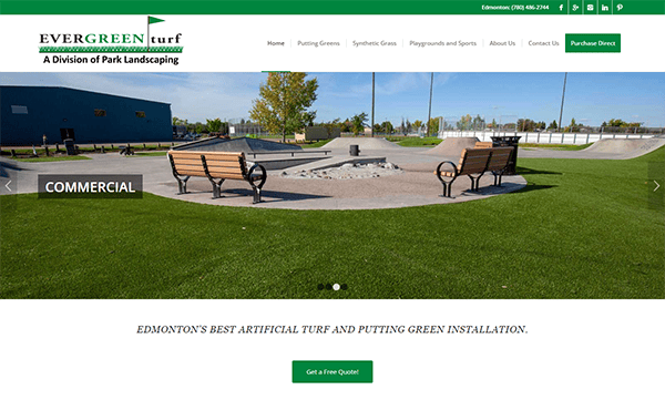
- Ever Green Turf: The website is modern, with an elegant, visually appealing, and user-friendly design. High-quality photographs of their artificial turf installations are presented, ensuring quick visual engagement and a professional image. The navigation is simple, with a well-organized menu that categorizes items and services, allowing consumers to discover what they need quickly. Using uniform color schemes and typefaces throughout the site improves consistency and brand identity. Furthermore, the website excels in providing detailed and accessible information. Detailed service descriptions, customer testimonials, and a comprehensive FAQ section are carefully placed to educate and develop confidence with prospective customers. The addition of conveniently accessible contact information, quotes, and financing choices improves client connection and engagement.
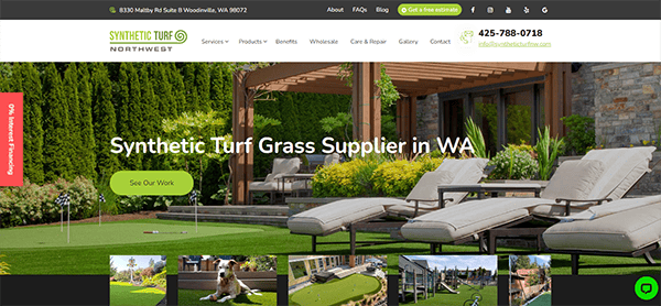
- Synthetic Turf: Its clean and modern design is enhanced by high-quality photos exhibiting its artificial turf installations. The site’s intuitive layout and well-structured menu enable users to quickly access specific information about products and services. Consistent color palettes of lush greens and typography improve the site’s coherence, while strategically placed testimonials and FAQs foster trust and provide helpful information to potential clients. The website shines at promoting consumer connection by giving precise and easily accessible contact information and forms, as well as alternatives for estimates and financing. Each service is fully detailed, allowing users to make informed judgments. The site also features a blog with relevant articles, adding value and demonstrating the company’s expertise.
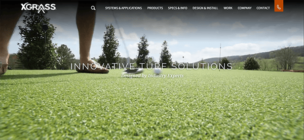
- X Grass: The website’s sleek, modern, straightforward design provides an excellent user experience. The homepage is visually appealing, with vivid, high-quality pictures and exciting hero page video footage demonstrating numerous turf applications. The navigation is smooth, with well-organized menus and distinct divisions for various products and services, such as playgrounds, sports fields, landscaping, and pet areas. Each part contains detailed information accompanied by visual aids and user testimonials. The site’s consistent color scheme and professional layout improve reading, making it visually appealing and functional. The use of ample white space ensures readability and keeps the focus on the content. The site contains helpful resources such as installation guides, maintenance advice, and FAQs, which improve the user experience by offering useful information. The responsive website provides a great surfing experience on various devices, including smartphones and tablets.
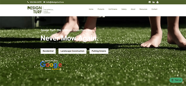
- Design Turf: The site’s clean, modern look immediately draws attention, with high-quality photographs and videos demonstrating their vast selection of artificial turf products and installations. Navigation is simple under a well-organized menu, categorizing items like residential lawns, playground grass, and pet-friendly options. The consistent color palette and professional font choices improve visual coherence while expressing the brand’s professionalism. The addition of an extensive portfolio and detailed details of the installation process helps buyers visualize their projects. The interactive chat window is a prominent feature, allowing real-time customer help and involvement. Detailed service descriptions, customer testimonials, and an educational blog provide depth and value, promoting trust and providing insights. Contact information and pricing alternatives are readily available, making customer interactions simple.
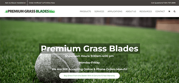
- Premium Grass Blades: The homepage quickly draws attention with its vivid and high-quality photographs of lush, artificial grass installations, which present the company’s product offers realistically and appealingly. The clean and modern layout, paired with a harmonious color scheme of greens and whites, demonstrates the company’s emphasis on environmentally responsible and visually appealing products. The navigation is simple, with a well-organized menu allowing customers to explore various parts, including product specifications, installation services, and client testimonials. The intentional use of white space keeps the content manageable, directing users’ attention to vital information and calls to action. The presence of articles and an FAQ section displays the company’s dedication to educating customers and addressing common concerns, which boosts trust and credibility. The contact page is simple to use, inviting visitors to get in touch through a contact form, phone number, and social network links.
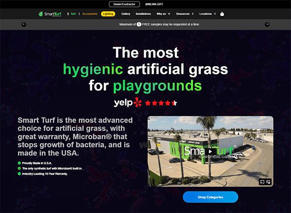
- Smart Turf: Upon entering the site, visitors are met with high-resolution photos of lush, realistic artificial turf, which quickly express the items’ quality and appeal. The sleek, contemporary style is enhanced by a consistent color palette of greens, blacks, and whites, which reflect the natural appearance of grass and promote a sense of freshness and reliability. The navigation is smooth, with a well-organized menu that walks users through various categories like items, installation guidelines, and customer testimonials. This user-friendly structure ensures visitors can quickly access the required information, whether exploring different turf selections or seeking installation help. Furthermore, the integrated chat box enables rapid customer service, improving the user experience by allowing potential consumers to get their questions answered in real time. The website’s responsiveness guarantees a smooth and consistent experience across multiple devices, making it more accessible.
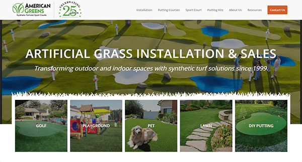
- American Greens: Its website provides a good user experience with its clean, modern design and intuitive navigation. The webpage welcomes visitors with bright photos of their synthetic turf installations, emphasizing the quality and breadth of their services. The layout is user-friendly, making it simple to learn about their products, including greens, pet-friendly grass, playground surfaces, and DIY kits. The information is simple and well-organized, clearly defining their products’ benefits and features. Customer testimonials provide authenticity and demonstrate their commitment to satisfaction. The simple call-to-action buttons, such as “Get a Free Estimate” and “Contact Us,” successfully direct users to engage with the organization. It effectively demonstrates its knowledge and dependability through careful design, extensive material, and easy access, making it an ideal platform for anyone looking into synthetic turf solutions.
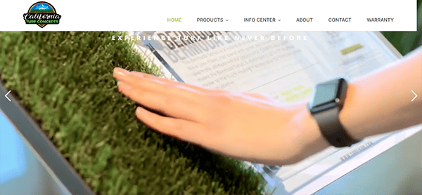
- California Turf Concepts: The homepage is visually appealing, displaying a wide range of artificial turf products and conveying professionalism and experience. The navigation is simple, allowing users to quickly explore different grass options for landscaping, pets, putting greens, and sports. Each product category is well-detailed with specifications and benefits, allowing potential buyers to make informed choices. Visitors are directed to further interaction with the site by big call-to-action buttons such as “View Products” and “Get the Complete System.” The site’s resourcefulness is further demonstrated by specialized areas for client testimonials, an info center, and detailed product information. These features increase trust and provide valuable information about company goods and service quality.
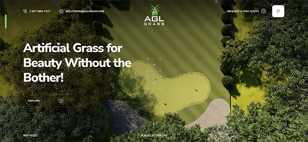
- AGL Grass: The website boasts a user-friendly design and a modern and clean appearance. The homepage is visually aesthetic and easy to navigate. The primary components are easily accessible via the top menu, allowing users to discover what they need quickly. The product descriptions are extensive and informative, emphasizing crucial aspects such as durability, safety, and aesthetic appeal. They cater to diverse customers, from households to commercial organizations. Furthermore, the website’s material is well-organized and intriguing, resulting in a smooth surfing experience. The website also includes customer testimonials, and a gallery showcasing finished projects, enhancing their authenticity and fostering confidence.
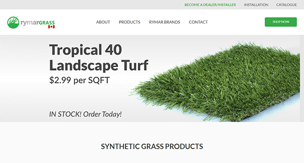
- Rymar Grass: The webpage stands out for its clean structure and high-resolution photographs that showcase the quality and range of its products. The color choice is harmonious, with greens and earth tones complementing the fake grass motif. The navigation menu is clearly positioned at the top, allowing quick access to crucial parts. Each section includes thorough product descriptions, specifications, and high-quality graphics to assist consumers in immediately comprehending the benefits and applications of each product. Interactive components improve the user experience on the site. The “Become a Dealer/Installer” and “Shop Online” buttons are displayed prominently, increasing user interaction and simplifying purchasing. Furthermore, customer feedback and project galleries are seamlessly integrated, providing social proof and demonstrating real-world applications.
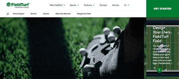
- Field Turf: The site features vibrant, high-resolution photographs of their grass products in various sports scenarios, immediately catching attention and demonstrating product quality. A clean, professional color palette of greens, blues, and whites that captures the essence of fields and grass while strengthening brand identity. The primary navigation bar is rationally organized, with several categories. An extensive search box at the top lets users quickly find certain content or goods. The website delivers thorough but straightforward information on its products, features, and technology, allowing customers to make informed decisions without being overwhelmed. The “Design Your Own FieldTurf Field” tool is a notable feature, as it will enable users to modify and visualize their turf, making the experience more interactive and personalized.
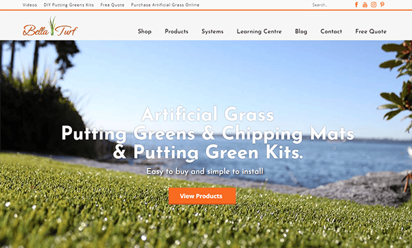
- Bella Turf: The website’s design is simple. The color design is relaxing, with shades of green, white, and orange that fit the artificial turf motif well. The layout is user-friendly, allowing visitors to locate what they’re looking for quickly. One of the most notable aspects of this website is the extensive product information. Each artificial turf type is featured with high-quality photographs, comprehensive explanations, and a list of significant features. This makes it easier for buyers to comprehend the differences between products and select the best one for their needs. Another standout feature of the website is the utilization of high-quality photographs. The images depict several varieties of artificial turf in various situations, allowing clients to see how the products would look in their local environments.
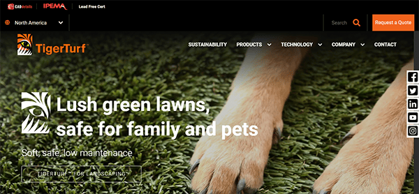
- Tiger Turf: The visually appealing design and powerful branding make the website stand out right away. The combination of a clear layout, high-quality photos, and a consistent color palette (green, white, and orange to match their turf goods) results in a professional and cohesive brand image. The typography is straightforward to read, which improves usability. The homepage effectively engages visitors with a carousel of high-resolution photos demonstrating diverse turf applications, including residential lawns and sporting grounds. Each image is complemented by brief, engaging text emphasizing essential features such as durability, environmental friendliness, and low maintenance. Clear and concise CTAs are deliberately distributed throughout the website to direct visitors to certain actions, such as soliciting a quote or reaching out to a local specialist.
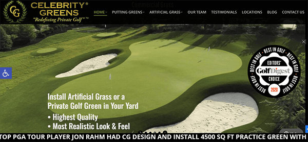
- Celebrity Greens: The website’s design is sleek, modern, and aesthetically pleasing. The color design is relaxing and enhances the natural features of their products. High-quality photographs throughout the site effectively highlight their projects, allowing potential consumers to visualize the ultimate outcome. The content is informative, short, and well-written. The Gallery section is one of the website’s highlights. It features a wide range of projects, each backed by breathtaking images that highlight the quality and artistry of their work. The ability to sort projects by type and region is precious for prospective clients seeking inspiration. Its contact information is prominently displayed on all pages, making it simple for visitors to get in touch. The primary contact form encourages people to contact us for a quotation or consultation. Furthermore, the site has apparent calls to action (CTAs), enabling users to learn more or contact them.
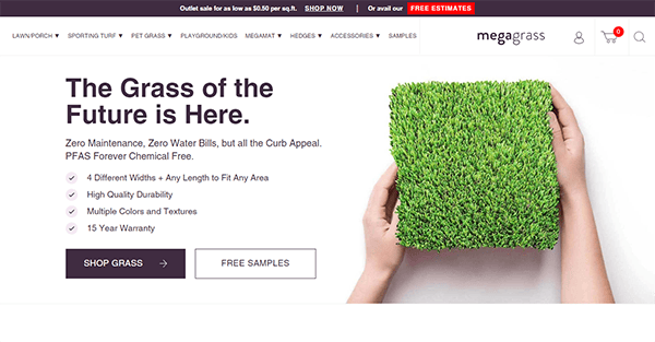
- Mega Grass: The website’s modern, clean, and visually beautiful design. The color scheme is fresh and inviting, with green tones that evoke the natural appearance of their artificial grass products. High-resolution photographs and videos throughout the site effectively highlight their many grass selections, allowing potential consumers to assess the quality and diversity available quickly. The Products section is a notable feature on the website. It provides thorough information about various artificial grass, including its characteristics, applications, and advantages. The comparison tool is very beneficial, allowing customers to compare several grass products to determine the best fit for their needs. Its contact information is also displayed on all pages, making it simple for visitors to get in touch with a contact form. It is simple and encourages people to contact us for additional information or to obtain a price. The introduction of a live chat function improves customer service and responsiveness.
A well-designed website is more than just a digital brochure; it’s a powerful tool for growing your turf business. By prioritizing user experience, high-quality content, and SEO, you may design a website that entices visitors and converts them into repeat buyers. Regularly updating your site with fresh content, showcasing recent projects, and featuring customer testimonials can help maintain its relevance and appeal.
Engaging with your audience through an interactive blog or news section can further establish your authority in the turf industry. By sharing important insights and answering common questions, you can increase trust and portray your firm as an expert. This continual contact instills a sense of community and loyalty in your customers.
If you’re willing to boost your online presence and drive more leads for your turf business, CyberOptik is here to help. We specialize in creating the best turf website designs tailored to your unique needs. Contact us today for a free consultation and learn how we can turn your website into a valuable tool for your company.

