Just looking for our Best Tourism Website examples list?
Why Your Tourism Website Design Can Make or Break Bookings
Creating your website is more than just selecting pretty pictures and plugging in your company info—it’s about building a digital experience that inspires action. In the hyper-competitive travel market, your website is often your first impression and your strongest sales tool. Whether you’re promoting a dreamy destination, guided tours, or an all-inclusive resort, a well-designed website can mean the difference between a reservation sale and a bounce.
Consumers have high expectations. They want fast, mobile-friendly sites that are visually immersive, easy to navigate, and rich in content. And with the surge in AI-generated travel planning and real-time decision-making, having a strategically designed, search-optimized website is critical. Your website needs to do more than look good—it needs to convert visitors into paying customers.
In this comprehensive guide to tourism website design, we’ll explore proven strategies, current trends, and the essential building blocks of a site that looks stunning and drives measurable results. From layout and branding to SEO, copywriting, and conversion tactics—we’ve got you covered. Let’s turn your site into the powerful business asset it should be.
Plan With Purpose: Laying the Groundwork for a High-Converting Tourism Website
Before diving into design elements or selecting templates, the most effective websites begin with a clear planning phase. This is where goals are defined, user journeys are mapped, and the foundation for a successful digital experience is laid. For tourism businesses, this step is critical because you’re not just selling a product, you’re selling an experience, a dream, and often, a once-in-a-lifetime opportunity.
Define Your Primary Goals
Start by identifying what you want your website to achieve. Do you want to increase direct bookings? Build awareness for a destination or tour company? Provide an easy-to-use resource for travel planning? Each of these goals will shape your design decisions, from layout and navigation to content hierarchy.
Understand Your Audience
Successful websites in tourism are built with the traveler in mind. That means understanding the needs and behaviors of your target audience. Are they international or domestic? Are they enrolling in last-minute adventures or planning luxury getaways for months? Answering these questions helps guide the tone of your messaging, the functionality you offer (like multilingual support or real-time chat), and how information is presented.
Outline the Ideal User Journey
Think through the path a visitor might take on your website—from landing on the homepage to making a reservation. Key questions to address include:
- How quickly can users find the information they need?
- Are your CTAs (calls-to-action) visible and persuasive?
- Is the sign-up process streamlined and intuitive?
Align Brand and Content Strategy
Your website should be a visual and verbal extension of your image. Establish guidelines, including voice, color palette, typography, and photography style, before jumping into design. Equally important is your content strategy—deciding what types of content (like destination guides, blogs, or video tours) will resonate most with your audience and support your business objectives.
Set Technical and Marketing Priorities
Identify key technical requirements such as integration with scheduling platforms, mobile responsiveness, and SEO-readiness. Also, consider future marketing needs like blog functionality, newsletter sign-ups, and analytics tracking. Planning for these early prevents costly changes down the line.
Design That Inspires: Proven Tourism Website Design Principles That Work
Designing for the tourism industry means creating digital experiences that spark wanderlust, build trust, and make planning a trip effortless. While beautiful imagery is essential, it’s the underlying design principles that truly determine a site’s success.
1. Visual Hierarchy and Clean Layouts
All websites must guide the viewer’s eye toward key content and actions, like tour details, testimonials, and sign-up buttons. Achieve this through a clear visual hierarchy, using size, color, and placement to emphasize important elements.
2. Responsive and Mobile-First Design
Over 60% of travel searches start on mobile devices. A mobile-first design ensures your content adapts seamlessly across all screen sizes.
3. Consistent Branding
Your website should reflect the personality of your destination or service, from the color palette to typography and voice.
4. High-Impact Visuals
Highlight your offerings with immersive photography and videos that highlight landscapes, accommodations, and activities.
5. Easy Navigation
A logical, easy-to-use navigation structure reduces friction and enhances UX.
6. Accessibility for All Users
Use proper contrast ratios, alt text, keyboard navigation, and readable font sizes to ensure an inclusive experience.
7. Fast Load Times
Optimize images and code to keep your site fast and reduce bounce rates.
8. Trust-Building Features
Incorporate trust signals like reviews, certifications, and a compelling About page to increase credibility.
Navigate the Journey: Structuring Content for Seamless Travel Planning
In website design, content and navigation are the tools that guide visitors from curiosity to conversion. When structured intentionally, they create a seamless, user-friendly experience.
Clear, Goal-Oriented Navigation
Organize the menu around key visitor actions with 5–7 top-level pages: Home, Destinations, About, Booking, Reviews, and Contact.
Smart Use of Internal Links and CTAs
Use internal links to help users discover content and CTAs to guide them to the next step.
Content That Sells the Experience
Use storytelling, practical details, and emotional imagery to guide decision-making.
Visual-First Layouts
Use imagery and iconography to create engaging, scannable content.
Personalized User Paths
Consider personalized features like recommended trips or location-based content to boost engagement.
Show, Don’t Tell: How Visual Design Sells the Travel Experience
In the tourism industry, your website is the first destination your audience visits. Visual elements are powerful storytelling tools that shape perception, build trust, and drive action.
Hero Imagery That Captivates
Use high-quality images or video headers to instantly engage visitors and communicate the company’s tone.
Cohesive Image Strategy
Keep image styles consistent across the site to reinforce a strong identity.
Video Integration for Engagement
Add short videos, testimonials, or drone footage to key pages.
Interactive Media and Virtual Tools
Use 360° tours or image galleries to let users explore.
Iconography and Visual Cues
Use icons to highlight features like amenities or activity types.
Design for Performance
Compress images and use lazy loading to ensure speed and performance.
Keep it Fresh: Why WordPress Maintenance is Vital for Tourism Websites
A stunning tourism website built on WordPress is only as good as its upkeep. Ongoing WordPress maintenance is not optional.
Why Maintenance Matters
A well-maintained site means better security, faster performance, and up-to-date content.
Key Maintenance Tasks
- Core, theme, and plugin updates
- Security monitoring
- Performance optimization
- Regular content updates
- Backup and recovery plans
- Broken link and form testing
- Analytics and reporting
Partnering with a Maintenance Provider
Work with a professional team like ours to handle ongoing updates and ensure site health. How about some industry examples?
Best Tourism Website Examples
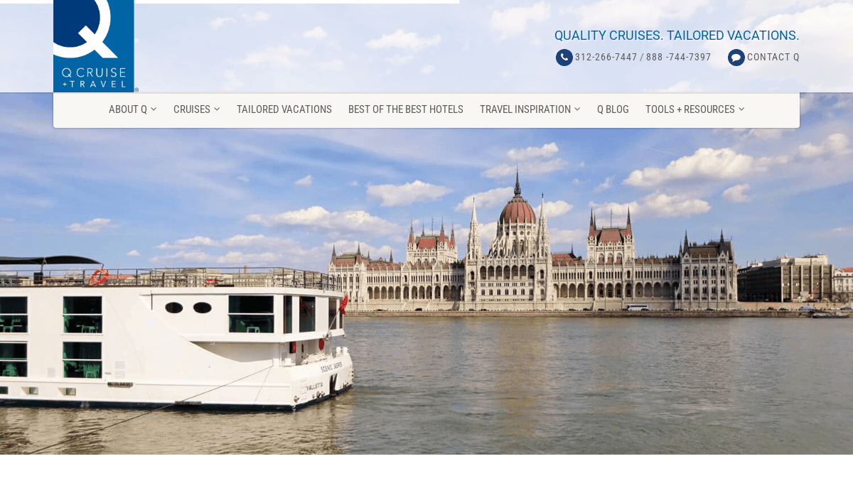
1. Q Cruise + Travel
Location: Chicago, IL
Key Takeaways:
- Sleek, modern design tailored for cruise enthusiasts.
- Seamless browsing experience with intuitive navigation.
- Expert advice and recommendations for personalized travel planning.
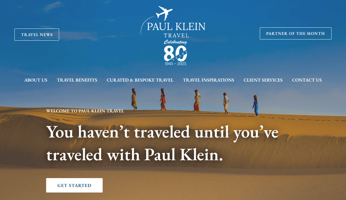
2. Paul Klein Travel
Location: Chicago, IL
Key Takeaways:
- Visually attractive design with carefully curated content.
- Enables users to discover hidden travel gems.
- Emphasis on extraordinary travel experiences.
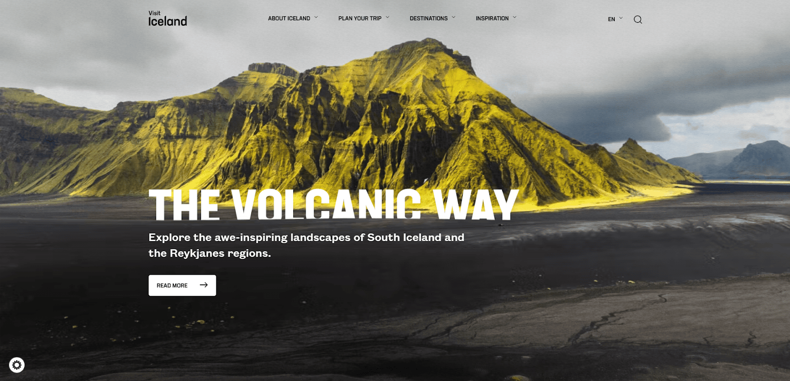
3. Visit Iceland
Location: Reykjavik, Iceland
Key Takeaways:
- Clean and minimalistic design reflecting Nordic aesthetics.
- Full-screen photos and stunning imagery captivate visitors.
- User-friendly interface facilitates trip planning.
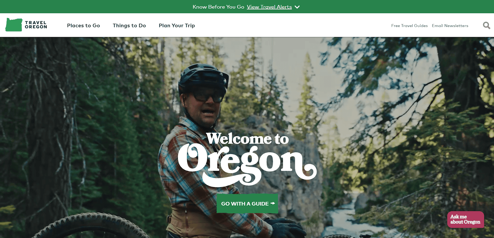
4. Travel Oregon
Location: Salem, OR
Key Takeaways:
- Professional layout with green accent colors enhancing visual appeal.
- Features attractions based on emotions or feelings.
- Fun tree graphics and interactive elements engage users.
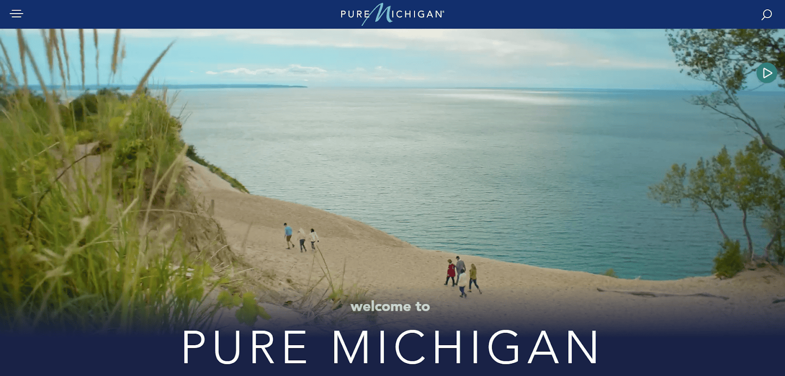
5. Pure Michigan
Location: Lansing, MI
Key Takeaways:
- The calming color scheme creates a welcoming atmosphere.
- Highlights upcoming events throughout the state.
- Allows exploration by season, enhancing user experience.
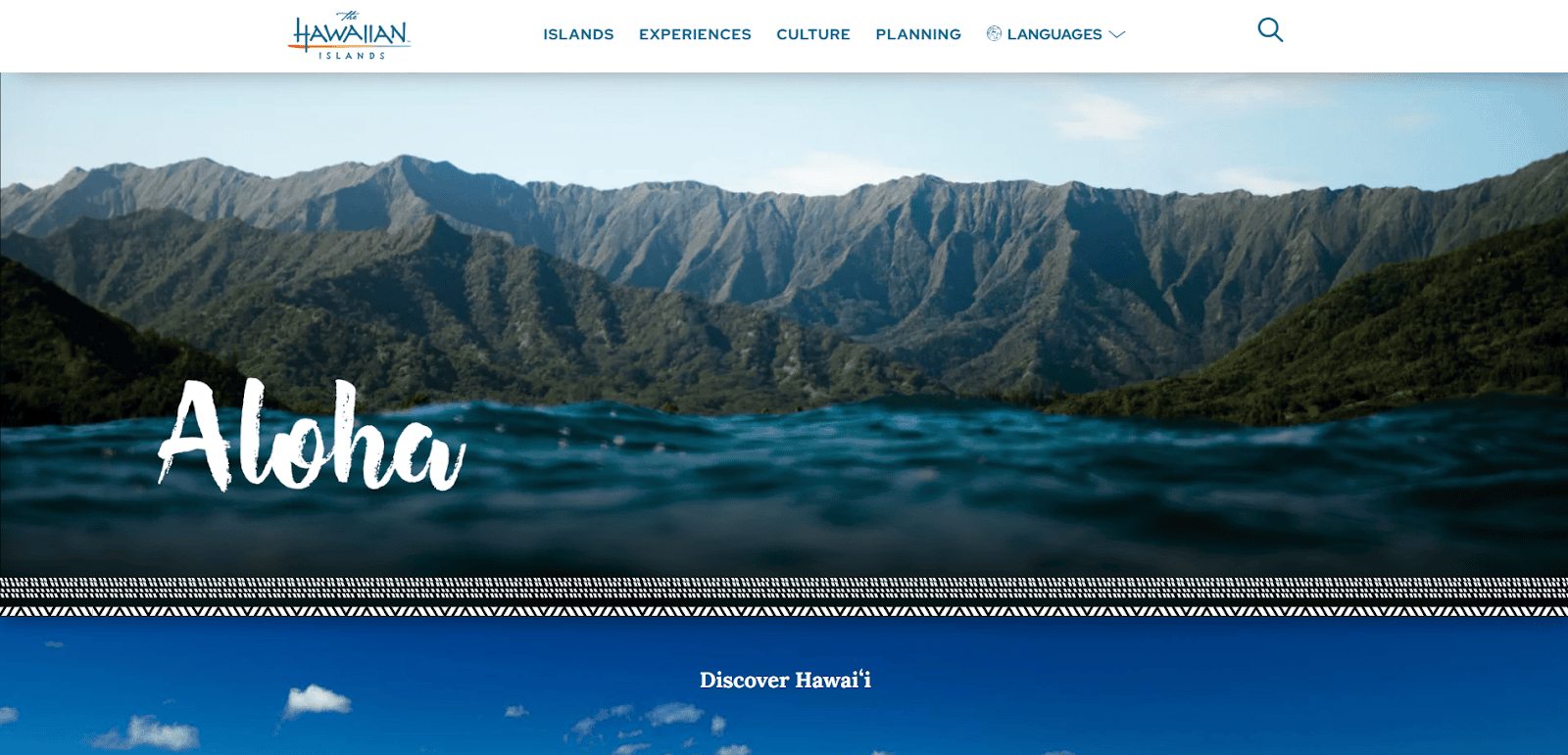
6. Go Hawaii
Location: Honolulu, HI
Key Takeaways:
- Professional feel with blended use of blue and white accents.
- Geometric patterns add visual interest.
- Interactive map of Hawaii enhances navigation.
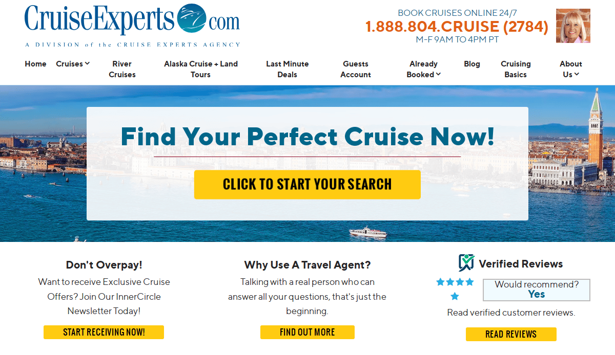
7. Cruise Experts
Location: Chicago, IL
Key Takeaways:
- Immersive Visuals: Features captivating images of cruise destinations.
- Detailed Deck Plans: Provides comprehensive information about cruise ships.
- Easy Booking System: Simplifies the process of finding and reserving cruises.
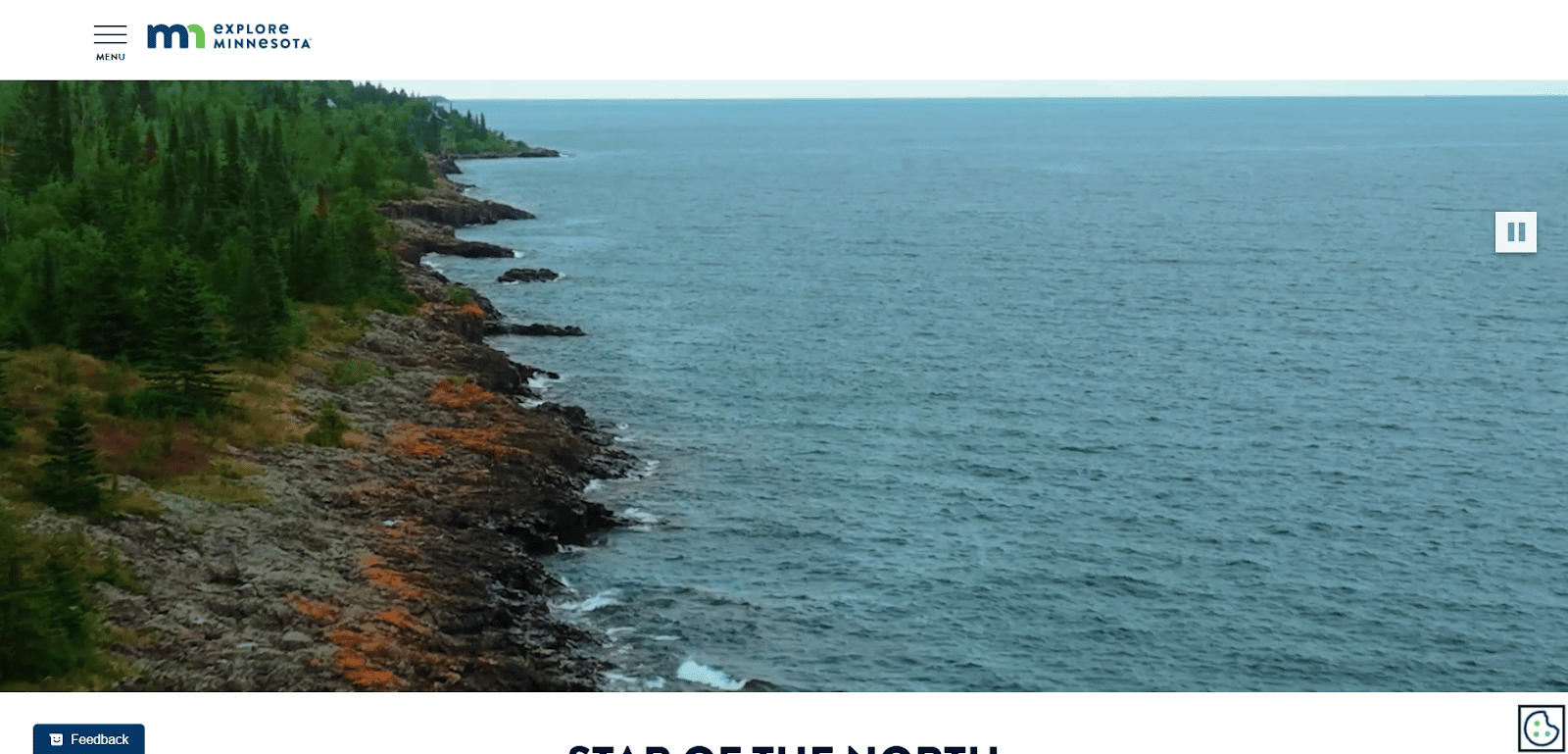
8. Explore Minnesota
Location: St. Paul, MN
Key Takeaways:
- Unique frames for imagery create a distinctive look.
- Balanced use of images, text, and whitespace.
- Integration of social media for broader reach.
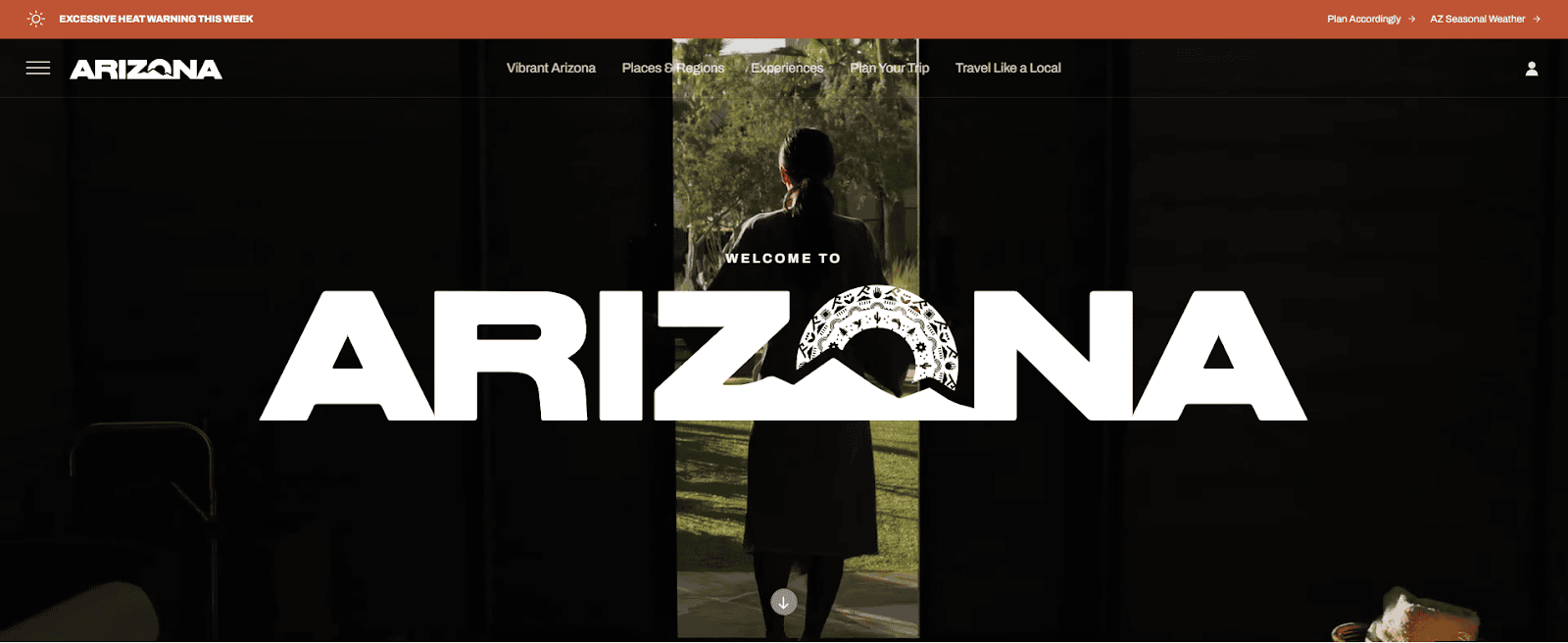
9. Visit Arizona
Location: Phoenix, AZ
Key Takeaways:
- Red accents throughout the page draw attention.
- Subtle animations enhance user interaction.
- Clearly labeled menus aid in navigation.
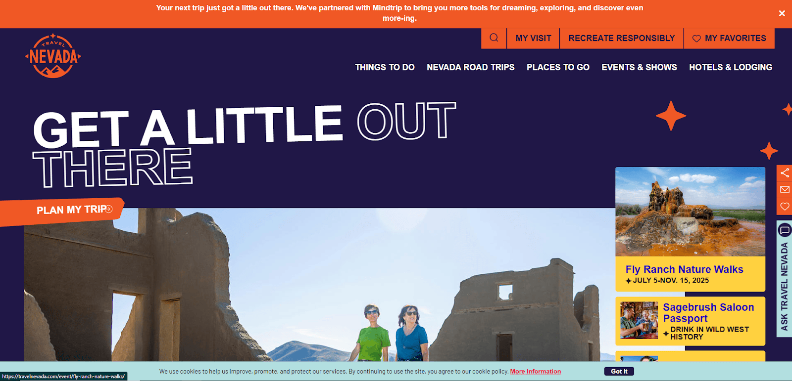
10. Travel Nevada
Location: Carson City, NV
Key Takeaways:
- Stunning logo design establishes brand identity.
- Varied font sizes help titles stand out.
- Simple layout ensures ease of use.
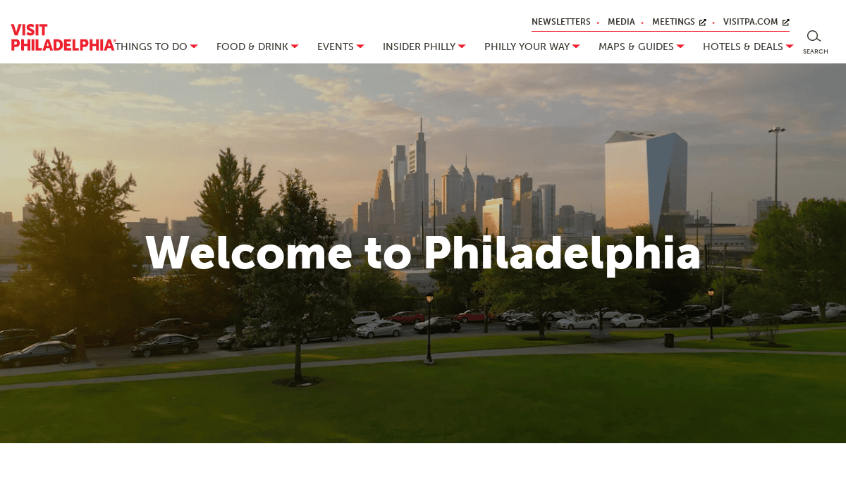
11. Visit Philadelphia
Location: Philadelphia, PA
Key Takeaways:
- Modern design with high-quality imagery.
- Simplistic layout promotes company image without overwhelming visitors.
- Engaging content encourages exploration.
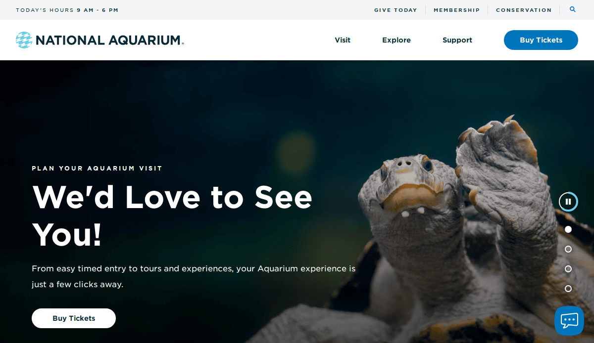
12. National Aquarium
Location: Baltimore, MD
Key Takeaways:
- High-quality imagery featuring aquarium offerings.
- Modern design enhances user engagement.
- Simplistic layout facilitates information access.
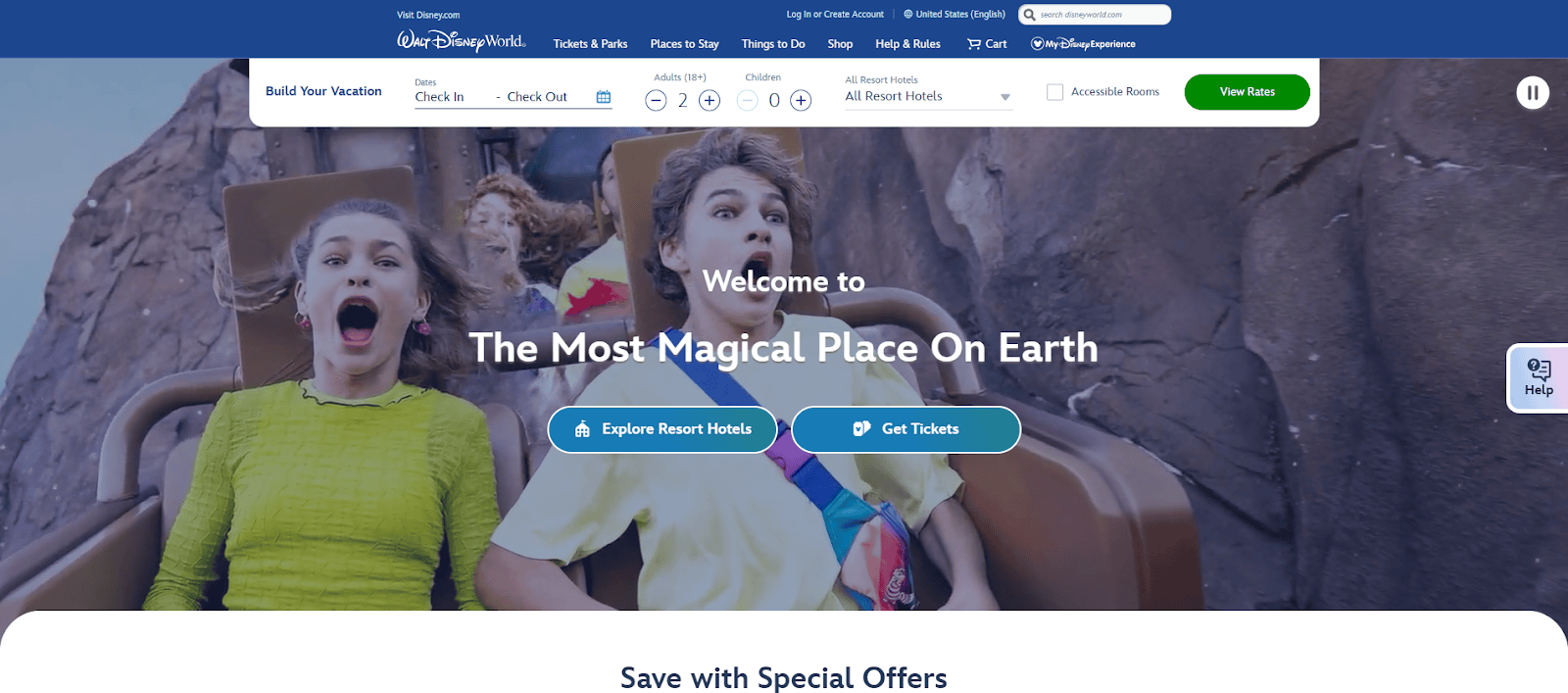
13. Walt Disney World
Location: Orlando, FL
Key Takeaways:
- User-friendly navigation simplifies trip planning.
- Interactive elements enhance user experience.
- Comprehensive information on attractions and accommodations.
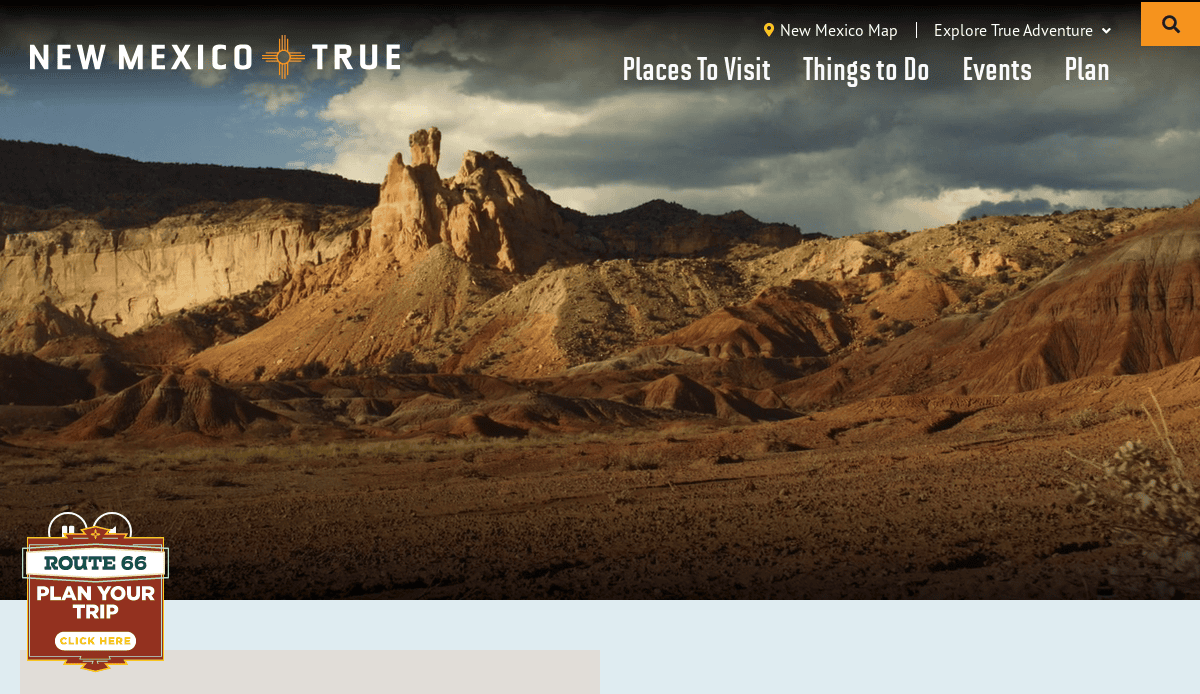
14. Visit New Mexico
Location: Santa Fe, NM
Key Takeaways:
- Creative logo design establishes brand identity.
- Variety in imagery subjects adds visual interest.
- Search bar functionality improves user experience.
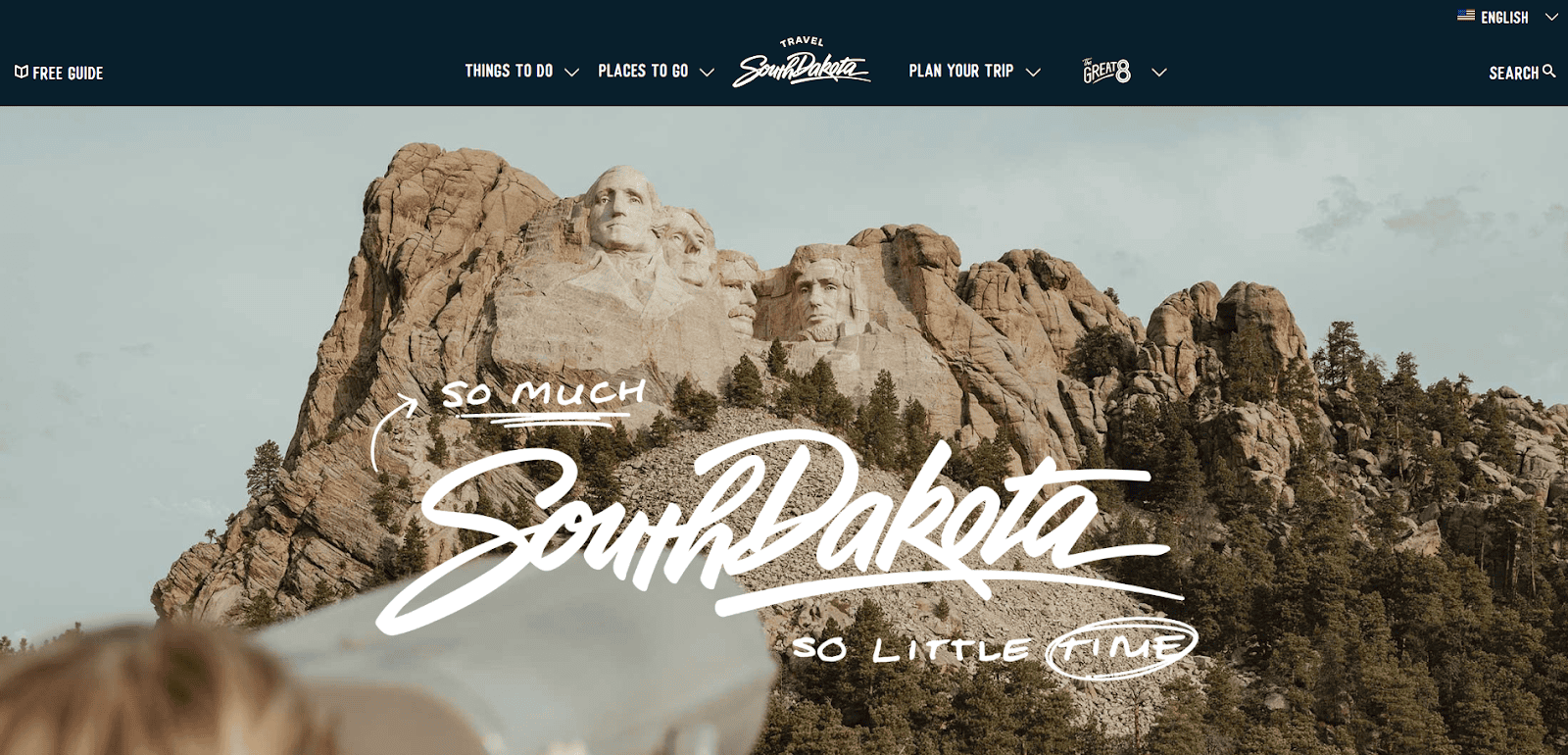
15. Travel South Dakota
Location: Pierre, SD
Key Takeaways:
- Captivating typography enhances visual appeal.
- Inclusion of social media fosters community engagement.
- Well-labeled navigation bar improves usability.
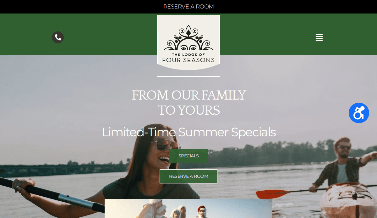
16. The Lodge of Four Seasons
Location: Lake Ozark, MO
Key Takeaways:
- Elegant design with custom company elements.
- Focused on conversion with strategic CTAs and enrollment integration.
- Seamless mobile responsiveness for travel-ready users.
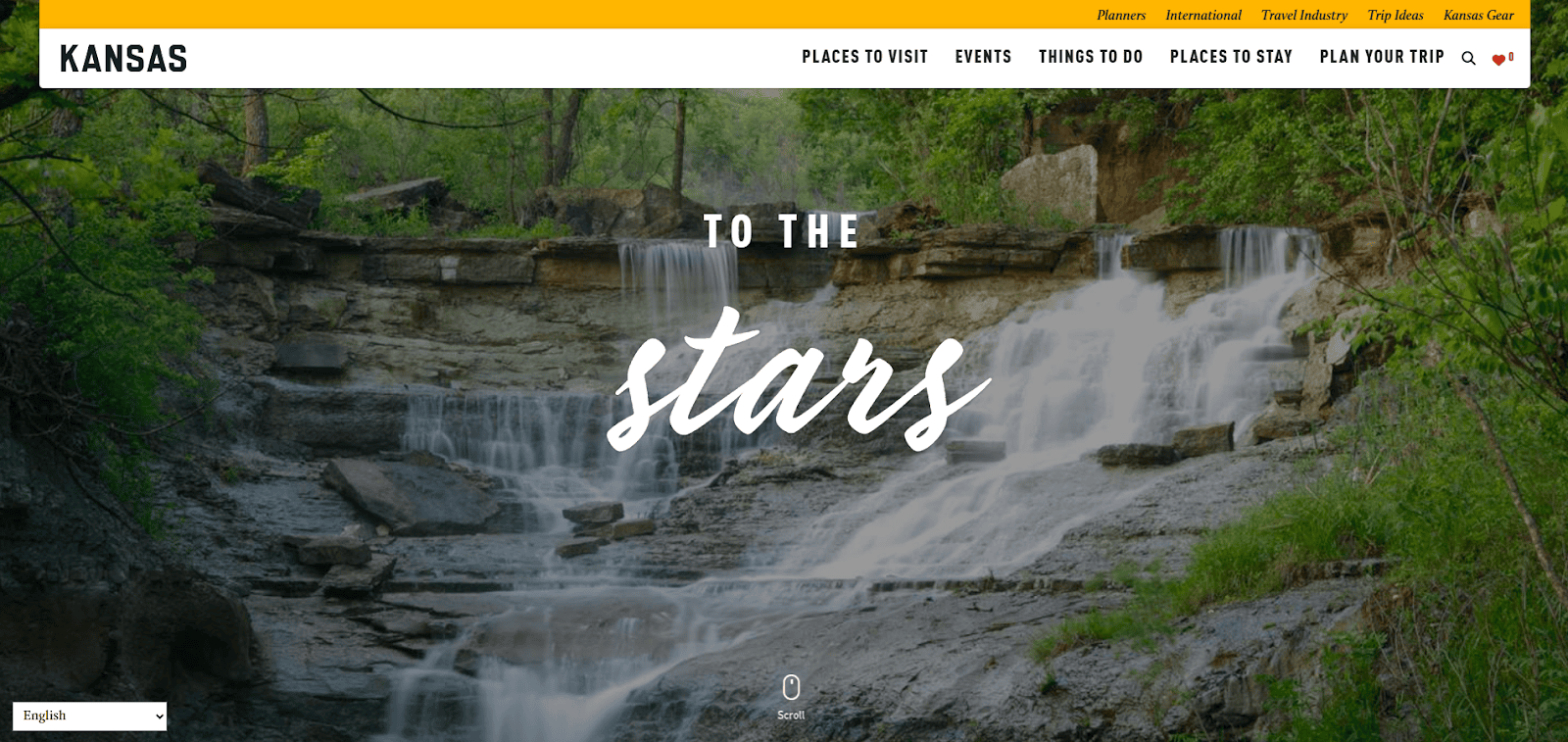
17. Travel Kansas
Location: Topeka, KS
Key Takeaways:
- Large imagery creates an immersive experience.
- Clearly labeled menus aid in navigation.
- Professional layout appeals to a broad audience.
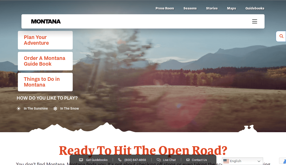
18. Visit Montana
Location: Helena, MT
Key Takeaways:
- High-quality visuals represent natural beauty.
- Integration of social media expands reach.
- Well-labeled navigation bar enhances usability.
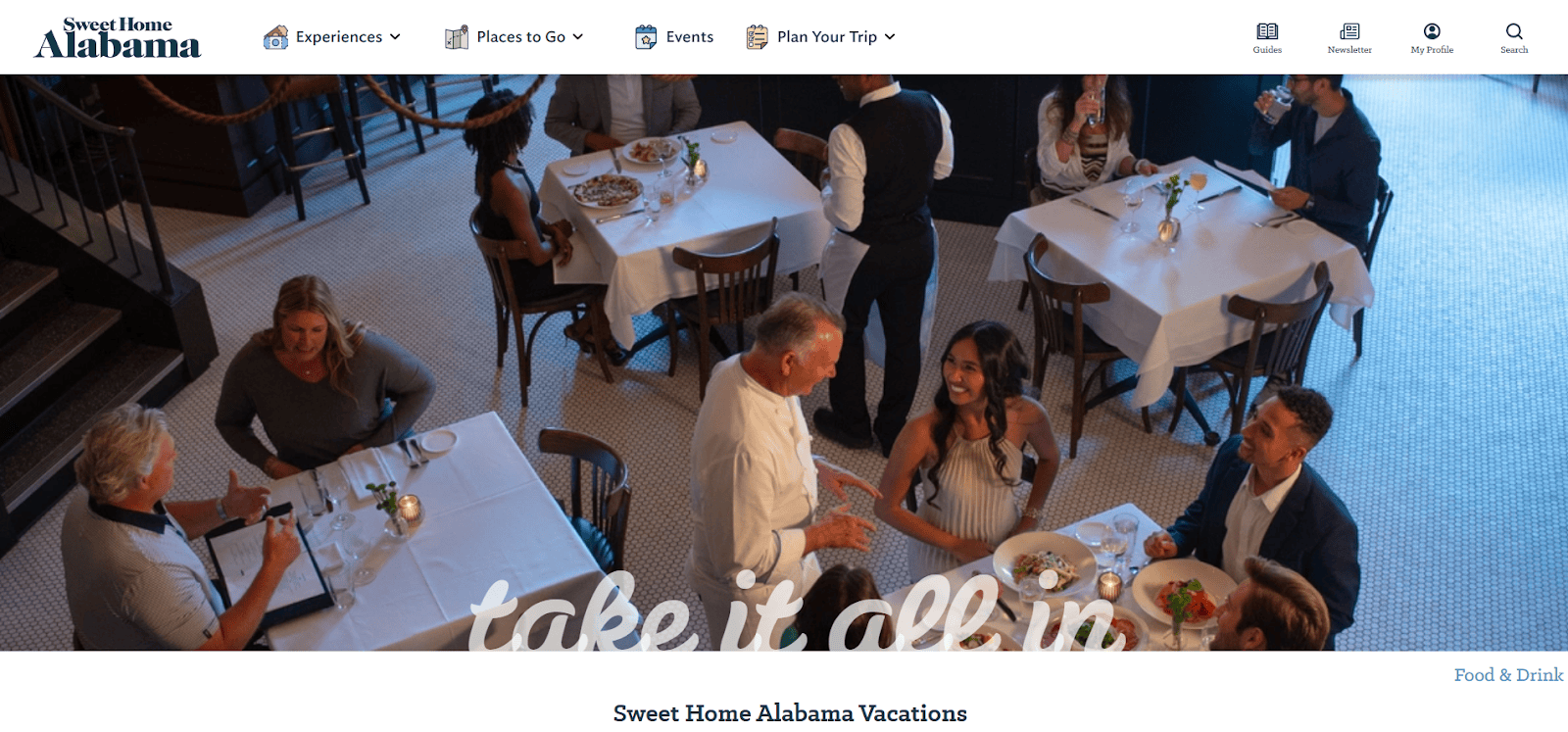
19. Travel Alabama
Location: Montgomery, AL
Key Takeaways:
- White, blue, and black color palette creates authenticity.
- Graphics assist users in site navigation.
- Relaxing imagery promotes a welcoming atmosphere.
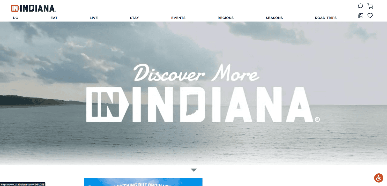
20. Visit Indiana
Location: Indianapolis, IN
Key Takeaways:
- Optimized content improves search engine visibility.
- Addition of a blog provides valuable information.
- Organized template enhances user navigation.
These examples exhibit the importance of clean layouts, strong calls-to-action, and beautiful visuals in creating effective tourism websites.
Ready to Elevate Your Tourism Website? Let’s Build Something Beautiful
Your website is your most powerful sales tool, whether you’re a travel agency, a tour operator, or offering vacation rental experiences. An optimized travel website built with modern web design principles ensures you stand out, engage users, and convert interest into bookings. From identity and layout to performance and SEO, every detail matters.
Whether you’re redesigning your current platform or launching something new, we can help you create a professional, high-performing website tailored for the travel industry.
Ready to take the next step? Contact us today to get started.
Answers to Your Top Tourism Site Design Questions
What makes a good tourism website?
A good tourism website features a clean site design, fast load times, strong calls-to-action, and high-quality photos and videos. It should be responsive and include key website features like interactive maps, scheduling apps, and social media integration to help visitors plan their next adventure with ease.
How do I create a website for a travel agency?
Start by choosing a tourism web design partner experienced in building travel-focused platforms. Select a customizable website template or a unique design, integrate a reservation system, and populate it with stunning visuals, tour details, and testimonials. As a full-service digital marketing agency, we can help you create a website that drives results.
What pages should be on a tourism or travel website?
Key pages include a captivating home page, destination listings, travel blog, booking options, about us, and contact. These should be structured to ensure potential customers can easily find what they need and feel confident enough to take action.
What’s the best website template for tourism?
The best tourism website template is one that’s mobile-responsive, customizable, and built for SEO. Whether you’re using WordPress, Squarespace, or a Bootstrap-based layout, look for templates that support slideshows, virtual tours, room details, and visitor engagement.
Why is virtual content important in tourism web design?
Virtual tours, image galleries, and video sliders help showcase villas, attractions, and nearby activities. These elements make it easy for visitors to envision their trip and encourage them to reserve faster.
How do I optimize my new tourism website for search engines?
Use tourism-specific keywords, such as “tourist destination” and “comprehensive travel experiences,” throughout your content. Ensure fast loading speeds, accessible design, and optimized images. Read our full SEO services guide for travel websites.
What makes a stunning website in the travel industry?
A stunning website blends elegant images with strong storytelling, clear navigation, and frictionless reservation experiences. The use of an HTML template or customized design with integrated features like live chat and slideshows enhances credibility.
Can I sell tours and day trips directly on my website?
Yes! A well-designed website for a travel brand can integrate enrollment systems that allow you to sell tours, rentals, and day trips directly. This improves both the sign-up experience and your revenue.
What are the must-have features for tourism site design?
Essential features include social proof (testimonials), booking app integration, search results filters, visually appealing galleries, and clear CTAs. These elements help visitors easily find the information they need and convert faster.
Where can I get inspired and start planning my tourism website?
You can explore real examples of perfect tourism web design today on platforms like Behance or in our best tourism website designs blog. These resources showcase what’s possible in modern web development for the travel industry.

