The tattoo industry has transcended beyond the ink and needles to carve its presence in the vast expanse of the internet. A great website serves not just as a digital portfolio for artists but as a beacon for the artistry and ethos of a tattoo shop. For enthusiasts and potential clients, the first interaction with your tattoo shop often starts online. This makes having an engaging, visually appealing, and user-friendly website more crucial than ever. It’s about capturing the essence of your brand and the creativity of your artists in a way that resonates with your audience. The best tattoo shop websites are those that create a lasting impression, encouraging visitors to book their first or next session.
A compelling website in the tattoo industry is not just about showcasing beautiful artwork; it’s about building a connection with the audience. It should tell a story of your artists, style, and philosophy. High-quality images, artist bios, and customer testimonials play an important part in building trust and credibility. Integrating social media and a blog can keep content fresh and ensure your shop stays at the top of your mind. Navigation should be intuitive, effortlessly leading prospective clients to galleries, booking information, and contact details. The best tattoo parlor websites prioritize user experience, making it easy for visitors to explore artists’ portfolios and book appointments.
Furthermore, in an industry driven by visual appeal, your website must be visually stunning and reflective of your shop’s unique identity. It’s not just a matter of aesthetics; it’s about creating a user-friendly experience that guides potential clients through your offerings, showcases your expertise, and builds confidence in your ability to realize their vision. Enhancing your website for search engines involves incorporating pertinent keywords, such as “best tattoo shop websites” and “best tattoo parlor websites,” which ensures that your shop is discoverable by those looking for top-notch tattoo artistry. In an industry where creativity is paramount, your website is your canvas.
Examples of the Best Tattoo Shop Website Designs
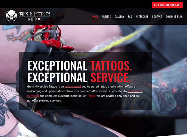
- Guns N Needles: The website reflects its concept with authentic graphics and information that appeals to its target audience. Every element, from the edgy fonts to the brilliant colors, helps create a cohesive brand voice that speaks directly to its target audience. Users may quickly locate the information they require because of the website’s easy use and straightforward navigation. The website’s approach to addressing frequently asked questions (FAQs) and providing clear, easy-to-follow instructions on tattoo aftercare is exemplary. Furthermore, the well-placed CTAs on their website are stunning, employing attention-grabbing wording and eye-catching buttons to promote conversions.
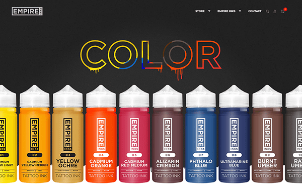
- Empire Inks: The website’s design approach is quite remarkable. The incorporation of high-resolution images that present their products in a visually striking manner promptly engages the visitor’s interest. The color palette is carefully selected, emanating an air of grandeur while preserving a lively dynamism that mirrors the brand’s core. The website’s user-friendly interface and intuitive structure make navigating around it simple. Owing to well-organized categories and a powerful search tool, finding what viewers need is simple, regardless of experience level as a tattoo artist or beginner enthusiast. Smoothly incorporating its collection, product descriptions, and safe payment procedure further improves the customer experience.
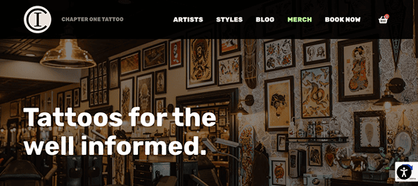
- Chapter One Tattoo: The website’s design is an artistic creation that reflects the ingenuity and talent displayed in the studio’s tattooing. Captivating imagery and bold typography instantly grab the visitor’s attention, creating an immersive trip through tattoo artistry. The brilliant artwork takes center stage because of the well-chosen color scheme, which evokes a sense of mystery and intrigue. The integration of artist biographies, client testimonials, and frequently asked questions (FAQs) offers insightful perspectives into the studio’s artistic workflow, cultivating a stronger rapport with guests and kindling an enthusiasm for tattooing.
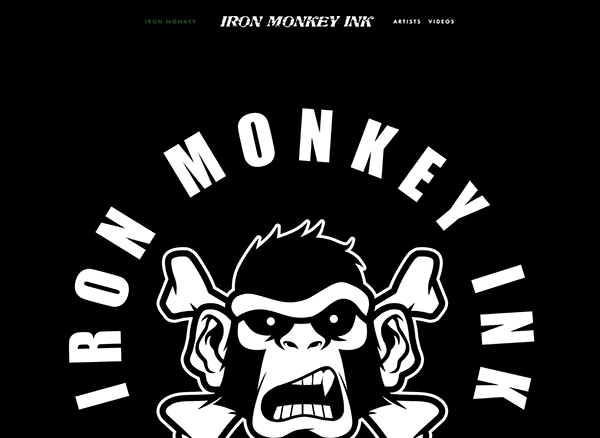
- Iron Monkey Ink: The design reflects the edgy look synonymous with tattoo culture and is sleek, sophisticated, and effortlessly elegant. Every page features high-resolution photos of the studio’s productions, highlighting the delicate artistic technique and particulars that characterize their work. The adoption of an intuitive navigation system, transparent artist pricing, and an online booking system augments the entire user experience by simplifying communication between the studio and clients to plan their subsequent tattoo appointments.
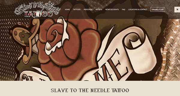
- Slave to the Needle: The website has a highly eye-catching, contemporary style. Navigation is easy, attributable to the straightforward layout. The breathtaking photography across the website was among the first things viewers would notice. Every image seemed to jump out of the computer with color and life, from detailed tattoo designs to photos of the lively studio environment. The Slave to the Needle crew takes great pride in their work; every photo they take reflects that commitment. The website features each tattoo artist in-depth, along with galleries of their previous work and biographies. It’s evident that these people are true artists in every sense of the term, not just adept technologists. There is an artist here who can realize your idea, whether you like bright, vibrant patterns or something more somber and austere.
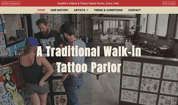
- Seattle Tattoo Emporium: The website’s slick, contemporary style immediately grabs attention. Through its clear and straightforward structure, it’s a breeze to discover everything this virtual emporium offers. The website dynamically adjusts to deliver the best viewing experience, regardless of whether you’re on a desktop computer or a mobile device. The gallery section offers various tattoo styles and techniques, making it an eye feast. The use of vivid and striking hues to sophisticated patterns in shades of light brown, black, and red may be found here to fit any inclination. The incorporation of client testimonials provides insight into the profound transformative potential of the tattoo artistry that the artist delivers and its effect on individuals’ lives.
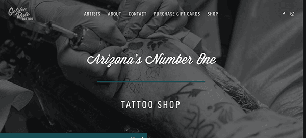
- Golden Rule Tattoo: The clean design and excellent photos of their studio, artists, and portfolio pieces entice and spark interest. Every website component, including the user-friendly interface and unified color scheme, has been thoughtfully chosen to offer visitors an immersive and captivating experience. The shop’s various awards and accolades throughout the years are proudly displayed on the website. These accomplishments, which range from industry distinctions to local recognition, attest to the studio’s steadfast dedication to artistic innovation and client pleasure.
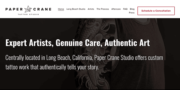
- Paper Crane Tattoo Studio: The homepage’s visually appealing layout sets in motion an immersive voyage into the world of tattoo artistry. The studio’s colorful artwork, interlaced with a clean black-and-white color scheme, gives potential clients an enticing preview of what to expect from their tattoo experience. The strategically placed CTAs throughout the site stood out, encouraging users to take action and dig deeper into the world of tattoo artistry. Moreover, using modest animations throughout the site adds a dynamic dimension to its visually stunning design.
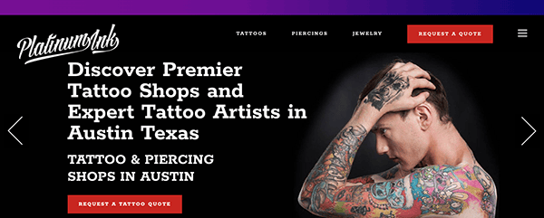
- Platinum Ink: The homepage’s eye-catching images and user-friendly layout draw you in instantaneously. The page features high-quality photographs of the studio, artists, and portfolio pieces, highlighting exceptional creativity and artistry. The design is sleek and modern, and it takes users through the site with ease. The webpage’s attention to detail is truly remarkable. Every detail, from the coherent color scheme to the seamless integration of multimedia features, has been meticulously designed to provide visitors with an immersive and engaging experience.
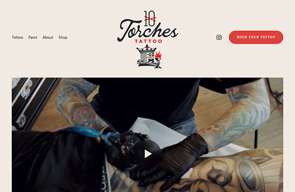
- Ten Torches: The website’s rough elegance reflects the spirit of discovery and adventure. Its user-friendly layout allows users to easily navigate through categories, filter options, and product descriptions. The minimalist design keeps the services front and center, and the muted color scheme evokes the peace of the vast outdoors. It uses appealing graphics to their utmost potential to transport users to the tattoo industry. The homepage features high-quality films and images that highlight the artist’s creative ability in action. These draw attention to the shop’s longevity and usefulness while arousing curiosity and excitement in the viewer, encouraging them to get their tattoos.
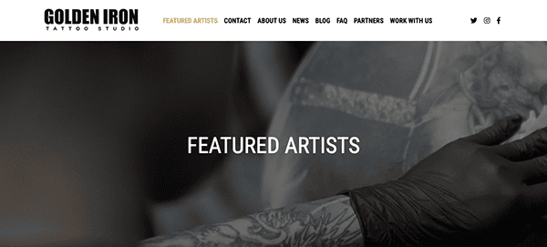
- Golden Iron Tattoo Studio: The clean style, exquisite font, and well-chosen graphics emanate a sense of refinement and professionalism, creating the ideal atmosphere for a compelling browsing experience. Navigating the website is as easy as tracing the contours of a tattoo. The straightforward menu structure and clear call-to-action buttons make it easy for visitors to navigate through different parts, whether looking at artist profiles, browsing tattoo galleries, or booking appointments. The website’s seamless navigation and rapid access to vital information make it easy for visitors to discover what they’re searching for. Its website is an experience in and of itself, inviting visitors to learn about tattoo artistry and embark on a journey of self-expression and transformation.
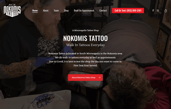
- Nokomis Tattoo: The website’s design is quite charming, with subtle references to tattoo culture throughout, a striking red color scheme, and typography with a vintage feel. It’s an artistic tribute to tattoo artistry’s lengthy legacy and timeless appeal. The website’s interface is crafted for ease of use, ensuring all website components are easily accessible and navigable, boosting the entire surfing experience. The website facilitates the scheduling of consultations and tattoo sessions for users through an integrated online booking system and walk-ins, thereby expediting the procedure and promoting convenience.
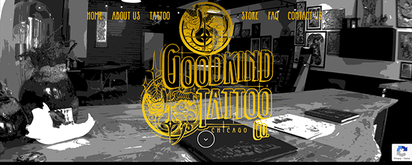
- Goodkind Tattoo Co.: The clean, elegant design that greets guests instantly draws their attention. High-quality photos, elegant typography, a black-and-white color scheme, and a minimalist layout create an immersive and visually captivating browsing experience. The website’s design reflects the studio’s artistic expression and artistry attitude, which fosters a professional yet creative atmosphere. Visitors can easily navigate various aspects of the website, such as artist profiles, tattoo galleries, and studio details, because of the apparent fixed menu options and navigation bars. Finding what you’re looking for is simple and easy, whether you are looking for a specific artist or just want to browse the studio’s body of work.
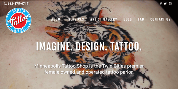
- MPLS Tattoo Shop: Bold yet friendly, the design approach features vivid colors, attention-grabbing visuals, and dynamic layouts that immediately grab the viewer’s attention. It’s an eye-candy display that captures the studio’s vibrant energy and enthusiasm for stretching the limits of tattoo creation. Along with showcasing the studio’s work, the website invites users to go on a journey of self-expression, inspiration, and discovery with its lively design aesthetic, immersive gallery showcase, easy navigation, captivating interactive features, mobile-friendly design, and unwavering commitment to creativity. The website is an experience in and of itself, offering the chance to immerse oneself in the creativity of tattooing and uncover the seemingly endless possibilities of self-expression through ink, regardless of skill level or whether this is your first time getting inked.
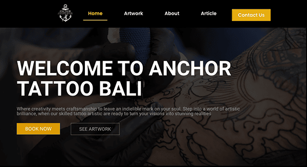
- Anchor Tаttоо Bаlі: The appealing imagery of extensive tattoos takes center stage under the minimalistic and clean design style. Each page has been thoughtfully designed to showcase tattoo artists’ various styles and skills, giving the impression that you are entering an artist’s studio. Because of its simple structure and menu options, navigating the website is a delight. The simplicity and ease of location of information about services and artists and scheduling appointments, regardless of experience level with tattoos, are seamless and prominent throughout the site. The chosen color combination is a stun as it uses black and yellow, which exudes elegance and the pristine appearance of the website. Their website also has a chat box feature that improves user engagement and customer happiness by offering real-time, individualized assistance and making it easier for visitors to explore their passion for tattoo artistry online.
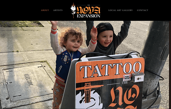
- Nova Expansion Tattoo: The stunning visuals will instantly grab viewers’ interest. They use dynamic graphics, image sliders, and high-quality photos to create an immersive experience that invites viewers to explore the tattoo shop’s offerings further. The website provides abundant inspirational information that informs, entertains, and inspires users to unleash their creativity through captivating artist profiles, thought-provoking essays, and behind-the-scenes looks into the creative process.
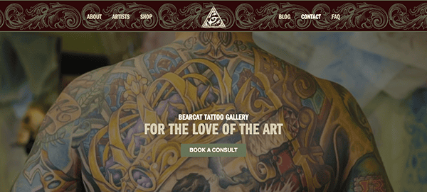
- Bearcat Tattoo: The website creates a welcoming environment for tattoo enthusiasts by skillfully fusing aesthetic flair with user-friendly design. Its visually arresting homepage invites users into a collection of varied tattoo masterpieces, showcasing the skill of its artists. The user-friendly navigation provides easy access to services, studio details, and artist portfolios. Blog entries and artist biographies are engaging information that informs and motivates users. The website places a high value on inclusion and accessibility, making the tattoo procedure accessible to everybody. Tattoo enthusiasts are encouraged to feel a feeling of community by incorporating blog posts and instructional content about tattooing.
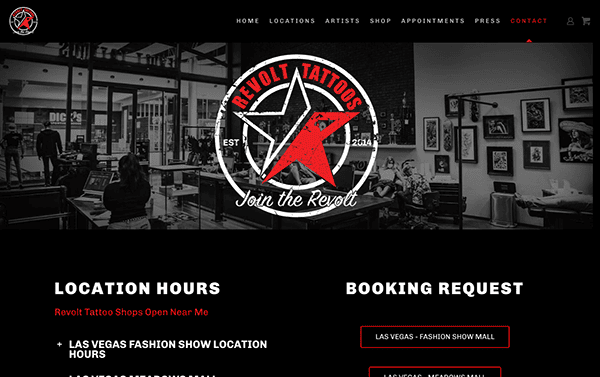
- Revolt Tattoos: With its striking red color scheme, the website creates an immersive experience for tattoo enthusiasts by skillfully fusing artistic expression with user-friendly design. Its striking design immediately draws guests in by showcasing a wide range of tattoo artistry. The user interface is simple to use, offering quick access to tattoo galleries, artist biographies, and reservation details. User experiences are enhanced with exciting material, such as blog entries and artist biographies, which inform and uplift viewers. Interactive features like virtual studio locations and videography increase user engagement. Its website serves as a place for interaction with a vibrant tattoo culture rather than merely serving as an exhibition.
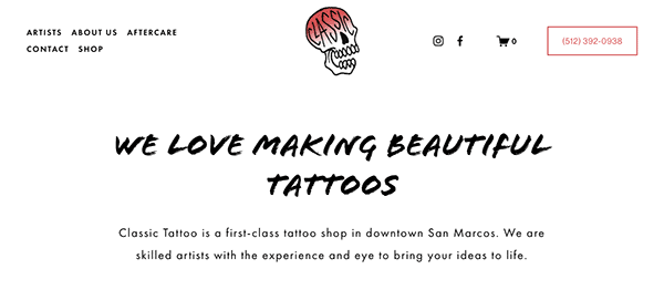
- Classic Tattoo: The website features a clean, minimalistic layout with lots of white space, resulting in a sophisticated digital canvas highlighting the studio’s tattoo artistry. The visually arresting arrangement places sharp photos against a simple background, sophisticatedly highlighting the studio’s repertoire. Seamless navigation simplifies the process of exploring tattoo galleries, artist portfolios, and vital information for users. All the components of a unified online presence are guaranteed to have a purpose when the content is focused. The website does an excellent job conveying the studio’s dedication to artistic expression and innovation, even with its simplistic design. It encapsulates the spirit of Classic Tattoo’s aesthetic concept with brief text and well-chosen pictures.
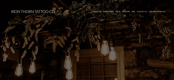
- Iron Thorn Tattoo Co.: The website’s design radiates genuine charm with its vintage-inspired style, rustic color scheme, and subtle allusions to tattoo culture. By combining elegant design components with high-quality photographs, the website creates a captivating environment that immediately grabs attention and invites exploration. Whether it’s scheduling a consultation or looking through artist portfolios, the website’s compelling calls-to-action (CTAs) encourage users to go forward. The purpose of these thoughtfully positioned and crafted calls to action is to boost user engagement and conversion rates by promoting interaction.
As we venture into a digital representation, it becomes evident that not all websites are created equal. The best tattoo shop websites stand out through their combination of artistic flair, user engagement, and seamless navigation. They don’t just display artwork; they immerse visitors in the culture and community of the tattoo world. These websites understand the importance of a first impression and leverage it to captivate and convert their online audience. They are a testament to how innovative design and strategic user experience can elevate a tattoo shop from another option to the go-to destination for tattoo enthusiasts.
In wrapping up the discussion on the transformative power of well-crafted tattoo shop websites, it’s clear that your online presence is an integral extension of your physical shop. The digital landscape offers limitless possibilities to showcase your artistry, connect with a global audience, and drive bookings. The importance of investing in a website that accurately reflects the quality and creativity of your work cannot be overstated. It’s not just about having a website; it’s about having a website that works as hard as you do.
CyberOptik understands the unique challenges and opportunities within the tattoo industry. Our expertise in crafting bespoke websites that combine stunning design with strategic functionality can help your tattoo shop stand out. Whether you’re looking to revamp your existing site or build a new digital presence from scratch, CyberOptik has the tools and talent to bring your vision to life. Ready to transform your tattoo shop’s online presence? Contact CyberOptik today for a free consultation about your tattoo shop website. Let’s create a digital masterpiece that resonates with your artistry and attracts more clients to your shop.

