Just looking for our Best Small Business Website examples list?
Key Takeaways:
- Embrace Local Identity in Design
Use authentic imagery, local references, and community-specific branding to build trust and resonate with your local audience. - Prioritize Mobile Responsiveness
Design for mobile first—most visitors are browsing on smartphones, and your site needs to be fast, intuitive, and touch-friendly. - Optimize for Local SEO
Structure content with local keywords, integrate your Google Business Profile, and build local citations to improve visibility in search results. - Use Clear Calls-to-Action (CTAs)
Guide users toward action with strategically placed buttons and forms—whether it’s booking, calling, or requesting a quote. - Showcase Social Proof
Highlight testimonials, reviews, and client success stories to establish credibility and reduce hesitation from new visitors. - Keep Your Site Updated and Secure
Ongoing WordPress maintenance ensures performance, protects data, and supports your local SEO rankings over time.
Why Every Local Business Needs a High-Performing Website
Today, your website is often the first impression your customers get—and it needs to count. Whether you’re a family-owned shop or a growing startup, the right website design can be the difference between getting noticed and getting ignored.
For small businesses, especially those serving specific communities, your online presence must do more than just exist. It needs to reflect your brand, engage visitors instantly, and drive measurable results. A high-performing small business website builds trust, converts visitors into leads, and sets the foundation for long-term growth. When designed with strategy and purpose, your site becomes your hardest-working employee—available 24/7 and never asking for a day off.
From SEO that puts you in front of the right audience to intuitive layouts that make it easy for users to take action, effective website design directly impacts your bottom line. This guide is here to help business owners understand what it takes to build a website that truly works. Whether you’re starting from scratch with a website builder or revamping a dated template, we’ll show you how to make every pixel count and ensure your local business gets the attention it deserves.
Website Planning & Purpose
Before writing a single line of code or selecting a website template, every business must begin with a clear website plan. Strategic planning is the cornerstone of effective web design and determines how well your site performs once it’s live. For business owners, this means taking time to define your goals, understand your audience, and determine the features and content that will serve them best.
The planning phase should include a deep dive into your business objectives. Are you trying to attract more foot traffic to a physical location? Generate leads through contact forms? Showcase a portfolio or menu? Each purpose influences your design choices, site structure, and content strategy. Without this clarity, even the best design can fall flat.
Next, consider your target audience. What are their pain points? What questions are they asking before they decide to reach out? By understanding these motivations, you can design a user experience that speaks directly to their needs. From intuitive navigation to clearly placed calls-to-action, every decision should make it easier for visitors to take the next step.
Content plays a foundational role in this process. Decide early which pages your site needs (Home, About, Services, Contact, FAQs, etc.) and what information each should include. This content framework supports the design and improves your search engine visibility. Good content fuels good SEO.
Finally, businesses must identify technical and operational needs upfront, like integration with Google, mobile responsiveness, and loading speed. These decisions impact everything from customer satisfaction to local search rankings.
When you plan with purpose, your website becomes more than a digital brochure. It becomes a conversion-focused marketing tool tailored for your community. For more insights on why this planning phase is so critical, read our blog post on why all small businesses should have a website.
Design Principles
Once you have a plan, it’s time to bring your vision to life with intentional and impactful design. Strong design principles are the backbone of any successful website, and for local businesses, they determine how users experience your brand from the first click to final conversion.
- Clarity and Simplicity
A website must be easy to navigate, visually clean, and free of unnecessary clutter. Clear headings, ample white space, and concise content help users find what they need without frustration. This enhances usability and encourages engagement. - Visual Hierarchy
Organize your content so the most important elements stand out. Use size, contrast, and placement to guide visitors’ eyes to key information, such as contact buttons, service highlights, and calls-to-action. A strong hierarchy ensures users don’t miss what matters most. - Consistency
Maintain uniform colors, fonts, and styles throughout the site to reinforce your brand. Consistency improves user recognition and keeps the experience seamless across all pages. It also adds a level of polish and professionalism that builds trust with potential customers. - Mobile Optimization
More than half of your visitors are likely coming from mobile devices. Your site must be responsive, meaning it adapts seamlessly to different screen sizes. Prioritize touch-friendly navigation and streamlined content that looks great on smartphones and tablets. - Speed and Performance
A slow site is a lost opportunity. Optimize image sizes, leverage caching, and choose reliable hosting to ensure your site loads quickly. Performance isn’t just a user experience issue—it’s a direct factor in search engine rankings and local SEO. - Accessibility
Design with inclusivity in mind. Use readable fonts, proper color contrast, and alt text for images to make your website usable for all visitors, including those with disabilities. Accessibility is both a legal and ethical responsibility. - Conversion-Focused Layouts
Every page should serve a purpose. From service detail pages to blog posts, each layout should include a clear next step. This might be a call-to-action, a lead form, or a click-to-call button. Guide users toward conversion at every touchpoint.
Applying these design principles is not just about aesthetics—it’s about creating a seamless, goal-oriented experience for your customers. For an in-depth look at current best practices, explore our article on essential web design strategies for small businesses.
Content & Navigation
Content and navigation are the structural backbone of any website. While design gets users in the door, it’s content and site structure that keep them engaged and guide them toward action.
Start by mapping out a core set of pages. Every small business website should include:
- Homepage: The welcome mat, summarizing your services and unique value proposition.
- About: A personal connection point that builds credibility and shares your brand story.
- Services or Products: Detailed descriptions of what you offer, ideally with individual pages for each service or category.
- Contact: Clear, easy-to-use forms and contact information, plus a map and links to your Google Business Profile.
- Testimonials/Reviews: Social proof that builds trust.
- FAQ: Answers to common customer questions that can also support SEO.
- Blog or Resources: A place to share updates, insights, and boost long-term search engine visibility.
Navigation should be intuitive. Use a top navigation bar with clear, descriptive labels. Group similar pages together using dropdown menus, but don’t overload the user with too many choices. Every page should be accessible within two to three clicks from the homepage.
Think of your navigation as a guided path. What do you want users to do first? Where do they go next? Use internal links within your content to guide that journey. For example, a homepage section about your services should link directly to the Services page.
Consistency and predictability are key. Place the navigation in the same location on every page. Use breadcrumbs for deeper navigation levels, and always include a search function to help users who want to skip straight to specific content.
Lastly, keep mobile users in mind. Your mobile menu (often called a “hamburger menu”) should be easy to find and use, with touch-friendly buttons and expandable sections that don’t overwhelm the screen.
When your content and navigation work together, users feel guided, informed, and ready to take the next step. That’s how great websites drive results.
Visual Elements
Visual elements are strategic tools that reinforce your brand, enhance usability, and keep users engaged. The right visual presentation can create immediate credibility and differentiate your business in a crowded marketplace.
- Brand-Aligned Imagery
Use custom images that reflect your team, your work, and your local environment. Stock photos can be useful, but over-reliance on them can create a generic feel. Authentic visuals build a stronger emotional connection and reflect professionalism. - Color and Typography
Consistent use of color schemes and fonts helps establish a recognizable brand identity. Choose a palette that aligns with your logo and industry. Ensure your typography is legible across all devices and contributes to a cohesive aesthetic. - Icons and Graphics
Custom icons and infographics can help explain services, break up large sections of text, and add visual interest without clutter. These elements should support your message, not distract from it. - Calls-to-Action (CTAs)
Use contrasting colors and deliberate placement to make CTAs stand out. Buttons should be easy to find, clearly labeled, and intuitively positioned to guide users toward booking, calling, or contacting your business. - Visual Flow
Page layouts should follow a logical visual path. Guide visitors from top to bottom with a balanced use of imagery and content blocks. Anchor key messages with bold visuals and use whitespace to create breathing room. - Video and Animation
Videos, background loops, and subtle animations can enhance storytelling and engagement, but they must be purposeful. Ensure these features load quickly and do not interrupt the user experience. - Trust-Building Visuals
Include badges, certifications, and real customer testimonials with photos when possible. These visual trust signals help reassure first-time visitors that your business is reputable and capable.
Great visual design supports functionality, enhances readability, and strengthens brand perception. A strategically sound website incorporates visual elements intentionally to guide users and convert visits into actions. For a deeper understanding of how visual structure supports performance, read our article on what makes a strategically sound website.
Ongoing WordPress Maintenance
A great website isn’t a one-time project—it requires ongoing care to stay secure, up-to-date, and high-performing. For local businesses relying on WordPress, regular maintenance is essential to protect your investment and ensure the site continues to deliver results.
WordPress is a powerful and flexible platform, but it also comes with ongoing responsibilities. These include:
- Software Updates
The WordPress core, themes, and plugins are updated frequently to add features, fix bugs, and close security vulnerabilities. Ignoring these updates can leave your site exposed to hacking and performance issues. Set a schedule to check and apply updates weekly or bi-weekly. - Security Monitoring
Even small business websites are targets for automated attacks. Maintenance includes installing security plugins, configuring firewalls, and scanning regularly for malware. If you collect any customer data, security becomes even more critical. - Backups
A solid backup strategy is your safety net. If anything goes wrong—whether from a hack, an update conflict, or human error—you’ll need a full, restorable backup. Daily or real-time backups stored off-site are best practice. - Performance Optimization
Maintenance ensures your website continues to load quickly and operate smoothly. This includes optimizing images, cleaning up the database, and monitoring uptime. A slow site can harm your search engine rankings and frustrate users. - Broken Link & Functionality Checks
Over time, links can break, and third-party tools may stop working. Routine audits should catch these issues before they affect your visitors. Broken contact forms, outdated plugins, or 404 errors can silently cost you leads. - SEO Health Checks
Regular updates to your SEO setup help maintain rankings. This might involve reviewing meta tags, updating site maps, and checking for indexation issues with Google Search Console. Staying on top of SEO ensures you remain competitive in your local market. - Content & Visual Refresh
Keeping your content current is part of maintenance. Swap out seasonal promotions, update staff bios, and refresh visuals to keep your website feeling active and relevant. A stale website signals to visitors—and search engines—that your business may not be active.
Maintaining a WordPress site doesn’t require a full-time IT team, but it does require consistent attention. Many business owners choose to partner with a trusted provider for ongoing website care. It’s a small investment compared to the potential loss from downtime, data breaches, or a poor user experience. The goal is to keep your website reliable, secure, and aligned with your business goals, month after month.
Small Business Website Design Examples That Are Thriving
1. Best Dental Spa
- Clean layout with intuitive navigation for patients.
- Bold calls-to-action encouraging bookings.
- Consistent branding with a calming, clinical color palette.
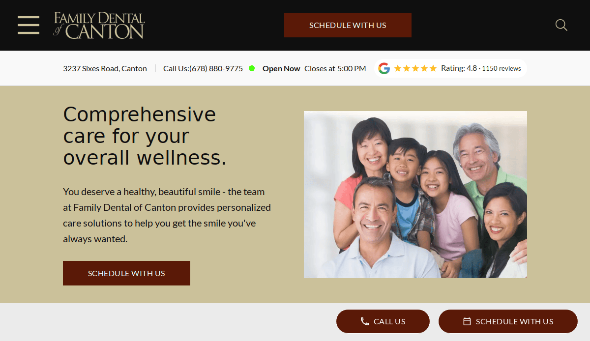
2. Family Dental of Canton
- Features a clean layout with easy navigation.
- Detailed descriptions of dental services.
- The site is mobile-friendly, ensuring accessibility across all devices.
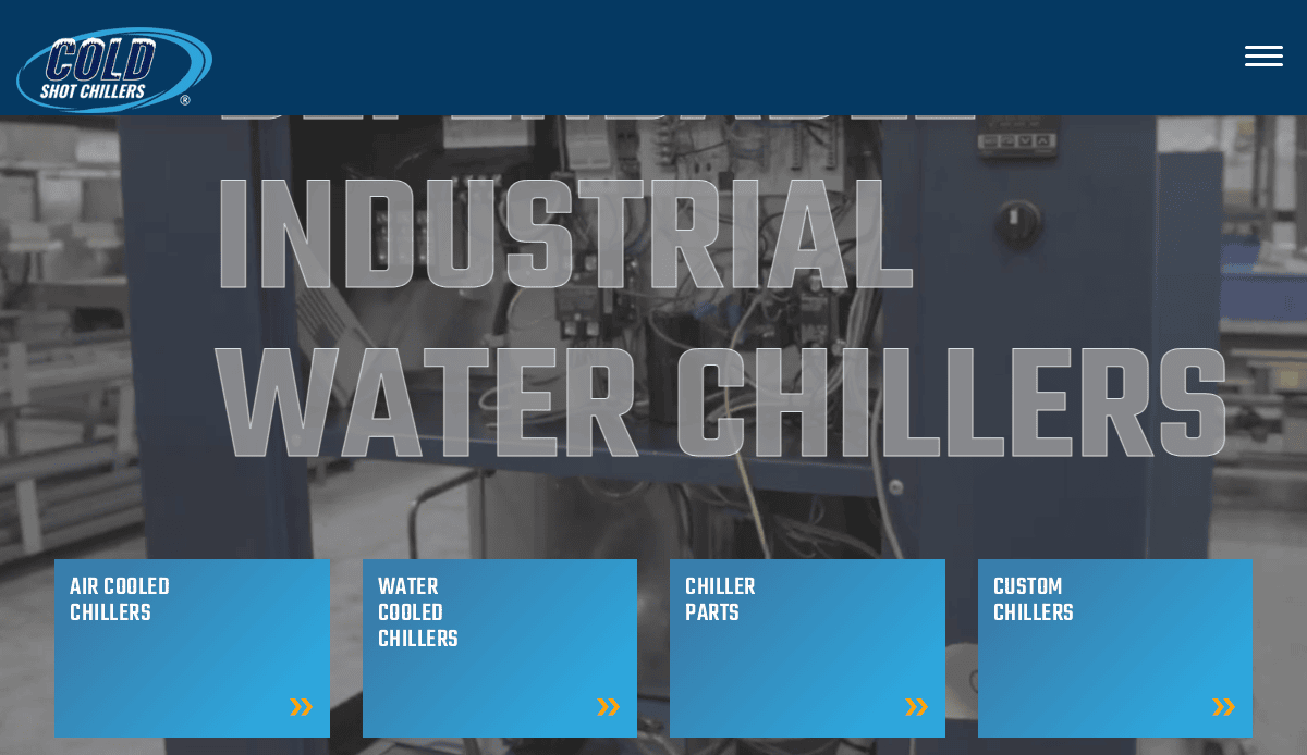
3. Cold Shot Chillers
- Clear product categorization for B2B users.
- Technical specifications presented with visual clarity.
- Fast-loading, optimized for conversions.
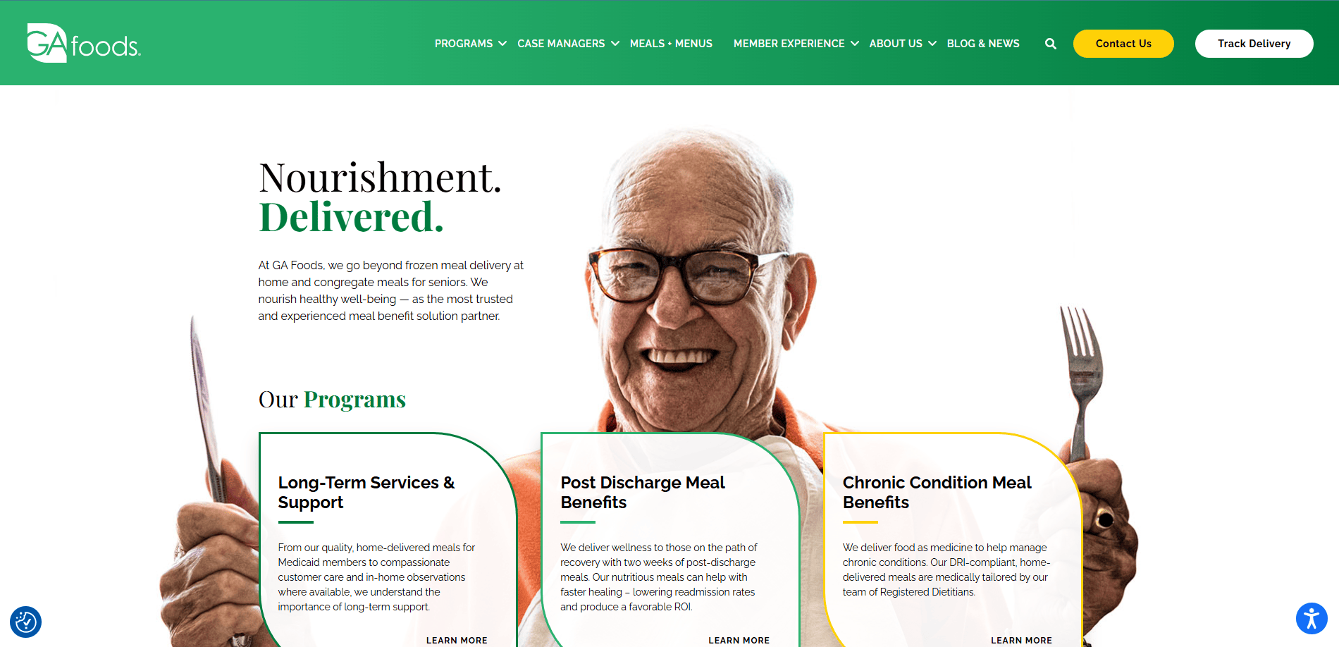
4. GA Foods
- Strong visual storytelling with lifestyle imagery.
- Engaging homepage with service area map.
- Easy-to-navigate layout for older audiences.
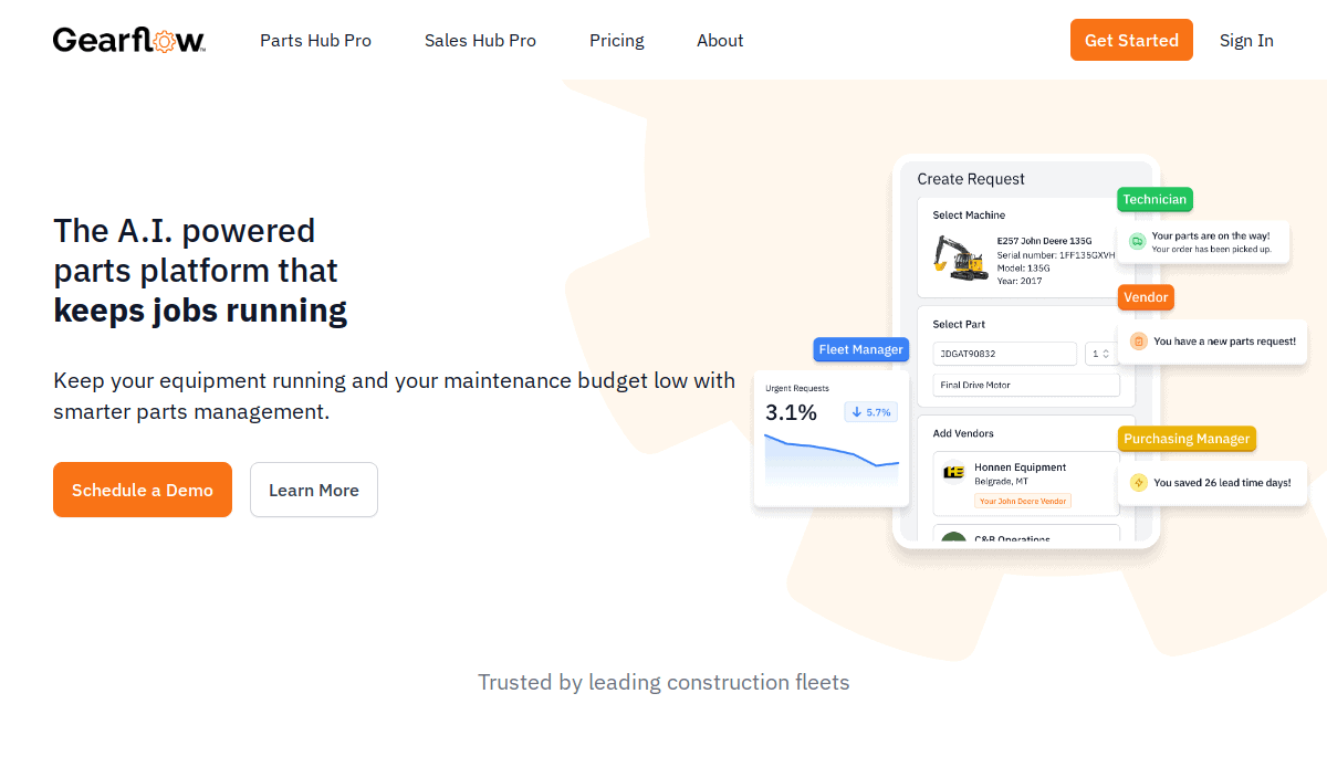
5. Gearflow
- Smart e-commerce layout tailored for equipment rental businesses.
- Easy navigation between vendor products.
- Modern, tech-driven visual identity.
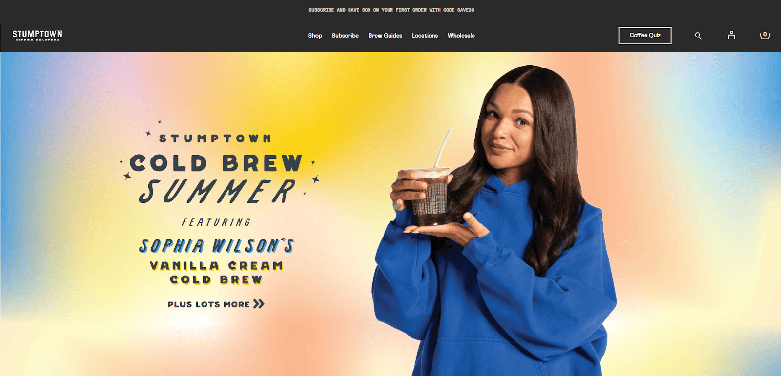
6. Stumptown Coffee Roasters
- Sleek product pages with high-quality visuals.
- Thoughtful integration of brand story.
- Mobile-first design enhances shopping experience.
7. Sweetgreen
- Strong use of local imagery in menu displays.
- Mobile-first design with fast navigation.
- Consistent branding and clear sustainability message.
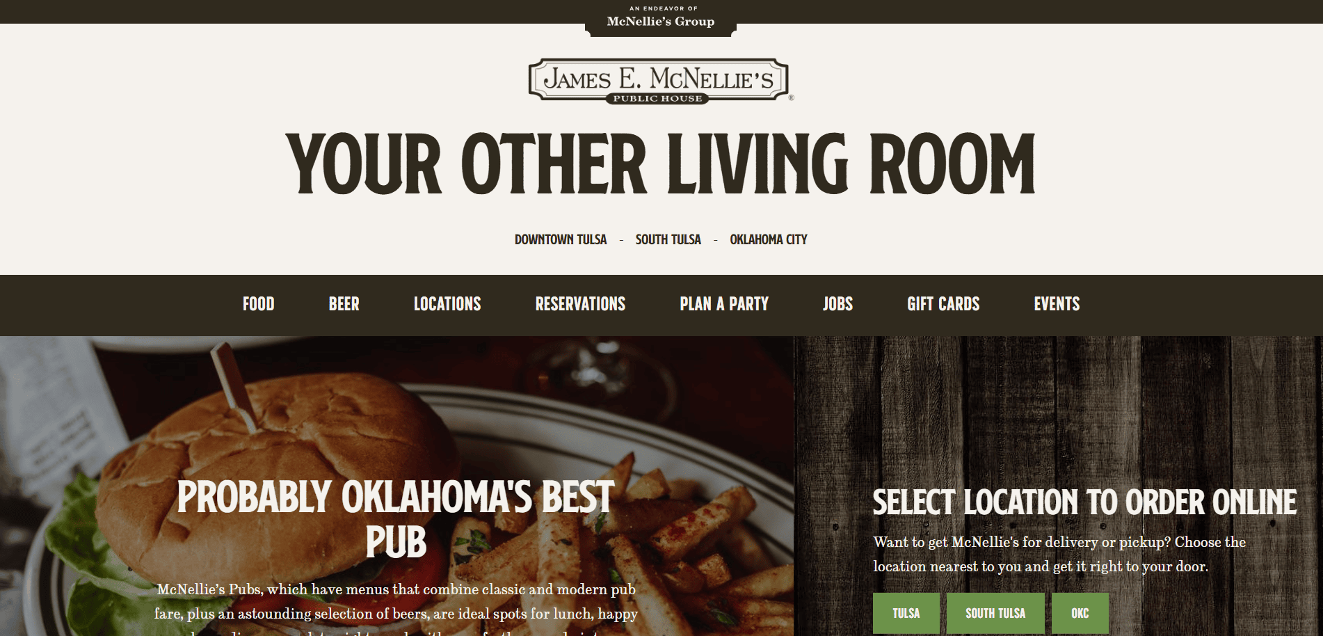
8. McNellie’s Group
- Uses photography to highlight atmosphere across locations.
- Simple navigation with location-specific menus.
- Unified yet distinctive branding for multiple restaurants.
9. Steel Toe Books
- Excellent use of negative space and type.
- Showcases brand story effectively.
- Focus on case studies helps build credibility.
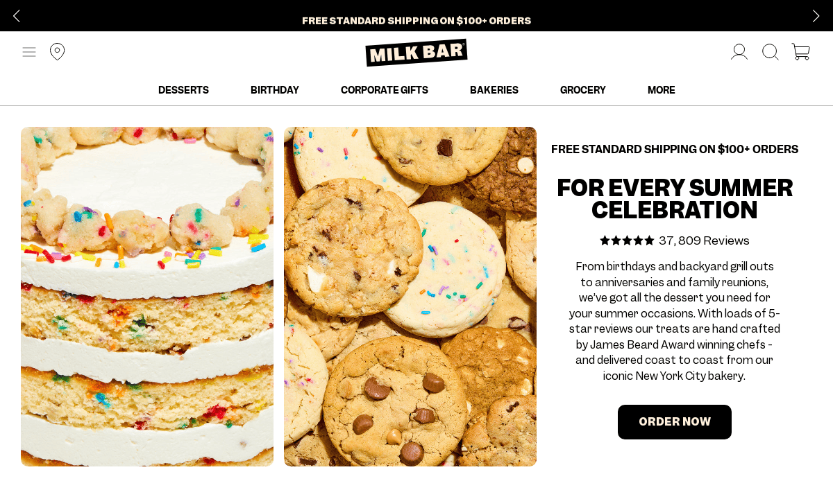
10. Milk Bar
- Playful visuals consistent with the brand personality.
- Streamlined e-commerce functionality.
- Highlights local store locations and delivery options.
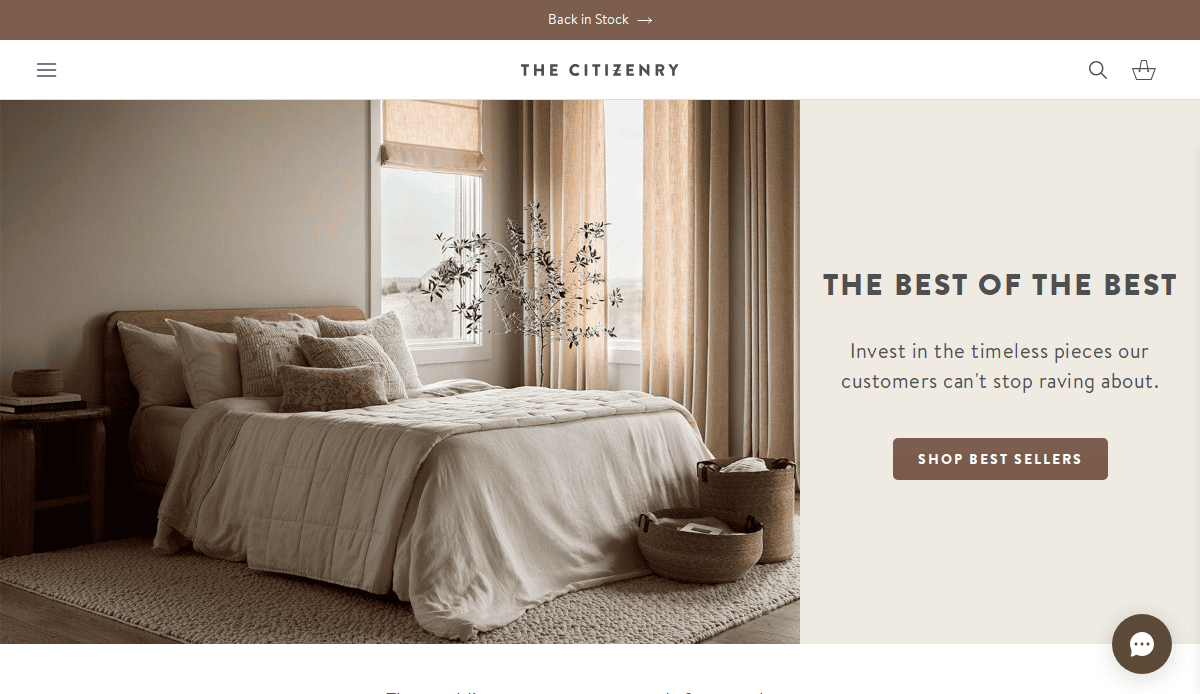
11. The Citizenry
- Strong commitment to ethical sourcing emphasized through visuals.
- Minimalist, editorial layout for product discovery.
- Fast site speed and clear category structure.
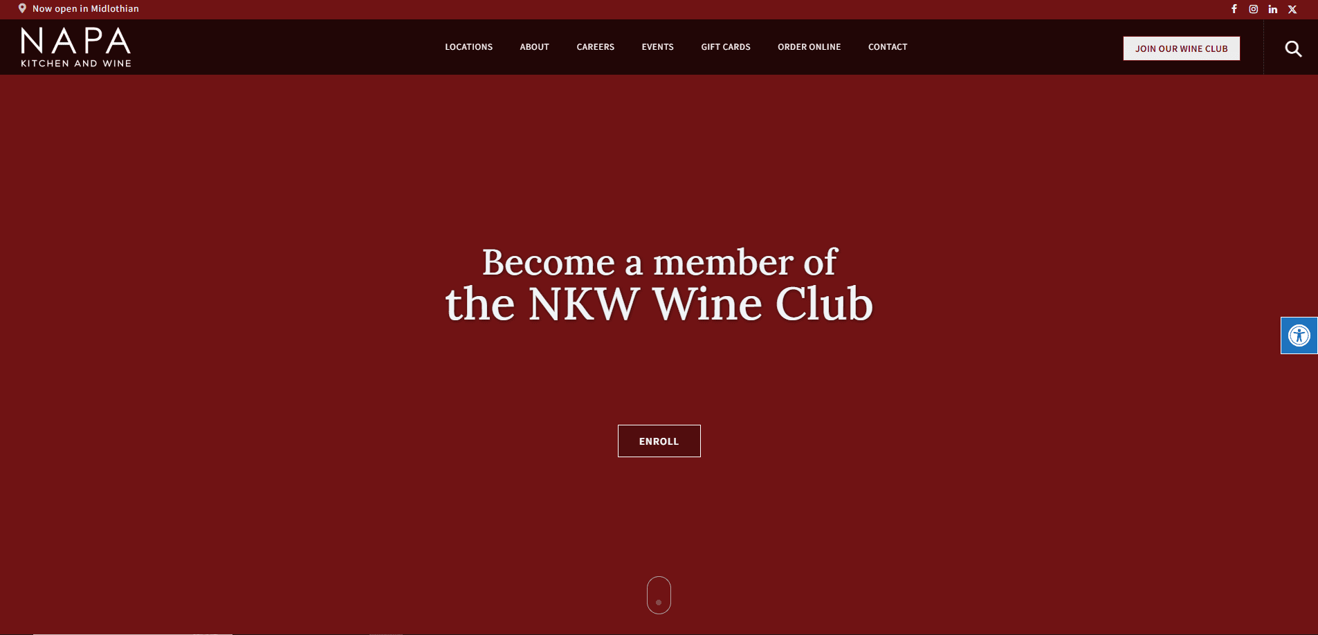
12. NAPA Kitchen & Wine
- Elegant layout matching fine dining branding.
- Event promotion and reservation tools are well integrated.
- Engaging food and ambiance photography.
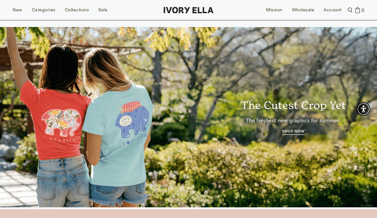
13. Ivory Ella
- Mission-driven design tied to wildlife conservation.
- Visual storytelling through photography and video.
- Optimized product pages with CTAs.
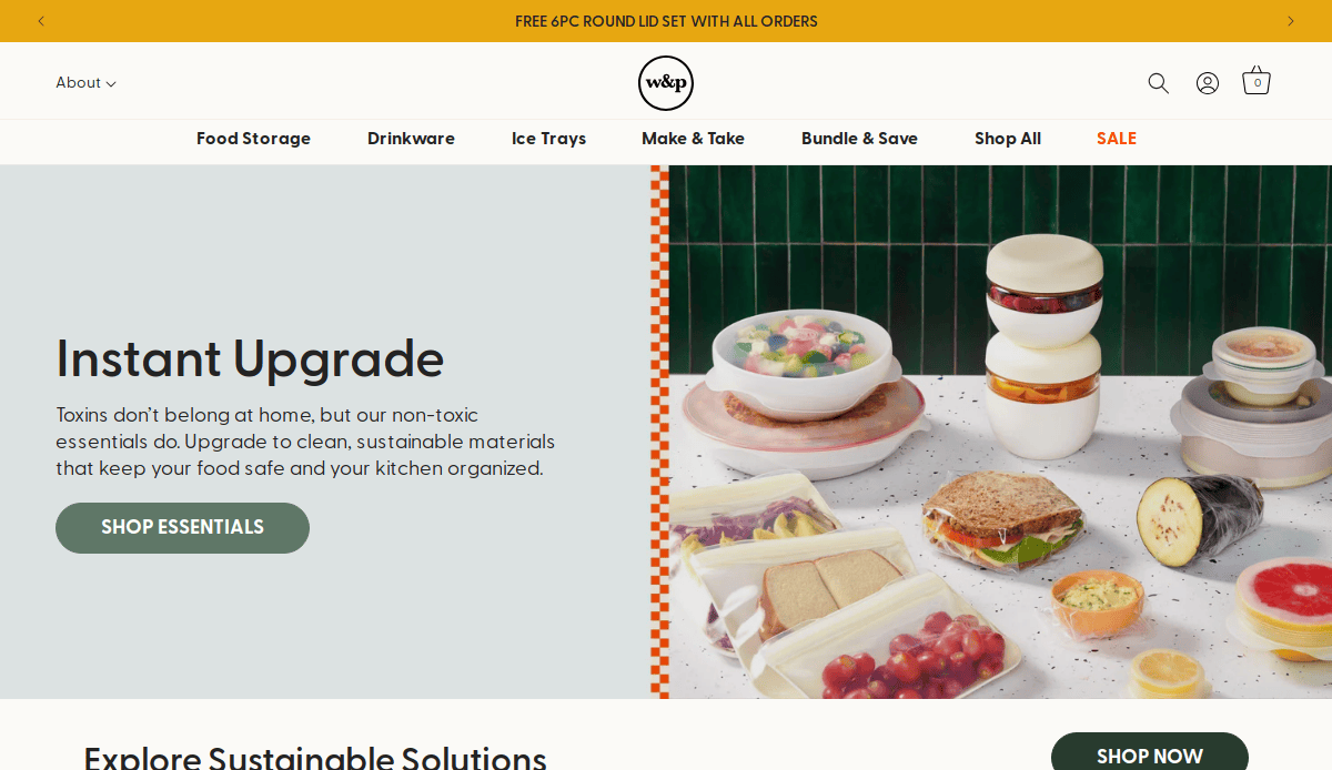
14. W&P
- Clean, modern design with bold color usage.
- Great use of social proof and customer photos.
- Interactive features like gift finders.
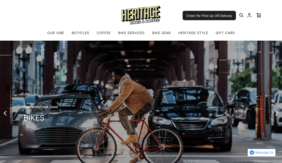
15. Heritage Bikes & Coffee
- Combines e-commerce with lifestyle branding.
- Unique visual identity and typography.
- Strong narrative supporting local manufacturing.
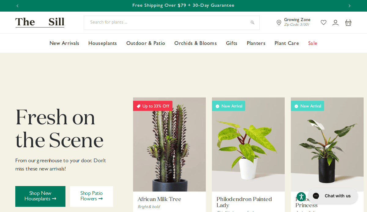
16. The Sill
- Educational content supports plant purchases.
- Seamless navigation and mobile design.
- Integrated blog helps grow organic traffic.
17. Alder Apparel
- Fresh, modern aesthetic appealing to younger shoppers.
- Transparency messaging reinforces trust.
- Mobile-optimized product discovery.
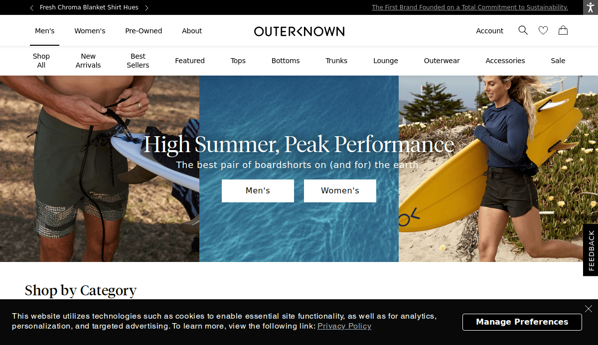
18. Outerknown
- The eco-conscious message is reinforced through visuals.
- Smart filtering for product browsing.
- Great use of space and contrast.
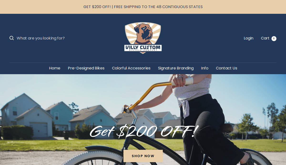
19. Villy Custom
- Interactive platform for customers to design their own bicycles, offering a personalized shopping experience.
- Showcases colorful and stylish bike designs, appealing to a fashion-conscious audience.
- Easy-to-navigate site structure.
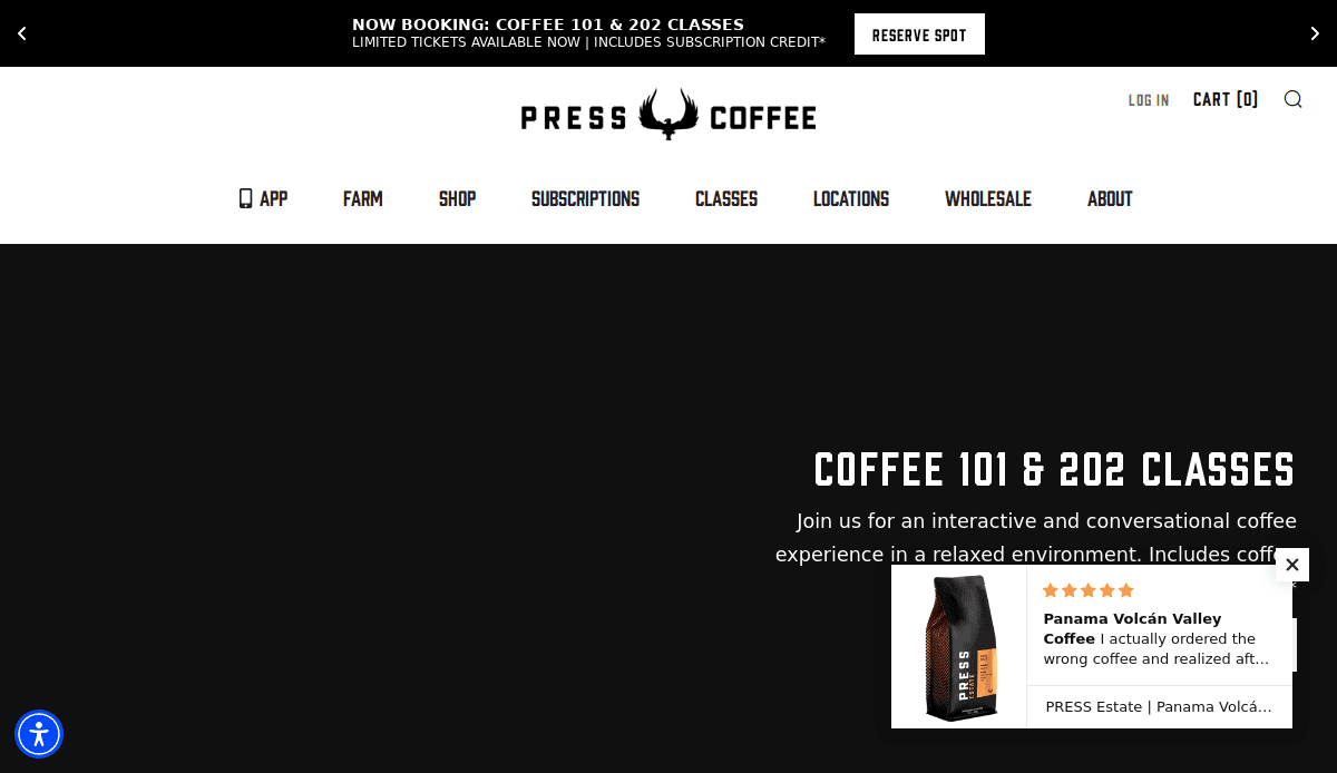
20. Press Coffee
- Crisp product visuals and brand storytelling.
- Subscription model clearly explained.
- Simple layout enhances usability and buying experience.
Take the Next Step for Your Small Business Website
A well-designed website isn’t just a marketing asset—it’s a reflection of your brand and a tool that works around the clock to support your business. For small business owners aiming to grow their business, the difference between being discovered or overlooked often comes down to their online presence.
Designing a website with clarity, strategy, and consistency sets the foundation for lasting success. From responsive website design to thoughtful website content and ongoing maintenance, every element should be built to meet your small business’s needs and drive real results.
Ready to design a small business website that actually works for you? Whether you need to build your website from scratch or improve your local presence with a mobile-ready refresh, we’re here to help.
Contact us today to get started on your new website.
Professional Website Frequently Asked Questions
What are the essential pages every website should have?
Every website should include a homepage, about page, service or product pages, a contact page, testimonials, and a blog or resource section. These website pages help build trust, improve your website for SERPs, and guide visitors toward action.
Should I use a website builder or hire a web designer?
Many website builders include simple drag-and-drop features, but they often fall short for businesses that need flexibility, speed, and scalability. Hiring a professional web designer ensures your site is built to support your business goals and optimized for performance.
How do I drive more traffic to my website?
Optimizing your website for searches, publishing regular content, and maintaining fast load times are key strategies. Make sure your site is mobile-friendly and built with SEO best practices in mind. For expert help, explore our SEO services.
Can I create a website on my own?
You can use a stand-alone website builder to create a website, but creating your website from scratch requires time, planning, and technical know-how. If you want a site that effectively grows your business, working with a web development team is usually the smarter long-term choice.
How often should I update my small business website?
You should check your website monthly for content accuracy, performance, and security updates. Regular updates help keep your website fresh and signal activity to search engines.
Why does my business need a website?
A small business website gives you credibility, acts as your digital storefront, and helps customers find your business online. For small businesses, having one is no longer optional—it’s a must for growth, visibility, and customer trust.
What makes the best professional industry sites?
The best website balances performance, design, usability, and strategy. It should reflect your brand, be easy to navigate, load quickly, and include key content that supports your business.
Do I need a mobile version of my website?
Absolutely. Most traffic to your website comes from mobile devices. Responsive website design ensures your site looks and works great across all screen sizes, enhancing user experience and improving your website’s search rankings.
What’s involved in hosting and maintaining a website?
You’ll need to host your website with a reliable provider, perform software updates, manage security, and back up your content regularly. For stress-free support, consider our hosting and care plans.
How do I make a website that helps me find local businesses, or customers find me?
Use location-specific content, set up an online profile, and ensure your NAP (name, address, phone) info is consistent. A properly optimized website for local search will help customers find your website and visit your business.

