In the competitive dining world, a restaurant’s website is frequently the first point of contact with prospective clients. A well-designed restaurant website showcases the menu and ambiance and provides essential information like location, hours, and reservation options. In this blog post, we will discuss 20 of the best restaurant websites, highlighting what makes each one stand out. These examples will give inspiration and insights into effective restaurant website design, helping you understand the elements crucial for creating an engaging and user-friendly site.
Examples of the Best Restaurant Website Designs
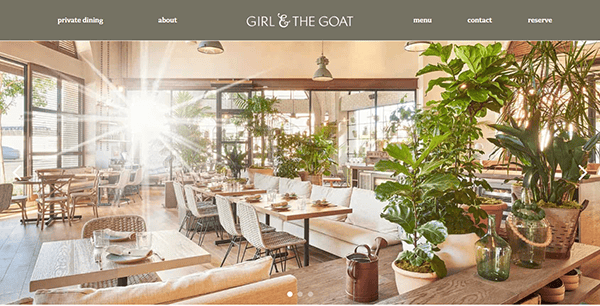
- Girl and the Goat: Its website is a stunning example of modern, high-end restaurant web design. The webpage welcomes visitors with full-screen, bright photos of the restaurant and its dishes, instantly conveying the lively, gastronomic atmosphere. The color design combines warm, earthy tones with sophisticated gray and white accents to precisely capture the restaurant’s smart, friendly atmosphere. The navigation is fluid, with a well-organized menu that allows users to access reservations, menus, and event details with just one click. The menu page is thoughtfully laid out, featuring enticing images showcasing the chef’s artistry and clear descriptions. The site also includes a blog and a section for special events, providing a comprehensive view of what its services have to offer.

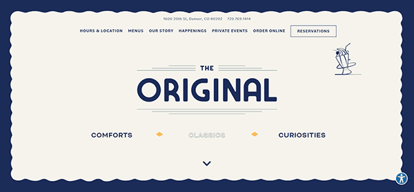
- The Original in Denver exemplifies how a website can bring the restaurant experience online. The quirky illustrations of malts and T-bone steaks throughout the site add a playful touch, while the navy border keeps guests focused on browsing menus and new happenings. The prominent “Reservations” button encourages visitors to book a table, converting an online guest into a paying customer. The site also includes a blog and an events calendar, providing a thorough overview of what’s happening at The Original. The overall design is vibrant and engaging, reflecting the restaurant’s unique character.

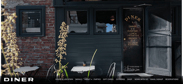
- Diner in Brooklyn is celebrated for its unique dining experience in a 90-year-old Pullman dining car. The website is clean and modest, with full-bleed images of the interiors that allude to the restaurant’s distinctive atmosphere. A highlighted “Online Ordering” button takes visitors to their online store, where they can order for pickup and delivery directly through the website. The site also includes a blog and a detailed FAQ section, making it easy for visitors to find the information they need. The straightforward design and focus on usability make Diner’s website a standout example of effective restaurant website design.

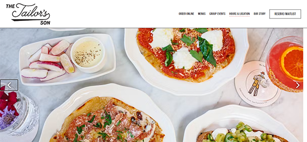
- The Tailor’s Son in San Francisco offers a website that reflects the unpretentious yet modern vibe of the restaurant. The design features muted textural backgrounds and high-quality images that showcase the Italian-inspired menu. The site includes sections for menus, reservations, and events, making navigating easy for visitors. The homepage highlights the latest news and special offers, encouraging visitors to stay engaged with the restaurant’s happenings. The overall design is cohesive and inviting, making it a great example of the best restaurant websites.

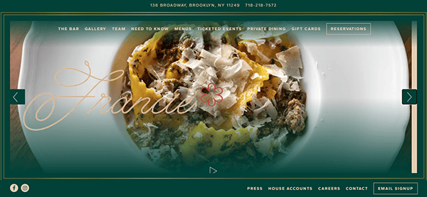
- Francie in Brooklyn is known for its approachable yet elevated dining experience. The website features a sleek design with high-quality images and a “Happenings” page where visitors can purchase tickets for events like “Learn How To Make Pasta Like A Pro.” This unique feature engages visitors and provides an additional revenue stream for the restaurant. The site also includes a blog and a detailed FAQ section, making it easy for visitors to find the information they need. Combining engaging content and practical features makes Francie’s website a valuable tool for the restaurant and its patrons.

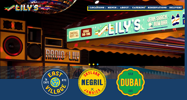
- Miss Lily’s with locations in NYC, Jamaica, and Dubai, brings its vibrant, colorful branding to life online. The website’s design reflects the eclectic, calm, and friendly atmosphere, making it a destination for booking rum and jerk chicken-fueled events. Simple-to-fill-out inquiry forms make it easy for visitors to plan their next island party. The site also includes menus, reservations, and events sections, providing a comprehensive view of what Miss Lily offers. The lively design and user-friendly navigation make it a standout example of restaurant website design.

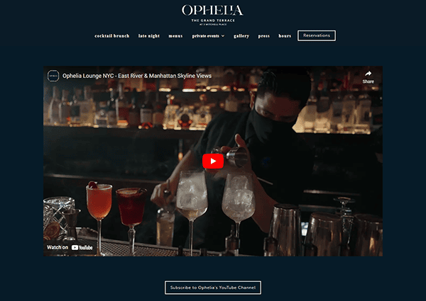
- Ophelia in New York City is a rooftop cocktail lounge with 360-degree city views. The website’s design is elegant and modern, with high-quality images showcasing stunning views and sophisticated ambiance. The site includes sections for menus, reservations, and events, making navigating easy for visitors. The homepage highlights the latest news and special offers, encouraging visitors to stay engaged with Ophelia’s happenings. The sleek and inviting design makes it a great example of the best restaurant websites.

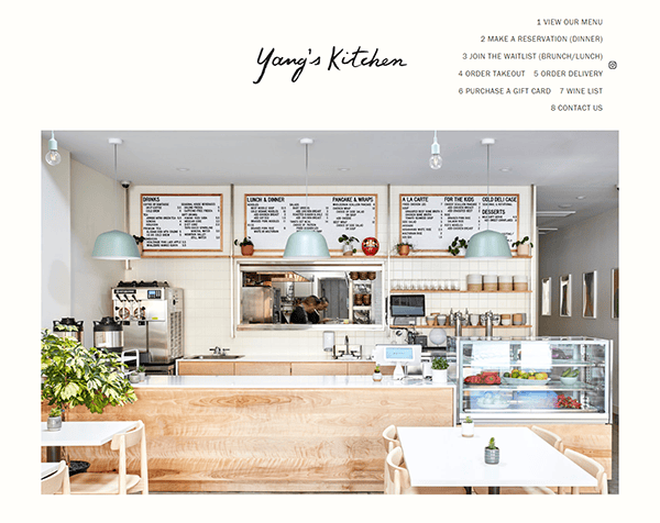
- Yang’s Kitchen in Los Angeles features a straightforward design that puts essential information front and center. The address, hours, and contact information are displayed prominently on the homepage, making it simple for visitors to find what they need. The site also includes an up-to-date menu in a webpage format, ensuring that it is easy to browse and search for menu items. This focus on usability makes Yang’s Kitchen’s website a great example of effective restaurant website design. The clean and functional design ensures visitors can quickly find the necessary information.

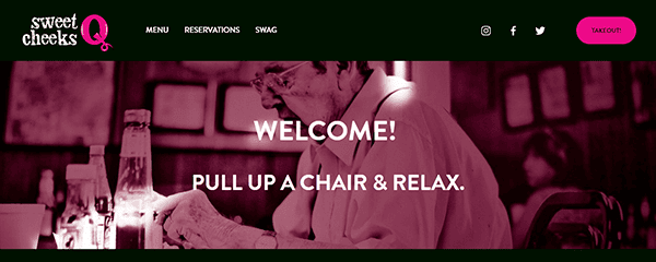
- Sweet Cheeks in Boston showcases its menu on an easy-to-navigate webpage, making it simple for visitors to browse and search for menu items. The site also includes reservations, online ordering, and gift card purchasing sections, providing a comprehensive view of what Sweet Cheeks offers. The homepage highlights the latest news and special offers, encouraging visitors to stay engaged with the restaurant’s happenings. The overall design is user-friendly and engaging, making it a great example of the best restaurant websites.

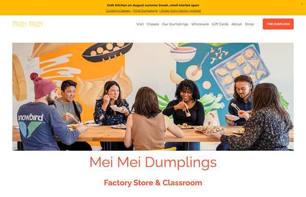
- Mei Mei Street Kitchen in Boston features a wealth of content, including information about the restaurant’s story, its make-at-home dumplings, and its local and sustainable approach. The site also includes a blog and recipes page, where they post about food, events, and more. This rich content engages visitors and provides valuable information about the restaurant’s philosophy and offerings. The comprehensive and engaging design makes Mei Mei Street Kitchen’s website a standout example of restaurant website design.

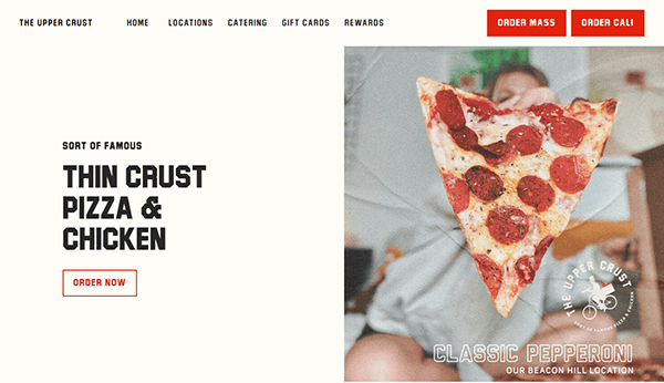
- Upper Crust Pizzeria, with multiple locations, features a clean, minimalist, and modern design that makes it easy for visitors to find essential information. The site includes sections for menus, online ordering, and reservations, ensuring a seamless user experience. The homepage highlights the latest news and special offers, encouraging visitors to stay engaged with the restaurant’s happenings. The straightforward and functional design makes Upper Crust Pizzeria’s website a great example of the best restaurant websites.

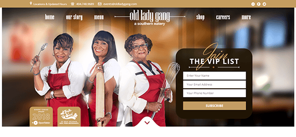
- Old Lady Gang in Atlanta offers a website that reflects the warm and friendly ambiance of the restaurant. The design features high-quality images and a straightforward layout, making navigating easy for visitors. The site includes sections for menus, reservations, and events, providing a comprehensive view of Old Lady Gang’s offerings. The homepage highlights the latest news and special offers, encouraging visitors to stay engaged with the restaurant’s happenings. The inviting and user-friendly design makes Old Lady Gang’s website a standout example of restaurant website design.

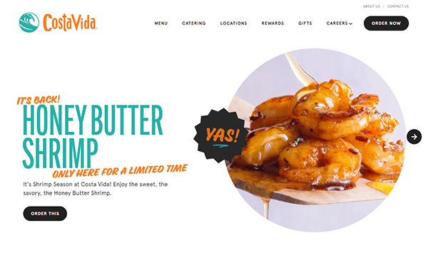
- Costa Vida has multiple locations and features a vibrant and colorful design that reflects the lively spirit of the restaurant. The site includes menus, online ordering, and gift card purchasing sections, ensuring a seamless user experience. The homepage highlights the latest news and special offers, encouraging visitors to stay engaged with Costa Vida’s happenings. The energetic and engaging design makes Costa Vida’s website a great example of the best restaurant websites.

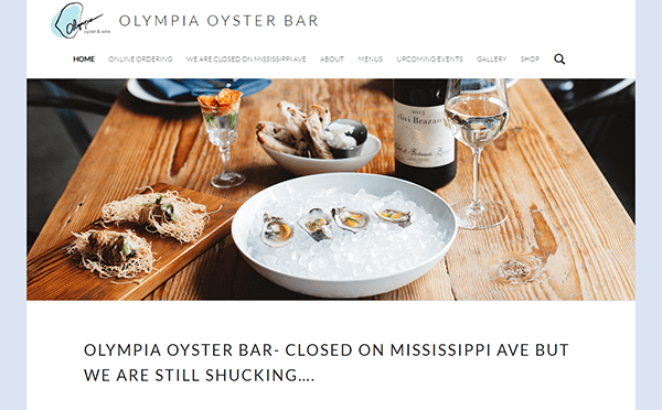
- Olympia Oyster Bar in Portland offers a website that combines elegance with functionality. The design features high-quality images and a straightforward layout, making navigating easy for visitors. The site includes menus, reservations, and events sections, providing a comprehensive view of Olympia Oyster Bar’s offerings. The homepage highlights the latest news and special offers, encouraging visitors to stay engaged with the restaurant’s happenings. The elegant and user-friendly design makes Olympia Oyster Bar’s website a standout example of restaurant website design.

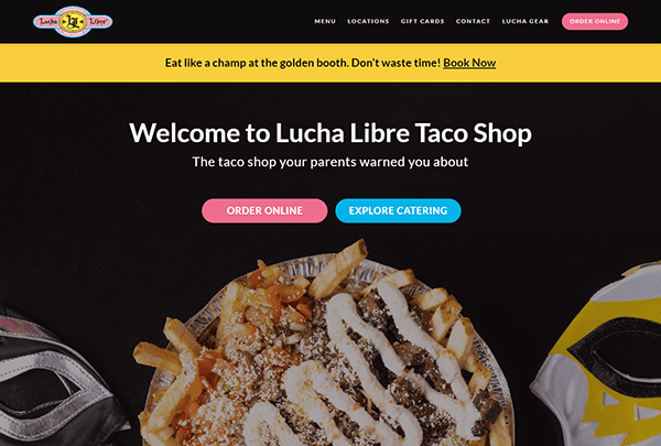
- Lucha Libre Taco Shop in San Diego features a playful and vibrant design that reflects the fun and energetic atmosphere of the restaurant. The site includes menus, online ordering, and gift card purchasing sections, ensuring a seamless user experience. The homepage highlights the latest news and special offers, encouraging visitors to stay engaged with Lucha Libre Taco Shop’s happenings. The lively and engaging design makes Lucha Libre Taco Shop’s website a great example of the best restaurant websites.

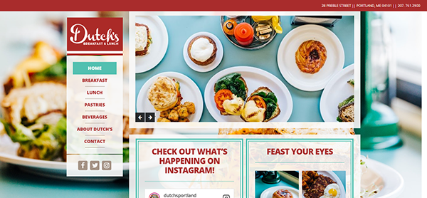
- Dutch’s in Portland, ME, features a clean, minimalist, and modern design that makes it easy for visitors to find essential information. The site includes sections for menus, online ordering, and reservations, ensuring a seamless user experience. The homepage highlights the latest news and special offers, encouraging visitors to stay engaged with Dutch’s happenings. The straightforward and functional design makes Dutch’s website a great example of the best restaurant websites.
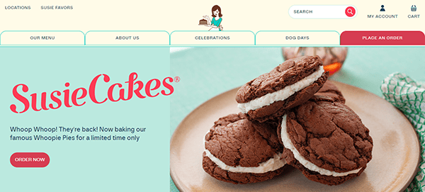
- SusieCakes has multiple locations and offers a website that reflects the warm and friendly ambiance of the bakery. The design features high-quality images and a straightforward layout, making navigating easy for visitors. The site includes menus, online ordering, and gift card purchasing sections, providing a comprehensive view of what SusieCakes offers. The homepage highlights the latest news and special offers, encouraging visitors to stay engaged with the bakery’s happenings. The inviting and user-friendly design makes SusieCakes’ website a standout example of restaurant website design.

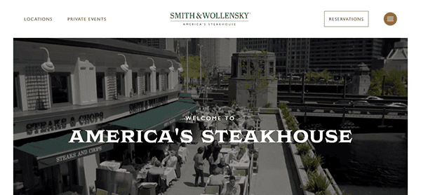
- Smith & Wollensky has multiple locations and features a sleek and modern design that reflects the sophisticated atmosphere of the steakhouse. The site includes menus, reservations, and events sections, ensuring a seamless user experience. The homepage highlights the latest news and special offers, encouraging visitors to stay engaged with Smith & Wollensky’s happenings. The elegant and engaging design makes Smith & Wollensky’s website a great example of the best restaurant websites.

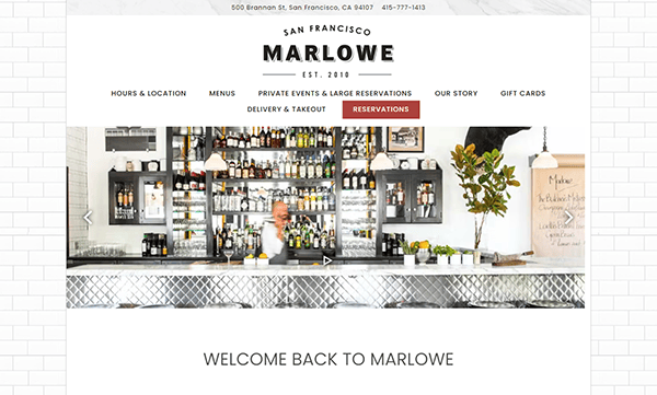
- Marlowe in San Francisco offers a website that combines elegance with functionality. The design features high-quality images and a straightforward layout, making navigating easy for visitors. The site includes menus, reservations, and events sections, providing a comprehensive view of what Marlowe offers. The homepage highlights the latest news and special offers, encouraging visitors to stay engaged with the restaurant’s happenings. The elegant and user-friendly design makes Marlowe’s website a standout example of restaurant website design.

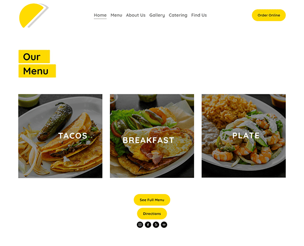
- Tacos Poncitlan: The Tacos Poncitlan website offers a vibrant and visually appealing design that perfectly captures the essence of authentic Mexican cuisine. Bright colors and high-quality food images instantly grab attention, creating a mouth-watering experience for visitors. Navigation is smooth, straightforward, and intuitive, making it easy for users to find menu items, location details, and contact information. The clean and well-organized layout allows for a seamless browsing user experience on desktop and mobile devices.

Top 10 Most Important Aspects of a Website for Restaurants
- Clear Navigation: Ensure that visitors can easily locate information about your menu, location, and contact details.
- Mobile-Friendly Design: Optimize your webpage for mobile devices to reach a wider audience.
- High-Quality Images: Use professional images for dishes and restaurant interiors to create a polished look.
- Engaging Content: Include a blog, newsletter, and exclusive content to keep visitors engaged.
- Social Media Integration: Connects to social media profiles to build a community around your restaurant.
- Online Ordering: Offer visitors a way to order food directly from your website.
- Reservation System: Integrate a reservation system to streamline the booking process.
- SEO Optimization: Ensure your web page is optimized for search engines to increase visibility.
- Contact Information: Make contacting you or your representatives easy for visitors.
- Consistent Branding: Use a cohesive design that reflects your restaurant brand and the atmosphere of your establishment.
Ready to elevate your restaurant’s digital footprint? Contact CyberOptik for a free consultation about your restaurant website design and set your business on a path to digital excellence.

