Just looking for our Best Residential Roofing Website examples list?
Why a High-Performing Roofing Website Is Your Most Valuable Sales Tool
The residential roofing industry is fiercely competitive, and your online presence is often the first—and sometimes only—impression you make on potential customers. With homeowners turning to search engines for everything from emergency roof repair to comparing roofing contractors for a new roof, your website must do more than look good. It needs to work hard.
Today, your website is your best salesperson. It never sleeps, doesn’t take breaks, and speaks directly to homeowners looking for trustworthy, professional service. Yet, many roofing companies settle for generic templates or outdated designs that drive traffic away instead of generating leads.
This guide is built to help roofing service providers create a well-designed website that reflects their brand and drives measurable business results while curating a strong online presence. From strategic layout and trust-building features to location-specific SEO strategies and smart conversion tactics, you’ll learn how to build a roofing website that works as hard as you do.
Whether you’re launching a new roofing business or want to upgrade your existing site, this guide will walk you through every element that separates average roofing sites from the best roofing websites dominating the market. Let’s dive in and start building your strongest online asset yet.
Website Planning & Purpose
Before diving into visual elements and SEO, successful roofing websites begin with clear, strategic planning. The planning phase ensures your site isn’t just a digital brochure—it becomes a powerful tool for lead generation, customer education, and long-term growth.
For roofing contractors, the first step is identifying your business goals. Are you looking to increase roof inspection appointments? Do you want to attract more high-end roof replacement jobs or generate more inquiries in a specific service area? Your answers will shape your website structure, calls to action, and content strategy.
Next, define your audience. Most residential roofing clients are homeowners who may be stressed, budget-conscious, or unsure of what they need. Your website must guide them clearly—from showcasing your credentials and services to offering easy ways to get a free estimate. It should feel like you’re anticipating their questions before they ask them.
In this phase, also map out the content and pages you need: service area pages, roof types, testimonials, photo galleries, financing info, and blog posts on roof maintenance and seasonal tips. A detailed sitemap helps ensure nothing important is missed and supports roofing SEO from the ground up.
The planning stage is your opportunity to align your website’s purpose with your company’s goals. With a strong foundation, every page can reinforce your message, engage users, and convert traffic into qualified leads for your roofing business.
Site Design Principles
A well-designed website doesn’t just look professional—it builds trust, encourages action, and turns visitors into leads. Residential roofing clients are often seeking reassurance and convenience, and design plays a major role in delivering both.
First, prioritize mobile-first design. Most users will access your site from their phones, especially when dealing with urgent issues like storm damage. Your site must load quickly, look sharp, and function smoothly on every device.
Next, ensure the visual hierarchy is intuitive. Use large, readable fonts, clearly labeled navigation, and distinct buttons that lead visitors to actions like scheduling a roof inspection or requesting a free estimate. Each page should guide users toward a single goal without distractions.
Use high-quality photography to establish credibility. Showcase completed projects, happy clients, and your team in action. Real images of your work are far more convincing than stock photos.
Color and branding should reflect professionalism and clarity. Stick with a clean color palette that aligns with your logo and is accessible to all users. Consistency across pages creates a polished experience.
Trust elements should be embedded into the design, not treated as afterthoughts. Include badges for certifications, associations, and insurance coverage. Prominently display customer reviews, especially those tied to specific neighborhoods or services.
If you’re unsure where to start, look at what’s working. This post on roofing website design outlines additional tips that can help shape your approach.
Finally, keep calls to action prominent and frequent. Whether it’s a sticky button in the header or a form embedded after service descriptions, make it easy for users to take the next step. An effective site uses design to guide, engage, and convert every type of visitor—from the cautious researcher to the urgent homeowner ready to book.
Site Content & Navigation
The structure of your content and navigation directly impacts how easily visitors can find the information they need and take action. In this industry, where decisions are often time-sensitive and trust is critical, intuitive site navigation and clear content hierarchy can make or break a lead.
Begin with a clean and focused primary navigation menu. Limit it to essential items such as Home, Services, About, Gallery, Reviews, Blog, and Contact. Under Services, offer dropdown options for specific offerings like Roof Repair, Roof Replacement, Emergency Services, and Maintenance. If you serve multiple cities or counties, create dedicated Service Area pages that are easily accessible.
Every page should have a clear purpose and one main call to action. Use headings and subheadings to guide the reader down the page, and organize content into digestible sections with bulleted lists or FAQs where helpful.
Homepage content should give a quick overview of your value proposition, service areas, and why homeowners should choose your company. Include links to your most important pages to funnel visitors deeper into the site.
For service pages, be specific. Include photos, benefits, pricing cues, and process explanations. For example, a Roof Replacement page might describe how long the job takes, what materials are used, and what warranties are offered.
Your blog is another crucial component. It should answer common homeowner questions and support your SEO strategy. Topics like “How to Know When You Need a New Roof” or “The Best Time of Year for a Roof Inspection” attract organic traffic and establish authority. For inspiration on how to leverage content effectively, check out this guide on roofing marketing.
Always link related pages together to improve user flow and SEO. For instance, your blog post on hail damage should link to your Emergency Roof Repair service page. This keeps users engaged and signals relevance to search engines.
Ultimately, great content paired with smart navigation creates a user experience that’s both helpful and persuasive—turning browsing homeowners into paying customers.
Visual Elements
Visual elements are powerful tools to build trust, guide user behavior, and reinforce your brand. For roofing websites, visuals often create the first emotional connection with the visitor and influence whether they stay or bounce.
Hero images should showcase your best work in real-world settings. Use crisp, high-resolution photos that demonstrate the quality of your roofing projects. If you offer both residential and commercial services, consider a homepage slider that features both to instantly clarify your capabilities.
Before-and-after galleries are incredibly effective. They illustrate your craftsmanship and serve as social proof. Visitors want to see transformation and results—showing the impact of your work through compelling visuals builds credibility.
Icons and custom graphics can make complex ideas easier to understand. Use them to highlight warranties, service steps, or emergency availability. Interactive elements like clickable icons or process timelines also enhance engagement.
Consistency in style is key. Fonts, colors, button styles, and image treatments should align with your brand identity across every page. Visuals should support your message, not compete with it.
Videos are another impactful medium. Consider a brief homepage intro video or testimonial clips from past clients. Videos humanize your brand and give prospective customers a reason to trust you.
Strategic visual placement also affects performance. Use contrast to draw attention to key CTAs. Add subtle hover effects on buttons or images to signal interactivity. Structure each page to include a focal visual element—whether it’s a featured project, customer quote with photo, or a short explainer video.
To explore proven visual strategies specific to the roofing industry, check out this guide to the 15 Converting Elements Every Roofing Contractor Needs. Incorporating the right visuals can transform your site from a static brochure to a powerful digital tool that engages visitors and inspires action.
Ongoing WordPress Maintenance
Building a high-performing website is only the beginning. Keeping it updated, secure, and running smoothly requires consistent WordPress maintenance. Roofing companies that neglect site upkeep often experience issues that impact performance, security, and search rankings.
Start by ensuring your WordPress core, themes, and plugins are always up to date. Updates often contain security patches and compatibility improvements. Running outdated software can expose your site to vulnerabilities that hackers exploit.
Backups should be automatic and frequent. Daily backups stored off-site provide peace of mind and ensure your site can be quickly restored if anything goes wrong. Combine this with uptime monitoring to alert you if your site becomes unavailable.
Speed optimization is another critical component. As roofing prospects are often browsing from mobile devices, your website needs to load fast. Regularly audit performance using tools like Google PageSpeed Insights or GTmetrix, and make improvements to image sizes, caching, and code structure as needed.
Security should never be an afterthought. Use a web application firewall (WAF), limit login attempts, enforce strong passwords, and run regular malware scans. These steps help protect your brand reputation and customer trust.
Also, keep your website content current. Update galleries with recent roofing projects, refresh blog posts to reflect seasonal services, and revise copy to reflect new service offerings or certifications. Stale content can hurt your credibility and SEO.
By maintaining your site regularly, you ensure it continues to deliver a fast, secure, and effective experience for your customers—without interruptions that could cost you leads or damage your brand.
Best Roofing Website Design Examples
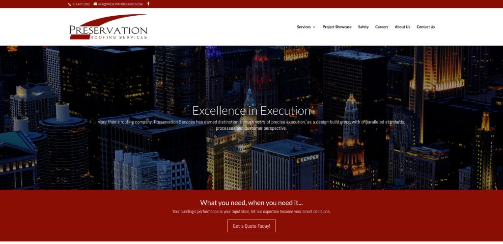
1. Preservation Services
Location: Chicago, IL
- Clean layout with high-contrast CTAs to request a quote
- Real project images showcase trust and local expertise
- Clear service breakdown per roofing type
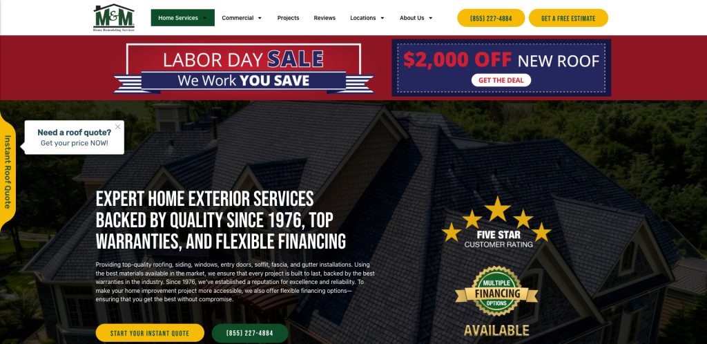
2. M&M Home Remodeling Services
Location: Crete, IL
- Simple navigation paired with a fast-loading design
- Customer-focused homepage with CTA in header
- Video testimonials integrated into design
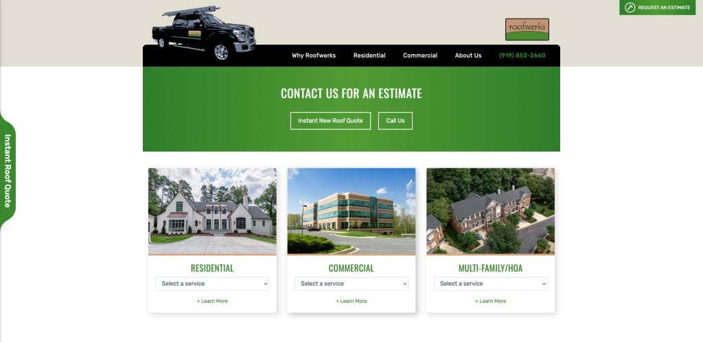
3. Roofwerks
Location: Raleigh, NC
- Sleek, modern layout that prioritizes mobile performance
- Prominent local awards and certifications build authority
- Service menu makes it easy to navigate by roofing type
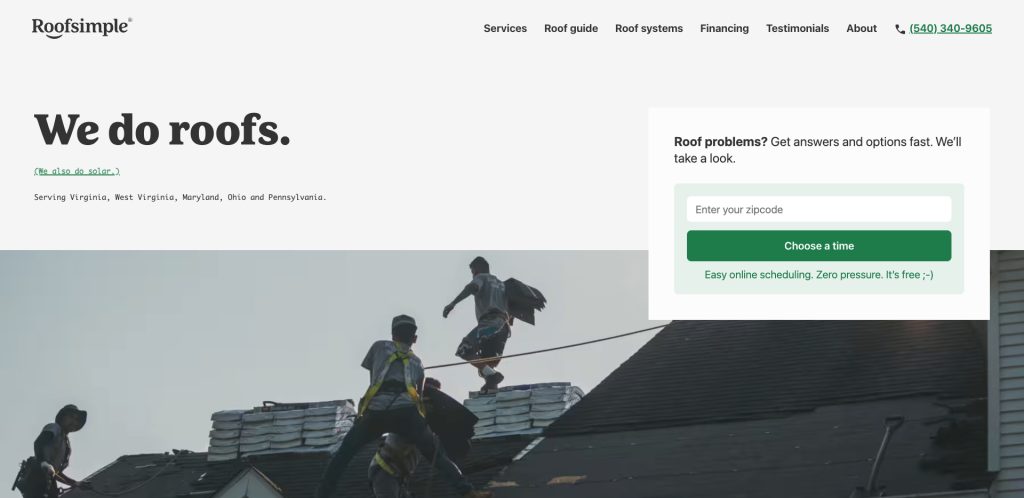
4. Roofsimple
Location: Winchester, VA
- Interactive roof visualizer tool
- Conversion-focused layout with multiple CTAs
- Strong use of iconography for service types
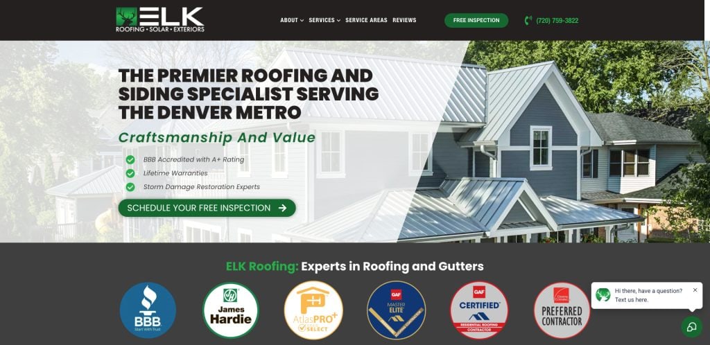
5. Elk Roofing
Location: Austin, TX
- Trust badges throughout the homepage for immediate confidence
- Bold typography emphasizing their residential focus
- Embedded customer stories and photos
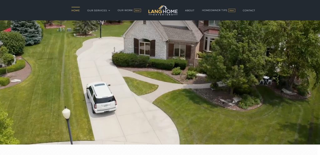
6. Lang Home Exteriors
Location: Orland Park, IL
- Service-focused homepage designed for conversions
- Integrated gallery with images of completed roofing projects
- Localized SEO-friendly service area sections
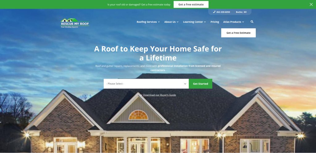
7. Rescue My Roof
Location: Butler, WI
- Bright, bold design that matches the company’s fun brand voice
- Transparent pricing cues and financing integration
- Real project galleries categorized by roof material
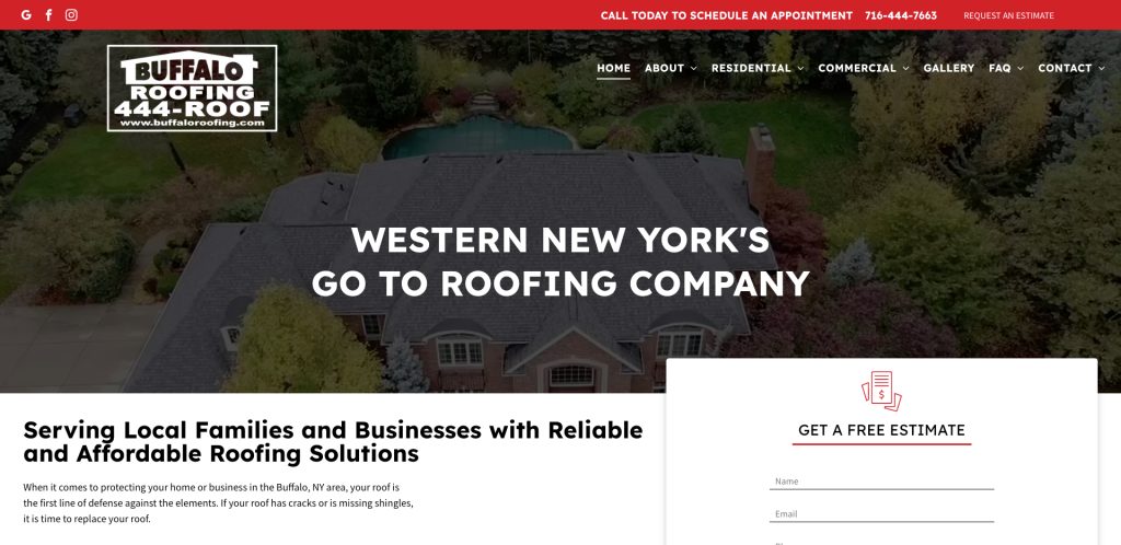
8. Buffalo Roofing
Location: Kearney, NE
- Well-organized structure with a distinct residential focus
- Gallery and reviews are built into the homepage design
- Multiple CTAs tailored to customer readiness
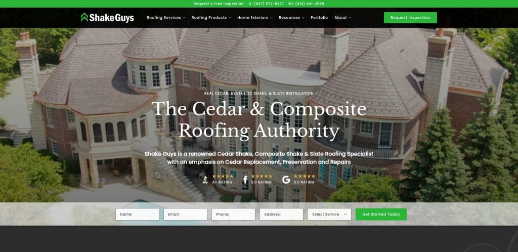
9. Shake Guys
Location: Lake Zurich, IL
- Niche branding focused on cedar shake roofing
- Educational content directly embedded into navigation
- Unique visual identity across pages
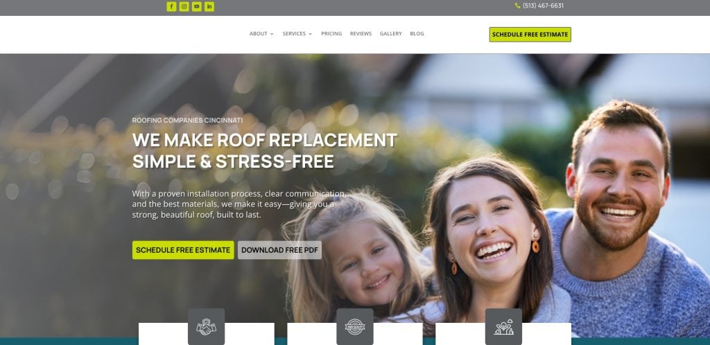
10. Advantage Roofing
Location: Cincinnati, OH
- “Why Choose Us” section near the top of the page highlights their USP
- Logical navigation path that supports the customer journey
- Embedded video testimonials bring social proof to life
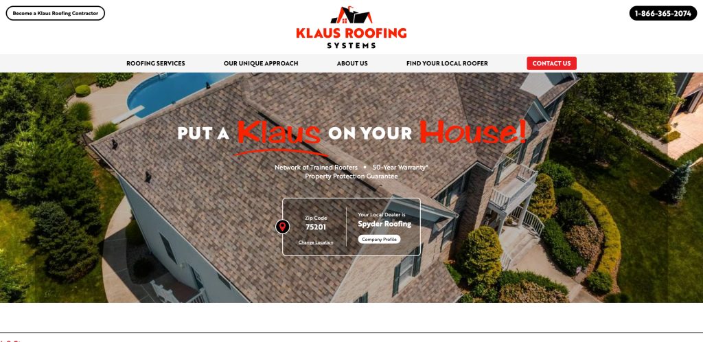
11. Klaus Roofing Systems
Location: Seymour, CT
- Visual segmentation of roof repair vs. replacement
- Nationwide franchise branding that still feels local
- “Get a Free Estimate” above the fold
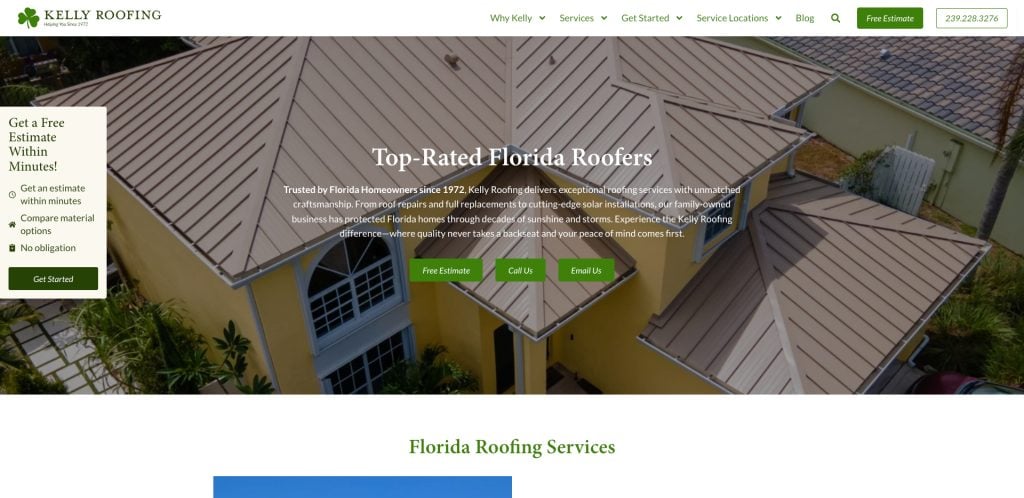
12. Kelly Roofing
Location: Naples, FL
- Vivid project photography and video banner
- CTA-rich site targeting both residential and commercial
- Integrated resource center with downloadable content
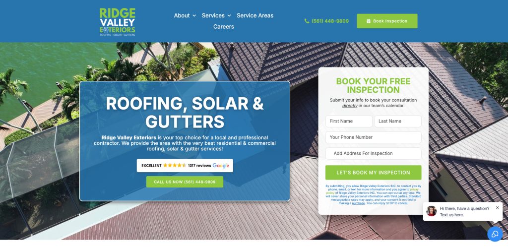
13. Ridge Valley Exteriors
Location: Cumming, GA
- Emphasizes client education through blog and videos
- Real-time scheduling feature
- Trust logos throughout design
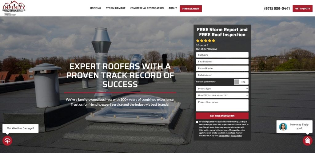
14. Infinity Roofing & Siding
Location: Houston, TX
- Modular homepage sections organized by buyer intent
- “Why Infinity” brand story above testimonials
- Structured roof types and insurance claims info
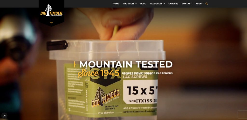
15. Big Timber Construction Fasteners
Location: Billings, MT
- Warm design that reflects local identity
- Clear navigation from the homepage to the estimate
- Full-width testimonials and community links
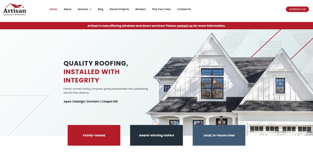
16. Artisan Quality Roofing
Location: Cary, NC
- Polished look with strong calls to action
- Roofing and gutter services are cleanly divided
- FAQ and testimonials linked directly from the homepage
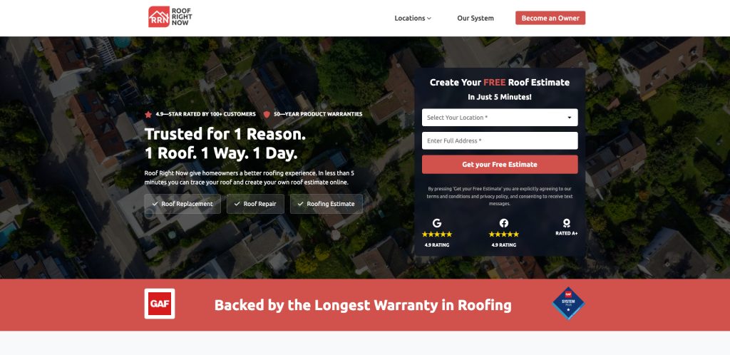
17. Roof Right Now
Location: Seattle, WA
- “Instant Quote” tool featured on homepage
- Tight copy and headline strategy
- Bright CTA buttons and visible financing options
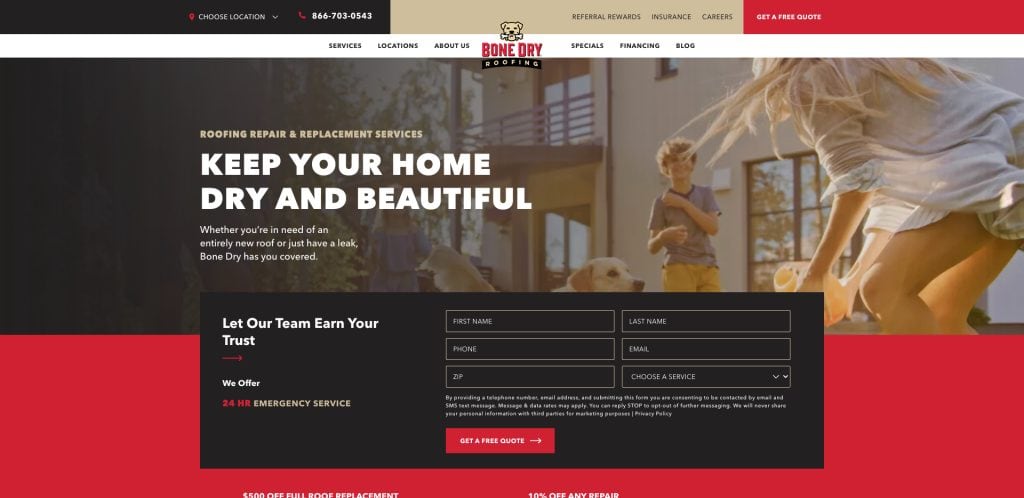
18. Bone Dry Roofing
Location: Indianapolis, IN
- Clean grid system for services and blog
- Focused on roof inspections and repairs
- Custom icons support fast information scanning
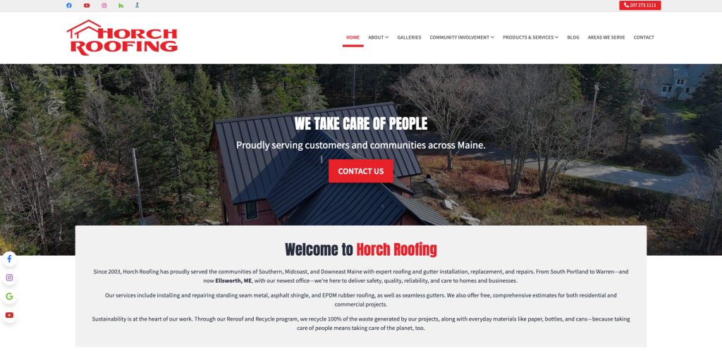
19. Horch Roofing
Location: Warren, ME
- Unique color scheme for regional branding
- Strong community and sustainability messaging
- Bold lead forms are embedded in several scroll zones
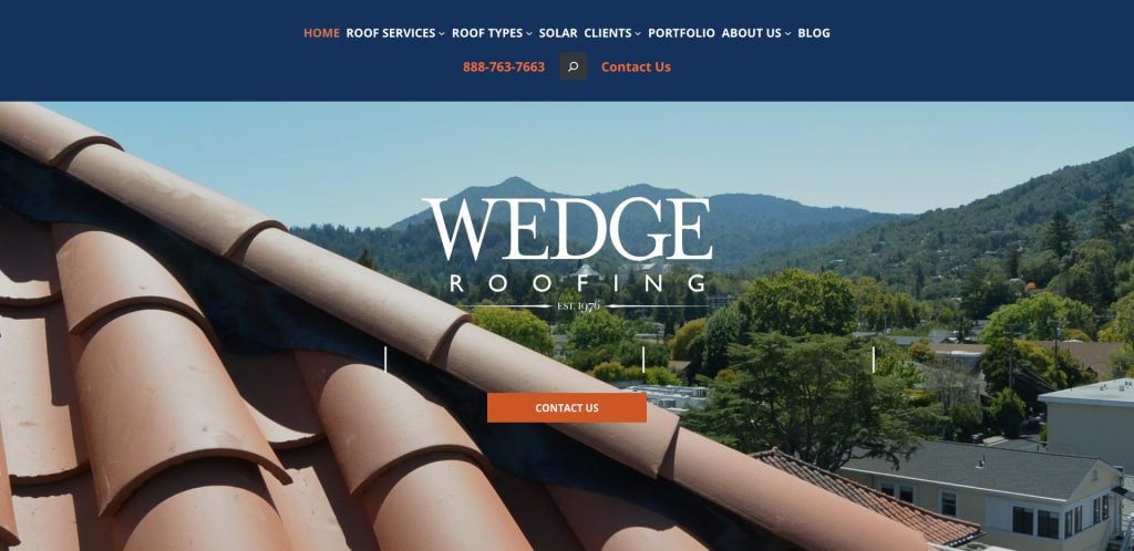
20. Wedge Roofing
Location: Petaluma, CA
- Elegant visual hierarchy with embedded certifications
- Long-scroll homepage loaded with service insights
- Optimized for mobile with click-to-call actions
Take the Next Step Toward a High-Impact Roofing Website
If you’re ready to build a roofing website that reflects your brand, drives quality leads for your roofing business, and sets you apart from competitors, it’s time to work with a partner that understands what makes an effective roofing website.
Our team specializes in professional web design tailored for roofing. We help contractors build a website from scratch or redesign an existing one using proven SEO best practices, clear structure, high-quality images of completed roofing work, and a user-friendly design that converts.
Let’s make your roofing company site work as hard as you do.
Residential Roof Site Design FAQs
What makes a great professional website?
A great site includes clear calls to action, a user-friendly design, high-quality images of completed projects, and localized SEO content. It should reflect your roofing brand and make it easy for users to request a quote or get a free estimate.
How can I track website performance?
You can track website performance using tools like Google Analytics, Search Console, and heatmapping software. These tools help monitor metrics such as bounce rate, form submissions, traffic sources, and how users engage with specific pages—essential for growing your roofing business.
What pages should I include when building a roofing company website?
Key pages include a professional roofing website homepage, individual service pages (like roof replacement or inspections), an About page, testimonials, a project gallery, and a Contact page with multiple CTA buttons. For best results, incorporate roofing content that addresses specific types of roofing and location-based services.
Should I use roofing website templates or build from scratch?
Templates can offer a fast start, but a custom-built site tailored for roofing businesses provides more flexibility and SEO potential. A custom site allows better integration of design features that reflect your brand, highlight your best projects, and support future marketing campaigns.
How do I choose a website builder for a roofing and construction site?
If you’re not hiring professionals, select a builder that supports responsive templates, SEO tools, and integration with CRMs. However, working with roofing web design experts ensures your website is built for performance, speed, and conversions—especially if your focus is on designing your website for lead generation.
What kind of images should I include?
Use images of completed projects that showcase before-and-after results, team professionalism, and the types of roofing services you provide. These visuals build trust and are key to effective website building in the roofing industry.
How often should I update my content?
Update your content quarterly to reflect seasonal services, promotions, certifications, and new testimonials. Consistent updates improve rankings and help you stay top of the page in search results.
Do I need SEO for my website?
Yes. Using SEO best practices helps your website rank for searches like “looking for roofing services” and “roof repair near me.” It’s essential for generating leads, especially in competitive local markets.
Can I get design services specifically tailored for roofing?
Yes. At our full-service digital marketing agency, we offer design services tailored for roofing to help you build your roofing site with strategy, conversion, and long-term growth in mind.
What’s the best way to start designing your roofing website?
Start by clarifying your business goals, audience, and unique value. Then partner with a team that understands roofing web design projects and can execute a site that reflects your expertise and drives quality leads.


