The importance of an excellent website for businesses in the residential construction industry cannot be overemphasized. A well-made website set as the digital storefront of a construction company, offering the first impression to potential clients. It’s not just about aesthetics; it’s about functionality, user experience, and the ability to convey trust and professionalism. The best residential construction websites go beyond showcasing beautiful images of homes and projects; they provide visitors with an intuitive, informative, and seamless online experience that reflects the quality and reliability of the service offered.
A website is critical for small construction companies to level the playing field with larger competitors. A small construction company website can demonstrate expertise, showcase past projects, and provide essential information about services and contact details. It’s an opportunity to tell your brand’s story and connect with your target audience on a personal level. In an industry where trust and credibility are paramount, a professional website can be the deciding factor for homeowners looking to embark on a construction project.
Moreover, construction company website examples serve as inspiration and benchmarks for achievable goals. They highlight the latest trends in web design, such as responsive design, user-friendly navigation, and engaging content. These elements are crucial for attracting and retaining visitors, converting leads into customers, and, ultimately, driving business growth. In the competitive landscape of residential construction, having a standout website is not just an advantage; it’s a necessity.
Examples of the Best Residential Construction Website Designs
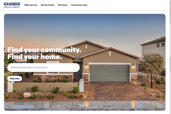
- D. R. Horton: Visitors to their website are greeted with an easy-to-use and visually appealing interface. Beautiful video graphics presenting their wide range of house construction services and outcomes for 45 years greet you as soon as you land on the homepage. The design is simple yet properly organized, making it easy for users to move between areas without a saturated feeling of information. Finding pertinent information is simple whether you’re a seasoned homeowner or a first-time buyer because of the user-friendly design. Finding the perfect home to match your location preferences and needs is made simple with its comprehensive search options for location.
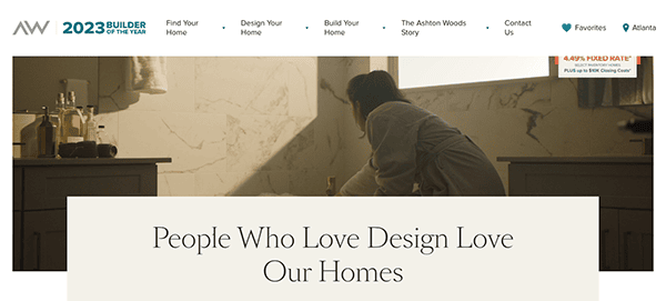
- Aston Woods: Its website captivates you with its simple and easy-to-use interface as soon as you land on the homepage. The welcoming ambiance of high-quality photography and videography, contemporary font, and clean lines draw visitors in. Because of the minimalistic style, the homes’ beauty is always at the forefront and can be appreciated without effort. Users may easily navigate the website with clearly marked menus and easy-to-follow browsing paths. Their website guarantees that assistance is always accessible. User-friendly client support channels, such as live chat and contact forms, facilitate accessible communication between users and trained staff who are available to answer questions and offer tailored assistance.
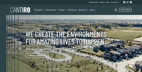
- Cantiro Homes: The website’s visually striking design features create a fascinating experience. Its sophisticated layouts, eye-catching graphics, and elegant typography give viewers an immersive experience that leaves a memorable impression. Finding your dream home has never been easier with their customizable home search tool. The website offers a simple and easy-to-use navigation system. Users easily navigate the website because of well-organized menus, simple browsing paths, and well-placed call-to-action buttons. Its enlightening resources and guides demonstrate its dedication to openness and education, giving prospective homeowners the knowledge they need to confidently traverse the path to homeownership.
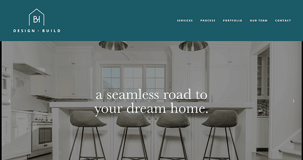
- BH Design & Build: The website’s sleek, contemporary design evidently enhances its visual appeal. It perfectly captures the inventiveness and professionalism of its services. High-quality photos display the company’s portfolio correctly, enabling viewers to recognize the skill and attention to detail that goes into each job. Customer testimonials give the content more authority and assurance, which gives prospective customers more confidence. Call-to-action buttons are set up strategically around the website to encourage users to take the following action: contacting the business with questions, setting up a consultation, or reading through more of the information.
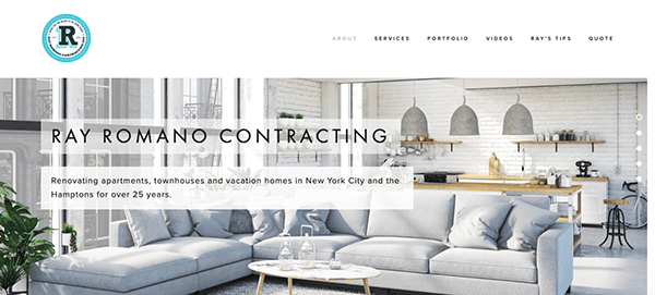
- Ray Romano Contracting: The website design’s eye-catching images and elegant arrangement initially attract visitors. High-resolution photos of completed projects highlight the company’s diligence in refining outcomes and meticulous attention to detail. The carefully selected color scheme conveys a feeling of sophistication and professionalism consistent with the company’s brand identity. Every project is accompanied by interesting written content that offers insightful information about the company’s methodology, level of experience, and commitment to client pleasure. The inclusion of client testimonials, which lend genuineness and trustworthiness to the content, reassures prospective customers about the satisfaction of clients and the company’s track record of success.
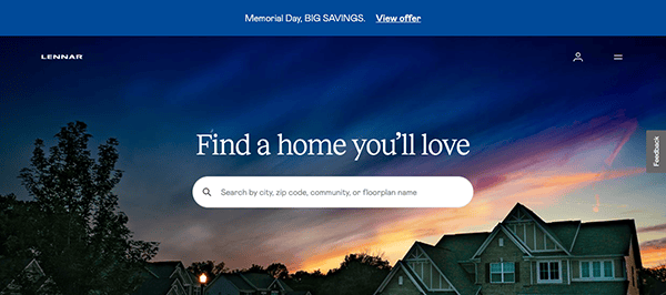
- Lennar Corp: The website welcomes users with an innovative, vibrant layout that immediately grabs their attention. Bright images highlight its wide variety of features and communities, stimulating curiosity and encouraging exploration. Homebuyers can easily find their desired home with the help of the extensive property search engine available on its website. Users can refine their options using the advanced search filters by selecting from various factors, including features, location, and more. The website features a responsive design that guarantees excellent performance and usefulness on PCs, laptops, tablets, and smartphones, among other devices.
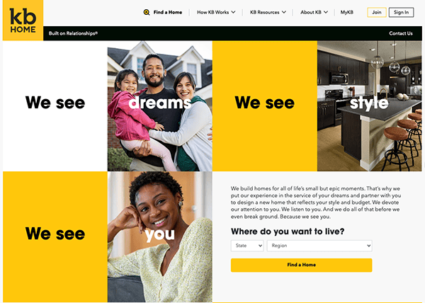
- KB Home: The website has a simple-to-operate layout that improves user experience. The color combination mainly comprises warm, welcoming tones like vivid yellows, gentle neutrals, and whites. Visitors are greeted by an eye-catching design on the homepage, which highlights essential components like featured communities, available floor plans, and exclusive deals right away. Users can easily traverse the site since enough white space is used to prevent the material from feeling congested. Each element is thoughtfully constructed to provide a seamless browsing experience, and the subtle animation features make a smooth transition between sites. Its website also excels in creating engaging Call-to-Actions (CTAs) that cue viewers to take specific actions and guide them through the home construction journey.
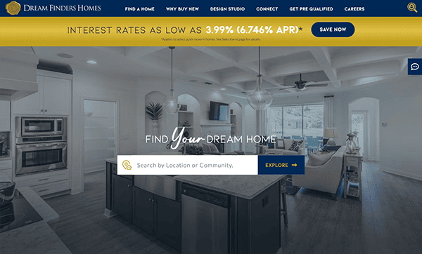
- Dream Finder Homes: Whether a visitor is looking through floor plans, communities, or move-in-ready houses, the site’s simple navigation and clean structure make it easy for them to explore the wide range of offers. The site has a sophisticated appearance because of its chosen colors—white, navy blue, and gold highlights. Because of the site’s user-friendly interface, simple menu, and noticeable call to action, visitors will find surfing it to be easy. The high-quality images showcase the beauty and craftsmanship of their homes, providing virtual tours and immersive experiences that bring the services to reality. Utilizing eye-catching components like images, tasteful animations, and user-friendly navigation encourages visitors to delve deeper and take advantage of abundant resources.
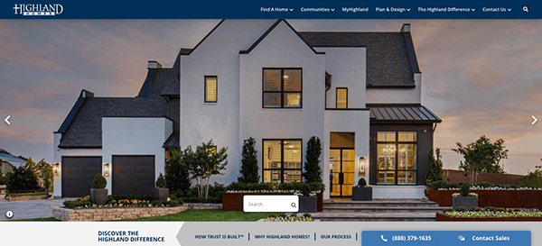
- Highland Homes: Visitors to the website are greeted by an aesthetically attractive design that emanates modernity and beauty. The simple style and thoughtful use of whitespace create a sense of sophistication, making for a wonderful browsing experience. The well-organized menu allows users to navigate between components such as available communities, floor plans, and design possibilities effortlessly. Its commitment to inclusive communication options, such as phone numbers and live chat assistance, demonstrates its priority to client pleasure and accessibility. Whether viewers prefer the ease of a phone call or the immediacy of live chat, it ensures that assistance is always available, making its process a smooth and enjoyable experience for everyone.
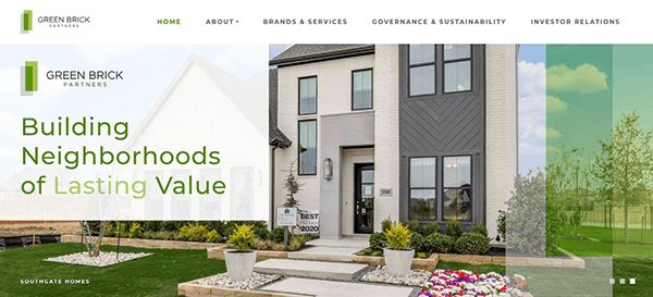
- Green Brick Partners: The website has a slick and modern design appearance. Using a clean style with abundant white space creates a sense of openness and clarity, allowing visitors to explore and discover the information they need. The website’s navigation is smooth and user-friendly. The information is clear, educational, and well-written; it is intended for both prospective investors and those looking to buy real estate in the towns in which they are situated. The menu layout is well-organized, allowing customers to easily browse through different categories such as “Brand and Services,” “Governance and Sustainability,” and “Investor Relations.” Unambiguous calls-to-action encourage users to take the desired actions, such as researching available properties or contacting the company for further information.
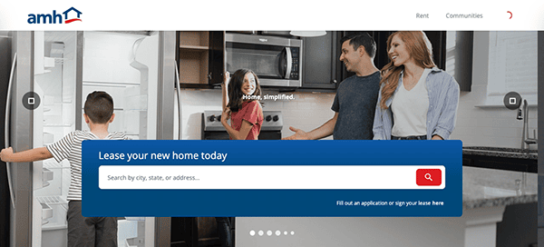
- AMH: The website instantly grabs visitors’ attention with its sleek, contemporary design approach. Its use of a tasteful color palette, crisp layout, and superior imagery projects dependability and credibility, solidifying its position as a respectable real estate business. The website uses interactive elements like hover effects and sliders to increase user interaction and provide a dynamic browsing experience. Additionally, the website is easy to navigate because of the clearly marked calls to action and well-structured menu.
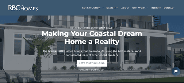
- RBC Homes: With its elegant yet functional design, the website is a model of digital competence for the residential construction industry. An essential component is the use of captivating multimedia material, such as films that capture the spirit of their work. Its online presence displays its skill in building dream homes and highlights its home renovation and protection services, catering to a wide range of homeowner demands. The website’s design demonstrates its dedication to quality and craftsmanship.
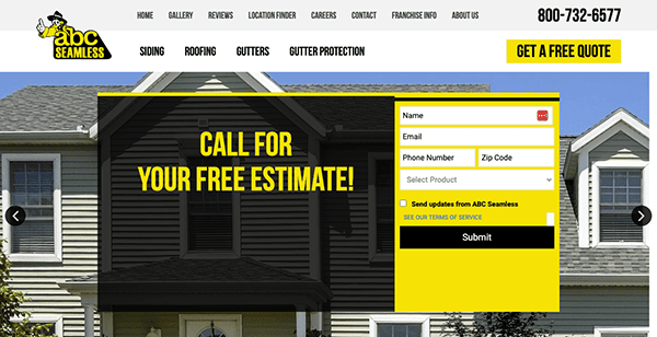
- ABC Seamless: Their website offers a clean, polished look that immediately gives off an air of professionalism and experience in the home remodeling sector. The simple layout, contemporary font, and unified branding elements produce a polished and unified appearance that is appealing to visitors. Comprehensive details regarding its array of services, which include siding, roofing, windows, doors, and gutters, are also available on its website. The writing is excellent, educational, and customized to meet the interests of homeowners looking for home remodeling ideas. Case studies and customer feedback are also used to establish credibility and demonstrate the company’s dedication to customer contentment. Its websites make it simple for users to proceed by offering options for seeking a quote and straightforward contact information with the use of clear CTAs.
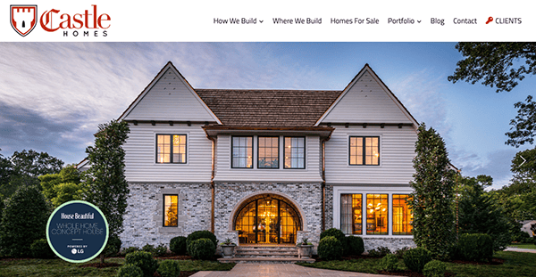
- Castle Homes: The company’s dedication to creating unique residential buildings is reflected in the website’s sophisticated and welcoming design. A classy color scheme, crisp layout, and excellent photography combine to produce an eye-catching experience that draws visitors in immediately. The website features captivating visuals that showcase its portfolio of custom-built residences. The options for arranging consultations and the readily available contact information help you advance. Visitors may quickly contact the organization to discuss their demands for custom home building, whether by a conspicuous contact form, phone number, or email address.
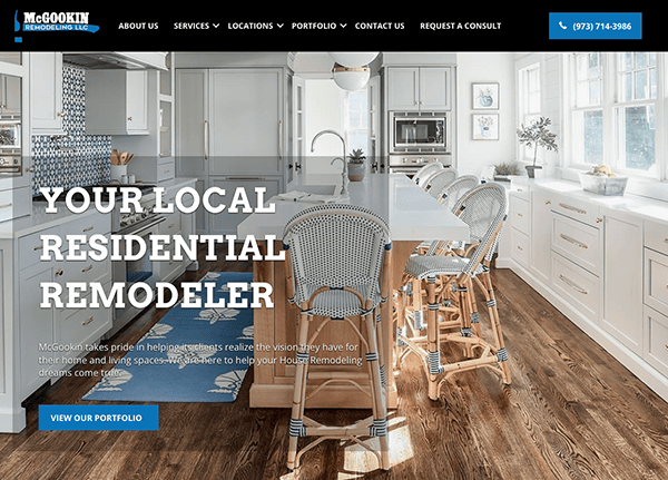
- McGookin Remodeling: Its website offers users a smooth surfing experience, embodying elegance and simplicity. Every design element, from the clean layout to the user-friendly navigation, highlights the company’s skill and professionalism. The color scheme is well-chosen, maintaining a unified look while improving readability with a pleasing combination of neutrals and highlights. Its website boasts intuitive navigation, guiding visitors to key areas such as services, portfolios, and contact information. The well-organized menu structure ensures that users can easily find what they want. Moreover, strategically placed call-to-action buttons encourage engagement, prompting viewers to the next step, whether scheduling a consultation or exploring the company’s past projects.
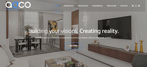
- Adco: The website has a distinct visual appeal, with stunning images showcasing its previous work and craftsmanship. Excellent photos of finished structures and construction sites demonstrate the company’s competence and give guests an eye-catching experience. The color scheme is well-chosen, maintaining a unified look while improving readability with a pleasing combination of neutrals and emphasis. Attention-grabbing headlines and captivating project and service descriptions draw readers in and communicate the company’s value proposition. Call-to-action buttons placed prominently on the page urge readers to interact and move forward, whether obtaining a quote or learning more about the organization’s services.
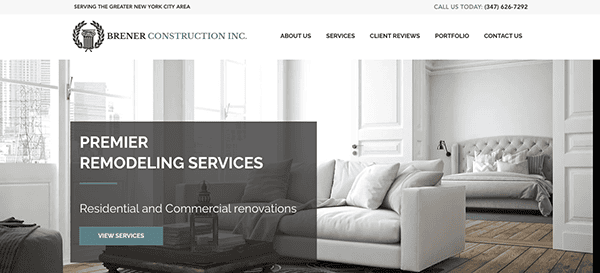
- Brener Construction Inc: The website uses a solid visual hierarchy to prioritize information and properly lead users through the content. Prominent components, such as service offerings and highlighted projects, attract attention and promote investigation. Because whitespace is strategically added around text and images, the design seems open and uncluttered, making it easier for users to concentrate on the most crucial components. The thoughtful placement of call-to-action buttons on their website ensures users can see them clearly and easily.
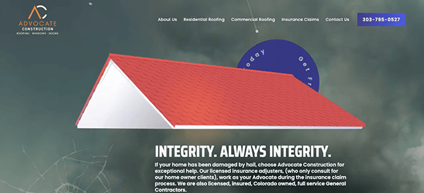
- Advocate Construction: When users land on the page, they will notice the animated header, which narrates a tale about the company’s goal. Against the ample negative space in the backdrop, the dominating red and orange, mixed with the dark blue, constitute a modern blend that creates a lot of contrast and implicit movement. The menu layout is clearly laid out, making it easy for users to obtain the information they need and guaranteeing that they do so promptly. Throughout the website, prominent call-to-action buttons are positioned to promote interaction and direct users toward the intended tasks, such as getting a quote or setting up a consultation.
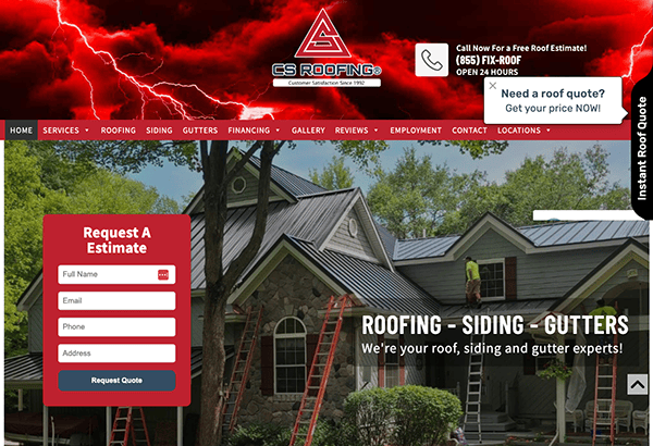
- CS Roofing: The website’s modern design and excellent photography make its visual appeal instantly apparent. Vibrant pictures of finished roofing jobs draw attention to the company’s skill and attention to detail, inspiring visitors to have faith in its abilities. The site’s overall look is created, and readability is improved by the well-chosen color scheme of red and white with a harmonic combination of tones. One of the website’s best attributes is its user-centric navigation. The main menu is organized logically, making it easy to find essential details about the business, its services, and how to contact it.
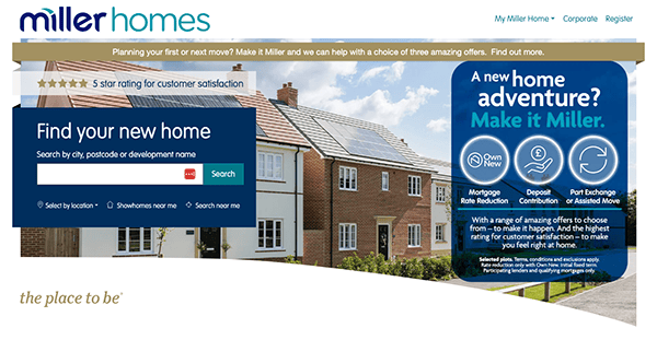
- Miller Homes: The website welcomes users with a neat, welcoming, and professional interface. The scheme of colors is well-balanced, combining warmth and modernism. Every page has been carefully designed to provide a plethora of information in an easily readable way. The combination of captivating text and eye-catching images informs and motivates prospective homeowners. Calls to action (CTAs) are strategically positioned to help visitors move from browsing to the next stage of the house-buying process.
As we have an in-depth understanding of the world of residential construction, it becomes clear that the leaders in this industry understand the power of a robust online presence. The best residential construction websites combine aesthetic appeal with functionality, creating an online environment where possible clients can find the information they need and feel inspired by what they see. These websites often feature portfolios of past projects, detailed service descriptions, client testimonials, and a clear call to action. They are designed not just to inform but to engage and persuade visitors to take the next step.
The digital landscape in residential construction is constantly evolving. Today’s top websites are not just about static images and text; they incorporate video tours, interactive floor plans, and customer service chatbots. They are optimized for search engines to ensure visibility in a crowded market. Furthermore, they are responsive, ensuring a seamless experience across all devices, from desktops to smartphones. This level of sophistication and attention to detail is what sets apart the best in the industry.
Choosing the right partner for your residential construction website design is crucial. At CyberOptik, we understand the unique challenges and opportunities within the construction industry. Our expert designers and developers are dedicated to creating custom websites that look great and perform exceptionally. Whether you’re a small construction company looking to make a significant impact or an established business aiming to elevate your online presence, we’re here to help.
Contact CyberOptik today for a free consultation about your residential construction website. Let us help you build a digital foundation that aids your business goals and drives success in the competitive world of residential construction.

