Just looking for our Best Realtor Website examples list?
Why Your Realtor Website Is Your Most Valuable Sales Tool in 2026
A great website doesn’t just showcase properties; it builds trust, captures leads, and positions you as the go-to expert in your local market. Yet too many realtors settle for cookie-cutter designs that fail to stand out or deliver results.
The reality is simple: clients are judging your professionalism and value the moment they land on your homepage. If your site is slow, outdated, or hard to navigate, you’re losing opportunities before you even speak to a prospect. On the other hand, a strategically designed, SEO-optimized website can become your 24/7 lead generator, converting browsers into buyers and inquiries into closed deals.
As top-tier web designers, we’ll walk you through everything you need to create a website that looks stunning but performs like a top producer. From foundational design principles to advanced conversion tactics and optimization best practices, this is your blueprint for building a high-converting digital presence in 2026.
Website Planning & Purpose
Before you dive into design elements or start adding listings, it’s essential to define the purpose and plan of your website. For professionals in the real estate industry, a website isn’t just a digital storefront—it’s a critical tool for lead generation, branding, and client engagement.
Start by identifying your primary goals. Are you focusing on showcasing listings? Do you want to attract sellers, buyers, or both? Are you targeting a specific geographic market or property type, like luxury homes or commercial real estate? Clearly defining these goals at the outset will shape every design and content decision moving forward.
Next, map out your ideal user journey. Think through the steps a potential client takes from landing on your site to reaching out for a consultation. Each page and feature should support this journey. For instance, a visitor searching for homes should easily find the listings section, be able to filter results by price or neighborhood, and schedule a showing in just a few clicks.
This planning phase also includes outlining must-have features, such as:
- An IDX integration for real-time listings
- High-resolution photography and video tours
- Clear calls-to-action for inquiries or appointments
- Contact forms and live chat functionality
- SEO-optimized neighborhood pages
In short, your website should be built around your business goals and your users’ needs. Taking the time to define its purpose and plan a strategic structure ensures your site doesn’t just look good—it performs with measurable impact.
Design Principles
An effective website must do more than look professional—it needs to drive engagement, build trust, and guide users toward taking action. The best real estate websites are grounded in core design principles that balance aesthetics with functionality, ensuring a seamless experience for every visitor.
Clarity and Simplicity
Prospective buyers and sellers come to your website with specific goals. Avoid overwhelming them with cluttered layouts or excessive information. A clean, simple design helps users quickly find what they’re looking for—whether it’s a property search, contact form, or agent bio. Prioritize whitespace, concise content, and intuitive navigation to keep your site user-friendly.
Visual Hierarchy
Effective real estate websites use visual hierarchy to direct attention to key areas, like featured listings or lead capture forms. Use contrast, scale, and spacing to emphasize important elements. Highlight calls-to-action (CTAs) with bold buttons and ensure headlines and subheadings guide the reader through each page smoothly.
Mobile-First Responsiveness
With a large percentage of users browsing on smartphones or tablets, your website must be fully responsive. Mobile users should enjoy the same fast load times, intuitive navigation, and functionality as desktop users. Prioritize mobile-friendly layouts and test every page across devices to eliminate friction in the user experience.
Brand Consistency
Your website should be a clear extension of your personal or brokerage brand. Use consistent colors, fonts, logos, and tone of voice throughout the site. A cohesive brand identity builds credibility and helps visitors remember you when they’re ready to act.
Accessibility
Ensure your site meets accessibility standards so all users, including those with visual or motor impairments, can access content. Use readable fonts, provide text alternatives for images, and enable keyboard navigation wherever possible. An accessible website demonstrates professionalism and broadens your reach.
Fast Load Times
In real estate, speed matters. Potential clients won’t wait for a slow site to load, especially on mobile. Optimize images, streamline code, and choose a reliable hosting provider to ensure quick load times that keep users engaged.
When applied thoughtfully, these design principles transform your website from a basic online presence into a strategic business asset that attracts, engages, and converts.
Content & Navigation
Content and navigation are the backbone of a high-performing website. They determine how easily visitors can find information, how well your site ranks in search engines, and how effectively it converts traffic into leads.
Clear, Purpose-Driven Navigation
Navigation should be intuitive and streamlined, guiding visitors through your site without confusion. A best-practice menu includes links to:
- Home
- About
- Property Listings (with filters by location, price, and type)
- Buyer and Seller Resources
- Testimonials
- Blog
- Contact
Avoid cluttering your navigation bar with too many links. Group related pages under dropdowns when necessary, and always ensure critical CTAs—like “Schedule a Showing” or “Contact an Agent”—are easily accessible.
Structured Content Layout
Each page should serve a distinct purpose and follow a consistent structure to enhance readability and engagement. Use headings (H1-H3) to organize content hierarchically, and break text into short paragraphs and bullet points to improve scannability.
The homepage should highlight your value proposition, showcase featured listings, and direct users toward their next step. Inside pages, such as service areas or blog posts, should include internal links to keep users exploring your site longer.
Property Listings That Convert
Your listings page should be the centerpiece of your content. Use IDX integrations to display up-to-date MLS data, and pair listings with high-quality images, video tours, and downloadable property sheets. Include CTAs like “Request More Info” or “Schedule a Tour” on every listing.
Localized and Resource Content
Create dedicated pages for neighborhoods or service areas with unique content about schools, amenities, and local market trends. This enhances optimization and positions you as a local expert. Supplement with blog posts, FAQs, and guides that educate buyers and sellers.
CTAs and Lead Capture
Every page should include a strategically placed CTA, whether it’s subscribing to a newsletter, filling out a contact form, or downloading a free homebuyer guide. Forms should be short and easy to complete, increasing the likelihood of conversion.
By combining clear navigation with strategic content structure, your website becomes more than informative—it becomes an effective tool for lead generation and client conversion.
Ongoing WordPress Maintenance
Maintaining a website isn’t a one-time task—it’s an ongoing process that ensures your website stays secure, fast, and fully functional. In the real estate industry, where listings change frequently and market trends shift quickly, a well-maintained website gives you a competitive edge and keeps potential clients engaged.
Regular Software Updates
WordPress core, themes, and plugins are updated regularly to improve performance, patch security vulnerabilities, and add new features. Ignoring these updates can leave your site exposed to hacks or cause functionality issues. A maintenance plan should include checking for updates at least once a week and testing them on a staging site before deploying live.
Security Monitoring and Backups
A realtor’s website often holds sensitive data from contact forms, client inquiries, and property databases. Regular security scans help detect malware, unauthorized login attempts, or outdated code. Daily backups ensure that if something goes wrong, like a plugin conflict or hack, you can quickly restore your site without data loss.
Performance Optimization
Speed is crucial for user experience and optimization. Monthly maintenance should include performance checks such as image optimization, database cleanup, and removing unused plugins or themes. These actions reduce page load times and improve overall site responsiveness, which is especially important for mobile users browsing listings on the go.
SEO and Content Audits
Search engine algorithms and real estate market conditions change constantly. Regular audits help identify outdated content, broken links, or declining keyword rankings. Updating neighborhood pages, blog content, and meta descriptions keeps your site fresh and aligned with current search trends.
Plugin and Integration Management
Many websites rely on integrations like IDX feeds, CRMs, and lead capture tools. These systems must be monitored for reliability and compatibility. Any change in third-party software can disrupt your site’s functionality, so ongoing maintenance ensures these tools continue working smoothly.
Technical Support and Troubleshooting
Having access to technical support ensures any unexpected issues, like broken forms or layout bugs, can be resolved quickly. This minimizes downtime and maintains a professional online presence that builds client trust.
A proactive approach to WordPress maintenance protects your website, maximizes its effectiveness as a lead generation and client engagement platform. For professionals, staying on top of site maintenance isn’t optional—it’s essential.
20 Award-Winning Real Estate Website Designs
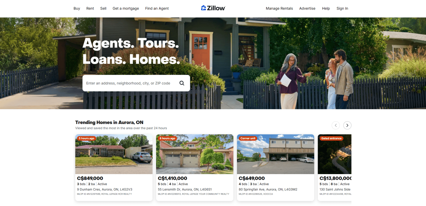
1. Zillow
Location: Seattle, WA
Key Takeaways:
- Extensive property database with user-friendly search tools
- “Zestimate” feature provides home value estimates
- Mobile app integration for on-the-go access
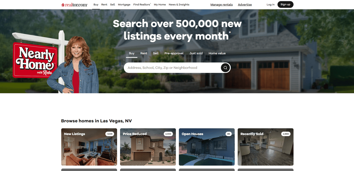
2. Realtor.com
Location: Santa Clara, CA
Key Takeaways:
- Direct MLS listings ensure up-to-date information
- Comprehensive neighborhood insights and school data
- Robust mobile experience
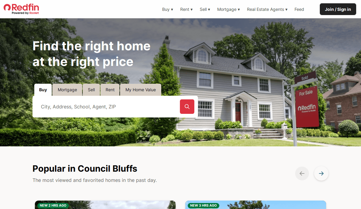
3. Redfin
Location: Seattle, WA
Key Takeaways:
- Real-time data updates every 5 minutes
- Integrated home tour scheduling
- Commission rebates for buyers
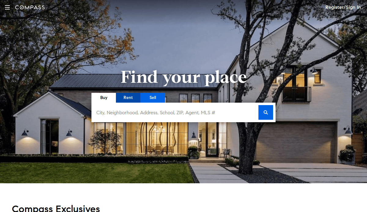
4. Compass
Location: New York, NY
Key Takeaways:
- Sleek, modern design emphasizing luxury listings
- AI-driven property recommendations
- Integrated marketing tools for agents
5. The Agency
Location: Beverly Hills, CA
Key Takeaways:
- Sleek, luxury-focused design that aligns with high-end clientele
- Strong use of video and visual storytelling throughout the site
- Integrated international search tools for global buyers and investors
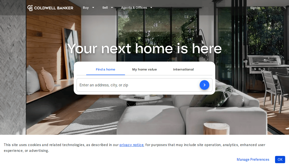
6. Coldwell Banker
Location: Madison, NJ
Key Takeaways:
- User-friendly interface with virtual tour options
- Comprehensive agent directory
- Strong emphasis on community involvement
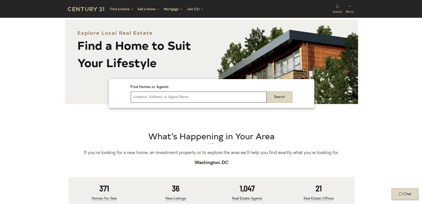
7. Century 21
Location: Madison, NJ
Key Takeaways:
- Bold branding with a focus on agent recognition
- Interactive neighborhood guides
- Mobile-optimized design
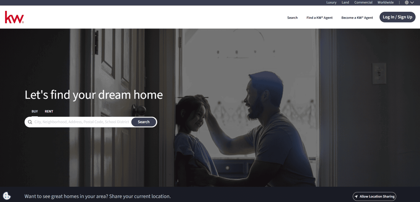
8. Keller Williams Realty
Location: Austin, TX
Key Takeaways:
- Robust training resources for agents
- Customizable agent websites
- Emphasis on technology and innovation
9. Douglas Elliman
Location: New York, NY
Key Takeaways:
- Focus on high-end real estate markets
- Detailed market reports and insights
- Strong agent branding
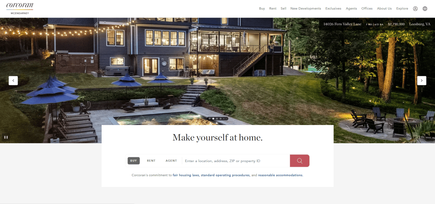
10. The Corcoran Group
Location: New York, NY
Key Takeaways:
- Visually appealing design with lifestyle content
- Emphasis on storytelling through property descriptions
- Integrated blog and market news
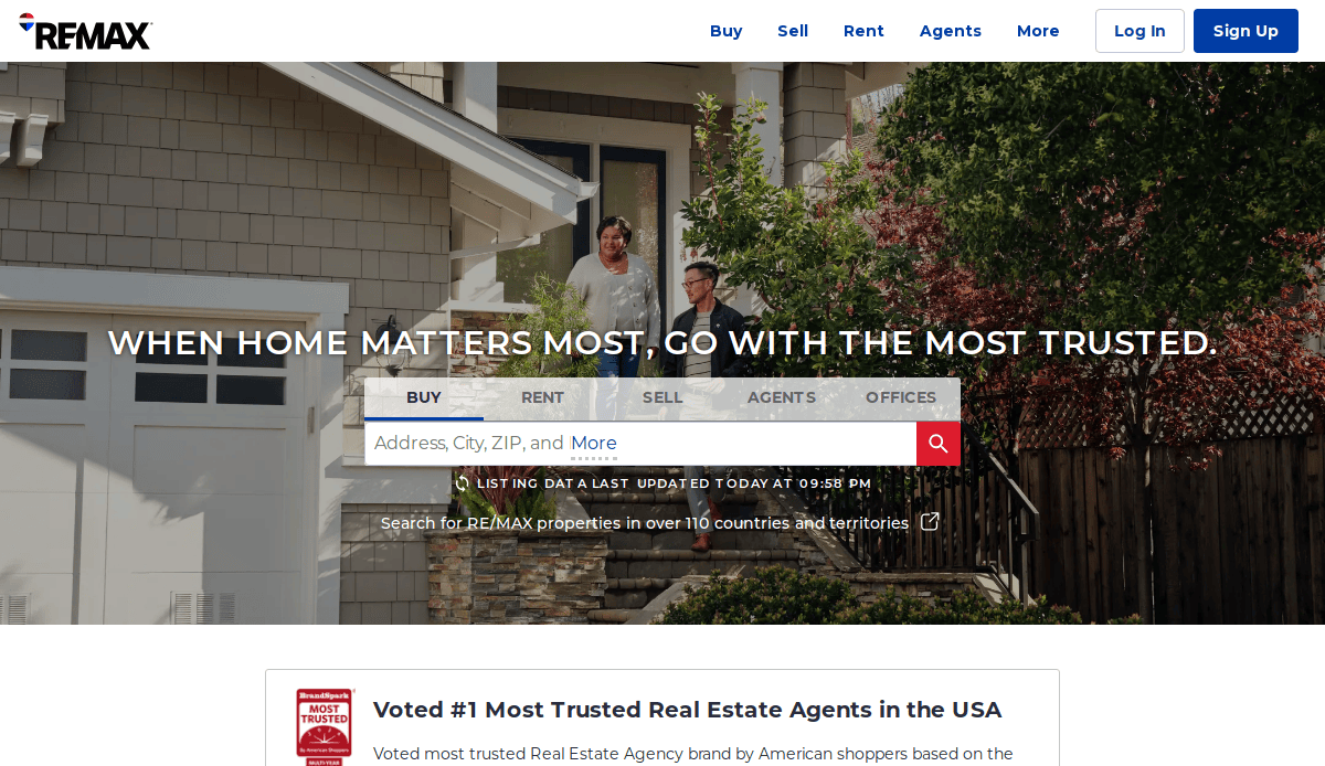
11. RE/MAX
Location: Denver, CO
Key Takeaways:
- Global reach with localized agent websites
- Comprehensive property search tools
- Strong brand recognition
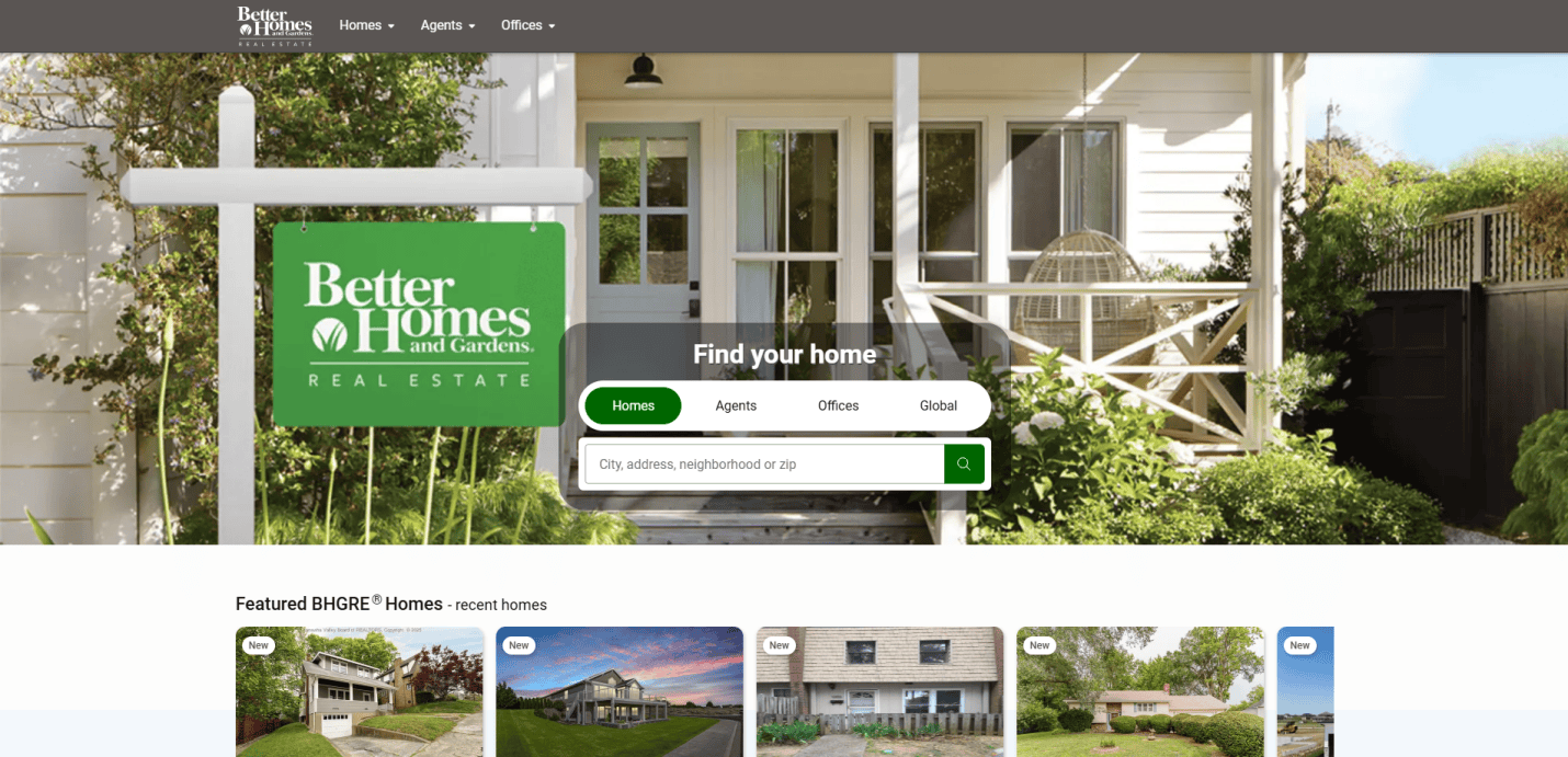
12. Better Homes and Gardens Real Estate
Location: Madison, NJ
Key Takeaways:
- Lifestyle-focused content aligning with home and garden interests
- User-friendly property search
- Integration with BHG magazine content
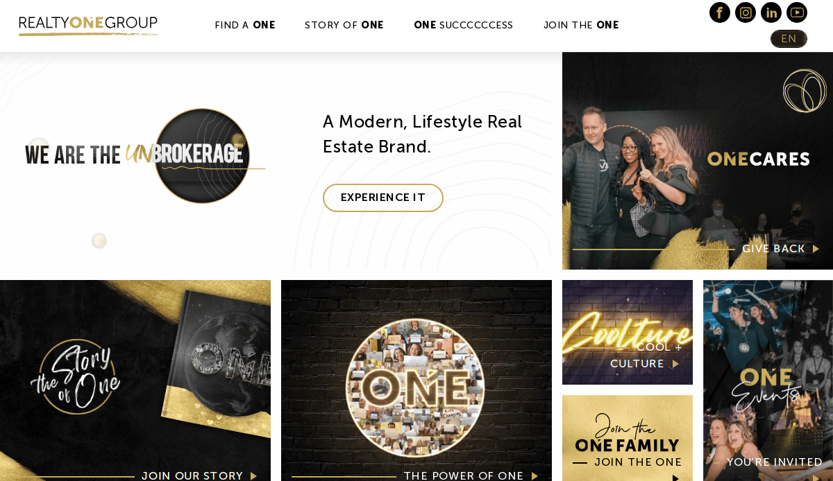
13. Realty ONE Group
Location: Laguna Niguel, CA
Key Takeaways:
- Modern, sleek website design
- Emphasis on agent empowerment
- Innovative marketing tools
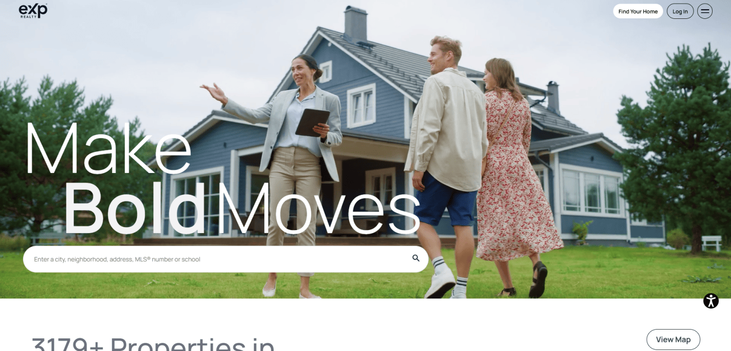
14. eXp Realty
Location: Bellingham, WA
Key Takeaways:
- Cloud-based brokerage model
- Virtual office environment for agents
- Extensive training and support resources
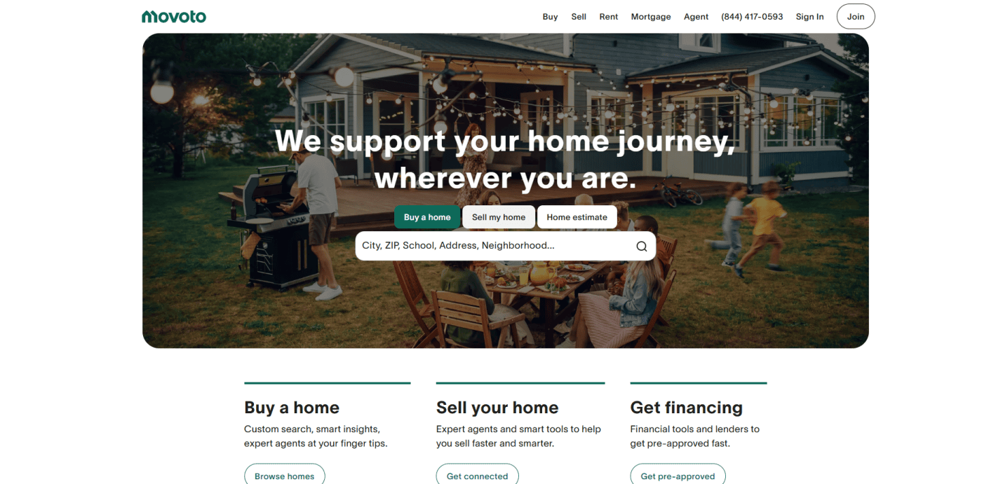
15. Movoto
Location: San Mateo, CA
Key Takeaways:
- Data-driven property search experience
- User-friendly interface with neighborhood insights
- Mobile app for on-the-go access
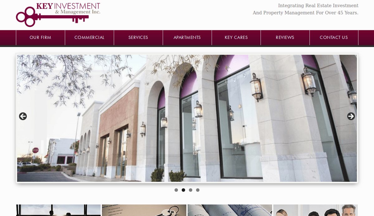
16. Key Investment & Management
Location: Chicago, IL
Key Takeaways:
- Clean, professional design with intuitive navigation
- Detailed service offerings for commercial real estate
- Strong visual branding
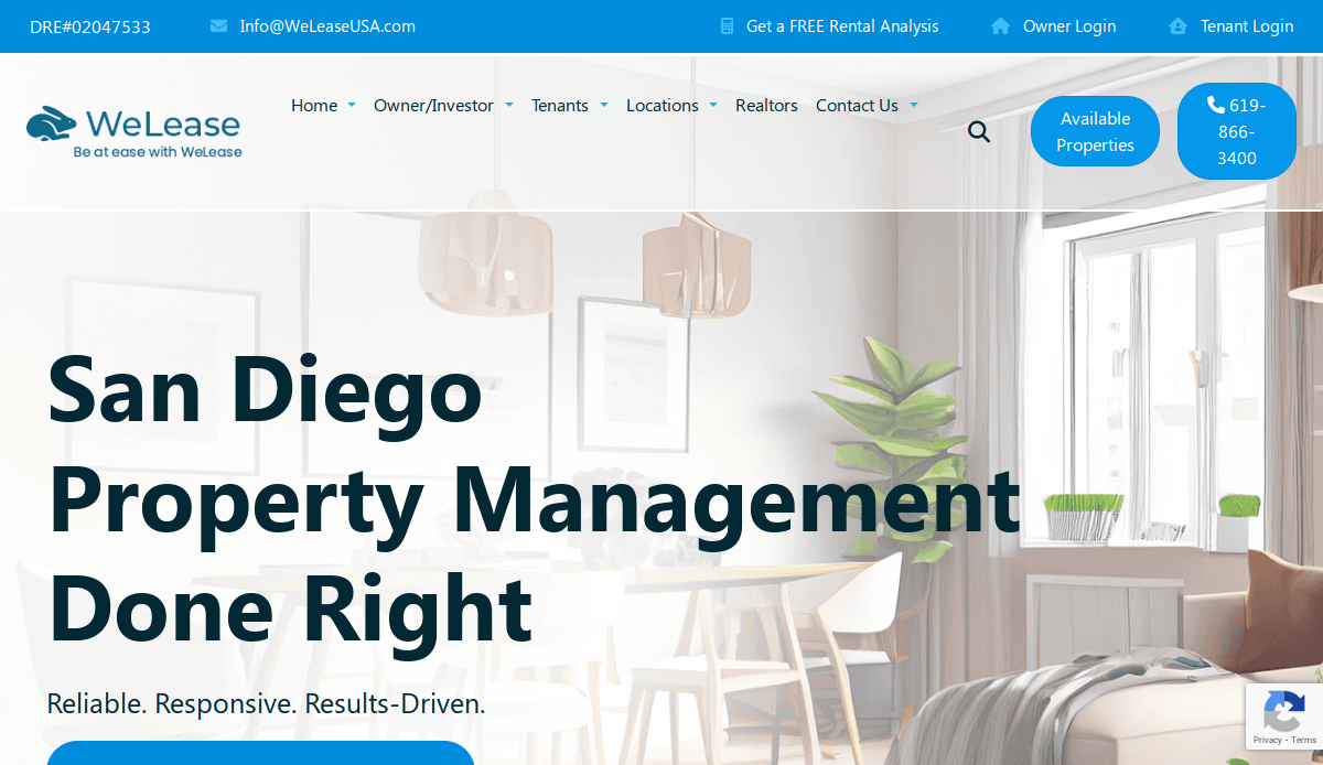
17. WeLease
Location: San Diego, CA
Key Takeaways:
- Modern design with high-quality imagery
- User-friendly property search functionality
- Clear calls-to-action for both owners and tenants
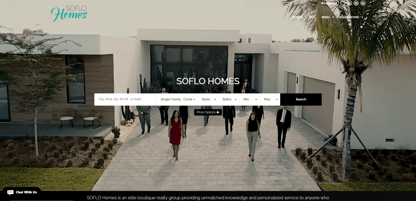
18. Soflo Home Realty
Location: Miami, FL
Key Takeaways:
- Sleek, contemporary layout with user-friendly navigation
- Top-notch imagery and valuable information
- Comprehensive property listings and client reviews
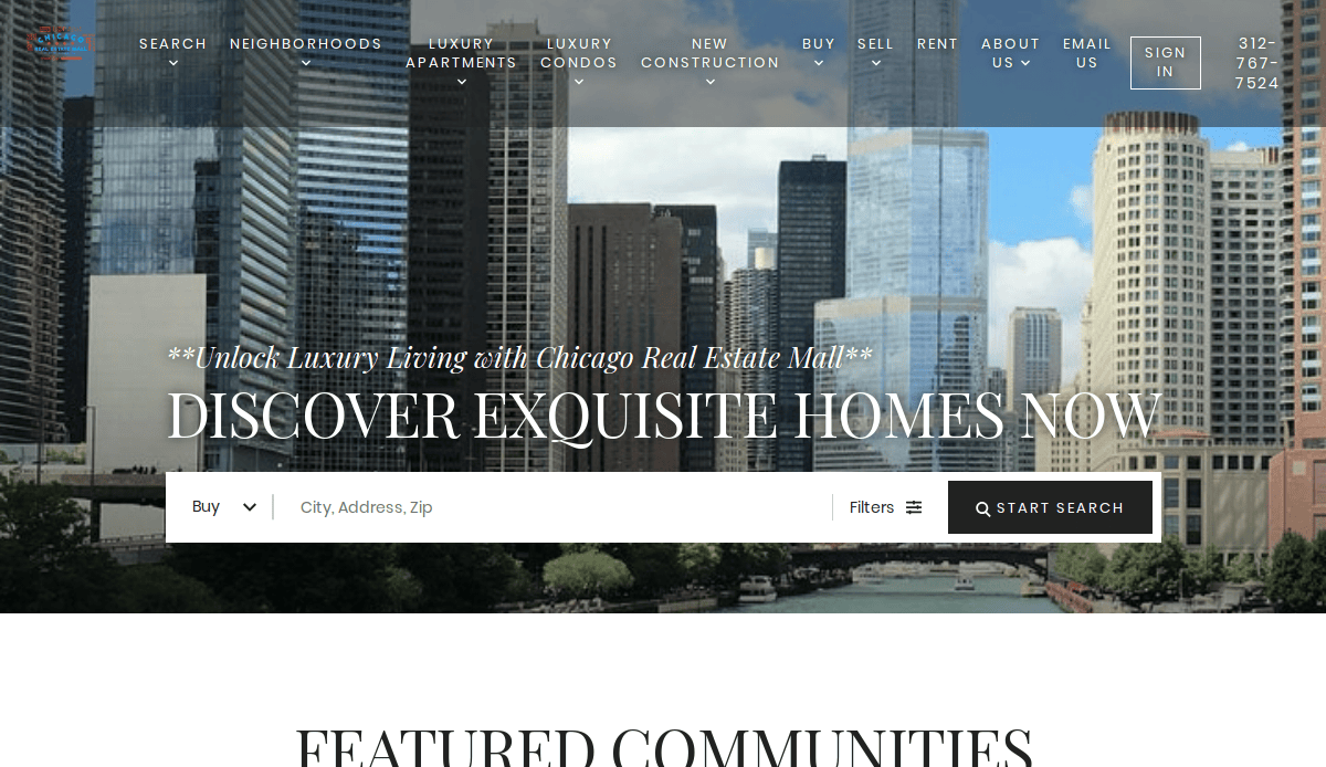
19. Chicago Real Estate Mall
Location: Chicago, IL
Key Takeaways:
- Robust property search tools tailored for the Chicago market
- Informative blog content enhances SEO
- Strong community engagement features
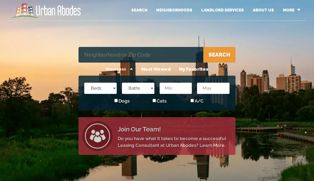
20. Urban Abodes
Location: Chicago, IL
Key Takeaways:
- Vibrant design appealing to urban dwellers
- Easy-to-navigate rental listings
- Integrated social media for broader reach
These examples showcase a range of effective strategies in real estate web design, from user-friendly interfaces and high-quality visuals to integrated tools and strong branding.
Take the Next Step Toward a High-Performing Real Estate Website
If you’re a real estate agent or broker ready to elevate your digital presence, now is the time to invest in a website that actually delivers results. A well-executed design reflects your professionalism and serves as a powerful engine for attracting leads, building trust, and growing your business.
Our agency specializes in custom real estate website design that helps agents and brokers stand out in a crowded market. With proven strategies tailored to the real estate industry, we ensure your website becomes more than just an online brochure—it becomes your top-performing sales channel.
Ready to build a site that sets you apart? Contact us today to schedule your free consultation. Let’s create a real estate website that works as hard as you do.
Frequently Asked Questions About Realtor Website Design
What is the best way to build a website for a real estate agent?
The best approach is to use a custom website designed specifically for real estate professionals rather than relying solely on generic website builders like Wix or GoDaddy. A custom site allows full control over layout, branding, and lead gen tools, helping real estate agents and brokerages stand out and convert visitors into clients. Learn more about our custom website design services for RE professionals.
Are website templates effective for real estate agents?
Real estate website templates can be a good starting point, especially for a new agent or a smaller real estate company. However, to compete with top professionals in the industry and appeal to leading agents, a more tailored solution is recommended. Templates often lack advanced integration options and limit your ability to customize your real estate branding and content.
How important is search engine optimization (SEO) for real estate websites?
The short answer is it’s critical. Without solid search engine optimization, your website won’t appear in local searches, no matter how attractive it looks. Use location-specific content, fast load times, and structured property pages to boost search visibility and search engine ranking. Regular content updates and optimized landing pages will help you attract clients looking for properties or agents in your area.
Can I use platforms like Real Geeks or Placester for my site?
Yes, Real Geeks and Placester are popular platforms built specifically for real estate. They offer built-in CRM tools, IDX integrations, and pre-built templates. However, for high-end agents or those aiming to project a luxury presence, a customizable site with more control over design and user experience may be a better fit. These platforms may not offer the flexibility needed to create a truly stunning website.
What kind of content should I include on my real estate website?
Your website should include:
- IDX-enabled property pages
- A compelling agent image and bio
- A dedicated testimonials page
- Neighborhood guides and blog posts
- A clear marketing strategy
- Conversion-focused landing pages
Should my site include a CRM?
Yes, integrating a CRM is essential for managing leads efficiently. It helps real estate pros track inquiries, schedule follow-ups, and automate communications—critical for growing your sales volume. Whether using built-in CRMs from platforms like Placester or external tools, CRM integration is a core requirement for serious agents.
How can I showcase a luxury brand through my website?
To trust luxury presence and appeal to discerning clients, your website should emphasize elegant design, exclusive property showcases, and high-resolution imagery. A custom website with refined typography, white space, and compelling visuals creates an elegant website that builds trust with upscale buyers and sellers.
What are the drawbacks of using generic website builders?
Platforms like Wix and GoDaddy offer convenience but often result in a website that doesn’t fully meet the needs of a real estate business. Limitations in optimization, speed, and IDX integration can hurt user experience and lead generation. A brokerage website requires more advanced features to support multiple agents, listings, and branding needs.
How often should I update my website?
A good rule of thumb is to update listings and property pages weekly, publish blog posts monthly, and conduct quarterly audits of SEO and performance. Keeping your site current enhances search engine ranking, signals to clients that you are an active and trusted RE professional.
What’s the best way to stand out from the competition online?
To truly find the best clients and generate quality leads, focus on a web design strategy that aligns with your business goals. Incorporate visual branding, fast-loading pages, and customize everything—from your drag and drop homepage layout to your CTAs. Showcase your achievements, such as working with notable names including Ryan Serhant, to elevate your credibility.

