The first impression your real estate appraisal company makes is often through your website. A well-designed website is significant for establishing trust and credibility with potential clients. It’s not just about aesthetics; it’s about functionality, user experience, and the ability to convey your expertise in real estate appraisal. The best appraisal websites blend visual appeal with intuitive navigation, making it easy for visitors to find the information they need and to reach out for your services.
For real estate appraisal companies, a professional website is more than just an online presence. It serves as a critical tool for marketing and customer engagement. With the increasing competition among top real estate appraisal companies, having a standout website can set you apart from the rest. Your website should communicate your particular value proposition, showcase your successful projects, and provide valuable resources to help potential clients understand the appraisal process and its benefits.
Moreover, in an industry where details matter, your website’s quality reflects the quality of your work. Clients seeking appraisal services are likely to be detail-oriented and discerning, so your website needs to be meticulously crafted to meet their expectations. Your site should be a reliable and comprehensive resource, whether they’re looking for information on market trends, appraisal methodologies, or your company’s credentials.
Examples of the Best Real Estate Appraisal Website Designs
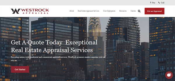
- Westrock Appraisal: These appraisal websites provide an excellent user experience by combining modern style with functionality. The homepage is clean and well-organized, with easy navigation to other parts, including services, technology, and expertise. The combination of clear headings, brief explanations, and high-quality photos gives a professional appearance that reassures potential clients. The website effectively emphasizes its assets, such as its statewide presence and powerful proprietary software that improves the accuracy and timeliness of its appraisals. Respect, loyalty, communication, and honor are strongly exhibited, demonstrating their devotion to client satisfaction. Furthermore, the website’s structure makes information easily accessible, with separate sections for various property and professional services. The integrated chat box is a notable feature that provides rapid client help and involvement.
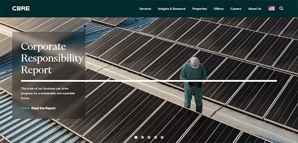
- CBRE: The website’s visual design is modern and classy, with a complementary color scheme of blues and whites reflecting the brand’s professionalism and reliability. High-quality photos and videos are strategically distributed across the site, increasing visual appeal and user engagement. The primary menu, prominently displayed at the top, categorizes important categories such as Services, Industries, Insights, About Us, and others. This logical organization lets users quickly find the information they need, improving the overall user experience. Dropdown menus improve navigation by allowing visitors to delve deeper into specific topics with fewer clicks. The content on the website is presented clearly and concisely. Each part is deliberately laid up, with plenty of white space to ensure that text and multimedia features are easy to understand. The site uses a variety of appealing formats, such as infographics, articles, and case studies, to cater to different user tastes and increase the overall educational value of the information.
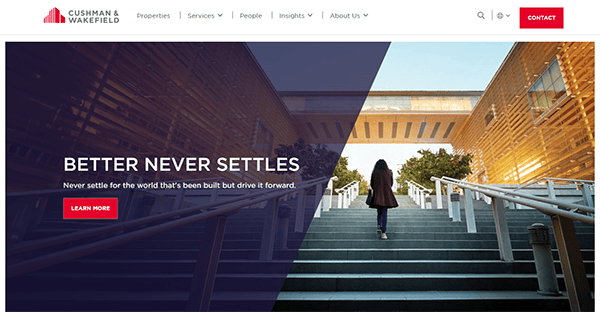
- Cushman & Wakefield: The sleek and professional style conveys an initial sense of dependability and experience in real estate evaluation services. The user interface is well-designed, allowing visitors to navigate with ease. The main menu is well-organized, with easy access to major sections, including services, insights, and property listings. Furthermore, the site has a clean and consistent layout, which helps keep users focused and reduces visual clutter. It employs a sophisticated color scheme dominated by whites, blues, grays, and red lines, conveying professionalism and trustworthiness. High-quality images and graphics are strategically placed to improve the visual browsing experience. The ample white space enhances the information, making it more legible and engaging. The presence of informative articles, papers, and case studies illustrates the company’s thought leadership in the real estate industry. Furthermore, the property search feature is comprehensive and user-friendly, with detailed information and high-resolution photographs to assist prospective clients in making informed judgments.
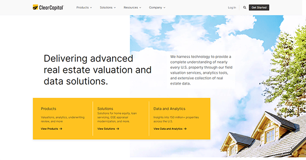
- Clear Capital: The website’s structure is clean and professional, allowing customers to easily navigate products, solutions, resources, and business information. The extensive use of white space ensures that the content does not become overwhelming, resulting in a pleasant surfing experience. One of the site’s most remarkable aspects is its well-organized navigation. The top menu is well-organized, allowing users to access essential topics such as appraisals, alternative valuations, property data insights, and collateral risk management. The dropdown menus are user-friendly, and the consistent usage of iconography aids in quickly identifying various products and services. The homepage effectively emphasizes the essential services and strengths. Using brief, compelling content paired with high-quality photos and visuals promotes trustworthiness and creativity. The statistics and essential metrics, such as the monthly property data records and valuation transactions, foster trust and credibility among prospective clients.
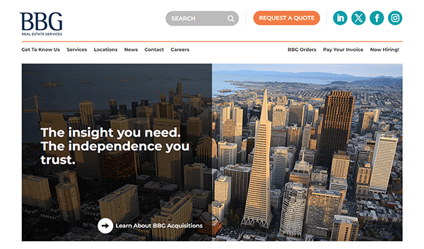
- BBG: The website has a sleek and professional appearance. The use of a clean, modern color palette, primarily in blues and whites, shows trust and dependability. The high-quality photos of buildings and business environments add to the professional appeal, creating a great first impression. The top navigation bar is sticky, allowing visitors to navigate different site sections anywhere on the page effortlessly. This design option improves the user experience by providing easy access to important information such as services, team members, and contact information. The website has a strong visual hierarchy, allowing users to access vital information. Headings and subheadings efficiently break up the material, and carefully positioned call-to-action buttons direct readers to desired tasks, such as contacting the company or requesting a consultation.
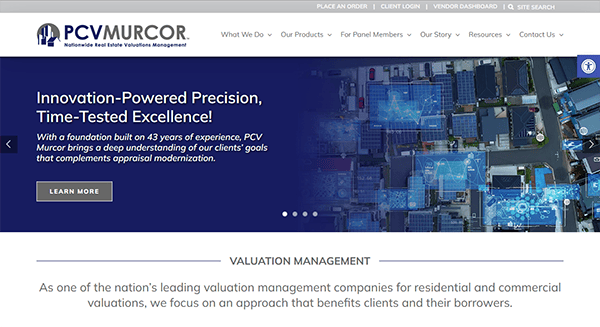
- PCV Murcor: The design is modern and clean, with a well-organized layout that makes navigation easy. A consistent color scheme and high-quality photos create a professional yet inviting vibe. The site is particularly effective in quickly describing the company’s offerings and principles. The text is practical and well-written, clearly defining the services provided. Its commitment to client service is seen throughout the website. Several contact options are available, including phone numbers for various requests and a “Get a Quote” feature. The “Client Login” and “Vendor Dashboard” areas are prominently defined, giving current clients and partners simple access. Using bullet points and headings throughout the site improves readability and ensures that crucial topics are easily understood. Strong calls-to-action (CTAs) such as “Get a Quote,” “Contact Us,” and “Join Our Team” are deliberately positioned to stimulate user participation.
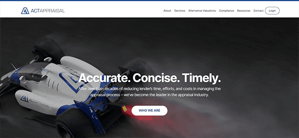
- ACT Appraisal: The website is created with a strong focus on professionalism and usability, reflecting the company’s appraisal management experience. It employs a clean and professional color palette in blue and white tones to convey a peaceful and trustworthy presence. High-quality graphics and icons break up text and provide visual appeal. The availability of appropriate images, such as maps and icons, helps to illustrate crucial concepts. The content is concise and direct, effectively explaining the company’s services and ideals. Prominent calls to action, such as “Get Started” and “Talk to Us,” are intentionally positioned to promote user involvement and inquiries. The website works effectively across multiple devices, retaining functionality and aesthetic appeal on mobile and desktop platforms. It also has accessibility features like text scaling and high-contrast settings, which show a dedication to inclusivity.
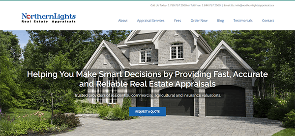
- Northern Lights Appraisals: Its website has a slick, professional design that successfully conveys its competence in real estate appraisal services. The website is well-organized and graphically appealing, providing a compelling user experience. It has a sleek and modern style with a sophisticated color scheme of blues and grays. This color scheme conveys professionalism and trustworthiness, making it excellent for a business in the assessment field. High-quality photos and a well-organized layout create a professional appearance consistent with the company’s brand identity. The main menu is easy to find and gives rapid access to important sections. The sticky menu bar guarantees that users can always access the primary navigation options, which improves the overall user experience. The website’s content is well-written and informative. Each service is carefully stated so potential clients know what to expect. Furthermore, the presence of client testimonials gives a personal touch while also increasing credibility.
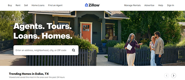
- Zillow: The website’s homepage has a clean, modern style that is simultaneously inviting and straightforward. Using whitespace and a well-organized layout ensures that consumers can easily discover what they want. The prominent search bar on the hero page of the homepage is an important element, allowing customers to quickly enter their desired location and begin their property search right away. This search feature is supplemented with an interactive map that shows a dynamic view of available properties. The map’s seamless integration with the property listings allows consumers to better understand the geographic context of their search results. The site’s intuitive navigation ensures users can easily find what they need, from property searches to market trends and agent connections. Including high-quality photos and interactive maps improves the user browsing experience by creating a visually appealing and instructive tour through the property market. The website’s adaptable design ensures a fluid experience across all devices, and its well-organized categories and filters allow users to narrow their search quickly. The website also includes user reviews and ratings, providing helpful information about properties and real estate brokers.
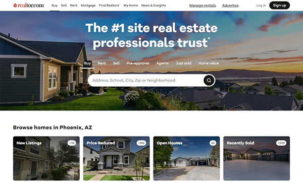
- Realtor: The website has a clean, modern design emphasizing user experience and functionality. A pristine white background and bright, contrasting colors ensure vital information jumps out and catches attention efficiently. The top navigation bar enables quick access to critical functions such as property search, buying and selling suggestions, and local market trends, allowing users to obtain relevant information without effort. The search bar is prominently displayed, allowing users to filter results by area, price range, and property type. The interactive map tool enhances the search process by visually depicting property locations and neighborhood statistics, allowing users to make informed judgments. The website also includes high-quality images and thorough property descriptions to highlight homes in their best light. Each listing is supported by detailed information, such as images, floor plans, and prices, which provide potential buyers with a clear understanding of each property.
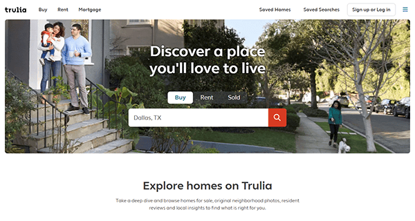
- Trulia: Its website has a modern and visually appealing design with a balanced color scheme of blues and whites, conveying a sense of trust and expertise. High-quality photos of properties and neighborhoods improve the overall visual experience. The website has a simple and user-friendly navigation mechanism. Key aspects such as house search, rentals, and neighborhood information are extensively featured. The search bar is centrally located and easily accessible, and extensive filters allow users to restrict their search based on particular preferences such as area, price range, and property type. The website’s user interface is simple and clean, with a well-organized layout that helps users navigate the property search process. The presence of clear iconography, easily understandable buttons, and uncomplicated forms collectively enhance the interface’s user-friendliness, accommodating users with varying degrees of technological proficiency.
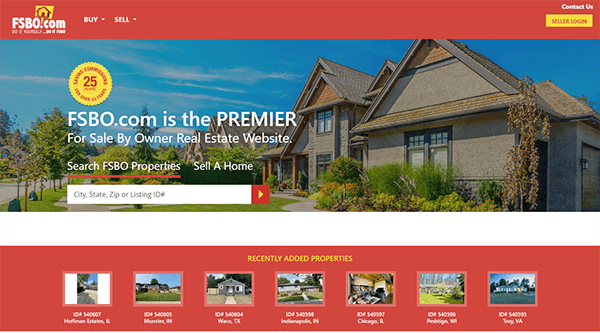
- FSBO: The website has a clean, modern look with a color scheme dominated by red and white, which promotes confidence and reliability. The visual hierarchy is well-defined, with multiple font sizes, weights, and colors used to direct users’ attention to critical elements such as CTAs (Calls to Action), headlines, and property listings. The website’s layout is thoughtfully designed, with a good balance of text, graphics, and white space. It has a sticky menu bar at the top, ensuring navigation options are always visible, even as users scroll down the page. This menu has clear, succinct terms like “Sell,” “Buy,” and “Contact Us,” which assist users in finding what they need. It uses interactive components, such as forms for listing properties or looking for homes, intended to improve the user experience. These forms are easy to use, with clear labeling and instructions that reduce user annoyance. Interactive maps for property searches enhance usability by allowing users to visualize places.
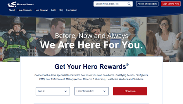
- Homes for Heroes: It is a commendable website that supports an honorable cause and has an equally impressive design. Visitors to the homepage are welcomed with a clean, modern look that communicates professionalism and kindness. The layout is large and well-organized, allowing users to effortlessly browse the many areas without being overwhelmed. High-quality photographs of heroes like firefighters, police officers, and military members offer a personal touch while reinforcing the organization’s objective. Its simple navigation system includes a sticky menu bar that remains visible as users browse the pages. Effective call-to-action buttons are prominently displayed across the site, urging visitors to register or learn more about the program. Furthermore, the site’s live chat feature offers consumers rapid assistance, improving the whole experience by providing real-time support and answers to questions.
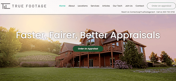
- True Footage: The homepage quickly draws attention with a clear, concise statement highlighting their dedication to providing faster, fairer, and better appraisals. The combination of high-quality photos and a simple color palette improves visual appeal, resulting in a modern and trustworthy appearance. The navigation is simple, with adequately named categories like About, Locations, Services, and Contact. This layout ensures that users can simply access information about the company, its services, and how to contact them. The call-to-action buttons, such as “Order an Appraisal,” are prominently displayed, promoting user participation while not overwhelming visitors. The “Services” section is well-organized. It outlines several appraisal alternatives with brief descriptions, making it possible for potential clients to grasp what is offered and select the best service for their needs. Furthermore, the site’s emphasis on timely communication and on-time delivery is reinforced by precise, impactful data provided on the homepage, demonstrating their dependability.
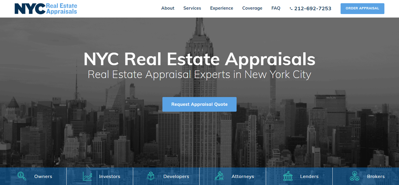
- NYC Real Estate Appraisals: The website’s design is modern and neat. The color scheme, which is dominated by professional colors of blue and white, communicates a sense of confidence and reliability. The usage of high-quality photographs of New York City’s famed skyline and properties adds to the site’s visual appeal while not overpowering the viewer. The imagery chosen is relevant and aspirational, highlighting the company’s relationship to New York City’s thriving real estate industry. The content is well-organized and concise, delivering enough information to keep users interested. The homepage includes an engaging introduction to the company’s services, customer testimonials, and a brief explanation of their expertise. Interactive components like contact forms and appealing CTAs are smoothly integrated into the design. These elements are critical for user engagement and conversion since they enable potential clients to contact us for further information or to schedule an appraisal.
- Real Estate Appraisals Austin: Their website is both visually appealing and very functional. It features a clean, modern style with a striking color palette, contributing to its popularity in real estate appraisal. The design demonstrates a thorough awareness of the target audience’s needs, resulting in an intuitive and engaging user experience. The site’s simple layout, adaptable design, and strategic use of images and material add to its ease of navigation and visual attractiveness. The use of whitespace is very successful, providing the website with a clean, uncluttered appearance that improves readability and focus. Interactive components such as contact forms and call-to-action buttons are prominently displayed and simple to use, promoting visitor participation. It has given outstanding resources to anyone needing real estate appraisal services in the Austin area, demonstrating the company’s professionalism and commitment to quality.
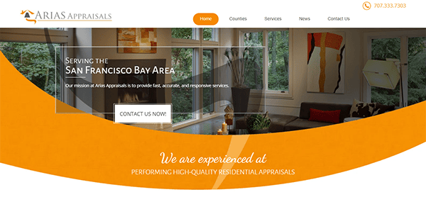
- Arias Appraisals: The site’s sleek and clean layout, which is visually appealing and straightforward to use, quickly conveys a sense of professionalism. The homepage effectively communicates the company’s purpose of providing prompt, accurate, and responsive appraisal services, establishing a favorable tone for potential clients. Navigation is simple, with a straightforward menu at the top of the page that provides rapid access to critical parts. The “Services” section is notable for thoroughly discussing the many appraisal alternatives available, including Full Appraisal, Multi-Family Appraisal, Drive By Appraisal, and Additional Appraisal Services. Each service is detailed in full so clients know what to expect. This amount of transparency is critical to establishing confidence with potential customers. It also contains a prominent “Contact Us” area with a simple form for requests, a phone number, and an email address. This accessibility enables potential clients to contact the company, cultivating a sense of approachability and customer service.
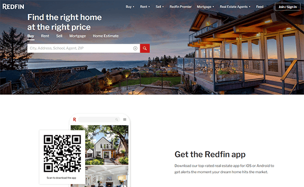
- Redfin: The website has a simple and user-friendly appearance. The homepage greets users with a simple search bar that encourages rapid engagement. The search function is comprehensive and user-friendly. Users can quickly filter postings based on price, location, number of bedrooms, and property type. The simple design, which includes enough white space and well-organized sections, allows users to focus on key features without becoming overwhelmed. The navigation menu is primary but extensive, allowing visitors to access areas like Buy, Sell, Mortgage, and Rent easily. It excels at the usage of high-quality images. Property listings include huge, high-resolution photos that provide a clear and enticing view of the residences. Its website is designed for mobile devices, offering a consistent user browsing experience across all screen sizes.
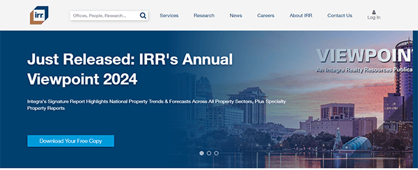
- Integra Realty Resources: The website features a functional and modern design tailored to the real estate industry. It uses a professional color scheme of blues and whites to create a clean and pleasant appearance. The intuitive navigation, with a prominent main menu and dropdown options, makes exploring the site accessible. The homepage contains a mix of high-quality graphics, clear writing, and strategically positioned call-to-action buttons that direct visitors to important portions of the site. The research area is imposing, with various industry papers and insights. The use of filters and search features makes it easy for users to access specific reports relevant to their interests, demonstrating the site’s innovative design in catering to the demands of professionals.
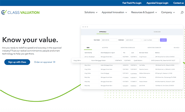
- Class Valuation: The website’s visual design is clean, professional, and aligned with the brand’s identity. A minimalist color palette of blue and white tones promotes trust and reliability. High-quality photos and modern fonts add to the polished and stylish appearance. The website offers extensive information that is presented and easy to understand. Each part is carefully designed to meet the unique demands of different consumers. The clean appearance, high-contrast text, and simple navigation make it accessible to people with various needs. Furthermore, transparent calls to action help consumers navigate the site successfully. The inclusion of client reviews and case studies lends legitimacy and personality to the website. These features provide real-world instances of how the firm has benefited its clients, increasing confidence and authority in the appraisal sector.
When establishing a strong online presence, real estate appraisal websites must balance informative content and a user-friendly interface. The best appraisal websites look professional and offer seamless navigation, ensuring visitors can effortlessly access the services and information they seek. These websites often feature clear calls to action, easy-to-find contact information, and engaging content highlighting the company’s expertise and success stories.
An exquisitely crafted website is a crucial investment for any real estate appraisal company. It elevates your professional image and is vital for attracting and retaining clients. Investing in a top-quality website showcases your dedication to excellence and meticulous attention to detail—traits that clients highly appreciate in the appraisal process. Since your website often serves as the initial point of contact with potential clients, it must leave a lasting, positive impression.
At CyberOptik, we specialize in creating bespoke websites for real estate appraisal companies. Our staff comprehends the distinct requirements of the appraisal industry and can help you design a website that not only looks great but also drives results. Whether you’re looking to update your site or build a new one from scratch, we’re here to help. Contact us today for a free consultation about your real estate appraisal website and see how we can take your online presence to the next level.

