Just looking for our Best Psychotherapist Website examples list?
Why Your Therapist’s Website Design Matters More Than Ever
If you’re a mental health professional looking to grow your therapy practice, your website isn’t just a digital brochure—it’s your first impression, your conversion tool, and your most valuable marketing asset. With more people searching online for therapy services, your therapist’s website needs to do more than look good. It must build trust, convey professionalism, and gently guide potential clients to take action.
The days of relying on a generic template or an outdated site are over. Today’s clients expect more. A high-performing therapy website can help establish authority, increase search visibility, and significantly improve lead conversion rates. Whether you’re in private practice or launching a group clinic, investing in great therapist website design isn’t optional—it’s essential.
In this guide, we’ll walk you through everything from foundational design elements to advanced optimization strategies. You’ll learn what it takes to create a website that not only reflects your unique approach but also drives real business results.
Website Planning & Purpose
Before jumping into visuals or content, the planning phase of a website is where long-term success begins. A thoughtful planning process ensures your site is tailored not just to your personal brand, but to the emotional and informational needs of your potential clients.
Start by defining your core goals. Are you aiming to attract new clients to your private practice? Do you need to highlight specific therapy services like EMDR, couples counseling, or teletherapy? Your website’s purpose will determine everything from structure to messaging.
Next, create detailed user personas. Think about the people you want to reach—their age, life stage, emotional state, and what kind of therapist they’re looking for. This helps shape your site’s tone, layout, and functionality. A therapy website serving trauma survivors will differ significantly in design and voice from one focused on performance coaching or teen mental health.
Also, assess what success looks like for your website. Is it measured in appointment bookings, email inquiries, or phone calls? Clarifying key performance indicators at the outset allows you to build conversion points strategically throughout the site.
To ensure your planning process is complete, explore our guide to therapist website success, which covers must-have features and best practices specifically for the mental health field.
Design Principles
Effective website design hinges on clarity, empathy, and strategic structure. Visitors are often experiencing emotional stress, so your design must foster a sense of calm and safety while making key information instantly accessible.
Visual hierarchy is critical. Use clear, spacious layouts with intuitive navigation that helps visitors quickly find what they need—whether that’s a list of your services, your bio, or contact details. Headlines should be supportive yet direct, guiding users down the page without overwhelming them.
Color choice matters. Soft, muted tones—such as blues, greens, and earth tones—communicate trust and stability. Avoid high-contrast, aggressive palettes that may feel jarring to someone in emotional distress.
Typography should be clean and legible. Choose a sans-serif font for body copy and ensure text is well-spaced, especially for mobile users. Keep paragraphs short and break up information using headings, bullet points, and calls to action.
Accessibility features should be baked into the design. Include alt text for images, sufficient color contrast, and easy-to-navigate menus. This not only helps users with disabilities but also aligns with SEO best practices.
Strong design is also aligned with performance. Ensure your site is mobile-optimized, fast-loading, and secure. A slow or glitchy site can erode trust instantly. To learn how to pair great design with essential search strategies, explore our guide on optimizing your therapy website.
Content & Navigation
Content and navigation are the structural backbone of an effective website. The content must be welcoming, informative, and aligned with your clients’ emotional state. Your navigation should be simple, predictable, and help users find what they need in as few clicks as possible.
Start with a clean top-level navigation bar. Keep it limited to essential pages: Home, About, Services, Blog or Resources, and Contact. Avoid dropdown overload, which can confuse or overwhelm visitors. Every page should have a clear purpose and lead the visitor toward an action, whether that’s learning more or reaching out.
Each page’s content should be concise, conversational, and easy to scan. Break up text with subheadings, bullet points, and strategically placed calls to action. Make sure each service has its own dedicated page, especially if you’re targeting specific niches like anxiety, couples therapy, or trauma recovery. This approach improves clarity for users and strengthens your SEO footprint.
Your homepage should introduce who you help, how you help, and what clients can expect when working with you. The About page should humanize your practice with your credentials, philosophy, and a friendly, professional photo. Include an FAQ section to preemptively answer common questions about therapy, cost, insurance, or session format.
Ensure your website is accessible to everyone, including visitors with disabilities. Structure your navigation to work with screen readers, and use alt text for all images. To learn more about designing accessible websites for therapy practices, read our guide on ADA-compliant websites for therapists.
Visual Elements
Visual elements are the emotional connectors between your website and the clients you hope to serve. They play a critical role in establishing your brand identity, supporting your message, and creating an intuitive experience for site visitors. When used intentionally, visuals can reduce anxiety, reinforce credibility, and deepen user trust.
Start with authentic imagery. Use high-quality photos that reflect your actual practice, team, or clientele demographics. Avoid sterile stock photography that feels impersonal or generic. Clients should feel like they’re being welcomed into a space created for them.
Incorporate video content when possible. A brief welcome video or virtual office tour can help clients feel more familiar and at ease before they reach out. Seeing and hearing you builds early rapport and removes uncertainty, especially for first-time therapy seekers.
Design elements like icons, illustrations, and section dividers should serve a purpose, not clutter the experience. Use icons to visually break up service sections or highlight key benefits. Soft transitions, consistent padding, and minimal animations help make the site feel polished and professional without being overwhelming.
Whitespace is your friend. It creates breathing room and prevents cognitive overload, especially important for visitors managing anxiety or emotional distress. Ensure your visual elements support focus and flow rather than distract.
Finally, make sure your visuals align with accessibility guidelines. Use high-contrast combinations for text overlays, descriptive alt text for every image, and responsive formats so visuals look sharp across all devices. Together, these details ensure your website is inclusive, engaging, and on-brand.
Ongoing WordPress Maintenance
Maintaining a WordPress website isn’t optional—it’s essential to the health, security, and performance of your online presence. Consistent maintenance also protects sensitive client data and ensures your site remains accessible, professional, and trustworthy.
Start with core updates. WordPress regularly releases updates to its core system for improved functionality and to patch vulnerabilities. Skipping these updates can lead to site errors, plugin conflicts, or security risks that put your business and clients at risk.
Plugin management is equally important. Professional websites often rely on plugins for booking systems, contact forms, and accessibility tools. Each plugin should be vetted for reliability and kept updated to avoid compatibility issues or feature breakdowns.
Security should be proactive. Implement automated backups, malware scanning, and a strong firewall. For practices that handle online intake forms or client portals, a secure SSL certificate and privacy-first configuration are non-negotiable.
Site speed is another factor that affects user experience and SEO. Over time, websites can slow down due to bloated media files or outdated scripts. Regular performance reviews, image optimization, and caching can keep your site running efficiently.
Finally, content checks and broken link audits ensure your site stays accurate and functional. Regular reviews help maintain a strong brand image and make sure users never encounter outdated information or dead pages. A well-maintained WordPress site supports client confidence, smooth engagement, and long-term practice growth.
Best Therapy Web Design Examples
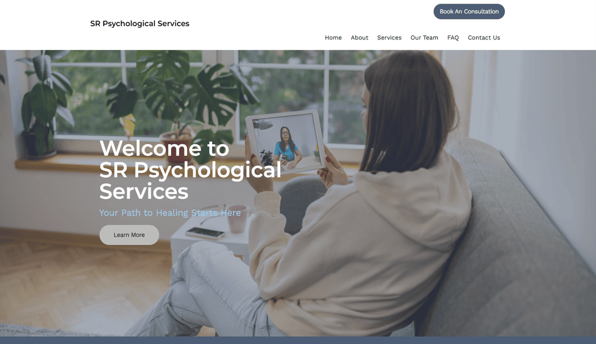
1. SR Psychological Services – Los Angeles, CA
- Uses calming color scheme and clear fonts for instant trust
- Prominent bios of therapists to establish credibility
- Intuitive calls-to-action and easy navigation
- URL: http://srpsychologicalservices.com
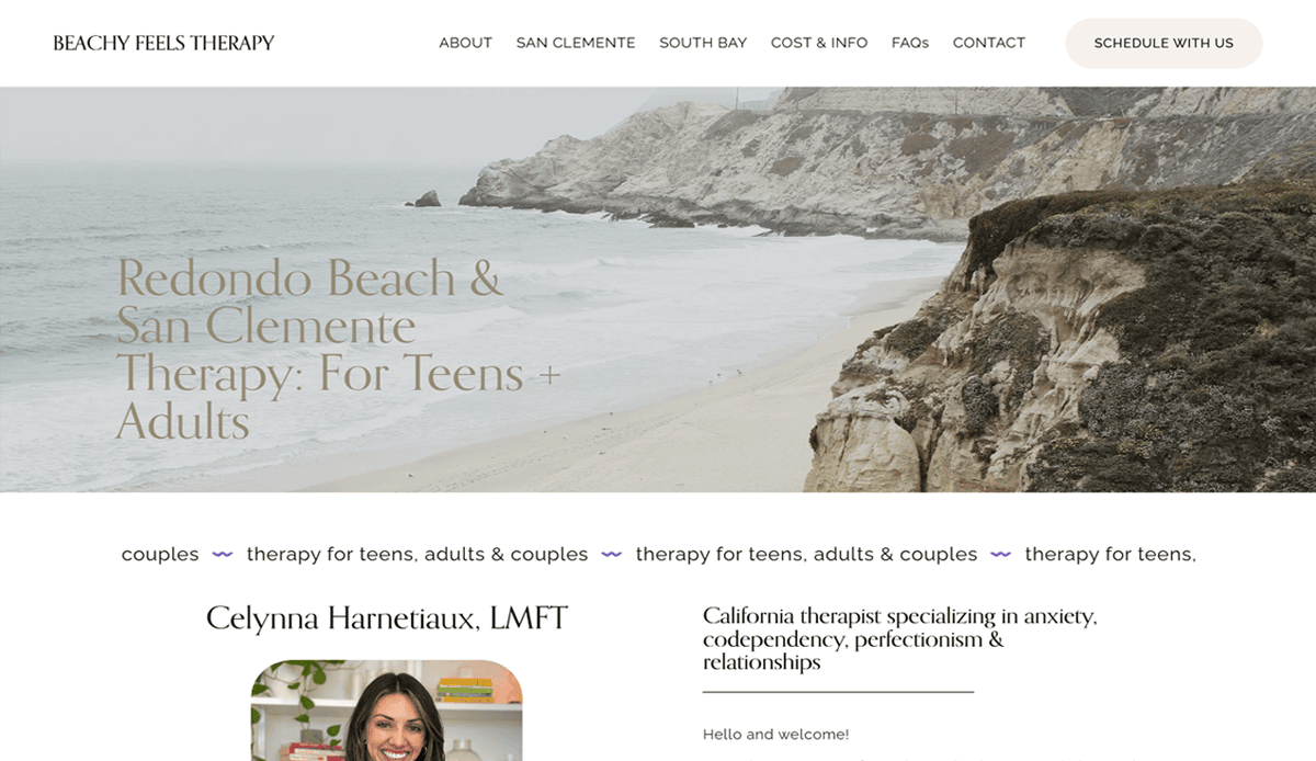
2. Celynnia Harnetiaux, LMFT – Redondo Beach, CA
- Comprehensive private practice information (fees, specialties)
- Concise professional bio aligned to visitor needs
- SEO-friendly structure to support local search visibility
- URL: http://celynnialmft.com
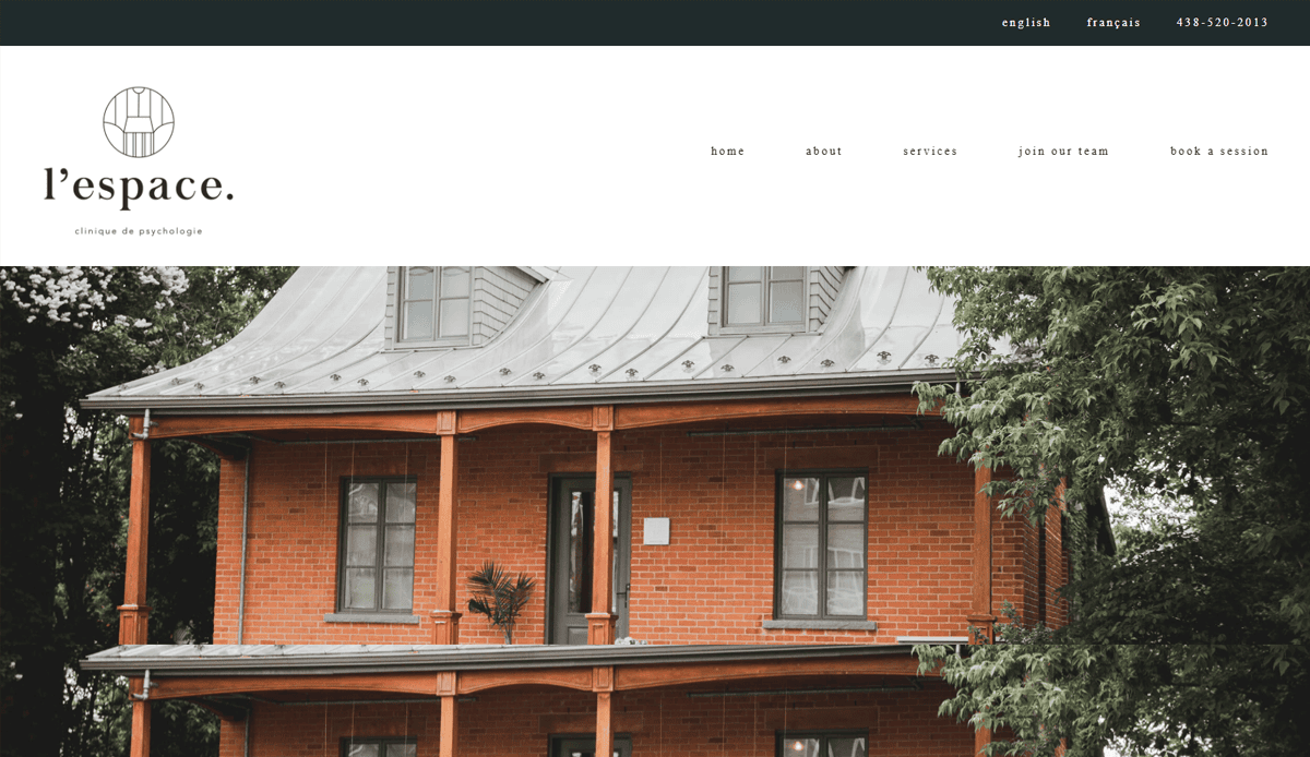
3. L’espace Clinique de Psychologie – New York, NY
- Stylish section transitions and modern typography
- Detailed FAQ section supporting client questions
- Encouraging contact form designed for ease of booking
- URL: http://lespaceclinique.com
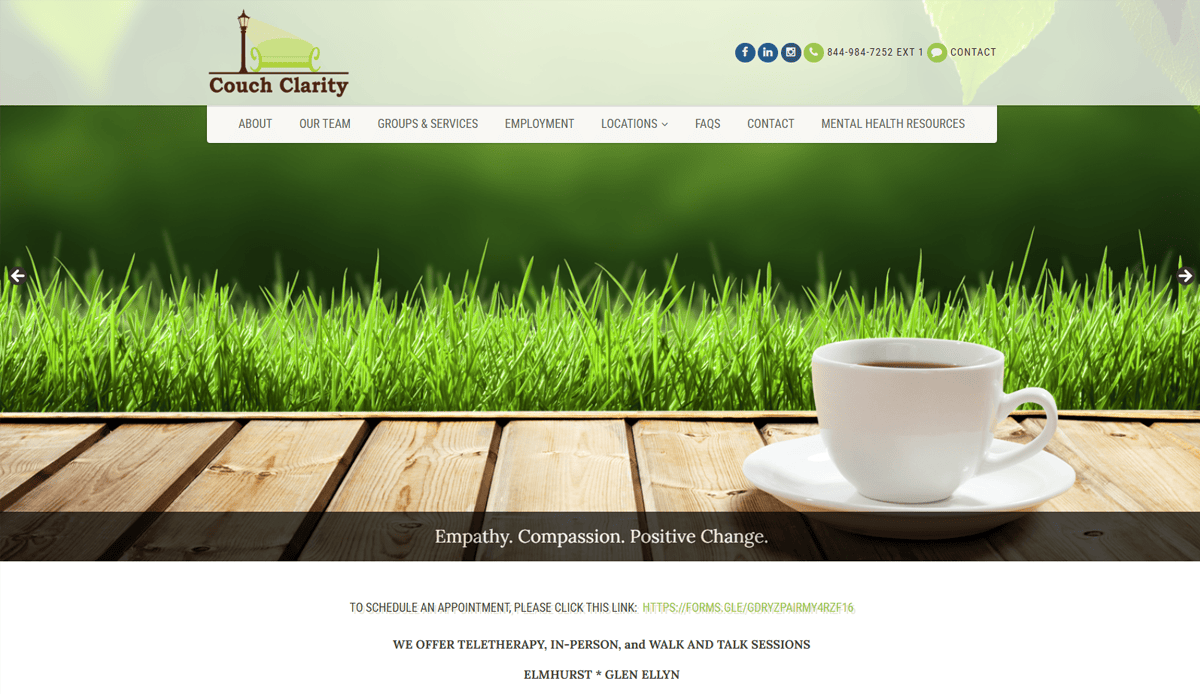
4. Couch Clarity – Seattle, WA
- Clean, professional design that matches healthcare aesthetic
- Clear navigation and color‑coded service sections
- Resource-rich blog for education and SEO visibility
- URL: http://couchclarity.com
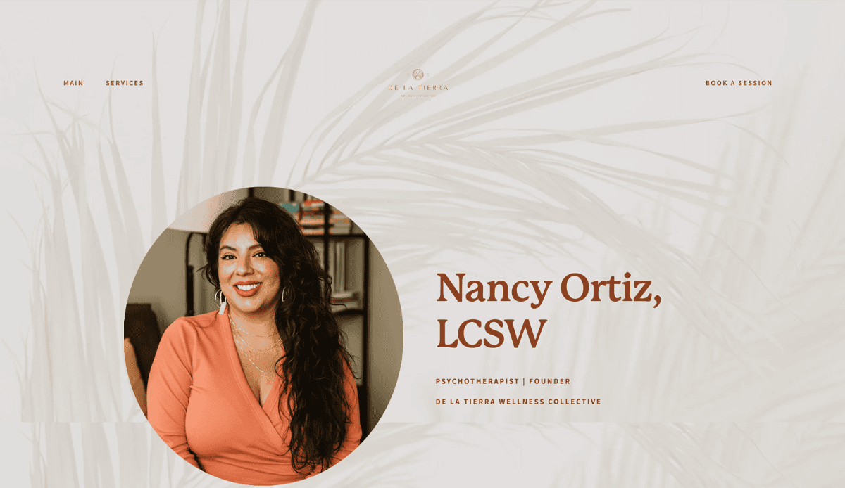
5. Nancy Ortiz, LCSW – Dallas, TX
- Soft earthy palette and generous whitespace for calm UX
- Personal photographic portrait fosters human connection
- Purposeful messaging that targets clients of color
- URL: nancyortiz.com
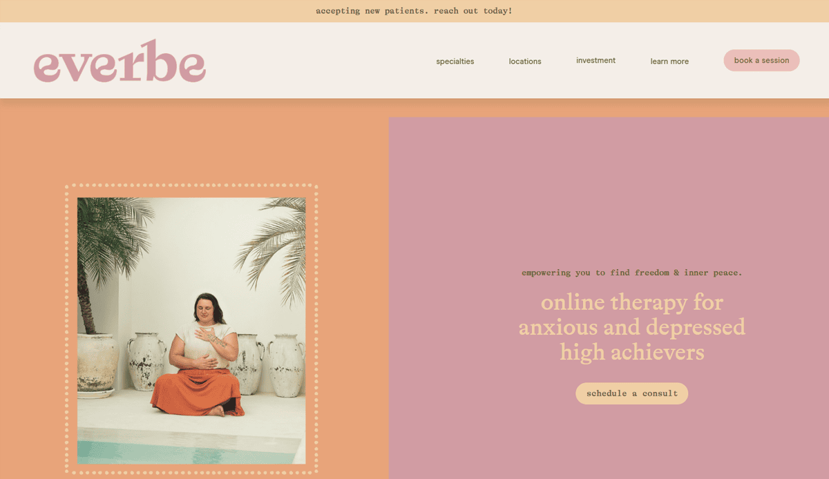
6. Ever Be Therapy – Arlington, VA
- Focused niche messaging for high-achievers
- Clean layout built with Squarespace and professional branding
- Strong CTAs like “Book a Session” placed without pushiness
- URL: everbetherapy.com
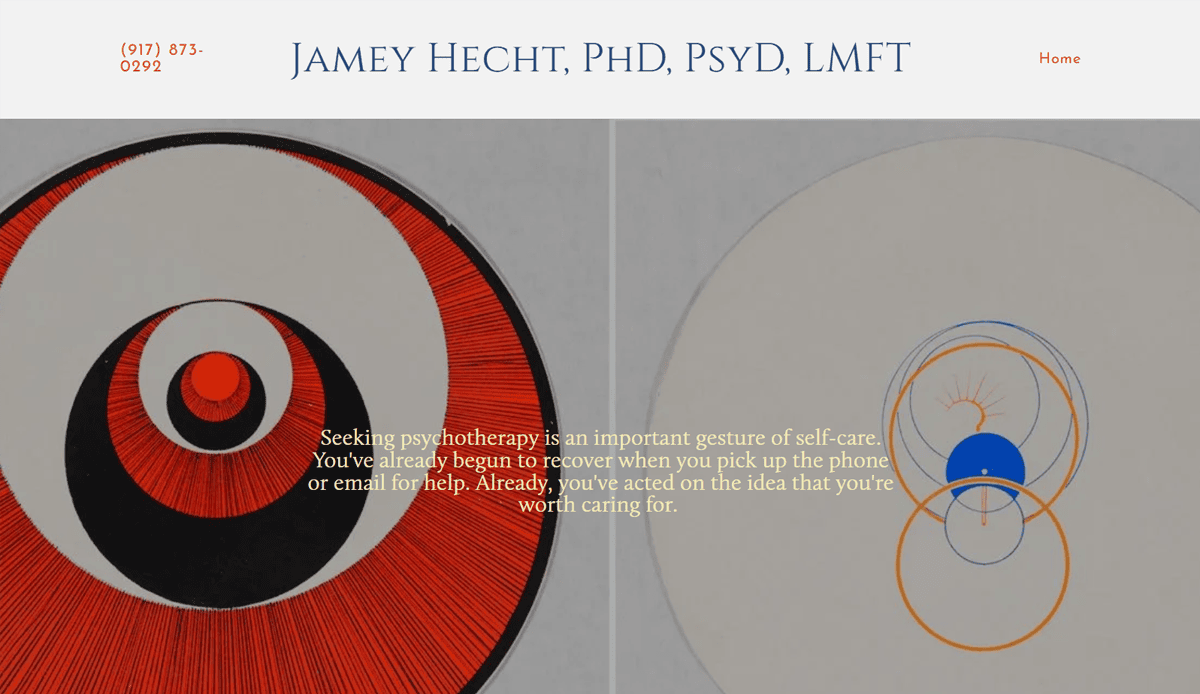
7. Dr. Jamey Hecht, PsyD, LMFT – Brooklyn, NY
- Squarespace-based with a polished, professional atmosphere
- Clear biography and specialization in psychoanalysis
- Visually simple design, effective use of client-facing copy
- URL: drjameyhecht.com
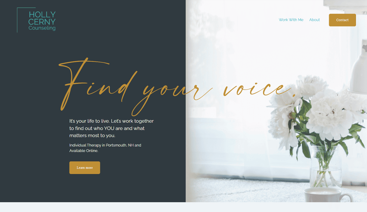
8. Holly Cerny Counseling – Brooklyn, NY
- Warm tone and conversational copy style
- Services section clearly separated by client need
- Built on Squarespace with mobile responsiveness
- URL: hollycernycounseling.com
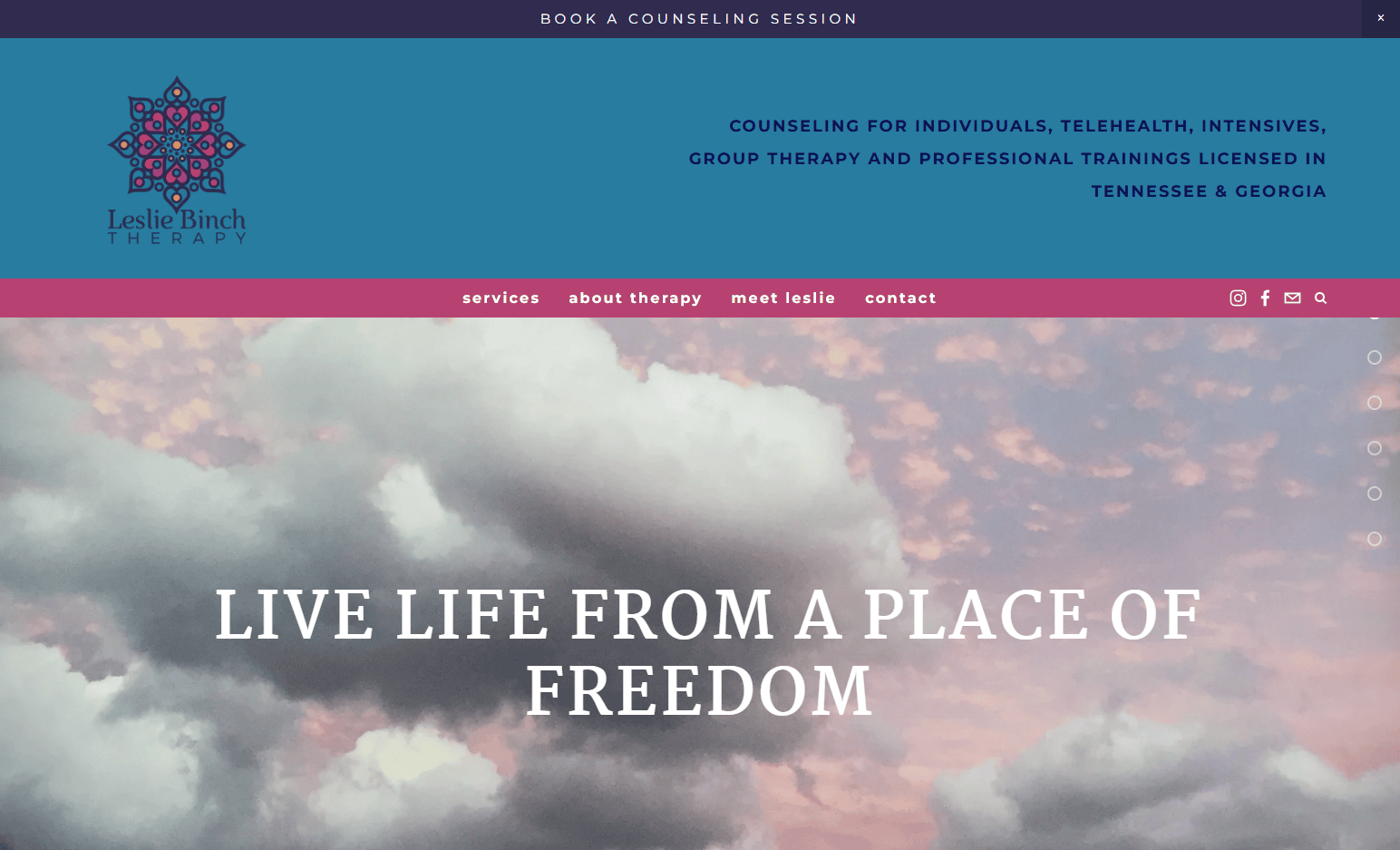
9. Leslie Binch Therapy – Tennessee & Colorado
- Effective scroll-driven layout with trauma-informed design
- Clean typography and distinct service navigation
- Built with client psychology in mind and visual sensibility
- URL: lesliebinchtherapy.com
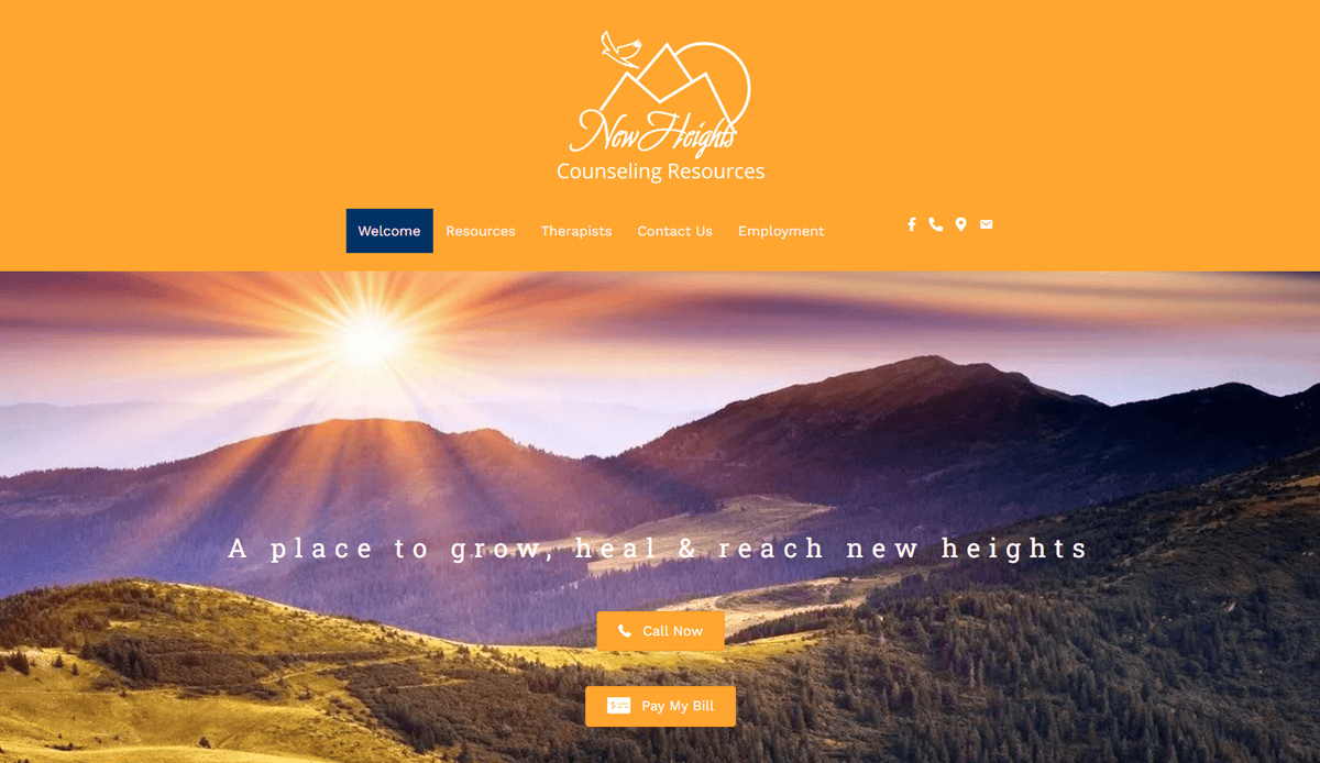
10. New Heights Counseling – Atlanta, GA
- Warm, story‑led homepage with clear “Book Now” calls to action that cater to both in‑office and online clients
- Fully responsive build ensures legibility of copy, images, and CTAs on any screen size
- Offers both in‑person and virtual sessions, reducing decision friction for potential clients
- URL: https://newheightscounseling.com
11. Ian Macnaughton & Associates – San Francisco, CA
- Serene background image and client testimonial immediately build professional trust
- Hover animation adds subtle polish while keeping navigation intuitive
- Clean, single‑column layout makes it easy to find key service pages
- URL:https://www.ianmacnaughton.com/
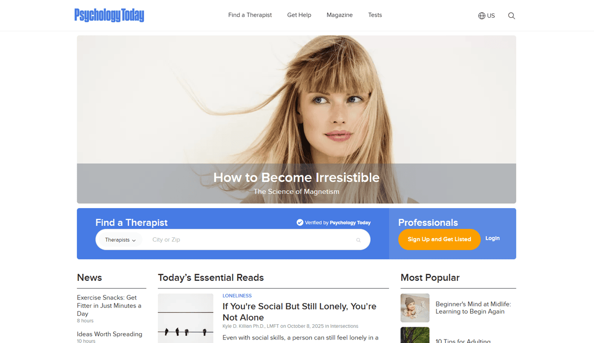
12. Psychology Today Directory Listing – (nationwide)
- Examples of therapist website designs surfaced via directory profiles
- Consistent branding and easy-to-scan visit pages
- Useful for referencing design commonalities across private practices
- URL: psychologytoday.com/therapists
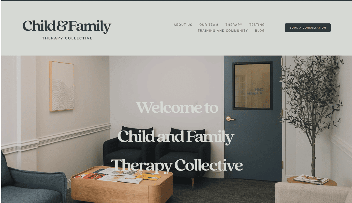
13. Child & Family Therapy Collective – (Northern VA, MD region)
- Soothing pastel palette and clean layout convey trust for family‑focused visitors
- Clear service navigation by audience (children, teens, parents) improves usability
- Compassionate language paired with visible booking prompts encourages action
- URL: https://www.childandfamilytherapycollective.com/
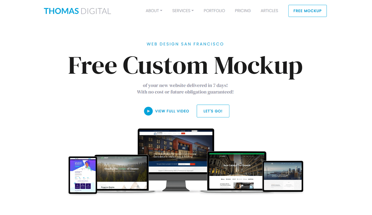
14. Thomas Digital Best Therapist Websites – (national examples)
- Showcases bold fonts, inclusive photography, and whitespace
- CTAs and service pages built for engagement
- Designed to reflect trust and professionalism for therapy clients
- URL: thomasdigital.com/best-therapist-websites
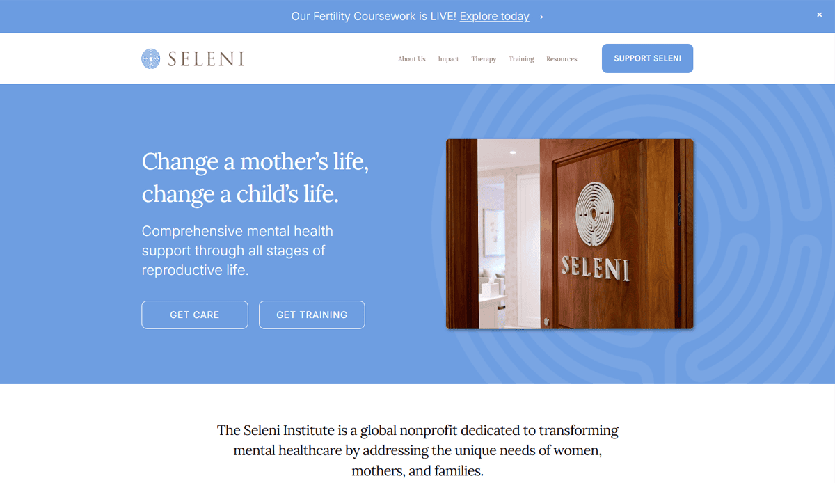
15. Seleni Institute – Manhattan, NY
- Dedicated mental health services for women and families
- Clean layout with clear offerings and navigation support
- Credibility-building through training & support group details
- URL: seleni.org
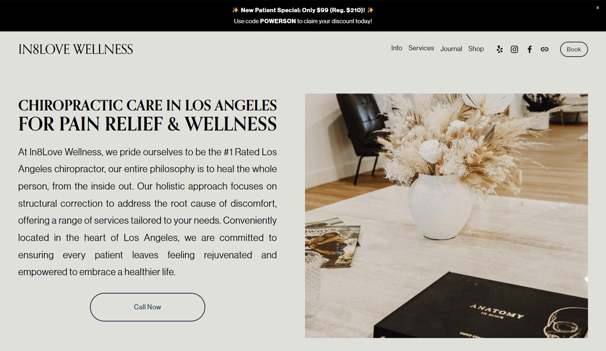
16. In8love Wellness – (various US locations)
- Full‑screen hero image with instant booking CTA and transparent header navigation
- Widgets for contact info, hours, and newsletter in the footer maximize accessibility
- Bold, concise value statement immediately clarifies the therapist’s focus
- URL: https://in8lovewellness.com/
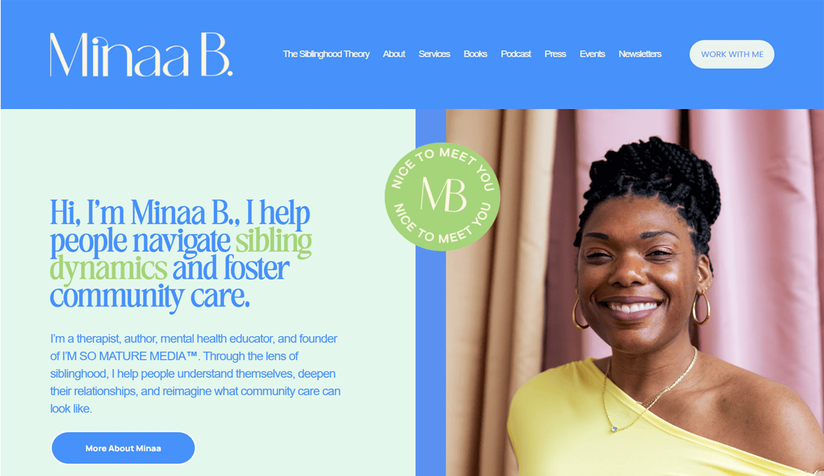
17. Minaa B. Consulting – (NYC area)
- Minimalist Squarespace build with subtle scrolling animations for modern appeal
- Integrated Instagram feed adds real‑time visual content and social engagement
- Streamlined menu and footer layout keep focus on core offerings and booking
- URL: https://minaab.com/
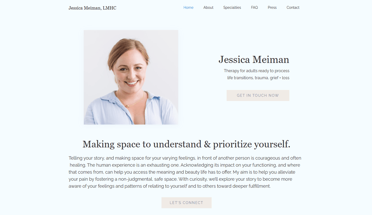
18. Jessica Meiman Therapy – (Portland, OR)
- Built on Webflow with generous white space and clear visual hierarchy
- Floating header ensures easy navigation throughout the page
- Client-portrait hero section paired with a concise CTA sets a welcoming tone
- URL: https://jessicameiman.com/
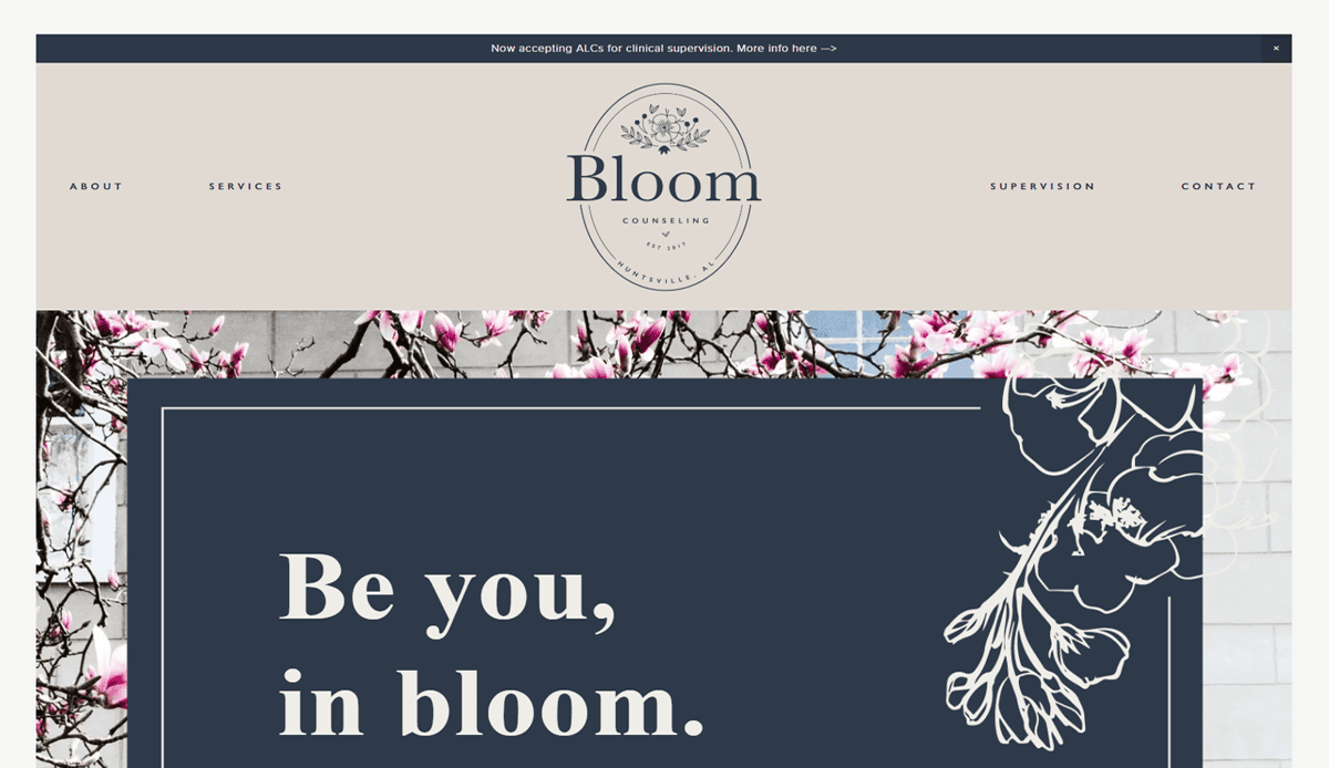
19. Bloom Counseling – Huntsville, AL
- Bold heading fonts and rounded buttons support clear visual hierarchy and CTA clarity
- Feminine but professional design echoes therapist’s brand personality
- Testimonials and service descriptions are well-organized to guide visitor decisions
- URL: https://www.bloomhuntsville.com/
Ready to Build a Website That Supports Your Practice?
Your website is often the first experience someone has with your approach to therapy. It should reflect the professionalism, empathy, and clarity that define your work. From page structure to website copy, every therapist benefits from a well-designed therapist website that meets the expectations of modern users.
If you’re ready to enhance your therapy website and attract more of the right website visitors, let our team help you create a custom website that fits your practice goals.
Request a free consultation with our team of professionals today!
Common Questions About Therapist Site Design
What should be included on a website for your therapy practice?
Every website should include an engaging homepage, a clear list of services, a bio page, contact options, and client FAQs. Pages like your approach to therapy, fees, and blog articles featuring mental health tips can help your practice grow.
How do I make my website stand out from other therapist website examples?
Focus on branding, tone, and user experience. Use custom imagery, highlight client-centered messaging, and apply the best practices for websites designed for therapy professionals. To review design ideas, browse our therapist website examples.
Should I use site templates or invest in a custom website?
Templates are cost-effective for new therapists or simple website needs, but a custom website offers full flexibility to support long-term goals and convey the personality of your practice.
What are the benefits of a mobile website for therapists?
A mobile-optimized website improves the user experience for visitors searching for a therapist on their phone. It also boosts SEO rankings, builds trust, and helps your website appear professional and accessible to every client.
How does content influence your website traffic?
Content that aligns with search intent—such as blogs with mental health tips, service page clarity, and optimized meta data—can drive more traffic to your website and convert website visitors into clients.
What are some examples of therapist websites that perform well?
The best websites combine thoughtful content, intentional structure, strong SEO, and smooth design. Look for examples of therapist websites with clear navigation, authentic imagery, and responsive design to guide your own website creation.
How often should I update or refresh my therapy website design?
It’s smart to refresh your site every 2–3 years to reflect changes in your services, improve functionality, and stay visually modern. Keeping your site aligned with your goals and client expectations will help your practice stay competitive.

