With more consumers turning to the internet to find services, your pressure washing website can make or break your business. A well-crafted website showcases your expertise and serves as a 24/7 marketing tool that can attract and convert visitors into loyal customers.
An exceptional pressure-washing website should blend aesthetics, functionality, and user-friendliness. Potential customers visit your site for specific information about your services, pricing, and contact details. Presenting this information clearly and concisely builds trust and encourages visitors to choose your services over competitors.
Moreover, the best pressure-washing websites are optimized for search engines (SEO). A high search engine rankings are crucial for visibility, attracting organic traffic, and generating leads. By implementing effective SEO strategies, your website can target a larger audience and stand out in the crowded digital landscape.
Examples of the Best Pressure-washing Website Designs
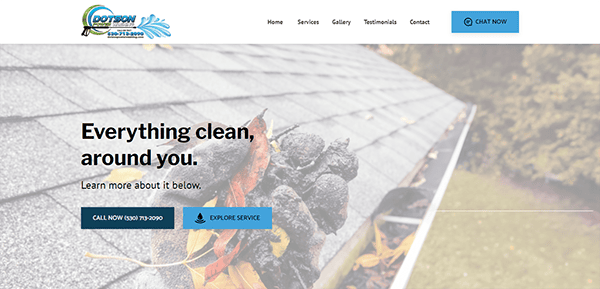
- Dotson Power Washing: The website’s design is excellent, with a layout that is visually appealing and easy to navigate. The homepage has high-quality photographs that immediately attract the viewer’s attention, resulting in a strong visual impact. The color pattern is coherent, with blues and whites that convey cleanliness and reliability. The site’s responsive design guarantees a consistent experience across all devices, including computers and smartphones. Detailed service descriptions, a gallery of previous projects, and several positive testimonials help to establish confidence and reliability. The contact area is straightforward, with a user-friendly form and necessary contact information, allowing potential clients to reach out simply. Social media links are also integrated, allowing for greater involvement and connection. The presence of a conspicuous call-to-action button increases user engagement.
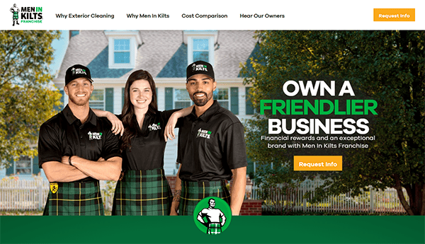
- Men In Kilts: The vibrant, clean layout draws attention immediately, and high-quality photographs and engaging visuals underline the brand’s distinct and recognizable identity. The website’s navigation is user-friendly, featuring a well-defined menu and strategically positioned call-to-action buttons that direct users toward crucial information and actions. The website is well-organized, with simple navigation that allows users to quickly learn about franchise options, fees, and support services. Key sections such as “Why Men Wear Kilts” and “Hear From Our Owners” offer deep insights and testimonials, lending credibility and a human touch. The clear call-to-action buttons and simple contact forms make it easy for prospective franchisees to request additional information.
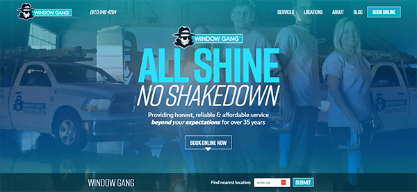
- Window Gang: The site has a clean, modern appearance and straightforward navigation, making it easy for users to discover information quickly. One of the notable features is the homepage’s intuitive arrangement. It displays the primary services available, such as residential and commercial cleaning, while offering rapid access to additional information about each service. The use of high-quality photos and clear, concise writing improves the website’s overall visual appeal and readability. Call-to-action buttons like “Book Online” are widely placed and highly visible, boosting user involvement. The website also contains handy elements such as location finders and online booking choices, which help users navigate from browsing to scheduling a service. Furthermore, its website is optimized for mobile devices, guaranteeing users a consistent and seamless experience on all platforms.
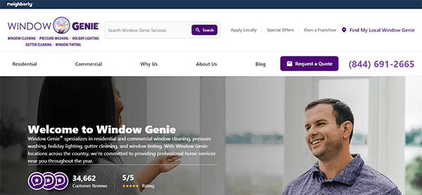
- Window Genie: The websites provide a clean, user-friendly experience that successfully promotes their offerings. The search feature enables users to locate specified information efficiently, enhancing usability. The homepage has a well-organized style and straightforward navigation, making it easy for customers to locate information about residential and commercial services like window cleaning, pressure washing, and holiday lighting. The website’s fixed header guarantees that navigation choices are consistently available, improving the user experience. The website has a clean and professional color combination of purple and white, emphasizing the brand’s dependability and credibility. The website includes thorough explanations of services, client testimonials, and an educational blog, all of which serve to establish credibility.
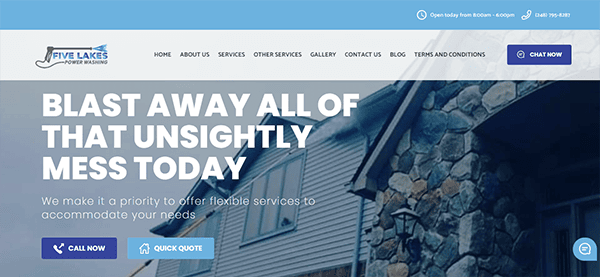
- Five Lakes: Its website has a well-designed interface with a simple and intuitive user experience. The homepage quickly draws attention with its visually appealing layout and high-quality graphics that effectively highlight the services offered. The website is simple to navigate, with distinct headings and a logical flow. The design harmoniously integrates aesthetics and utility. Comprehensive service descriptions and photographs assist potential consumers in understanding what is available, and the prominently displayed “Quick Quote” function makes requesting quotes easy. Positive evaluations and testimonials increase the business’s credibility and reliability. Furthermore, the integrated chat box improves client engagement by offering rapid assistance and responses to concerns. The chat box feature also promotes user interaction by allowing customers to receive real-time service.
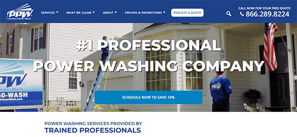
- Perfect Power Wash: Its website has a clean and modern design, with a constant color scheme that conveys professionalism and reliability. The menu is well-organized and easy to navigate. The content is well-structured and helpful, offering users the information they need regarding the services provided. The website employs a combination of textual content, graphics, and videos to accommodate various user preferences, assuring thorough communication of their knowledge. Incorporating customer testimonials and before-and-after galleries helps to develop trust and highlight the quality of work. The inclusion of professional design components enhances the company’s reputation. It contains powerful call-to-action buttons strategically positioned throughout the site, promoting user participation and allowing simple estimates and scheduling access.

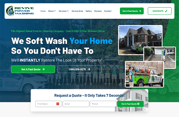
- Revive Power Washing: The design is clean, modern, and highly navigable, allowing potential clients to obtain the information they require quickly and easily. The homepage makes an immediate impression with its high-quality graphics and well-organized structure. The use of bright but soothing hues indicates the company’s commitment to cleanliness and professionalism. Each service is presented in depth, with the benefits clearly stated. This transparency fosters confidence among potential customers. The inclusion of before-and-after photographs serves as a dramatic visual testament to the efficiency of their services, allowing visitors to witness tangible outcomes. Visitors are guided fluidly across the site with prominent call-to-action buttons, encouraging them to explore services or obtain quotes. The website has an integrated chat box that provides real-time customer service. It helps the site feel more interactive and approachable, demonstrating a dedication to customer service.
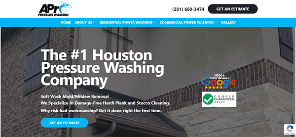
- APro Pressure Washing: Its website is distinguished for its remarkable design, which combines a visually appealing layout with simple functionality. The selected color palette emphasizes simplicity while providing a visually attractive appearance that effectively showcases the website’s offers and services. The homepage immediately captures visitors’ attention with professional graphics and a simple design that successfully highlights the company’s services. The navigation is simple, with a well-organized menu that lets visitors quickly access information about residential and business services, customer reviews, and FAQs. The site includes evident calls to action for obtaining quotes and contacting the company, which promotes user interaction. Trust is established on testimonies and Google 5-star evaluations, which are supplemented by assurances of covered services. Furthermore, clear service descriptions and exciting blog entries offer vital insights, increasing user understanding and trust.
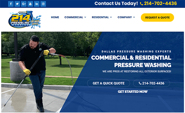
- 214 Pressure Washing: The website has a sleek and professional web design that communicates the company’s offerings and expertise. The usage of a clean and straightforward structure allows visitors to move through the many sections effortlessly. The homepage quickly draws attention with high-quality photographs demonstrating the company’s work, improving visual appeal, and establishing credibility. The site’s continuous color palette of blues and whites conveys a sense of confidence and trustworthiness, which is appropriate given the nature of their business. Furthermore, the typography is clean and legible, making all information readily available to visitors. The website is remarkably responsive, providing a smooth and uninterrupted user experience on many devices, including PCs and smartphones.
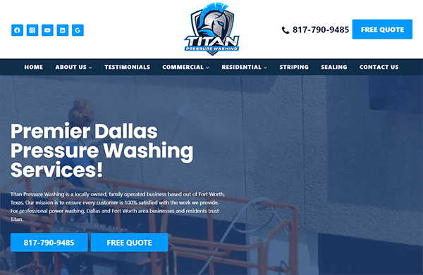
- Titan Pressure Washing: The homepage immediately draws visitors’ attention with vivid, high-resolution pictures emphasizing the company’s expertise and service quality. The clean, modern layout and a harmonious color combination of blues and whites convey a professional and trustworthy image. The website’s navigation is easy and efficient, allowing visitors to readily obtain the information they need. The menu is well laid out, and the call-to-action buttons are placed prominently to direct customers to schedule services and learn more about the company’s offers. A significant feature is the inclusion of a chat window, which provides rapid customer help and increases user engagement. This interactive aspect demonstrates a dedication to customer service by allowing potential clients to ask inquiries and receive immediate responses.
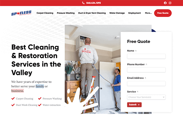
- Spotless: Its website emanates a clean, professional appearance that complements the company’s emphasis on cleanliness and structure. The homepage quickly attracts visitors with a modern design and excellent imagery, displaying their offerings in an eye-catching manner. The color palette, primarily white with blue accents, maintains a sense of cleanliness and reliability. The navigation is simple, with clear headings and a well-organized menu that allows users to quickly access information about the company, services provided, and contact information. Using testimonials and client logos increases credibility, improving the user experience by creating confidence in potential customers. A simple contact form on the hero page and a publicly displayed phone number encourage direct communication, making it easy for visitors to seek assistance.

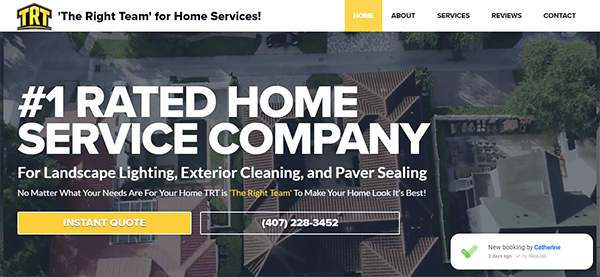
- The Right Team: Its website is visually beautiful and modern, successfully communicating the company’s cleaning services competence. The homepage has a bright, appealing design with high-quality photographs highlighting the company’s dedication to comprehensive and professional cleaning. The color combination, which is predominantly blue and white, provides a sense of trust, dependability, and cleanliness. The navigation is simple, with a well-organized menu that allows customers to explore the numerous services available, learn more about the organization, and find contact information. The presence of client testimonials and service descriptions on the homepage provides rapid insight into the quality and breadth of its products. The website offers convenient features like an instant estimate form and a prominently posted phone number, allowing accessible communication and service needs.
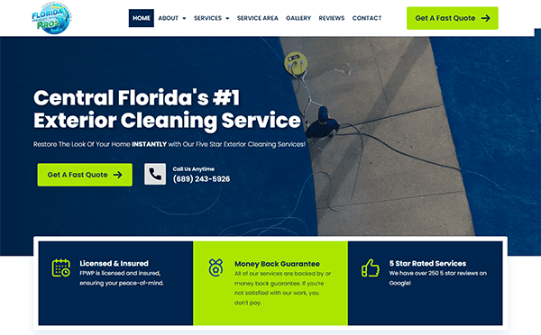
- Florida Pressure Washing Pros: Its website epitomizes a modern and professional style, which is ideal for its target audience of financial experts. The homepage greets visitors with a clean, simple look that conveys confidence and skill from the start. The color combination of blues and whites is relaxing and authoritative, expressing the importance of financial planning while remaining welcome. The navigation is simple, with clearly defined menus allowing users to quickly search for information, whether it’s information on services, client testimonials, or contact data. The usage of high-quality photos and graphics throughout the site improves the user experience by adding visual interest without overwhelming the text. The website has been carefully chosen to establish a consistent brand identity and deliver a seamless user experience. The typeface is crisp and readable, allowing visitors to assimilate the information offered quickly. The layout is responsive, implying it adjusts smoothly to different screen sizes and devices, which is critical for today’s mobile-centric users.
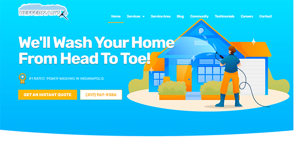
- Heffernan’s Power Washing: It generated a website that impresses with its user-friendly design and clear, professional layout. The webpage is visually appealing, with a relaxing color palette and high-quality photos highlighting its offerings. The navigation is simple, with a well-organized menu providing users to explore different aspects of the site, such as its list of home renovation services and customer reviews. The use of white space is very beneficial, providing a sense of openness and making the material easier to read and understand. Contact information and CTAs are prominently displayed, encouraging visitors to contact them quickly, which is critical for service-oriented firms. Modest animations and transitions offer a modern feel without overwhelming the viewer.
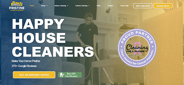
- Pristine House Cleaning: Its website welcomes viewers, combining cleanliness, convenience, and a touch of elegance. It is deliberately built to provide a smooth experience for all visitors. The homepage features a magnificent hero page video that shows their experienced crew at work, providing an insight into the detailed attention provided. The design is sleek and modern, demonstrating our dedication to impeccable cleanliness. Navigating its website is simple, owing to its well-organized structure that displays its extensive services. Whether you’re looking for residential, business, or specialist services like carpet or window cleaning, each service is described clearly and offers benefits. Its booking method is simple and user-friendly, allowing you to schedule a cleaning service with a few clicks. Its dedication to customer satisfaction is apparent across the site, with testimonials and reviews clearly displayed to reassure visitors of its exceptional service.
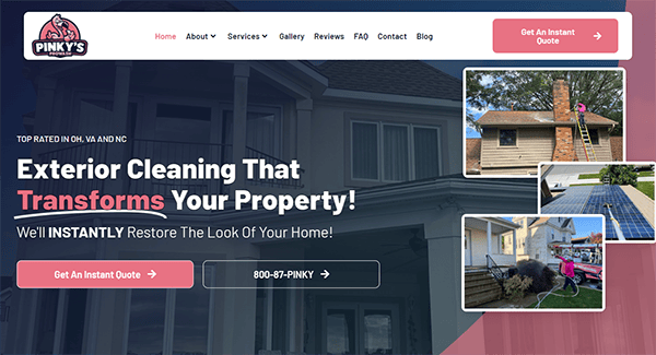
- Pinky’s Prowash: When users arrive at the homepage, they will be met with a beautiful rush of pink and pastel colors that immediately inspire a sense of excitement and playfulness. The website design is highly unified, with a pleasant layout that highlights a variety of its services. Its website is easy to navigate, with a user-friendly style emphasizing our extensive selection of gentle washing solutions. The method is step-by-step, providing transparency and peace of mind to our ecologically aware customers. Its customer testimonials and reviews clearly highlight its delighted customers and confirm its reputation for providing excellent service. Contacting the website’s team is simple and convenient, whether via the chat box, contact form, or phone number widely placed across the site.
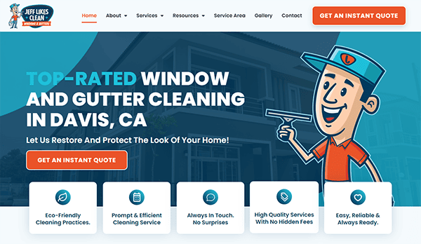
- Jeff Likes Clean: The layout is clear and intuitive, making it simple to navigate. The color choice is pleasant, with gentle blues and whites that convey cleanliness and professionalism, entirely consistent with their brand. The company’s services are presented clearly and organized, facilitating the identification of contact information and the ability to obtain a quote. This streamlined approach enables potential consumers to proceed efficiently with their inquiries. The inclusion of high-quality photographs of their work throughout the site helps to demonstrate the outcomes that clients may expect. The testimonials and client reviews are prominently displayed, providing authenticity and reassurance.
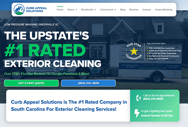
- Curb Appeal Solutions: The sleek and dynamic design evokes a polished appearance that emphasizes the company’s humble origins as a family business while still presenting its top-rated services. The clean and vivid style quickly draws the eye, resulting in a professional appearance that successfully shows their skill in improving curb appeal. The welcoming webpage has high-quality graphics and concise content that effectively communicates their services. Navigation is simple, with well-organized menus and quick access to critical information. The color scheme and design elements convey a sense of trust and dependability, while customer testimonials and a portfolio of previous projects lend authenticity and reassurance. The website is mobile-friendly, providing a consistent experience across all platforms.
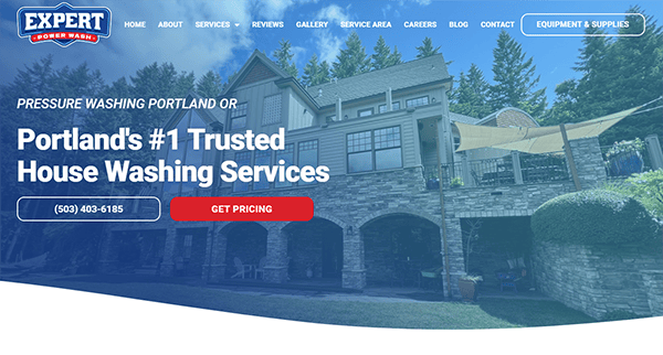
- Expert Power Wash: The website has a clean and modern design, with high-quality photos and a consistent color scheme that emphasizes the brand’s expertise. The well-organized layout allows visitors to explore and obtain the information they need quickly. The content is brief yet comprehensive, successfully presenting the breadth of services provided by Expert Power Wash. The Gallery section includes detailed explanations and visual examples that help potential consumers comprehend the work’s quality and scope. The website contains strategically placed CTAs encouraging visitors to seek a quote or contact the company for additional information. These CTAs are prominent and well-designed, prompting users to take action without being invasive.
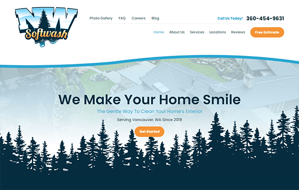
- NW Softwash: The website has a remarkable design that is both modern and polished. The site’s color palette is consistent, and the photographs are of excellent quality, adding to its professionalism. The layout is well-organized and visually appealing, allowing visitors to explore easily. The navigation menu is straightforward and comprehensive, with easy access to critical sections, including Services, About Us, Reviews, and Contact. This guarantees that consumers may readily access the information they require. The site’s content is well-organized and informative, with thorough service descriptions presented concisely. Strategically positioned call-to-action buttons, such as “Get Started” and “Free Estimate,” successfully direct users to take action. The site’s responsiveness ensures a consistent user experience across all devices. Furthermore, prominently displayed client testimonials boost confidence and credibility, making the website interesting and trustworthy.
Investing in a high-quality website for your pressure washing business is an investment in your future success. A professional and user-friendly website attracts more visitors and converts them into loyal customers. Showcasing your expertise, providing essential information, and offering a seamless user experience can place your business apart from the competition.
Your website is often the first point of contact potential clients have with your company. Making a good first impression can greatly impact your company’s growth and profitability. Don’t leave your online presence to chance; make sure your website represents the professionalism and quality of your pressure washing services.
By partnering with a renowned web design agency like CyberOptik, you can ensure your pressure-washing website meets all the requirements for success. From design and functionality to SEO and user experience, we know what it takes to create a top-tier website. Contact us today for a free consultation about your pressure-washing website, and let us help you develop a website that effectively entices and turns visitors into loyal consumers.

