In the serene world of ponds, having a well-designed website is crucial for pond builders, cleaners, and enthusiasts alike. A great pond website showcases the beauty of water features and provides essential information and resources for pond maintenance and construction. Whether you’re a pond builder looking to attract new clients or a pond cleaner aiming to offer your services, a user-friendly and visually appealing website can make all the difference.
The pond industry has unique web design needs. Websites must be visually engaging to reflect ponds’ aesthetic appeal while being informative and easy to navigate. Important features include high-quality images, detailed service descriptions, customer testimonials, and easy access to contact information. Additionally, incorporating SEO strategies can help pond-related websites rank higher in search results, compelling more visitors and potential clients.
This article will focus on 20 of the most exceptional pond websites, highlighting their design elements, functionality, and overall user experience. These examples inspire anyone looking to create or improve their pond builder or pond cleaner website.
Examples of the Best Pond Website Designs
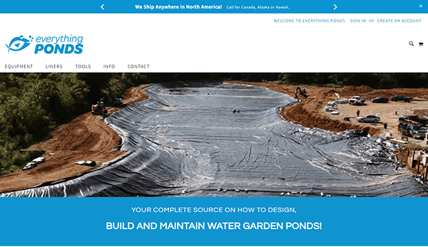
- Everything-Ponds.com is a comprehensive resource for pond enthusiasts, offering detailed guides on pond design, construction, and maintenance. The website features a clean, easy-to-navigate layout with high-quality images and a wealth of information. Visitors can find everything from pond kits to maintenance tips, making it a one-stop shop for all pond-related needs. The site also includes customer testimonials and a blog filled with helpful articles, ensuring users can access a wide range of resources. The overall design is professional and inviting, making it easy for users to find the necessary information. Whether you’re a novice pond builder or an experienced pond cleaner, this website provides valuable insights and tools to help you succeed.

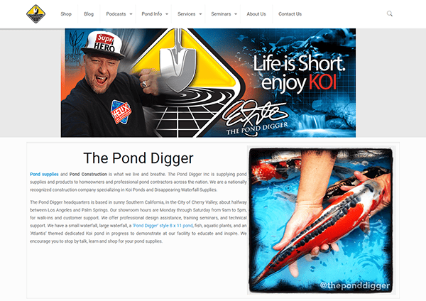
- The Pond Digger: The homepage quickly draws attention with colorful images of gorgeous ponds and landscaping, establishing a clear link to the brand’s expertise in water features. The navigation is simple, with precise menu options allowing users to explore services, products, and educational resources. The website is also mobile-responsive, providing a consistent experience across all devices. Engaging material, such as blog articles and videos, increases value and positions the company as an industry leader. Overall, the site strikes a mix of aesthetics and usefulness, making it inviting and straightforward to use.

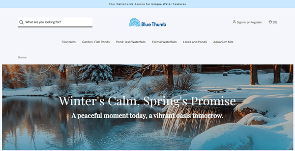
- Blue Thumb: The website’s design appears neat, competent, and easy to use. The layout is well-organized and modern, making it easy to navigate the site. The homepage greets visitors with eye-catching, high-quality photos highlighting the company’s pond installation and maintenance skills, making an excellent first impression. The menu is straightforward, with well-defined sections that direct users to services, testimonials, and an educational blog. The use of white space and essential design components improves readability and concentration, and the responsive design guarantees that the site works well on both desktop and mobile devices. The introduction of a project gallery and portfolio increases credibility and confidence.

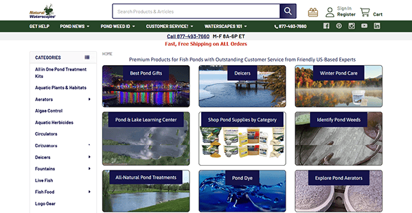
- Natural Waterscapes: Its website has a clean and friendly design, making it simple for users to navigate and discover their products. The homepage has an eye-catching design with high-quality graphics that properly highlight their goods, making an excellent impression. Customers can locate their needs through well-organized categories and detailed product descriptions. The site also has a sticky menu bar, which allows users to easily navigate without losing their place. Customer reviews are displayed, which adds legitimacy and trust to the purchasing process. The product pages are well-designed, with thorough information and high-quality photographs. The site’s responsiveness across different devices ensures an ideal experience whether browsing on a desktop or a smartphone.

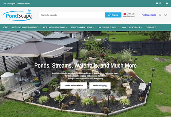
- PondScape: Its website design emits a natural and peaceful style that complements the pond and water feature products it sells. The site style is clean and straightforward, with well-placed photos of tranquil ponds and water gardens that create a welcoming atmosphere. The navigation is straightforward, with well-defined categories allowing users to explore numerous product alternatives easily. The presence of user feedback fosters a sense of community and trust, giving prospective purchasers confidence in their purchases. Product pages are visually appealing, featuring high-quality photos and extensive descriptions of significant features. Overall, the site mixes a peaceful visual concept with functionality to provide a pleasant buying experience.

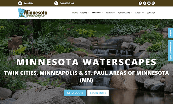
- Minnesota Waterscapes: The website’s calm, nature-inspired design perfectly reflects their concentration on pond and water feature services, creating a beautifully created user experience. The site uses high-quality pictures to immediately immerse visitors in the peacefulness of pond landscapes, making a positive first impression. The navigation is simple, with a well-organized menu that allows consumers to explore their services, making information easily accessible quickly. Furthermore, the site features a consistent color palette incorporating natural tones, reinforcing the brand’s link to nature and water. With easily accessible contact information and clear service descriptions, the website offers a pleasant and instructive experience for anybody wishing to alter their outdoor environments.

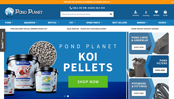
- Pond Planet: The website is clean, professional, and simple, ensuring a smooth buying experience for pond enthusiasts. A white background combined with colorful, high-quality photographs of pond items and aquatic plants creates a visually beautiful and inviting website. The webpage has a well-organized structure with clear sections, making finding products like pond filters, pumps, and accessories easy. A prominent search tool enhances the user-friendly layout, allowing for speedy product discovery. Customer feedback and ratings have been integrated, providing useful insights to potential buyers. The homepage now includes featured product sections and promotional banners, keeping visitors updated on the latest offers and best-sellers.

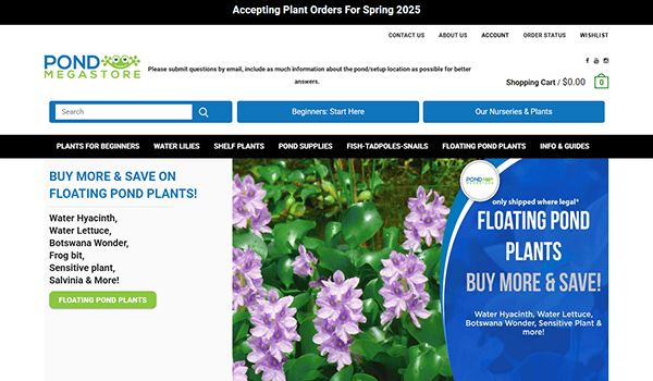
- Pond Megastore: The homepage has an attractive design with beautiful, high-resolution photographs of water lilies, lotus, and other aquatic plants that immediately entice users into the site’s content. The navigation is easy and intuitive, with distinct product categories and a visible search box that allows users to find specific items. The style is reinforced with extensive product descriptions and bright photographs highlighting each item, allowing buyers to make more educated purchasing decisions. Furthermore, the site provides client reviews, which foster confidence and provide valuable feedback to prospective purchasers. The color choice, which emphasizes green and earthy tones, suits the idea of nature and ponds wonderfully.

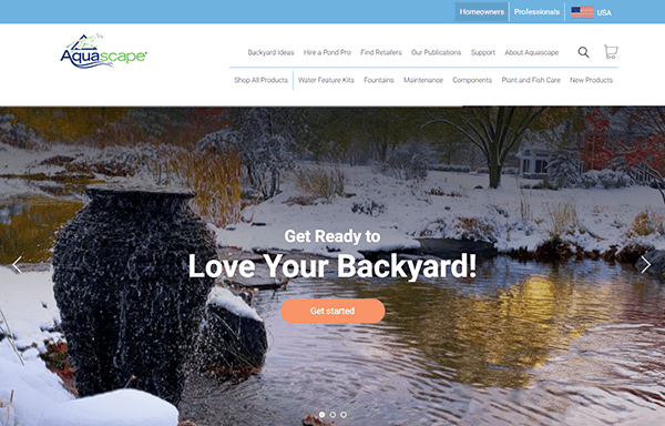
- Aquascape: The homepage makes good use of a large, high-quality video banner, which immediately engages visitors with the company’s water feature products and services. The navigation menu is simple to use, allowing viewers to access important information. The design is clean and well-structured, with a relaxing blue and green color scheme that complements the company’s water-centric brand identity. The use of well-spaced sections and clear headings improves the site’s overall organization, making it easier to access content. The website also has an interesting blog, which adds value and encourages further customer participation. The support button improves the user experience by providing seamless navigation to customer assistance and resources, ensuring that help is always just a click away.

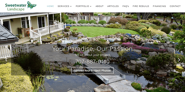
- Sweetwater Landscape: The website’s design is slick and modern, balancing professionalism with visual appeal. The layout is simple, with a minimalist look emphasizing vital information without overpowering the visitor. The webpage effectively introduces its services with high-quality pictures and an ordered layout, with bold font ensuring readability. The navigation is essential, with a well-organized menu that allows users to explore numerous alternatives easily. The color scheme, which primarily includes calming greens and neutral tones, is consistent with the brand’s objective, creating a sense of trust and knowledge. With clear calls to action and easily accessible contact information, the website provides a seamless and engaging experience for users seeking effective water management solutions.

- Pond Supplies Canada provides a wide range of pond supplies and equipment. The site has a clear and organized layout, making it simple to navigate through the many areas. The use of whitespace and well-defined categories allows consumers to find items easily and without feeling overwhelmed. The design uses excellent images and a consistent color scheme, which strengthens the overall visual appeal. Product photos are clear and comprehensive, allowing users to get a good feel for the things before making a purchase. Each product page has extensive information, such as specifications, pricing, and availability. This transparency enables visitors to make informed judgments and boosts the site’s trustworthiness.

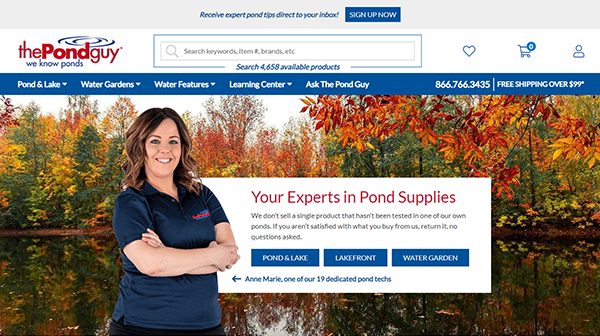
- The Pond Guy: The company’s website has an inviting and attractive appearance that promptly attracts visitors. A well-balanced color palette, including greens, reds, and blues, mimics the natural aspects connected with pond care, resulting in a relaxing and visually appealing experience. The homepage contains enormous, vibrant photographs of stunning ponds and water features that promote the company’s offerings and encourage visitors. The website includes a visible and easily accessible support option, allowing users to contact us for assistance. The contact information is prominently displayed, and the live chat feature provides real-time service, increasing client satisfaction.

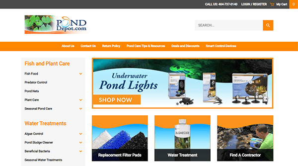
- Pond Depot: The website provides a pleasing atmosphere and intuitive experience that perfectly reflects its commitment to supplying high-quality pond supplies. The website exudes a pristine and polished aesthetic, instilling in its users a sense of confidence and reliability. The layout is well-organized, with a harmonious color scheme incorporating mild gray and orange colors, creating a calm and nature-inspired feel. The site effectively showcases its items with appealing visuals, such as high-resolution photos and videos. This is very important for consumers who want to see how the products will fit into their specific pond settings. A prominent search bar and filters enable users to rapidly identify specific products or information, improving the user experience.

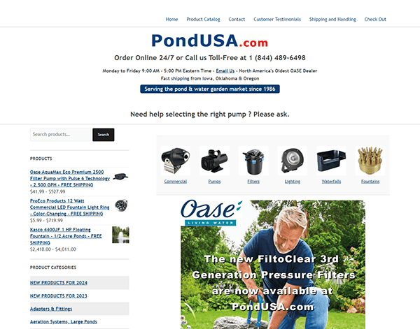
- Pond USA: The website’s neat, straightforward style makes it simple for users to explore and find the things they require. The color design, which includes soothing blues and greens, enhances the theme of water and tranquility. The website has well-organized navigation that categorizes products and services rationally, resulting in a smooth buying experience. The product pages are thorough, with high-quality photographs and clear information to assist shoppers in making informed purchases. In addition, the site has a helpful search engine and filters to make product discovery easier. A live chat support facility is prominently displayed, providing prompt assistance and improving the customer experience.

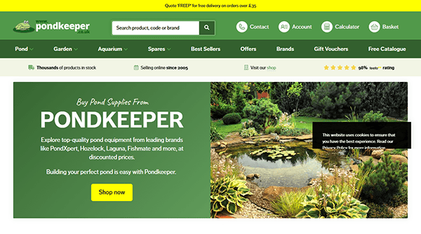
- Pond Keeper: The website showcases a clean, minimalist, and inviting appearance with a well-organized structure that seamlessly walks users through their selection of pond products and services. It uses a balanced color scheme and font to depict the calm character of the ponds. Using large sections and clear titles allows readers to discover the required information rapidly. Navigation is simple, with a straightforward primary menu that organizes items and services logically. The dropdown menus are simple, allowing users to discover specific products or information without stress. The website contains well-placed call-to-action buttons, such as “Buy Now” and “Contact Us,” that are easily accessible and promote user involvement.

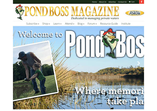
- Pond Boss: The website has an engaging and modern design that efficiently targets its audience. The homepage has a revolving graphic slider that showcases essential products and specials, immediately grabbing users’ attention. This dynamic element modernizes the design while also encouraging involvement. It is a complete website for pond management, focusing on offering relevant knowledge and goods to enthusiasts and professionals. The website has a well-organized layout and a color scheme that fits its specialty. The information is well-organized and comprehensive, with thorough descriptions of products, tools, and services.

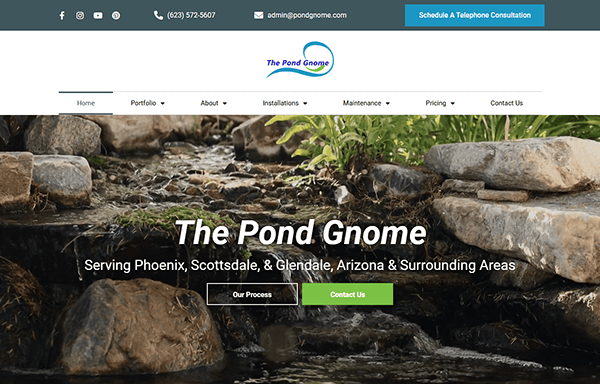
- The Pond Gnome: The site has a sleek and modern appearance with a fresh color palette incorporating green and blue tones to match the aquatic theme. High-quality photos of ponds and pond items are prominently presented, adding visual appeal and providing a friendly environment for visitors. The website contains many information, such as extensive product descriptions, useful purchasing guidelines, and pond management tips. The homepage has a dynamic banner highlighting current deals and prominent products, highlighting crucial offerings. The design also contains visually appealing elements such as product photos, videos, and infographics demonstrating various pond supplies’ benefits and applications.

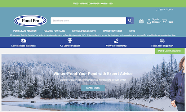
- Pond Pro Canada: The site’s selection of a soothing color palette with blue and green tones mirrors the maritime theme, producing a relaxing and inviting ambiance. The homepage includes high-quality photographs highlighting their pond and water garden items, immediately engaging visitors. The layout is simple, with a well-organized navigation menu allowing you to browse different product categories and services easily. Essential information is prominently displayed, and the search tool is effective, allowing users to locate what they are looking for easily. Product pages are built with the user experience in mind, with concise descriptions and high-resolution photographs emphasizing each item’s quality and details. Furthermore, the site’s responsive design provides a consistent experience across every platform.

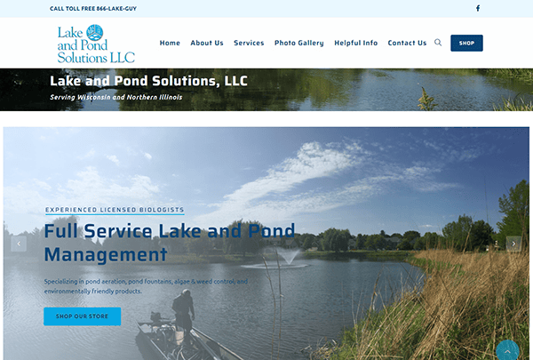
- Lake and Pond Solutions: Its website has a neat, appealing design that effectively communicates the essence of its offerings. The color scheme is relaxing, with shades of blue and white that inspire a sense of calm and connectedness to nature. The main navigation bar is clear and simple, allowing visitors to quickly locate vital information regarding services, goods, and corporate details. It contains a sticky menu bar, which ensures that navigation options are always available, increasing usability. Image slides and movies provide dynamic visual appeal, attracting customers and providing a complete overview of their offerings. The significant call-to-action buttons effortlessly direct consumers to ask questions or explore offerings.

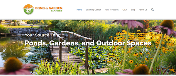
- Pond Market: The website has an attractive, contemporary, eye-catching, and efficient layout. The homepage has a well-organized layout with easy-to-navigate categories, so visitors can locate what they need quickly. The website’s well-structured menu and search tools make navigation a snap. The website has a sticky navigation bar that remains visible as you navigate, providing rapid access to various aspects of the site. The search bar is prominently displayed, allowing users to find specific products or information quickly. The website includes pond maintenance articles and guidelines, product selection guidance, and advice on creating a healthy pond environment.

Top 10 Most Important Aspects of a Pond Website
- High-Quality Images: Visual appeal is crucial in the pond industry. High-quality images showcase the beauty of ponds and attract potential clients.
- Detailed Service Descriptions: Clear and comprehensive service descriptions help visitors understand what is offered and make informed decisions.
- User-Friendly Navigation: Easy-to-navigate websites enhance user experience and keep visitors engaged.
- Customer Testimonials: Positive reviews build trust and credibility, encouraging new clients to choose your services.
- Contact Information: Easy access to contact details ensures potential clients can contact us for inquiries or consultations.
- SEO Optimization: Implementing SEO strategies helps improve search engine rankings and attract more visitors.
- Responsive Design: A mobile-friendly design ensures the website is accessible on all electronic devices, providing a seamless user experience.
- Informative Blog: A blog with helpful tips and guides keeps visitors engaged and positions the website as an authority in the pond industry.
- Fast Loading Times: Quick loading times improve user experience and reduce bounce rates.
- Clear Calls to Action: Prominent calls to action guide visitors towards taking desired actions, such as contacting for a consultation or purchasing.
Ready to elevate your pond builder or pond cleaner website’s digital footprint? Contact CyberOptik for a free consultation about your website design and set your business on a path to digital excellence.

