A well-designed website showcases your expertise and acts as your business’s digital face, making the first impression on potential customers. It is a 24/7 marketing tool, providing valuable information about your services and allowing customers to connect with you anytime.
A professionally designed best plumbing website can set your business apart from competitors. To attract more visitors, it should be aesthetically pleasing, easy to navigate, and SEO-optimized. High-quality images, detailed service descriptions, and clear contact information are crucial elements that help build trust and credibility with your audience. Additionally, incorporating customer testimonials and showcasing completed projects can further enhance your reputation.
A significant number of customers search for plumbing services online. Therefore, your website must be mobile-friendly and fast-loading to provide an excellent user experience across all devices. Investing in a high-quality website ensures that your company remains competitive and accessible to prospective customers looking for dependable plumbing services.
Examples of the Best Plumbing Website Designs
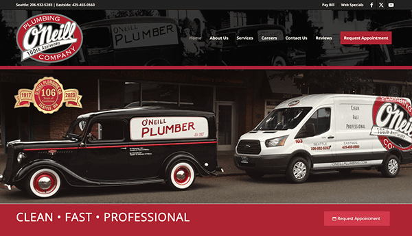
- O’Neill Plumbing Company: Its website provides an excellent user experience with a clean, professional design representing its devotion to quality service. The homepage greets visitors with a clean, modern design that exudes professionalism and reliability. The website is simple to navigate, with separate areas for services, testimonials, and contact information. High-quality photos and clear, helpful text help to effectively promote the company’s expertise and client happiness. Features like 24-hour emergency service and live chat show their commitment to accessibility and client support. The responsive design guarantees that the site operates well on mobile devices and desktops, giving users a consistent experience regardless of the device.
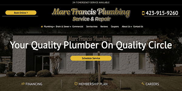
- Marc Francis Plumbing Service & Repair: When visitors arrive at the homepage, they are met with a clean, professional look that immediately portrays confidence and dependability. The use of a muted color palette, primarily golds, blacks, and whites, provides the site with an elegant and professional appearance, which is ideal for a plumbing firm. The design is simple but informative, ensuring consumers are not overwhelmed by clutter and can quickly find the required information. The site’s navigation is easy and intuitive. The top menu is well-organized and well-labeled. The website contains strong calls to action intentionally placed to stimulate user participation. Whether scheduling a service, learning more about a specific offering, or contacting the team, these prompts are simple and appealing, directing consumers to take the next step.
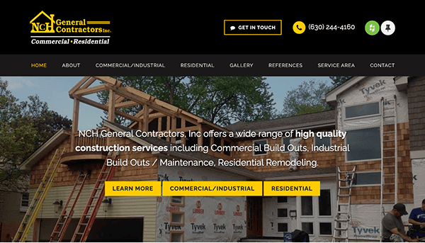
- NCH General Contractors: The clean and professional look is immediately noticeable. The sophisticated color palette, primarily black, yellow, and gray, emanates professionalism and credibility. This is accentuated by the clean, uncluttered style, which focuses on highlighting the company’s strengths and accomplishments. The site’s menu structure is user-friendly and well-organized, making navigation simple. The logical layout allows users to easily access crucial information without making unnecessary clicks. The website effectively uses high-quality imagery. Large, bright photographs of completed projects are prominently featured, demonstrating the organization’s quality and scope of work. Recognizing the importance of mobile accessibility, NCH GeneralContractors has ensured that their website is fully responsive.
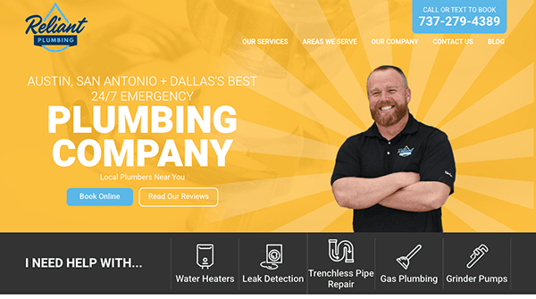
- Reliant Plumbing: The website has a modern, clean, and professional style. The use of a consistent color scheme, primarily blues and whites, gives it a trustworthy and welcoming appearance. The user interface is clear and direct, enabling swift navigation through a comprehensive array of services, including emergency plumbing, leak detection, and water heater repairs. The homepage includes large call-to-action buttons for booking services, making it easy for users to get help immediately. The site also features client testimonials, which demonstrate their dependability and professionalism. Furthermore, the adaptable design provides excellent viewing on mobile devices and desktops, making it ideal for consumers on the move.
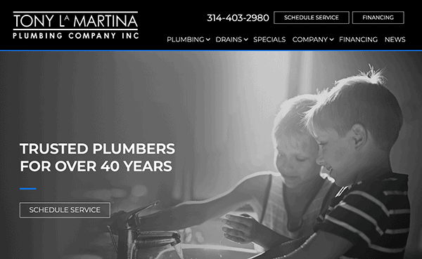
- Tony LaMartina Plumbing Company, Inc.: Its website offers a clean, professional design with easy navigation. The site’s color palette is consistent, consisting of black and white with blue lines, appearing professional. The homepage is captivating and educational. It includes a big hero area with distinct call-to-action (CTA) buttons for scheduling services. The navigation menu is well-organized, with quick access to important sections. Its content is well-organized and informative, offering complete information on various plumbing services. Each service page contains concise descriptions and relevant imagery, which improves the user experience. The use of testimonials and case studies increases credibility. The contact forms are straightforward, and the inclusion of a live chat function provides rapid assistance. The site meets accessibility standards, making it usable by individuals with impairments.
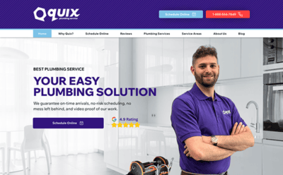
- Quix Plumbing Service: The website stands out for its slick, modern design and user-friendly layout. Its professional color palette of blues, whites, and oranges conveys dependability and professionalism. The simple, straightforward style allows users to discover the information they need. The primary navigation bar is prominently displayed, ensuring easy access to the different sections. The usage of high-quality photos and graphics improves overall visual appeal. The information is well-written and entertaining, effectively presenting the services provided. The smart use of headlines and concise paragraphs makes the content more digestible and user-friendly. Interactive components like forms and call-to-action buttons are intentionally positioned to encourage user participation and facilitate connection with the company.
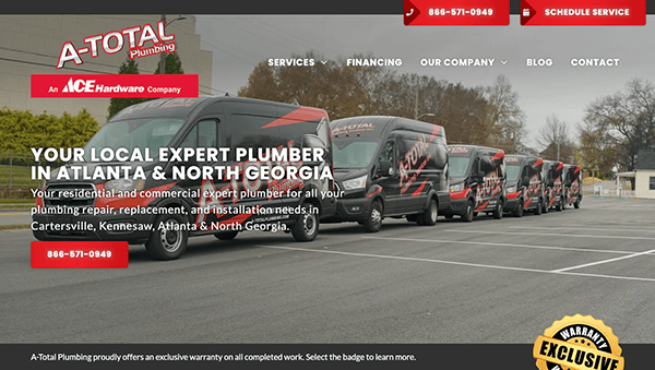
- A-Total Plumbing: The website’s design is sleek and current, which instills trust. The color design is professional and visually appealing, making it pleasant to navigate. It has done an outstanding job of providing extensive information regarding its services. Each service page is detailed, outlining what clients may expect, which promotes confidence and transparency. The website uses high-quality photos throughout, improving the overall user experience. Images of completed projects and satisfied customers lend credibility to the services provided. Customer feedback and reviews are prominently displayed, emphasizing the excellent experiences of previous customers. This social proof guarantees potential customers about the company’s dependability and excellence. Contact information is prominently presented on every page, making it simple for customers to reach out. The website also features a contact form and a service request form, allowing customers to reach out most conveniently.
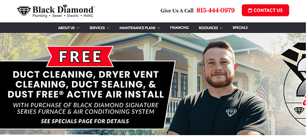
- Black Diamond: The website’s sleek and professional design exudes confidence. The chosen color combination is appealing to the eye, and the layout is neat and organized. The menu is simple and organized, and the intuitive navigation layout makes navigating the website accessible. The website also includes detailed information on their extensive range of services. Each service page is informative, explaining what the service comprises and how it benefits the customer. It features a separate section for special deals. This section lists the current promos, discounts, and seasonal specials for clients. It is prominently displayed, allowing visitors to quickly identify what cost-saving potential exists. It also includes client testimonials and reviews that appear on the website. This social proof promotes trust and confidence in potential clients by emphasizing the positive experiences of previous clients.
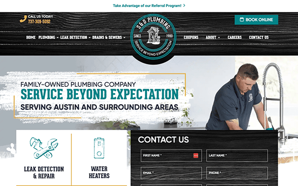
- S&D Plumbing: The website features inventive background patterns, discrete section dividers, and one-of-a-kind image effects. Its design stands out for its innovative use of color and contrast, subtle hover animations, creative fonts, and readily visible contact information for visitors. The website effectively conveys essential signals about the company’s offerings, values, and dedication to client satisfaction. Navigation is simple, with a sticky header that stays visible as you scroll down, giving you quick access to necessary links. The website is responsive and adapts well to various screen sizes and devices. The layout is straightforward and functional on mobile devices, offering a consistent user experience.
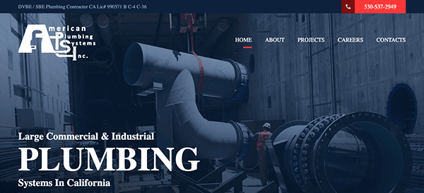
- American Plumbing Systems: The website emanates professionalism with its sleek and sharp design. The layout is open and uncomplicated, with an even distribution of white space that improves reading and user experience. The information is organized into well-defined areas, allowing users to easily explore different parts of the company’s offerings. It prominently features highly visible buttons and links, excellent color contrast, and well-designed sections that enhance usability. Information is easily accessible because of the homepage’s extensive linkages to internal pages. The website efficiently uses high-quality photographs related to plumbing services, such as team portraits and featured projects. These visuals enrich the material and add a personal touch by highlighting the team and their work. The usage of client testimonials and exhibited past projects lends credibility and insight into the plumbing company’s skills.
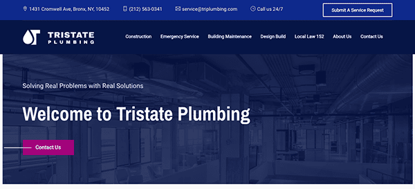
- Tristate Plumbing: The website boasts a clean, modern aesthetic with a color scheme that predominantly features shades of blue and white. The primary navigation has a sticky header that keeps the main menu visible as visitors browse the page. This feature, together with the sensible dropdown menus, ensures visitors can access the information they seek. The website’s contact information is prominently displayed, making it clear and simplified for potential clients to get in touch. Its information is concise, straightforward, and informative. It effectively communicates its service offerings, company values, and commitment to customer happiness. The presence of customer testimonials and detailed service descriptions increases credibility and fosters trust among potential clients.
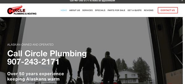
- Circle Plumbing and Heating: The website has a well-executed design, with a consistent color scheme, high-quality pictures, an effective parallax scrolling effect, and clear typefaces. The well-organized layout starts with an effective hero section that communicates the service area and expertise with concise content, various call-to-action buttons, and a captivating video of the team in action. The navigation is simple, with a prominent header and dropdown menus under services, giving a consistent user experience. High-quality photos and carefully positioned visuals offer a personal touch, which improves the overall aesthetic appeal. Utilizing high-caliber imagery, captivating videos, and explicit calls-to-action amplifies user engagement, facilitating seamless connections between potential customers and the company.
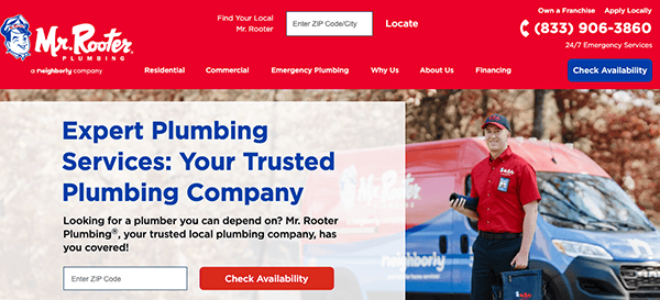
- Mr. Rooter Plumbing: The website has a clean, minimalist, modern design, with a bright color scheme of red, white, and blue that complements the company’s logo. This palette not only draws attention but also promotes dependability and trustworthiness. The use of abundant white space ensures that the site does not feel congested, increasing the overall visual appeal and readability. The layout is meticulously designed, beginning with a large hero section that immediately grabs visitors’ attention. The navigation menu is simple and straightforward. The hero section is very effective, with eye-catching pictures and concise writing that conveys the company’s service offers and commitment to client pleasure. Prominent call-to-action buttons stimulate user participation, resulting in increased conversions and engagement.
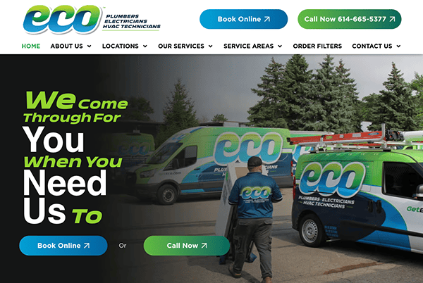
- Eco Plumbers: The design is clean and visually appealing, boosting the user experience while highlighting the company’s environmentally friendly products and services. The website’s refreshing color scheme of green, white, and earth tones quickly emphasizes its commitment to sustainability. This color scheme is not only visually beautiful, but it also supports the brand’s environmentally responsible values. The design is basic but effective, focusing on usability and user interaction. The layout is well-organized, beginning with a visually appealing hero section filled with high-quality photographs and intriguing writing regarding sustainability. The website includes prominent call-to-action buttons that guide customers to browse products or obtain further information about their solutions.
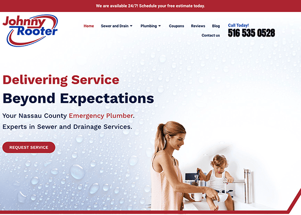
- Johnny Rooter: Its website features a clean and professional design with a patriotic color scheme of red, white, and blue, giving it a strong and trustworthy appearance appropriate for a service-oriented organization. The navigation is straightforward and user-friendly. The menu is concise and prominently presented at the top of each page. The website effectively enhances the information with minimum stock photographs and clearly depicts the services. The website’s design elements are similar throughout, resulting in a unified user experience. The contact form on the home page allows visitors to reach out instantly. CTAs are deliberately positioned throughout the website, prompting users to take the intended action.
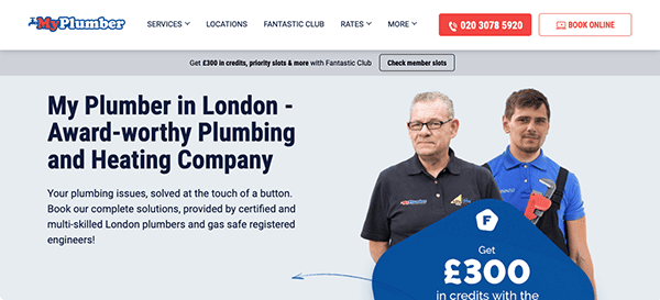
- My Plumber Limited: The website’s design is modern and visually appealing. The color scheme, primarily blue and white, conveys a sense of cleanliness and professionalism appropriate for a plumbing service. The layout is well-organized, creating a great first impression. The home page is well-organized, with a straightforward and appealing design. The essential services are prominently shown, and high-quality photos improve the overall appearance. Customer testimonials and trust badges are displayed, increasing credibility and encouraging new clients to use their services. CTAs are strategically positioned throughout the website, prompting consumers to schedule a service or contact the provider. The buttons are noticeable and invite interaction.
- Roto-Rooter: Its website is designed to be user-friendly and professional, effectively communicating the company’s vast plumbing and water cleanup services. The homepage is well-organized, with clear navigation choices that make discovering information about emergency plumbing, drain cleaning, water damage restoration and more simple. Key elements include a visible “Schedule Online” button, thorough service descriptions, and trust-building customer testimonials. The service also promotes openness, offering free onsite estimates and no additional fees for nights or weekends. Thus, it efficiently gives a seamless experience for people looking for dependable plumbing services.
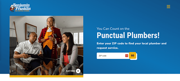
- Benjamin Franklin Plumbing: Its website is notable for its clean, modern design, which promotes user experience and accessibility. The color pattern is professional and peaceful, with a blue and white palette that conveys trust and dependability. The menus are simple and well-labeled, and the service and location finder functions make it easy for users to access the information they need. Services are well-organized, with thorough explanations that help users comprehend their alternatives and the company’s competence. Customer testimonials and open pricing foster trust, while the site’s commitment to punctuality and satisfaction is conveyed. Overall, it offers a user-friendly and customer-centric online presence.
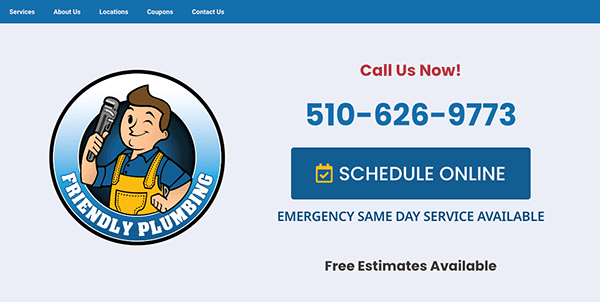
- Friendly Plumbing: The website is well-designed with regard to the aspects required for a good user experience. The page includes detailed service information, simple lead capture forms, and convincing social proof in the form of client testimonials. Discounts are prominently advertised, prompting potential buyers to act. Service locations are appropriately labeled, improving accessibility. The design is clean and well-organized, with sections nicely aligned and separated by alternate shades, resulting in a visually appealing and unified appearance. The color scheme is harmonized, which enhances readability and overall beauty. The site’s responsive design guarantees a consistent experience across all devices, and the intuitive navigation makes it easy to identify service locations and contact information.
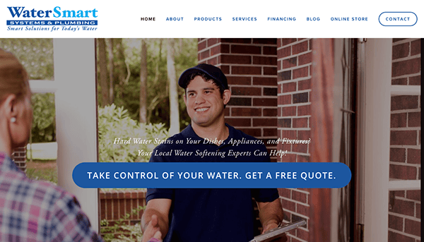
- Water Smart: Since 1994, the company has provided innovative, high-quality water purification systems and plumbing services to consumers in specific areas. Its website has a user-friendly layout that efficiently communicates its services and products. The homepage has a simple design with easy navigation connections to critical areas such as “Products,” “Services,” and “Contact.” The inclusion of high-quality photos and short, functional language improves the user experience, while client testimonials increase credibility. Detailed product descriptions and an easy-to-use contact form help potential consumers quickly get the necessary information. Including testimonials and comprehensive service descriptions increases confidence and credibility.
A superb plumbing website does more than just inform; it engages and converts visitors into customers. To achieve this, your site should include strong calls to action, entertain visitors, and encourage them to contact you for consultations, request quotes, and schedule services. Interactive features like online booking systems and live chat assistance may greatly improve the user experience and increase conversions.
Moreover, integrating a blog section with useful plumbing tips and industry news is not just a suggestion but a powerful strategy to improve your website’s SEO and establish your business as an authority in the field. Regularly updating your content ensures that visitors return to your site, increasing the chances of them choosing your services when needed inspiring you to create engaging and informative content.
A collaboration with a reputable web design agency like CyberOptik is a strategic move that ensures your plumbing website meets all the criteria for success. From design and functionality to SEO and user experience, we understand what it takes to create a top-tier plumbing website. Contact us today for a free consultation about your plumbing website, and let us help you craft a website that will attract and convert visitors into loyal clients, giving you peace of mind about your online presence.

