In the competitive field of plastic surgery, a well-crafted website is not just an asset; it’s a necessity. It serves as your digital storefront, offering the first glimpse into the level of care and professionalism you provide. A top-notch website creates an immediate sense of trust and credibility, crucial for attracting new patients and establishing a strong online presence. It provides comprehensive information on services, credentials, before-and-after galleries, and patient testimonials—all vital tools for engaging potential clients.
Today’s plastic surgery patients are discerning and well-informed. They spend considerable time researching online before selecting a practitioner. A superior website must be aesthetically pleasing, reflect the services’ quality, and be informative, user-friendly, and secure. It should answer potential patients’ questions about procedures, recovery times, risks, and costs in an easy-to-navigate format. Moreover, integrating features such as virtual consultations, interactive galleries, and clear calls-to-action can significantly enhance the user experience, making the website a powerful conversion tool.
The digital landscape for best plastic surgeon websites is evolving, with more practices vying for attention than ever. A standout website can differentiate a practice from the competition by showcasing unique selling propositions and the surgeon’s expertise. SEO optimization is also critical, ensuring the practice appears prominently in search results and drives more organic traffic to the site. The combination of compelling content, striking visuals, and a seamless user interface establishes the website as an extension of the practice’s commitment to excellence and patient satisfaction.
Examples of the Best Plastic Surgeon Website Designs
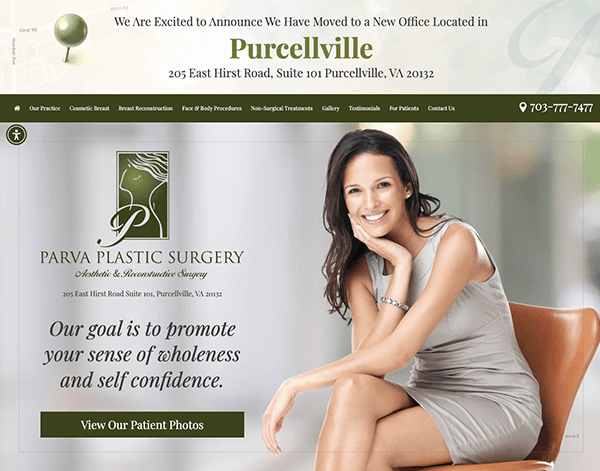
- Parva Plastic Surgery: The website’s appearance and functionality blend seamlessly. The site has a gorgeous design, with a clear and accessible layout that leads visitors quickly through its rich content. Navigation through the various areas was simple, courtesy of clear menu options and well-organized content. Everything is readily available if you’re looking for information on specific operations, the surgeon’s background, or patient testimonials. One standout feature of their website was the detailed information about the various surgical and non-surgical procedures available. Each surgery is thoroughly discussed, and before and after images illustrate the astonishing results achieved by Dr. Parva and his staff.
- New York Group for Plastic Surgery: The sleek and modern design has a simple layout that quickly conveys trust in the practice’s ability. The navigation is seamless due to logical menus and clear calls-to-action that direct users to the required information. Including patient testimonials and success stories gives a human touch, reassuring potential clients about the level of service they may expect. One of the most noticeable elements is the use of high-resolution photos throughout the website. From the fascinating hero photographs that reveal the outcomes of their treatments to the thorough before-and-after galleries, each shot is meticulously chosen to emphasize the surgeons’ talent and artistry. The website stands out for its powerful calls to action, user-friendly contact forms, and clever disabilities button. Strategically positioned CTAs encourage visitors to take the next step, while user-friendly contact forms make communication easier. The presence of a handicap button reflects the practice’s dedication to accessibility, allowing all visitors to explore the site comfortably.
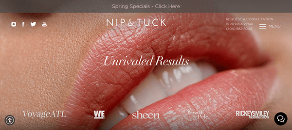
- Nip & Tuck Plastic Surgery: The simple style, sophisticated color palette, and high-quality pictures give the website an air of professionalism and elegance. The combination of soft tones and subtle gradients provides a relaxing ambiance, ideally representing the tranquility and reassurance people want while considering cosmetic operations. One of the website’s notable characteristics is its abundance of educational offerings. From extensive process descriptions to educational blog entries and patient testimonials, it provides visitors with knowledge to make informed judgments about their aesthetic goals. FAQs reflect the clinic’s dedication to transparency and client happiness. The website’s built-in appointment scheduling system makes booking a consultation or operation simple. The addition of a chat box for tailored assistance guarantees that clients receive timely support and guidance throughout the process, increasing convenience and efficiency.
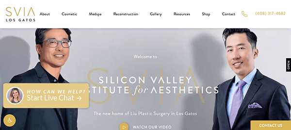
- Liu Plastic Surgery: The simple layout, pleasing color palette, and outstanding images produce an atmosphere of elegance and professionalism. Each element is deliberately arranged, creating a smooth and visually appealing visitor experience. The website’s straightforward interface and well-organized structure make navigation a snap. You’ll find what you need quickly, whether you’re looking to discover more about the surgical and non-surgical procedures available, the renowned medical team, or financing choices. The website’s responsive design delivers a consistent experience across all devices, meeting clients’ needs. The website’s friendly and caring tone and emphasis on customized care instill confidence and trust in potential clients. The clinic fosters a friendly environment where clients feel appreciated and empowered throughout their aesthetic journey through informed material, transparent pricing, and a dedication to excellence.
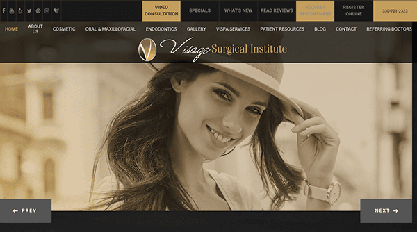
- Visage Facial Surgery: The design oozes professionalism and elegance, reflecting the skills one would expect from a premier facial surgery practice. The layout is clear and uncluttered, allowing visitors to focus on essential information. Each segment flows easily into the next, taking customers on a voyage of discovery about the services available and the surgical team’s expertise. Navigation is simple because of the straightforward menu structure and carefully positioned call-to-action buttons. The inclusion of before-and-after galleries improves the user experience by demonstrating the transforming power of expert surgical methods.
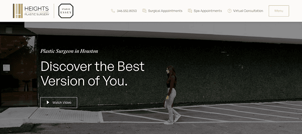
- Heights Plastic Surgery: The website’s visual appeal stems from a beautiful combination of colors, text, and images. The color scheme symbolizes sophistication and professionalism. The menu’s layout is straightforward and concise, directing users to their intended destination with minimal effort. Additionally, call-to-action buttons strategically positioned throughout the site stimulate engagement and allow for seamless interaction. The website also uses interactive components, including before-and-after galleries, interactive forms, and video testimonials, to keep visitors interested and improve their browsing experience. Its content enriches the user experience with informative articles, insightful blog posts, and compelling patient testimonials. These resources provide invaluable guidance and empower visitors to make well-informed choices regarding their aesthetic objectives.
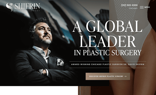
- Shifrin Plastic Surgery: Its website is a fascinating blend of visual beauty and user-friendly design, establishing a new standard for online presence in the plastic surgery industry. The design exudes refinement, with a harmonized color scheme and exquisite typography emphasizing the practice’s dedication to excellence. The navigation is logical and user-friendly, with a well-organized menu layout that directs users to their chosen destination without confusion. Whether studying treatments, learning about the practice’s philosophy, or requesting a consultation, you’re always just a click away from the needed information. It has featured on the website its appreciation for its many awards and honors in cosmetic surgery.
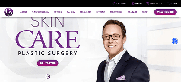
- Care Plastic Surgery: The design exudes warmth and professionalism, with a cohesive color scheme and attractive typography that conveys trust and knowledge. Visitors may locate the information they need, whether it’s regarding treatments, the surgical team, or patient testimonials. Clear calls to action encourage visitors to take the next step, such as arranging a consultation or contacting the clinic. Interactive features like contact forms, virtual consultations, and appointment scheduling tools increase user engagement and make the process easier for new patients. These interactive aspects make communication easier and allow visitors to take proactive measures toward their aesthetic goals from the website.
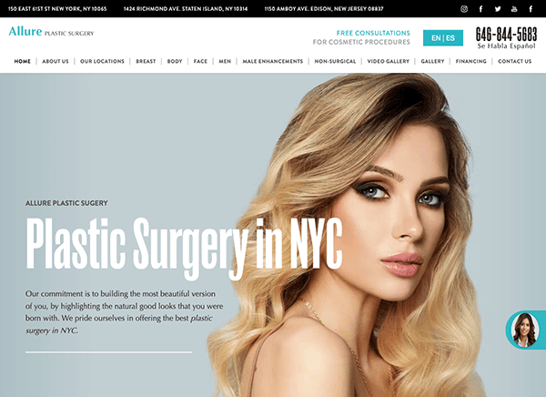
- Allure Plastic Surgery: The website’s clean and polished design reflects the professionalism and knowledge of its services. The layout is simple, with easy navigation that takes users fluidly across the many components of the website. The structured menu and dropdown sections facilitate navigation, allowing visitors to easily find information on treatments, the medical team, and other essential details. High-quality photographs enhance visual appeal while effectively demonstrating the outcomes that clients can expect from their procedures. Contact details are clearly displayed, enabling potential clients to reach out and inquire further easily. In addition, a chat box function allows visitors to interact with the practice in real-time. The chat box improves user accessibility and convenience, whether they are looking for rapid responses to questions or help arranging appointments.
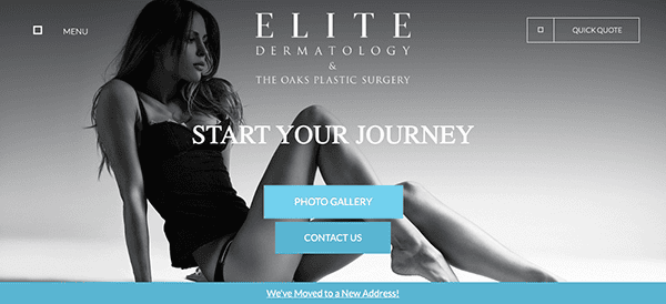
- The Oaks Plastic Surgery: The website uses a pleasant visual palette, mixing soft tones and clean lines to create a relaxing atmosphere. Subtle gradients and soft contrasts offer dimension to the design, enticing visitors to discover more. The website features high-resolution photographs that highlight the artistry and expertise of its crew. Before-and-after galleries demonstrate the transforming consequences of various treatments, instilling confidence in future clients. The layout was meticulously developed to prioritize user involvement and accessibility. Clear calls to action encourage visitors to explore options, arrange consultations, or contact the clinic with questions. Hover effects and animation transitions are interactive components that enhance the browsing experience.
- Rowe Aesthetics: Its website is a stunning combination of luxury and functionality, representing the brand’s commitment to providing high-quality wellness services. The refined color choice of soft neutrals and relaxing whites provides a peaceful ambiance that puts visitors at ease. High-quality images and a clean, simple design quickly highlight the spa’s luxury products. The homepage is well-designed, with simple navigation allowing customers to easily explore services, prices, and testimonials. The incorporation of a blog and educational tools adds value by establishing the spa as a reputable authority in the wellness industry. Call-to-action buttons are positioned strategically, and an easy-to-use booking function helps streamline the consumer experience.
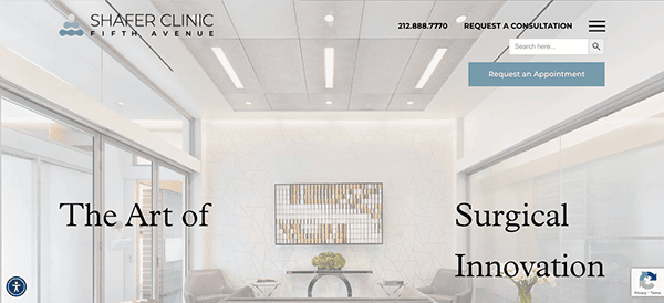
- Shafer Clinic Fifth Avenue: Its website design stands out for its clean appearance and smooth animations, which provide users with a seamless browsing experience. The clinic uses a minimalist layout to exhibit previous client makeovers successfully, delivering compelling imagery of attainable results. Testimonials and before-and-after images prove the clinic’s expertise and commitment to client satisfaction. The website also extensively describes the many services available, allowing users to make informed selections regarding their cosmetic goals. With its user-friendly appearance and straightforward navigation, the website offers straightforward access to details on the various procedures and treatments offered. The Shafer Clinic’s dedication to excellence shines through in every area of its website design, from the elegant looks to the insightful content.
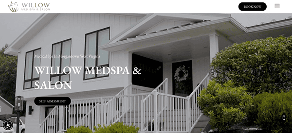
- Willow MedSpa: Its website features an aesthetically pleasing look that radiates refinement and tranquillity. The use of soft hues, fine font, and high-quality graphics provides a welcoming and relaxing atmosphere. Its website smoothly integrates visual content into its plastic surgery website design, establishing a standard for others to emulate. This intelligent placement quickly attracts visitors’ attention by providing an engaging introduction to the clinic’s offerings and atmosphere. Emphasizing visual storytelling produces an immersive experience that appeals to potential clients, instilling trust in the clinic’s expertise and commitment to customer happiness. The website gives detailed information on the many services available, allowing users to make informed judgments regarding their aesthetic goals. Throughout the website, cleverly positioned CTAs inspire users to take the next step in their quest for rejuvenation and self-care.
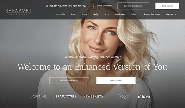
- Rapaport Plastic Surgery: Its website design features eye-catching, modern hues that immediately capture visitors. Furthermore, the website’s easy layout makes it simple to access the information you’re looking for. Users can find the therapies they seek by classifying their services into three unique groups. Furthermore, the website builds credibility and confidence through solid social proof, highlighting the clinic’s appearances in popular magazines. This intentional use of social proof immediately instills trust in potential clients, strengthening the clinic’s reputation and skill. The website also goes above and beyond to facilitate interactions with its clientele. It provides complete contact information and handy contact forms, allowing visitors to contact them with questions or appointment requests simply. Furthermore, the website contains compelling calls-to-action (CTAs) strategically positioned throughout, encouraging users to take action, whether scheduling a consultation, signing up for exclusive deals, or researching the latest treatments.
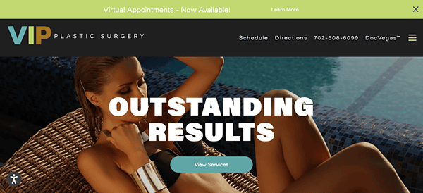
- VIP Plastic Surgery: The website’s gorgeous layout exudes sophistication and professionalism. The streamlined design, high-quality imagery, and exquisite writing create an enticing first impression reflecting the clinic’s dedication to luxury and excellence. The website uses large, eye-catching graphics throughout to effectively showcase the clinic’s services and results. Furthermore, the intentional use of high-contrast images makes their photos stand out, allowing visitors to enjoy the nuances and results displayed fully. It also has an organized menu and clear calls-to-action that direct users through the site’s various sections, making it simple to explore services, read patient testimonials, and contact the clinic.
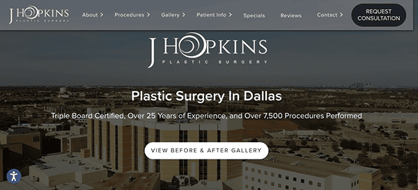
- Dr J Hopkins: The website’s design strikes an ideal blend of simplicity and refinement. The sleek interface quickly draws attention, allowing users to focus on the most essential components without feeling overwhelmed. The color palette, which includes soothing tones and subtle contrasts, produces a tranquil ambiance consistent with the healthcare industry’s values of comfort and trust. The website’s easy-to-use menu structure guarantees that visitors can locate the information they seek, whether it involves understanding the practice, discovering services, or reaching out to the team. High-quality pictures are essential for increasing the website’s appeal. From appealing hero photos to genuine shots of the practice and its personnel, visual content is deliberately placed throughout the site to reinforce the brand’s identity and develop a personal connection with visitors. The usage of video increases the user experience by providing vital insights and increasing engagement.
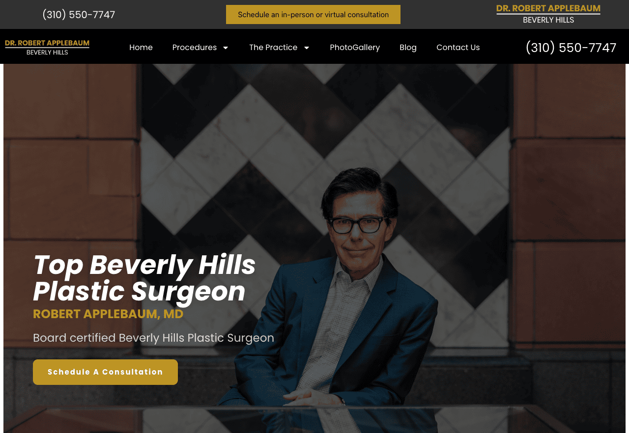
- Applebaum MMD: The website’s design is elegant and refined, blending modern aesthetics with straightforward functionality. Its sleek design draws attention, providing a seamless fusion of form and function. Its elegant structure and intuitive navigation simplify exploration, allowing visitors to quickly obtain important information about the practice’s offerings and arrange appointments. The website’s accessibility and responsive design ensure a consistent experience across all devices, while high-quality pictures and engaging multimedia content create a personal connection with visitors, instilling trust and confidence in the business. It has created a vibrant hub for community engagement and education. The website encourages continuing dialogue and deepens ties with its audience through educational blog articles, patient testimonials, and interactive features.
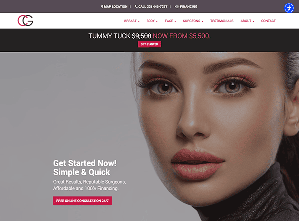
- CG Cosmetic Surgery: The website’s design exudes sophistic and elegance, expressing the essence of the cosmetic surgery industry. Its clean layout and appropriate color palette provide a visually appealing experience, while modest animations provide dynamism without overwhelming the user. The use of high-quality graphics and clean typography improves the overall aesthetic appeal, making a lasting impression on visitors. Its website is smooth and intuitive, with a well-organized navigation layout that allows for quick exploration of various parts, including treatment descriptions and patient resources. Clear calls-to-action are featured on thoughtfully designed sites, guiding consumers and assisting them in making educated decisions. The utilization of sizable graphics significantly contributes to conveying the site’s elegance.
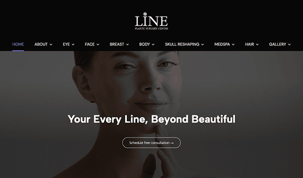
- LINE Plastic Surgery Center: The website’s design is outstanding, capturing users’ attention with its sleek and modern appearance. The layout is simple and straightforward, providing a fluid browsing experience. The color scheme is well-chosen, resulting in a visually appealing environment that encourages user involvement. The website’s homepage welcomes visitors with a stunning hero image that establishes the brand’s tone. Excellent photos across the site lend a professional and polished touch, increasing the overall visual appeal. It contains clean and succinct headings that complement the well-spaced body content. It also smoothly integrates interactive features into its design. From subtle hover effects to interactive sliders and buttons, each element responds to user activities, delivering a dynamic and engaging browsing experience.
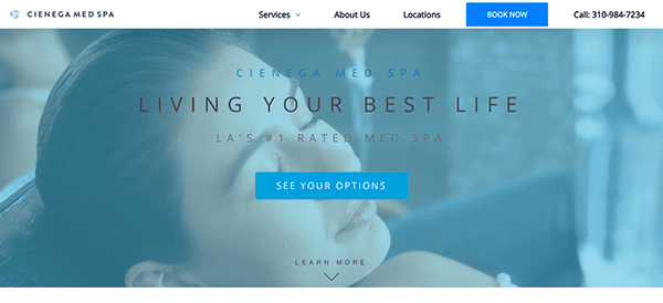
- Cienga Medspa: The website features an incredible selection of color schemes that immediately capture the eye. Notably, the strong blue and white accents radiate conservatism and build confidence in the viewer. It has a simple and uncomplicated design, making sure that important information is easily accessible without overwhelming the user. It also employs high-quality photos and attractive writing to convey a sense of refinement and professionalism, indicating that this is a location where quality and excellence are prioritized. Furthermore, the website proudly displays its awards and customer service. These distinctions demonstrate the spa’s dedication to providing high-quality treatments and unforgettable experiences.
The top websites in the plastic surgery industry are those that successfully blend innovative design with functionality, delivering a user experience that is both engaging and educational. These websites often feature modern, clean designs with high-quality images that highlight the transformative results of their procedures. Navigation is transparent, allowing users to easily access detailed information on treatment options, surgeon qualifications, and patient testimonials—critical elements for establishing trust and credibility.
Interactive elements like virtual try-on tools, detailed FAQs, and before-and-after photo galleries help prospective patients visualize outcomes and better understand what to expect from their procedures. These features, along with easy-to-use contact forms and online booking systems, not only improve user engagement but also streamline the process of scheduling consultations, enhancing overall service accessibility.
Moreover, the best plastic surgeon websites ensure that they are mobile-responsive and comply with all privacy regulations, which is crucial for protecting patient information. They also integrate social media platforms to extend their reach and patient interaction, providing a platform for ongoing engagement and community building. These sites maintain relevance and effectiveness in a fast-paced industry by continuously updating their content and embracing the latest web technologies.
If you’re looking to develop or enhance your plastic surgery practice’s website, CyberOptik understands the unique needs of this industry. Our expert team specializes in designing customized, cutting-edge websites that resonate with prospective patients and elevate your online presence. Contact CyberOptik today for a free consultation to discuss how we can help you achieve one of the best plastic surgeon websites in the industry, driving growth and enhancing patient engagement.

