In the digital era, a photographer’s website is more than just an online portfolio; it’s a comprehensive showcase of their artistic vision, technical skills, and unique style. The best photographer websites display stunning imagery and provide a seamless user browsing experience, ensuring potential clients can easily navigate through the portfolio, learn about the photographer, and get in touch for bookings. Whether you’re a skilled professional or an emerging talent, having a well-designed website is crucial to standing out in the competitive world of photography.
Photographers’ websites must be visually appealing, accessible, and mobile-friendly. They should feature high-quality images, a clear and concise biography, client testimonials, and an easy-to-use contact form.
Integrating social media connections and a blog can help photographers engage with their audience and showcase their latest work and behind-the-scenes stories.
This article will explore 20 of the best photographer websites that exemplify these qualities. These websites have been chosen based on their design, functionality, and overall user experience. Whether you’re looking for inspiration for your site or simply want to appreciate beautiful photography, these websites will impress.
Examples of the Best Photographer Website Designs
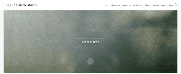
- Lulu and Isabelle Studio: Lulu and Isabelle Studio’s website captivates visitors with its full-width banner showcasing a diverse range of photography. The sophisticated color palette and striking images invite viewers to embark on a visual journey. User-friendly navigation arrows and prominent typography create an immersive experience, drawing visitors deeper into the captivating world of photography on display. The site’s clean design and easy-to-navigate structure ensure visitors can effortlessly explore various galleries and learn more about the studio’s offerings.

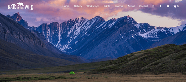
- Nate Luebbe: Nate Luebbe’s portfolio stands out with its awe-inspiring full-width imagery and user-friendly navigation. The arresting visuals and prominent typography seize the viewer’s gaze, creating an immersive experience that draws them further into the captivating world of photography on display. The website features a minimalist and sophisticated design that focuses squarely on the images, allowing Nate’s stunning landscape and wildlife photography to shine. The site also includes a blog section where Nate shares his adventures and photography tips, providing additional value to visitors.

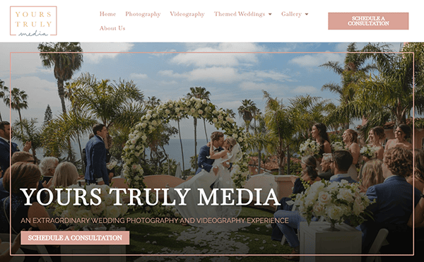
- Yours Truly Media: Specializing in wedding photography and films, Yours Truly Media’s homepage features striking full-width banners with concise text. The curated images, elegantly presented in a spacious dynamic-view format, transport visitors into an experience akin to perusing a cherished wedding album, ensuring an emotional connection to the captured moments. The website’s design emphasizes the storytelling aspect of wedding photography, with each gallery meticulously organized to showcase the narrative of the couple’s special day. The site also includes client testimonials and a detailed services page, making it easy for potential clients to understand what Devotion Media offers.

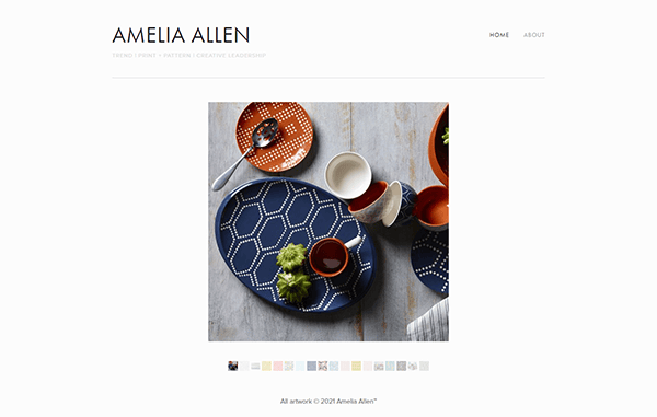
- Amelia Allen: Amelia Allen’s website boasts a beautifully crafted design with a portfolio replete with opulent, evocative, and atmospheric photographs. The unique presentation style, opting for horizontal layouts over the conventional grid structure, ensures the focus remains squarely on the images, allowing visitors to gain a deeper insight into the photographer’s artistic style and creative approach. The site’s elegant design and intuitive navigation make it easy for visitors to explore various projects and learn more about Amelia’s work. Additionally, the website includes a blog where Amelia shares her thoughts on photography and her latest projects.

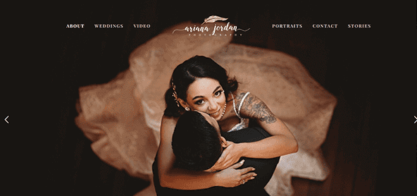
- Ariana Jordan: Ariana Jordan’s website greets visitors with a visually arresting grid display on the homepage, showcasing a carefully selected assortment of captivating portraits. The navigation menu offers easy access to several category-specific galleries, allowing visitors to explore the nuances and diversity within her portfolio with just a click. The site’s clean design and easy-to-navigate structure ensure that visitors can effortlessly browse through different galleries and learn more about Ariana’s approach to photography. The website also includes client testimonials and a detailed services page, providing potential clients with all the necessary information.

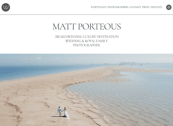
- Matt Porteous: Matt Porteous’ website features a visually engaging splash page offering visitors three choices: event, travel, and wedding photos. Each option seamlessly directs visitors to a dedicated portfolio page, highlighting a unique aspect of his photography expertise. The dynamic blog section enriches visitors’ experience with insightful content and updates. The site’s clean design and intuitive navigation make it easy for visitors to explore different galleries and learn more about Matt’s work. Additionally, the website includes client testimonials and a detailed services page, providing potential clients with all the information they need.

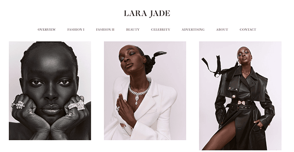
- Lara Jade: Lara Jade’s website employs a clean, white background, which is a familiar choice among photography websites. The curated grid display on the homepage showcases a carefully selected assortment of captivating portraits. The navigation menu offers access to several category-specific galleries, allowing visitors to delve deeper into her work. The site’s elegant design and intuitive navigation make it easy for visitors to explore various projects and learn more about Lara’s work. Additionally, the website includes a blog where Lara shares her thoughts on photography and her latest projects.

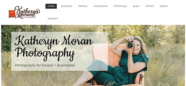
- Katheryn Moran Photography: Katheryn Moran Photography’s website is a testament to her decade-long experience in the industry. Based in Bellingham, WA, and traveling around the Pacific Northwest, Katheryn’s site features a welcoming introduction and a portfolio highlighting her posing, lighting, and directing expertise. The site’s design is user-friendly, with easy navigation that allows visitors to explore various galleries, client testimonials, and detailed information about her services. The website’s clean layout and high-quality images ensure visitors can appreciate Katheryn’s work’s depth and quality.

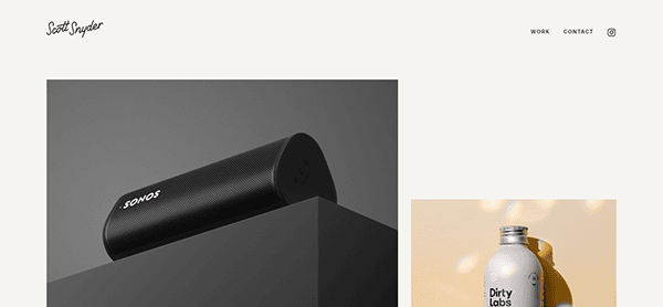
- Scott Snyder: Scott Snyder’s website is a prime example of a minimalist design emphasizing high-quality imagery. The homepage features a clean layout with plenty of negative space, allowing his product and object photography to take center stage. Visitors can click on each photo to learn more about the project, including Scott’s roles and the client’s details. The site also includes a separate “Work” page, where more of Scott’s projects are displayed in a two-column layout, making it easy for visitors to navigate and find inspiration.

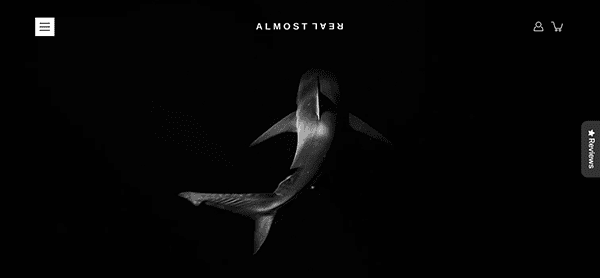
- Almost Real: Almost Real’s website stands out with its unique design and captivating full-width imagery. The homepage features a sophisticated color palette and striking images that invite visitors to explore further. The site’s user-friendly navigation and prominent typography create an immersive experience, drawing visitors deeper into the world of photography on display. The website also includes a blog section where the photographer shares insights and updates, adding an extra layer of engagement for visitors.

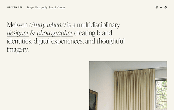
- Meiwen See: Meiwen See’s website is a minimalist masterpiece that showcases his travel, people, editorial, and interior photography. The homepage features a short bio and a selection of portfolios, with a minimal navigation bar that helps visitors find more of his work. The photography portfolio is organized in a four-column layout, making it simple for visitors to browse the images and appreciate Meiwen’s unique style. The site’s clean design and intuitive navigation ensure a seamless user experience.

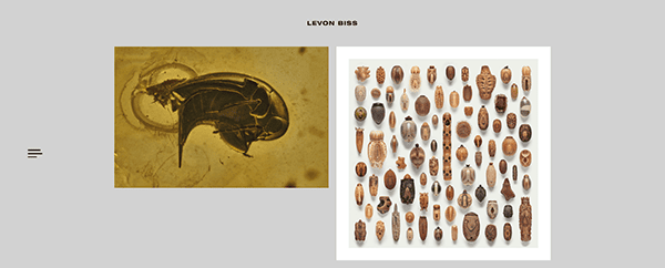
- Levon Biss: Levon Biss’ website is a visual feast featuring his work with people, soccer, and insects. The homepage serves as the main portfolio page, showcasing featured photos in a unique yet user-friendly manner. Visitors can tick on each image to learn more about the project, including the story behind the photo. The website also includes separate portfolio pages for different categories of Levon’s work, making it easy for visitors to explore specific types of photography.

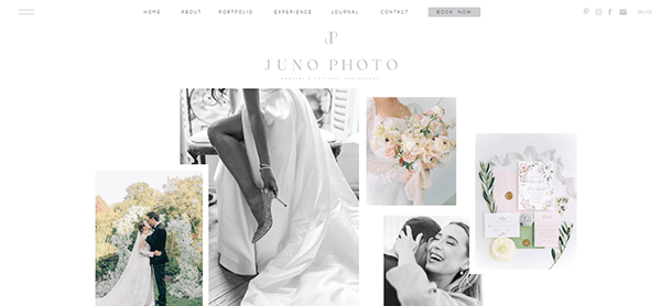
- Juno Photo & Film: Juno Photo & Film’s website captures the essence of weddings and elopements with its elegant design and stunning visuals. The homepage features a selection of wedding photos complemented by a neutral color palette and refined typography. The straightforward navigation bar guides visitors to various galleries, including weddings, elopements, and the latest works. Each portfolio page is thoughtfully organized, allowing visitors to explore the photographer’s work in detail.

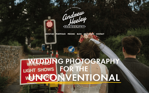
- Andrew Heeley Photography: Andrew Heeley Photography’s website caters to unconventional and alternative weddings with a conventional look and feel. The portfolio page allows visitors to choose from different categories of photos, including couples, weddings, and family photos. Once a category is selected, the corresponding portfolio gallery opens, showcasing Andrew’s work in an organized and visually appealing manner. The site’s clean design and easy navigation ensure a seamless user experience.
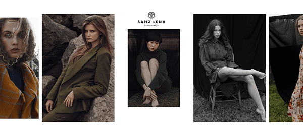
- Sanz Lena: Sanz Lena’s website is a stunning example of a fashion and beauty photography portfolio. Built using a classic Format template, the site features a clean, organized layout showcasing Sanz’s impressive portfolio. The homepage includes a selection of featured photos, while the navigation bar provides easy access to different categories of work, including editorial, still-life, and personal projects. The website’s design ensures visitors can appreciate Sanz’s photography’s quality and diversity.

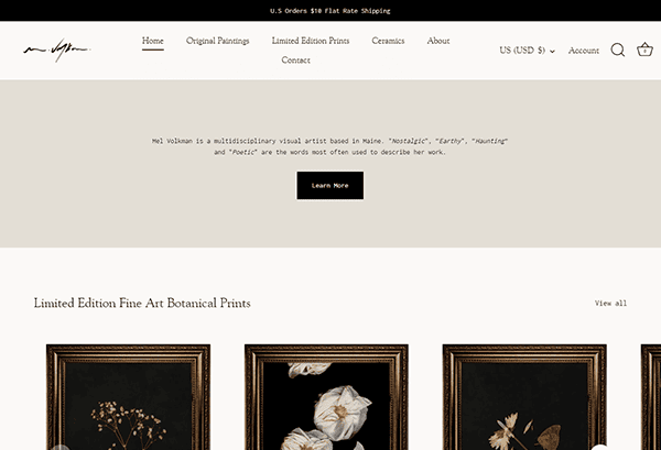
- Mel Volkman: Mel Volkman’s website is a beautifully crafted platform that showcases her fine art photography. The clean and simple design focuses on displaying her work and selling prints. The ecommerce store uses an Instagram profile-like three-column template, while the “Journal” section features photos stacked one below another. The site’s elegant design and easy navigation make it easy for visitors to explore Mel’s work and make purchases.

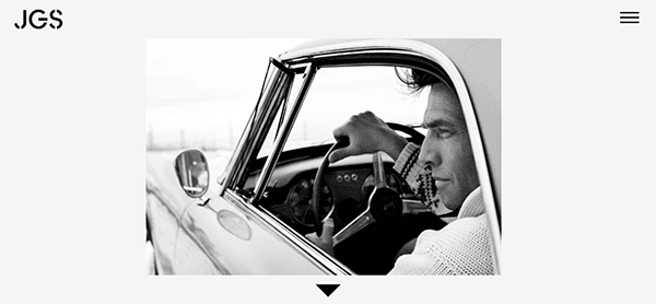
- Jonathan Glynn Smith: Jonathan Glynn Smith’s website is an excellent example of a photography portfolio that keeps photos front and center. The homepage features thumbnails of different projects, allowing visitors to click and view a particular project’s work. The site’s clean design and intuitive navigation ensure visitors can easily explore Jonathan’s extensive portfolio, including work for big brands and small businesses.

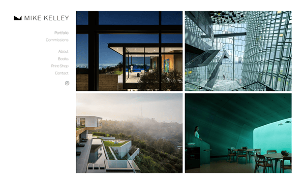
- Mike Kelley: Mike Kelley’s website is a clean and well-organized platform that showcases his architectural and aviation photography. The homepage is divided into two columns, with the central section displaying his works and the left column providing navigation to different parts of the website. Visitors can easily explore Mike’s portfolio, ecommerce store, about page, and contact page. The site’s design ensures visitors can appreciate Mike’s photography’s quality and detail.

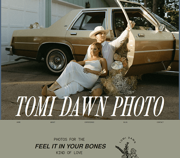
- Tomi: Tomi’s website is a visually engaging platform showcasing his diverse photography range. The homepage features a selection of stunning images, while the navigation bar provides easy access to different galleries, including travel, portrait, and commercial photography. The site’s clean design and intuitive navigation ensure that visitors can effortlessly explore Tomi’s work and learn more about his approach to photography.

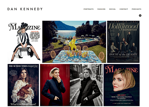
- Dan Kennedy: Dan Kennedy’s website uses a black-and-white color palette to create a striking and professional look. The homepage displays past projects, with each photo accompanied by detailed information about the project. The site also includes a podcast section, where Dan shares insights and stories about his work. The website’s design ensures visitors can easily navigate through different sections and appreciate the quality of Dan’s photography.

Top 10 Most Important Aspects of a Photographer’s Website
- High-Quality Images: Ensure your website showcases high-resolution images highlighting your photography skills.
- User-Friendly Navigation: Make it easy for visitors to navigate your portfolio and find what they want.
- Responsive Design: Optimize your website for desktops and devices to provide a seamless user experience.
- Clear Biography: Include a concise and engaging biography to introduce yourself and your work to potential clients.
- Client Testimonials: Display client testimonials to establish trust, rapport, and credibility.
- Easy Contact Form: Provide an easy-to-use contact form to make it simple for potential clients to reach out to you.
- Social Media Integration: Connects your social media profiles to engage with your audience and showcase your latest work.
- Blog Section: Maintain a blog to share behind-the-scenes stories, tips, and updates about your work.
- SEO Optimization: Optimize your web page for search engines to increase visibility and attract visitors.
- Online Store: If applicable, include an online store to sell your prints and other photography-related products.
Ready to elevate your photography’s digital footprint? Contact CyberOptik for a free consultation about your photography website design and set your business on a path to digital excellence.

