Possessing an exceptional website for businesses within the pest control sector is paramount. A well-designed pest control website acts as your company’s online storefront, providing a first impression that has the power to draw in or turn away potential clients. It’s important to consider functionality, user experience, and the capacity to communicate confidence and knowledge in pest control solutions in addition to aesthetics. A top-tier pest control web design integrates all these elements, ensuring visitors can easily find the information they need, understand the services offered, and take the next step in hiring your services.
The pest control industry faces unique challenges and opportunities in the digital space. Customers looking for pest control services often need solutions, making it crucial for pest control websites to offer clear, accessible, and reassuring information. Effective pest control website design prioritizes ease of navigation, showcases services clearly, and highlights customer testimonials and certifications to build trust.
Investing in high-quality pest control website design is about standing out from the competition and creating a valuable resource for your audience. A website that addresses common questions dispenses actionable tips, and guides visitors through identifying and tackling pest issues demonstrates your expertise and commitment to delivering outstanding customer service. This strategy builds your brand as a leader in the pest control sector and improves your web presence.
Examples of the Best Pest Control Website Designs
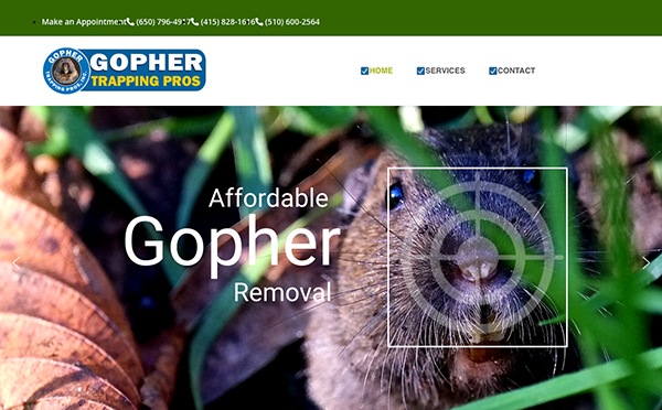
- Gopher Trapping Pros: Its website delivers a seamless user experience from the moment you land on its homepage. Vibrant images in a sleek, eye-catching layout instantly draw the eye and wonderfully tie in with the gopher-trapping theme. Exploring the many options available is simple due to the clear navigation. The inclusion of clear calls-to-action ensures that visitors can easily contact the team for assistance or learn more about their services. One of this website’s best qualities is its abundance of useful information. Consumers can learn essential gopher management and prevention lessons by thoroughly explaining their trapping techniques. Additionally, whether using a desktop computer or a mobile device, the website’s responsiveness guarantees a flawless experience across all devices. This dedication to detail indicates the team’s commitment to offering top-notch service at every touchpoint.
- All Pest Services: The website features an eye-catching, contemporary style that draws visitors in immediately. The homepage exudes a warm welcome with its striking images and simple structure. The brand’s identity is apparent in the professional and unified style created using colors, fonts, and artwork. The website’s navigation is user-friendly, featuring clearly labeled menu options that facilitate users’ effortless exploration and retrieval of desired information. Visible calls-to-action ensure that users may get in touch with the team right away to ask questions or get a quote. By integrating customer feedback, its website fosters confidence in prospective clients and upholds its reputation as a dependable pest control company.
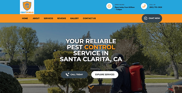
- Pest Shield Protection: The website’s sleek and contemporary layout features bright graphics and clean font, instantly drawing the eye in. The interface has been carefully crafted to easily guide users through the process and guarantee a hassle-free encounter from beginning to end. A wealth of educational material is available online, such as thorough explanations of pest control methods, typical indicators of pest infestations, and prevention advice. Its smooth integration of the request form and chat box into its website shows how deeply it values the ease and happiness of its users. In addition to enabling customers to interact with the business on their terms, these capabilities expedite the process of obtaining superior pest control services.
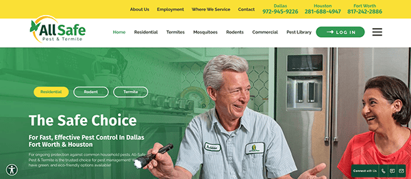
- All-Safe Pest & Termite: The homepage greets you with stunning images and a simple structure that immediately communicates dependability and professionalism. The well-thought-out menu structure and well-placed calls to action make navigation a snap. Everything is well-thought-out and readily available, whether you’re looking to learn more about the variety of pest control services available, read educational blog pieces, or get advice on pest prevention. The website includes trust-building components by showcasing client testimonials and affiliations with essential industry groups. This social proof reassures potential clients of the business’s dependability and competence, which gives them more confidence in their choice for their pest control requirements.
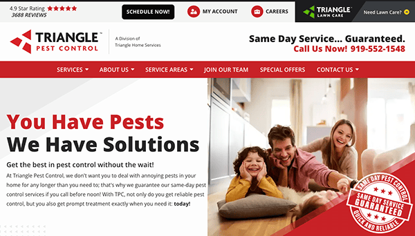
- Triangle Pest Control: Bright colors and excellent graphics immediately draw the eye and create an upbeat environment. Whether you’re looking for service information, want to make an appointment, or just want pest control advice, the website’s structure makes surfing effortless. With the clear and uncluttered user interface, locating what you need is simple without being distracted by extraneous elements. With the help of the online quote tool, visitors can quickly obtain an estimate that is customized to meet their unique requirements. Including client endorsements and evaluations gives a personal touch and gives prospective customers confidence.
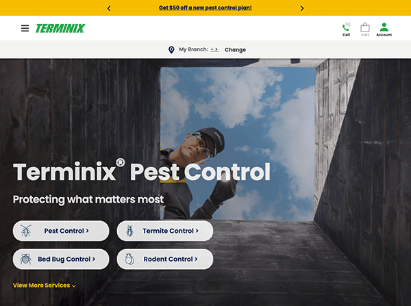
- Terminix: The website greets users with an eye-catching, contemporary design that instantly engages the senses. The intelligent positioning of branding elements and the use of bold imagery produce a visually striking experience. The straightforward user interface makes it easy for users to navigate and locate what they need. The website is dedicated to teaching clients about pests and the significance of pest management. It is full of educational films, infographics, and essays about different pests and how to avoid them. Regardless of your experience with pest management, you’ll get helpful advice on protecting your house or place of business.
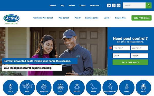
- Active Pest Control: From the minute you land on the homepage, the color scheme exudes professionalism and friendliness, lending the website an air of dependability and confidence. The sleek style that welcomes guests radiates professionalism. Visitors are drawn in by the website’s visually appealing design. Every element, from the crisp photographs highlighting the business’s offerings to the captivating graphics providing information quickly, is carefully designed to captivate and educate visitors. By adding interactive elements that increase user engagement, it goes beyond static material. With its clear call-to-action buttons and convenient live chat support for instant help, the website puts communication power at your fingertips.
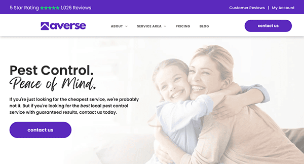
- Averse: The website features a tasteful combination of typeface, color, and photography that perfectly harmonizes its corporate identity. Using a simple, modern design aesthetic shows their dedication to expertise and quality. Visitor ease of use and reduced click count are ensured by menu structures that are clear and intuitive. Their services are portrayed in high-quality photos in various environments, inspiring potential clients and helping them make decisions. Whatever device a visitor chooses, they may browse with ease, which encourages interaction and enjoyment. Visitors are encouraged to do desired actions, such as looking through products, contacting the business with questions, or booking consultations using marked calls-to-action (CTAs).
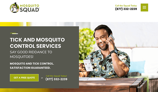
- Mosquito Squad: The website’s calm and welcoming design beckons users in. The perfect answer to mosquito problems is presented in a peaceful outdoor atmosphere that is instantly evoked by the well-balanced combination of colors and graphics. Visitors are equipped with knowledge through thorough service descriptions, frequently asked questions, and instructional materials, which help them make wise decisions when fighting mosquitoes. Visitors are encouraged to take the next step by seeing clear calls to action, which can include booking a treatment, getting a quote, or getting in touch with the team for individualized support.
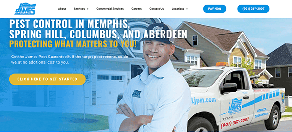
- James Pest Management: The website’s consistent color arrangement, font, and graphics produce a cohesive and expert look. The user interface has been carefully built with accessibility and convenience of use in mind. Thanks to the clear fixed menus and user-friendly style, visitors can navigate the website easily and swiftly to locate the required information. The website adapts seamlessly to various screen sizes and devices, ensuring a consistent and enjoyable browsing experience for smartphones, tablets, and desktop computers. Calls-to-action (CTAs) are prominently placed where users do particular actions, such as getting a quote or making an appointment for service. CTAs are prominently placed throughout the website to help users through the customer journey and enhance engagement and conversions.
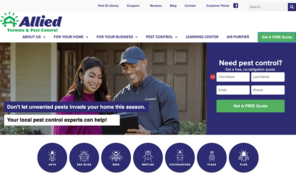
- Allied Pest Control: The layout of the homepage is tidy and well-organized when a user visits it. Users may easily navigate to different website sections using the menu bar at the top, making it quick and easy for them to locate what they’re searching for. The website’s color design, which combines white and green to evoke a feeling of freshness and nature, is welcoming and professional. Visitors may clearly see the services available thanks to well-placed, high-quality photos of pests and extermination services on the website. Additionally, the website’s well-placed and conspicuous calls-to-action (CTAs) facilitate users’ ability to take action. These calls to action (CTAs) let users quickly go through the conversion funnel, whether they are scheduling a service, getting an estimate, or getting in touch with the business.
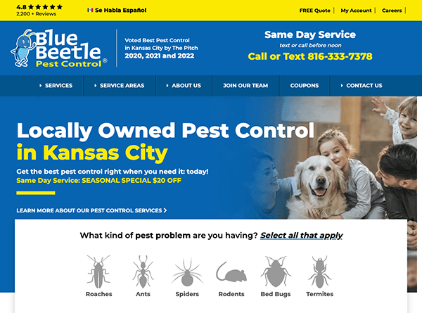
- Blue Beetle Pest Control: The website greets visitors with a contemporary and eye-catching style. The website’s extensive use of high-quality graphics and animations brings a captivating element that draws visitors in and successfully communicates the brand’s professionalism and dependability. The website’s user-friendly navigation system promotes simplicity for visitors in locating the information they require. Its website uses succinct, simple language to convey its value proposition and services effectively. The user experience is improved overall by interactive features, including a contact form that is easy to use, interactive maps for service locations, and clickable call-to-action buttons. The insertion of client endorsements and evaluations enhances the website’s social proof and fosters confidence and trust in prospective buyers.
- Triangle Pest Control: The website has an expertly designed layout that gives visitors instant confidence in the company’s abilities. High-quality photos and a contemporary color palette produce an eye-catching style consistent with the business concept. Through educational content and tools, it offers valuable information on pest management solutions, services provided, and typical pest problems. Because the website is responsive, using it on various devices and screen sizes is a smooth experience. Its website uses well-placed calls-to-action (CTAs) that are obvious and noticeable to drive users toward conversion efficiently. The incorporation of a chat box augments the user experience on its website by offering immediate assistance, easy contact, and tailored support.
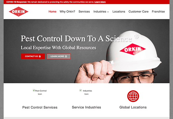
- Orkin: Upon accessing the homepage, users are welcomed by an elegant and polished layout. The clean layout and modern look create a visually appealing user experience that inspires confidence in the company’s services. The user experience is improved overall by interactive features, including animation visuals, service area interactive maps, and an easy-to-use contact form. Visitors may easily locate the information they need on its website because of its user-friendly navigation and well-organized menu. Users can effortlessly browse the site to learn about pest remedies, explore services, or contact the organization.
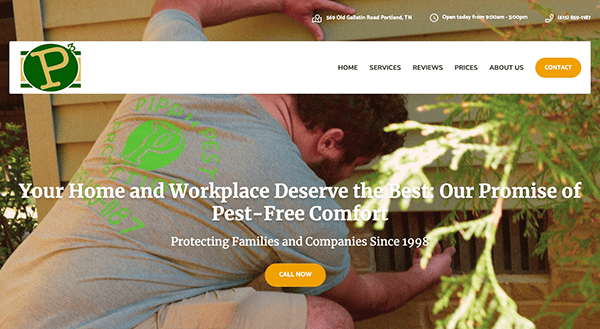
- Pippin Pest Protection: Its website has an eye-catching layout that complements its brand identity. The brand’s identity is reflected in the color scheme, typography, and graphics, which results in a cohesive and polished appearance. The website uses whitespace well, contributing to its tidy and minimalist design. All users, including those with disabilities, may easily navigate and utilize the website because it was created with accessibility in consideration. Features that enhance accessibility and user experience include keyboard navigation, high-contrast text, and alt text for images. Additionally, the website is adaptable, allowing it to quickly adjust to various screen sizes and gadgets, such as tablets and smartphones.
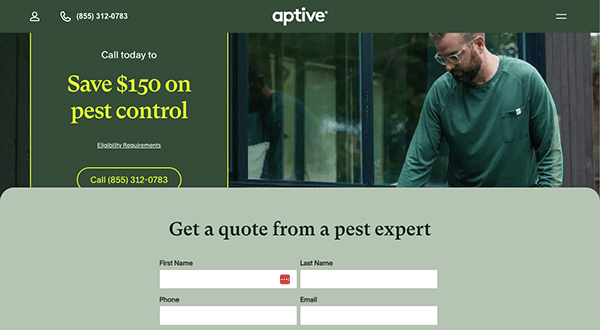
- Aptive: Its website immediately grabs users’ attention with its sleek and engaging design. High-quality photos and graphics enhance visual appeal and successfully convey the company’s dedication to excellence. The color scheme’s vivid blend of green is welcoming and enticing. It provides helpful information through educational content and resources regarding common pest problems, preventive measures, and pest management methods. Incorporating customer testimonials and evaluations into the website enhances its social proof and fosters credibility and confidence among prospective clients. Positive testimonials from pleased customers support its standing as a provider of top-notch customer care.
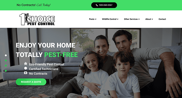
- 1st Choice Pest Control: A visually pleasing experience is produced by employing a well-balanced color palette, high-resolution photos, and an orderly layout. One of the first things visitors notice when navigating the homepage is the subtle yet excellent green accent. This spotless pest control website also performs admirably in its star-rated customer review section. The website has a clear and direct user interface that improves use and navigation. The menu is well laid out, making it simple for customers to look over different services, discover pest control options, and locate contact details. With calls-to-action thoughtfully positioned throughout the website, it will efficiently direct users toward conversion.
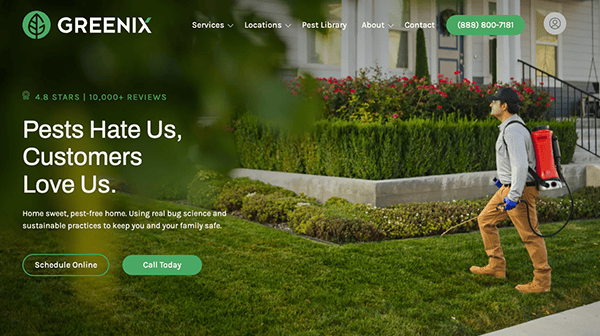
- Greenix Pest Control: The website welcomes users with an eye-catching, contemporary style that draws them in. The natural and fresh color scheme complements the business’s environmentally conscious philosophy. Excellent photos of the outdoors and bugs are cleverly incorporated to improve the aesthetic appeal and demonstrate the business’s dedication to ecologically responsible pest control. The website is accommodating in terms of site navigation. It has a well-organized menu that makes it simple for users to explore different services, discover contact information, and learn about pest remedies. Additional categorization is provided by dropdown menus, which help visitors locate what they’re looking for quickly and without being overwhelmed.
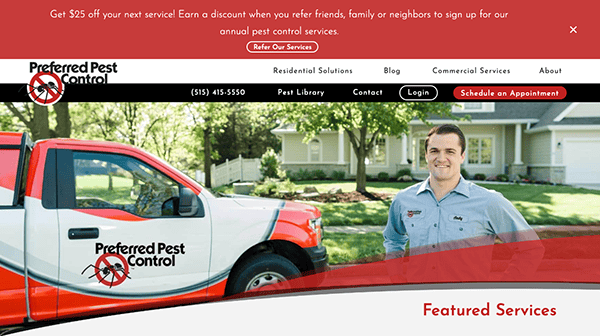
- Preferred Pest Control: The website has an eye-catching, contemporary design that welcomes visitors with style. The red and white color combination exudes elegance and simplicity, making for a polished and welcoming color scheme. Throughout the website, high-quality photos of pests and pest control services are thoughtfully placed to provide visitors with a clear understanding of the available options. The website strategically places calls-to-action (CTAs) that are clear, engaging, and visible to guide users toward conversion effectively. A user-friendly contact form and dynamic visuals are interactive components that improve the user experience overall.
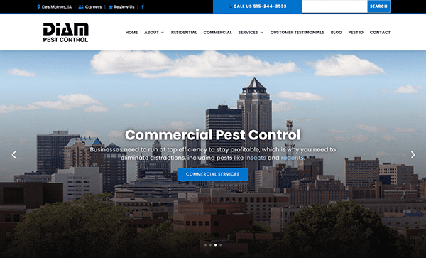
- Diam Pest Control: The website’s eye-catching, contemporary design welcomes visitors immediately. With a blue and white combination that exudes trust and cleanliness, the color palette is polished and welcoming. Their easy navigation was another well-considered feature of this pest control website. The content provided on the website is logically arranged and structured, which facilitates users in finding the information they require. Every piece of content, from service announcements to customer endorsements and instructional materials, is arranged logically and clearly to make it easy for users to find pertinent information. The website also has a news or blog area, which offers relevant and up-to-date content to keep users interested and informed.
As we delve into examples of the best pest control website designs, it’s clear that the most effective sites are those that combine aesthetic appeal with practical functionality. These websites understand their audience’s needs, offering solutions through easy-to-navigate layouts, engaging content, and clear calls to action. Whether through compelling visuals, detailed service descriptions, or customer success stories, the best pest control websites are designed to convert visitors into customers.
To sum up, a meticulously designed pest control website is a formidable asset in your marketing toolkit. It highlights your services and know-how and functions as a hub for interacting with prospective clients, offering them essential insights and steering them towards selecting your offerings. Achieving success hinges on grasping the distinct requirements of the pest control sector and crafting a website that communicates effectively with your intended audience.
If you want to elevate your pest control business with a standout website, CyberOptik is here to help. Our pest control web design and digital marketing expertise allow us to create a custom website that reflects your brand’s values, attracts more customers, and grows your business. Contact CyberOptik today for a free consultation about your pest control website and take the first step towards a more substantial online presence.

