https://spaymart.org/A compelling, well-designed website is a cornerstone for any successful nonprofit organization. Not only does it lend credibility to your mission, it also functions as a dynamic platform for engaging visitors, promoting your cause, and encouraging donations. It’s the digital gateway through which the world learns about the change you’re fostering.
A good nonprofit website clearly articulates the organization’s mission, showcases the impact of its work, and offers straightforward ways to get involved or donate. Furthermore, it’s built with a user-friendly backend allowing efficient and hassle-free updates.
Navigating the nonprofit website design process can seem daunting, especially when balancing numerous other responsibilities. One of the easiest ways to start is by drawing inspiration from organizations that have done it well. In this post, we’ve curated a selection of standout nonprofit websites that excel in several key areas: visitor engagement, ease of use, clarity of mission, and simplicity of making donations.
Examples of the best nonprofit website designs:
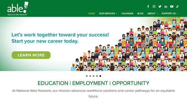
- National Able Network: National Able features a clean, impactful, and professional design that aligns with the organization’s mission to help and provides career counseling, training, and employment services. A cohesive color scheme, artistic imagery, engaging infographics, clear typography, and ample white space creates a professional, trustworthy, and fascinating impression. The website has a user-friendly navigation structure and a well-organized static menu, making visitors quickly find the necessary information. The website features resourceful content, information on job search strategies, resume writing, interview tips, downloadable resources, and links to external sources, adding spice to its mission commitment and dedication. This feature engages and draws viewers to support its services and efforts.
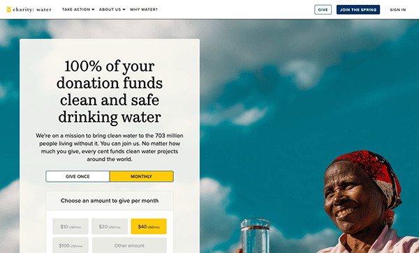
- Charity: water: Their website is a visually stunning and impactful platform that effectively communicates the organization’s mission of providing clean and safe drinking water to needy people. The website’s design is visually captivating, utilizing high-quality images, videos, vibrant colors, and typography, creating a powerful emotional impact on visitors. It also excels at storytelling, using engaging narratives, personal stories, and real-life examples. The website communicates the organization’s mission and impact effectively, providing a user-friendly platform for individuals to participate and make a meaningful difference in the global water crisis.
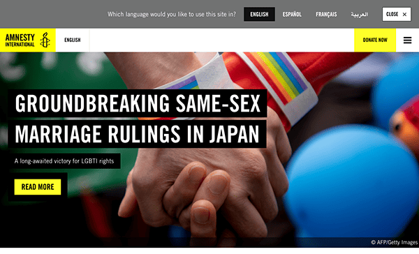
- Amnesty International: Amnesty International’s website effectively combines compelling storytelling, action-oriented features, and comprehensive resources to engage visitors and advocate for human rights. The website has a clean and modern design. It uses ample white space, straightforward typography, and intuitive navigation, making it easy for visitors to navigate and find the information they seek. The website offers localization options and language support, making it accessible to a global audience. Its user-friendly platform compels visitors to be educated, takes action, and supports the organization’s effort to defend human rights globally.
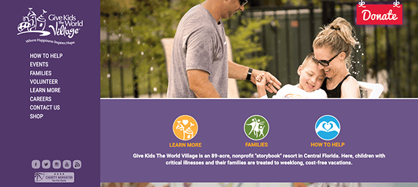
- Give Kids The World Village: Give Kids The World Village’s website is a heartfelt and well-designed platform that effectively communicates the organization’s mission of providing magical experiences to children with critical illnesses and their families. Its design is warm and colorful, incorporating positive images, playful illustrations, and vibrant colors reflecting an inviting spirit of the organization. Personal stories and testimonials from families who have benefited from their services stand out, creating a strong emotional impact on visitors and the organization’s impact on the recipients’ lives. The website prominently and strategically features calls-to-action (CTAs), encouraging visitors to donate, volunteer, or get involved.
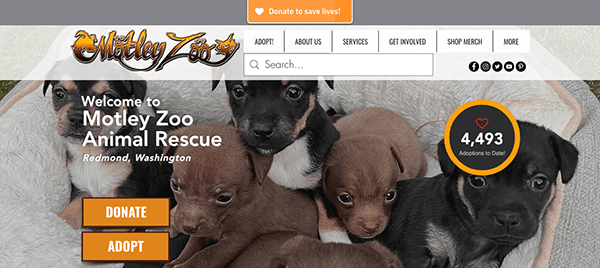
- Motley Zoo Animal Rescue: Motley Zoo Animal Rescue’s website is an engaging and user-friendly platform that effectively conveys the organization’s mission of rescuing and rehabilitating animals. The website has a playful, whimsical aesthetic design with a well-organized, intuitive navigation system. The main menu provides clear options to learn about donation, interactive adoption, fostering, volunteering, and events, making it easy for visitors to find relevant information they need. They also offer educational resources on pet ownership, training tips, and animal welfare topics. Additionally, the website highlights success stories and features testimonials from adopters and volunteers, showcasing the impact and positive experiences of those involved with the organization.
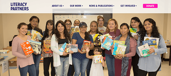
- Literacy Partners: The website features a well-organized, clean, and professional design that prioritizes an informative platform that effectively presents the organization’s mission and commitment to improving adult literacy through education. A simple color scheme and ample white space create a visually appealing and uncluttered interface. It also features impactful storytelling through real-life success stories, testimonials, and case studies that highlight the transformative effect of literacy on their benefactors’ lives, conveying emotional connection to visitors and reinforcement of their work. Its easy and user-friendly navigation system would give visitors quick access to essential sections such as their programs, resources, and ways to get involved.
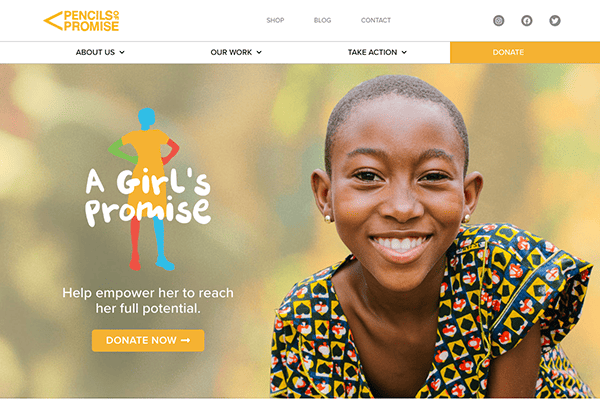
- Pencil of Promise: Pencils of Promise’s website has an impactful and inspiring platform that effectively communicates the organization’s mission of providing quality education to children in underserved communities. The website immediately compels visitors’ attention with its powerful visuals- high-resolution videos and striking imagery, vibrant colors, clear and concise message presentation, and impact-driven storytelling create an ambiance that fits with the organization’s mission. Their website involves prominent calls to action features and provides financial transparency, including the financial statements and annual reports building trust and credibility with visitors and potential donors.
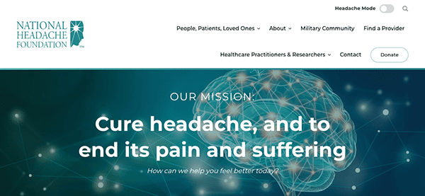
- National Headache Foundation: The National Headache Foundation’s website is a comprehensive and informative platform that effectively serves as a resource for individuals seeking information and support for headaches and migraines. The website has a well-structured navigation menu making it easy for visitors to find the information they need. It has a unique “headache mode” feature designed to provide a user-friendly experience for individuals visiting the site who are sensitive to light, has visual disturbances, or are experiencing a headache or migraine, reflecting the foundation’s mission. It includes a directory of healthcare providers specializing in headache management, support groups, updates related to headaches and migraines, and online forums that inform visitors of treatment options, connect to individuals facing similar challenges, and provide hope for individuals seeking relief.
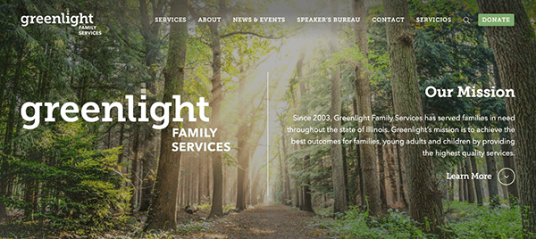
- Greenlight Family Services: The website welcomes a serene visual ambiance to viewers with an earthy homepage image and a green color palette that effectively communicates Greenlight Family Services’ mission of finding loving homes for children through adoption and foster care. The website has a clean and modern design with a well-organized layout menu, allowing visitors to navigate different sections and relevant information about its programs easily. The website highlights success stories and testimonials from adoptive families and foster parents. Engagement of success stories gives impact its program’s mission, creating an emotional connection and inspiring visitors to get involved.
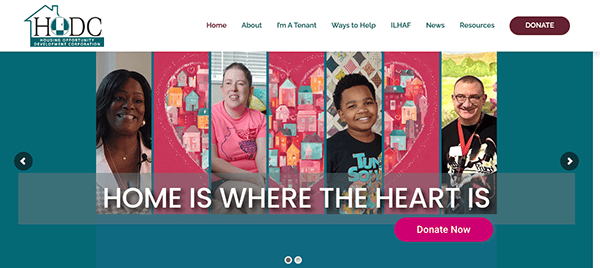
- House of Delegates of Culture: The website captivates users’ attention as they successfully provide detailed information about its mission, goals, services, and commitment to providing affordable housing and promoting community development. The website has a simple yet elegant design, which focuses visitors on the website’s information creating a visually pleasing browsing experience. Additionally, it has a transparent navigation system, detailed property listings, additional resources, and accessible contact information. It contributes more to an effective platform for visitors to learn about HODC’s mission, explore available, affordable housing options, and engage with the organization.
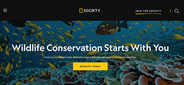
- National Geographic Society: The website immediately captures attention with stunning, high-quality visuals. Using vibrant imagery, engaging videos, and immersive photography creates an awe-inspiring experience that aligns with National Geographic’s reputation for exceptional visual storytelling. National Geographic is renowned for its storytelling prowess, and the website continues that tradition. This approach evokes emotion and connects visitors and the natural world. The website also provides multiple avenues for exploration with its well-organized and user-friendly navigation menu. Visitors can delve into National Geographic’s various initiatives, programs, and projects, such as the Society’s grants, research expeditions, and conservation efforts.
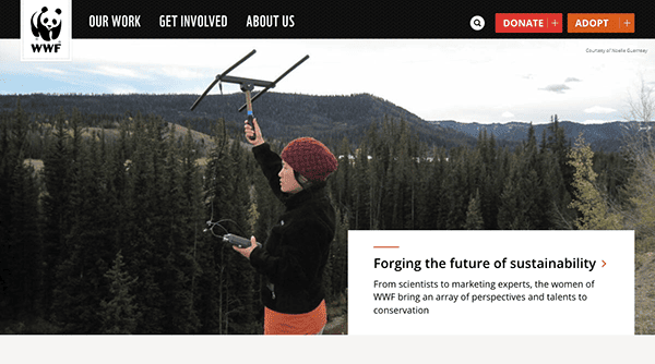
- World Wildlife Fund: The World Wildlife Fund’s website is an informative and engaging platform that effectively communicates the organization’s mission of conserving nature and protecting the diversity of life on Earth. The website features a visually appealing design with stunning wildlife imagery, large high-quality visuals, and captivating videos that grab visitors’ attention and convey the organization’s commitment to wildlife and nature conservation. The website provides a wealth of information about various species, habitats, and conservation efforts worldwide as they provide a clear and intuitive layout of its navigation menu. Visitors can easily access detailed species profiles, explore different ecosystems, learn about environmental threats, and discover the organization’s initiatives and projects.
- Make-A-Wish Foundation: The Make-A-Wish Foundation’s website features inspiring stories, heartfelt videos, and easy-to-use donation options to support its mission of granting wishes to children with critical illnesses. The website conveys the impact and significance of the organization’s work through inspiring wish stories, personal testimonials, and heartfelt narratives. The website features a clean and impactful use of bright colors, uplifting imagery, and compelling storytelling, creating a positive and hopeful atmosphere that reflects the mission and values of the Make-A-Wish Foundation.
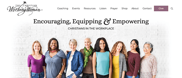
- The Christian Working Woman: The website has a welcoming and professional atmosphere as it uses a clean and warm color scheme design as you browse different website pages, aligning with the Christian Working Women platform of catering to Christian women in the workplace and aims to provide resources, encouragement, and support for their professional and spiritual lives. Their website is effective for its target audience as it offers a variety of resources, daily devotionals, prayer requests, events, a radio program, and videos addressing various topics related to work, faith, leadership, relationships, and personal growth. The website has a user-friendly navigation menu, making it easy to browse different sections. It also provides options for visitors to donate with its visible and prominent “Give” button, as visitors would opt to support the ministry’s work and mission.
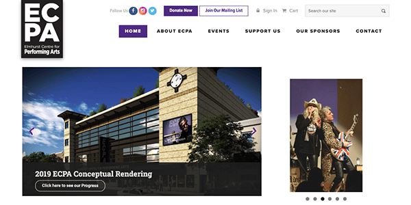
- Elmhurst Centre for Performing Arts: The Elmhurst Centre for Performing Arts website is an information hub for individuals interested in the center’s events, educational programs, and supporting the arts. The website maintains its professionalism by using a visually appealing layout and design. It combines images, videos, well-organized content, and a clean color scheme creating an aesthetic effect reflecting the performing arts center’s mission. The website highlights its educational and outreach programs, providing information about classes, workshops, and other opportunities for individuals of different ages and skill levels to engage in performing arts education and enrichment. The includes dedicated sections for “Support us” and “Our Sponsors” on the menu for donations or sponsorship is well placed, giving visitors options to contribute to the center’s mission and initiatives.
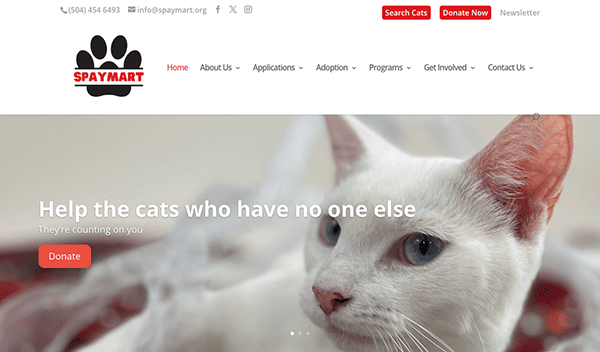
- SpayMart: Spaymart website promotes animal welfare focused mainly on cats through spaying and neutering programs. Its clean, well-organized use of adorable cat or kittens images and consistent color scheme gives visitors an inviting and appealing experience to get involved with the organization’s programs. It has a prominent and static menu with clear buttons for the “Search Cats” and “Donate Now” sections that give comprehensive information as they click on it about available cats for adoption and the easy process for individuals getting involved in supporting the organization’s effort.
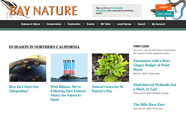
- Bay Nature: The Bay Nature website effectively showcases the beauty and biodiversity of the San Francisco Bay Area’s natural environment. Its website stuns with nature photography and vibrant natural colors in its design and layout, creating an instant captivation of visitors and a sense of connection to nature. The homepage prominently features selected articles and highlights, showcasing the most recent and popular content allowing visitors to discover exciting stories and explore various aspects of the Bay Area’s natural world. Moreover, it has a user-friendly interface with clear navigation menus, making you a nature enthusiast as you explore each page and giving visitors interest in supporting the work of Bay Nature.
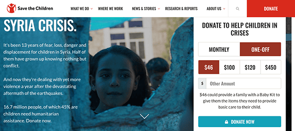
- Save the Children: With the mission of “saving the lives of children, protecting their rights and providing a better future worldwide,” The Save the Children website creates an impact and reinforcement of their commitment to making a difference to children globally. Their website effectively communicates with visitors with well-organized content, straightforward typography, vibrant colors, and the incorporation of impactful images of children and families. It contributes to a professional and visually appealing website giving potential donors quick, clear, and transparent information about the organization’s efforts. Their highlight included personal stories and testimonials, creating an emotional connection and reinforcing the organization’s effectiveness in making a difference. It also acknowledges global reach and localization allowing visitors worldwide to access relevant information specific to their location. It demonstrates the organization’s commitment to addressing specific needs and challenges in different contexts.
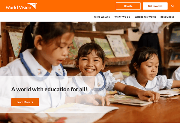
- World Vision: The website’s design stands out as it incorporates inspiring images, stories, and videos of children and communities of the positive change the World Vision has made in their lives. It features a user-friendly design with clear navigation menus, intuitive layouts, and visually appealing elements. It also offers various ways for individuals to engage and get involved beyond monetary donations, such as options for sponsoring a child, giving spiritual support through prayers, volunteering, fundraising, advocacy, and even career opportunities within the organization. Additionally, it has the localization of donor opportunities, which enhances the sense of connection and allows individuals to support children in specific communities, adding a more personal and meaningful aspect to the giving experience.
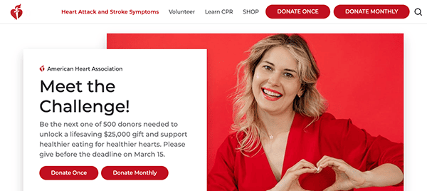
- American Heart Association: The website effectively conveys to users of its platform heart health information, prevention, advocacy, and support for individuals and communities with heart-related conditions. It features a clean and modern layout using engaging imagery, vibrant colors, and straightforward typography, maintaining its professional vibes. The website offers various options to support the organization’s work through donations and fundraising efforts. Visitors can learn about different fundraising campaigns, participate in events, and find ways to contribute to the organization’s work through its easy navigation system giving users seamless browsing opportunities. Moreover, the website also offers information and resources for CPR (Cardiopulmonary Resuscitation) and first aid training providing instructional materials, videos, and guidelines to equip individuals with life-saving skills and knowledge.
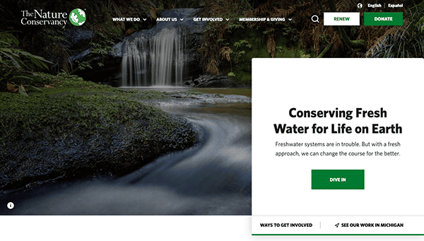
- The Nature Conservancy: Its website serves as a platform for the global environmental organization with a mission to protect nature and conserve natural resources. The website stuns as it features an engaging design incorporating nature-inspired visuals, vibrant colors, and stunning imagery of natural landscapes. The design creates an immediate connection with the organization’s mission and visually represents the beauty of nature. The website has a well-organized and intuitive layout. The top menu provides access to key sections, such as “What We Do,” “About Us,” “Get Involved,” and “Membership & Giving,” allowing users to access the content they are interested in quickly. Its engaging design, comprehensive information, interactive features, and commitment to science-based conservation make it a valuable resource for individuals passionate about protecting nature and conserving natural resources.
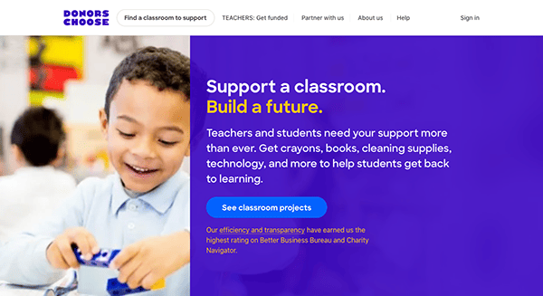
- Donors Choose: The website for Donors Choose serves as a unique crowdfunding platform that connects teachers in need with donors who want to support education projects. The website’s intuitive design and user-friendly interface make it easy for teachers and donors to navigate and participate in crowdfunding. Donors Choose presents ongoing communication between donors and teachers. Donors receive updates and feedback from the classrooms they support, including thank-you notes, photos, and progress reports. This feedback loop enables donors to witness the impact of their contributions. These unique features create a meaningful connection between teachers and donors, allowing them to collaborate in supporting impactful educational initiatives.
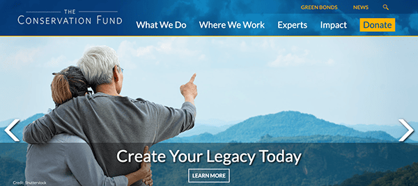
- The Conservation Fund: The website provides comprehensive information about The Conservation Fund’s conservation programs, initiatives, and impact. Visitors can learn about the organization’s various focus areas: land conservation, water resources, community development, and sustainable forestry. The website shares compelling impact stories using engaging images and videos that demonstrate the tangible outcomes of the organization’s conservation efforts. Its clean and professional design, comprehensive information, interactive features, and emphasis on collaboration and partnership make it a valuable resource for individuals interested in land conservation, sustainable forestry, water resources, and community development efforts across the United States.
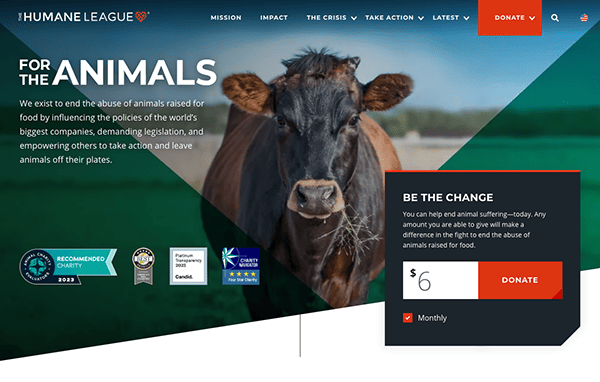
- The Humane League: The Humane League seeks to end the abuse of animals raised for food production. The organization runs advocacy campaigns encouraging the world’s largest food companies to adopt humane animal welfare policies. The website immediately captivates users’ attention by featuring a modern and appealing design using high-quality images, vibrant colors, well-designed graphics, and elements on its landing page. It effectively conveys the organization’s mission and goals through consistent and prominent use of clear and concise typography throughout the site. The content is well-organized, making navigation and finding specific information easy. The Humane League offers one-time and monthly donations directly from its homepage via a clear calls-to-action (CTA), incorporating potential donors into its success narrative.
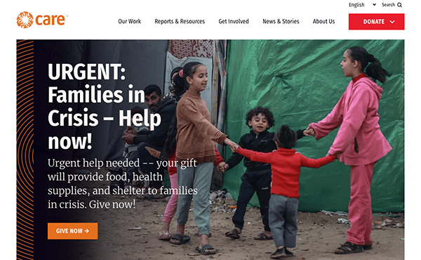
- CARE: CARE is a global leader within a worldwide movement dedicated to ending poverty. We are known everywhere for our unshakeable commitment to the dignity of people. Its website captures the user’s attention with its clean and professional design, eye-catching infographics reflecting the organization’s credibility, and program services prominently displayed on the footer. The website demonstrates CARE’s commitment to transparency and accountability by providing detailed financial information, annual reports, and impact reports outlining the organization’s funds use and outcomes. This transparency builds trust and ensures donors and supporters can see the tangible results of their contributions.
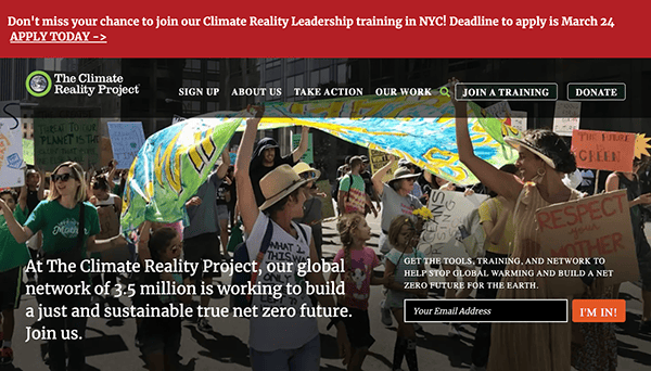
- The Climate Reality Project: Using vibrant colors, interactive elements, and high-resolution images to engage users in an immersive and dynamic browsing experience. The website content is well-structured and easy to navigate, providing comprehensive information about The Climate Reality Project’s mission, programs, and initiatives. The website offers a wealth of climate change facts, resources, and educational materials. Visitors can access reports, infographics, videos, and articles explaining climate change’s science, impacts, and potential solutions. The organization’s emphasis on education and providing reliable information distinguishes it as a trusted source on climate-related topics.
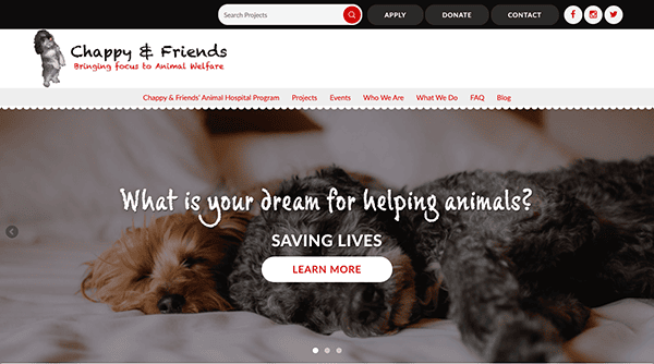
- Chappy and Friends: The website for Chappy and Friends playfully represents a nonprofit organization focused on animal welfare and promoting compassion towards animals through interactive elements, vibrant illustrations, and typography. The message is concise and prominently displayed throughout the site, ensuring visitors understand the organization’s core purpose. It also promotes pet adoption and provides information on local animal shelters and rescue organizations, emphasizing the importance of adopting needy animals. It also provides resources for individuals looking to add a furry friend to their family.
Each of these websites sets a high bar in web design. They seamlessly combine visual storytelling, intuitive navigation, and simple donation processes to create a meaningful and enjoyable user experience. They clearly outline the path for visitor engagement and make it easy for supporters to take action.
Just like these nonprofits, your organization deserves a top-notch website that ticks all the right boxes: engaging design, easy navigation, clear call-to-actions, user-friendly donation options, and a backend that makes content updates a breeze.
At CyberOptik, we specialize in creating high-quality, user-friendly websites tailored to the unique needs of nonprofits. We appreciate the financial constraints many nonprofits face, so we offer special discounts for nonprofit organizations.
We’re here to ensure you get a world-class website that doesn’t just look good but functions optimally to help you advance your cause. By blending aesthetic appeal with practical functionality, we’ll help you build a site that beautifully tells your story, connects with your audience, and facilitates the essential contributions that fuel your work.
Get in touch with CyberOptik today. Let’s discuss how we can collaborate and make your online presence as impactful as your mission. We’re excited to partner with you and help your organization thrive in the digital space and make a difference in the world.

