Just looking for our Best Municipal Website examples list?
Key Takeaways
- Modern, Mobile-First Municipal Website Design Increases Engagement: A responsive, accessible design ensures that residents, businesses, and visitors can easily access municipal services and updates on any device, meeting ADA standards while enhancing public trust.
- Strategic Content and Navigation Are Crucial for User Experience: Prioritize intuitive action buttons and clear content organization to help users find critical information quickly, such as meeting agendas, permit forms, and emergency alerts, reducing frustration and administrative workload.
- SEO and Integrated Features Amplify Community Visibility and Interaction: Implementing government-specific SEO tactics, online service integrations, and calendar/event modules can improve search rankings, increase citizen engagement, and streamline digital services across your local government website.
Why Modern Website Design is Essential for Municipalities
Your website isn’t just a hub for information—it’s a critical gateway for communication, transparency, and civic engagement. For residents, businesses, and visitors alike, your website shapes their perception of how your municipality operates and how tuned in you are to their needs.
Outdated designs, slow-loading pages, and clunky pathways send the wrong message. But with a modern, intuitive, and user-focused design, your municipality can deliver a seamless experience that builds trust, reduces staff workload, and promotes community involvement. Whether you’re launching a new site or planning a redesign, great website design translates directly into measurable public service improvements—and a stronger reputation for your local government.
Website Planning & Purpose
Before diving into layouts, colors, or content, begin with a strategic planning phase. This critical first step ensures the website aligns with the core mission of local government: to serve its community with transparency, inclusivity, and efficiency.
Effective web planning begins with clearly identifying the site’s primary purpose. Whether it’s to deliver real-time updates, provide self-service tools like permit applications, or offer a directory of local departments, defining goals up front ensures the design supports functional outcomes.
Key planning components include:
- Stakeholder Interviews: Include internal departments (e.g., city clerk, public works) and external voices (residents, local businesses) to understand needs.
- Information Architecture Blueprint: Map out logical content groupings and user pathways to streamline action.
- Feature Prioritization: Identify must-have elements like emergency alerts, service request forms, calendars, and news updates.
- CMS Evaluation: Choose a government-friendly content management system (CMS) that is secure, scalable, and manageable by non-technical staff.
- Compliance Review: Plan for ADA, Section 508, and data privacy standards from day one.
Municipalities that take time to plan their website with intention avoid costly redesigns later and build a foundation that serves both internal teams and public users. This planning phase ensures the final site is attractive, purpose-driven, inclusive, and built to last.
Design Principles for Municipal Website Success
Designing for an entire community means going beyond aesthetics. The core goal is to create a website that balances visual appeal with public utility. For local governments, this means following a set of proven design principles that drive usability, compliance, and trust.
Clarity and Simplicity
- Design should eliminate clutter and prioritize essential content. Simplicity helps users focus on what matters—finding information quickly and easily.
Consistency Across Pages
- Maintain a uniform layout, color scheme, and guidance system. This helps residents feel familiar with the site and reduces cognitive load.
Accessibility Compliance
- Ensure the design meets ADA and Section 508 standards with keyboard navigation, screen reader support, and appropriate color contrast ratios. Accessibility is non-negotiable for public sector websites.
Mobile Optimization
- With the majority of traffic coming from mobile devices, interactive designs ensure the site performs equally well on smartphones and tablets.
Visual Hierarchy
- Use headings, bullet points, and whitespace effectively to guide the eye. Proper visual flow improves engagement and comprehension.
Performance and Load Speed
- A sleek design isn’t useful if it takes too long to load. Optimize images, limit unnecessary animations, and test performance regularly.
Security and Trust Signals
- HTTPS, privacy policies, and visible contact details build credibility and show users they’re on a safe and legitimate government platform.
By embedding these principles from the start, municipalities can design websites that are attractive, functionally superior, making every visit a productive one for residents and staff alike.
Content & Navigation: Structuring for Usability and Clarity
Strong websites excel not just in design, but in the structure and clarity of their content. The goal is to make information easily accessible and intuitive to engage with, reducing the need for users to call city hall or dig through unrelated content.
Organize Content Around User Intent
- Break down pages by topic and user need: residents, businesses, and visitors. Group related services together and avoid using department jargon as menu labels.
Keep Menus Intuitive and Consistent
- Use short, descriptive action terms like “Pay Bills,” “Permits & Licenses,” or “City Council.” Limit top-level menu items to no more than 6-7 options to prevent overwhelm.
Implement a Clear Search Function
- Search is a must-have feature. Ensure it’s prominent, returns accurate results, and filters by category (e.g., documents, forms, meeting minutes).
Highlight Priority Services and Notices
- Use homepage and banner space to spotlight emergency alerts, service disruptions, and seasonal information, making time-sensitive info easy to find.
Use Mega Menus or Quick Links for Depth
- For municipalities with a wide range of services, mega menus or structured quick links provide deep direction without forcing the user to dig.
Optimize Content for Skimming
- Use bullet points, subheadings, and short paragraphs to help users quickly absorb key details. Include visual aids such as icons or infographics when possible.
A thoughtfully structured content and guidance system turns your website into a self-service tool, empowering residents and improving internal efficiency by reducing call volume and walk-ins.
Ongoing WordPress Maintenance for Municipal Websites
Launching your website is just the beginning. To maintain performance, security, and reliability, ongoing WordPress maintenance is essential. Government websites handle sensitive information and serve as critical communication hubs, which means they must stay operational and up-to-date at all times.
Routine Software Updates
- WordPress core, theme, and plugin updates must be applied regularly to patch security vulnerabilities and maintain compatibility. Delaying these can expose your site to attacks or functionality issues.
Security Monitoring and Backups
- Implement firewalls, malware scanning, and automated backups to protect municipal data. Daily or weekly backups ensure that, in the event of a breach or error, you can restore your site quickly without losing vital information.
Performance Checks and Uptime Monitoring
- Regularly test load speeds, review server uptime, and optimize database performance. These checks keep the user experience seamless and help avoid disruptions during high-traffic periods, like election days or severe weather alerts.
Accessibility and Compliance Reviews
- Laws and accessibility standards evolve. Schedule periodic audits to ensure your website remains compliant with ADA and Section 508 standards.
Content and Link Audits
Broken links, outdated documents, and missing contact details erode trust. Conduct monthly reviews to ensure all content remains accurate and relevant to the public.
CMS and User Management
- Limit admin accounts to essential staff, use role-based permissions, and review user access regularly to ensure security and content integrity.
Consistent maintenance extends the life of your website, safeguards your municipality’s credibility, and ensures uninterrupted access to important community resources. A neglected website quickly becomes a liability—an updated one reinforces your commitment to digital excellence.
Best Municipality Website Examples
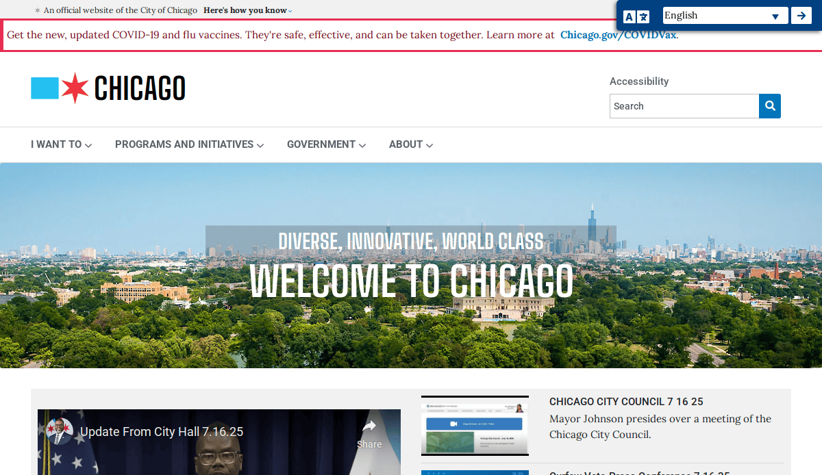
1. City of Chicago, IL
Location: Chicago, Illinois
Key Takeaways:
- Modern, responsive design with clear navigation
- Comprehensive access to city services and information
- Multilingual support enhances accessibility
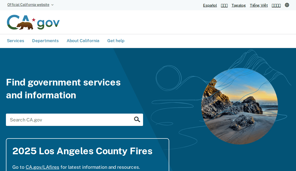
2. State of California
Location: Sacramento, California
Key Takeaways:
- User-friendly interface with intuitive navigation
- Mobile-optimized design for on-the-go access
- Centralized portal for state services and information
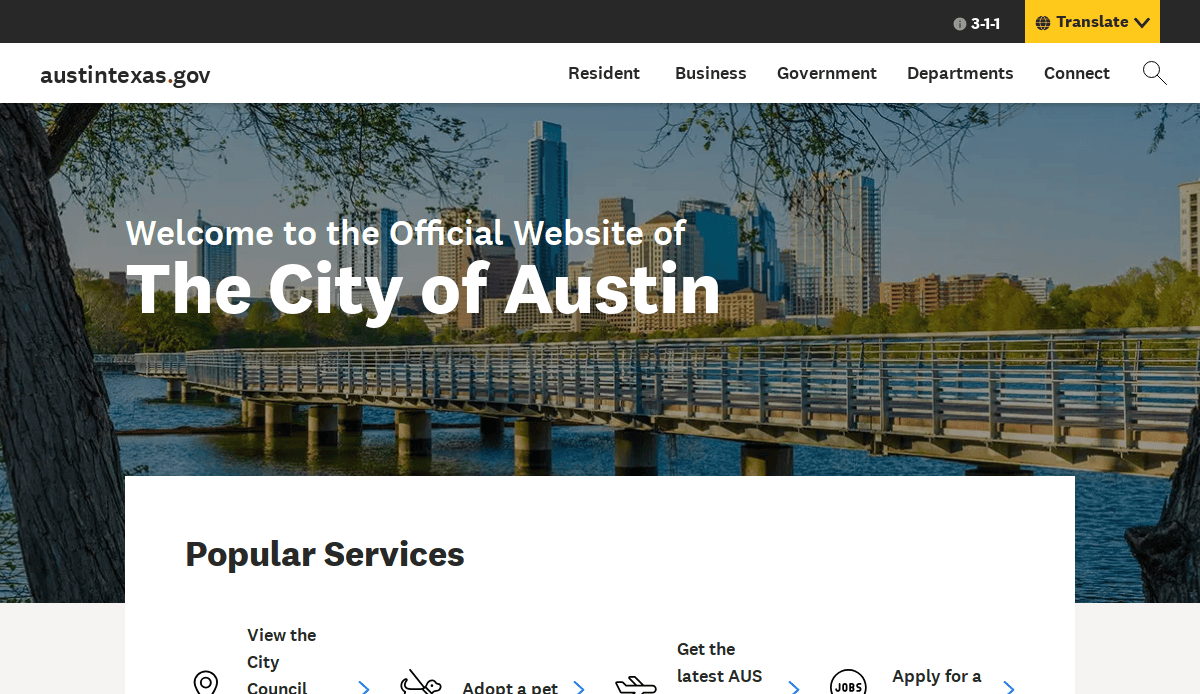
3. City of Austin, TX
Location: Austin, Texas
Key Takeaways:
- Clean layout emphasizing key services
- Interactive tools for community engagement
- Accessible design meets ADA standards
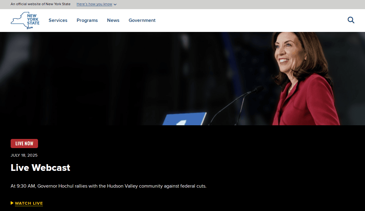
4. State of New York
Location: Albany, New York
Key Takeaways:
- Streamlined access to state services
- Responsive design ensures usability across devices
- Clear categorization of information for easy navigation
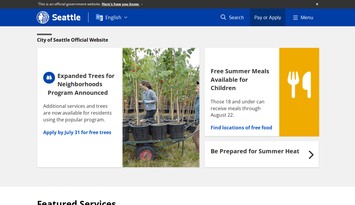
5. City of Seattle, WA
Location: Seattle, Washington
Key Takeaways:
- Engaging visuals reflecting the city’s identity
- User-centric design with personalized content
- Efficient search functionality for quick information retrieval
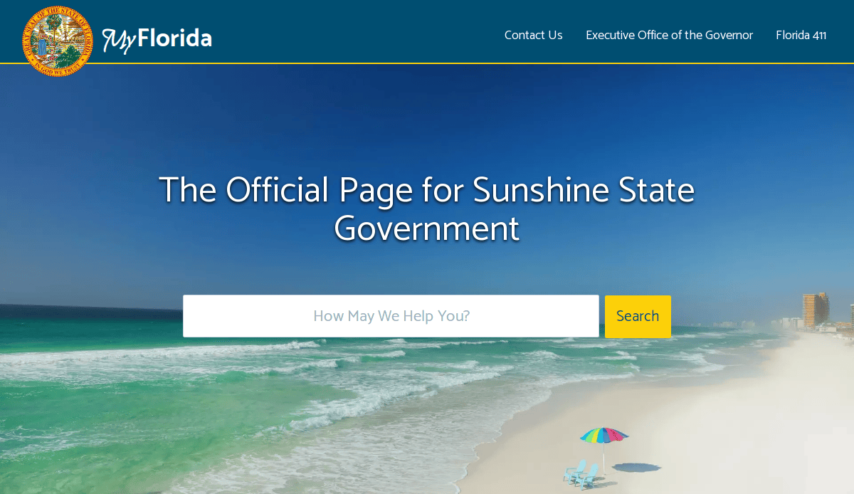
6. State of Florida
Location: Tallahassee, Florida
Key Takeaways:
- Comprehensive portal for state resources
- Accessible design catering to diverse users
- Regular updates ensure current information
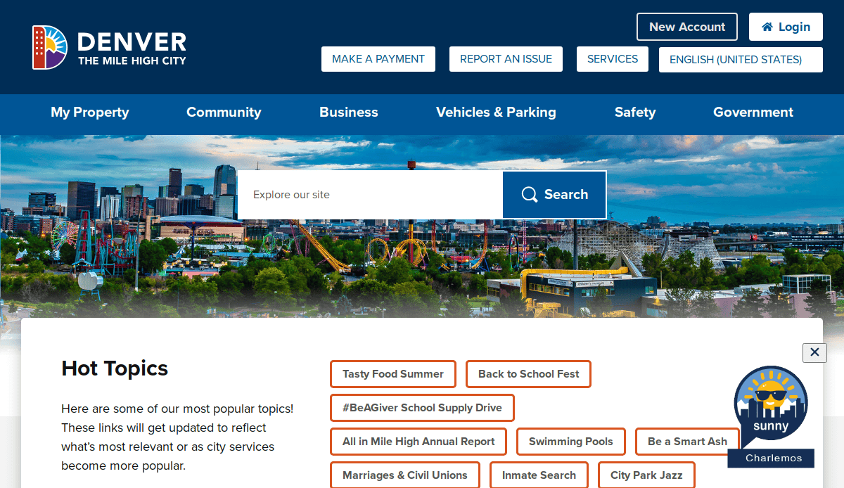
7. City of Denver, CO
Location: Denver, Colorado
Key Takeaways:
- Interactive features enhancing user engagement
- Mobile-friendly design for seamless access
- Clear presentation of city services and news
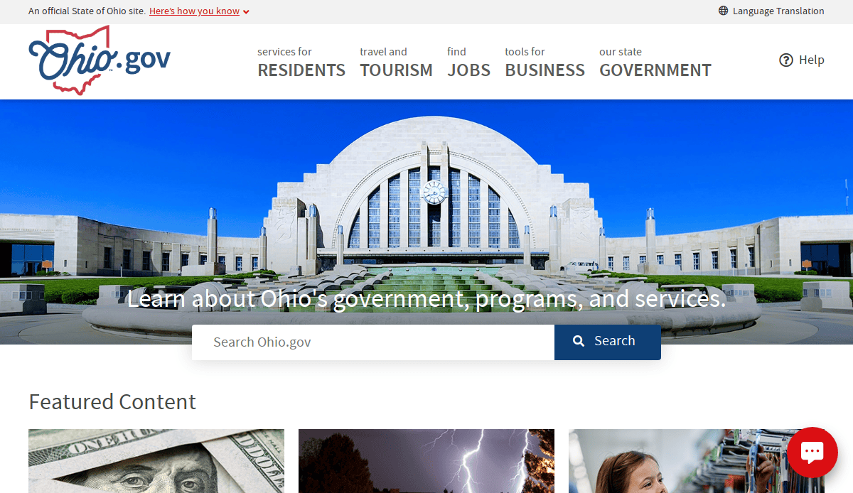
8. State of Ohio
Location: Columbus, Ohio
Key Takeaways:
- Simplified navigation for efficient information access
- Responsive design accommodating various devices
- Emphasis on citizen services and resources

9. City of San Francisco, CA
Location: San Francisco, California
Key Takeaways:
- Modern aesthetics reflecting the city’s innovation
- User-friendly interface with intuitive navigation
- Comprehensive access to city services and updates
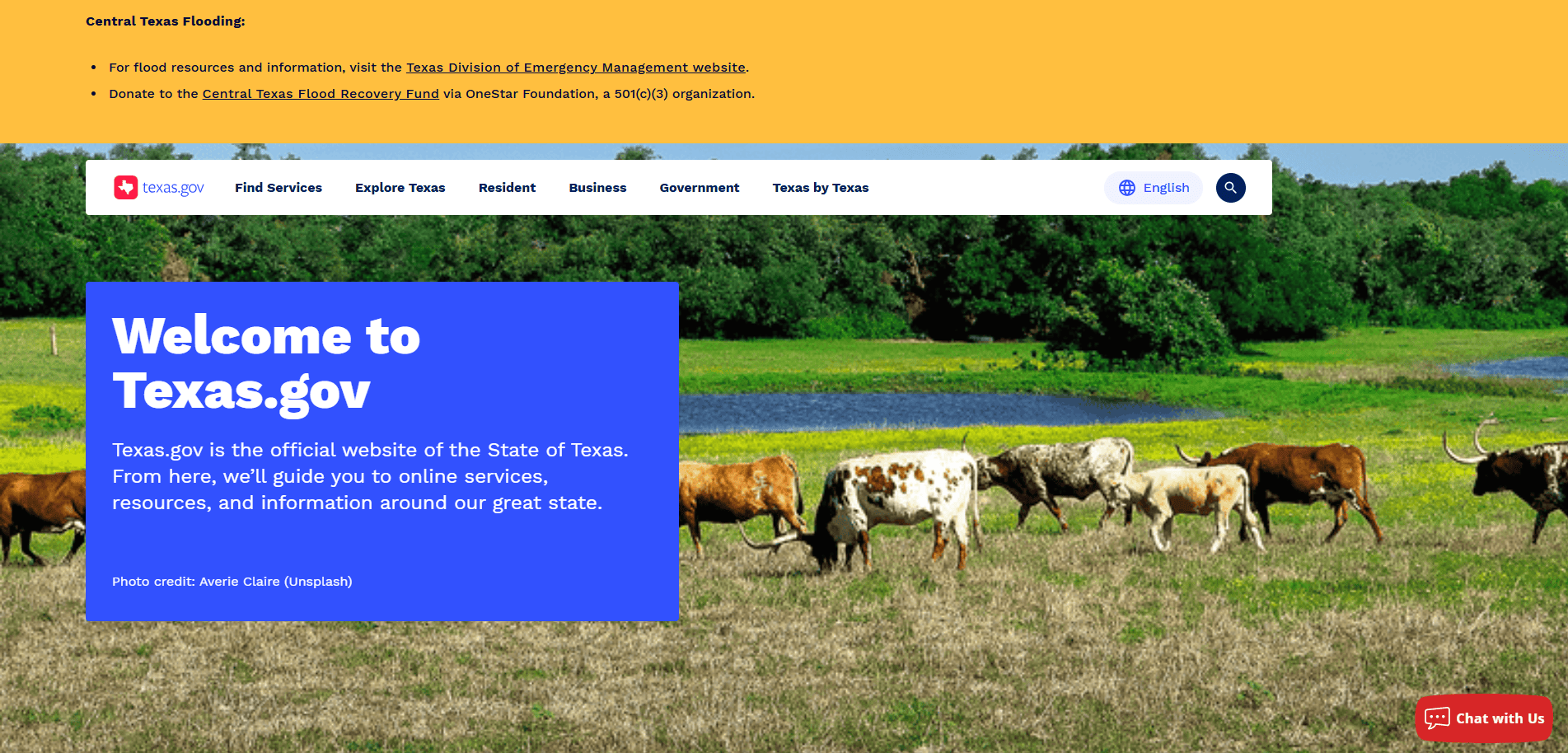
10. State of Texas
Location: Austin, Texas
Key Takeaways:
- Centralized portal for state services
- Accessible design meeting diverse user needs
- Efficient search functionality for quick information retrieval
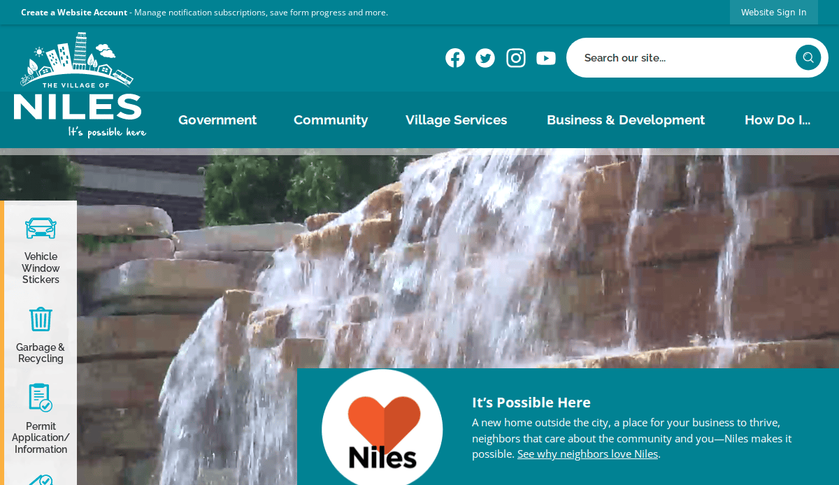
11. Village of Niles, IL
Location: Niles, Illinois
Key Takeaways:
- Clean, inclusive design with organized direction
- High-quality visuals enhance aesthetic appeal
- Responsive layout suitable for desktop and mobile use
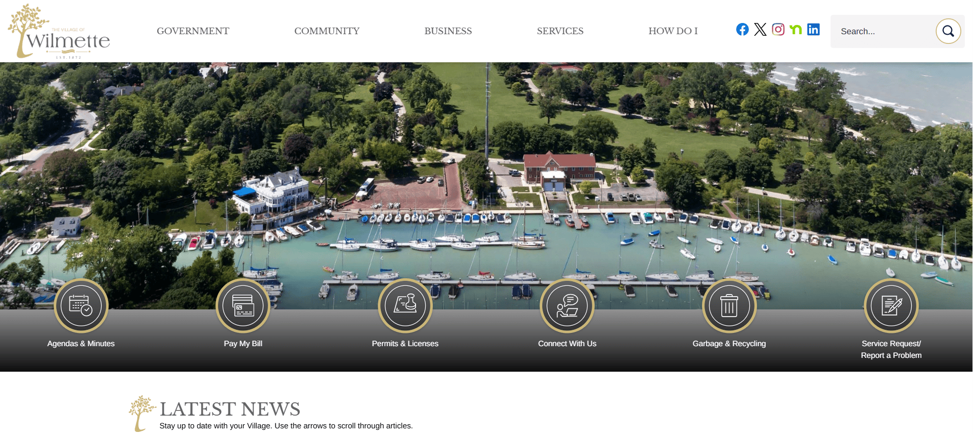
12 .Village of Wilmette, IL
Location: Wilmette, Illinois
Key Takeaways:
- User-friendly interface with intuitive navigation
- Comprehensive access to village services and information
- Mobile-optimized design for on-the-go access
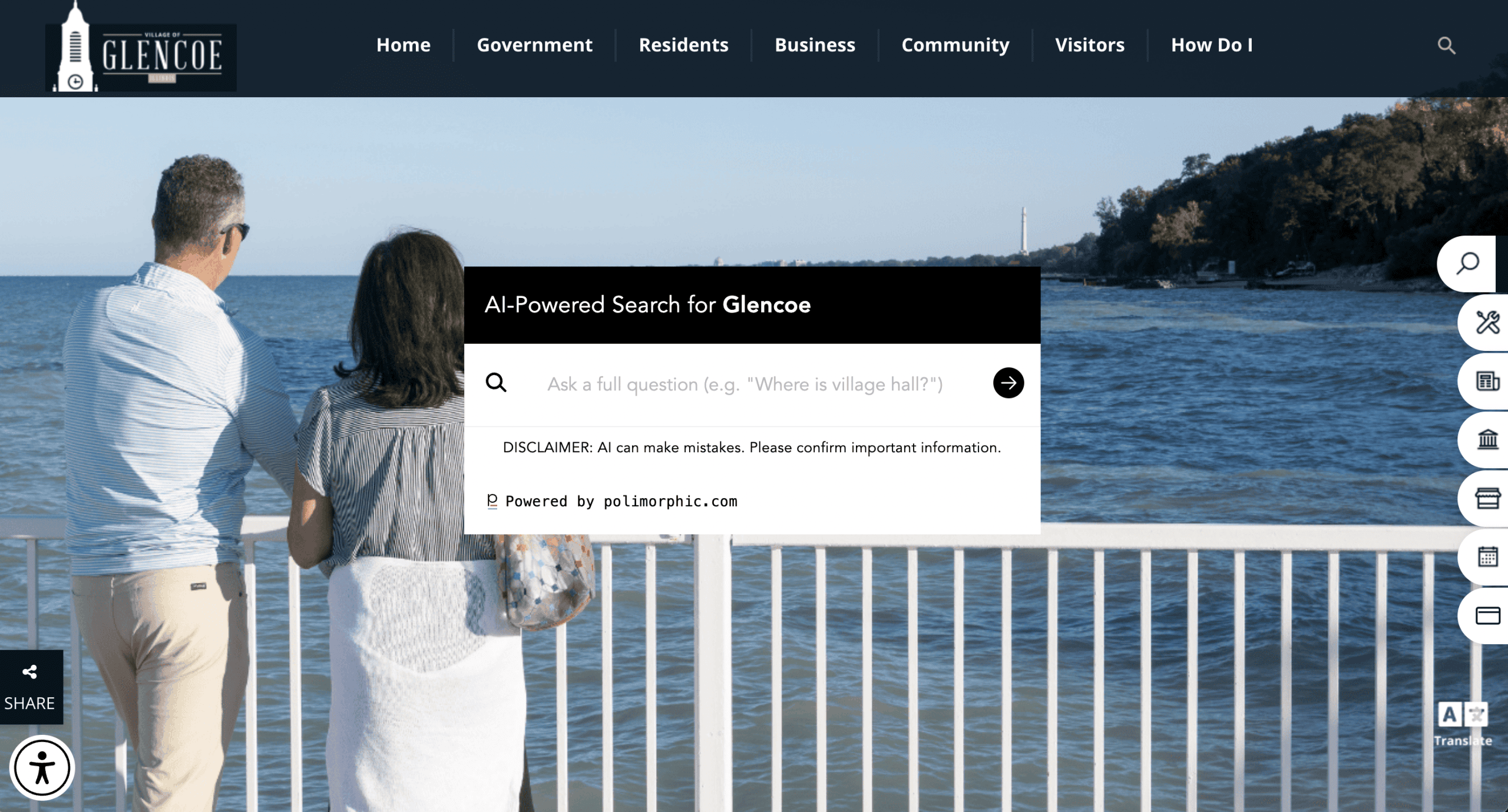
13. Village of Glencoe, IL
Location: Glencoe, Illinois
Key Takeaways:
- Modern design reflecting the village’s identity
- Efficient search functionality for quick information retrieval
- Inclusive layout meeting ADA standards
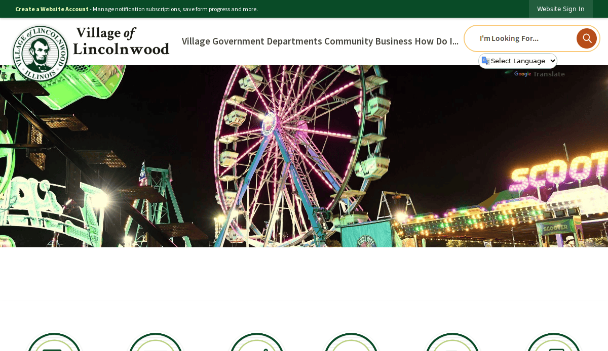
14. Village of Lincolnwood, IL
Location: Lincolnwood, Illinois
Key Takeaways:
- Engaging visuals enhance user experience
- Streamlined access to village services and updates
- Responsive design ensures usability across devices
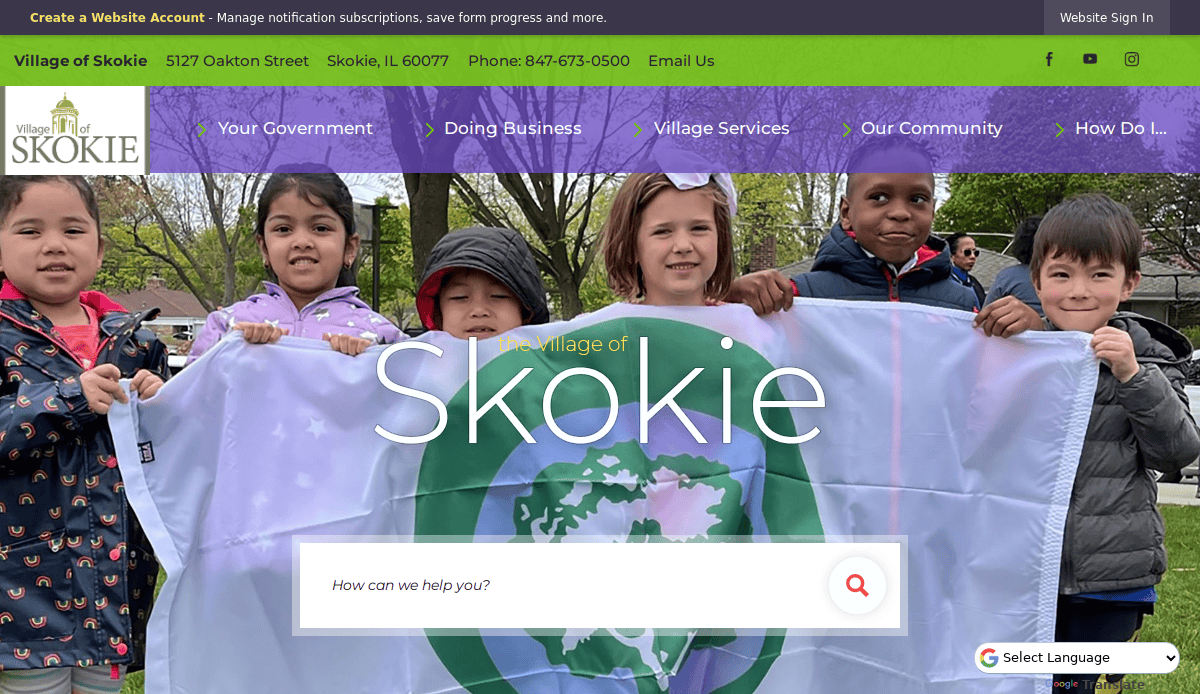
15. Village of Skokie, IL
Location: Skokie, Illinois
Key Takeaways:
- Interactive features promoting community engagement
- Clear presentation of village services and news
- Mobile-friendly design for seamless access
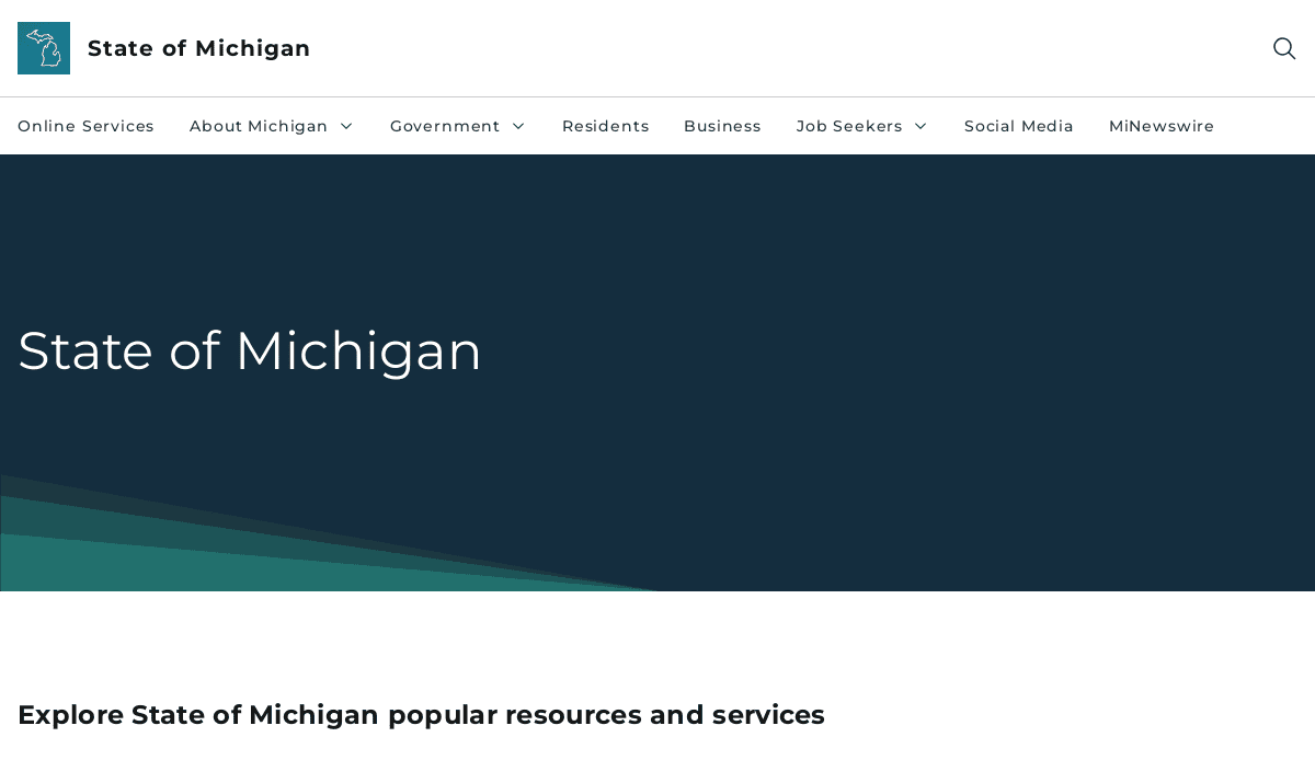
16. State of Michigan
Location: Lansing, Michigan
Key Takeaways:
- Centralized access to state services and information
- User-centric design with personalized content
- Efficient search functionality for quick information retrieval
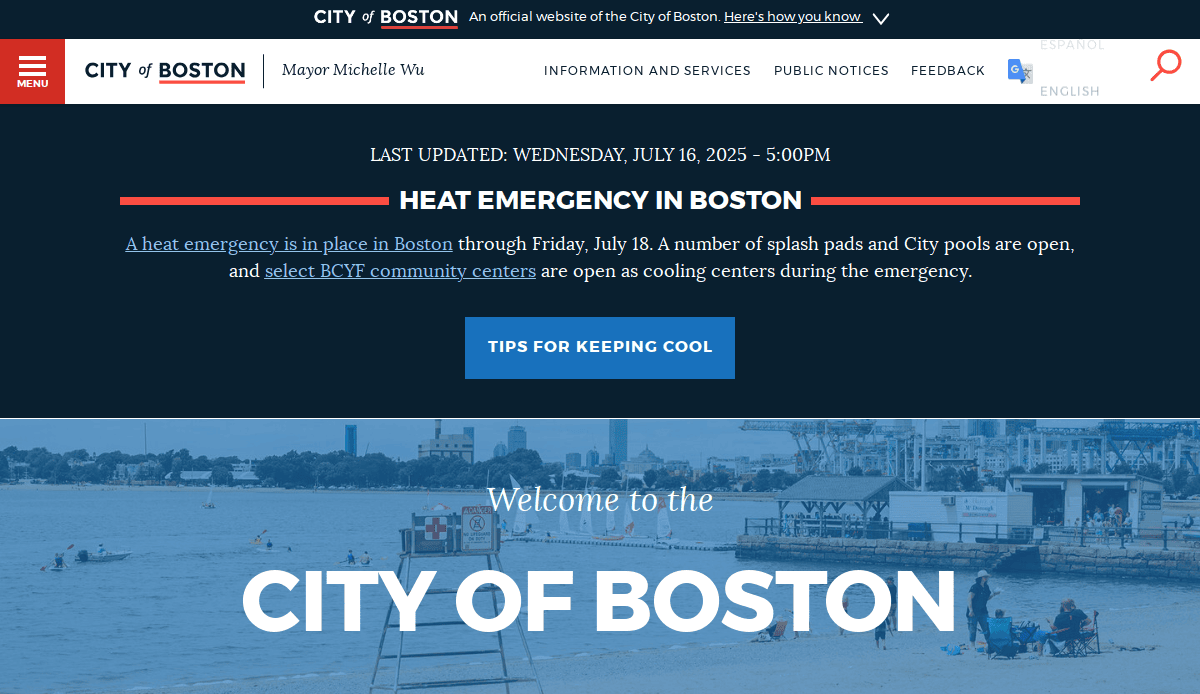
17. City of Boston, MA
Location: Boston, Massachusetts
Key Takeaways:
- Modern aesthetics reflecting the city’s innovation
- User-friendly interface with intuitive action steps
- Comprehensive access to city services and updates
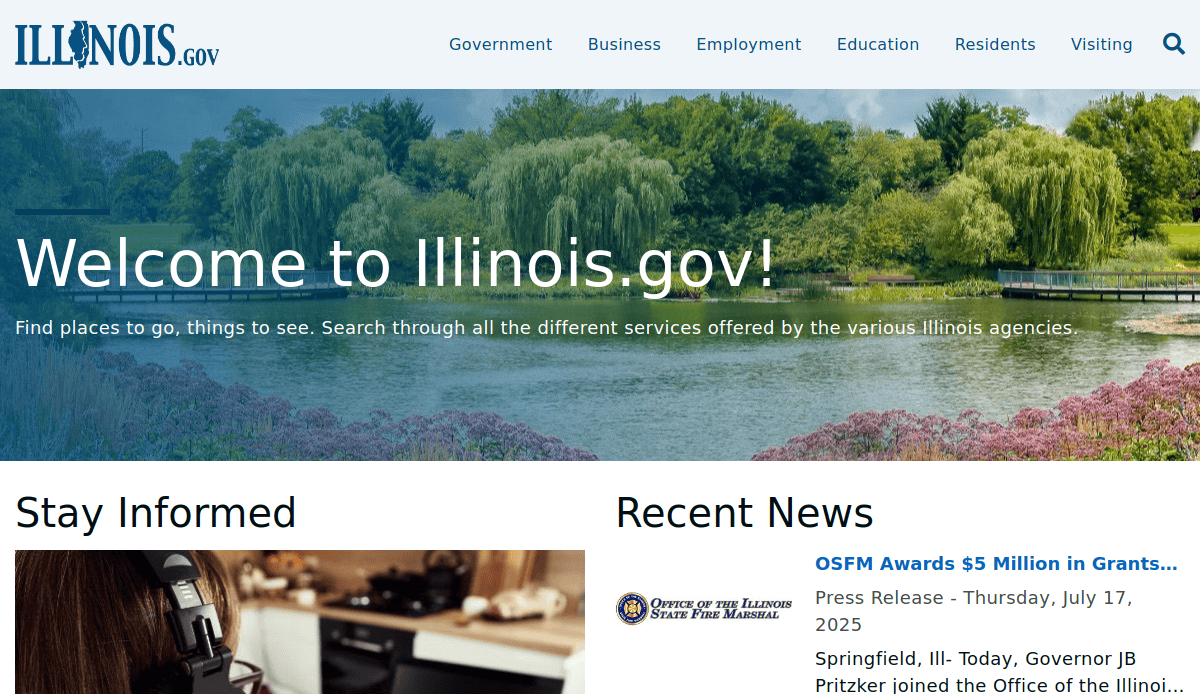
18. State of Illinois
Location: Springfield, Illinois
Key Takeaways:
- Streamlined access to state services
- Responsive design accommodating various devices
- Emphasis on citizen services and resources
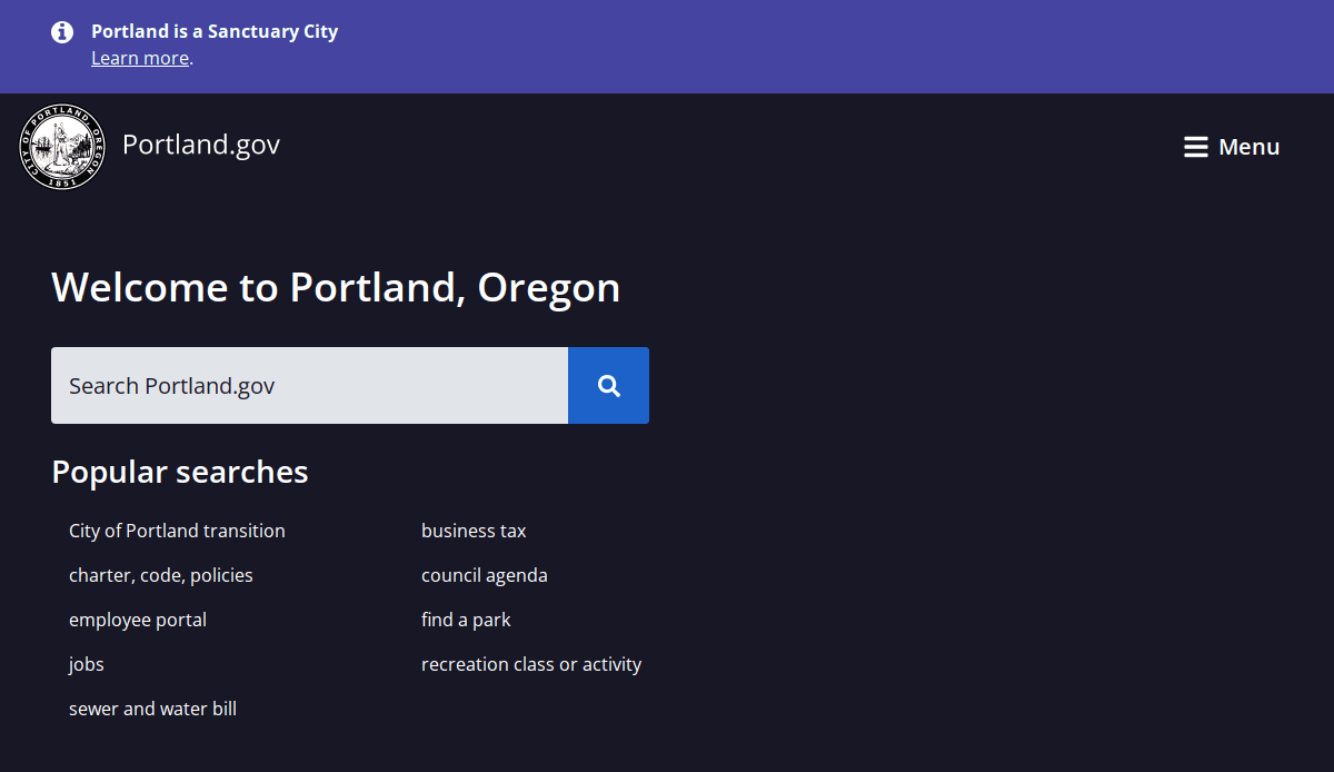
19. City of Portland, OR
Location: Portland, Oregon
Key Takeaways:
- Engaging visuals reflecting the city’s identity
- User-centric design with personalized content
- Efficient search functionality for quick information retrieval
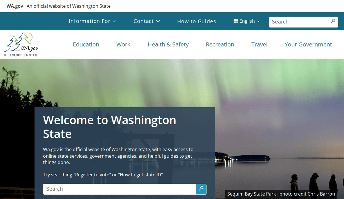
20. State of Washington
Location: Olympia, Washington
Key Takeaways:
- Centralized portal for state services
- Accessible design meeting diverse user needs
- Efficient search functionality for quick information retrieval
These examples illustrate the importance of user-centric design, inclusivity, and responsive layouts in government websites. Our agency’s contributions (numbers 11-20), in particular, highlight the impact of professional design in enhancing public sector digital presence.
Take the Next Step Toward a Smarter Web Presence
If your current government website design isn’t meeting the needs of your community, now is the time to change that. A new website that is secure, engaging, and easy to use can redefine how your municipality connects with the public. From user-focused action items to modern web design principles, every element should work toward improving service delivery and public trust.
Our full-service digital marketing agency specializes in helping municipalities build functional, scalable, and visually clean government websites. If you’re ready to launch a new website or enhance your current one, let’s talk about your goals.
Start your municipal web design project with us!
Government Organizations Web Design Questions Answered
What are the best practices for local government website design?
Best practices include clear direction, ADA compliance, responsive website design, consistent branding, and intuitive information architecture. These elements ensure your site is easy to use and meets the expectations of residents and visitors.
How often should a city website undergo a website redesign?
A redesign is recommended every 3–5 years or sooner if the website no longer supports mobile-friendly standards, modern functionality, or evolving constituent needs.
What is the ideal website content for a local municipality?
Essential content includes contact information, departmental overviews, emergency alerts, public meeting schedules, recreation resources, permit applications, and searchable archives of forms and documents.
How can we make it easy for site visitors to find information and services?
Utilize mega menus, a robust search function, and a strategic homepage layout to guide users to high-demand pages. This empowers residents and streamlines service delivery.
What CMS is best for managing a government website?
A government CMS like WordPress with role-based access and web content management tools offers flexibility, scalability, and ease of use for non-technical staff.
What is the importance of ongoing maintenance for government websites?
Ongoing maintenance ensures website security, speed, inclusivity, and accuracy. It supports both constituent trust and backend reliability.
Can we use a template, or do we need a custom design?
Templates can offer a fast start, but custom government website development ensures your site reflects your municipality’s unique look and feel while meeting compliance and functionality requirements.
What makes a city website one of the best municipal examples?
The best city websites offer user-friendly pathways, mobile optimization, accessible design, and real-time communication tools like a chatbot or emergency alert bar.
How does a responsive website improve constituent engagement?
Responsive design ensures users can browse your website, which would adjust across devices—empowering them to interact with services, browse search results, and access key information anywhere, anytime.
What features help government agencies customize their websites?
Custom features may include service directories, recreation calendars, staff directories, and integration with tools that manage your website content and empower dynamic websites tailored to your information needs.