In the modern online environment, the significance of a stellar website for businesses within the moving industry is paramount. A well-designed, moving website acts as the digital face of your business, presenting the initial impression to prospective clients. It transcends mere visual appeal, focusing on functionality, user experience, and the capacity to project trustworthiness and reliability. The finest moving company websites cater specifically to their audience’s needs, furnishing them with all the necessary information to make an educated choice. Every website component should be meticulously crafted to align with your target audience’s expectations, from comprehensive service outlines to clear pricing and genuine customer feedback.
Moreover, exceptional moving website design is about more than just drawing in visitors. It’s centered on converting these visitors into leads and, ultimately, customers. This conversion necessitates a strategic approach to the placement of content, calls to action, and navigation. The aim is to seamlessly guide visitors through your site, gradually building trust and prompting them to take action. Whether it involves requesting a quote, booking a consultation, or initiating a phone call, your website should streamline this process as much as possible.
Furthermore, in the highly competitive moving industry, differentiation is crucial. The best-moving company websites adopt the latest web design trends and technologies to stand out from the crowd. This might include integrating interactive features, offering virtual tours of storage facilities, or providing real-time chat support. By delivering a memorable and engaging online experience, you ensure your company remains the first choice for anyone needing moving services.
Examples of the Best Moving Company Website Designs
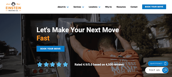
- Einstein Moving Company: Its website has an eye-catching, contemporary style that is sleek and appealing. The combination of vivid blues and whites creates a fresh palette that exudes professionalism and reliability. Users may easily navigate across the website with the help of well-labeled menus and noticeable calls to action. Visitors will get an immersive experience on the website thanks to the visually appealing and high-quality visuals and photos. It is excellent at offering insightful material that speaks to the wants and requirements of its audience. The website provides a plethora of information that enlightens and empowers users, from thorough descriptions of their services to practical advice for a stress-free relocation. Genuine client endorsements offer a human touch and bolster the business’s legitimacy and dedication to client happiness.
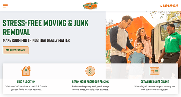
- College Hunks Hauling Junk & Moving: The website’s lively and dynamic design welcomes visitors and embodies the company’s youthful and active brand attitude. Bright orange, green, and white tones are mixed together to create a powerful yet calming color scheme that exudes dependability and energy. The clean, well-organized design has visually appealing features and simple navigation that lets users quickly move around the website. The user-friendly menu arrangement and well-placed call-to-action buttons encourage visitors to explore more or take action, making navigation simple. The website makes it simple to find what you need, whether you want to arrange for local or long-distance relocation, waste disposal, eco-friendly practice information, or learn more about employment prospects. Furthermore, responsive design accommodates many user preferences by guaranteeing a smooth surfing experience on desktop and mobile devices.
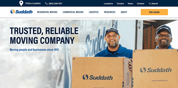
- Suddath: The website exudes professionalism and sophistication through its elegant design. The color scheme, featuring shades of blue and white, evokes a sense of trust and reliability, while the minimalist layout creates a clean and uncluttered appearance. A refined and welcoming style is produced using fine graphics and subdued animations, providing visual appeal without overwhelming the viewer. The website conveys the company’s knowledge and capabilities while captivating the audience with its visually attractive visuals and captivating multimedia elements. The company’s esteemed reputation for excellence and customer satisfaction is further reinforced by real client testimonials and success stories, which inspire confidence and trust in prospective clients. The site’s navigation is simple and easy to use, with calls to action placed in strategic locations and menus with clear labels that lead users through the site.
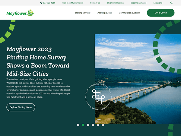
- Mayflower: Visitors are quickly drawn in by the website’s slick and contemporary appearance. Shades of blue and white in the color palette provide a feeling of dependability and credibility, and the neat, structured layout makes it easier to read and navigate. The website offers customers of all technical skill levels a flawless surfing experience thanks to its user-friendly design and intuitive interface. The website’s eye-catching graphics and interesting multimedia components improve the user experience and visual attractiveness. Every optical element, whether a series of images exhibiting their fleet of moving trucks, a film showing off their skilled movers in action, or interactive tools to help with the moving process, is carefully chosen to capture viewers’ attention and create a lasting impression. Utilizing live chat on their website establishes a direct and immediate connection with prospective and new customers, facilitating real-time engagement and support to enhance their experience and foster meaningful relationships.
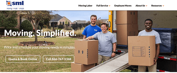
- Simple Moving Labor: Its website, which reflects the company’s dedication to hassle-free moving experiences, is impressive in its simple, easy-to-use design. Warm neutrals and soothing blue tones combine to create a color scheme that welcomes guests and gives them confidence. Users can easily navigate the website because of the well-organized structure, which includes prominent call-to-action icons and simple navigation menus. White space also allows a breathing area between elements to improve readability and visual attractiveness. Crucial components like service offerings, contact details, and call-to-action buttons are placed and underlined carefully using color, size, and placement to ensure visitors can quickly find the information they need and perform the necessary action.
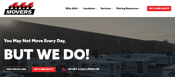
- AAA Movers: Its impressively modern and polished website design showcases the company’s dedication to quality in the moving field. The color scheme conveys a sense of dependability and credibility, a tasteful combination of red and white tones. At the same time, the neat and tidy layout improves navigability and use. The website provides a smooth surfing experience, connecting users from the moment they land on the homepage, pursuant to its user-friendly design and intuitive layout. The website’s eye-catching graphics and captivating multimedia components improve the user experience and overall attractiveness. Every visual element, whether it be dynamic graphics demonstrating their dedication to quality, films showcasing their effective moving procedure, or images showing their staff at work, is carefully chosen to capture viewers and make a good impression.
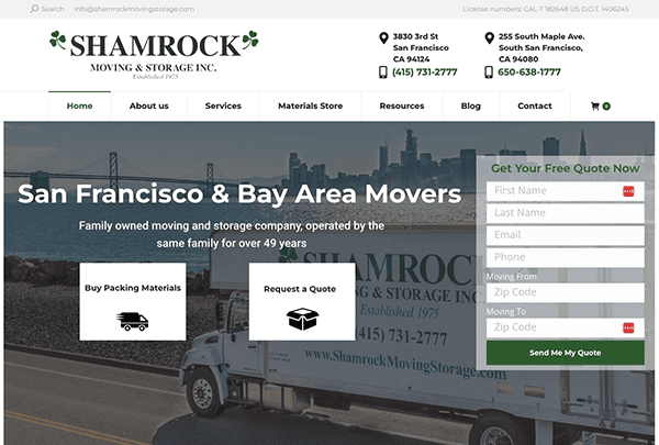
- Shamrock Moving & Storage: The company’s professional and dependable nature is reflected in its website’s visually stunning and user-friendly design. While the user-friendly navigation guarantees a hassle-free browsing experience, the color scheme radiates stability and trust. The color scheme, featuring a harmonious blend of green and white accents, evokes a sense of confidence and strength while maintaining a fresh and modern aesthetic. Thorough service descriptions, valuable resources, and actual client testimonials enhance an educational and beneficial content offering. Multimedia components that attract the viewer and improve aesthetics include pictures and movies. The adaptable design of the website ensures maximum operation on a range of devices, making it accessible to all users.
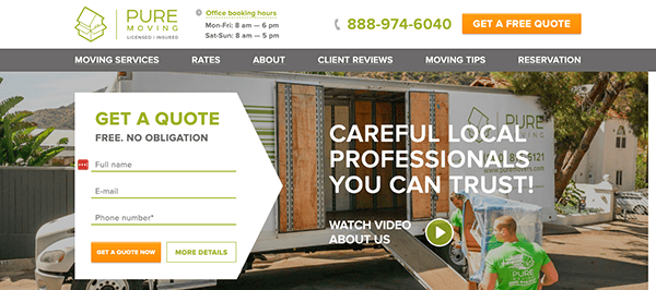
- Pure Moving: The website has a clean, contemporary style that embodies professionalism and simplicity. The palette looks clean and modern with its serene white, gold, and green touches, evoking confidence and dependability. Users are easily guided around the website because of the well-organized style, simple navigation menus, and apparent calls to action. Beyond its functionality, the website emanates professionalism and attention to detail. Succinct yet informative text, attractive images, and subtle animations kept visitors interested throughout their browsing experience. Furthermore, including real-time customer reviews and testimonials offered a dimension of legitimacy, bolstering my faith in the company’s ability to keep its promises.
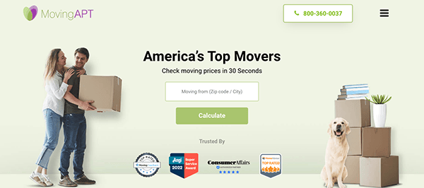
- Moving APT: Viewers will be instantly taken in by the site’s sleek, contemporary design, which radiates credibility and professionalism. An appealing atmosphere was produced by the basic design and a bright color scheme, giving visitors confidence in the company’s capacity to handle any relocation demands. The website’s user-friendly appearance and clear menu structure made navigating it a breeze—all the required information, whether service details or general relocation information, was immediately available and well-organized. A notable characteristic of its website is the availability of live chat support, which offers clients immediate help and direction. With the help of this helpful resource, customers can quickly address any issues, obtain the answers to the questions they require, and receive advice specifically catered to their needs.
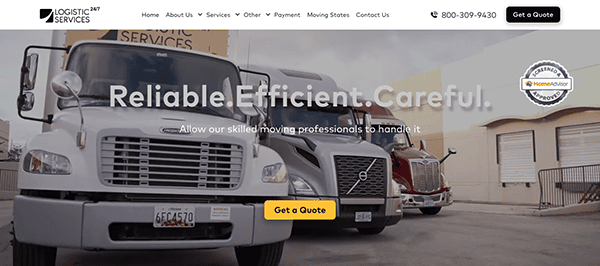
- 24/7 Logistic Services: When visitors appeared on the homepage, they were greeted with a clean, contemporary style that exuded expertise and reliability. The user-friendly layout, lively graphics, and soothing color scheme produced an appealing ambiance that inspired trust in the company’s ability. The site’s design is well-organized, featuring call-to-action buttons and menus that are easy for consumers to navigate. The website has captivating multimedia components and aesthetically pleasing pictures that improve the user experience and overall aesthetics. Real customer testimonials and success stories are included to provide authenticity and credibility while highlighting the business’s proven track record of outstanding customer service.
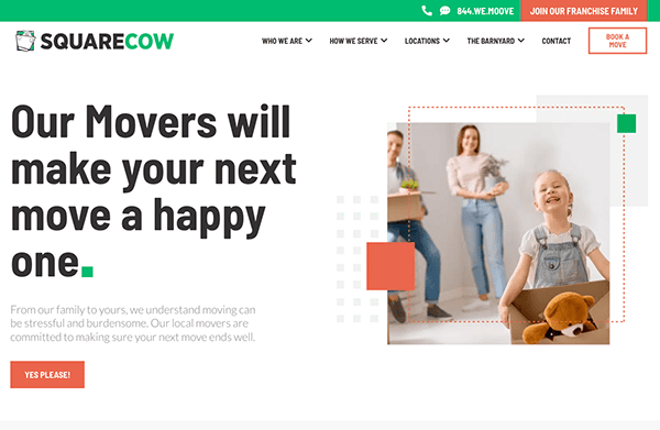
- Square Cow Movers: Probably the most memorable aspect of this website’s homepage was the imaginative frames they used for their images. The color scheme, which combines earthy tones with brilliant green, is modern and fresh, creating a feeling of trust and friendliness. Another well-considered element of this expert moving company website that consumers appreciated was the layout, which had a solid proportion of white space. Users are easily guided around the website because of the well-organized style, simple navigation menus, and apparent calls to action. The website guarantees a simple and hassle-free browsing experience whether you’re looking through their array of moving services, getting a price, or accessing valuable resources. Additionally, the responsive design easily adjusts to various screen sizes, giving PC, tablet, and smartphone users a consistent and optimized experience.
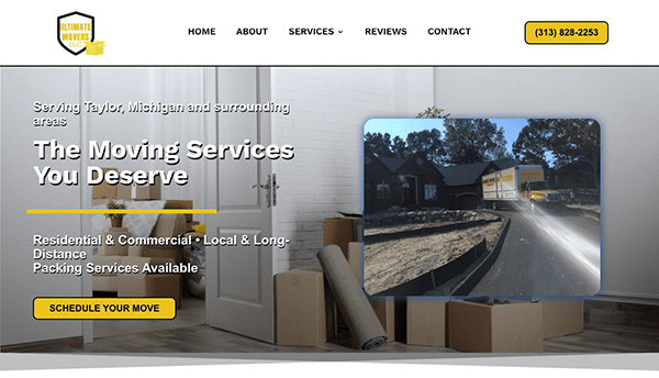
- Ultimate Movers: The website welcomes users with a simple, contemporary layout that prioritizes accessibility and ease of use. High-quality photos and a unified color palette instantly exude professionalism and dependability, vital in the moving business. The site’s layout is user-friendly, featuring well-labeled menus and calls to action that lead visitors through the site with ease and facilitate finding information about services, costs, and how to contact the site. The company’s service offerings are concise and detailed, giving prospective customers a clear idea of what the business offers without confusing them with technical terms or extraneous details.
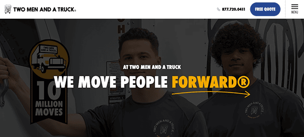
- TWO MEN AND A TRUCK: Its website features an elegant and polished design that embodies the business’s dedication to dependability and effectiveness. The color scheme, which combines shades of gray, black, white, blue, and yellow, keeps a clean, contemporary look while generating a lively, welcoming ambiance. It is excellent at offering exciting and educational stuff. The website provides a thorough rundown of services, including packing and unpacking as well as long- and short-distance moving. The website features prominent calls to action (CTAs) that are noticeable without being obtrusive, all purposefully placed to direct visitors towards conversion points. Customer testimonials and success stories are prominently featured, enhancing trust and credibility. Combined with high-quality images and videos, these elements create a narrative that resonates with visitors, encouraging them to envision a successful moving experience with the company.
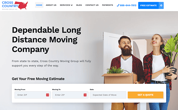
- Cross Country Moving Group: The website impresses with its clean, modern aesthetic that combines ease of navigation with visual appeal. A harmonious color palette reflects the brand’s professional image while creating a welcoming atmosphere for visitors. The website’s content has been carefully designed to cater to the requirements and worries of those considering relocating across the country. There are sections specifically for each type of service, such as long-distance moving, packing services, and storage options, and the services are well laid out. To encourage visitors to take the next step—whether it’s getting a quote, booking a consultation, or just learning more about the services provided—calls to action (CTAs) are intelligently crafted and prominently presented.
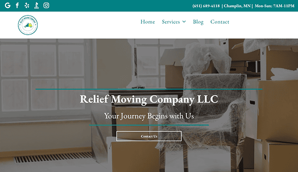
- Relief Moving Company: A visually appealing interface that blends a sleek, contemporary design with simple navigation welcomes visitors. The design makes use of a soothing color palette that complements the brand’s objective of offering stress-free moving experiences. The website’s layout is well thought out, making the content easily accessible and rationally arranged. This corporation makes it easy for users to navigate, enabling them to locate the services they require, comprehend the business’s procedures, and proceed quickly. The user experience is further improved by the website’s responsive design, which makes it possible to see it on a desktop, tablet, or smartphone and keeps it operational.
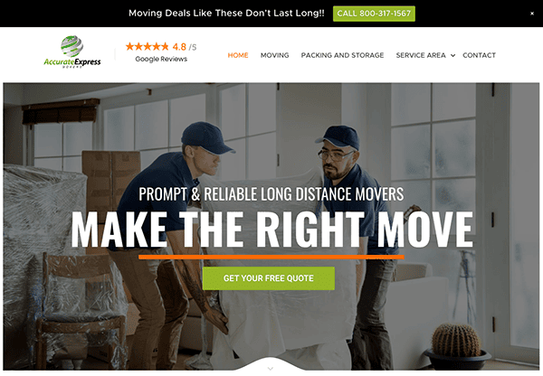
- Accurate Express Movers: The website has a simple design that makes it easy for users to understand the main points of the business’s offerings. The color was carefully selected to convey professionalism and dependability, two essential qualities for gaining prospective clients’ trust. Reviews and testimonials are arranged purposefully to highlight the business’s dedication to client happiness. Calls to action (CTAs) are strategically placed throughout the website to encourage users to interact with the company. These CTAs are clearly marked and carefully crafted to entice users to take action, whether to get a price, find out more about particular services, or get in touch with customer service.
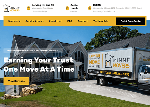
- Minne Movers: The design makes use of a simple, contemporary look that highlights accessibility and ease of use. Combining high-quality photographs with a unified color scheme that matches the brand’s identity creates an environment of professionalism and trust. With sections specifically for packing services, commercial moving, home moving, and other services, the services are well-described. The site features a lot of customer testimonials and success stories, which increases credibility and confidence. Furthermore, the website has a blog section with insightful advice and ideas, solidifying its reputation as an informed and helpful resource for the moving industry.
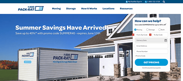
- 1-800-PACK-RAT: The neat, well-organized layout immediately gives guests a professional and dependable impression. Users are encouraged to explore the services provided by the pleasant ambiance created with eye-catching graphics and a warm color palette. Its easy navigation is one of the website’s main advantages. Through simple and easy-to-use menus, users are guided through the site’s offers, which include client testimonials, contact details, and extensive service descriptions. The way the website uses calls to action (CTAs) is excellent; it’s simple and persuasive. Every page is intentionally created to encourage users to proceed, whether seeking a price, making an appointment for a service, or browsing the choices. The CTAs are written to promote action and are displayed to ensure they grab the user’s attention.
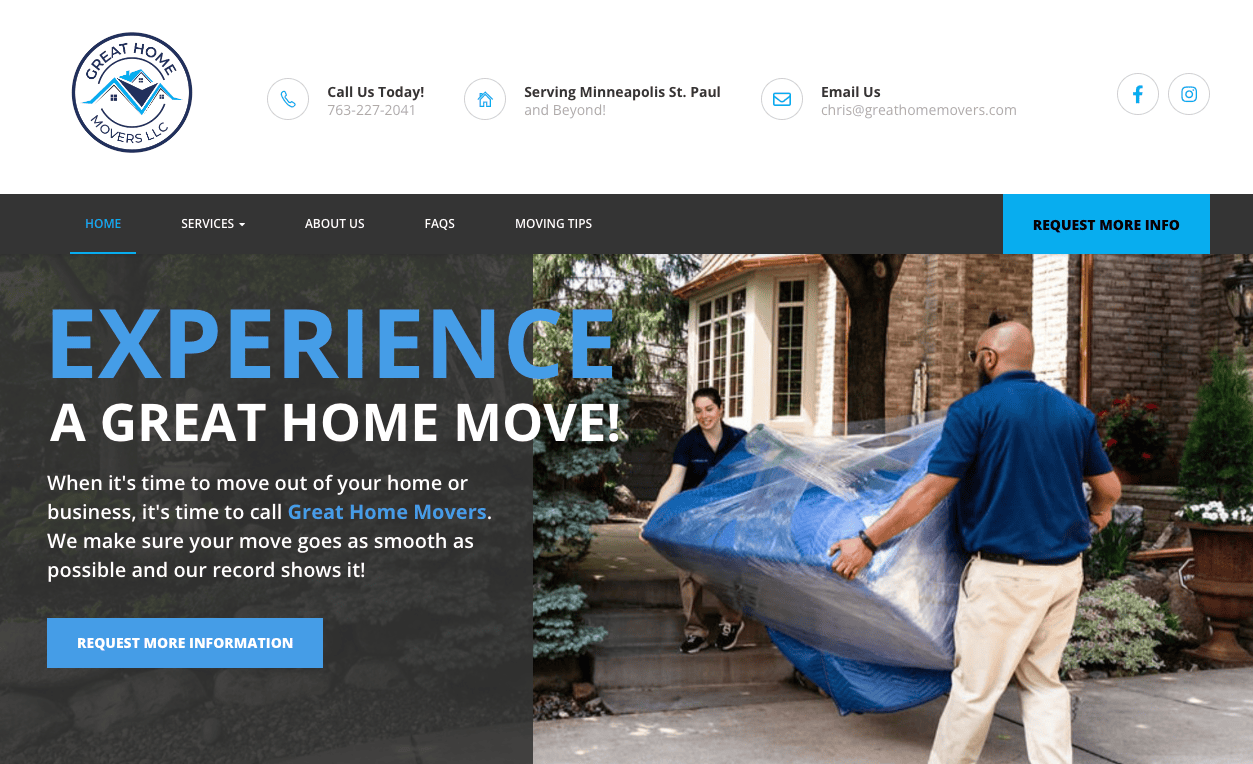
- Great Home Movers: The website has a visually appealing design that perfectly combines warmth and professionalism. The warm color palette appeals to customers by fostering a welcoming environment. Strategically positioned, high-quality photos and videos highlight the business’s offerings and help to humanize the brand, which makes it seem more approachable and reliable. The website’s design is simple and uncomplicated, emphasizing providing a good user experience and essential information. Easy access to various website parts, including service descriptions, prices, testimonials, and contact details, is made possible by the well-organized main menu. The website for this tidy moving firm also does a fantastic job with its subdued animations.
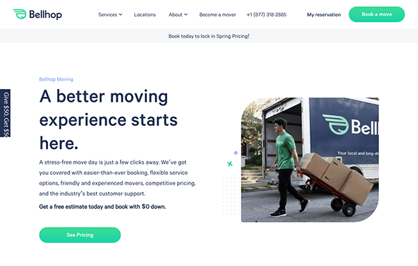
- Bellhop: The website’s design successfully blends professionalism and approachability. Vibrant hues, such as the brand’s emblematic green, energize and uplift the user experience. Excellent photos and videos highlight the brand’s human side and commitment to offering a dependable and personable service. Thanks to a well-managed visual hierarchy, essential components like calls-to-action (CTAs) are prominently presented and made to stand out without overpowering the text. The menu structure and simple navigation make it simple to find information about services, locations, and costs. The homepage uses an eye-catching headline and encouraging pictures to effectively convey the business’s value proposition.
Exploring examples of the best moving company website designs reveals that these sites excel in both aesthetics and functionality. They present a professional and attractive appearance and ensure a user-friendly experience, making it straightforward for potential clients to locate the information they’re seeking. These websites prioritize mobile optimization to guarantee accessibility and optimal device performance. By focusing on the user’s journey, they effectively convey their value proposition and establish credibility with their audience.
To wrap up, the impact of a meticulously designed website in the moving industry is undeniable. It serves as a potent instrument that can markedly influence your business’s growth and success. The premier moving company websites offer an ideal mix of visual appeal, functionality, and user experience. They adeptly address their audience’s requirements in a clear and concise manner, facilitating the ease with which potential customers can engage further.
Should you aspire to enhance your moving company’s online footprint, CyberOptik stands ready to assist. Boasting over two decades of experience in website construction and hosting, we specialize in developing bespoke moving website designs that captivate and deliver tangible results. Reach out to us today for a complimentary consultation about your moving website, and let’s begin an expedition to transform your digital presence.

