Your website serves as the digital storefront for your business, often being the first point of contact potential customers have with your brand. A well-designed site showcases your products and builds trust and credibility with your audience. This is especially important in an industry where quality and design are paramount.
A great kitchen cabinets website should highlight your product’s unique features and benefits. It should include high-quality images, detailed descriptions, and customer reviews to create a compelling narrative around your offerings. Additionally, intuitive navigation and a seamless user experience are essential to keep visitors involved and encourage them to explore your catalog further. With so many options available, a standout website can differentiate a potential customer’s choice of your business over a competitor.
Moreover, a well-optimized website can significantly boost your search engine rankings, making it easier for possible customers to find you. By investing in a professional, visually appealing, and functional website, you position your business as a leader in the kitchen cabinets industry.
Examples of the Best Kitchen Cabinets Website Designs
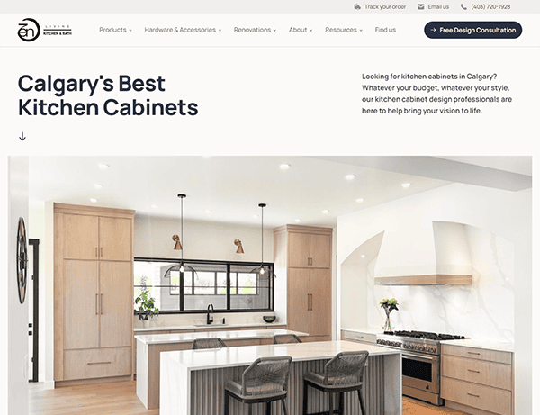
- Zen Living: Its website provides an excellent user experience due to its clean, modern, and intuitive design. The webpage is appealing, with high-quality photographs of their bespoke cabinetry that demonstrate their knowledge and craftsmanship. The intuitive navigation allows consumers to explore various items and services, from kitchen cabinets to bathroom vanities. Each section is well-organized, with detailed information and visual aids that help readers comprehend and interact. The site’s white space and uniform color palettes promote readability and a professional appearance. The “Free Design Consultation” function is prominently highlighted, encouraging user engagement and emphasizing the company’s customer-focused approach. Moreover, incorporating customer reviews and an extensive resources section fosters confidence and offers vital perspectives.

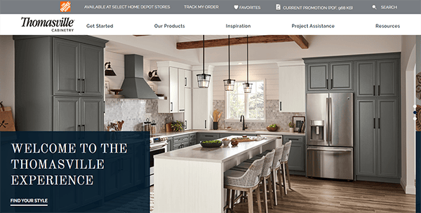
- Thomasville Concierge: Its website excels in aesthetics and functionality, making for a user-friendly experience. The homepage welcomes visitors with high-resolution photographs that wonderfully exhibit their cabinets, enticing them into their product offers. The navigation is simple, with quick access to numerous sections such as products, design inspiration, and resources. Key elements such as the “Room Visualizer” and “Budget Estimator” are prominently shown, providing valuable tools for potential consumers. The site’s clean design, consistent color palette, and intelligent use of white space create a professional and pleasant ambiance. Furthermore, thorough product information, user evaluations, and design ideas add to the total value, making it an excellent resource for anyone planning to remodel their kitchen.
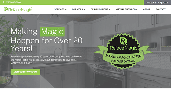
- Reface Magic: The site displays eye-catching, high-resolution photographs that quickly lure visitors in, highlighting the quality and beauty of their work. It has a clean, modern layout with a consistent color scheme and enough white space, which creates a professional and inviting atmosphere. Navigation is simple, with adequately labeled menus leading customers to essential parts, including services, design options, and galleries. The “Request a Quote” and “Book Now” CTAs are deliberately placed to increase user interaction and provide simple service access. Contact forms are prominently displayed and easy to use, ensuring potential clients can quickly connect with the company. The website’s responsive design ensures it looks and functions beautifully on all devices, enhancing the user experience across platforms.
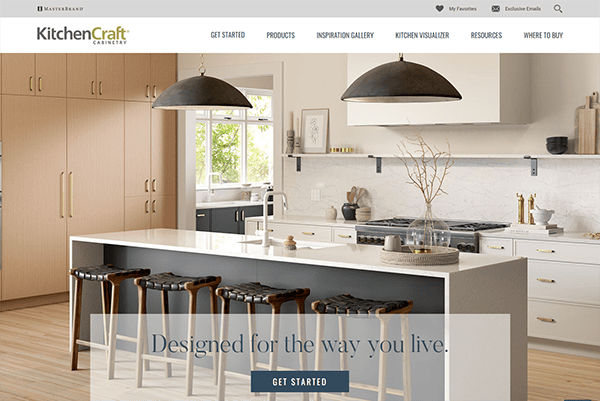
- Kitchen Craft: Its website succeeds at providing a user-friendly and visually appealing interface. The homepage has high-quality photographs highlighting their trendy, European-style kitchen cabinets. The site’s structure is simple and well-organized, making navigating easy with clearly labeled menus and sensible paths to explore items, design inspiration, and information. Key features like the “Kitchen Visualizer,” “Budget Calculator,” and “Inspiration Gallery” are prominently featured to increase user engagement. Call-to-action buttons such as “Get Started” and “Download Free Planning Guide” are intentionally positioned to promote interaction. The contact forms are simple to locate and utilize, allowing potential consumers to reach out for additional information swiftly. The consistent color scheme and ample white space create a professional and inviting atmosphere. Additionally, the responsive design ensures an optimal experience across all digital devices, from desktops to mobile phones.
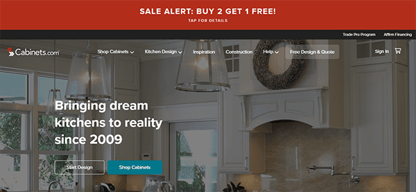
- Cabinets.com: The website sets the standard for web design, combining aesthetics and functionality to provide an excellent user experience. The homepage captivates visitors with high-quality pictures of various cabinets, quickly engaging them. The site’s style is sleek and well-organized, making it simple to navigate through sections like “Shop Cabinets,” “Kitchen Design,” and “Inspiration.” The color scheme is consistent and appealing, with intelligent use of white space to improve readability and concentration. Additional features, such as the “Room Visualizer” and thorough product filters, enhance the user experience by providing valuable tools for decision-making. The website also offers many resources, such as design ideas and customer testimonials, which help develop trust and inspire visitors. Prominent CTAs like “Get Started” and “Free Design & Quote” encourage user engagement, guiding visitors smoothly through their journey from exploration to action. The contact forms are easily accessible, facilitating quick communication with their team.
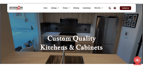
- Cabinets R Us: The website’s color palette is visually appealing, with a balanced blend of colors that complements the brand’s identity. The typography is crisp and accessible, making for a pleasant reading experience. The website impresses with its straightforward and uncomplicated structure, which allows users to discover what they need without interruptions. The usage of high-quality photos throughout the website improves its visual appeal. The photographs are carefully chosen to successfully highlight the products, providing visitors with a clear understanding of what the company offers. The material is helpful, offering valuable information about the company, its services, and available items. It finds an appropriate mix between being brief and providing sufficient detail to make educated decisions. The website’s design included a chat box element, which improved user interaction and customer service. The chat box’s user-friendly interface, real-time communication capabilities, and personalized service options make it an effective mechanism for enhancing the total user experience and increasing customer satisfaction.
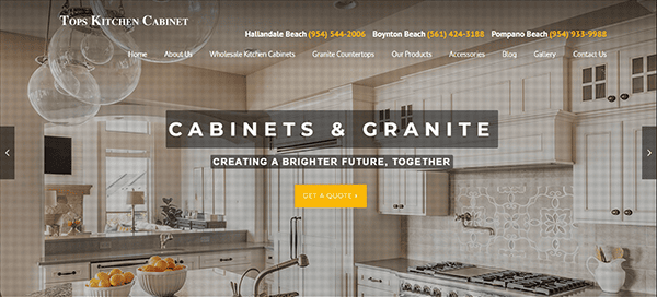
- Tops Kitchen Cabinet: The website has a neat, complementary design that is visually appealing and easy to use. The color scheme of yellow, black, and white produces a distinctive and professional ambiance, which improves the user experience through dramatic contrast. High-quality photos are used efficiently throughout the website to highlight the products. Its content is straightforward, helpful, and well-presented, with valuable information regarding its services and product offerings. Each product page includes detailed descriptions and specifications, allowing users to make informed judgments. Customer testimonials and reviews are featured, highlighting their great experiences with Tops Cabinet. This increases credibility and assures potential customers about the quality of the items and services. CTAs are deliberately positioned around the site to encourage users to take action, such as getting a price, booking a consultation, or browsing other product categories.
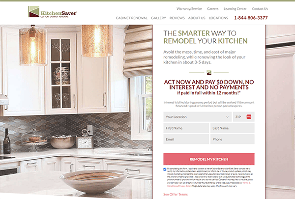
- Kitchen Saver: Its website has a clean, modern style that quickly draws the eye. The color scheme is inviting and appropriate for a kitchen remodeling company, with warm tones and easy-on-the-eyes typography. The layout is simple, allowing you to easily navigate and discover what you’re searching for without any needless clutter. Using high-quality photos to showcase their work is especially beneficial in displaying their expertise and service excellence. The webpage is well-organized, with distinct sections directing you through their services, goods, and customer testimonials. The menu is rationally structured, allowing for a smooth transition between areas of the website. The usage of customer testimonials and before-and-after images enhances their credibility and experience in the sector.
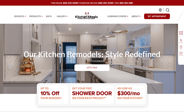
- Kitchen Magic: The website has a sleek, modern style that quickly draws your attention. The color palette is well-chosen, and the overall appearance is clean and professional, reflecting the high quality of their services. The use of high-resolution photographs across the site effectively highlights their kitchen remodeling projects, allowing visitors to envision the possibilities for their own homes. The website’s content is both instructive and engaging. Each page has detailed information about their services, including high-quality images of their kitchen conversions demonstrating their skill and experience. Their blog area is particularly good, offering great ideas and insights into kitchen design trends, adding additional value for visitors seeking inspiration and direction. One of the website’s distinguishing features is its usage of interactive components to increase user interaction. Compelling calls-to-action (CTAs) are strategically positioned across the website, encouraging users to take action, such as booking a free consultation or browsing their gallery of kitchen designs. Furthermore, the introduction of a chat box is an effective interactive tool. It enables visitors to communicate directly with a representative in real-time, asking inquiries and receiving prompt responses.
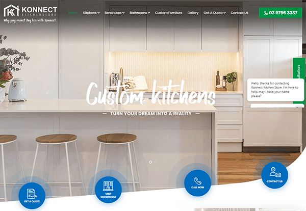
- Konnect Kitchen: The website has a modern, visually appealing design that immediately captures your attention. The color scheme is elegant and cohesive with the brand’s identity, creating a professional and pleasant environment. High-quality photos of their kitchen goods and installations are featured, giving visitors a quick impression of the quality and design. The layout is user-friendly, with a well-organized menu that makes navigation straightforward and efficient. Users can quickly navigate through categories such as kitchen equipment, bathroom vanities, and DIY stone benchtops. The website provides valuable elements such as inquiry forms and contact information, allowing clients to easily contact the store for specialized guidance or support. The installation of a chat box improves the user experience by offering real-time support.
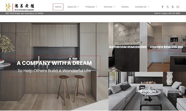
- HC Kitchen Cabinet: The website’s design is visually pleasing, with a well-balanced color scheme that radiates professionalism and friendliness. The combination of high-quality photographs and crisp typography improves the overall aesthetic, making it more engaging and appealing. The photos of kitchen cabinets and designs are attractively displayed, giving users a clear understanding of the items and services available. The website’s straightforward style allows for seamless navigation. The well-organized menu will enable customers to quickly access information about products, services, and the firm. Each area is clearly labeled, and the drop-down options are responsive and easy to use. The strategically placed calls to action (CTAs) direct users to ask questions or seek quotations, which increases user engagement. The contact forms are straightforward to complete, and adding social media connections encourages users to engage with the company across several platforms.
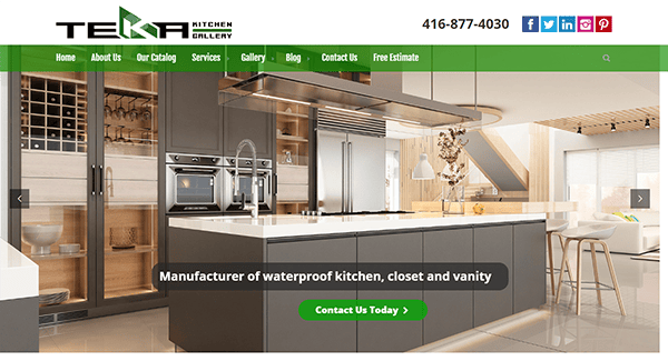
- Teka Kitchen Gallery: The website’s design is stunning and professional, with a sleek, modern color palette that quickly draws attention. The homepage’s hero section features slider images that dynamically exhibit unique kitchen designs while showcasing significant items and services. The overall layout is clean and straightforward, resulting in a visually appealing and professional appearance. The main menu is well-organized, with clear labels directing viewers to various areas, including Products, Services, Projects, and About Us. Drop-down menus work seamlessly, and the logical content classification helps consumers discover what they want. The introduction of a search bar improves usability by providing quick access to particular products or information. The well-written language and carefully positioned testimonials demonstrate the company’s knowledge and devotion to excellence. The Gallery section is remarkable, displaying previous work with vibrant photos and captions showing the company’s strengths.
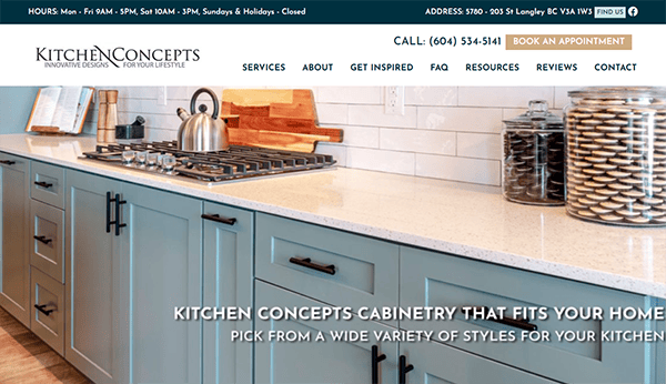
- Kitchen Concepts: The website immediately captures attention with its clean, modern design. Using high-quality photographs of kitchens and cabinetry emphasizes the company’s craftsmanship and motivates visitors. The chosen color combination is elegant and inviting, with various neutral tones that lend a professional and stylish appearance. The information is delivered systematically and interestingly. The homepage includes succinct yet helpful sections highlighting the company’s offers, making it simple for visitors to understand the range of services available. Interactive components, such as imagine sliders and hover effects, give the site a dynamic sense without overwhelming the viewer. These elements increase interaction and keep visitors intrigued. Customer feedback and reviews enhance authenticity and reliability.
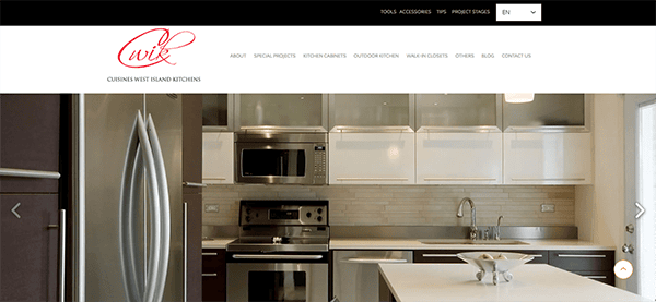
- Cuisines West Island Kitchens: The website has an appealing and clean design that immediately attracts the user’s attention. Its use of a relaxing color palette and high-quality photographs provides a professional but welcoming ambiance. The layout is intuitive, allowing users to explore and access information. The website’s use of high-quality photos improves its overall visual appeal. The images are visually appealing, and they also serve to highlight the company’s skill in kitchen design and refurbishment. Contact information is freely available, and visitors can contact us via a contact form or a direct phone number. The incorporation of social media links enables users to connect with the firm across several platforms, increasing engagement and communication. The website has clear calls to action (CTAs) positioned adequately throughout the pages.
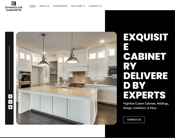
- Chandler Cabinets: The homepage includes high-quality, full-color images of beautiful kitchens, highlighting the company’s skill and attention to detail. The layout is manageable and straightforward, making it easy to navigate and obtain information. One of the website’s most notable aspects is its usage of imagery. Each page features bright, clear photographs of several cabinet styles and designs, allowing clients to visualize their ideal kitchen. The color scheme is well-chosen, with a relaxing and classy palette that improves the browsing experience. A well-organized menu guides users to the information they require, whether about products, services, or contacting the firm. The usage of white writing on the website is clean, crisp, and simple to read against the backdrop imagery.
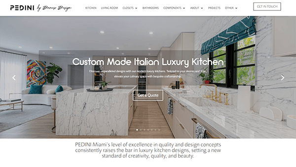
- Pedini: The website design is beautifully minimalist, allowing the furniture and décor pieces to speak for themselves. The color scheme is calming, with soft neutrals that create a sense of luxury and style. Navigation is intuitive, with clear categories and a well-structured menu that makes locating what you’re looking for easy. The website thrives at delivering a seamless user experience. The product pages are straightforward, with high-quality photographs highlighting each item’s features and craftsmanship. The layout is constant throughout the pages, allowing customers to browse and compare products easily. CTA buttons are positioned around the site to direct people to actions like “Get in Touch” or “View Now.” These buttons are visually different, with contrasting colors that capture the viewer’s attention without being invasive, thus improving the website’s usability.
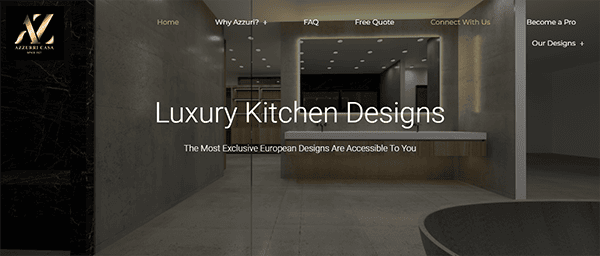
- Azzurri Kitchens: The website greets visitors with a visually stunning homepage that exudes sophistication. The style is clean, modern, and uncluttered, with a sophisticated color scheme representing high-quality products. The utilization of white space and modest color accents creates a luxurious, refined ambiance. The website’s user interface is likewise intuitive and easy to use. The navigation is simple, with a well-organized menu that allows users to browse categories quickly. Typography is carefully chosen to improve readability and elegance. Headlines and product descriptions are straightforward, allowing customers to navigate the website with ease. Client evaluations and testimonials are prominently featured on product pages, providing potential purchasers with vital insights and social proof.
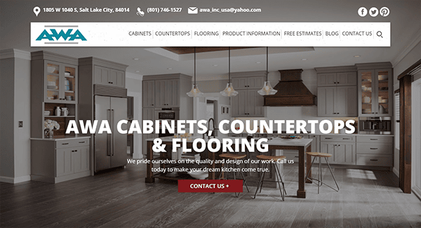
- AWA Kitchen Cabinets: The sleek and modern design has a relaxing color palette that elevates simplicity to elegance. The navigation is simple, with a well-organized menu that allows users to browse different product categories and services quickly. Everything is clear and available whether you’re looking for cabinets, countertops, or accessories. The website’s looks are outstanding. High-quality photos highlight their products brilliantly, providing customers with a clear picture of what to expect. The layout is spacious, so each object receives the attention it deserves. It has shown a commitment to client service across the website. Contact information is readily available, with clear calls to action to seek a quote or speak with a representative. Testimonials from delighted customers give social proof and create trust in prospective consumers.
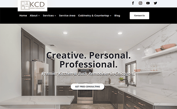
- Kitchen Cabinets Deal: The website design is simple, attractive, and well-organized. The color scheme is visually aesthetic, and the layout is open, giving each element room to breathe. The navigation is simple, with a straightforward menu that lets you quickly peruse their extensive product line. Whether you’re looking for ready-to-assemble cabinets, custom designs, or accessories, everything is well-organized and easy to find. The crisp and detailed product photographs give users a realistic approach to what to expect. The design components are tastefully blended, improving the overall look while not overpowering the user. The website employs explicit, actionable prompts and adopts a customer-centric approach, guaranteeing that each user can effortlessly locate their desired information and go towards designing their perfect kitchen.
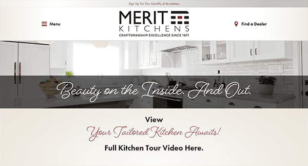
- Merit Kitchens: The website’s design is elegant and intuitive, reflecting the top-quality craftsmanship of its products. The color scheme is sophisticated and soothing, enhancing the aesthetic appeal of their kitchen cabinets. The navigation is simple, with a well-organized menu that lets users readily discover what they want. The use of large, high-resolution photographs elegantly shows their goods and clearly indicates Merit Kitchens’ reputation for quality and craftsmanship. It excels at customer engagement with various features, including the “Find a Dealer” option. This service helps consumers find authorized dealers nearby, making exploring items in person and receiving tailored support simple. Contact options, including inquiry forms and direct phone numbers, are readily available, ensuring customers can easily reach out for support.
Creating the best kitchen cabinets website involves a combination of strategic design, compelling content, and technical excellence. It’s about more than just having a digital space; it’s about crafting an experience that resonates with your audience and meets their needs. As the kitchen is the heart of the home, your website should reflect the care and craftsmanship that goes into your products.
Investing in a high-quality website is vital for the future success of your business. It attracts and retains customers and distinguishes you in a competitive market. With the right strategy, your website can serve as a powerful platform to highlight your expertise and drive business growth.
At CyberOptik, we specialize in creating stunning, effective websites tailored to your industry needs. If you are set to boost your online presence and stand out as the best kitchen cabinets website, contact us for a free consultation. Let us help you design a website that truly reflects the quality and uniqueness of your brand.