A potential client’s initial interaction with a house painting company is often through its website. A well-crafted website serves as the digital facade of your business, showcasing your services, portfolio, and expertise in the house painting industry. It transcends mere aesthetics, focusing on creating a user experience that navigates potential clients through your offerings, establishes trust, and ultimately converts visitors into loyal customers. With strategic design elements, a coherent content strategy, and an intuitive user interface, a painting company’s website can distinguish itself in a saturated market, underscoring the professionalism and quality of your services.
Possessing an outstanding website for your painting business is paramount. In a field where visual appeal is essential, your website must mirror the high standards of your work. Featuring high-quality images of your projects, customer testimonials, and easily navigable service pages can significantly impact you. Ensuring your website is mobile-friendly, and search engine optimized to reach a wider audience is also critical. By integrating relevant keywords, such as “best painters websites” and “best house painting websites,” you make your site easily discoverable by those seeking your services.
Furthermore, an exceptional website serves as a potent marketing tool. It enables you to highlight your expertise, differentiate your brand, and articulate your unique value proposition. Through engaging storytelling and strategic keyword usage like “painting company website examples,” you can captivate your audience, build trust, and position your company as a frontrunner in the house painting industry. Let’s now take a look at some of the industry leaders in this domain.
Examples of the Best House Painting Website Designs
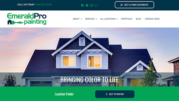
- Emerald Pro Painting: The website’s modern and timeless design has a relaxing color scheme and clean imagery that instantly captivates visitors. Users are easily guided through the website by clearly marked call-to-action buttons and well-organized menus. Every component is thoughtfully positioned for maximum user engagement, whether you want to learn more about their services, explore their portfolio, or contact them. The company’s fantastic portfolio of finished projects, which is a visual feast, is displayed in the portfolio area. Customer testimonials are included to reaffirm the business’s dedication to client happiness and highlight its proven track record of producing excellent outcomes.
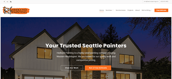
- Hedlund Painting: The company’s website embodies its commitment to excellence by combining elegance and efficiency. Visitors are ushered into a realm of excellent craftsmanship and knowledge with a modern design and simple navigation. The comprehensive service descriptions and thought-provoking blog entries on the website make it an invaluable resource for both fans and prospective customers. Furthermore, the compelling portfolio demonstrates its expertise and creates a lasting impression of its dedication to excellence. This website is not merely a digital storefront but also a tribute to the company’s artistry, dependability, and stellar reputation. It has perfect responsiveness across all devices and showcases its awards for service excellence.
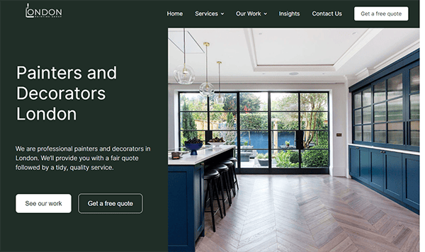
- London Painting Group: You are welcomed by a smooth blend of style and functionality as soon as you arrive at the site. The website’s design radiates elegance, with a tasteful color scheme, clear images, an easy-to-use structure, and well-placed call-to-action buttons that enable users to navigate the site easily. Every component has been carefully designed for maximum user engagement, whether you want to contact them, browse their portfolio, or learn more about their services. The company’s reputation for quality is further supported by clear and transparent explanations of its services spanning 35 years. A feast for the eyes, the portfolio section displays the team’s remarkable attention to detail and craftsmanship on various projects.
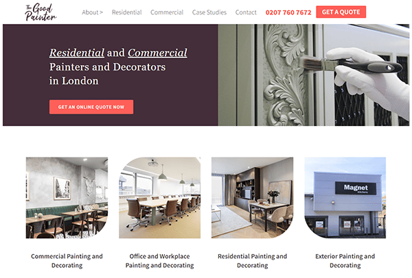
- The Good Painter: Its website has an eye-catching, stylish design that draws visitors in instantly. Every detail, from the elegant color scheme to the simple layout, oozes skill and professionalism. Credit to its easy-to-use fixed menus and smooth transitions, the website is enjoyable to browse and navigate around. This website’s ability to provide concise and transparent information on its services is one of its best qualities. Every interaction seems simple and natural, from educational material that informs visitors about their services to a responsive design that guarantees a flawless surfing experience across devices. Potential consumers are given more confidence by adding client testimonials and reviews, which also increase credibility and trust. For anyone interested in painting and decorating, their blog area is a veritable gold mine of knowledge, advice, and ideas.
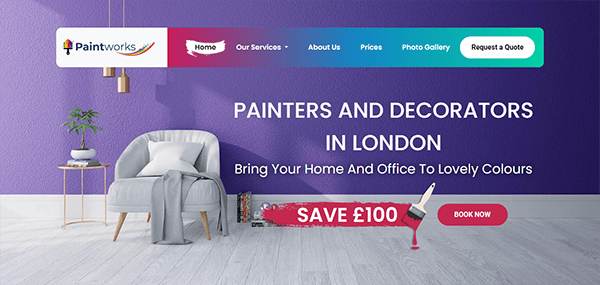
- Paintworks: Viewers are welcome to the vibrant world of its website, where every brushstroke tells a story and every color palette inspires creativity. Its website expertly added a touch of class and elegance that quickly set the tone for what’s to come. Their portfolio is all splendor because of the simple layout and tastefully chosen photos, which draw attention to their work’s exquisite craftsmanship and exacting attention to detail. The inclusion of clear call-to-action buttons and easily accessible contact information further enhances the user journey, making it effortless to get in touch and bring your vision to life. Its website is genuinely unique due to its unwavering commitment to customer satisfaction. You can see countless positive reviews from pleased clients all over the website, praising them for their professionalism, dependability, and outstanding outcomes.
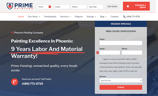
- Prime Painting & Construction: The website’s color choice is visually striking yet calming, reflecting its services’ potential for transformation. The use of warm, inviting hues instantly evokes a sense of comfort and reassurance, making it clear that this company is dedicated to creating welcoming spaces for its clients. Comprehensive details regarding the services offered, covering exterior staining, interior painting, and everything in between, are available on the website. It is easy to go through all of the parts, from their portfolio to the services they provide. Whether you are a repeat customer or a first-time visitor, locating information is made simple by the uncluttered style and uncomplicated menu. Click on the “Get a Free Quote” button prominently displayed across the website to begin remodeling your house. Its website also has a handy chat box function for anyone with inquiries or immediate help.
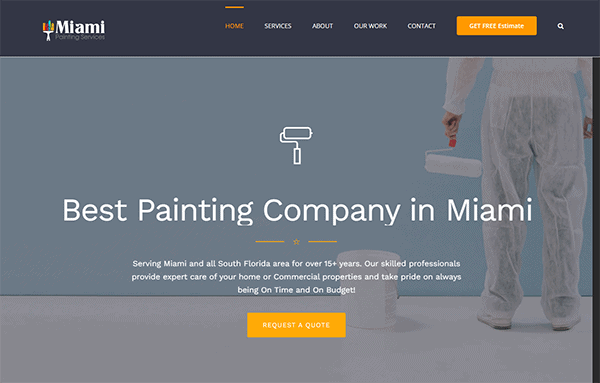
- Miami Painting Services: Its website is simple, contemporary, and welcoming, perfectly capturing the essence of its quality. Visitors receive a warm welcome from an extensive selection of completed projects, highlighting their versatility and attention to detail as they navigate through their user-friendly structure. The website features their work and offers insightful information about their values, certifications, and dedication to client satisfaction. Potential clients should feel confident that they are selecting a reliable and trustworthy partner for their painting needs because of the transparency and integrity that are consistently demonstrated throughout. To further enhance the user experience, it has integrated engaging calls-to-action (CTAs) throughout the website.
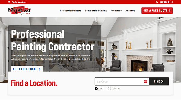
- Fresh Coat Painters: Its website charms visitors with a simple design and vibrant images that precisely convey the spirit of their business. The website offers straightforward navigation, enabling users to discover a range of services, including commercial projects and interior painting. A gallery section provides an intriguing peek into their portfolio, and the user-friendly interface makes accessing information simple. Every project they display demonstrates their skill and attention to detail, giving you hope that they can change any area. The site is overflowing with compelling, thoughtfully positioned calls to action to persuade users to proceed, whether getting a free estimate or making an appointment. Additionally, the “Find a Location” option offers consumers additional convenience by making it simple to find the closest Fresh Coat Painters location and contact local professionals aware of their unique painting requirements.
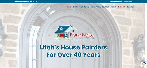
- Frank Nolte Painting: The quality of their painting services is reflected in their website’s lovely fusion of professionalism and artistic flare. With its picture sliders on the hero page, the visually appealing layout greets visitors when they arrive on the homepage, exuding a sense of skill and artistry. With a tasteful color scheme that symbolizes the firm’s dedication to outstanding quality and rigorous focus on precision detail, the design is tidy, contemporary, and welcoming. The site’s extensive use of high-resolution photos brilliantly highlights the artistry and accuracy of their work, inspiring and impressing visitors. In addition, incorporating customer testimonials gives the website a more intimate feel while highlighting the positive experiences of past users, which offers prospective buyers trust.
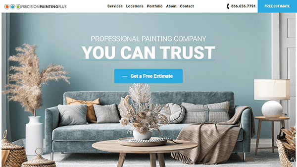
- Precision Painting Plus: The design aesthetic is clean, professional, and inviting, with a harmonious color scheme and tasteful use of white space that enhances readability and visual appeal. The website’s design is visually beautiful and incredibly functional, with simple navigation that simplifies getting the exact content you want. Everything is well categorized and easily accessible from the main menu, whether you’re interested in home painting, commercial painting, or any other of their services. The website’s top-notch visuals, animations, and effects powerfully highlight the company’s craftsmanship, inspiring and impressing visitors.
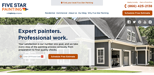
- Five Star Painting: With a beautiful color scheme, excellent photography, and a thoughtful use of white space, the design is modern and warm. Every service, including interior and exterior painting and specialist services like deck staining and cabinet refinishing, is provided with clarity and attention to detail. The color visualizer tool on the website is one of its more intriguing features. With the help of this creative application, guests may try out various paint colors and see how they would seem in their own areas before deciding on one. Besides the color visualizer, the website provides user-friendly navigation that facilitates discovering more about the company’s offerings, examining its portfolio, and contacting an expert painter.
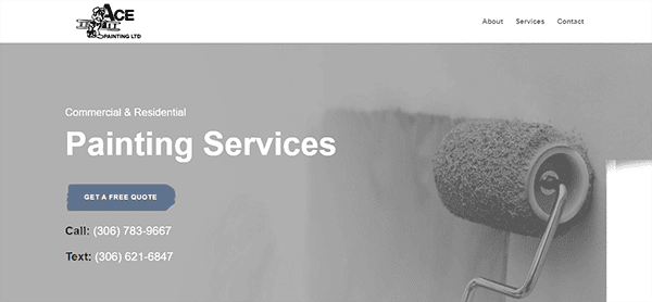
- Ace Painting: Its website is visually appealing and sophisticated, with a solid yet minimal web design that draws in new visitors. A call to action, an excellent backdrop image, and a clear headline are all present. The website’s easy navigation and layout are among its best qualities. Clear, concise text and well-organized menus make finding information about the company’s services, portfolio, and contact information accessible. The website’s gallery section, which showcases a wide variety of painting jobs finished by its team of professionals, is quite striking. The website’s gallery is complemented by helpful resources like client testimonials, further highlighting the business’s dedication to providing exceptional customer service and happiness.
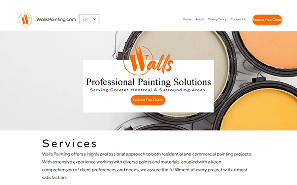
- Walls Painting: The clean, contemporary design of the website lures users in promptly and promotes exploration. With subtle images and a harmonized color palette, the design aesthetic is innovative, visually appealing, and clean, reflecting the company’s commitment to high standards and dedication to detail. The website has excellent user involvement even beyond its aesthetic appeal. Calls-to-action that are carefully positioned throughout the website encourage users to take the next step, such as requesting a free quote or setting up a consultation. Furthermore, integrating a chat function guarantees that help is always accessible, offering tailored assistance to those needing direction or information.
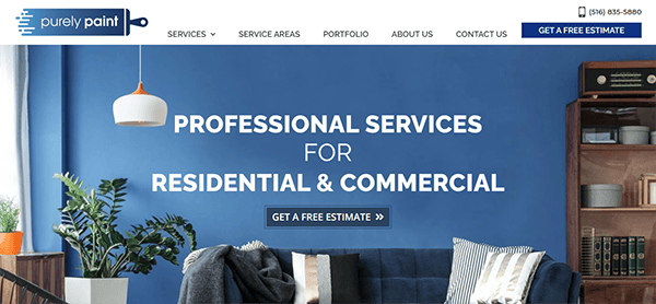
- Purely Paint: Everyone’s attention was first drawn in by the homepage’s greeting, which had a sleek and contemporary style. It was simple to investigate the range of services provided, from outside restoration to interior painting, owing to the straightforward layout and easy-to-use navigation. The beautiful portfolio section is one of the website’s most notable aspects. This area showcases the team’s outstanding craftsmanship and attention to detail through a visually stunning collection of previous projects. The portfolio provides an overview of the capacity to precisely and stylishly realize any project, whether it involves remodeling a business area or creating a warm living room. Visitors are encouraged to proceed with compelling calls to action thoughtfully positioned throughout the website. A personal touch is added by including client testimonials, awards, and recognition. These elements provide insightful information about previous customers’ experiences and uphold the company’s stellar image for customer satisfaction.
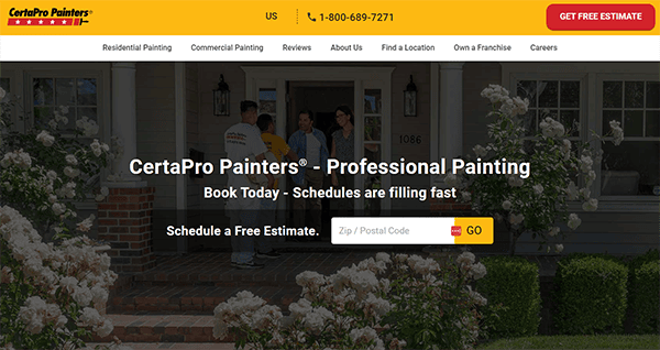
- CertaPro Painters: The homepage is welcoming and has excellent pictures highlighting their commercial and residential painting proficiency. The color palette is elegant and calming, perfectly capturing the spirit of their work. With clearly marked call-to-action buttons and well-organized menus that lead customers to examine projects, explore services, or obtain a free estimate, navigation is a snap. The location finder feature is a noteworthy addition that improves user convenience by making it simple for visitors to find nearby branches for individualized treatment. This website raises the bar for professionalism and user experience in the painting industry with its comprehensive material, testimonials, and careers area.
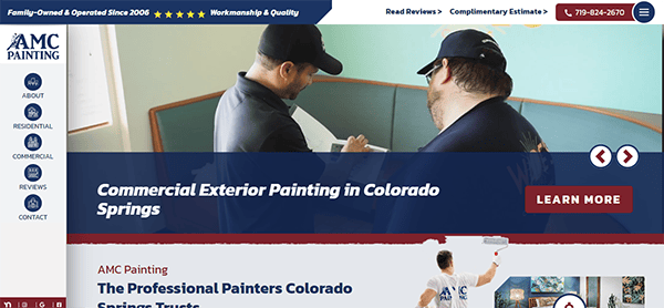
- AMC Painting: Visitors are greeted by an eye-catching showcase of their work on the homepage, which features excellent photographs that capture viewers’ attention and demonstrate their proficiency in residential and commercial projects. Users may examine galleries, obtain estimates, and explore services because of the user-friendly interface and engaging imagery. Featuring intuitive menus and well-placed call-to-action buttons that direct visitors to browse services, take a look at galleries, or get a free estimate. Furthermore, the website skillfully conveys its principles and experience through educational material and customer endorsements.
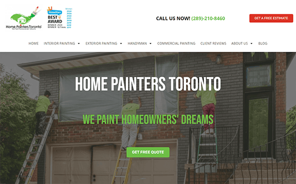
- Home Painters Toronto: Its website is user-friendly, elegant, and contemporary. With all the information you need at your fingertips, navigation is simple and effortless. The simple style makes it easy for viewers to quickly and easily find what they want. The quantity of information that was available was one visually striking element. The website effectively encourages visitors to take action through clear and compelling calls to action (CTAs). Whether it’s prompting users to request a free quote, explore the gallery of completed projects, or contact the company directly, the CTAs are strategically placed throughout the site, guiding visitors toward conversion. Viewers were utterly confident in their talents because of their expertise and attention to detail, which were immediately apparent.
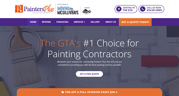
- Painters Plus: Its website has an eye-catching design that draws visitors in immediately with its sleek, contemporary style. The company’s inventiveness and painting services experience are reflected in the colorful and captivating aesthetic created by the use of bold colors and high-quality photographs. Because of the neat and organized design, it is simple for users to navigate and locate the information they require. The well-organized menu allows users to effortlessly explore different site sections, including services offered, project galleries, and client testimonials. It is also designed for mobile devices to guarantee users a constant and pleasurable experience on the site.
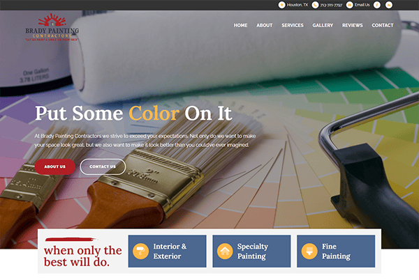
- Brady Paint: Its website’s elegant, minimalistic design radiates sophistication and elegance. The layout is tidy and well-planned, with lots of white space that draws visitors in and lets the material breathe. Using top-notch photos of finished work enhances the aesthetic appeal and successfully displays the painting services company’s skill. Because of the menu’s careful organization, customers may quickly learn about the company’s offerings, portfolio, and contact information. Calls-to-action (CTAs) on the website are placed strategically and clearly to entice users to take action, such as requesting a free estimate, seeing the gallery of finished projects, or contacting the business for further details. CTAs are placed prominently on the website to entice users to interact with the business’ offerings and proceed with their painting job.
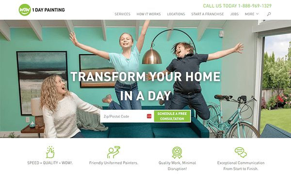
- Wow, 1 Day Painting: The website is striking due to its lively and colorful design, which draws in visitors instantaneously. The layout is contemporary and eye-catching, showcasing the company’s love of painting with a blend of vibrant colors, captivating graphics, and excellent photos. The aspect of this website for custom paintings that viewers liked was its use of green as an accent color. It’s evident that Wow 1 Day Painting prioritized usability when designing straightforward website navigation. The website features clear and prominent calls-to-action (CTAs) that encourage visitors to take action, whether requesting a free estimate, scheduling a painting project, or exploring the company’s blog for painting tips and inspiration.

Exploring the examples of the best house painting website designs reveals that these sites excel in aesthetics and functionality. They offer a fluid user experience, from straightforward navigation to compelling content that addresses the homeowner’s needs and desires. These websites utilize striking visuals, customer success stories, and clear calls to action to engage visitors and encourage them to inquire about or book a service. By examining these top examples, we can extract valuable insights into what constitutes an effective house painting website and how to emulate this success.
A meticulously designed website is crucial for house painting companies aiming to succeed in today’s digital environment. It’s about more than just displaying your work; crafting a digital presence that connects deeply with your intended audience, establishes credibility, and fosters business growth. The showcased examples of the best house painting website designs illustrate the impact of merging visual appeal with practicality, offering a model for online success.
If your goal is to propel your house painting business ahead with a website that captures attention, CyberOptik is ready to assist. Boasting over two decades of experience in website building and hosting, we are well-versed in the unique demands and opportunities of the house painting industry. Reach out to us today for a free consultation about your house painting website, and let’s craft a digital presence that accurately reflects the professionalism and quality of your services.

