In the bustling world of house cleaning services, having an outstanding website is not just an asset; it’s a necessity. In an industry where trust and professionalism are paramount, your website serves as the digital front door to your business. It’s the first point of contact for many potential clients, setting the tone for their expectations. A well-designed website showcases your services and conveys the reliability and attention to detail that clients expect from a top-tier house cleaning service.
The critical role of an attractive and easy-to-navigate website in the house cleaning sector is undeniable. The appropriate design allows your website to convey the excellence and comprehensive nature of your offerings accurately. It goes beyond merely enumerating your services; it involves crafting an experience that aligns with the preferences and needs of your target audience. A great website design can differentiate your business in a crowded market, highlighting your unique selling points and the exceptional standards of cleanliness and care you provide.
Moreover, your website is essential for online marketing and engaging with clients in the modern digital landscape. It’s the hub where potential clients can learn about your services, read customer testimonials, and easily get in touch for quotes or bookings. A website that is intuitive, informative, and well-organized improves the user experience, potentially resulting in more inquiries and higher rates of customer conversions. For a house cleaning business, a website that reflects your brand’s commitment to excellence is key to attracting and retaining clients.
Examples of the Best House Cleaning Website Designs
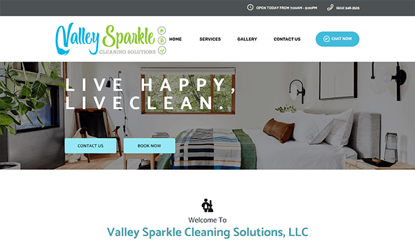
- Valley Sparkle Cleaning Solutions: Its websites boast a well-crafted design, aesthetics, and functionality. The color palette is carefully chosen, creating a visually appealing and harmonious atmosphere that resonates with the cleaning industry. The use of high-quality visuals, such as images showcasing pristine spaces and a clean layout, contribute to a professional and inviting look. Navigation is intuitive, with a well-organized menu and clear calls-to-action (CTAs) guiding users through the site’s different sections. Notably, including a chat box on their website enhances user engagement by providing immediate assistance to inquiries creating a personalized user experience. Additionally, the website includes client testimonials or reviews that serve as powerful social proof, building trust and confidence among potential customers.
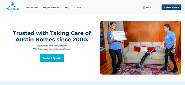
- MoreHands Maid Service: Upon accessing the homepage, visitors are immediately greeted by an aesthetically pleasing, clean layout that exudes trustworthiness and professionalism. The website boasts high-quality visuals that showcase the services’ professionalism and create an engaging and inviting atmosphere. Visitors may easily connect with the brand because of the warmth created by the use of subtle colors and sharp graphics. The descriptions of their services are clear and concise, offering potential customers a thorough understanding of what to expect. Furthermore, adding awards and feedback from customers gives a personalized touch and boosts confidence in the standard of their offerings. The engaging, clear calls-to-action guide users through the steps, making it easy to schedule a service.
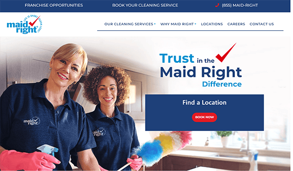
- Maid Right: The website design looks professional and shows the dedication to quality that one would anticipate from an outstanding cleaning business. It immediately captures attention with its sleek and modern design. Using a clean color palette and a well-thought-out layout provides a visually appealing interface that is easy on the eyes. It is simple to locate information about the many cleaning services offered, prices, and extra resources due to the menu’s organization. The consistent branding elements throughout the website contribute to a solid and memorable brand identity. It also integrates a live chat support feature along with its inviting CTAS that adds a layer of interactivity, allowing visitors to ask questions, seek clarification, or get assistance in real-time.
- KR Cleaning Services: The website has a warm, inviting design that greets users. A calm ambiance is created bythe gentle color scheme and tastefully chosen images, reflecting the freshness and cleanliness one would anticipate from a cleaning service. The design decisions are in perfect harmony with the business’s mission to provide a warm and inviting environment. The website utilizes authentic imagery that showcases the cleanliness of its work and gives a glimpse into its service’s personalized and attentive nature. Contacting its facility is made simple and accessible. Including a prominently displayed contact form, contact details, and live chat box makes it easy for potential clients to reach out. Adding customer testimonials and reviews gives the website a substantial boost in trustworthiness.
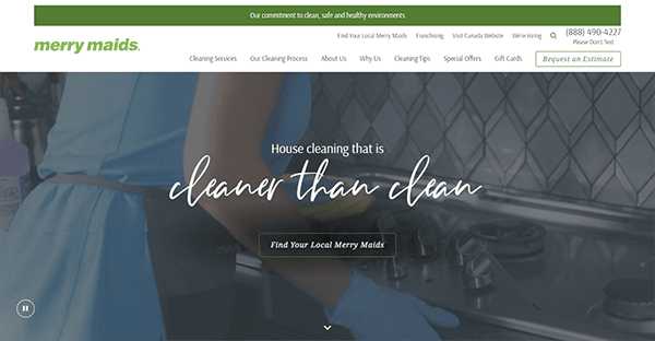
- Merry Maids: Its superb design aesthetics instantly draw attention to its website. An aesthetically pleasing interface combines excellent video imagery with a neat, polished color scheme. Because it skillfully uses captivating images and videos, it highlights the quality of their offerings and offers insight into their careful and committed approach to each cleaning task. The style exhibits the reliability and professionalism one would anticipate from a reliable cleaning company. The site is navigable and easy to use for individuals with varying degrees of web experience because of its straightforward structure. The website has user-friendly features like an easy-to-use service locator and a chat box. These components make it simple for users to interact with them and take action by streamlining the user journey.
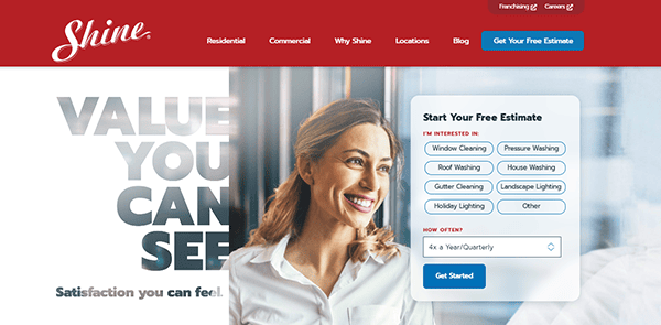
- Shine Window Cleaning: Navigating through its website was a delightful experience, showcasing a website that seamlessly blends elegance with user-centric design. Combining a clean layout, captivating visuals, and thoughtful functionality creates a positive and engaging online environment for visitors. Its website’s material expertly balances being educational with condensed. Services are succinctly and clearly described, giving prospective clients an instant idea of the value they bring. Users navigate the website easily because of the nicely organized menu and prominent call-to-action buttons, which simplify locating information about services, fees, and contact data.
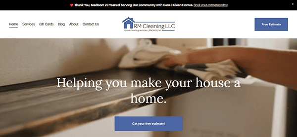
- RM Cleaning: The website has a pleasant and clean design that nicely complements the company’s focus on professional cleaning services. Its white, blue, and gray palette conveys freshness and dependability, immediately appealing to visitors. The homepage is well-organized, with simple navigation and short language that effectively explains the options available. The inclusion of high-quality pictures and testimonials provides a personal touch, which helps to create trust with potential clients. The site’s adaptable design offers a good user experience across all devices, making browsing services or making appointments even on the road simple.

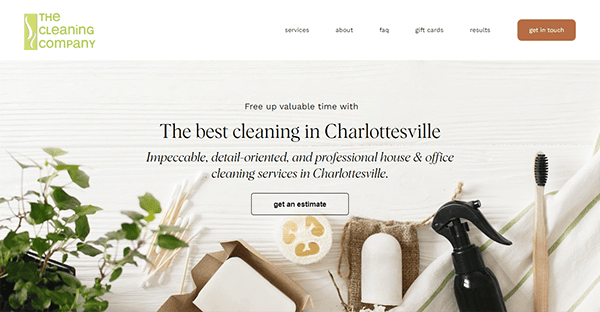
- The Cleaning Company: Visitors are instantly drawn in by the website’s hospitable and modern visual style. A polished and tidy look is produced by combining excellent photography with a well-balanced color scheme. The website’s design mirrors the services offered and reflects the dedication to providing a clean and welcoming environment. The website features an intuitive navigation system, making it easy for users to seamlessly discover various services provided. It is simple for viewers to navigate the website and obtain information about services, costs, and contact information courtesy of the clearly marked calls-to-action and well-organized menu. For users with varying degrees of web proficiency, accessibility is improved by the ease of navigating. A standout feature is the inclusion of convenient contact and booking options.
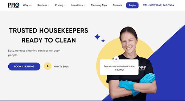
- Pro Housekeepers: The homepage is inviting, featuring a clean layout that immediately communicates the website’s purpose. High-quality photos demonstrate the company’s dedication to providing exceptional cleaning services and add a professional touch. The color scheme does not overwhelm the user, which creates a pleasant visual experience. The concise and straightforward service descriptions are one notable aspect. All the services are clearly described, giving prospective clients a thorough idea of what the website offers. The user experience is improved, and the use of interesting and educational material bolsters the company’s capabilities. The booking process is straightforward and efficient. The user is guided through a simple and secure form, allowing them to request services quickly. Clear calls-to-action throughout the site encourage visitors to take the next step, fostering a user-friendly conversion process.
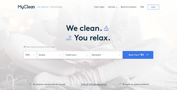
- MyClean: From the moment you land on the homepage, the site’s clean aesthetics and user-friendly interface create a pleasant and engaging experience. One standout feature is the interactive booking process. It offers an easy-to-navigate interface that leads customers through a straightforward yet detailed booking form. The transparent pricing model and detailed service options empower users to customize their cleaning experience, promoting transparency and trust. Including client testimonials and reviews adds a valuable personal touch to the website. These sincere and favorable reviews clearly reflect the firm’s dedication to client contentment. The combination of a visually appealing layout, user-friendly navigation, and transparent information make it a standout in the industry.
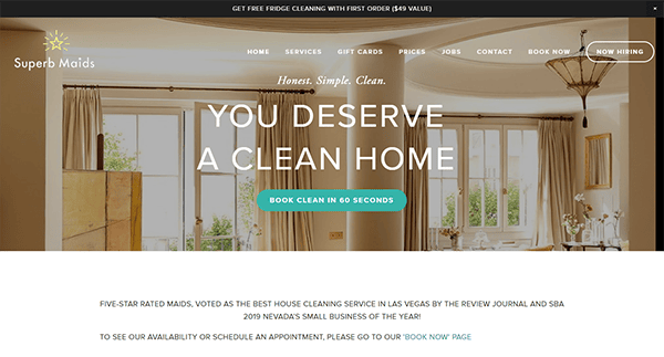
- Superb Maids: Its website is visually appealing, as shown by the well-balanced color scheme and clear images. The website exudes professionalism, which fosters confidence and dependability. The business’s dedication to providing outstanding cleaning services is clearly shown through the use of excellent graphics. One particularly commendable feature is the transparent and detailed service descriptions. The booking process is straightforward and user-friendly. Including awards and recognition prominently displayed on the website adds more credibility. It reinforces the idea that its services are a trusted and respected player in the cleaning industry.
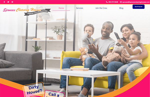
- Spouses Cleaning Houses: Exploring their website was a delightful journey that reflects the commitment to excellence in cleaning services and radiates warmth through its design. From its clean aesthetics to its intuitive navigation, the website creates a positive online environment that mirrors the sincerity and dedication of its services. The website fosters a cozy and inviting ambiance through its carefully selected images and cohesive color palette. Convenient contact, quotation, and booking options are a noteworthy feature. Potential customers can easily contact the website because it is easily accessible and has clear contact information. It also includes strategically incorporating client testimonials, offering a personal touch to the website, and contributing trust and confidence to its services.
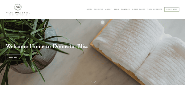
- West Domestic: Upon landing on its website, viewers are immediately impressed with its sophisticated design aesthetics. The website employs a tasteful color palette complemented by high-quality imagery, creating a clean and professional visual atmosphere. The features, such as an intuitive and user-friendly navigation system, allow visitors to explore the range of domestic services offered effortlessly. Including informative blog posts further establishes the website as a valuable resource in the domestic service industry. Including a chat box changes the game when it comes to user engagement. It contributes to the overall user-friendly nature of the site, making it easy for visitors to connect with the cleaning service and swiftly obtain the information they need.
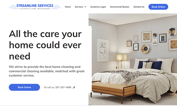
- Streamline Services: Their website is particularly noteworthy due to its skillful combination of cutting-edge design and simple usability. The sleek design, contemporary color palette, and high-quality imagery create a visually impressive atmosphere reflecting its commitment to innovation and service excellence. The user-friendly navigation system ensures a seamless exploration of their comprehensive offerings, with clear calls-to-action guiding visitors to information about services, pricing, and contact details. The website’s responsiveness across various devices enhances accessibility, and its engaging content, including case studies and success stories, establishes it as a valuable resource in the industry. Including client testimonials further builds trust, showcasing positive experiences and emphasizing its reliability. Moreover, the website features convenient contact and inquiry options, emphasizing a commitment to a hassle-free and customer-centric experience.
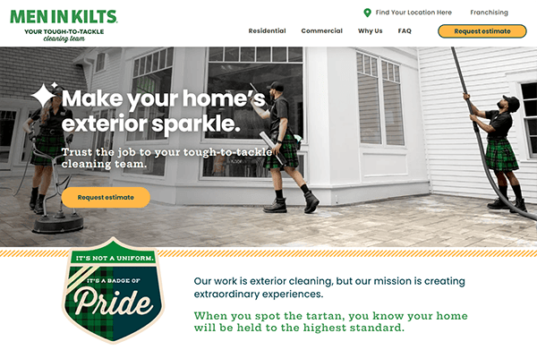
- Men in Kilts: The website exudes a unique charm perfectly aligned with the brand’s distinctive identity. The vibrant color scheme, featuring the signature kilt-inspired hues, immediately captures attention and sets the tone for a memorable online journey. The website’s layout is not just aesthetically pleasing but also remarkably user-friendly. Its straightforward interface lets users discover the wide range of services it provides. Clear calls-to-action guide users through the site, ensuring easy access to information about window cleaning, gutter cleaning, pressure washing, and other services. Incorporating engaging visuals and dynamic animations enhances the overall user experience, creating a sense of excitement and personality rarely found in service-based websites.
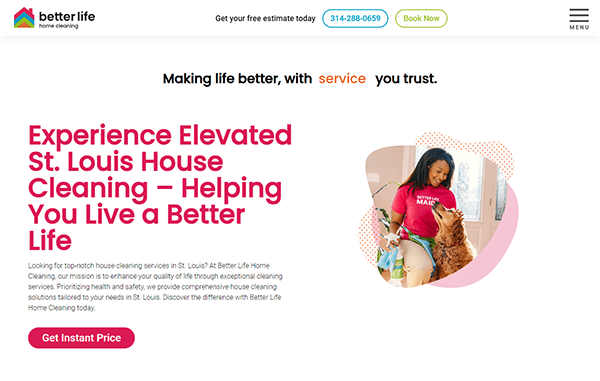
- Better Life Maids: The website opens with a visually appealing and calming color palette, setting the tone for a relaxing and stress-free user experience. The website’s design strikes a harmonious balance between aesthetics and functionality. High-quality imagery showcases the professionalism and dedication of the cleaning team while clear calls-to-action guide users seamlessly through the site. Including informative content, service details, and eco-friendly practices educates visitors and reflects the company’s commitment to transparency. Adding customer testimonials and awards to the website makes it more visually appealing and creates a dependable and good online experience for people looking for high-quality cleaning services.
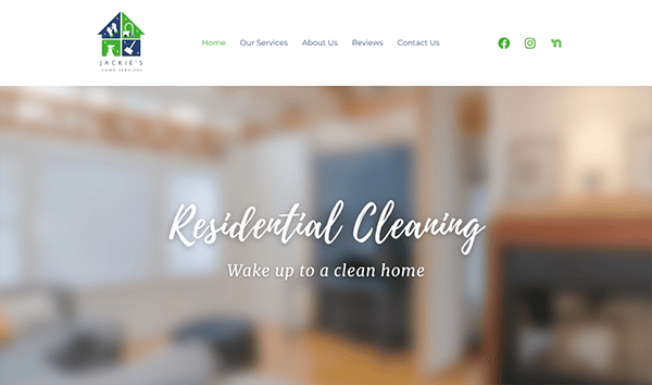
- Jackie’s Home Services: The cozy and inviting design immediately resonates with the essence of home, creating a comforting and approachable atmosphere for visitors. Users may easily browse the website’s wide range of home services via its user-friendly structure. Information regarding cleaning, organizing, and other services is easily accessible to visitors courtesy of the site’s well-organized menu and straightforward calls to action. Informative content is presented concisely and engagingly, clearly understanding the services provided. The client testimonials are a noteworthy element; integration in the website provides a personal touch and fosters trust by highlighting great experiences from previous customers.
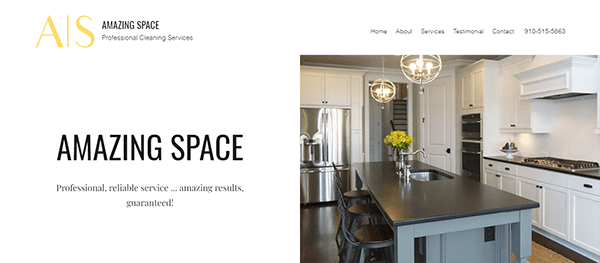
- Amazing Space: The sleek and modern aesthetic immediately communicates a sense of reliability. The well-balanced color scheme, neat typography, and tidy layout enhance the tasteful and sophisticated appearance. Using white space makes text easier to read, makes important information stand out, and improves the overall aesthetic. The content is straightforward and exciting, providing concise and understandable information about the cleaning services offered. Focused descriptions draw attention to Amazing Space Pro Clean’s distinctive selling features. The inclusion of client testimonials is a trust-building element. Contact details are clearly visible, simplifying the process for prospective clients to reach out for their services.
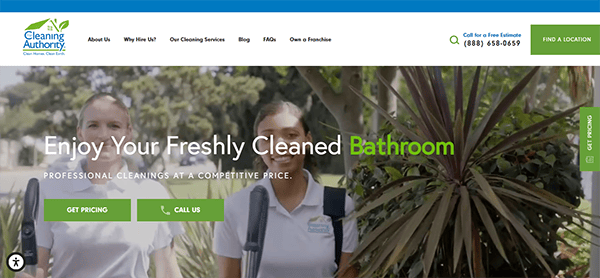
- The Cleaning Authority: The color palette, which is primarily composed of soothing blues and greens, exudes peace and cleanliness right away. The use of gorgeous photos of spotless houses and contented clients lends the overall design a pleasant, genuine feel. Because of its straightforward menu options and well-organized style, navigating the website is a delight. The logical labeling of each component facilitates users’ ability to locate the required information. The top navigation bar makes the user experience more efficient, guaranteeing rapid access to important sites. The booking process is straightforward and user-friendly. The online booking tool is prominently displayed, allowing users to select their location quickly, customize their cleaning preferences, and schedule appointments at their convenience. The transparency in pricing and the ability to get an instant quote enhance the user experience.
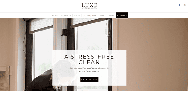
- Luxe Cleaning: Its website exudes luxury and professionalism when you land on the homepage. The sophisticated color palette, combining whites, golds, and muted grays, creates an ambiance of opulence that aligns perfectly with the brand’s high-end cleaning services. Its website offers a wealth of information about its services. From detailed descriptions of their cleaning packages to transparent pricing structures, the website leaves no room for ambiguity. Including prominent contact information, including a dedicated contact form and a clickable phone number, simplifies the process for users to get in touch.
When exploring the best house cleaning websites, one will notice a common thread: they all possess a clean, inviting layout that mirrors the quality of service they offer. These websites understand the importance of making a great first impression. They use high-quality images, engaging content, and a clear, easy-to-navigate structure that guides visitors effortlessly through their offerings. The best house cleaning websites also provide relevant and helpful information, such as cleaning tips, service details, and pricing, which positions them as knowledgeable and customer-centric in their field.
Another key aspect of these top websites is their responsiveness and optimization for various devices. As more clients turn to smartphones and tablets to find services, the necessity of a mobile-responsive website cannot be overstated. Top house cleaning websites guarantee their digital presence is both accessible and attractive on all devices, offering a flawless user experience. This level of accessibility not only caters to a wider audience but also reflects the company’s dedication to convenience and modern service standards.
In conclusion, a well-crafted website is a powerful tool for any house cleaning business looking to stand out and attract more clients. At CyberOptik, we understand the unique challenges and opportunities of the house cleaning industry. Our skilled designers and marketing professionals are committed to crafting custom website solutions that capture your brand’s core and enhance your digital visibility. Reach out to CyberOptik now for a complimentary consultation on your house cleaning website, and allow us to assist in developing a digital presence that truly stands out.

