Just looking for our Best Home Organizing Website examples list?
Key Takeaways
When designing a website for your home organizing business, it’s crucial to focus on elements that enhance user experience, establish trust, and improve search engine visibility. Here are the key takeaways:
- Prioritize Clear and Intuitive Navigation
Ensure that your website’s navigation is straightforward, allowing visitors to find information effortlessly. A well-organized menu structure enhances user experience and encourages exploration of your services. - Implement Responsive and Mobile-Friendly Design
With the increasing use of mobile devices, your website must be optimized for various screen sizes. A responsive design ensures that your site looks and functions well on smartphones and tablets, providing a seamless experience for all users. - Optimize for Local SEO
Enhance your visibility in local search results by optimizing your website with relevant local keywords and setting up a Google Business Profile. This strategy helps potential clients in your area find your services more easily. - Showcase Before-and-After Projects
Demonstrate your expertise by displaying before-and-after photos of your organizing projects. Visual evidence of your work builds credibility and allows potential clients to see the tangible results you can deliver. - Incorporate Client Testimonials
Featuring reviews from satisfied clients adds social proof to your website. Positive reviews can influence potential clients’ decisions and establish trust in your services. - Utilize Clear Calls-to-Action (CTAs)
Guide visitors toward taking desired actions, such as scheduling a consultation or contacting you, by using clear and compelling CTAs. Effective CTAs can increase conversion rates and help grow your client base. - Maintain Consistent Branding
Ensure that your website’s design elements, such as color schemes, fonts, and imagery, align with your brand identity. Consistent branding reinforces your professional image and helps clients recognize and remember your business. - Provide Valuable Content
Offer informative content, such as blog posts or organizing tips, to establish yourself as an authority in the field. Valuable content can improve your website’s SEO and keep visitors engaged. - Ensure Fast Loading Times
Optimize your website’s performance to ensure quick loading times. A fast website enhances user experience and can positively impact your search engine rankings. - Regularly Update Your Website
Keep your website content current by regularly updating information about your services, adding new project photos, and posting fresh blog content. Regular updates signal to search engines that your site is active and relevant.
By focusing on these key areas, your website can effectively attract and convert visitors, showcasing your expertise and professionalism in the industry.
Design That Delivers: Why Your Home Organizing Website Matters
If you’re a professional organizer, your website shouldn’t feel like just another cluttered closet. In today’s digital-first world, your homepage isn’t just the face of your brand—it’s your storefront, salesperson, and client concierge rolled into one. A poorly designed site can leave potential clients frustrated and clicking away, while a well-crafted one can boost your credibility, generate leads, and streamline your business.
Every element on your site—from how the layout flows to the style of your service template—either supports or sabotages your customer’s experience. Your visitors are likely searching for help with physical clutter, but if your digital presence is just as disorganized, you’re sending mixed signals. The right design establishes trust, reinforces your authority, and drives action.
This guide is designed to walk you through the most effective strategies for creating a high-performing website tailored specifically for professionals in your industry. Whether you’re revamping your existing platform or building from scratch, we’ll help you turn your site into a sleek, conversion-focused tool that attracts and retains your ideal clients. Ready to declutter your digital presence and get results? Let’s dive in.
Website Planning & Purpose: Laying the Foundation for a High-Impact Site
Before you choose a color palette or tweak a template, the most important step in site design is planning. A well-thought-out strategy ensures your site looks clean and appealing and supports your business goals, whether that’s booking consultations, showcasing project portfolios, or driving leads from search engines.
In this industry, your website serves as an extension of your brand. It needs to reflect the sense of order, clarity, and professionalism you deliver in person. That starts with defining the site’s purpose. Are you trying to build brand awareness? Generate leads? Sell packages or digital downloads? The answers shape everything from the site architecture to your homepage messaging and CTA placement.
Equally important is identifying your audience and mapping their journey. A busy parent looking to declutter a playroom will have different needs than a downsizing retiree or a real estate agent preparing a home for staging. Your site should guide each visitor seamlessly, from landing on the homepage to navigating services, viewing reviews, and ultimately contacting you. That means prioritizing intuitive gateways, a logical page hierarchy, and clear user pathways.
Content planning also plays a key role. This includes deciding what photos to include in your portfolio, how to structure your services, and what FAQ topics address customer objections. It’s not just about making things look tidy—it’s about building trust and removing friction in the client decision process.
Finally, this phase is the perfect time to look ahead. How will your website scale as your business grows? Will it support future blog content, booking tools, or SEO optimization? Staying aware of evolving trends—like personalization, minimalism, or video integration—can help you stay ahead of the curve. If you’re interested in how professional sites are evolving this year, explore our insights on upcoming web design trends for 2025.
By taking the time to plan with precision, you can ensure your website doesn’t just look nice—it becomes a core asset that helps drive measurable business results.
Design Principles for Home Organizer Websites That Convert
A visually clean space is the hallmark of every great organizing professional— the same principle applies to your website. The design of your site should reflect the order, simplicity, and efficiency you promise clients in their homes. It’s more than just choosing a pretty layout—it’s about using core design principles to guide user experience, encourage engagement, and build trust from the first click.
- Visual Clarity and White Space
Just as a huge mess in a room can be overwhelming, a cluttered website can drive visitors away. Prioritize generous white space, clean lines, and a balanced layout. This helps guide the eye and ensures that calls to action, images, and messaging are easy to absorb. Think of white space as a visual breathing room—it’s what lets your most important elements stand out. - Consistent Branding
Your logo, color palette, fonts, and imagery should reflect your organizing style—whether that’s modern minimalism, cozy and practical, or luxe and high-end. Consistency reinforces brand recognition and builds trust. Visitors should immediately get a sense of your personality and professionalism the moment they land on your homepage. - Functional Simplicity
An effective website minimizes decision fatigue. Make sure your layout is intuitive, with clearly labeled menu items and a consistent structure across pages. Avoid unnecessary animations, pop-ups, or busy elements that distract from your message. Every design choice should serve a purpose and guide the visitor closer to conversion. - High-Quality Imagery
Photos are one of your strongest assets. Use crisp, well-lit before-and-after images to demonstrate your expertise. Organize them in galleries that load quickly and are optimized for both desktop and mobile. These visuals establish credibility and help potential clients visualize results in their own spaces. - Accessibility and Mobile Optimization
Many visitors will find your site via their phone, especially busy homeowners searching on the go. Ensure your design adapts to all screen sizes and follows accessibility best practices, including legible font sizes, strong color contrast, and alt text for all images. - Visual Hierarchy and CTA Focus
Effective design leads the eye. Use typography, color, and spacing to create a clear hierarchy of information. Headings should be scannable, with strategically placed calls to action—like “Schedule a Consultation” or “See Our Portfolio”—that are easy to find and hard to ignore.
These principles are essential in building a site that looks good and supports your business goals. For inspiration rooted in real-world examples, see our expert breakdown of best home decor website design principles and how those lessons apply to the organizing industry. A site that’s simple, purposeful, and clean sends the right message—before you ever say a word.
Content & Navigation: Structuring a Seamless User Experience
Website content and navigation must reflect the same clarity and order that clients expect in their living spaces. This means that your site should look well-organized and feel intuitive to use. From the homepage layout to the way service information is presented, every part of your content and structure needs to guide the visitor naturally from interest to action.
Start with a Clear Information Hierarchy
Organize your website like you would organize a home: categorize, prioritize, and label everything clearly. Begin with your most important pages—Homepage, Services, About, Portfolio, and Contact. Each of these should have a clear purpose and be easily accessible from the main gateway menu. Avoid overwhelming visitors with too many options. Limit your top-level menu to no more than 5-7 items, and use submenus where necessary to group related content.
Craft Client-Centered Content
Each page should be written with your target client in mind. Avoid vague statements like “We help you get organized” and instead speak directly to specific needs: decluttering kitchens, preparing homes for sale, managing family schedules, or downsizing. Use short paragraphs, bolded headings, and bullet points to make your copy scannable and easy to digest, especially for busy visitors scanning on mobile devices.
Use Visual Content Strategically
Images play a huge role in organizing space. Feature curated galleries of before-and-after projects with brief descriptions of the process and impact. Client testimonials should be placed strategically near service descriptions or CTAs to build trust where it matters most. Videos of walkthroughs or time-lapse transformations can also be highly effective in engaging site visitors.
Build a Navigation Flow That Converts
Your navigation should mimic how someone explores your business: learn what you do, see proof, understand the process, and get in touch. Prioritize call-to-action buttons on high-intent pages like your Homepage and Services. Label these items in plain language—use “Services” instead of “What We Do,” and “Portfolio” instead of “Gallery.”
Support SEO and User Intent with Internal Linking
Strategically use internal links to guide users toward relevant pages. For example, link from your Services page to your Portfolio when showcasing examples of a “Pantry Makeover” or “Garage Decluttering.” This improves user experience and supports SEO by helping search engines understand your site structure.
For an in-depth breakdown of how to approach content flow and architecture, we recommend reading our Website Organization Guide. It provides tactical advice on structuring your website to enhance both usability and performance.
Ultimately, your website should make your visitors feel as organized as they’ll be after working with you—calm, confident, and ready to take the next step. When content is clear and guides visitors seamlessly, you’re not just telling your visitors what you do—you’re showing them how it feels to work with a true professional.
Visual Elements: Bringing Order and Brand Identity to Life
In the home organizing industry, how your website looks is just as important as what it says. Visitors make judgments about your brand in milliseconds based on visual cues alone. That’s why every visual element—from layout and color palette to photography and icons—should be intentional, cohesive, and aligned with the experience you offer as a professional.
Design That Mirrors Your Service
Your visual design should reflect the clarity and calm that your clients feel after a successful organizing session. That means using a clean, minimal aesthetic with plenty of white space to create a sense of openness. Avoid overly busy layouts or flashy effects that can feel overwhelming or chaotic. Instead, use consistent spacing, clean lines, and soft color contrasts to create a calming digital environment.
Color Palette and Typography
Color should reinforce your brand personality. Soft neutrals like grays, whites, and beiges often work well for organizers who emphasize simplicity and peace of mind. Bolder accent colors can be used sparingly to highlight calls to action or important sections. Typography should be legible and elegant, with a clear hierarchy between headings, subheadings, and body text. Choose fonts that convey professionalism and warmth, avoiding novelty or hard-to-read styles.
Photography That Builds Trust
In this industry, visuals are proof of results. Use high-quality, original photos of your work—before-and-after transformations, styled storage solutions, or client spaces that showcase your capabilities. These images validate your expertise and help prospective clients imagine what their own home could look like after working with you.
Icons and Graphics for Simplicity
Well-designed icons can help clarify services, break up text-heavy sections, and support user pathways. Use recognizable symbols for categories like closets, pantries, or digital organization. Custom illustrations or infographics can also visually communicate your process, helping visitors understand how your service works without needing to read paragraphs of text.
Video and Motion with Purpose
Subtle motion, like hover effects or smooth transitions, can enhance interactivity without distracting from content. Consider embedding short videos showing time-lapse organization, client testimonials, or even a quick walkthrough of your process. But keep it purposeful: motion should never detract from usability or site speed.
Consistency Across the Experience
All visual elements should support a unified brand experience. Your homepage, service pages, blog, and contact forms should feel like part of the same story. Consistency in imagery, color use, button styles, and iconography builds recognition and reinforces professionalism at every touchpoint.
When executed thoughtfully, your website’s visual elements become more than decoration—they become a strategic asset. They guide the eye, evoke emotion, and support your message in every scroll and click. For home organizers, it’s not just about creating something beautiful—it’s about creating a space that mirrors the calm, clarity, and order clients will experience in their own homes.
Ongoing WordPress Maintenance: Keeping Your Website as Tidy as Your Clients’ Homes
A well-designed website is only part of the equation. Just like an organized space needs routine upkeep to stay functional, your WordPress website needs regular maintenance to perform reliably, stay secure, and support your business over time. For home organizers who rely on a strong online presence to attract and convert clients, ongoing website care is essential, not optional.
Why Maintenance Matters
Outdated plugins, expired licenses, or ignored software updates can quietly damage your site’s performance and security. These issues can slow down your site, break functionality, or even leave it vulnerable to hackers. Routine maintenance ensures that everything runs smoothly behind the scenes, preserving the seamless experience your clients expect when they visit your site.
Security and Backup Protocols
Maintaining your WordPress site involves more than just hitting an “update” button. It includes implementing security measures like firewalls, malware scanning, and login protection to prevent unauthorized access. In addition, regular automated backups should be scheduled so you can restore your site quickly in case something goes wrong, whether it’s a failed update or accidental content deletion.
Plugin and Theme Updates
Your website likely depends on several plugins and a custom theme to manage forms, portfolios, SEO, and more. These tools are updated frequently to patch vulnerabilities, add features, or ensure compatibility with the latest version of WordPress. Ignoring updates can lead to broken functionality or unexpected downtime, especially if third-party software stops working correctly.
Performance Monitoring
Speed and responsiveness are critical, especially for mobile users searching for services on the go. Regular performance checks help identify slow-loading pages or technical bottlenecks. Keeping your site optimized ensures that potential clients can quickly view your services, portfolio, and contact options without delays or frustration.
Content Review and SEO Adjustments
Your website isn’t a one-time project. As your services evolve or client questions change, so should your content. Periodically reviewing and refreshing your service descriptions, testimonials, and blog posts keeps your site relevant and helpful. It also gives you a chance to refine keywords and maintain or improve your SEO rankings in your local market.
Who Should Manage It?
While some organizers try to manage updates themselves, it’s often more efficient and less risky to leave it to a professional. With a support partner in place, you can focus on what you do best—helping clients declutter—while knowing your digital storefront is updated, secure, and working for you around the clock.
Routine WordPress maintenance isn’t just about avoiding problems—it’s about maintaining a digital environment that reflects the same order and reliability your clients trust you to bring into their homes. When your website runs as smoothly as your organizing process, it becomes a natural extension of your business’s professionalism.
20 Web Design Examples from Home Organization Industry Greats
1. The Home Edit
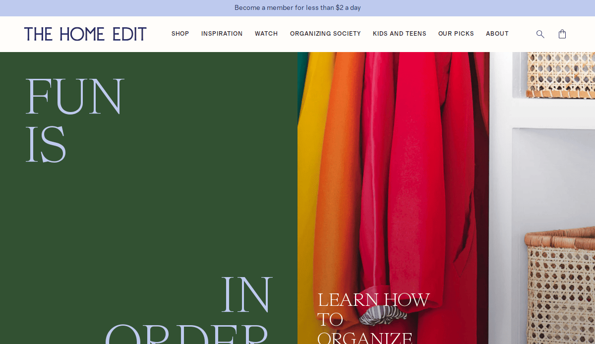
- Location City In The US: Nashville, TN
- 3 Key Takeaways:
- Signature Aesthetic: Features their iconic rainbow-sorted and clear container style prominently, instantly recognizable and aspirational.
- Extensive Media Presence: Leverages their Netflix show and book series with clear links and behind-the-scenes content, boosting credibility.
- Product Integration: Seamlessly integrates their own branded organizing products and links to retailers, driving sales.
2. Chicago Organized Home
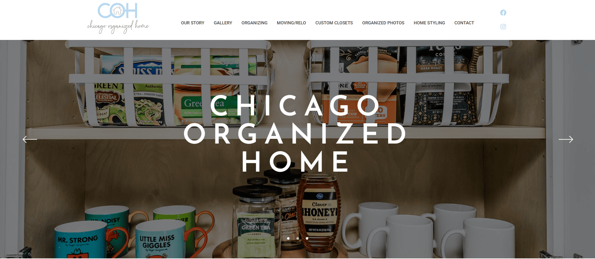
- Location City In The US: Chicago, IL
- 3 Key Takeaways:
- Emphasis on Long-Term Solutions: Highlights their dedication to improving clients’ lives by creating organized systems that are sustainable and easy to maintain.
- Diverse Service Offerings: Beyond just organizing, they also offer custom closet design, photo organizing, and interior styling, showcasing a broader range of expertise.
- Focus on Peace of Mind: Uses language that emphasizes the emotional benefits of organization, such as “peace of mind” and “rediscovered love for your home.”
3. Horderly
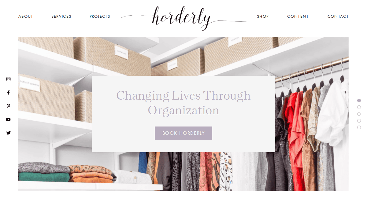
- Location City In The US: New York, NY
- 3 Key Takeaways:
- Impactful Before & Afters: Showcases dramatic transformations with high-quality photos, visually demonstrating their expertise.
- Clear Process Explanation: Breaks down their organizing methodology into simple steps, making the service feel accessible and understandable.
- Celebrity Testimonials: Features endorsements from well-known clients, adding a layer of prestige and trust.
4. Bee Organized
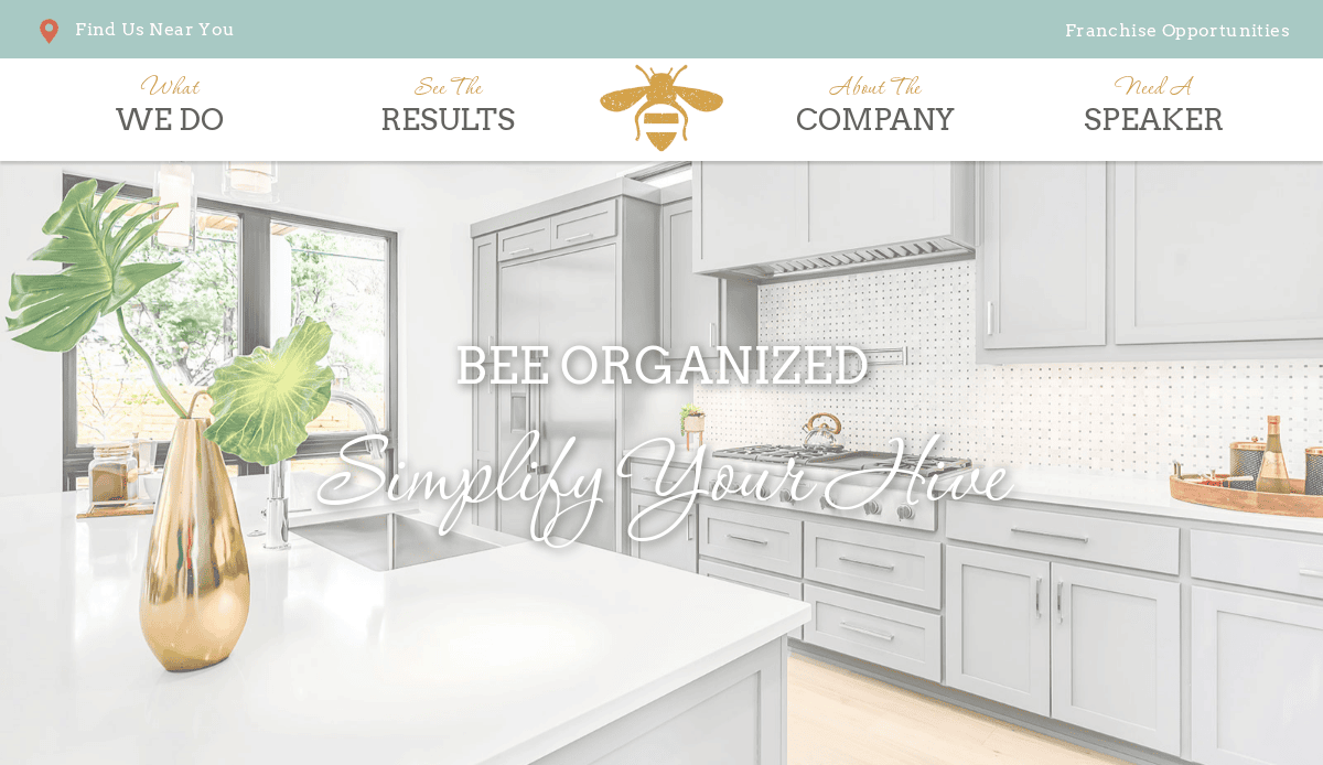
- Location City In The US: Kansas City, MO (headquarters, with franchises)
- 3 Key Takeaways:
- Compassionate and Judgment-Free Messaging: Emphasizes empathy and understanding, which is crucial for clients feeling overwhelmed by clutter.
- Vibrant and Approachable Branding: Uses a friendly “bee” theme with warm colors and inviting imagery, making the process less intimidating.
- Client Testimonials: Features numerous positive reviews that highlight the personal and transformative impact of their services.
5. Get Organized!
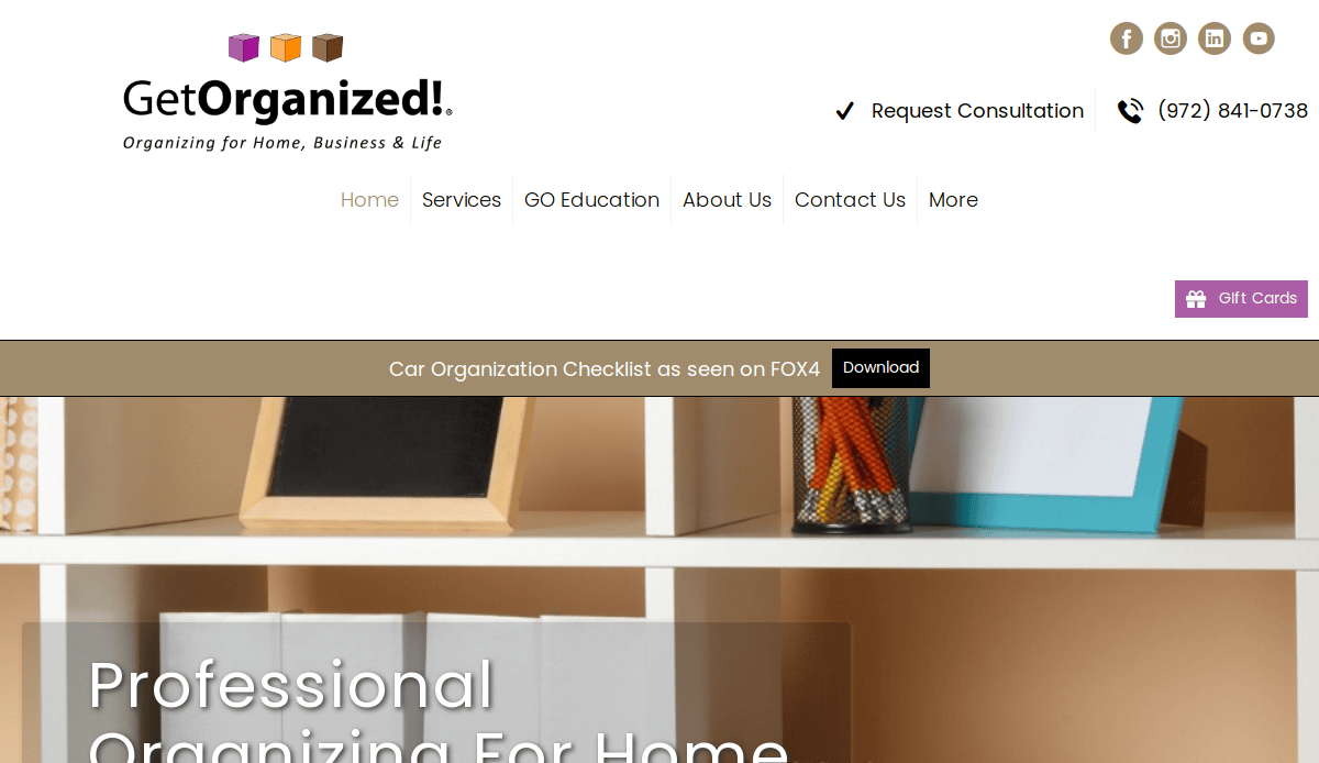
- Location City In The US: Dallas, TX
- 3 Key Takeaways:
- Clear Service Specializations: Immediately highlights their expertise in areas like digital organizing, senior move management, and home organization.
- Professional and Detailed Content: Provides in-depth descriptions of their services, demonstrating their expertise and thoroughness.
- Consultation Booking Focus: Features prominent calls to action for scheduling initial consultations, streamlining lead generation.
6. Sorted Out
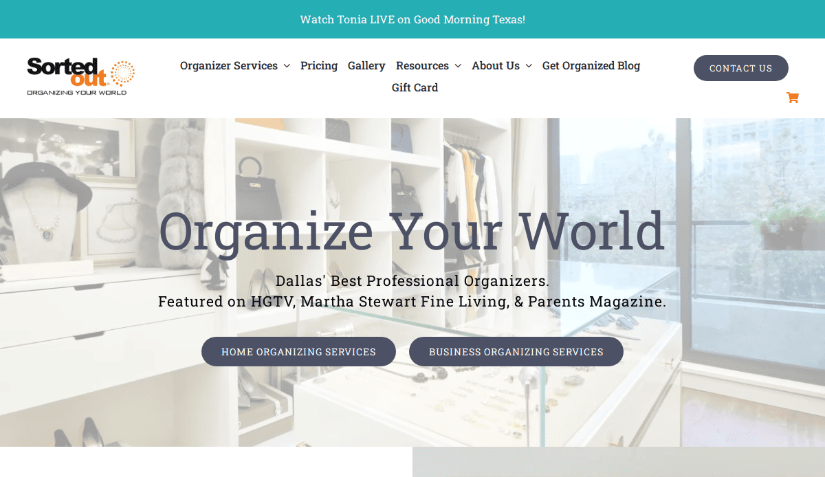
- Location City In The US: Dallas, TX
- 3 Key Takeaways:
- Engaging Video Background: The homepage features a short, dynamic video showcasing organized spaces, immediately capturing attention.
- Clear Service Categories: Divides services into “Home Organizing” and “Business Organizing,” making it easy for users to find relevant information.
- Media Mentions for Credibility: Highlights features in reputable magazines and TV shows, building trust and authority.
7. The Clutter Curator
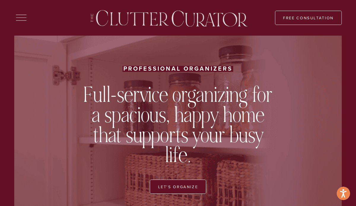
- Location City In The US: Denver, CO
- 3 Key Takeaways:
- Elegant and Serene Design: Uses a calming color palette and clean lines, reflecting the peaceful and orderly spaces they create.
- Personalized Approach Highlighted: Emphasizes tailoring solutions to individual client needs and lifestyles.
- Blog for Value & SEO: Features a blog with organizing tips and insights, positioning them as experts and attracting organic traffic.
8. Done & Done Home
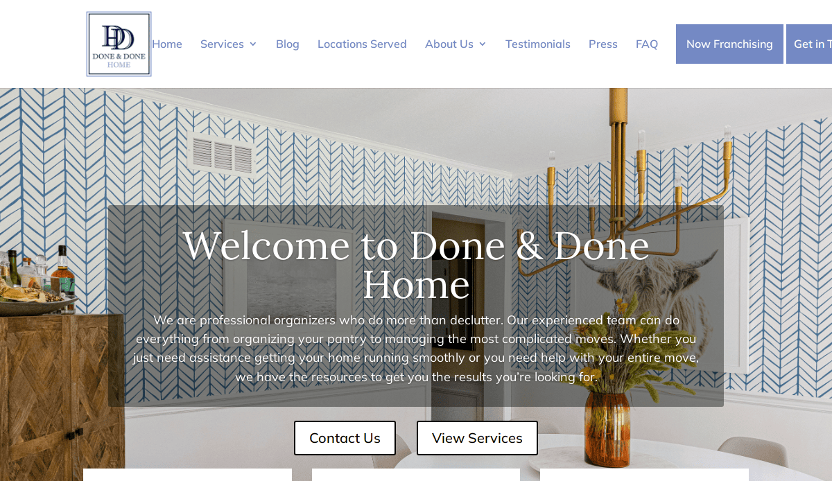
- Location City In The US: New York, NY
- 3 Key Takeaways:
- Interactive Video Explanation: Offers a helpful video that walks through their process, providing a visual understanding of their service.
- Focus on Giving Back: Mentions their support for a non-profit organization, adding a socially conscious aspect to their brand.
- Online Course Promotion: Features a clear banner for their online course, expanding their business model beyond in-person services.
9. The Tidy Bungalow
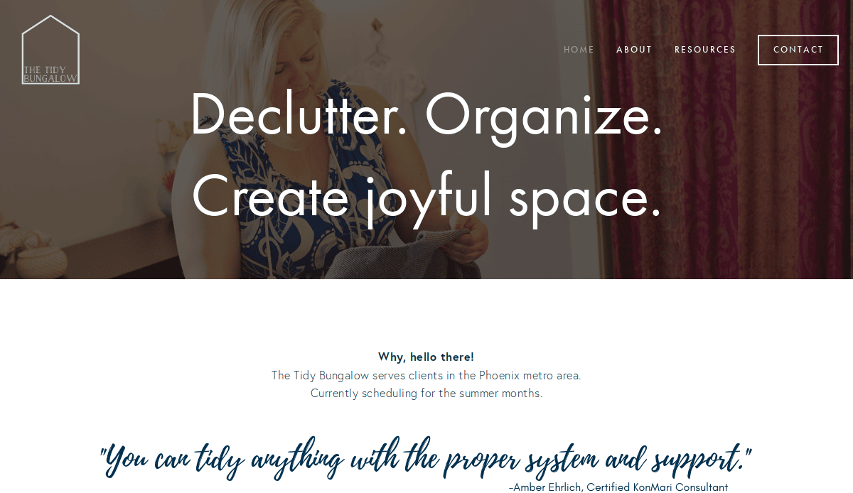
- Location City In The US:Orange County, CA
- 3 Key Takeaways:
- Inviting and Inspiring Language: Uses phrases like “create joyful space” to evoke positive emotions associated with organization.
- Clear Service List with Benefits: Outlines services alongside the direct benefits clients will experience, rather than just features.
- Third-Party Features for Trust: Highlights are mentioned in external blogs or publications, reinforcing their credibility.
10. Simply Organized
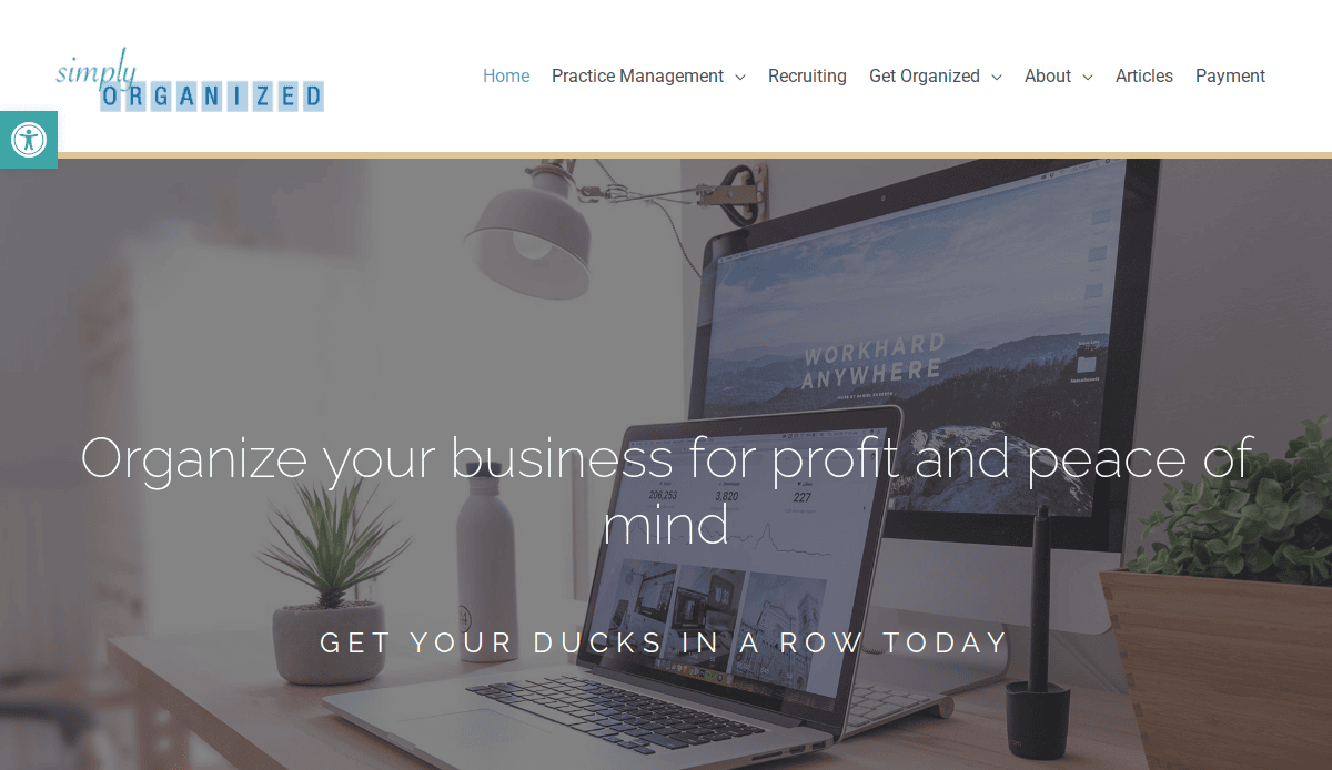
- Location City In The US: Atlanta, GA
- 3 Key Takeaways:
- Clean and Uncluttered Aesthetic: The website itself embodies the principles of organization with ample white space and clear content.
- Concise Messaging: Uses short, readable blurbs to quickly convey their value proposition (“organizing with style for real life”).
- Testimonial Slider: Features a rotating display of client testimonials, providing dynamic social proof.
11. The Organized Nest
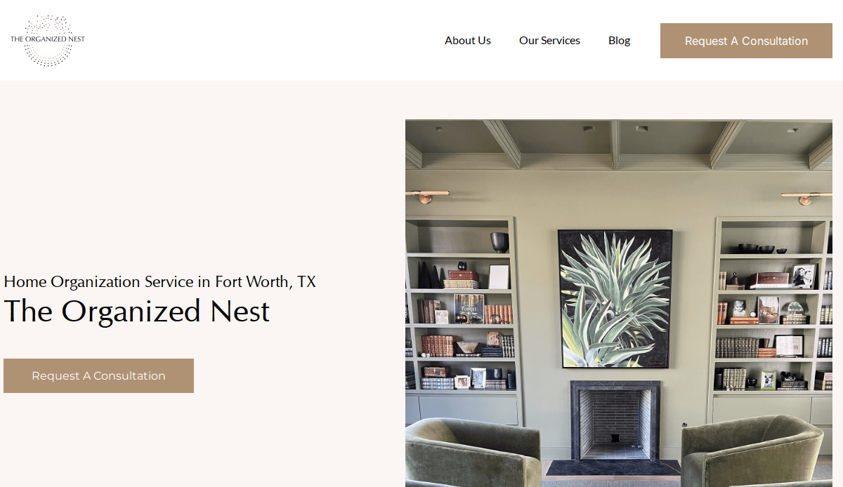
- Location City In The US: New York, NY
- 3 Key Takeaways:
- Bright and Appealing Photography: Uses high-quality, vibrant images of organized spaces to immediately engage visitors.
- Concise Service Blurbs: Offers short, digestible descriptions of services, making information easy to process.
- Clean Navigation: Simple and intuitive menu structure helps users quickly find what they’re looking for.
12. No Wire Hangers
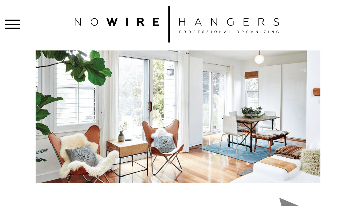
- Location City In The US: Phoenix, AZ
- 3 Key Takeaways:
- Clean Layout with Striking Imagery: Greets visitors with a clear design and a full-color hero image that sets a welcoming tone.
- Calming Color Palette: Uses soothing colors like white, light blue, and forest green to evoke a sense of peace and organization.
- Visual Portfolio Emphasis: Showcases appealing photographs of clients’ organized spaces to inspire and demonstrate capability.
13. NS Organizing
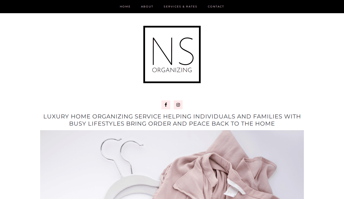
- Location City In The US: San Diego, CA
- 3 Key Takeaways:
- Appealing Room-Specific Imagery: Uses pictures of different rooms to help potential customers visualize the impact of the service on their own spaces.
- Clean Pink-and-White Color Palette: Conveys a sense of calmness and organization, appealing to the target audience.
- Neat Header Navigation: Organizes page links in a clear, accessible header at the top of the site.
14. Everyday Order
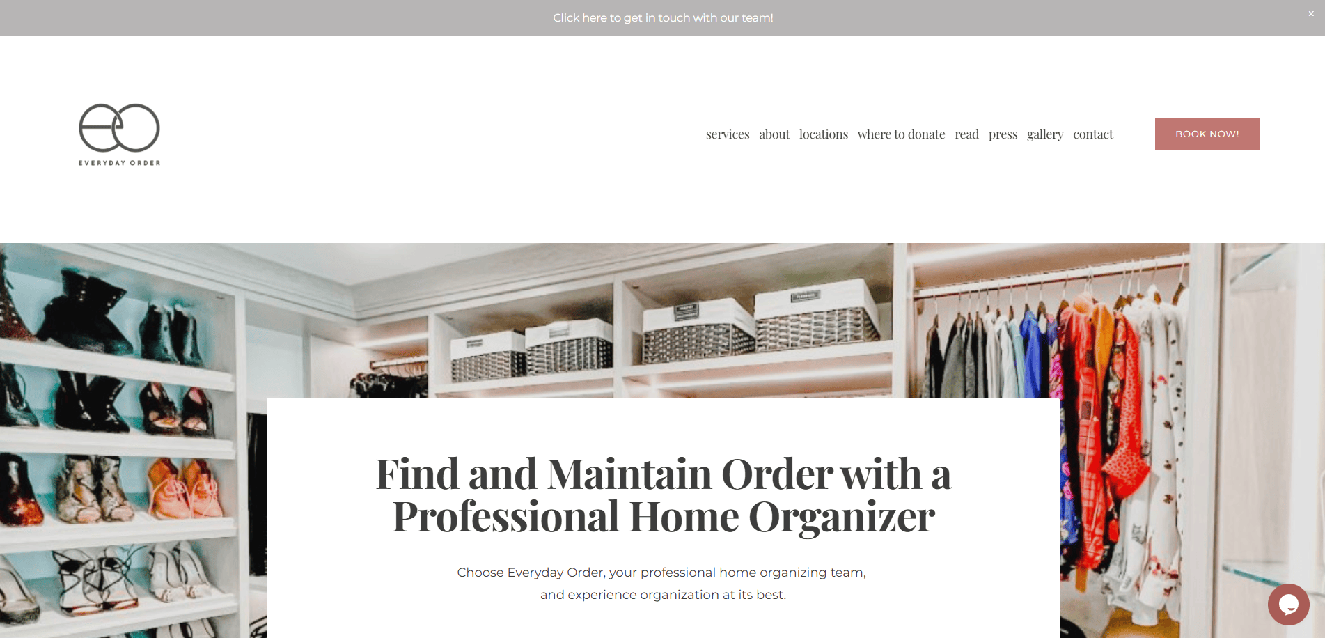
- Location City In The US: North Jersey / San Clemente, CA
- 3 Key Takeaways:
- Personalized Service Promise: Emphasizes tailoring solutions to fit unique lifestyles and transforming spaces to feel amazing.
- Diverse Service Offerings: Clearly lists various services from general organizing to unpacking and full-service solutions.
- Strong Client Testimonials: Features compelling quotes from satisfied clients, building confidence and social proof.
15. OCD Experience
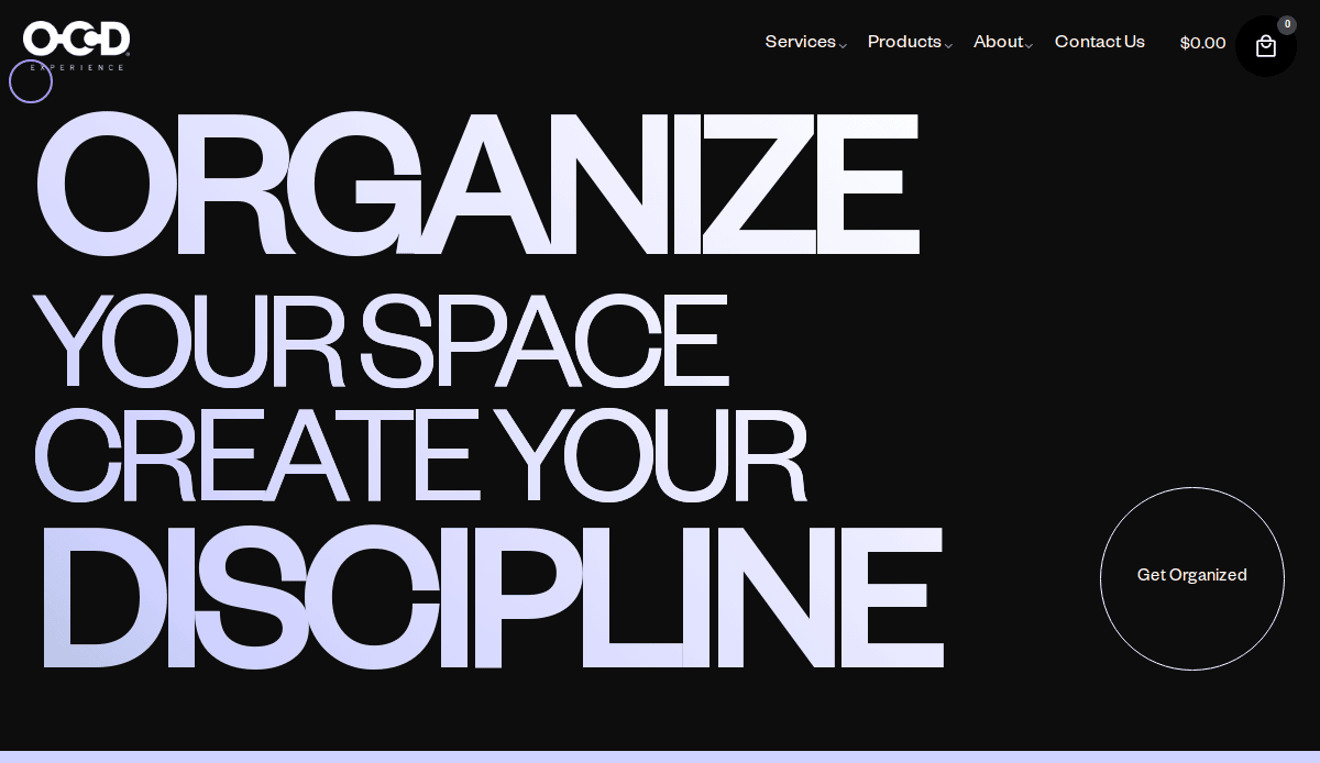
- Location City In The US: Los Angeles, CA
- 3 Key Takeaways:
- Unique Branding Concept: Uses an abstract image of jigsaw puzzle pieces and the tagline “organize and create discipline” to stand out.
- Celebrity Endorsements: Features a slideshow with celebrity client testimonials and photos, adding high-level credibility.
- Neat Block Content: Organizes information about services in clean, digestible blocks, making the site easy to read and understand.
Home Organization Websites Designed by CyberOptik
16. Imagine Home Organization
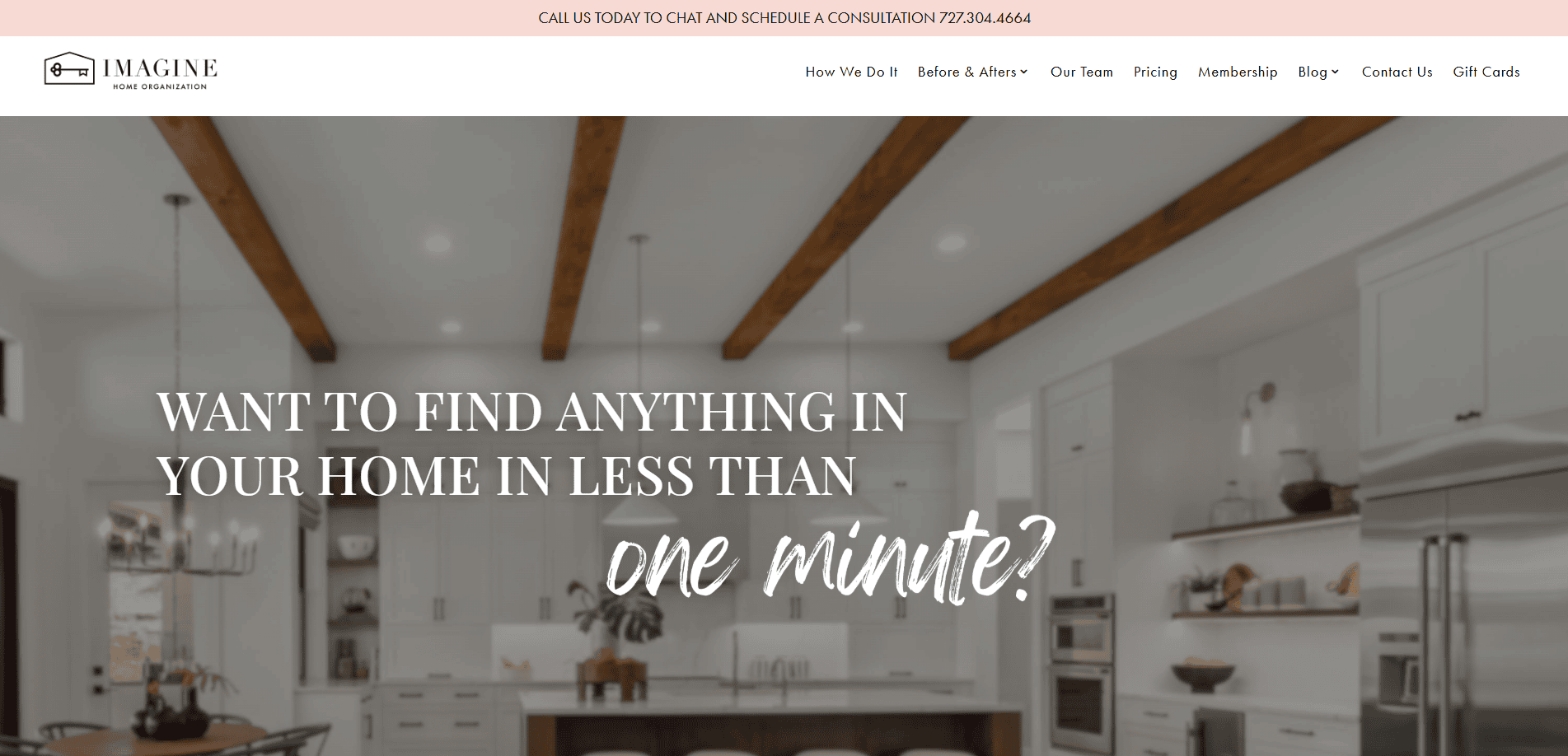
- Location City In The US: Chicago, IL
- 3 Key Takeaways:
- Inviting Question-Based Intro: Starts with a question that makes you think about the benefits of an organized home, immediately adding value.
- Clean and Modern Aesthetic: Utilizes a calm color palette that perfectly aligns with their mission of bringing order and peace to home environments.
- High-Quality Before-and-After Photos: Showcases impressive transformations, emphasizing the tangible results and worth of their services.
17. Organized Spaces, LLC
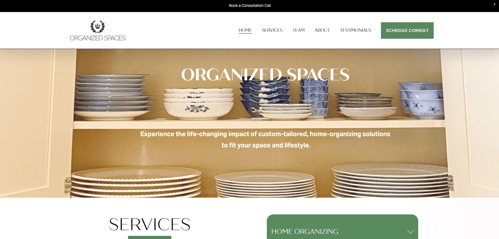
- Location City In The US: Chicago, IL
- 3 Key Takeaways:
- Direct & Benefit-Oriented Headline: Immediately communicates the primary benefit of their service to visitors.
- Professional and Trustworthy Visuals: Uses clean imagery and a structured layout that conveys reliability and expertise.
- Clear Service Breakdown: Presents different organizing services with clear descriptions, helping clients quickly identify their needs.
18. Sorted Affairs
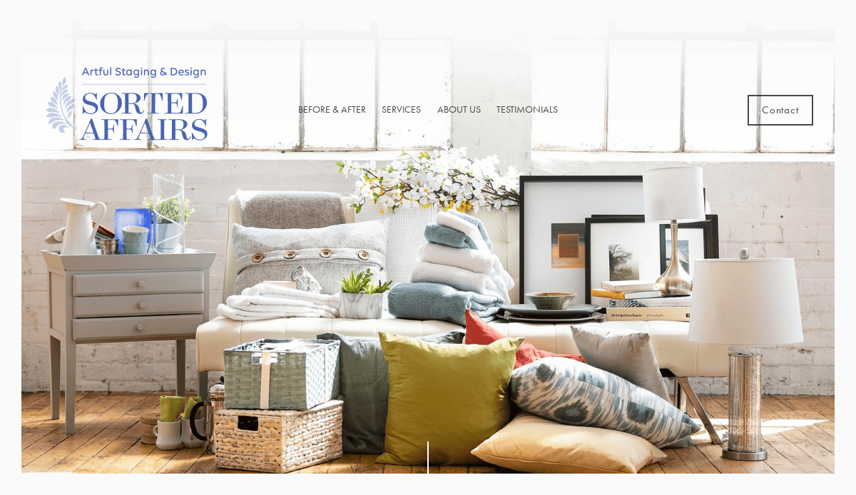
- Location City In The US: Chicago, IL
- 3 Key Takeaways:
- Elegant and Sophisticated Design: Reflects a high-end approach to home organization with a polished visual style.
- Focus on Custom Solutions: Emphasizes personalized organizing plans tailored to each client’s unique challenges and preferences.
- Comprehensive Service Areas: Clearly outlines the different types of spaces they organize (e.g., kitchens, closets, offices).
19. Neat Method
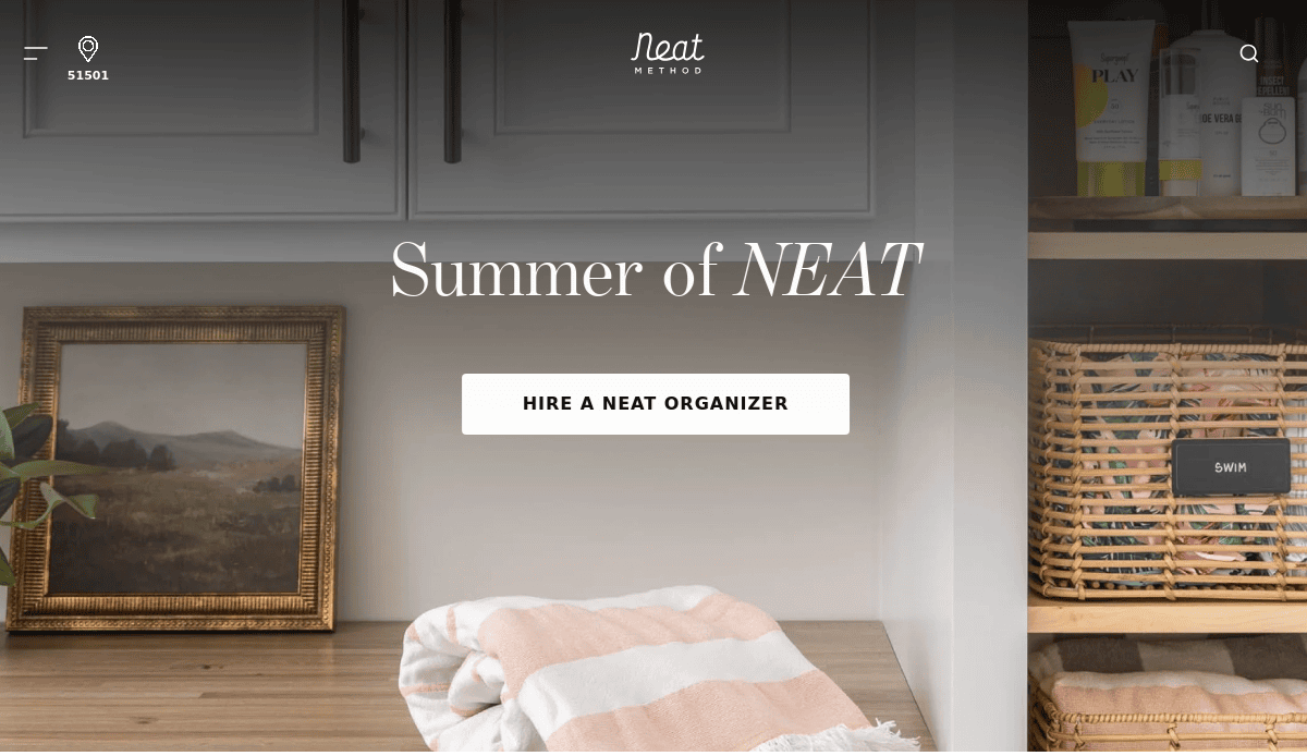
- Location In The US:Texas
- 3 Key Takeaways:
- Inviting and Relatable Imagery: Features realistic photos of homes that look well-organized but still lived-in, making the service feel achievable.
- Emphasis on Creating Functional Spaces: Focuses on how organizations can improve daily life and reduce stress.
- Easy Navigation for Services: Clearly categorizes their services, such as decluttering, organizing, and move management.
20. Organized by MC
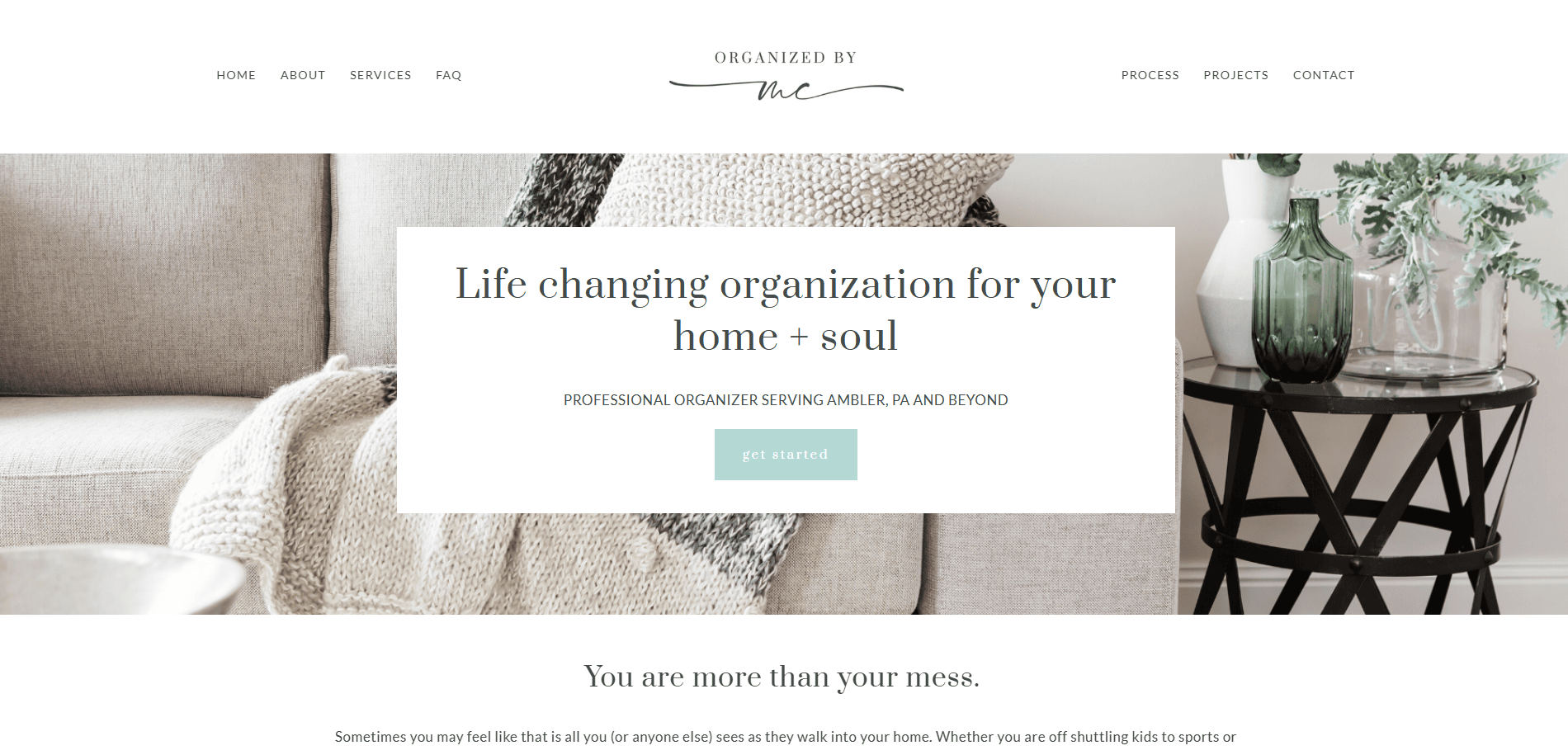
- Location In The US: Philadelphia
- 3 Key Takeaways:
- Personalized Brand with Founder Focus: Highlights the individual touch and expertise of the founder, building a personal connection.
- Aesthetic and Inspiring Visuals: Uses beautiful photography of organized spaces that are both aspirational and practical.
- Clear Call to Action for Consultations: Makes it simple for potential clients to schedule their initial step toward organization.
Ready to Organize Your Website Like a Pro?
As a pro organizer, your goal is to bring order to cluttered spaces, and your website should do the same for your online presence. A clean, user-friendly, professional website is essential to connect with your target audience, showcase your services, and turn prospective customers into loyal clients. From your homepage to every landing page and contact page, your site needs a solid content structure that speaks directly to your potential customers and makes it easy for them to find the information they need.
If you’re planning and organizing website content, think of your sitemap like a guide to organizing a space: you need category pages, sub-pages, and drop-down menus that reflect how real people browse. Create content with dedicated pages for each service you offer, and support it with blog articles, a strong FAQ page, and even a resources page that adds value and encourages newsletter sign-ups. Whether you’re launching a new website or refreshing your current one, you need to organize your content in a way that speaks to your audience, supports search engine optimization, and keeps website visitors engaged.
This is more than a design project—it’s your digital storefront, your most powerful piece of content marketing, and often your first impression. A well-built, accessible website helps prospective customers navigate from one page on your website to the next, understand your value proposition, and confidently schedule an appointment or make a purchase. If you’re serious about growth, now is the time to invest in hiring a professional to guide you through the planning process and deliver a site built to perform.
Let’s bring clarity to your online presence. Book a free consultation with us to get a professional organizing website that works as hard as you do.
Web Designing for Home Organizing Company FAQs
What are the most important pages on a website?
The most important pages include your homepage, services page, about page, portfolio or gallery, contact page, and a blog or resources section. These core web pages help communicate your value, showcase your work, and allow visitors to book an appointment. Including new pages like testimonials or a frequently asked questions section can also strengthen your credibility.
How should I organize content for my professional website?
Start by mapping your services, then build a sitemap that groups related topics using logical website navigation. Keep it simple with a clear main menu and use sub-pages for specific offerings. For example, if you offer organizing for toys and books, create a dedicated page to explain your approach. This helps visitors find exactly what they need quickly.
What’s the best way to structure a main menu?
Use a clean, uncluttered main menu with 5–7 top-level items. Start with common pages like “Home,” “Services,” “Portfolio,” “About,” and “Contact.” If needed, use a drop-down menu to include additional services or blog categories. Consistent, user-friendly gateways improve both user experience and SEO performance.
How can content marketing help my organizing business?
A strong content marketing strategy builds authority and drives website traffic. Blog posts on how to maintain an organized home or how to declutter specific areas (like toys and books) can attract search traffic while educating your audience. Each time you publish content, you’re helping search engines understand your expertise.
Should I include a blog on my organizing website?
Yes. Many websites see increased engagement and SEO performance from regularly updated blog articles. Writing about how to organize content, prep for a move, or set up functional spaces demonstrates your knowledge and builds trust with visitors.
What role does my company logo play in the website layout?
Your company logo anchors your brand visually and builds recognition. It should appear in the top left corner of every page on your website and link back to the homepage. This is a universal convention that helps guide navigation and reinforces brand consistency.
How do I encourage visitors to take action on my website?
Use strong calls to action on important pages, especially your service and contact pages. Offer simple forms, allow them to book an appointment, or suggest they join your email list for tips and updates. Make sure these options are easy to access and don’t require multiple clicks.
How can I know if my website is targeting the right audience?
Start by defining your ideal client—then align your content, services, and design choices around that profile. Know your target and speak directly to their needs with clear, benefit-driven messaging. If you’re attracting leads that don’t convert, revisit your content and structure.
Do I need different web pages for each product or service?
Yes. Creating new pages or sub-pages for each product or service helps you organize content more effectively and improves search visibility. For example, instead of listing all services on one page, dedicate a page on your website to each major category to deepen relevance and clarity.
What are some mistakes to avoid when building my website?
Avoid cramming too much into a single page, using vague language, or burying key information in hard-to-find locations. Many websites suffer from poor gateways or inconsistent branding. Instead, focus on user flow, highlight your product or service clearly, and ensure every page has a purpose.
For more insights on building a results-driven website, visit our blog and explore how we help professionals create sites that convert.

