When it comes to physical fitness, a gym’s website is often the first step in a person’s journey toward better health. Prospective members search online, compare offerings, and gauge the professionalism of an establishment before visiting. If your gym website leaves a strong impression, you’re far more likely to convert curious visitors into dedicated members.
Creating a user-friendly hub for your community is essential regardless of the size of your facility or the range of classes you offer. Incorporating strategic design elements, clear calls to action, and intuitive navigation can distinguish between your website standing out or fading into the background. If you need a fresh perspective on your gym’s online presence, you can explore various options here.
In today’s fast-paced digital world, gym website design trends lean heavily on immersive visuals and frictionless sign-up processes. The best gym website can incorporate bold imagery, interactive features, and an easy-to-use layout that appeals to fitness newbies and seasoned gym-goers. Check out the best gym website examples below for inspiration to shape your own.

Examples of the Best Gym Website Designs
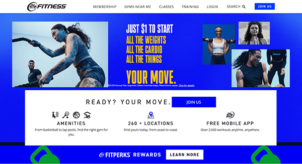
- 24 Hour Fitness: 24 Hour Fitness has long been a reliable name in the health and fitness industry, and its website certainly meets the expectations of gym-goers worldwide. Their homepage showcases vibrant, motivational images and simplifies the membership options, making it easy for users to find what they need. The “Find a Gym” feature is prominent, allowing visitors to locate the nearest club quickly. Designed for busy individuals, the navigation is intuitive and helps new members easily access class schedules, training programs, and membership details. This balance of high-quality imagery and practical content sets a winning tone for any gym website design.

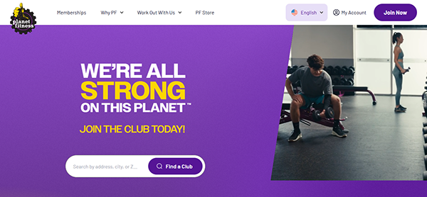
- Planet Fitness: Planet Fitness effectively merges fun and affordability, reflected by its eye-catching purple and yellow branding. Their website immediately informs visitors about membership deals, emphasizing their low-cost approach to fitness. The layout relies on a modern, clean design with large typography, ensuring critical information is straightforward to find. Social proof—like success stories and testimonials—adds credibility. Whether you’re looking for membership perks or in-depth FAQs, Planet Fitness guides users seamlessly toward answers. They also showcase a mobile-friendly structure that ensures visitors stay engaged, whether browsing on a desktop or a phone. It’s an excellent template for a user-first gym website approach.
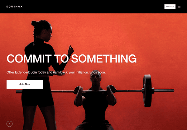
- Equinox: Equinox offers a premium fitness experience, and its website perfectly captures this upscale branding. The homepage greets you with sleek, minimalist visuals that immediately convey luxury. Each section highlights specialized training programs, spa services, and membership benefits. Their bold, magazine-style photography and uncluttered navigation reflect a high-end vibe. Equinox also does an exceptional job of storytelling, offering insights into their philosophy and exclusive classes. A dedicated “Equinox+” area extends the brand’s digital reach by offering virtual classes. If you’re seeking inspiration for a top-tier gym website design, Equinox proves that a refined, uncluttered approach can capture an audience’s attention.
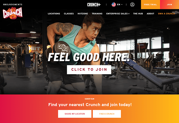
- Crunch Fitness: Crunch Fitness harnesses energetic visuals and playful branding to immediately draw users in. Bright colors and bold fonts give off a fun, inclusive atmosphere. The site’s clean layout helps visitors easily navigate through membership options, class schedules, and personal training details. Notably, Crunch includes a “Guest Pass” prompt right on the homepage, which is a compelling call to action for curious newcomers. The combination of imagery, success stories, and social media integration gives the website a community-centric feel. A stand-out feature is how they highlight unique class offerings that you won’t find in other gyms, truly giving them one of the best gym website experiences around.
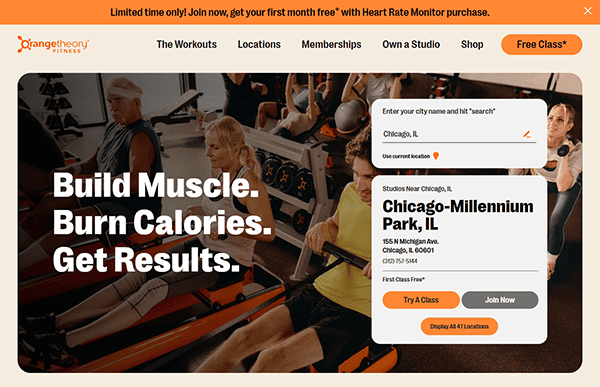
- Orangetheory Fitness: Orangetheory Fitness focuses on a unique workout concept centered on heart-rate-based interval training. Their website underscores that distinct concept through engaging explanations, visuals, and color coding. Users are guided to understand the science behind Orangetheory, making the brand more approachable for first-time visitors. A “Find a Studio” search function is visibly placed, giving prospective members instant access to local workout options. The site layout is clean and features crisp images that capture the energetic environment. By pairing informative content with an easy-to-follow design, Orangetheory’s platform emerges as a strong example of leveraging gym website templates creatively.
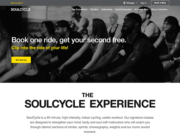
- SoulCycle: SoulCycle emphasizes community and its website mirrors that focus through people-centric visuals and inviting calls to action. With the brand well-known for its dynamic spinning classes, the site reflects its unique vibe by featuring real members and instructors in vivid photography. Navigation revolves around booking classes, with an interactive schedule that syncs with each visitor’s location. Their minimalist color palette ensures the user’s attention goes straight to key content like class info and sign-up. Overall, the sleek and modern design encourages users to take that first pedal toward a transformative fitness journey.
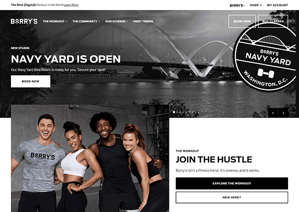
- Barry’s Bootcamp: Barry’s Bootcamp has perfected the art of combining intense group fitness with an approachable online persona. Their website quickly conveys high-energy workout experiences through dynamic imagery and bold typography. Classes are broken down by intensity levels, making it easy for newcomers to figure out where to begin. A professional yet playful tone resonates throughout each page, supported by vibrant color accents. The user-centric design also includes straightforward membership and location-finder tools, removing any guesswork. Barry’s uses real client stories and testimonials to reinforce credibility, embodying the best gym website approach that merges motivation and clarity.
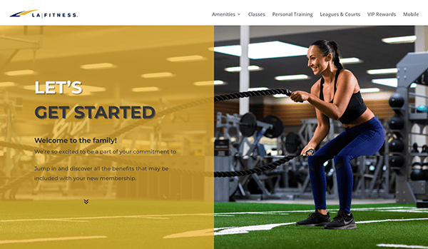
- LA Fitness: The LA Fitness welcome page has a clean, organized layout that guides new members through the gym’s amenities and services. The homepage uses intuitive navigation to direct users to sections, including amenities, classes, personal training, and mobile app features. High-quality images and concise descriptions clearly explain the offerings to enhance user engagement. Social media links and a podcast subscription further enrich the user experience by providing additional resources and community engagement.
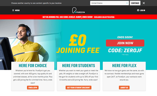
- PureGym: PureGym’s website captures a no-nonsense approach to fitness while still maintaining a friendly aesthetic. The homepage immediately promotes their flexible membership plans, often featuring special offers. With sections on workout classes, personal training, and member testimonials, visitors get a holistic overview of what to expect. PureGym also emphasizes easy access to locations through a convenient search bar. Their design ensures the sign-up process remains quick and painless. By combining crisp, clean imagery with essential information, PureGym demonstrates how a budget-friendly gym can still have one of the best gym website layouts to engage and retain members.
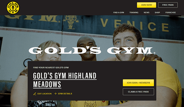
- Gold’s Gym: As a legendary brand in bodybuilding and general fitness, Gold’s Gym has a rich history that they showcase beautifully on their website. Featuring professional athletes, everyday success stories, and state-of-the-art facilities, the site exudes authority and credibility. The layout includes bold calls to action, encouraging visitors to check out membership deals, class offerings, or specialized training programs. A well-organized “Find a Gym” feature helps prospective members locate a convenient branch. By blending vibrant images, client testimonials, and membership incentives, Gold’s Gym effectively capitalizes on its storied reputation through a robust and appealing gym website.
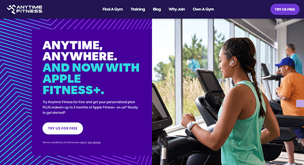
- Anytime Fitness: True to its name, Anytime Fitness emphasizes convenience and accessibility. Their website design places their 24/7 availability front and center, making it clear that members can work out on their schedule. A helpful “Get Started” guide outlines various membership benefits and essential FAQs. Additionally, the color palette and imagery evoke a sense of inclusiveness, welcoming people of all fitness levels. Location-specific pages provide membership details tailored to each branch, ensuring visitors receive relevant information for their area. This approach merges brand consistency with user-friendly features, setting a strong example for a results-driven gym website design.
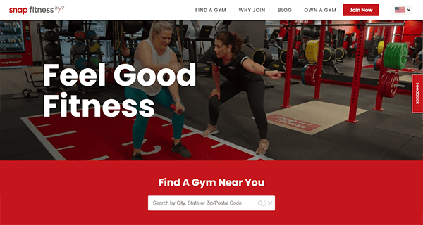
- Snap Fitness: Snap Fitness leans into its global presence by offering a location-based structure right from the start. The website’s color palette—bright reds and clean whites—creates a bold, modern look. With straightforward calls to action, the homepage guides visitors to learn about membership benefits, personal training options, and local gym amenities. Snap Fitness consistently highlights its inclusive environment and flexible hours. Testimonials and transformation stories add a human element, boosting credibility. Through simple navigation and clearly labeled pages, users can quickly find the information they need, demonstrating how the best gym website blends clarity, brand identity, and motivation.
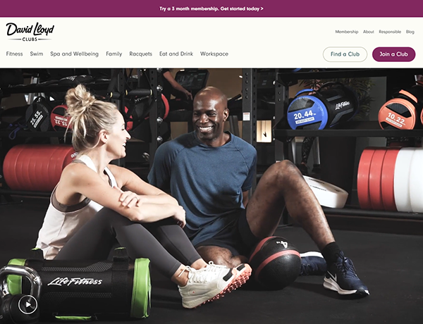
- David Lloyd Clubs: David Lloyd Clubs extend beyond the typical gym setup by providing tennis courts, pools, and family-friendly facilities. Their website design effectively showcases these expanded services through high-quality imagery and well-organized content. The main menu separates different offerings—fitness, racquet sports, and family activities—making it straightforward for visitors to navigate. Clear calls to action prompt potential members to book a tour or learn more about membership tiers. Warm colors and smiling faces evoke a welcoming vibe that underscores the club’s community-oriented approach. This website balances style with functionality, offering a comprehensive look at one of the UK’s most renowned fitness chains.
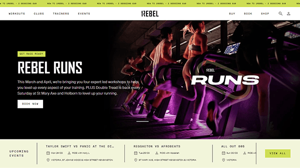
- 1Rebel: 1Rebel’s website stands out with its bold, edgy branding that appeals to urban fitness enthusiasts seeking high-intensity workouts. The design features dark tones accented by vibrant images of studio sessions and pumped-up clients. The minimal menu layout highlights core offerings: classes, studio locations, and membership packages. Each workout type has its dedicated section, enriched with compelling descriptions to attract interest. 1Rebel also integrates a streamlined booking interface, so potential members can sign up for classes in just a few clicks. Its distinctive style and user-friendly structure make it a compelling example of a cutting-edge gym website design.
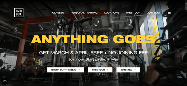
- Gymbox: Gymbox positions itself as a unique, fun, and slightly unconventional workout destination, and its website conveys that attitude perfectly. With neon visuals, high-energy class descriptions, and a playful tone, Gymbox builds excitement around its innovative fitness concepts. Visitors can quickly filter through class types and locations via a neatly structured interface. The bold color palette and dynamic videos reinforce the brand’s offbeat persona. Alongside membership details, Gymbox highlights success stories and staff profiles, offering credibility and a sense of community. If you’re seeking inspiration for a stand-out gym website that breaks traditional norms, Gymbox is a perfect benchmark.
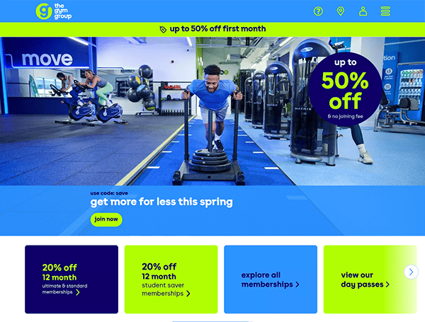
- The Gym Group: The Gym Group focuses on affordability, and that value proposition is clear throughout the site. From the very start, users see current promotions and membership tiers labeled in a straightforward manner. An interactive map helps people pinpoint the closest branch, while a “No Contract” slogan underscores flexibility. The site’s design employs calm colors and simple icons for easy scanning, ensuring prospective members don’t feel overwhelmed. Despite being a budget-friendly chain, The Gym Group’s website is polished, mobile-friendly, and user-oriented—demonstrating how even lower-priced gyms can host the best gym website that encourages user engagement and sign-ups.
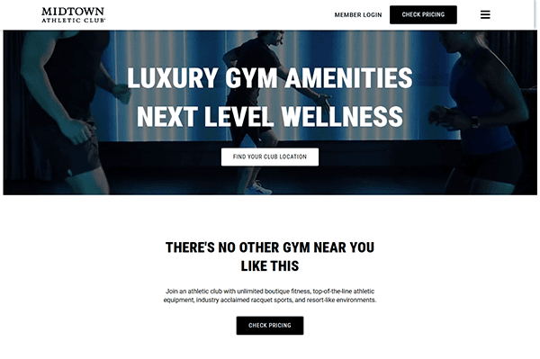
- Midtown Athletic Clubs: Midtown Athletic Clubs fuse fitness, hospitality, and wellness, which is immediately noticeable on their website. The crisp, modern design speaks to a higher-end demographic, highlighting group classes, spa services, and dining options. A sophisticated color scheme and upscale imagery convey the club’s premium nature. Each club location is showcased with distinct offerings, from indoor pools to tennis courts. The navigation also includes a dedicated blog with wellness tips, reinforcing the brand’s holistic approach. Midtown’s online platform proves that a gym website can easily blend fitness with lifestyle, catering to members seeking a well-rounded approach to health and leisure.
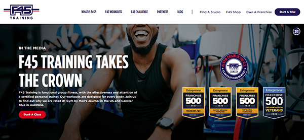
- F45 Training: F45 Training has garnered global attention for its 45-minute functional training sessions, and its website reflects that energetic approach. With bold calls to action like “Start Your Trial,” visitors know exactly how to take the first step. The homepage includes videos demonstrating different workout routines, giving an immersive feel. Additionally, the brand focuses on the community through success stories and social media integrations. Bright blues and reds underscore the brand’s vibrancy without overwhelming the user. This streamlined design and powerful storytelling are key examples of how a well-constructed gym website can turn curiosity into tangible membership conversions.
- Fitness First: Fitness First is known for its wide range of classes and training options, and the website presents these with clarity and style. Users can discover various training programs from the main menu, read about personal trainers, or explore membership deals. The brand’s color palette—primarily red, white, and black—lends a clean yet sporty look. Interactive elements like embedded videos and an online schedule keep users engaged, while the site’s location finder is easy to use. This approach makes the entire platform feel like a cohesive ecosystem for current members and newcomers. Fitness First shows how a neat, organized gym website design can speak volumes.
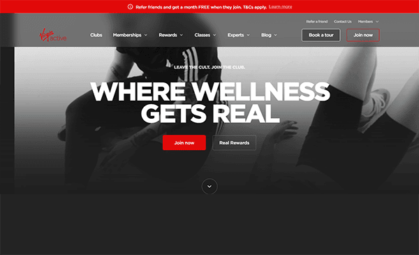
- Virgin Active: Virgin Active brings the well-known Virgin brand flair to fitness, showcasing an array of amenities like swimming pools, specialized studios, and spa services. The website highlights these offerings via dynamic visuals and concise descriptions. Each club has a dedicated page, allowing potential members to explore everything from cardio equipment to group classes. The brand’s confident red hue complements modern typography, creating a polished aesthetic. Booking classes or requesting membership info is straightforward, with prominent buttons placed across multiple pages. Virgin Active’s site elegantly proves that focusing on member experience, both online and offline, results in the best gym website approach.
Whether you run a cutting-edge boutique studio or a budget-friendly chain, you can learn a lot from these 20 gym websites. Each provides valuable insights into balancing brand identity, user experience, and up-front pricing or promotions. Designing an effective online presence isn’t merely about aesthetics—it’s about merging style with function so that potential members can quickly understand and engage with your fitness offerings.
A powerful gym website can help set you apart from the crowd. As seen in the examples above, interactive tools and engaging visuals are the backbone of a memorable experience. By focusing on user-friendly navigation, persuasive calls to action, and strong branding, you encourage a deeper connection with your audience. Integrating booking platforms, location search features, and member testimonials streamlines the process and builds trust in your services.
No matter how large or small your facility is, don’t underestimate the impact of thoughtful gym website templates. Showcasing your unique value proposition online can be the deciding factor for many potential members. Keep it modern, keep it fresh, and keep it aligned with your brand’s personality.
Top 10 Most Important Aspects of a Gym Website
- Clear Navigation: Users should easily find class schedules, membership options, and contact information without getting lost in unnecessary pages.
- Location Finder: Provide a quick way for visitors to identify the nearest gym branch, along with operational hours and special amenities.
- Online Booking: Make it simple for members to sign up for classes, trials, or personal training sessions directly through the website.
- Membership Details: Transparent pricing and contract terms build trust and reduce friction during the sign-up process.
- Engaging Visuals: Use professional images or videos that reflect the energy and community of your gym, inspiring visitors to join.
- Mobile-Friendly Layout: Ensure that your website is responsive and just as effective on smartphones and tablets as on desktops.
- Testimonials and Reviews: Genuine success stories and social proof go a long way in establishing credibility.
- Strong Branding: Consistent colors, fonts, and messaging help visitors remember your gym and what makes it unique.
- Easy Contact Methods: Prominent forms, phone numbers, or chat options encourage people to get in touch quickly.
- Social Media Integration: Connect your website to your gym’s social media channels so users can follow updates, events, and community-building activities.
FAQs About Gym Web Design
How can I make my gym website stand out from competitors?
Focus on clear navigation, eye-catching visuals, and compelling calls to action. Offering exclusive content, such as workout videos or expert tips, can help establish your brand’s uniqueness.
What platform is best for building a gym website?
WordPress is widely considered the best platform, thanks to its user-friendly interface, a plethora of gym-focused templates, and flexible customization options.
How much does it typically cost to design a gym website?
Basic websites can begin at around $2,000 and increase from there based on advanced features, custom design elements, and additional integrations like booking systems.
How often should I update my gym website?
Regularly adding value-driven updates, such as new class schedules or blog articles, is important for member engagement. Don’t update purely for search engine ranking; ensure your changes genuinely serve your visitors.
How do I keep my gym website secure?
Choose a reputable hosting provider and use reliable security plugins or services. Keeping your platform, themes, and plugins updated also helps prevent vulnerabilities.
Ready to elevate your gym’s website? Contact CyberOptik for a free proposal for your new gym website design and set your business up for success.