The graphic design industry is a constantly changing and developing area that demands creativity, precision, and an eye for detail. Graphic designers must often showcase their skills and versatility through well-crafted portfolio websites. These websites are a visual resume demonstrating a designer’s best work, design process, and personal brand. A solid graphic design portfolio website can make a significant impact, attracting potential clients and employers by showcasing the designer’s unique style and capabilities.
In the competitive world of graphic design, having an outstanding portfolio website is essential. It highlights a designer’s technical skills and ability to communicate ideas visually. The best portfolio websites are visually appealing, easy to navigate, and reflective of the designer’s personality and brand. They should include a curated selection of the designer’s best work, case studies, and a straightforward method for contacting the designer.
Creating a graphic design portfolio website involves careful planning and execution. Designers must consider the layout, color scheme, typography, and overall user experience. The goal is to create a site that showcases their work and provides an engaging and memorable experience for visitors. Below, we explore 20 of the best graphic design portfolio websites, each offering inspiration and insights into what makes a great portfolio.
Examples of the Best Graphic Design Portfolio Website Designs
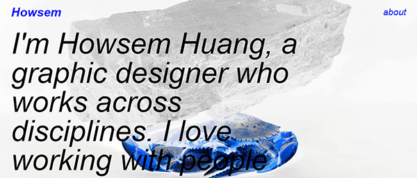
- Howsem Huang: Howsem Huang’s portfolio is a brilliant display of bold sans-serif typography atop contemporary imagery. This combination wonderfully showcases their unique yet tastefully stylized design work. The site is visually striking, with a clean layout emphasizing the designer’s creativity and technical skills. Howsem’s portfolio features various projects, from branding and web design to illustration and photography. High-quality images and minimal text allow the work to take center stage, making it easy for potential clients to appreciate the designer’s talent and versatility. Additionally, the site includes detailed case studies that provide insights into the design process and the challenges faced, further demonstrating Howsem’s expertise and thoughtfulness in their work.

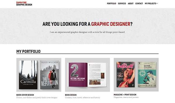
- Damn Website: Nando’s “Damn Website” is a testament to fully showcasing brand identity and design skills. The vaporwave-esque design employs bold visual elements and repetition of the word “damn” to create a memorable and engaging experience. This portfolio ultimately represents Nando’s bold artistic approach and competency as a graphic designer. The site features a variety of projects, including web design, branding, and illustration, all presented in a visually cohesive manner. Bright colors and striking typography make the portfolio stand out and leave a lasting impression on visitors. The portfolio also includes a blog section where Nando shares insights and tips on graphic design, further establishing his expertise and thought leadership.

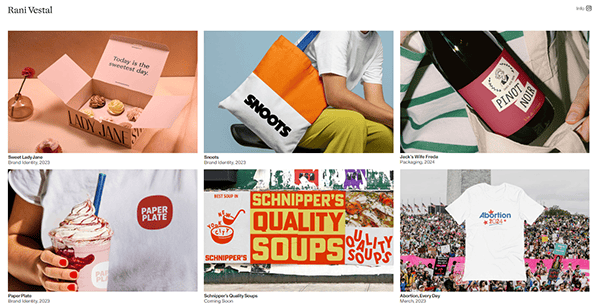
- Rani Vestal: Rani Vestal’s portfolio is a minimal yet high-quality way to demonstrate her best work. The site focuses on brand identity, with notable design projects that speak for themselves. The clean and professional layout highlights Rani’s aesthetic functionality and creative professionalism. Each project is presented with high-resolution images and concise descriptions, allowing visitors to understand the scope and impact of her work efficiently. The portfolio also includes a blog section where Rani shares insights and tips on graphic design, further establishing her expertise in the field. Additionally, the site features testimonials from satisfied clients, providing social proof of Rani’s skills and professionalism. The overall design of the portfolio reflects Rani’s attention to detail and commitment to excellence.

- Stensen Design: Mailinn Stensen’s portfolio wonderfully portrays innovative and creative graphic design. The bold burnt orange color and contemporary sans-serif font encapsulate the designer’s work and personality. The site is a subtle display of innovative creativity and design prowess. Stensen Design features many projects, from branding and packaging to web design and illustration. Each project is showcased with detailed case studies, providing insights into the design process and the challenges faced. The portfolio’s clean and modern design ensures a seamless user browsing experience, making it simple for visitors to navigate and explore the work. The site also includes a blog where Mailinn shares design tips and industry insights, further establishing her as a thought leader in the graphic design community.

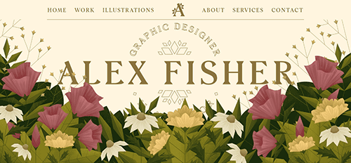
- Alex Fisher: Its website is an online portfolio with a breathtaking visual display of graphic design and illustration. The site features a clean layout with high-quality images highlighting Alex’s diverse skills. White space and minimal text allow the work to take center stage. Alex’s portfolio includes branding, web design, and illustration projects, each presented with detailed descriptions and high-resolution images. The site also features a blog where Alex shares insights and tips on graphic design, further establishing his expertise and thought leadership in the field. Visitors may quickly navigate Alex’s portfolio, learn about his design philosophy, and contact him using simple call-to-action buttons. The website’s flexible design makes it as unique on mobile devices as on desktop, ensuring a seamless and accessible experience across platforms.

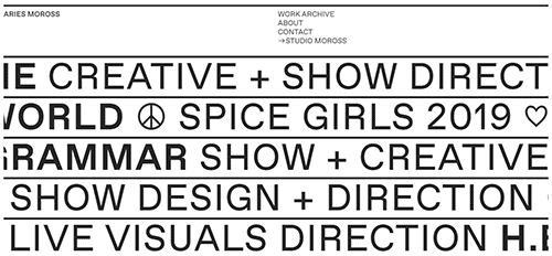
- Aries Moross: Aries Moross’s portfolio is visually stunning, with tiny text and a focus on vibrant imagery. The website is categorized based on specific types and mediums, facilitating a clear comprehension of the designer’s expertise and background for prospective clients. The bold and colorful design reflects Aries’s unique style. Each project has high-quality images and concise descriptions, allowing visitors to appreciate the designer’s talent and creativity. The portfolio also includes a blog section where Aries shares insights and tips on graphic design, further establishing their expertise in the field. Additionally, the site highlights a section dedicated to case studies, providing detailed insights into the design process and the challenges faced. The overall design of the portfolio is a testament to Aries’s creativity and attention to detail.

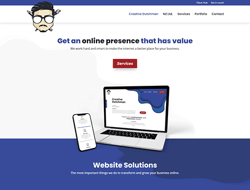
- The Dutchman: The Dutchman’s portfolio uses a scrolling homepage to display a collection of work. This single-page design encourages viewers to scroll through the entire portfolio, making it an excellent strategy for showcasing a cohesive body of work. The clean, minimalist, modern design is visually appealing and easy to navigate. The Dutchman’s portfolio features a variety of projects, including branding, web design, and illustration, each presented with high-resolution images and detailed descriptions. Using bold typography and striking visuals makes the portfolio stand out and leaves a lasting impression on visitors. The site also includes a blog section where The Dutchman shares insights and tips on graphic design, further establishing their expertise in the field. Additionally, the portfolio features client testimonials, providing social proof of The Dutchman’s skills and professionalism.

- Hom Sweet Hom: The Hom Sweet Hom website offers a delightful and inviting design that perfectly reflects Lauren Hom’s creative personality. The homepage immediately creates a warm connection through her friendly introduction, while the clean navigation menu makes it easy for visitors to explore her work, classes, blog, and store. Vivid imagery and artistic visuals are used thoughtfully, enhancing the overall aesthetic without overwhelming the content. Each section of the site feels well-balanced and organized, allowing users to seamlessly move between her portfolio, online courses, and personal stories. The blog adds authenticity by blending professional advice with Lauren’s unique voice, making the site both engaging and relatable. Clear call-to-action buttons guide visitors to explore her offerings in greater depth, creating a user-friendly experience that feels both inspiring and approachable.
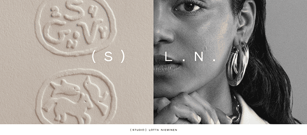
- Lotta Nieminen: Lotta Nieminen’s portfolio is a beautiful example of how to use photography and illustration to create a cohesive and engaging design. The site features a clean layout focusing on high-quality images and minimal text. A lot of her work is showcased in a way that highlights her versatility and creativity. Each project is presented with detailed case studies, providing insights into the design process and the challenges faced. The portfolio’s clean and modern design ensures a seamless user browsing experience, making it easy for visitors to navigate and explore the work. The site also includes a blog section where Lotta shares insights and tips on graphic design, further establishing her expertise in the field. Additionally, the portfolio features client testimonials, showcasing the positive feedback Lotta has received for her work.

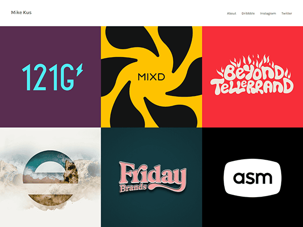
- Mike Kus: Mike Kus’s portfolio is a visually appealing site with a focus on web design and branding projects. The clean and modern design makes it easy to navigate, and the high-quality images showcase Mike’s skills and experience. The site is an excellent example of creating a professional and engaging portfolio. Each project is presented with detailed case studies, providing insights into the design process and the challenges faced. The portfolio also includes a blog section where Mike shares insights and tips on graphic design, further establishing his expertise in the field. The responsive design guarantees that the site appears great on desktop and mobile devices, while the subtle animations improve the overall user experience. The website’s current style and seamless user experience perfectly showcase Mike Kus’ creative talent and professional brand.

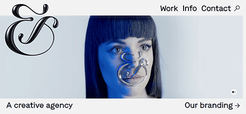
- &Walsh: Its website has a clean, visually appealing design that effectively conveys the creative agency’s artistic flair. The minimalist layout emphasizes utility and elegance, with an intuitive navigation mechanism that makes it simple to browse the site. White space throughout the site contributes to a smart, uncluttered appearance, highlighting crucial material and graphic aspects. Each page contains large, high-quality photos and dynamic visuals that appealingly present the agency’s portfolio. The homepage has a smooth scrolling appearance, providing a dynamic and user-friendly experience. Clear calls to action are strategically positioned, directing visitors to learn more about the services or contact the team.

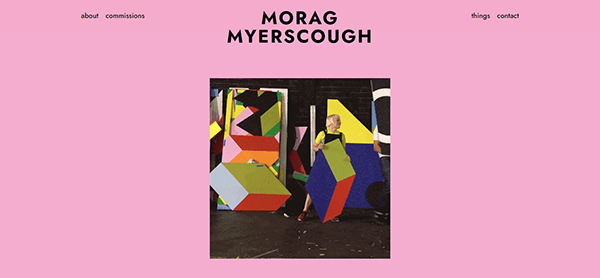
- Morag Myerscough: Its website emanates inventiveness and boldness, perfectly reflecting her design philosophy. The use of bold colors and dynamic imagery reflects her unique, happy aesthetic, making the site visually appealing. The navigation is straightforward, with a simple menu that allows you to easily explore various parts such as projects, exhibitions, and more. The homepage has a compelling hero image and clear calls to action, enticing visitors to delve further into her work. The style is simple and well-organized, letting the vibrant visuals of her projects stand out without overwhelming the user.

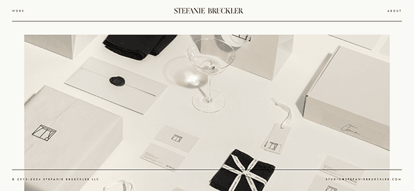
- Stefanie Brüeckler: The website for Stefanie Brueckler is visually stunning and offers a seamless user experience. The site’s clean, elegant design and soft, neutral color palette radiate refinement, complementing Stefanie’s creative work well. The homepage is a captivating combination of eye-catching imagery and simple language that guides visitors seamlessly through the portfolio. High-quality photographs and well-organized sections present her artistic efforts interestingly, while intuitive navigation and smooth transitions enhance the overall fluid experience. The adaptable design guarantees that the website’s attractiveness and functionality remain consistent across all devices, making it a remarkable online reflection of her abilities.

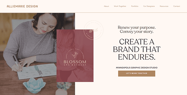
- AllieMarie Design: The Allie Marie Design website is a stunning example of creativity and expertise, with a clean and simple design that draws attention. When visitors arrive at the site, they are met with a stunning, full-width photograph of the designer’s work, conveying an immediate feeling of style and skill. The modest color palette, mostly consisting of soft whites and neutrals, helps the featured designs stand out, giving the site a clean and sophisticated appearance. Users may easily explore the site thanks to the intuitive navigation and well-organized menu that provides rapid access to portfolios, services, and contact information. Each portfolio part is professionally organized, with high-quality photographs emphasizing the work’s unique nuances and craftsmanship.

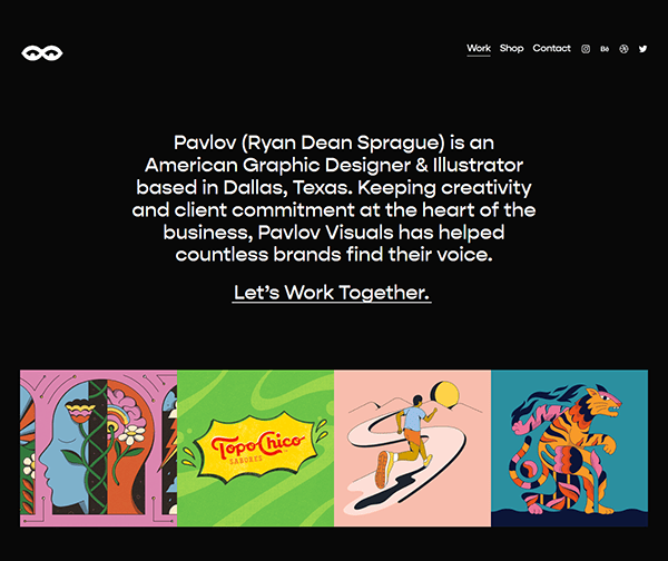
- Pavlov: Its website is an excellent example of clean, modern design, focusing on demonstrating its visual storytelling abilities. The homepage welcomes visitors with a simple look, enabling the bold, high-quality graphics and videos to speak for themselves. Navigation is simple, with a reduced menu that allows customers to reach essential areas such as the portfolio and services easily. The style is open and well-organized, with plenty of white space to help each project shine without feeling cluttered. The website has fluid scrolling and interactive components that improve the user experience while remaining exciting and lively. Typography is sleek and easy to read, with a modern feel that complements the brand’s identity. It also includes subtle animations and transitions that add sophistication without drawing attention away from the content.

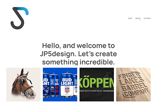
- John Panek: The website has a slick, professional appearance that immediately expresses their competence in architectural design. The minimalist layout is sleek and experienced, emphasizing high-quality photographs that elegantly present their design work. The navigation is straightforward, with a simple yet effective menu allowing users to quickly explore the firm’s services, portfolio, and pages. The color palette of soft neutrals with dramatic highlights gives a balanced and modern look that is consistent with the firm’s brand. Each project is carefully presented with extensive photographs and meaningful text, giving visitors a thorough grasp of the design process and results. The homepage provides a fluid, continuous scrolling experience that quickly leads viewers across various areas.

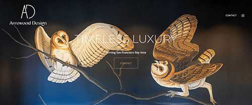
- Arrowood Design: The website is beautifully clean and contemporary, emphasizing their competence in graphic and brand design. The site’s minimalist structure employs a balanced combination of white space and eye-catching imagery to bring attention to their work without overwhelming visitors. The navigation is simple, making it easy to review their portfolio, services, and area. High-quality photos of their design projects are clearly shown, indicating their originality and competence. The typography is current and easily legible, adding to the site’s polished and professional vibe. The website perfectly matches the agency’s design philosophy, providing an easy and visually appealing method to learn about their creative work.

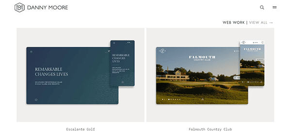
- Danny Moore: Danny Moore’s portfolio is simple and easy to navigate. It focuses on web design and branding projects. The hidden menu section expands to showcase the homepage, contact page, and work samples, making it a professional and engaging site. The design is simple and beautiful, focusing on high-quality images that highlight their outstanding work in explicit detail. The navigation is simple, with quick links to the portfolio, services, and about pages, allowing users to explore the work without distraction. Each project is presented with high-quality images and detailed descriptions, allowing visitors to appreciate the designer’s talent and creativity. The portfolio also includes a blog section where Danny shares insights and tips on graphic design, further establishing his expertise in the field.

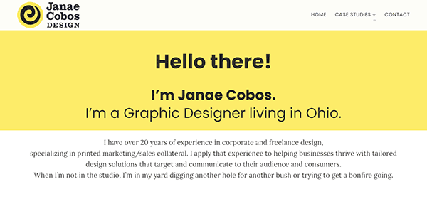
- Janae Cobos: Its website is attractively designed, with a sleek, modern appearance that emphasizes the company’s creative expertise. The elegant structure and minimalist color design provide a professional ambiance while allowing the featured work to stand out. High-quality photographs of the work are displayed, allowing visitors to traverse the portfolio quickly. The site’s logical menu and well-organized information make it user-friendly, and smooth scrolling and attractive animations improve the user experience. Furthermore, the responsive design guarantees that the website appears excellent across all devices, resulting in a professional and successful online presence.

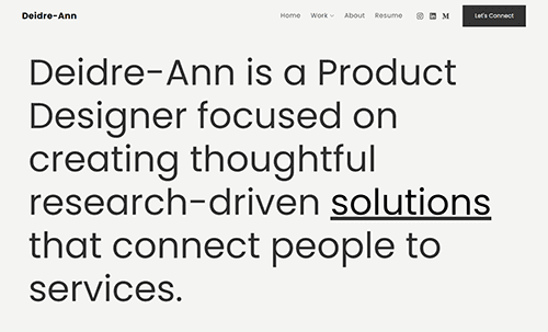
- Diedre-Ann: Diedre-Ann’s portfolio presents detailed case studies on big projects like LinkedIn and SXSW. The homepage features a substantial text-only description of Diedre, giving a clear understanding of the designer. The site is easy to navigate, with a resume and social links on the menu. Each project is presented with high-quality images and detailed descriptions, allowing visitors to appreciate the designer’s talent and creativity. The portfolio also includes a blog section where Diedre shares insights and tips on graphic design, further establishing her expertise in the field. Additionally, the site features client testimonials, providing social proof of Diedre’s skills and professionalism. The overall design of the portfolio reflects Diedre’s creativity and professionalism, making it a standout example of a graphic design portfolio.

Top 10 Most Important Aspects of a Graphic Design Portfolio Website
- Visual Appeal: The site should be visually striking and reflect the designer’s style and brand.
- Ease of Navigation: A clean and intuitive layout ensures visitors can easily find and view the designer’s work.
- High-Quality Images: Use high-resolution images to showcase design projects in the best possible light.
- Minimal Text: Let the work speak for itself with minimal text, focusing on critical information and project details.
- Responsive Design: Ensure the site is mobile-friendly and looks great on all devices.
- Clear Contact Information: Provide a transparent contact form or email address to make it simple for prospective clients and employers to reach out.
- Personal Branding: Reflect the designer’s personality and brand through the site’s design and content.
- Curated Work Selection: Showcase a curated selection of the best work, focusing on quality over quantity.
- Case Studies: Include detailed case studies to provide insights into the design process and project outcomes.
- Regular Updates: Keep the portfolio updated with new work and projects to show ongoing growth and development.
Ready to elevate your graphic design portfolio’s digital footprint? Contact CyberOptik for a free consultation about your graphic design portfolio website and set your career on a path to digital excellence.

