Just looking for our Best Garage Door Website examples list?
Today, many companies still view their online presence as a mere formality – a digital business card in a vast online ocean. They might have a basic website, but it often serves as little more than an afterthought. If this sounds familiar, it’s time for a critical re-evaluation. As a result, your business stands at a pivotal point, where the quality and performance of your garage door site design can either open the door to unprecedented growth or keep you stuck in the shadows of your competitors.
Consider that prospective customers aren’t just looking for any service; they’re looking for reliability, expertise, and a trustworthy partner for their repair or new installation needs. Their first impression, more often than not, comes from their interaction with your online presence. A poorly designed, slow, or difficult-to-navigate site doesn’t just deter visitors; it actively sends them straight to a competitor. So you see, this isn’t just about aesthetics; it’s about fundamental business impact.
A truly great web design for a door company goes far beyond being merely visually appealing. It’s a strategic engine built to optimize every aspect of the user’s journey. From seamless gateways and an intuitive UX on smart devices to sophisticated search engine optimization (SEO) strategies that ensure visibility on search engines, every element works in harmony. This comprehensive approach to digital marketing directly translates into higher conversion rates, more qualified leads, and ultimately, a more profitable garage door business.
This guide will delve into how to transform a garage door website into your most effective sales tool, moving past common pitfalls to embrace cutting-edge strategies that capture attention, build trust, and drive measurable results. Get ready to discover how superior site design isn’t just an expense, but your most valuable investment in future success.
Website Planning & Purpose: Laying the Foundation for Garage Door Success
Before a single line of code is written or a single image is placed, the most crucial phase of website development for a garage door business is the planning stage. This isn’t just about sketching out a few pages; it’s a strategic deep dive into your business objectives, your target market, and the competitive landscape. For garage door companies, a well-executed planning phase ensures your eventual website isn’t just a digital brochure, but a powerful engine for lead generation and brand authority.
Here’s a breakdown of the essential considerations during the website planning and purpose phase for the garage door industry:
- Defining Clear Business Objectives: What do you truly want your website to achieve?
- Lead Generation: This is paramount for most door companies. Are you aiming for phone calls, form submissions for quotes, or online appointment scheduling for garage repairs or installations?
- Brand Authority & Trust: Do you want to establish your company as the leading expert in your service area? This involves showcasing expertise, certifications, and customer testimonials prominently.
- Customer Education: Providing valuable resources can reduce pre-sale questions and position you as a helpful resource.
- Streamlining Operations: Can the website facilitate aspects like online booking, frequently asked questions, or even initial diagnostic tools?
- Understanding Your Target Audience (Beyond the Obvious): While you know you’re targeting homeowners, delve deeper:
- Problem-Solvers: Those with a broken garage door need immediate solutions and clear emergency contact information.
- Planned Purchasers: Customers looking for a new installation will seek detailed product information, galleries, and pricing transparency.
- Research-Driven Homeowners: Individuals comparing different door services will appreciate comprehensive guides, testimonials, and detailed “About Us” sections. Local vs.
- Broader Reach: Are you focused solely on local service, or do you have ambitions for a wider geographic footprint? This impacts keyword strategy and local SEO planning.
- Competitor Analysis & Differentiation: What are your competitors doing well on their websites? Where are their weaknesses? Are there unmet needs or overlooked angles you can leverage? How can your web design stand out and clearly communicate your unique selling propositions (USPs), whether it’s same-day service, specific product lines, or unparalleled customer service?
- Content Strategy Blueprint: What type of content will resonate with your target audience at different stages of their decision-making process? This includes service pages, an FAQ section, a blog, testimonials, and high-quality imagery/videos of your work. How will you structure information to ensure easy usage and a seamless UX? Consider how to incorporate a comprehensive blog section, similar to insights found in studies of top-performing sites, such as those highlighted in our analysis of the 20 Best General Contractor Website Designs.
- Technical & SEO Foundation Planning: From day one, plan for robust SEO. This includes identifying target keywords, mapping content to those keywords, and ensuring a fast, secure, and mobile-device-friendly site architecture. Consider the optimal URL structure, heading hierarchy, and meta descriptions to ensure maximum visibility on search engines. Planning for the easy integration of analytics tools is critical to track performance from launch.
- User Experience (UX) and User Interface (UI) Prioritization: An appealing site is important, but a functional and intuitive one is paramount. How will users interact with your site? Think about clear calls-to-action, prominent contact information, and an uncluttered layout. Ensure the design is responsive, adapting flawlessly across all screen sizes and mobile devices.
By meticulously addressing these planning elements, your company can establish a powerful online presence that attracts and effectively converts your ideal customers. This strategic groundwork is the difference between a website that simply exists and one that truly drives your business forward.
Design Principles: Crafting an Effective Website
Once the strategic planning is complete, the focus shifts to the execution of a design that looks professional and actively supports your business objectives. Effective web design for this industry hinges on several key principles that prioritize both aesthetics and functionality, ensuring a seamless journey for every prospective customer.
Here are the core design principles that elevate a garage door website from good to exceptional:
1. Clarity and Simplicity
Minimalist Aesthetics: Avoid clutter. A clean, uncluttered layout makes it easy for visitors to find what they need, whether it’s information on garage repairs or a gallery of new installations. Excessive elements can overwhelm and deter.
Clear Messaging: Your value proposition and primary door services should be immediately apparent. Use concise headings and digestible paragraphs to communicate quickly and effectively.
Intuitive Navigation: These should be straightforward and logical. Users should never feel lost or confused about how to get to service pages, contact information, or their portfolio. This means well-labeled menus, clear internal links, and a logical flow from one page to the next.
2. Mobile-First and Responsive Design
This is non-negotiable. A significant portion of your target audience will access your site on smart devices, especially when searching for immediate repair services.
The design must adapt flawlessly to any screen size, ensuring a consistent and optimal UX whether on a smartphone, tablet, or desktop. This includes legible text, easily clickable buttons, and quickly loading images, which are critical for both user satisfaction and SEO.
3. Visual Impact and High-Quality Media
Professional Photography and Video: The garage door industry is highly visual. Showcase your work with high-resolution images of actual garage door installations, before-and-after transformations, and your team in action. Videos demonstrating installations or explaining maintenance tips can significantly boost engagement and trust. An aesthetically appealing site instantly conveys professionalism.
Consistent Branding: Use a consistent color palette, typography, and logo placement that aligns with your garage door company’s brand identity. This builds recognition and reinforces trust.
Visual Hierarchy: Use size, color, and spacing to guide the user’s eye to the most important elements on the page, such as headlines, calls-to-action, and key information points.
4. Strong Calls-to-Action (CTAs)
Every page should have a purpose, and that purpose often culminates in a clear CTA. These should be prominent, action-oriented, and strategically placed.
Examples include “Get a Free Quote,” “Schedule Service,” “Call Now for Emergency Repair,” or “View Our Garage Door Collection.” The goal is to guide the potential customer towards the next step in their journey with your garage door business.
5. Trust Signals and Credibility:
Prominent Testimonials and Reviews: Integrate customer feedback directly on relevant service pages and the homepage. Real-world social proof is incredibly powerful.
Certifications and Awards: Displaying industry certifications, local awards, or professional affiliations immediately builds credibility.
Secure Website (HTTPS): A secure website protects user data and signals trustworthiness to visitors and search engines.
6. Speed and Performance:
A slow-loading site will quickly lose visitors. Optimize images, leverage caching, and ensure clean code to maximize loading speed. This impacts UX directly and is a significant factor in search engine optimization.
7. Accessibility:
Design your website to be accessible to all users, including those with disabilities. This includes proper alt text for images, keyboard navigation support, and clear color contrast. Accessibility is good practice and also contributes positively to your overall SEO efforts.
By meticulously applying these design principles, your company website will capture attention and effectively convert visitors into loyal customers, driving sustainable growth for your door company. For more insights into specialized web design for service-based businesses, explore our article on Contractor Website Design.
Content & Navigation: Structuring Your Site for Success
Even the most visually appealing site will fall short if its content is disorganized and its navigation is confusing. Effective content and intuitive user pathways are paramount for both UX and search engine optimization (SEO). They guide the potential customer seamlessly through your offerings, answer their questions, and ultimately lead them to conversion.
Here’s how to strategically structure content and navigation for a high-performing garage door business website:
Content Structure: Inform, Engage, Convert
Your content should cater to different user intents, from emergency garage repair needs to planned new installations.
- Homepage: The Grand Entrance:
- Purpose: Quickly convey who you are, what door services you offer, and your primary service areas.
- Key Elements:
- Clear, concise value proposition and headline.
- Prominent service categories (e.g., Repair, Installation, Maintenance).
- Strong, above-the-fold Call-to-Action (CTA) for immediate needs (e.g., “Emergency Repair,” “Get a Free Quote”).
- Trust signals: Customer testimonials, certifications, and local awards.
- Brief overview of your unique selling points.
- Service Pages: Detailed Solutions:
- Purpose: Each core service (e.g., garage door repair, new garage door installation, opener repair, maintenance) should have its own dedicated, in-depth page.
- Key Elements:
- Specific problem-solution approach (e.g., “Is Your Garage Door Stuck? Our Repair Services Can Help”).
- Detailed descriptions of what the service entails.
- Benefits to the customer (e.g., “Enhance Home Value,” “Improve Security”).
- Relevant images or videos of the service in action.
- Service-specific FAQs.
- Clear, relevant CTAs (e.g., “Schedule Repair Service,” “Request an Installation Quote”).
- Local SEO Focus: If you serve multiple areas, consider creating localized service pages (e.g., “Garage Door Repair [City Name]”).
- Product/Gallery Pages: Showcase Your Craft:
- Purpose: For new installations, allow potential customers to explore different garage door styles, materials, and brands.
- Key Elements:
- High-resolution images and videos of various garage door types (traditional, modern, carriage house, etc.).
- Filters or categories to allow users to sort by style, material, or color.
- Brief descriptions of each product line’s features and benefits.
- Case studies or customer photos showing installed doors.
- CTAs like “View Our Full Catalog” or “Request a Design Consultation.”
- About Us Page: Building Trust and Connection:
- Purpose: Share your door company’s story, values, mission, and team. This humanizes your brand.
- Key Elements: Company history, team bios (with photos), company values, commitment to customer service, community involvement.
- Testimonials/Reviews Page:
- Purpose: Centralize social proof to build credibility. While integrated testimonials are good, a dedicated page offers comprehensive reassurance.
- Key Elements: Direct quotes, links to external review platforms (Google, Yelp), before-and-after photos with client permission.
- Blog/Resources Section: Authority & SEO Powerhouse:
- Purpose: Establish your garage door business as an industry authority, answer common questions, and drive organic traffic through SEO.
- Content Ideas: “DIY Garage Door Maintenance Tips,” “Choosing the Right Garage Door for Your Home,” “Signs You Need Garage Door Repair,” “Understanding Garage Door Opener Types.” This section is crucial for long-tail keyword targeting and continually demonstrating expertise to search engines.
- Contact Us Page: Easy Communication:
- Purpose: Provide all necessary contact information in an easily accessible format.
- Key Elements: Phone numbers (prominent and clickable on mobile devices), email address, physical address (for Google My Business verification), interactive map, contact form, hours of operation, emergency contact details.
Navigation: Guiding the User Journey
Your website’s action steps are the roadmap. It must be logical, consistent, and user-friendly on all mobile devices.
- Primary Navigation (Main Menu):
- Should be prominent and consistent across all pages (usually at the top).
- Use clear, concise labels: Home, Services, New Doors/Products, About Us, Blog/Resources, Contact.
- Consider drop-down menus for sub-categories (e.g., “Services” could drop down to “Repair,” “Installation,” “Maintenance”).
- Secondary Navigation (Footer):
- Contains less critical but still important links: Privacy Policy, Terms of Service, Sitemap, Career Opportunities, Social Media Links.
- Internal Linking:
- Purpose: Crucial for SEO and UX. Links from relevant content to other pages on your site.
- Strategy: When discussing garage repair on your blog, link directly to your dedicated repair service page. From a new door product page, link to installation services. This helps search engines understand your site structure and helps users find related information.
- Search Bar:
- For larger sites or those with extensive product catalogs, a prominent search bar can significantly enhance user experience, allowing visitors to quickly find specific information.
By meticulously planning your content structure and ensuring intuitive gateways, your site will become a highly effective tool, serving both your target audience’s needs and your digital marketing objectives.
Visual Elements: Enhancing UX and Brand Identity
Where products are tangible and services often involve significant home improvements, visual elements play an exceptionally critical role. Beyond mere aesthetics, they directly support UX, build trust, and powerfully reinforce your company’s brand. A visually appealing website isn’t a luxury; it’s a necessity that can significantly influence a potential customer’s decision.
Here’s how visual elements strategically contribute to an effective design:
1. High-Quality Photography and Videography: Show, Don’t Just Tell
- Showcasing Your Craftsmanship: Generic stock photos simply won’t cut it. Invest in professional, high-resolution photography of actual garage door installations, garage repair work in progress, and your team in action. This demonstrates expertise and attention to detail.
- Before-and-After Galleries: These are incredibly effective. A visual comparison of an old, damaged door transformed into a beautiful, new installation speaks volumes and directly addresses a potential customer’s pain points and aspirations.
- Product Visuals: If you offer new installations, showcase various garage door styles (traditional, modern, carriage house), materials (steel, wood, aluminum), and color options clearly. Consider using interactive elements like a “visualizer” tool where users can upload a photo of their home and “try on” different doors.
- Team Photos: Professional photos of your technicians and office staff build rapport and trust. Seeing the faces behind the door company creates a human connection.
- Video Content: Short, high-quality videos can demonstrate complex door services (like opener installation), provide quick maintenance tips, offer customer testimonials, or give a virtual tour of your showroom. Videos significantly boost engagement and can improve optimization by increasing time spent on the page.
2. Consistent Branding and Color Palette: Reinforcing Identity
- Logo Prominence: Your garage door business logo should be clearly visible and consistently placed, typically in the header, acting as an anchor for your brand.
- Brand Colors and Typography: Utilize a consistent color scheme that reflects your door company’s branding, perhaps incorporating colors found in your logo or those that evoke trustworthiness, reliability, or modernity. Consistent typography throughout the site reinforces professionalism and legibility.
- Visual Hierarchy: Use size, color, and spacing to guide the user’s eye to the most important elements on the page, such as headlines, calls-to-action, and key information points.
3. Iconography and Graphics: Enhancing Understanding and Navigation
- Service Icons: Use clear, intuitive icons to represent different door services (e.g., a wrench for repair, a new door for installation). These offer quick visual cues and improve gateways and scalability.
- Infographics: For complex information (like “how a garage door works” or “steps for proper maintenance”), an infographic can be far more digestible and engaging than a block of text.
- Visual Cues for Calls-to-Action: Buttons should be visually appealing and stand out, using contrasting colors and clear text (e.g., “Get a Free Quote” in a vibrant button).
4. White Space and Layout: Improving UX
- Strategic Use of White Space: Don’t cram too much information onto one screen. Ample white space (or negative space) around elements makes content easier to read, reduces cognitive load, and highlights important sections. It gives the design a clean, professional feel.
- Organized Layout: A well-structured layout with clear sections and headings makes it easy for a potential customer to scan and find the specific information they are looking for, whether they’re on mobile devices or a desktop. This directly impacts how effectively users can navigate your site.
5. Responsiveness Across Devices: Universal Accessibility
All visual elements, from images to videos and interactive features, must seamlessly adapt and display correctly across all mobile devices and screen sizes. Images should scale appropriately, and text should remain legible, ensuring a consistent and positive user experience regardless of how the site is accessed.
By meticulously planning and executing these visual elements, your new or revamped website will capture attention and effectively communicate your professionalism, build trust, and convert visitors into valuable clients.
Ongoing WordPress Maintenance: Sustaining Your Site’s Performance
Launching a professionally designed site is a significant achievement, but it’s not the final step. To ensure your site remains a high-performing asset for your business, consistent and proactive WordPress maintenance is essential. Neglecting these ongoing tasks can lead to security vulnerabilities, slow loading times, broken functionalities, and ultimately, a decline in your search engine rankings and overall user experience.
Here’s why ongoing maintenance is crucial for your door company’s online success and what it entails:
1. Security Updates and Monitoring: Protecting Your Digital Asset
- Core WordPress Updates: WordPress regularly releases updates for its core software. These often include critical security patches and performance enhancements. Applying these updates promptly is vital to protect your website from known vulnerabilities.
- Plugin and Theme Updates: Just like the core software, plugins and themes are frequently updated to fix bugs, introduce new features, and patch security holes. Outdated plugins are a common entry point for malicious attacks. Regular updates minimize this risk.
- Malware Scans and Removal: Proactive scanning helps detect and remove malicious code before it can cause significant damage to your site or reputation. Timely removal prevents your site from being blacklisted by search engines.
- Firewall and Security Hardening: Implementing a robust firewall and other security measures helps prevent unauthorized access and ward off cyber threats, safeguarding your garage door company’s data and customer information.
2. Performance Optimization: Ensuring Speed and Efficiency
- Database Optimization: Over time, your WordPress database can become cluttered with revisions, spam comments, and unused data. Regular optimization cleans up this data, improving website speed and responsiveness, which is crucial for a positive user experience and optimization.
- Image Optimization: Large, unoptimized images can significantly slow down your site. Ongoing maintenance involves compressing new images and re-optimizing existing ones to ensure fast loading times across all mobile devices.
- Caching Implementation and Management: Caching stores static versions of your website, allowing pages to load much faster for returning visitors. Proper cache configuration and regular clearing are key to sustained performance.
- Broken Link Checks and Fixes: Broken links (404 errors) create a frustrating user experience and negatively impact your SEO by signaling a poorly maintained site to search engines. Regular checks identify and fix these issues.
3. Backup Management: Your Digital Safety Net
- Regular Backups: Implement an automated system for daily or weekly backups of your entire website (both files and database). Store these backups securely off-site.
- Backup Verification: Periodically test your backups to ensure they are functional and can be restored if an unforeseen issue arises. This provides peace of mind that your garage door business can quickly recover from any data loss.
4. Content and SEO Refinements: Staying Relevant
- Content Audits: Regularly review existing content for accuracy, relevance, and opportunities for updates. Ensure information about your door services (e.g., garage door repair, new installations) is always current.
- Keyword Performance Monitoring: Track the performance of your target keywords and identify new opportunities. This informs ongoing SEO adjustments and content strategy.
- Internal Link Optimization: As new content is added, identify opportunities to create new internal links that enhance user pathways and strengthen your site’s SEO authority.
- Monitoring Analytics: Regularly review website analytics to understand user behavior, identify popular content, and pinpoint areas for improvement in UX or content strategy.
5. Plugin and Theme Compatibility Checks: Preventing Conflicts
As themes and plugins are updated on WordPress, compatibility issues can arise, leading to website errors or broken features. Regular checks ensure all components work harmoniously, preventing downtime for your company’s online presence.
By committing to ongoing WordPress maintenance, your website will remain secure, fast, and highly effective at attracting and converting, ensuring its long-term value to your garage door business.
Key Takeaways: Building a Garage Door Website That Ranks & Converts
To truly elevate your garage door business online, your website must be more than just a digital brochure. It’s a dynamic sales and marketing powerhouse designed to attract, engage, and convert. Here are the essential takeaways to ensure your website achieves unprecedented growth:
- Your Website is Your #1 Sales Asset: Recognize that a poorly designed or unoptimized website isn’t just ineffective; it actively costs your business leads, credibility, and revenue. Investing in a professional, strategic website is a direct investment in your company’s future success.
- Deep Dive into Digital Customer Behavior: Move beyond basic demographics. Understand the why and how of your customers’ online journey. Are they searching in an emergency? Planning a major installation? Your website’s structure, content, and calls to action must cater precisely to these distinct digital behaviors to capture their attention and guide them efficiently.
- Design for User Experience (UX) and Visual Impact: A high-performing site prioritizes intuitive gateways, lightning-fast loading speeds, and impeccable mobile responsiveness. Crucially, it leverages high-quality visuals – from stunning before-and-after galleries to engaging videos – to tell your brand’s story and showcase your craftsmanship, directly influencing purchasing decisions.
- Master Next-Level SEO: Hyper-Local & Semantic: Beyond standard keywords, embrace hyper-local SEO strategies, including robust Google Business Profile optimization and geographically targeted landing pages. Integrate semantic SEO by answering related questions and building content clusters around broader topics, ensuring your site is the comprehensive answer to all garage door-related queries.
- Content is King, Conversion is Queen: Your website content should both inform and inspire. Develop valuable educational guides, interactive tools (like virtual configurators), and compelling case studies. This establishes your expertise and builds trust, moving visitors from information gathering to becoming qualified leads.
- Embrace Future-Forward Technology: Stay ahead of the curve by considering integrations like AI-powered chatbots for instant support, AI visualizers for virtual product try-ons, and personalized user journeys. These technologies enhance the UX and position your business as innovative and customer-centric.
- Measure What Matters: Focus on ROI: Don’t just track traffic. Prioritize metrics that demonstrate tangible business growth: lead volume and quality, conversion rates, and the reduction in cost per lead. A data-driven approach ensures your website continually optimizes for maximum return on investment.
- Partner with Expertise: Building a truly high-performing, future-proof site requires specialized knowledge. Collaborating with web design and SEO experts like ours ensures these complex strategies are executed flawlessly, delivering a digital presence that consistently drives growth and establishes your authority.
20 Examples of Garage Door Company Website Designs
A successful home service repair website combines professional aesthetics with seamless functionality, prioritizing the user’s needs to drive conversions. Below are examples showcasing what makes websites in this industry truly effective.
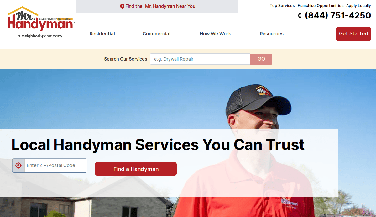
1. Mr. Handyman
Location City In The US: Ann Arbor, MI (Franchise HQ)
3 Key Takeaways:
- Clear Service Categorization: Services are well-organized and easy to find, often with dedicated pages for specific repairs.
- Trust Signals: Prominent display of customer reviews and testimonials builds immediate credibility.
- Franchise Locator: Efficiently directs users to local service providers, crucial for a national brand.
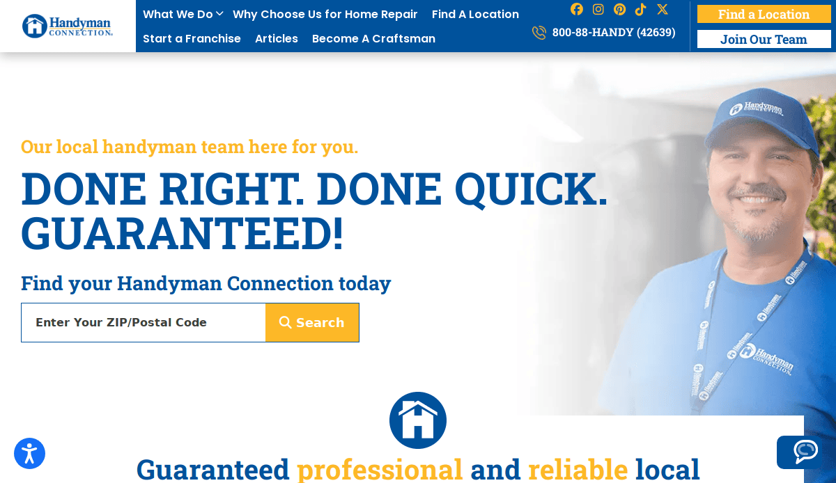
2. Handyman Connection
Location City In The US: Cincinnati, OH (Franchise HQ)
3 Key Takeaways:
- Optimized for Search: Strong use of location-based content and service pages to rank in local searches.
- Services Displayed Visually: Utilizes imagery effectively to showcase a wide range of repair capabilities.
- Mobile-Friendly Design: Ensures a smooth experience for users on any device.
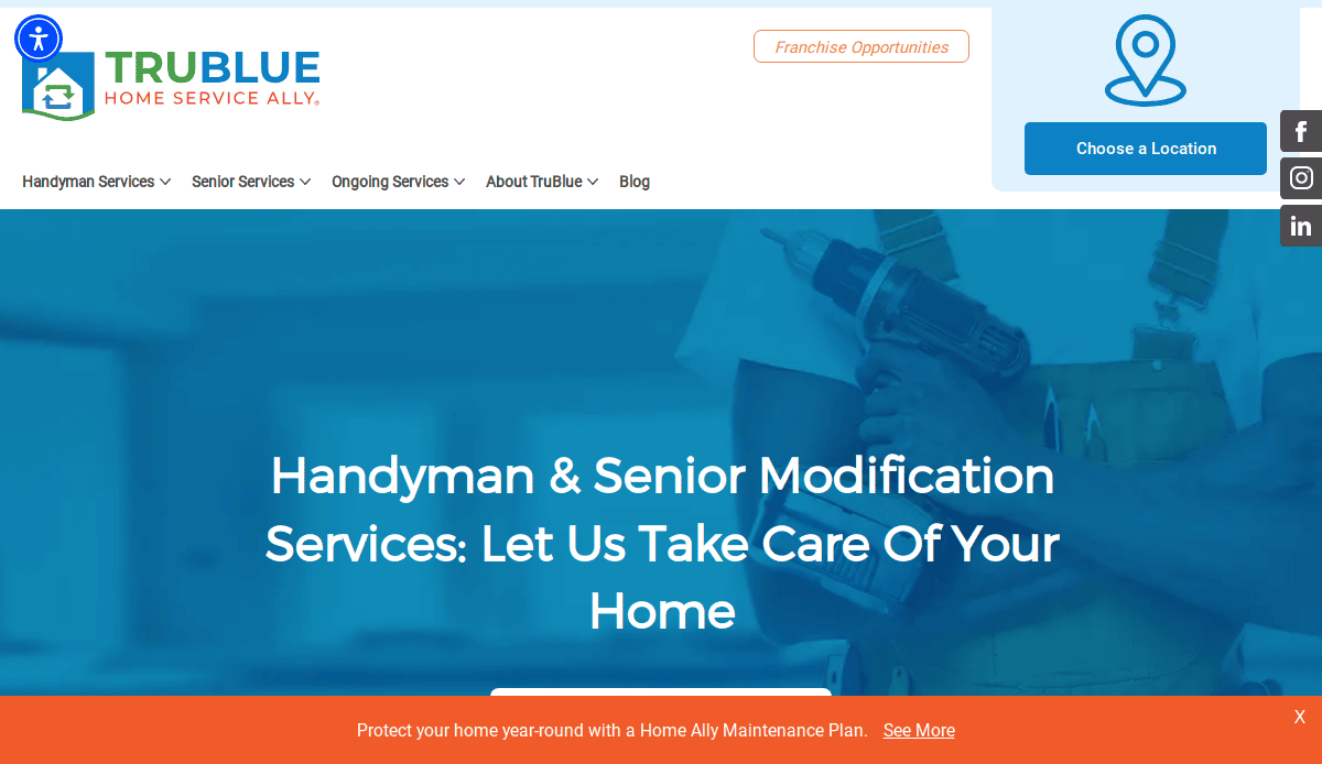
3. TruBlue Total House Care
Location City In The US: Cincinnati, OH (Franchise HQ)
3 Key Takeaways:
- Targeted Messaging: Clearly addresses specific audiences (e.g., seniors, busy adults) with tailored services.
- Helpful Resources: Offers valuable content like home maintenance checklists, positioning them as experts.
- Professional Branding: Consistent branding evokes trust and reliability.
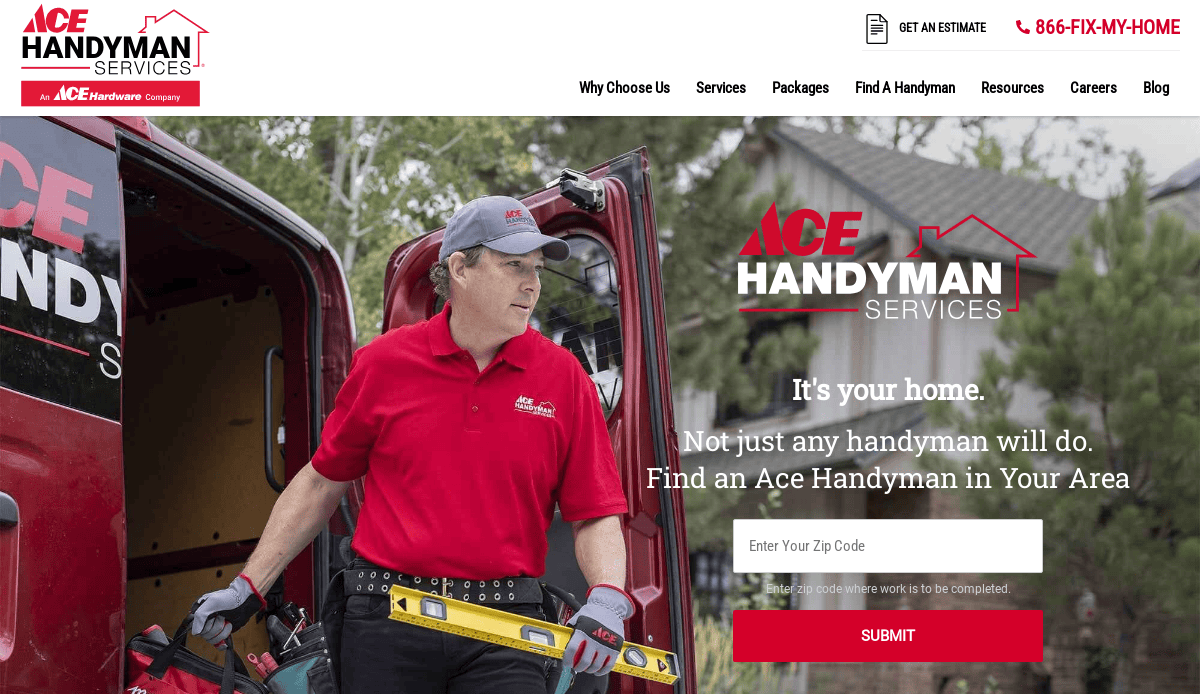
4. ACE Handyman Services
Location City In The US: National Franchise
3 Key Takeaways:
- Easy Service Area Navigation: Simplifies finding local service pros.
- Clean, Modern Layout: Aesthetically pleasing and easy to scan for information.
- Multiple CTAs: Prominent calls-to-action make it easy for visitors to schedule service.
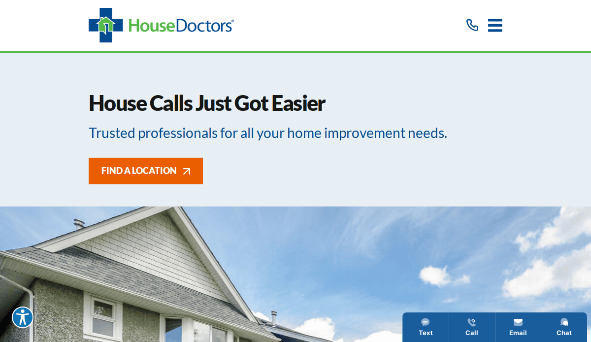
5. House Doctors
Location City In The US: National Franchise
3 Key Takeaways:
- Service-Focused Homepage: Clearly outlines various home improvement and repair services.
- Responsive Design: Adapts well to different screen sizes, ensuring accessibility.
- Trustworthiness Emphasized: Often includes certifications or guarantees prominently.
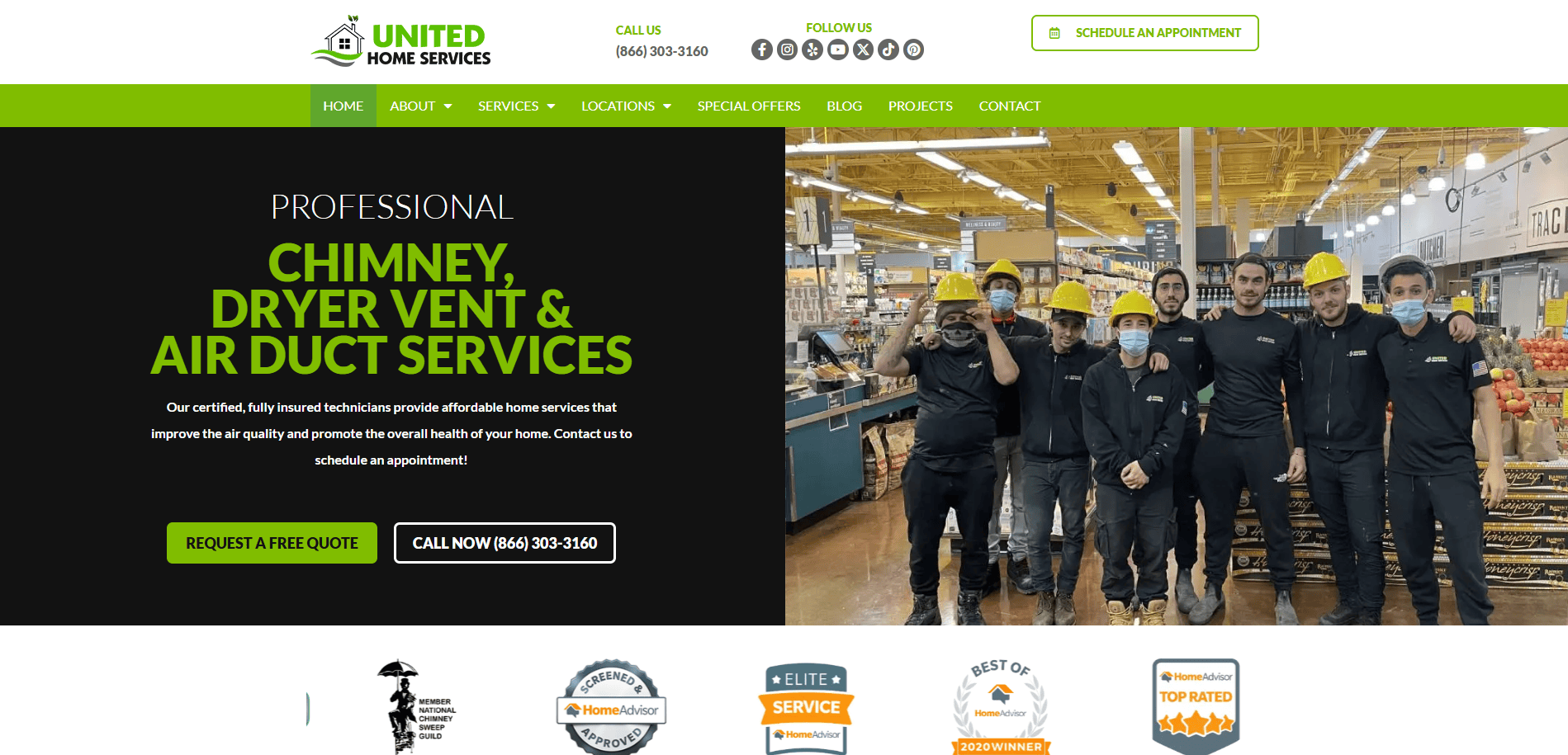
6. United Home Services
Location City In The US: Overland Park, KS
3 Key Takeaways:
- Modern Visuals: Uses a clean design with high-quality images of home improvement projects.
- Prominent Contact Details: Contact info and scheduling tools are immediately visible.
- Interactive Features: May include maps to explore service regions or sticky chat widgets for instant support.
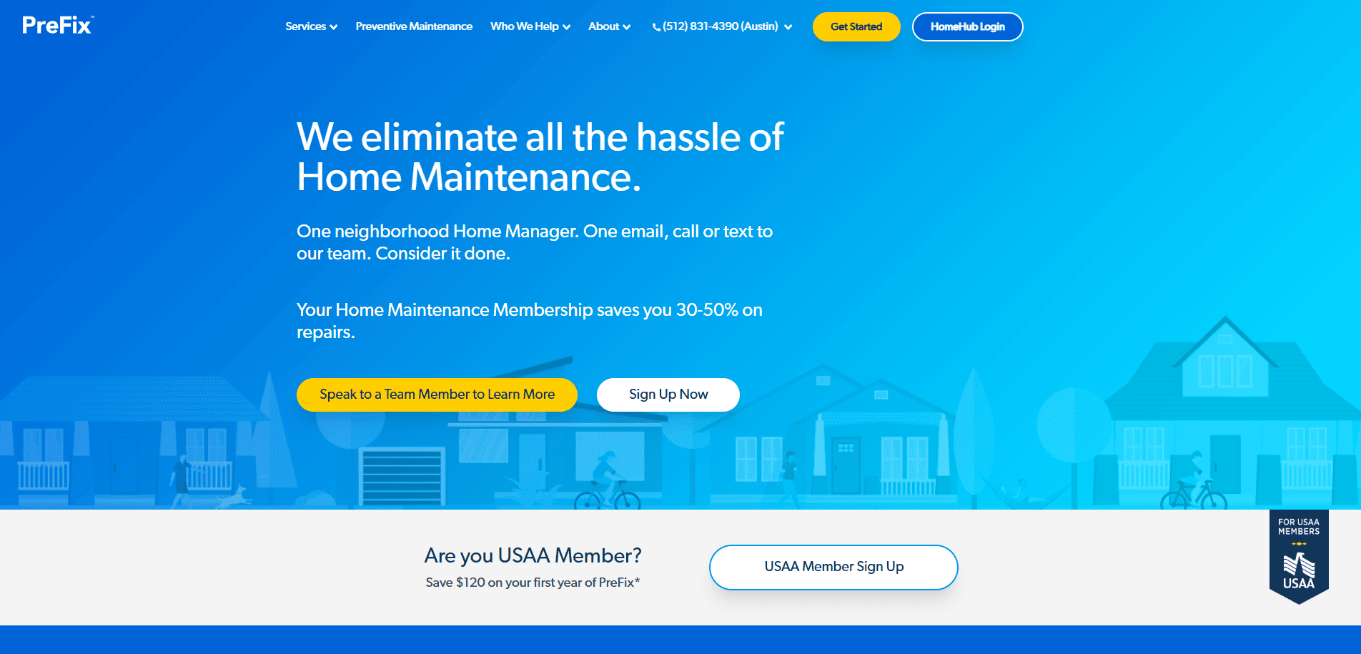
7. PreFix
Location City In The US: Austin, TX
3 Key Takeaways:
- Minimalist & User-Friendly: Emphasizes simplicity for easy navigation and understanding.
- Clear Value Proposition: Focuses on simplifying home upkeep with clear pricing.
- Mobile Optimized: Designed for excellent performance on mobile devices.
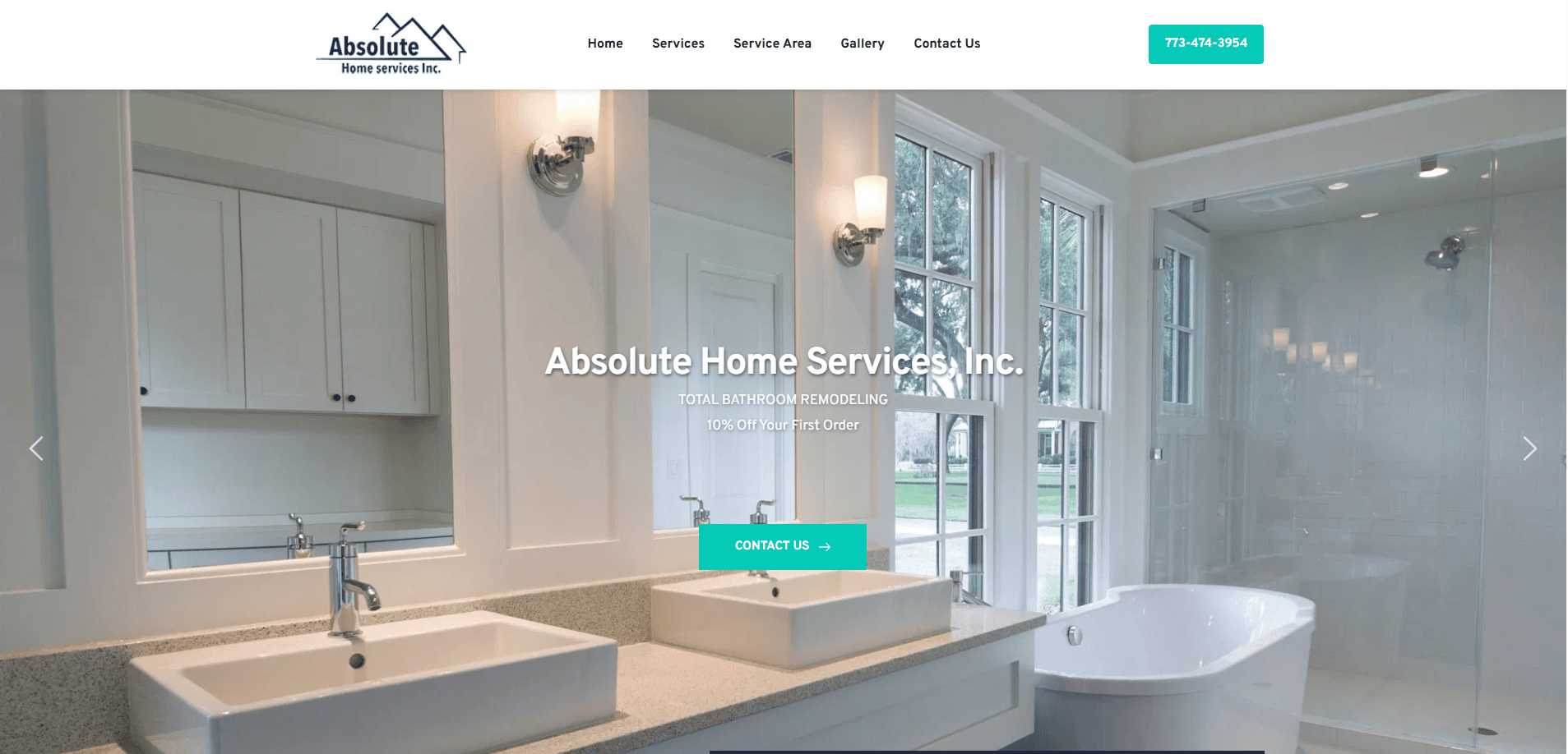
8. Absolute Home Services
Location City In The US: Elk Grove Village, IL
3 Key Takeaways:
- Visually Driven: Features compelling photographs of home projects.
- Prominent Review Ratings: Displays Google or other review ratings immediately to build trust.
- Clear Service Offerings: Makes it easy for potential customers to understand what services are provided.
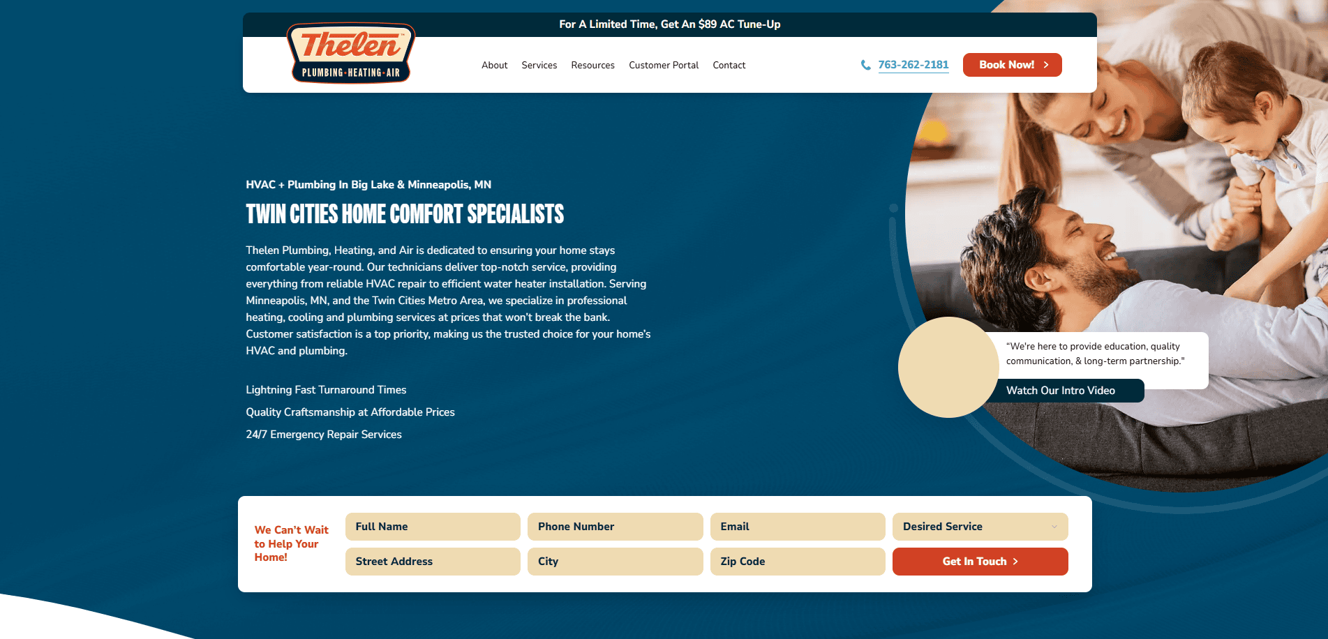
9. Thelen Mechanical
Location City In The US: Big Lake, MN
3 Key Takeaways:
- Emotion-Driven Design: Uses warm imagery and colors to convey comfort and peace of mind.
- Prioritized Service Paths: Clear, clickable offers (e.g., “$29 AC Tune-Up”) guide users to conversion.
- Strong Trust Badges: Prominent display of high ratings and guarantees.
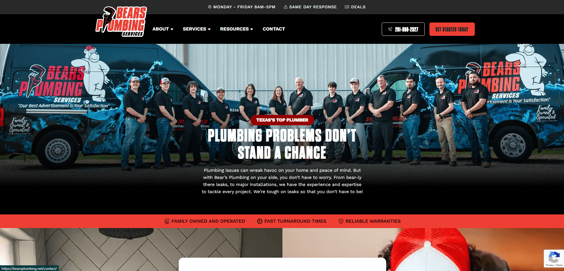
10. Bear’s Plumbing Services
Location City In The US: Spring, TX
3 Key Takeaways:
- Clean and Professional: A simple, yet effective design that conveys reliability.
- Easy Contact Access: Phone number and booking options are readily available.
- Service-Specific Content: Clearly outlines different plumbing services offered.
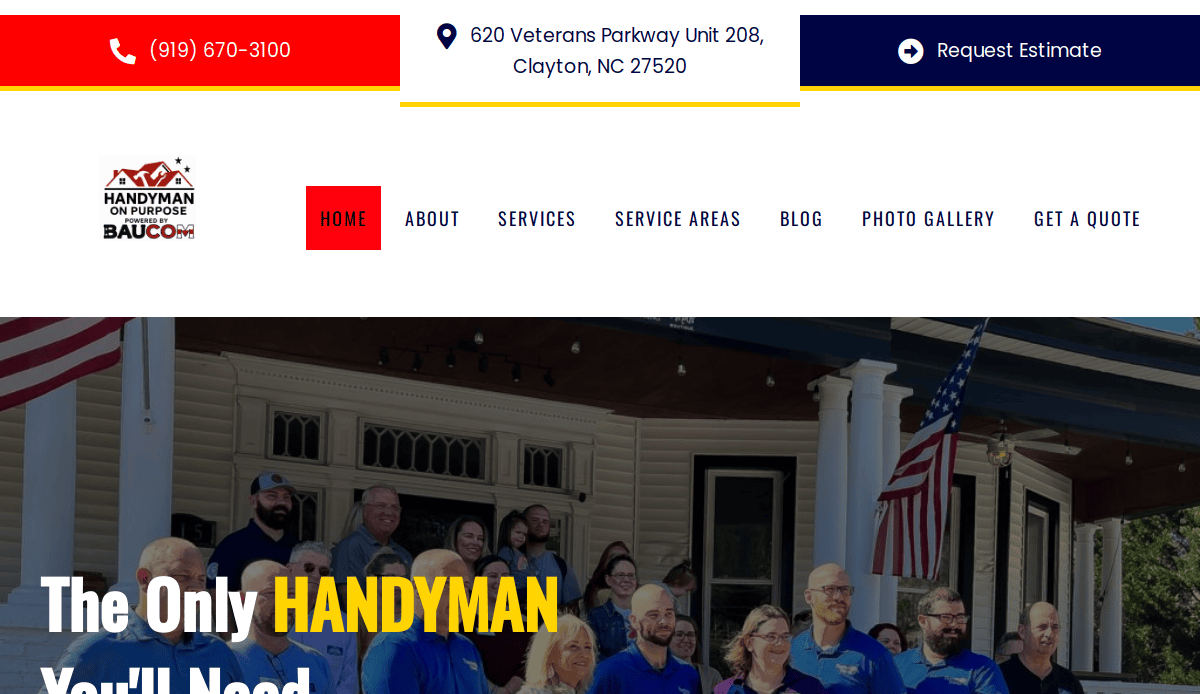
11. Handyman On Purpose
Location City In The US: Clayton, NC
3 Key Takeaways:
- Bold Top Bar: Features clickable phone numbers and location for quick access.
- Photo Gallery of Work: Showcases completed projects effectively.
- Comprehensive Service List: Clearly outlines all handyman services offered.
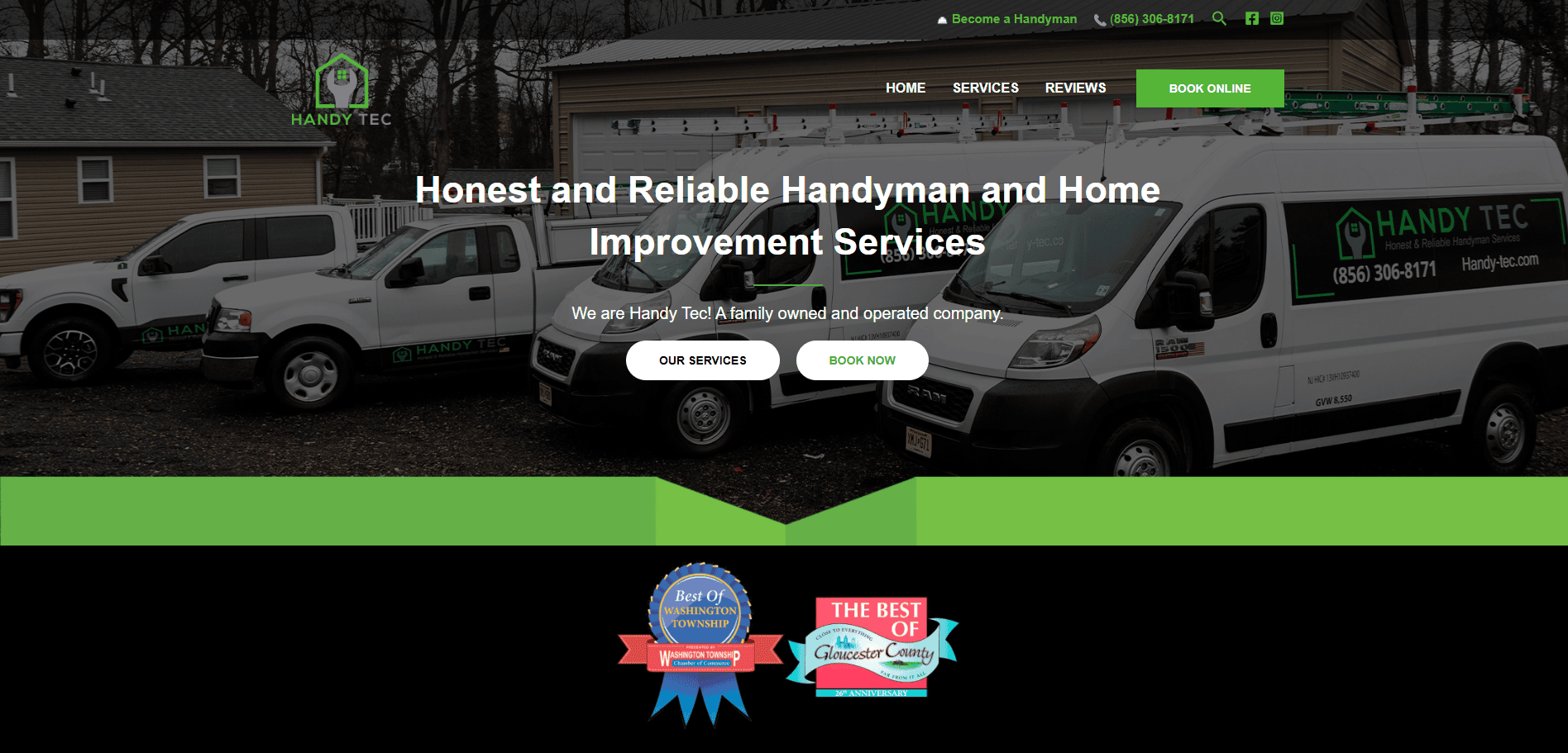
12. Handy Tec
Location City In The US: Washington Township, NJ
3 Key Takeaways:
- Modern Design: Clean layout and simple color scheme.
- Organized Service List: Services categorized by room for easy browsing.
- Online Booking Option: Streamlines the customer scheduling process.
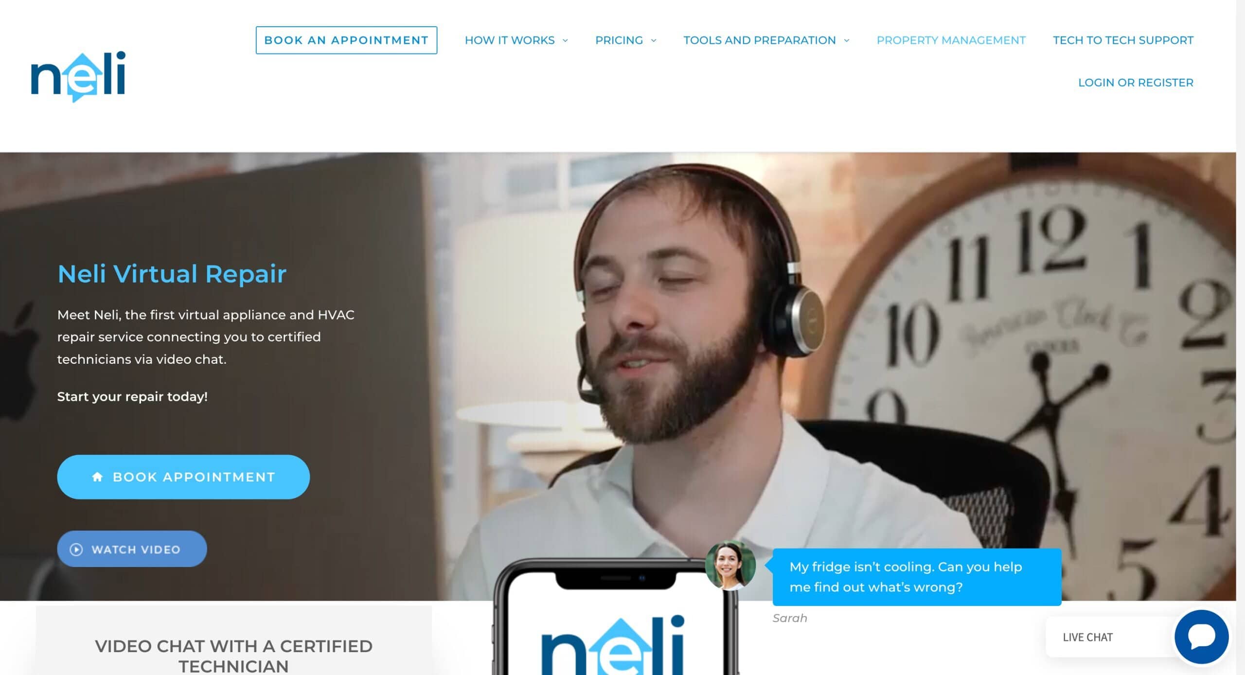
13. Neli Virtual Repair
Location City In The US: Sanford, NC
3 Key Takeaways:
- Consistent Branding: Logo, colors, and fonts are harmonized throughout the site.
- Client Hub Access: Offers a portal for existing customers to manage services.
- Comprehensive Service List: Clearly outlines all handyman offerings.
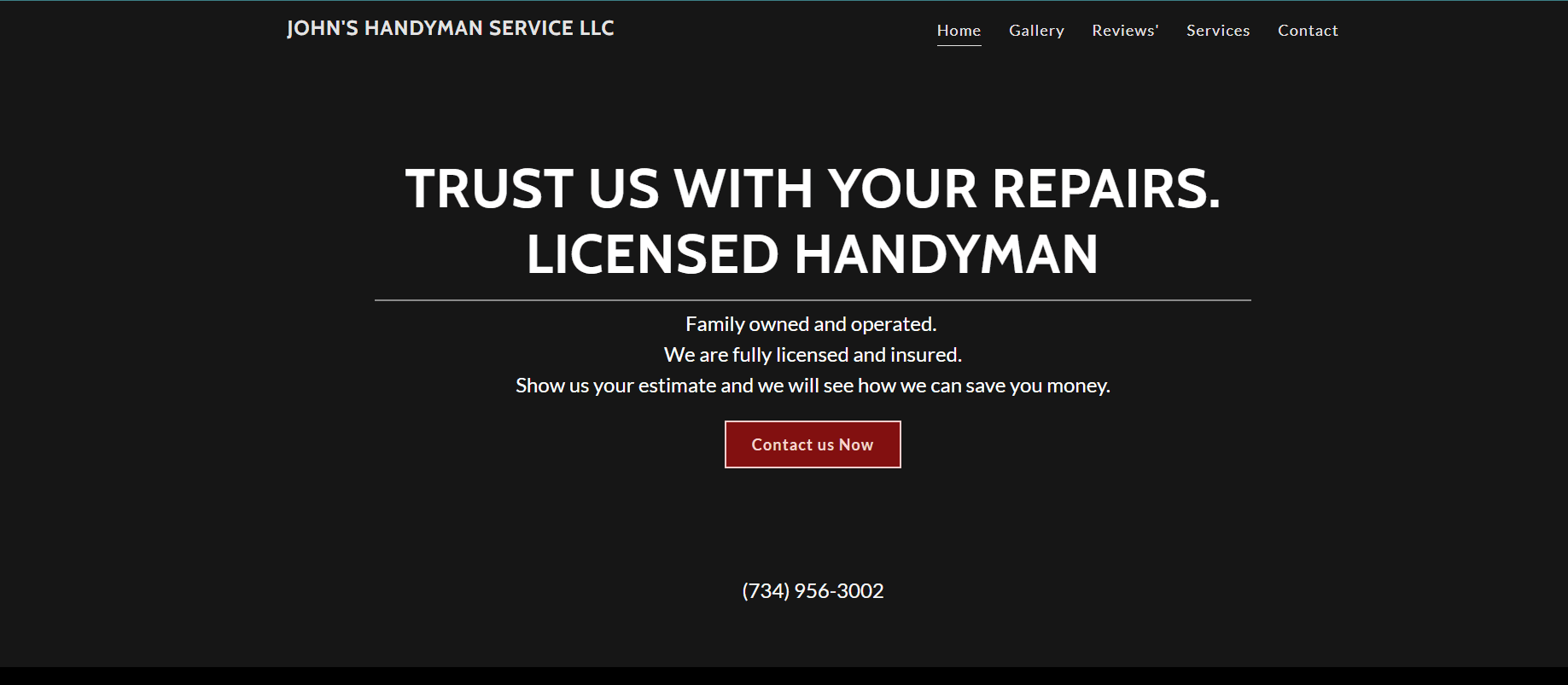
14. Johnny’s Handyman Services
Location City In The US: Livonia, MI
3 Key Takeaways:
- Visually Pleasing Design: Strong emphasis on aesthetics for a positive first impression.
- Great User Experience: Intuitive layout makes it easy to find information.
- Clear Call-to-Action: Guides visitors toward service requests.
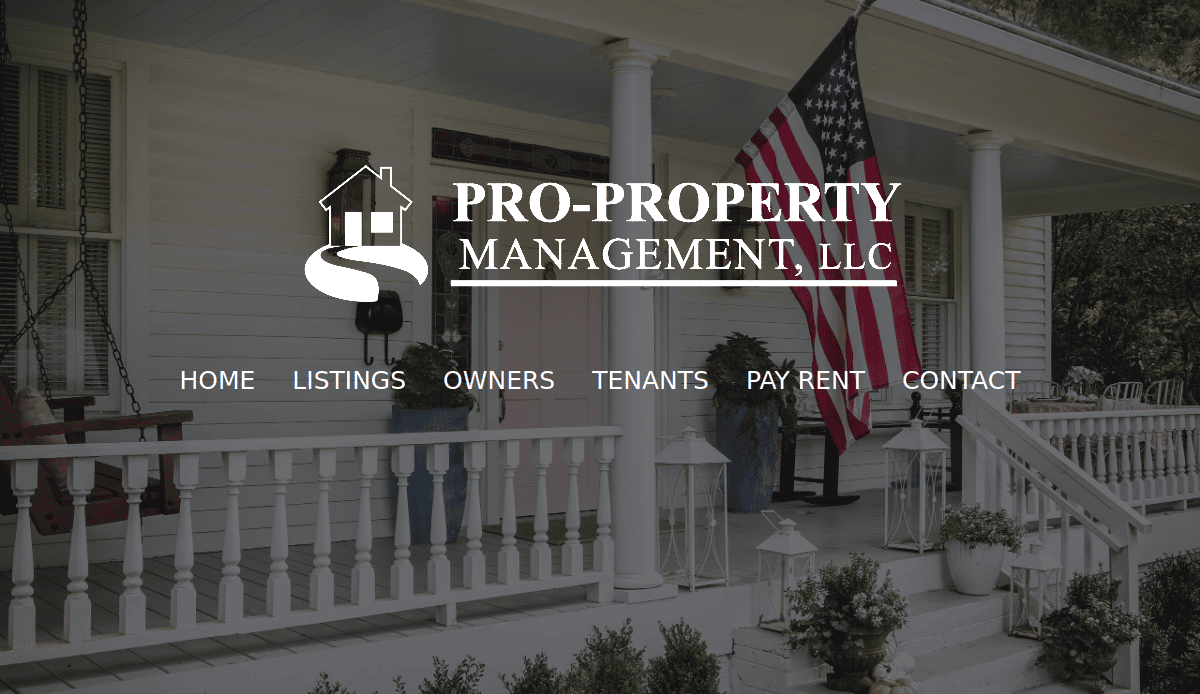
15. Pro Property
Location City In The US: Lewiston, ID
3 Key Takeaways:
- Modern Design: Sleek and contemporary look.
- Clear Service Presentation: Services for home repairs are presented in an easy-to-understand manner.
- Credibility Building: Often features positive reviews and service guarantees.
Examples of Web Designs Using Our Agency’s Strengths
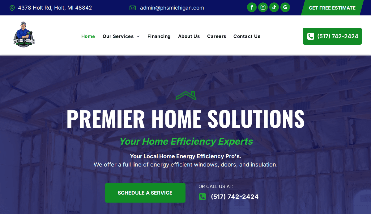
16. Premier Home Solutions
Location City In The US: Holt, IL
3 Key Takeaways:
- Integrated Local SEO: Deeply optimized for local search terms and Google Business Profile integration, common in our webmaster’s approach.
- User-Centric Navigation: Extremely clear pathways to specific home repairs and contact forms, typical of our agency’s focus on user flow.
- High-Converting CTAs: Strategically placed and compelling calls to action designed to maximize lead generation, a hallmark of their marketing-driven design.
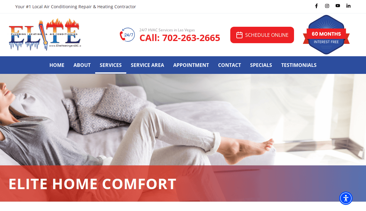
17. Elite Home Comfort
Location City In The US: Las Vegas, NV
3 Key Takeaways:
- Robust Service Pages: Each home service (HVAC, plumbing, electrical, etc.) has its own comprehensive, keyword-rich page, reflecting a thorough content strategy.
- Visual Storytelling with Project Galleries: High-quality, before-and-after photos and video tours of completed projects that resonate with prospective customers, a strength in visually driven industries.
- Fast Loading Speed: Optimized for performance and mobile devices, critical for retaining website visitors and SEO rankings, which our agency pros emphasize for contractor sites.
18. Guardian Property Maintenance
Location City In The US: Minneapolis, MN
3 Key Takeaways:
- Trust and Authority Building: Features prominent certifications, team bios, and an expert-driven blog that showcases the company’s knowledge and reliability, aligned with our content marketing focus.
- Seamless Online Booking/Quoting System: An intuitive and efficient system for scheduling services or requesting quotes, often integrated into our agency’s service-oriented designs.
- Strong Mobile-First Design: Prioritizes the experience on mobile devices, ensuring easy access and interaction for users on the go, a core tenet of modern web design.
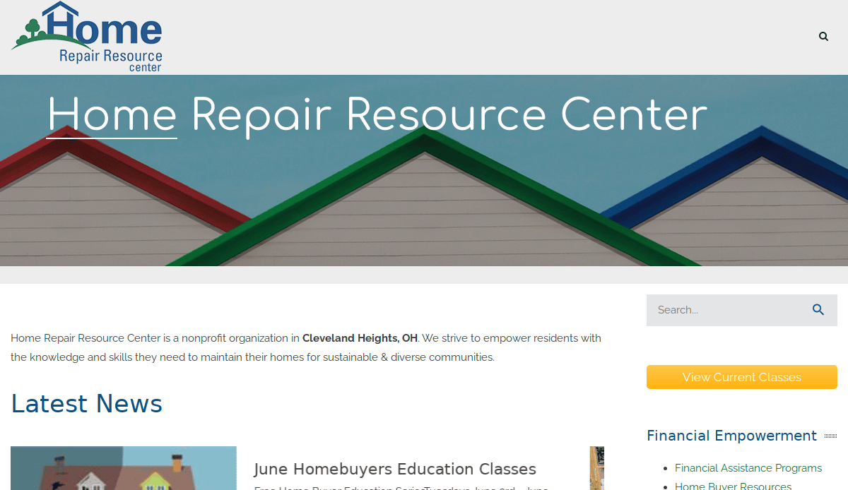
19. Home Repair Resource Center
Location City In The US: Cleveland Heights, OH
3 Key Takeaways:
- Comprehensive Resource Section: Features an extensive blog or FAQ section answering common home repair questions, establishing the site as a valuable resource, and boosting SEO.
- Clear Service Area Definition: Explicitly defines and highlights service regions, which is crucial for local SEO strategies and a common feature in well-optimized home service sites.
- Engaging Interactive Elements: May include simple tools like a “project cost estimator” or “service diagnostic quiz” to engage users and gather leads, reflecting a more advanced design tool approach.

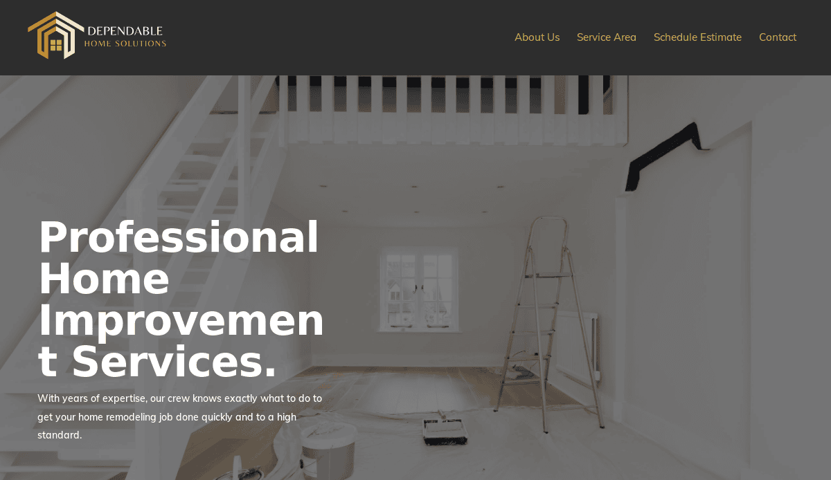
20. Dependable Home Solutions
Location In The US: Pennsylvania
3 Key Takeaways:
- Client Testimonial Integration: Customer reviews are seamlessly integrated across relevant pages, not just in a separate section, reinforcing social proof throughout the user experience.
- Secure and Credible Foundation: Focus on HTTPS, clear privacy policies, and security badges that instill confidence in your garage door (or other home repair) company.
- Scalable Architecture: Designed with future growth in mind, allowing easy expansion for new door solutions or additional home service repair offerings, characteristic of professional development.
Ready to Transform Your Garage Door Business? Let’s Build Your Digital Foundation!
You’ve now seen that a powerful company website is a critical investment that directly impacts your ability to grow your garage door business. From the strategic planning that defines your goals and targets your audience to the intricate design elements that create a seamless visitor experience, every aspect of your website’s design contributes to its overall success. A well-designed website acts as a magnet for website visitors, converting them into loyal customers seeking your services, including crucial installation and repair.
With decades of experience, we understand the unique web needs of your industry. As a result, we don’t just build websites; we craft comprehensive digital solutions that drive results. Our expertise in web design, coupled with advanced local SEO strategies, ensures your site ranks high. We ensure your website looks professional, functions flawlessly with a mobile-friendly design, and that responsive design ensures accessibility on all devices. We’ll optimize your website with relevant keywords, implement robust email marketing and social media marketing campaigns, and make sure that your website speed is crucial for retaining interest. This holistic approach maximizes your marketing, driving valuable website traffic and building confidence in your brand.
Are you ready to elevate your garage door business with a website that truly performs? Don’t let your online presence hold you back. Partner with an experienced marketing agency that knows how to optimize your website for maximum impact. Contact us Today to Get Started!
Common Questions About Garage Door Website Design
Why is a professional website essential for my business?
A professional design for your website is essential because it acts as your primary online storefront, working 24/7 to represent your garage door company. It’s where new customers search for solutions like garage door repair services, view your past work, and assess your credibility. A well-designed website builds confidence in your garage door brand and helps you enhance your online presence and attract more leads than traditional marketing for garage door businesses.
What are the most important elements for professional site design?
Key elements for effective web design for garage door companies include a visually appealing design, clear navigation, mobile responsiveness, high-quality images of your garage door services and projects, strong calls-to-action, and prominent contact information. Your website looks and functions should be top-notch to ensure a positive user experience.
How does SEO apply to a company website?
SEO is critical for marketing businesses. It ensures your website appears prominently on search engines when users search for garage door services or garage door repair. This involves optimizing your website with relevant keywords specific to your door solutions and service areas, improving your site’s technical health, and building local authority. Without strong SEO, even the best-looking website for your garage door company won’t be found.
Can I build a free website for my garage door company?
While platforms offering a free website exist, they typically lack the customization, robust SEO capabilities, and professional features required for a competitive company website. A truly effective site that can significantly grow your business often requires a professional investment in specialized web design and dedicated hosting. Think of it as an investment in a crucial marketing tool rather than just a cost.
What’s the difference between web design for garage door businesses and general web design?
Web design for professional companies is specialized because it focuses on the unique needs and customer journey within their industry. This includes showcasing specific projects, incorporating strong visual galleries, and implementing local SEO strategies crucial for service-based garage door contractors. General web design may not address these industry-specific requirements effectively.
Why is mobile-friendliness crucial?
A mobile-friendly design is paramount because many prospective customers will search for your services from their smart devices. A responsive design ensures your website looks and functions flawlessly on any screen size, providing an excellent experience. If your site isn’t device-friendly, visitors will quickly leave, hurting your website traffic and conversion rates.
How can I improve my site’s performance and conversion rates?
To optimize your website for better performance and conversions, focus on clear calls-to-action, compelling content that addresses customer pain points, excellent user experience, and fast website speed. Regularly update content, monitor analytics, and consider A/B testing different design elements. Ensuring your website builds confidence in your brand.
What kind of content should I have on my home service website?
Your website should include detailed service pages, a comprehensive gallery of past projects, customer testimonials, an FAQ section, and a blog with articles addressing common questions or industry trends. This helps you enhance your online presence by becoming a valuable resource for looking for solutions and supports your marketing through SEO.

