Just looking for our Best Flooring Website examples list?
Why Your Site Design Is the Key to Winning More Clients
Your business is built on precision, craftsmanship, and aesthetics—your website should be no different. Having a well-designed website isn’t just about looking professional; it’s about creating a digital experience that converts browsers into buyers. Whether you specialize in hardwood installs, luxury vinyl tile, or custom design, your site needs to highlight your expertise and make it easy for customers to take the next step.
A high-performing site does more than inform—it drives results. The right design enhances your business’s credibility, improves search visibility, and makes it effortless for visitors to explore services, request quotes, and trust your business. In a competitive digital landscape, the quality of your web design can be the deciding factor between a lost lead and a booked job.
This guide will show you how to transform your site from a basic vision into a strategic tool that helps your flooring business grow. Whether you’re launching a new site or revamping an outdated theme, you’ll discover the essential elements that set successful flooring websites apart—and how to implement them.
Website Planning and Purpose: Laying the Groundwork for a High-Impact Site
Every great website starts with a clear plan. Before diving into design mockups or selecting images of stunning textiles, the planning phase is where flooring professionals define their goals, understand their audience, and set the foundation for a results-driven digital presence.
Define the Purpose of Your Website
In the flooring industry, a website isn’t just a digital brochure—it’s a 24/7 sales tool. The first step is identifying what your site should accomplish. For most flooring businesses, that purpose includes:
- Attracting new clients through search engines and referrals
- Educating visitors about flooring materials, assembly processes, and service options
- Building trust through project galleries, testimonials, and company messaging
- Driving inquiries via contact forms, quote requests, or scheduling tools
Clarity on your site’s core function ensures every design and content decision aligns with a business outcome.
Identify Your Ideal Customer
A professional website should be built around the specific needs and behaviors of your target audience. Are you serving local homeowners looking for new hardwood floors? Commercial clients seeking durable solutions? Each ideal client type has different priorities. Use this phase to define:
- Demographics: Age, income, and location of your ideal clients
- Pain Points: Issues like outdated floors, confusing quotes, or a lack of trust in contractors
- Search Behavior: What terms do they type into Google when looking for flooring services?
Mapping out these customer details ensures your site content speaks directly to the people most likely to hire you.
Set Measurable Goals
A clear site strategy includes setting key performance indicators (KPIs). For flooring companies, these often include:
- Number of contact form submissions
- Local keyword rankings (e.g., “tile installation near me”)
- Call tracking data for inbound leads
- Conversion rate from website visits to consultations
Tracking these metrics will help you refine your strategy and improve ROI over time.
Build a Strategic Sitemap
Organizing your content into a logical sitemap is critical. Visitors should be able to find what they need quickly, whether it’s browsing services, viewing past projects, or requesting a quote. A solid sitemap typically includes:
- Home
- About Us
- Services (with subpages by flooring type)
- Project Gallery or Portfolio
- Testimonials or Reviews
- Contact Page
Planning this structure before designing the layout ensures a seamless experience that guides users toward conversion.
Align Branding with Business Objectives
Your business isn’t just a logo; it’s the feeling and trust your site conveys. During planning, align your site’s visual and messaging elements with your company’s identity. This includes:
- Color schemes that reflect professionalism or creativity
- Typography that’s clean and easy to read
- Messaging that reinforces your core values and service excellence
A brand-aligned site builds credibility and ensures a consistent experience from first click to final quote.
The planning phase is where successful websites are born. It’s where strategy meets creativity, ensuring your site does more than just exist—it performs. By investing time here, you’ll avoid costly revisions later and create a web presence that grows your business.
Design Principles: Crafting an Effective Site That Converts
Strong design isn’t just about looking polished—it’s about function, clarity, and trust. Your visuals must reflect craftsmanship and precision, design plays a crucial role in how potential clients perceive your business and whether they choose to do business with you. The following principles form the foundation of a site that looks great and performs consistently.
Visual Hierarchy That Guides the Eye
Your site must make it easy for visitors to find what they’re looking for without friction. A clear visual hierarchy helps organize information, prioritize calls-to-action, and highlight your most valuable offerings. Achieve this through:
- Clear headings and subheadings
- Contrasting colors to draw attention to CTAs like “Request a Quote”
- Strategic use of whitespace to reduce clutter and improve readability
The goal is to guide the user naturally from your homepage to the next step, whether it’s viewing your services or filling out a contact form.
Consistent Branding and Color Palette
A consistent visual identity across your site creates trust and brand recognition. Flooring companies should use colors, fonts, and graphic styles that reflect their brand values, whether modern and minimal or warm and traditional. Consistency should extend to:
- Logo placement and sizing
- Button styles
- Photography tones and filters
- Typography hierarchy
When every visual element reinforces your identity, your site feels more professional and reliable.
Mobile-First and Responsive Design
The majority of users will experience your website on a mobile device. A modern site must adapt seamlessly to different screen sizes and maintain performance across all devices. Responsive infrastructure ensures:
- Menus are easy to tap and navigate on phones
- Images and design scale properly for readability
- Page speed remains fast across devices
Google also prioritizes mobile usability for search rankings, so this is a non-negotiable element of modern web design.
High-Quality Visuals That Exhibit Work
Flooring is a visual business. Potential clients want to see the quality of your work before they commit. Your site must feature professional-grade photos of past projects, close-ups of porcelain or wood textures, and before-and-after galleries. Key considerations include:
- Full-width image sliders on the homepage
- Zoom-in capabilities for product details
- Organized galleries by material type or project category
Visual storytelling builds trust and reduces the perceived risk of hiring a contractor.
Clear and Actionable CTAs
Every page on your website should encourage action—whether it’s to request an estimate, view your portfolio, or call for a consultation. CTAs should be:
- Prominently placed in headers and at the end of sections
- Written in clear, direct language (“Get a Free Quote”, “Explore Our Work”)
- Designed with contrasting colors to stand out without overwhelming the theme
Effective calls-to-action drive conversions and turn passive viewers into active leads.
Fast Load Times and Optimized Performance
Slow websites drive visitors away. Web pages must load quickly to retain attention and improve your SEO. Best practices include:
- Compressing images without losing quality
- Limiting the use of heavy scripts and animations
- Hosting on a reliable, high-performance server
A fast, smooth experience helps ensure your site converts well and supports your business growth.
Design is where strategy meets execution. By applying these principles, flooring businesses like yours can build a site that looks good and delivers measurable business results through better engagement, stronger trust, and higher conversion rates.
Content & Navigation: Structuring for Clarity and Conversions
When people visit your homepage, they expect a professional experience that reflects the quality of your work. A well-structured content layout combined with intuitive navigation ensures visitors can quickly find the information they need—and take action. Poor organization leads to frustration, confusion, and lost business. This section outlines how to build a content strategy and navigation system that works for your flooring company.
Organize Content by Customer Intent
Great content doesn’t just fill space—it answers questions, removes friction, and drives decisions. To achieve this, structure your content around the most common customer intents:
- Learn About Services
Visitors want to understand the types of flooring you offer, such as ceramics, hardwood, laminate, or luxury vinyl. Dedicate a unique page or section to each service, clearly outlining features, benefits, and the assembly process. - See Examples of Past Work
Use a gallery or portfolio page to display completed projects. Organize by material, room type, or aesthetic to help users find inspiration. - Evaluate Trustworthiness
Include a testimonials or reviews page and add snippets throughout your site. This builds trust and provides proof of client satisfaction. - Take Action
Guide users to conversion with pages like “Contact Us,” “Request a Quote,” or “Schedule a Consultation.” Keep forms short, simple, and clearly visible.
Build an Intuitive Navigation Menu
Navigation is the backbone of user experience. It must be simple, clear, and easy to use across all devices. Follow these best practices:
- Keep the main menu concise:Limit to 5-7 top-level items to avoid overwhelming visitors.
- Use clear labels:Use intuitive terms like “Services,” “Gallery,” “About,” and “Contact”—avoid jargon or internal naming.
- Implement dropdowns logically:Group subpages under parent categories (e.g., “Flooring Types” > “Hardwood,” “Tile,” “Carpet”).
Consider adding a sticky header so the navigation menu remains visible as users scroll.
Design for Skimmability
Most website visitors skim rather than read every word. Break up your content into digestible sections:
- Use clear headings and subheadings to define each topic
- Incorporate bullet points and short paragraphs to improve readability
- Add visuals such as icons, photos, or diagrams to support key points
This structure improves user engagement and helps important details stand out.
Internal Linking for Better Flow and SEO
Strategic internal linking helps guide users through your site while also boosting your SEO. For example:
- Link from service pages to relevant blog posts about flooring trends
- Direct users from gallery images to a contact form or consultation page
- Reference related services from within other service pages
These links keep visitors on your site longer and increase the chances they’ll convert.
Include Local and Contact Information Prominently
Flooring clients are often searching locally, so your site should make it easy for them to get in touch. Key elements include:
- A footer with your business address, phone number, and email
- A dedicated “Contact” page with a map, contact form, and hours
- Local SEO copy that reinforces your service areas (e.g., “Serving Elmhurst and the greater Chicago area”)
This information builds trust and supports your local search visibility.
Smart content strategy and seamless navigation are essential for transforming your flooring website into a lead-generation machine. With clear structure, engaging content, and user-first design, you’ll provide a digital experience that converts visitors into loyal clientele.
Visual Elements: Showcasing Quality and Building Trust Through Design
In this industry, visuals are more than decoration—they are a direct reflection of your craftsmanship, attention to detail, and the transformation your work can deliver. Visitors are often making high-investment decisions and want to feel confident in their choice. High-quality visual elements elevate your brand and guide users through the decision-making process.
Use Professional Photography to Highlight Craftsmanship
Photos are the most powerful tool in your visual strategy. They allow clients to evaluate the finish, texture, and style of your flooring assembly before they ever speak with you. Effective use of photography includes:
- Project Galleries: Create a dedicated page featuring the completed setup. Categorize images by material (hardwood, tile, vinyl), style (modern, rustic, traditional), or room type (kitchen, basement, showroom).
- Before-and-After Sliders: Show transformations to demonstrate the value and quality of your work.
- Hero Images: Use full-width banner images on your homepage to create immediate visual impact and set the tone for your brand.
Always use high-resolution images that are well-lit and professionally composed to build trust and credibility.
Visual Hierarchy to Guide the User
Good design uses visual hierarchy to lead users to the most important content. Elements such as size, color, contrast, and spacing help prioritize content without overwhelming visitors. Best practices include:
- Headline Placement: Ensure primary headlines are bold and centered, drawing the eye to key messages.
- CTAs with Contrast: Use button styles that stand out from the background but still align with your overall brand palette.
- Whitespace: Use negative space intentionally to make content feel approachable and digestible.
This hierarchy enhances the aesthetic and improves usability, helping visitors take desired actions faster.
Integrate Branded Visuals Consistently
Consistency in visual design strengthens your brand identity and keeps the experience professional. Make sure the following elements are uniform across all pages:
- Color Palette: Choose 2–3 main colors that align with your brand and use them consistently for backgrounds, buttons, and text highlights.
- Typography: Stick to one or two font families for a clean and cohesive look.
- Graphic Elements: Use icons, dividers, and textures (like wood grain or ceramic patterns) subtly throughout the site to reinforce your service focus without cluttering the layout.
These elements should be built into your chosen theme or format to maintain consistency as your site evolves.
Use Video and Interactive Media to Educate
Videos add a dynamic layer to your visual presentation and help explain complex services like floor assembly or refinishing. Consider:
- Walkthrough Videos: Tour a completed project to show flow and finish.
- Explainer Videos: Brief clips that clarify your process or highlight materials.
- Interactive Room Visualizers: Allow users to preview different flooring options in a virtual space, increasing engagement and buyer confidence.
These tools enhance the user experience and reduce barriers to decision-making.
Optimize Visuals for Performance and Accessibility
While visuals are essential, they must be optimized to support performance:
- Compress Images: Reduce file sizes to maintain fast page speeds without sacrificing quality.
- Responsive Sizing: Ensure images scale properly on mobile, tablet, and desktop.
- Alt Text: Add descriptive alt tags to every image to support screen readers and boost SEO.
A visually compelling aesthetic reinforces your expertise and builds immediate confidence. When done right, your visuals will tell your brand’s story, exhibit your best work, and guide users toward becoming paying clientele.
Visual Elements: Showcasing Quality and Building Trust
In the flooring industry, visuals are more than decoration—they are a direct reflection of your craftsmanship, attention to detail, and the transformation your work can deliver. Visitors to your homepage are often making high-investment decisions and want to feel confident in their choice. High-quality visual elements elevate your brand and guide users through the decision-making process.
Use Professional Photography to Highlight Craftsmanship
Photos are the most powerful tool in your visual strategy. They allow clients to evaluate the finish, texture, and style of your flooring setups before they ever speak with you. Effective use of photography includes:
- Project Galleries: Create a dedicated page featuring completed projects. Categorize images by material (hardwood, porcelain, vinyl), style (modern, rustic, traditional), or room type (kitchen, basement, showroom).
- Before-and-After Sliders: Show transformations to demonstrate the value and quality of your work.
- Hero Images: Use full-width banner images on your homepage to create immediate visual impact and set the tone for your brand.
Always use high-resolution images that are well-lit and professionally composed to build trust and credibility.
Visual Hierarchy to Guide the User
Good design uses visual hierarchy to lead users to the most important content. Elements such as size, color, contrast, and spacing help prioritize content without overwhelming visitors. Best practices include:
- Headline Placement: Ensure primary headlines are bold and centered, drawing the eye to key messages.
- CTAs with Contrast: Use button styles that stand out from the background but still align with your overall brand palette.
- Whitespace: Use negative space intentionally to make content feel approachable and digestible.
This hierarchy enhances the aesthetic and improves usability, helping visitors take desired actions faster.
Integrate Branded Visuals Consistently
Consistency in visual design strengthens your brand identity and keeps the experience professional. Make sure the following elements are uniform across all pages:
- Color Palette: Choose 2–3 main colors that align with your brand and use them consistently for backgrounds, buttons, and text highlights.
- Typography: Stick to one or two font families for a clean and cohesive look.
- Graphic Elements: Use icons, dividers, and textures (like wood grain or tile patterns) subtly throughout the site to reinforce your service focus without cluttering the aesthetic.
These elements should be built into your chosen theme or design template to maintain consistency as your site evolves.
Use Video and Interactive Media to Educate
Videos add a dynamic layer to your visual presentation and help explain complex services like floor installation or refinishing. Consider:
- Walkthrough Videos: Tour a completed project to show flow and finish.
- Explainer Videos: Brief clips that clarify your process or highlight materials.
- Interactive Room Visualizers: Allow users to preview different flooring options in a virtual space, increasing engagement and buyer confidence.
These tools enhance the user experience and reduce barriers to decision-making.
Optimize Visuals for Performance and Accessibility
While visuals are essential, they must be optimized to support performance:
- Compress Images: Reduce file sizes to maintain fast page speeds without sacrificing quality.
- Responsive Sizing: Ensure images scale properly on mobile, tablet, and desktop.
- Alt Text: Add descriptive alt tags to every image to support screen readers and boost SEO.
A visually compelling site reinforces your expertise and builds immediate confidence. When done right, your visuals will tell your brand’s story, exhibit your best work, and guide users toward becoming paying customers.
Ongoing WordPress Maintenance: Stay Secure
Once your site is launched, the work isn’t over. A WordPress site requires regular maintenance to stay secure, functional, and fast. Neglecting upkeep can lead to broken pages, security vulnerabilities, or a poor visitor experience—all of which hurt your reputation and search visibility. Ongoing maintenance is essential to ensure a site continues to generate leads and support business growth.
Keep WordPress Core, Themes, and Plugins Updated
The CMS regularly releases updates to improve performance, fix bugs, and patch security risks. The same applies to your theme and installed plugins. Failing to apply these updates can create vulnerabilities that hackers exploit or result in plugin conflicts that break features. Set a schedule to:
- Update core files as soon as new versions are stable
- Update plugins weekly, especially those related to contact forms, galleries, or page builders
- Review theme updates for design or compatibility enhancements
Consistent updates help ensure your site remains compatible with the latest technology standards and web browsers.
Monitor Site Speed and Performance
Slow-loading websites frustrate users and hurt your rankings in search engines. Professional sites often feature high-resolution images, galleries, and videos—all of which can slow down your site if not optimized. Maintenance routines should include:
- Compressing large media files without sacrificing quality
- Running regular speed tests using tools like Google PageSpeed Insights or GTmetrix
- Implementing caching and content delivery networks (CDNs) to improve load times
A fast site keeps visitors engaged and improves your chances of converting them into leads.
Back Up Your Website Regularly
Website backups protect your business against unexpected problems like hacking, server failures, or accidental content deletions. A proper backup strategy includes:
- Daily or weekly backups of your full website and database
- Storing backups securely off-site or in the cloud
- Testing backup restoration to ensure the files are recoverable when needed
If something goes wrong, having a backup means your site can be restored quickly with minimal disruption.
Perform Routine Security Checks
Security threats evolve constantly. Flooring businesses are not immune, especially as they collect visitor information through forms or appointment requests. Protect your site with:
- A firewall and malware scanner
- Brute-force protection for login areas
- Strong, regularly updated passwords for admin accounts
- SSL certificate enforcement to ensure data encryption
Scheduled security scans and proactive monitoring reduce the risk of downtime and data breaches.
Check for Broken Links and Visual Errors
Websites evolve—pages are updated, links change, and plugins get deprecated.Regular audits help catch problems before visitors do:
- Test contact forms and CTA buttons to ensure they still function
- Use tools like Broken Link Checker to find and fix dead links
- Scan for theme issues caused by plugin updates or browser changes
A polished, error-free experience reflects the professionalism of your flooring business.
Maintain SEO Health
Ongoing maintenance also supports your search engine performance.SEO best practices are not one-time tasks—they require continual attention:
- Monitor keyword rankings and update content to stay competitive
- Refresh service pages and project galleries with new images or copy
- Add new blog posts or FAQs that target relevant search queries
Maintaining your website’s SEO ensures it continues to attract qualified traffic over time.
A WordPress website should be a long-term asset, not a one-time project. With consistent maintenance, your site remains secure, fast, and aligned with your brand’s growth, ensuring it continues to deliver value month after month.
Best Flooring Web Design Examples
Here are 20 of the best flooring service websites in the U.S., including five designed by our professionals. Each example highlights key elements that contribute to an effective online presence in the flooring industry.
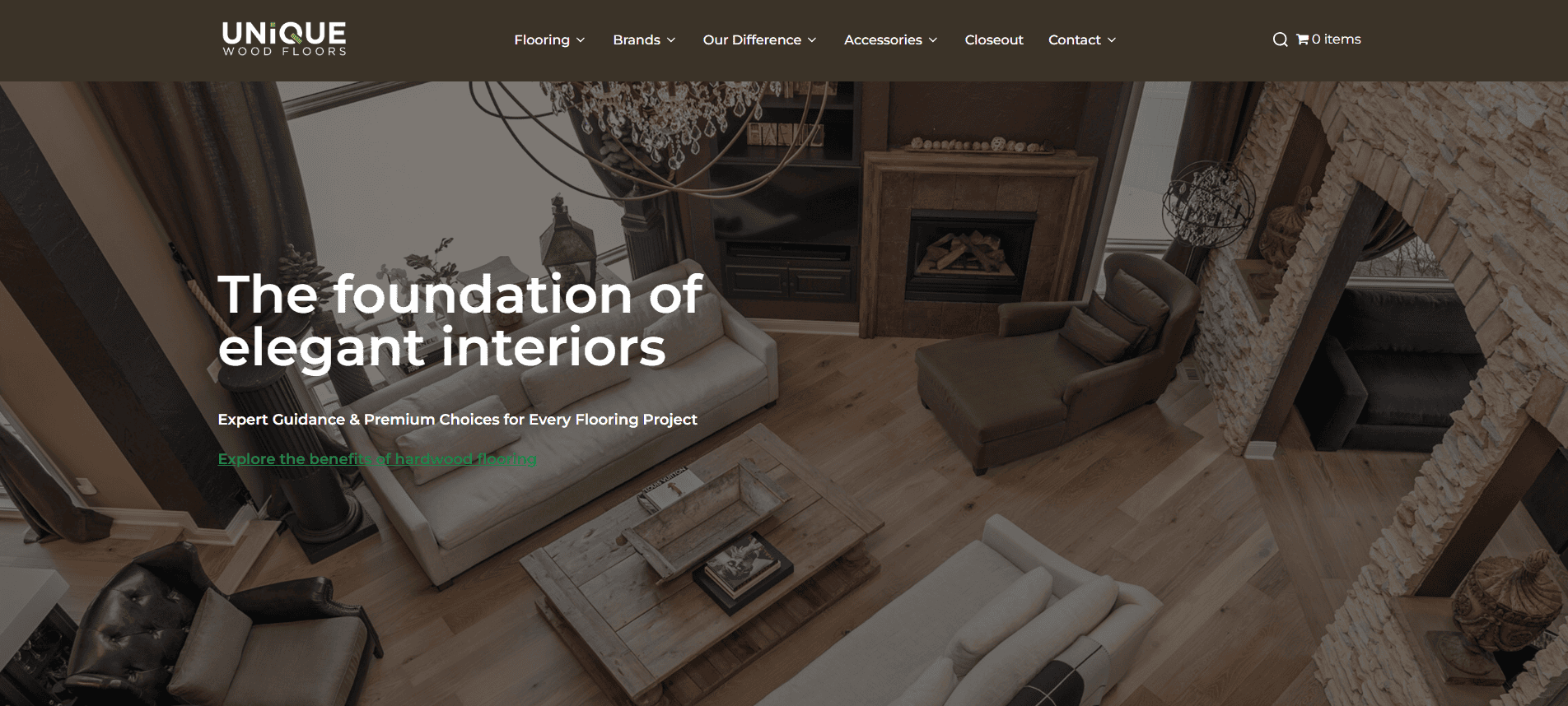
1. Unique Wood Floors – Minneapolis, MN
- Elegant and modern aesthetic
- High-resolution project imagery
- Streamlined navigation with clear calls-to-action
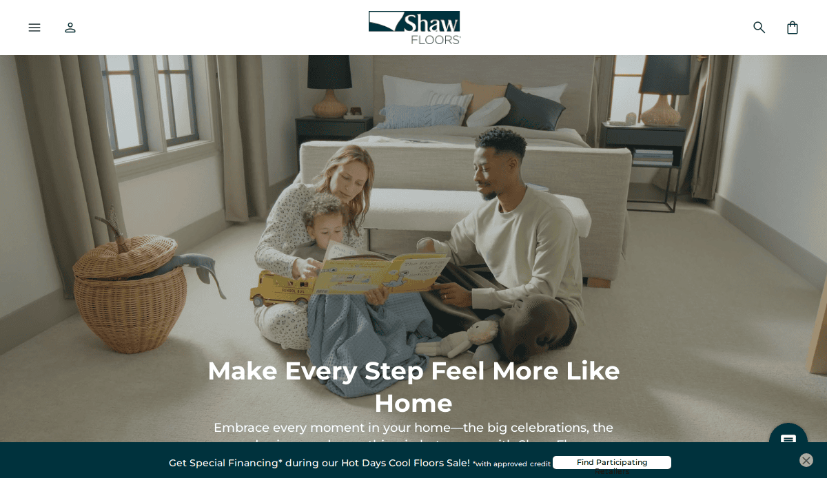
2. Shaw Floors – Dalton, GA
Key Takeaways:
- Sleek monochromatic color scheme
- User-friendly interface
- Prominent calls-to-action throughout the site
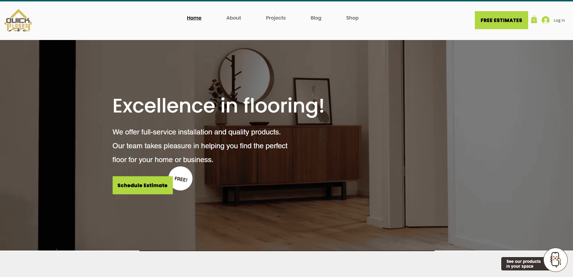
3. Quick Floors – Minneapolis, MN
Key Takeaways:
- Professional aesthetic with subtle graphics
- Accessible design with bright link colors
- Engaging testimonials section
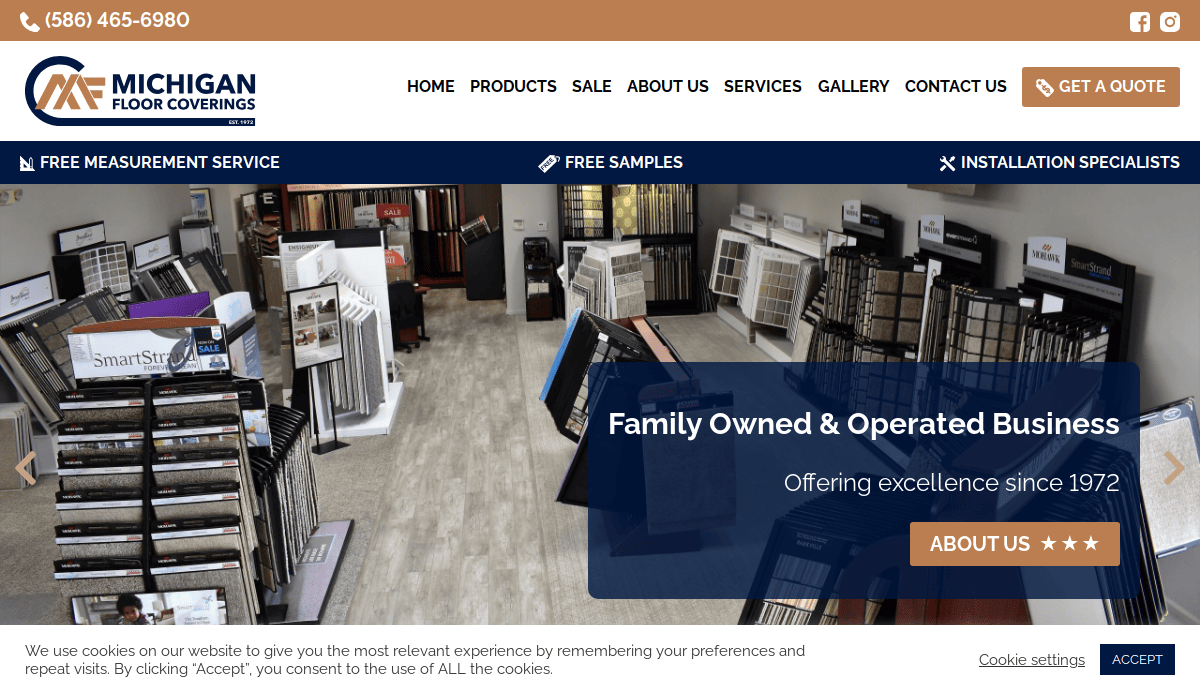
4. Michigan Floor Coverings – Detroit, MI
Key Takeaways:
- Dark blue banners highlight important information
- Professional color palette
- Planned imagery aimed at conversions
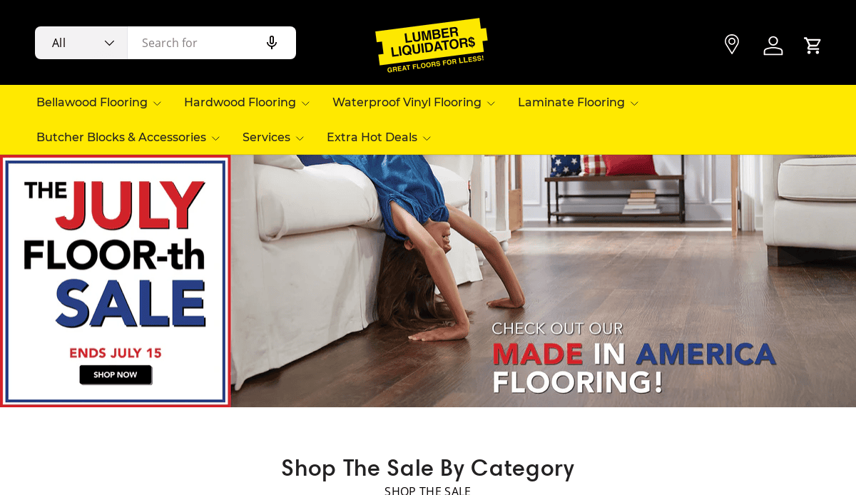
5. LL Flooring – Richmond, VA
Key Takeaways:
- Distraction-free theme
- Imagery titles double as navigation buttons
- Domain matches company name for ease of use
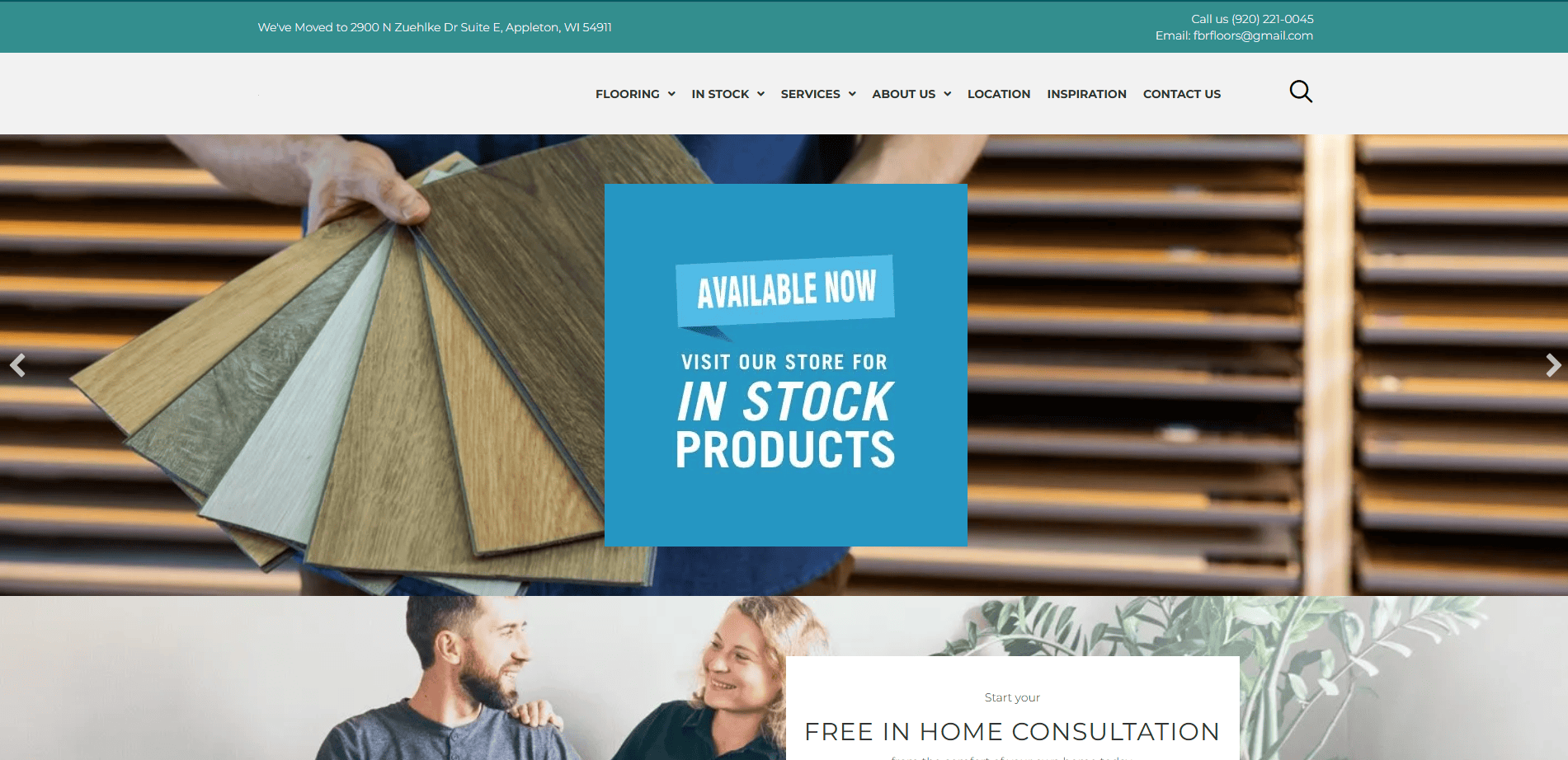
6. Floors by Roberts – Appleton, WI
Key Takeaways:
- Attractive color scheme of blue, white, and black
- Short, concise paragraphs for clarity
- “Trending now” section adds dynamic content
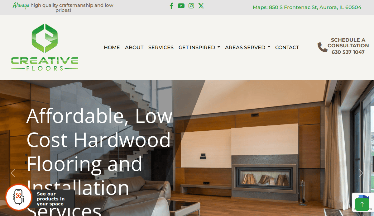
7. Creative Flooring – Grand Rapids, MI
Key Takeaways:
- Use of orange as an accent color
- Organized imagery layout
- Structured information presentation
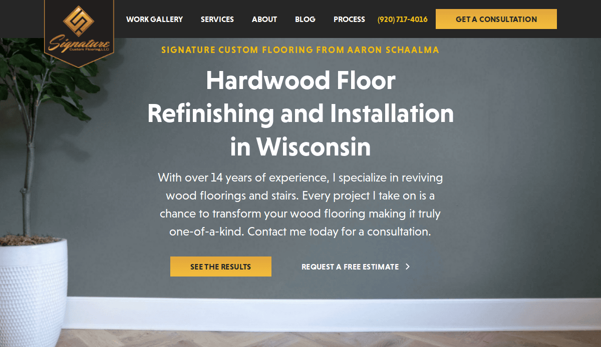
8. Signature Custom Flooring – Waupaca, WI
Key Takeaways:
- Thoughtful logo design
- Inclusion of a blog for added value
- User-friendly photo gallery
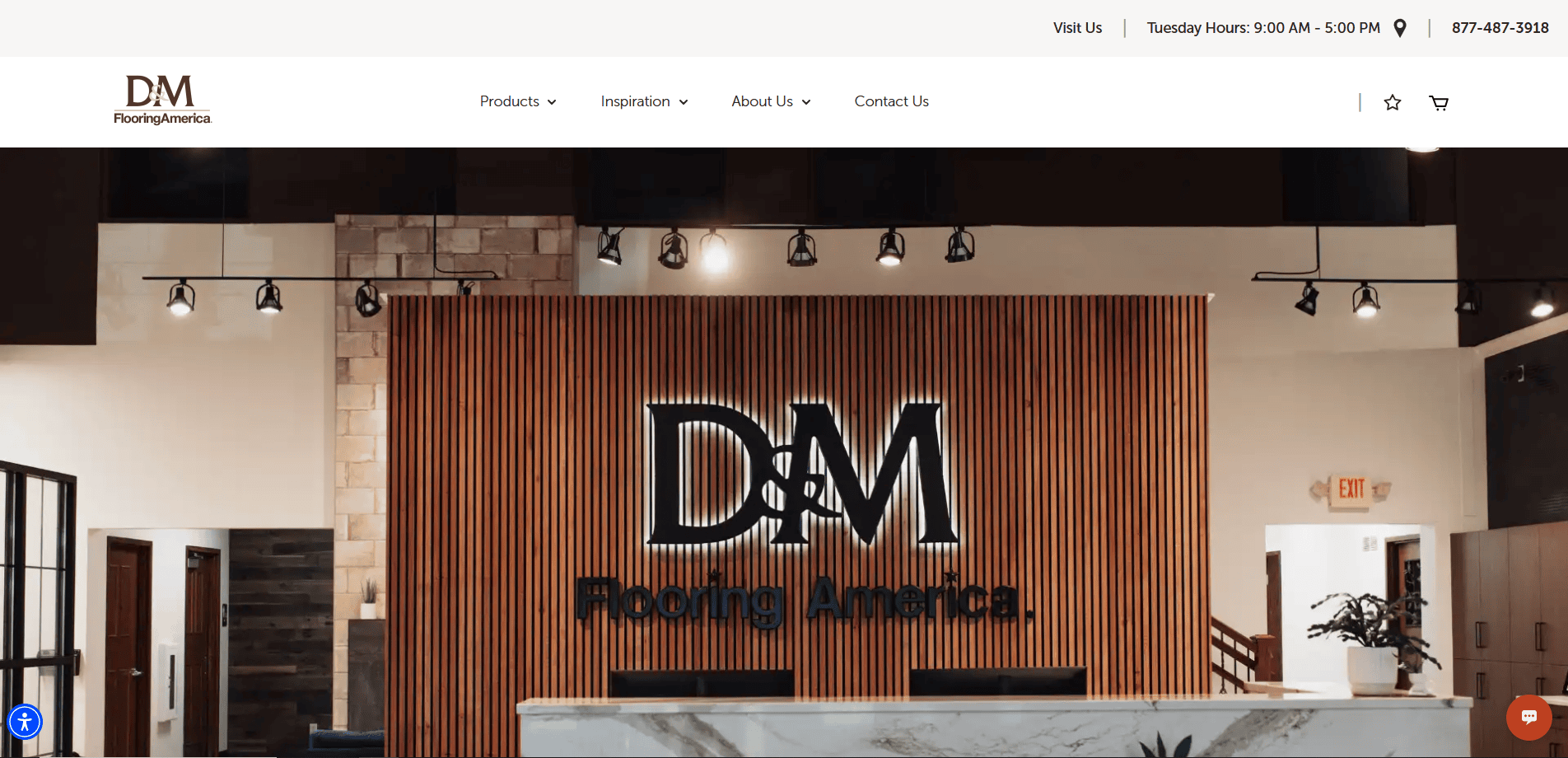
9. D&M Interiors – Appleton, WI
Key Takeaways:
- Bolded fonts to emphasize key points
- Progression bar enhances user experience
- Simple navigation for ease of use
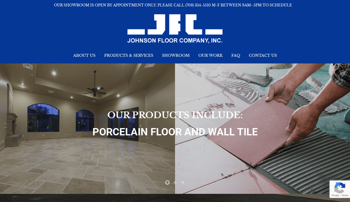
10. Johnson’s Flooring – Chicago, IL
Key Takeaways:
- Balanced white and red color scheme
- Easy-to-find buttons improve accessibility
- Concise content enhances readability
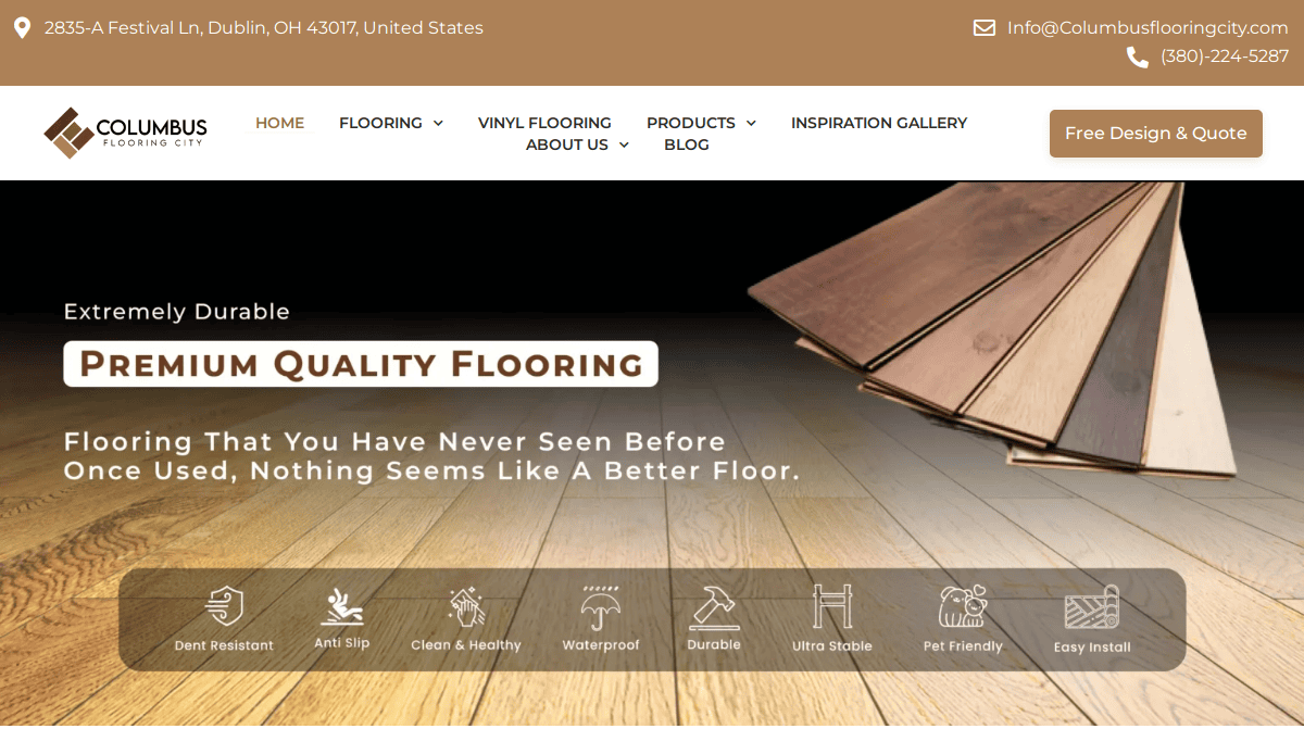
11. Columbus Flooring City – Columbus, OH
Key Takeaways:
- Color palette matches company branding
- Effective use of icons
- Simple contact information for accessibility
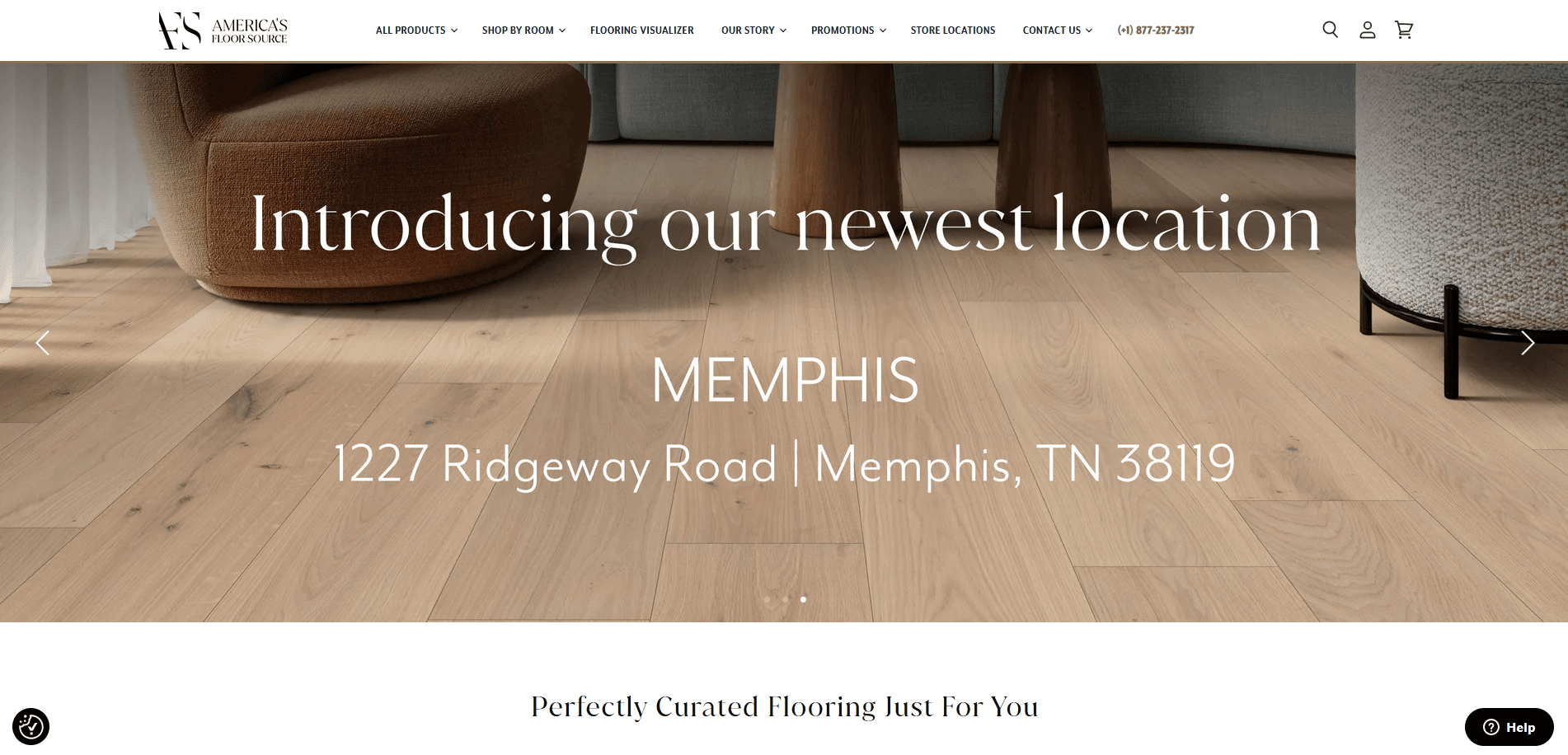
12. America’s Floor Source – Columbus, OH
Key Takeaways:
- Captivating fonts enhance visual appeal
- Use of square-like frames and color blocks
- Domain matches company name for brand consistency
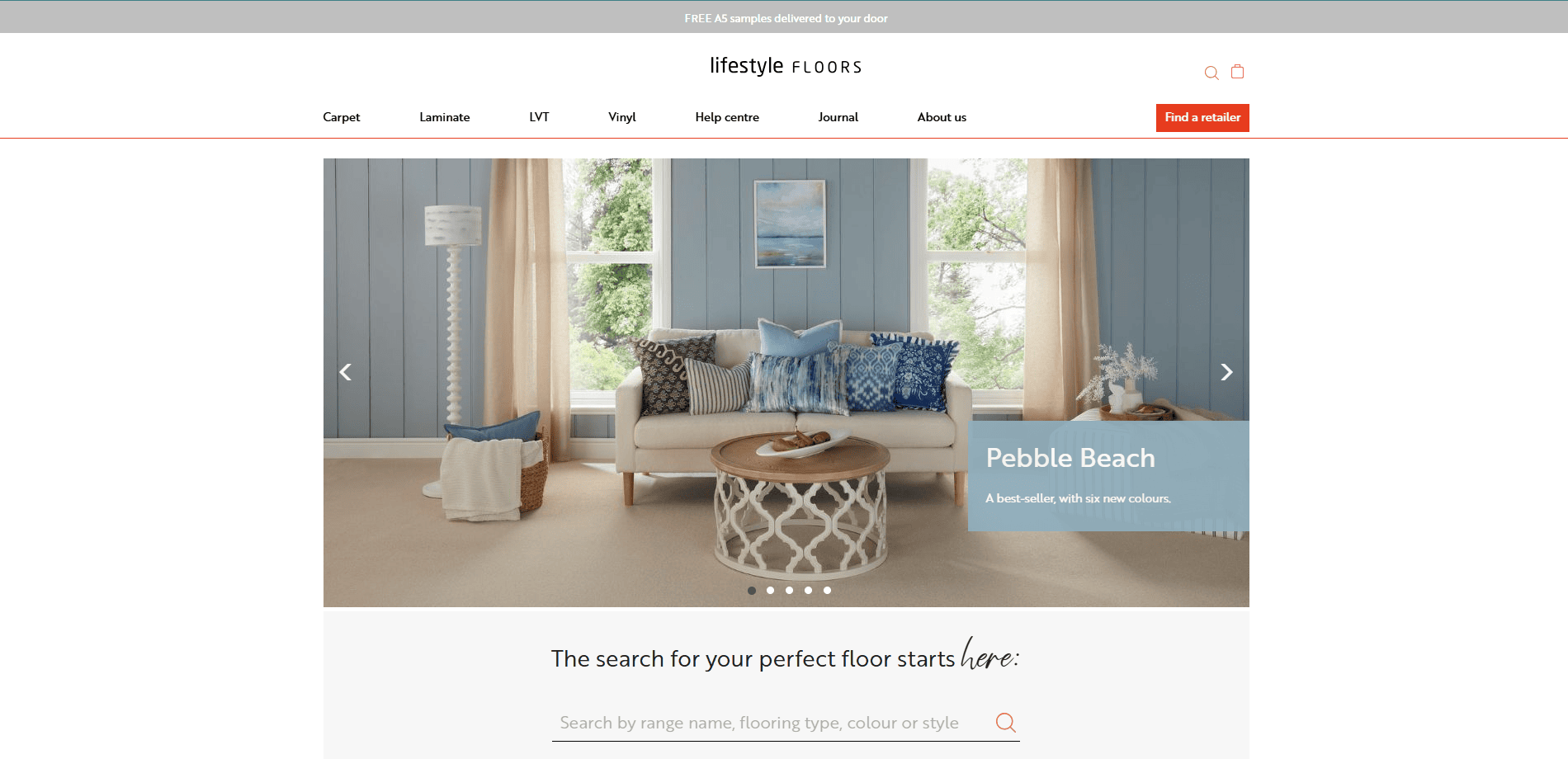
13. Lifestyle Flooring – San Diego, CA
Key Takeaways:
- Variety of blue tones creates a calming effect
- Easy-to-navigate theme
- Simple contact information enhances usability
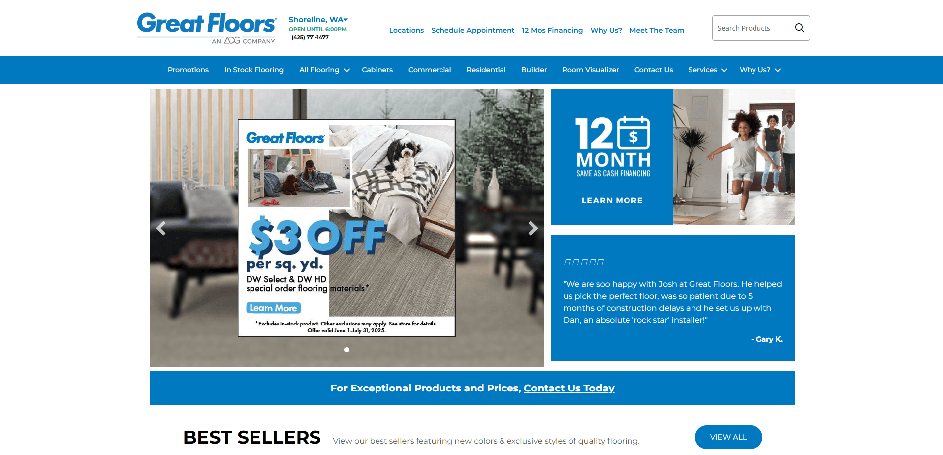
14. Great Floors – Coeur d’Alene, ID
Key Takeaways:
- Creative logo design stands out
- Different-sized fonts for title emphasis
- Wavy background patterns add visual interest
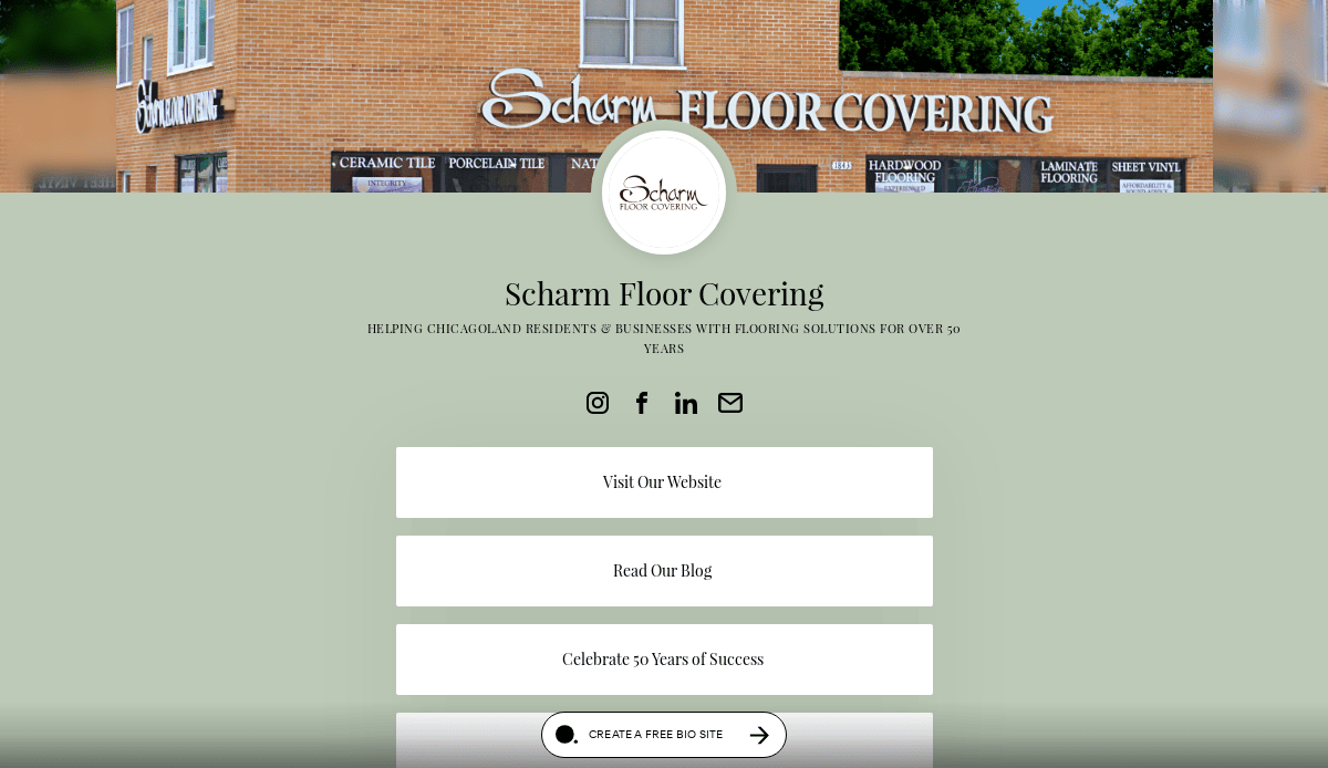
15. Scharm Floor Covering – Des Plaines, IL
Key Takeaways:
- Information-packed homepage
- Bold typography engages visitors
- Product carousel showcases showroom images
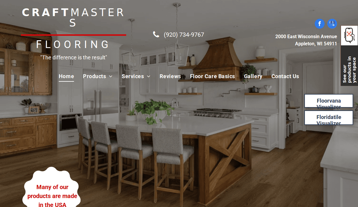
16. CraftMasters Flooring – Appleton, WI
Key Takeaways:
- Consistent bold typography throughout
- Full-width high-quality images
- Pinned contact feature for easy communication
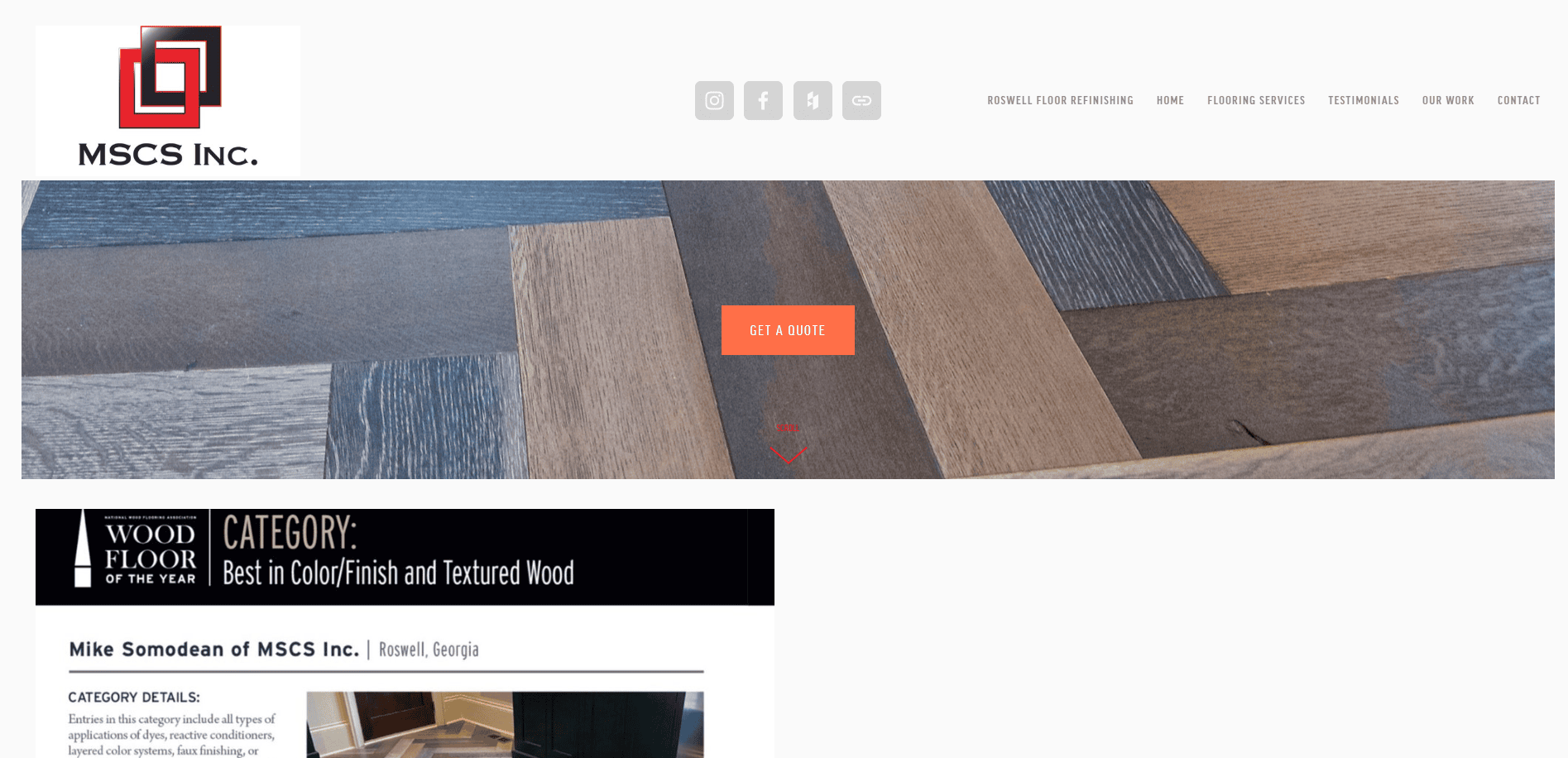
17. MSCS Inc. – Roswell, GA
Key Takeaways:
- Full-width black-and-white image slideshow
- Clean and modern aesthetic
- Clear navigation enhances user experience
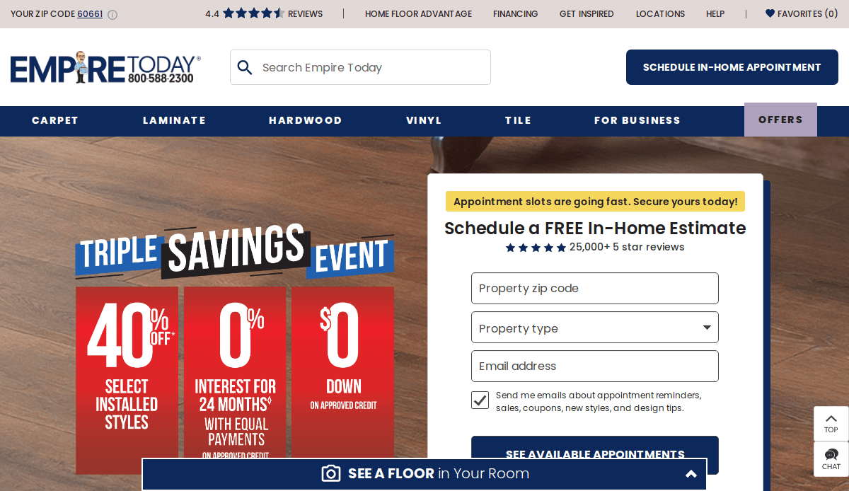
18. Empire Today – Northlake, IL
Key Takeaways:
- Strong brand recognition
- Comprehensive service offerings
- User-friendly online scheduling
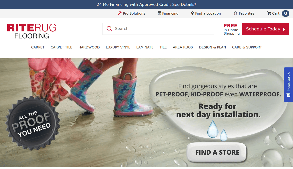
19. RiteRug Flooring – Columbus, OH
Key Takeaways:
- Long-standing industry presence
- Wide range of flooring options
- In-home shopping service for convenience
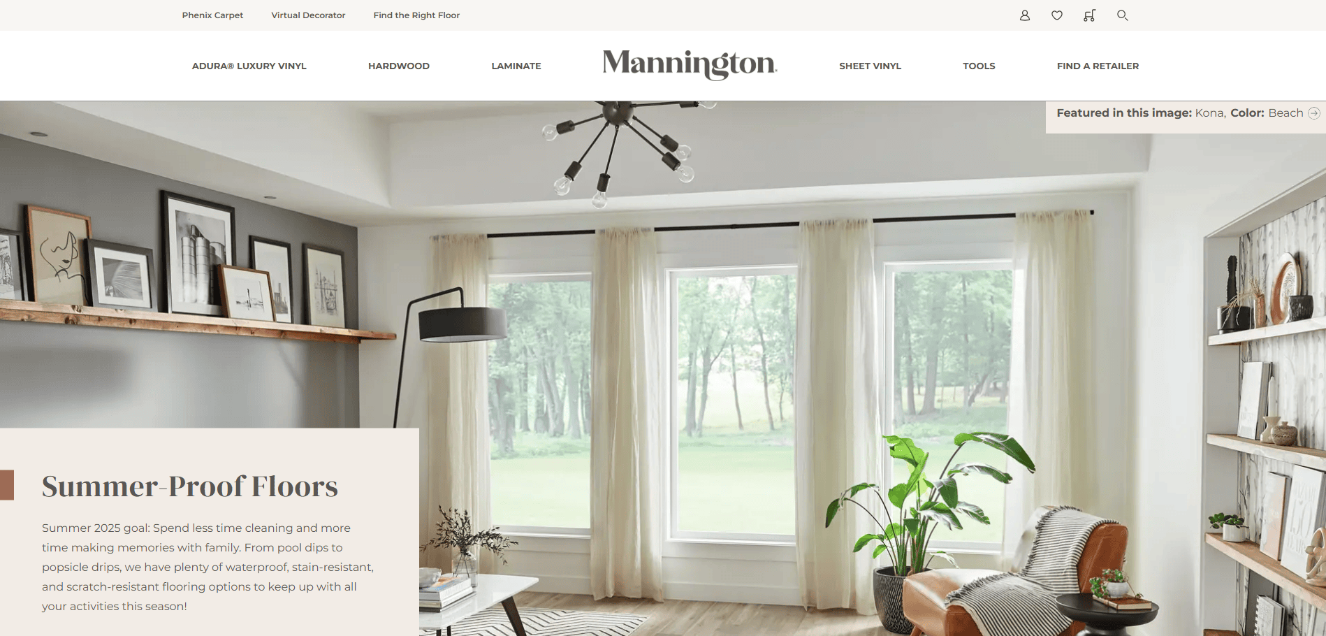
20. Mannington Mills – Salem, NJ
Key Takeaways:
- Family-owned with a century of experience
- Diverse product offerings
- Commitment to sustainability
Ready to Elevate Your Flooring Business Online?
A high-performing website isn’t just a digital placeholder—it’s a lead-generation engine, a trust-building platform, and a visual representation of your craftsmanship. Whether you’re competing against local flooring contractors or aiming to appear alongside the best flooring websites in search results, investing in strategic design elements and consistent optimization is essential to growing your business online.
At our top-tier web development agency, we tailor every project to your unique brand, market, and goals. From SEO-optimized sites to a full analytics setup and mobile-friendly performance tuning, our services are built to convert more leads and set you apart from the average contractor websites cluttering the web. If you’re ready for a site that delivers measurable results, we’re the web design firm that’s ready to help.
Let’s talk about your website needs, your goals, and how to position your business ahead of the next competitor.
Your Frequently Asked Questions Answered
What should a flooring contractor include on their homepage?
Your homepage should immediately highlight what sets your services apart. Focus on clarity—state your core offerings (e.g., hardwood installation, slab refinishing), show off completed projects with professional imagery, and feature key trust signals like client reviews or industry certifications. Add a compelling call-to-action to guide users toward requesting a quote or contacting you. For help crafting an effective homepage, visit our WordPress web services page.
How can I make my flooring business stand out online?
Standing out online starts with creating an experience that instills trust and communicates value. Use before-and-after galleries, video walkthroughs of projects, and detailed service explanations. Focus heavily on local SEO, including optimizing your Google Business Profile and collecting honest reviews from local clients. Unique content that addresses the needs of your local audience helps you outperform generic competitors.
Is WordPress a good platform for flooring professionals?
Yes. WordPress offers the flexibility, scalability, and control most flooring professionals need, without locking you into a proprietary system. It supports custom visuals, integrates well with SEO tools, and allows you to manage blog content, testimonials, and project updates easily. To see if it’s a good fit for you, explore our WordPress services.
How often should I update my content?
You should refresh content quarterly at a minimum. That includes updating service descriptions, adding new photos to project galleries, and publishing blog posts that answer common questions. Fresh content signals activity to search engines and shows visitors that your business is current and engaged.
Why is mobile performance so important?
More than half of all online searches come from mobile devices. If your online presence is slow, difficult to navigate, or hard to interact with on a smartphone, potential leads will leave. Mobile usability is also a ranking factor for Google, meaning it impacts how you appear in search results.
What is the benefit of including a project gallery?
Visual proof is key in flooring marketing. A gallery helps build confidence by showing the quality and range of your past work. Organize your gallery by material type or project type, and include captions that explain your process or challenges you solved. This doubles as powerful visual content and builds authority with prospects.
How do customer testimonials impact conversions?
Testimonials provide social proof that your company delivers results. They reduce skepticism and help answer unspoken objections. Use real names and, where possible, include photos of the finished project alongside the review. A strong testimonials page can often outperform traditional service descriptions in persuading hesitant prospects.
What are the most important SEO tactics for local flooring contractors?
Focus on optimizing for local search intent:
- Keep your name, address, and phone number consistent across directories
- Use location-specific keywords throughout your content
- Embed a map and service area references
- Build local backlinks from relevant directories or partner businesses
Should I invest in a blog for my business?
A blog helps improve search visibility and educates potential clients. Topics like “How to choose between laminate and hardwood” or “Top maintenance tips for decorative surfaces” improve keyword rankings and position you as an expert. A well-maintained blog becomes a long-term asset for traffic and trust.
How can I track if my online efforts are working?
You should monitor traffic sources, bounce rates, form submissions, and call volume through tools like Google Analytics and call tracking software. If you’re unsure how to set this up, we offer analytics integration and conversion tracking as part of our marketing services to help measure ROI and adjust tactics accordingly.

