Just looking for our Best Fitness Website examples list?
Creating an effective fitness website requires a strategic blend of user-centric design, SEO optimization, and engaging content. Here are the essential takeaways to guide your professional website development.
Key Takeaways:
- Prioritize User Experience (UX)
- Design intuitive navigation and responsive layouts to ensure seamless access across all devices.
- Incorporate interactive elements like virtual tours and real-time class schedules to engage visitors.
- Optimize for Search Engines
- Conduct thorough keyword research to target terms your potential clients are searching for.
- Implement on-page SEO best practices, including optimized meta tags, headers, and image alt texts.
- Leverage local SEO strategies to attract clients in your geographic area.
- Highlight Unique Value Propositions
- Clearly communicate what sets your fitness business apart, such as specialized programs or unique training philosophies.
- Use high-quality visuals and compelling copy to showcase your brand’s personality and offerings.
- Integrate Essential Features
- Include functionalities like online booking systems, membership portals, and e-commerce capabilities for selling merchandise or digital products.
- Ensure all features are user-friendly and enhance the overall experience.
- Build Trust and Credibility
- Feature testimonials, success stories, and certifications to establish authority and reliability.
- Maintain transparency with clear pricing, privacy policies, and contact information.
- Create Engaging and Valuable Content
- Develop a content strategy that includes blog posts, workout guides, and nutrition tips to provide ongoing value to visitors.
- Regularly update content to reflect the latest trends and information in the fitness industry.
- Monitor and Adapt
- Utilize analytics tools to track user behavior and website performance.
- Be prepared to make data-driven adjustments to improve user engagement and conversion rates.
By focusing on these key areas, your fitness website can effectively attract and retain clients, stand out in a competitive market, and support the growth of your business.
Why Your Fitness Website Design Is the Key to Growing Your Business
Your website isn’t just a digital brochure—it’s your most powerful sales tool. Whether you run a gym, offer personal training services, or manage a yoga studio, potential clients are judging your business by your online presence before they ever walk through your doors.
A well-designed website can do more than just look good. It can attract the right clients, drive online bookings, build credibility, and ultimately fuel business growth. On the other hand, a poorly designed or outdated site can repel visitors, hurt your brand, and cost you revenue.
This guide breaks down everything you need to know to build a fitness website that looks great and performs exceptionally. From user-friendly layouts and SEO strategy to conversion-driven features and design inspiration, we’ll walk you through the complete process to ensure your site stands out and drives results. Whether you’re launching your first site or redesigning an old one, this is the blueprint for success.
Website Planning & Purpose: Building the Right Foundation
Before a single pixel is placed or a line of code is written, successful web design starts with clear planning. This foundational phase shapes everything from UX to conversion rates, helping ensure your site meets the specific needs of your business and your audience.
Clarify Your Business Objectives
Start by defining what your website needs to accomplish. Is your goal to increase gym memberships? Book more personal training sessions? Sell online fitness programs or merchandise? Clear business goals will determine the site’s structure, functionality, and content strategy.
Understand Your Target Audience
A website must be designed with your ideal client in mind. Are you targeting busy professionals seeking convenient virtual workouts, local residents looking for group classes, or fitness enthusiasts investing in personal training? Consider their demographics, fitness goals, digital habits, and expectations. This ensures your messaging, layout, and features resonate and convert.
Determine Your Unique Value Proposition
What sets your fitness business apart? Whether it’s specialized training programs, exclusive equipment, a tight-knit community, or expert instructors, your site should immediately communicate this value. Use design elements, headlines, and visual storytelling to showcase what makes your brand different.
Choose the Right Platform
Your CMS (Content Management System) is the engine behind your website. WordPress is often the preferred choice due to its flexibility, scalability, and access to fitness-focused themes and plugins. Choose a platform that supports your current goals and can scale with your growth.
Plan Your Website Features and Structure
A strategic sitemap and feature set ensure your users find what they need quickly. Common must-haves for fitness websites include:
- Class schedules with filtering options
- Online booking or membership sign-up tools
- Trainer bios with certifications and specialties
- Clear pricing and service information
- Integrated blog or resources section for SEO and engagement
Create a Content Strategy
Plan ahead for the type of content you’ll publish and update regularly. Highlight services, promote special offers, and share client success stories. A consistent publishing plan supports SEO and builds trust and engagement with your audience.
Site design success starts long before development begins. When planning is handled with purpose, the end result is a website that looks impressive and actively supports your business growth goals.
Design Principles That Drive Results
A visually striking website can grab attention, but without strong design principles, it won’t convert visitors into clients. Great design is about more than aesthetics; it’s about function, clarity, and persuasion. The following core principles form the backbone of a high-performing site that converts traffic into leads and members.
- Clarity and Simplicity
Visitors should understand who you are and what you offer within seconds of landing on your homepage. Use clean layouts, concise messaging, and clearly defined sections to eliminate confusion. Avoid visual clutter and ensure every element has a clear purpose. - Strong Visual Hierarchy
Design elements should guide users’ eyes through your site in a logical and persuasive sequence. Use size, contrast, and placement to emphasize key areas—like your services, calls-to-action, and value propositions. Headlines should grab attention, while supporting text delivers details. - Mobile-First Responsiveness
Over 60% of fitness-related searches happen on mobile devices. Your site must be responsive—adapting seamlessly to all screen sizes without sacrificing speed, readability, or functionality. Buttons should be tap-friendly, and mobile booking or sign-up processes should be fast and intuitive. - Consistent Branding
Consistency builds trust. From color palette and typography to tone of voice and imagery, your branding should remain unified throughout the entire website. This strengthens brand recognition and creates a more professional user experience. - Visual Engagement Through Imagery and Video
Use authentic, high-quality visuals that reflect your space, your team, and your clientele. Videos showcasing your classes or client testimonials can build an emotional connection and demonstrate results. Avoid stock images that feel generic or impersonal. - Clear and Compelling CTAs
Calls-to-action should be prominently placed and action-oriented. Use strong verbs—like “Join a Class,” “Book a Free Consultation,” or “Start Your Transformation”—to drive clicks. Every page should direct users toward the next step that aligns with your business goals. - Accessibility and Readability
Make your content accessible to all users. Use legible fonts, sufficient color contrast, and logical content structure (headings, bullet points, short paragraphs). This improves usability and broadens your reach, including compliance with accessibility standards. - Fast Load Times
Professional websites with slow load speeds lose users quickly. Optimize images, minimize scripts, and use reliable hosting to keep your site fast. A few seconds of delay can dramatically reduce conversions.
Effective site design isn’t just about looking polished—it’s about guiding visitors to take action. These design principles ensure that your website reflects your brand and works as a powerful business tool.
Content and Navigation: Structuring for Engagement and Conversions
In any industry, first impressions are everything, and your website’s content and navigation play a central role in shaping that experience. Your website must deliver information clearly and quickly while guiding visitors toward the actions that matter most, whether that’s booking a session, joining a class, or learning more about your services.
Create a Clear and Logical Page Structure
Your site should be built around core pages that match your users’ intent. A well-organized sitemap improves both UX and SEO. Every website should include these essential pages:
- Homepage
- About
- Services
- Schedule or Classes
- Testimonials or Success Stories
- Contact
- Blog or Resources
Use Consistent, Client-Focused Messaging
Speak directly to your ideal client. Address their goals and pain points using clear, benefit-driven language. Every piece of content should guide users toward the next step.
Design Intuitive Navigation Menus
Navigation should be simple and intuitive. Use a top navigation bar with the most important links. Organize dropdowns logically and ensure easy access to the contact and homepage from anywhere on the site.
Use Internal Linking Strategically
Link between pages to guide users deeper into your site and improve SEO. Make sure every link adds value and keeps users engaged.
Add Utility to Every Page
Each page should have a clear purpose and a compelling CTA. Don’t let any section be a dead end.
A well-structured site makes it easy for visitors to find what they need—and encourages them to stick around, explore, and engage.
Visual Elements: How Design Drives Connection and Credibility
Visual impact plays a powerful role in building trust, showcasing results, and establishing brand identity. The right use of visual elements on your website can turn passive visitors into motivated clients by conveying energy, professionalism, and credibility at a glance.
Use High-Quality, Authentic Imagery
Avoid stock photos. Use professional photography that reflects your actual team, space, and classes. Authentic visuals build an emotional connection.
Create Visual Consistency Across the Site
Your brand’s visual identity—colors, typography, layout style—should be cohesive throughout. Consistency builds recognition and trust.
Leverage Video to Showcase Experience and Expertise
Embed videos of workouts, facility tours, or client testimonials to show what it’s like to train with you and highlight real results.
Incorporate Visual Hierarchy and White Space
Use contrast and layout to direct attention. Break content into digestible sections to avoid overwhelming users.
Add Icons and Graphics to Improve Clarity
Use icons to highlight features or benefits and infographics to explain processes, services, or pricing at a glance.
Design With Emotion and Energy
Let your visuals reflect the vibe of your brand. Whether it’s high-energy or calming, your visual tone should match the in-person experience.
Ongoing WordPress Maintenance for Fitness Websites
A high-performing fitness website doesn’t end with launch. Without ongoing WordPress maintenance, even the best-designed site can quickly become outdated, vulnerable to security threats, or fail to deliver the seamless experience your visitors expect.
Ensure Security and Protect Client Data
Keep WordPress, themes, and plugins updated to close security gaps and protect personal information.
Keep Content Fresh and Functional
Regular updates for class schedules, team bios, and offers are essential to reflect your business in real time and support optimization.
Maintain Website Speed and Performance
Audit performance monthly to avoid slow load times caused by outdated plugins or large files.
Back Up Site Data Regularly
Automated, secure backups ensure your site can be restored quickly if needed, reducing downtime and protecting revenue.
Monitor Uptime and Resolve Errors Quickly
Downtime impacts conversions and credibility. Maintenance includes uptime monitoring and resolving issues before users are affected.
Support Plugin and Theme Compatibility
Regular testing ensures your site’s features work as expected, even as tools and integrations evolve.
Preserve SEO and Google Rankings
Fix technical SEO issues, maintain sitemap accuracy, and ensure search engines can crawl and index your pages effectively.
Ongoing site maintenance is essential for keeping your website secure, fast, and effective. It supports the long-term health of your digital presence, giving you peace of mind while allowing you to focus on growing your business.
20 Health & Fitness Web Design Examples
A strong fitness website reflects your brand, builds trust, and turns visitors into clients. Below are 20 of the best fitness website examples in the U.S., including a few standout designs by our design agency, each example offering unique strengths and practical inspiration.
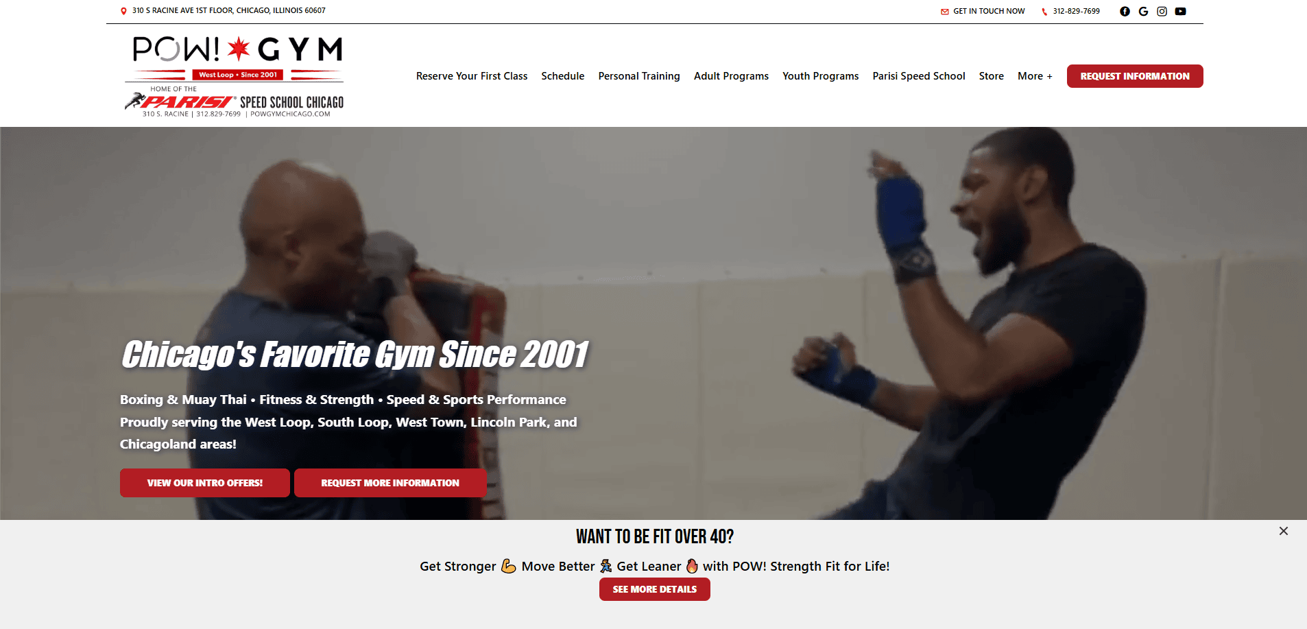
1. POW! Gym Chicago
Location: Chicago, IL
Key Takeaways:
- Clean, modern layout with high-impact visuals
- Easy-to-navigate class schedules and memberships
- Strong brand personality conveyed through imagery and tone
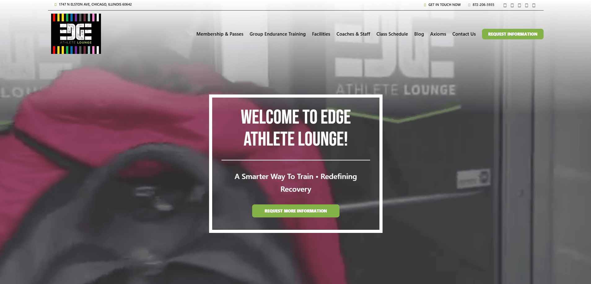
2. Edge Athletic Lounge
Location: Chicago, IL
Key Takeaways:
- Clear service differentiation and class breakdowns
- Seamless scheduling interface
- Visual consistency with a focus on performance and recovery
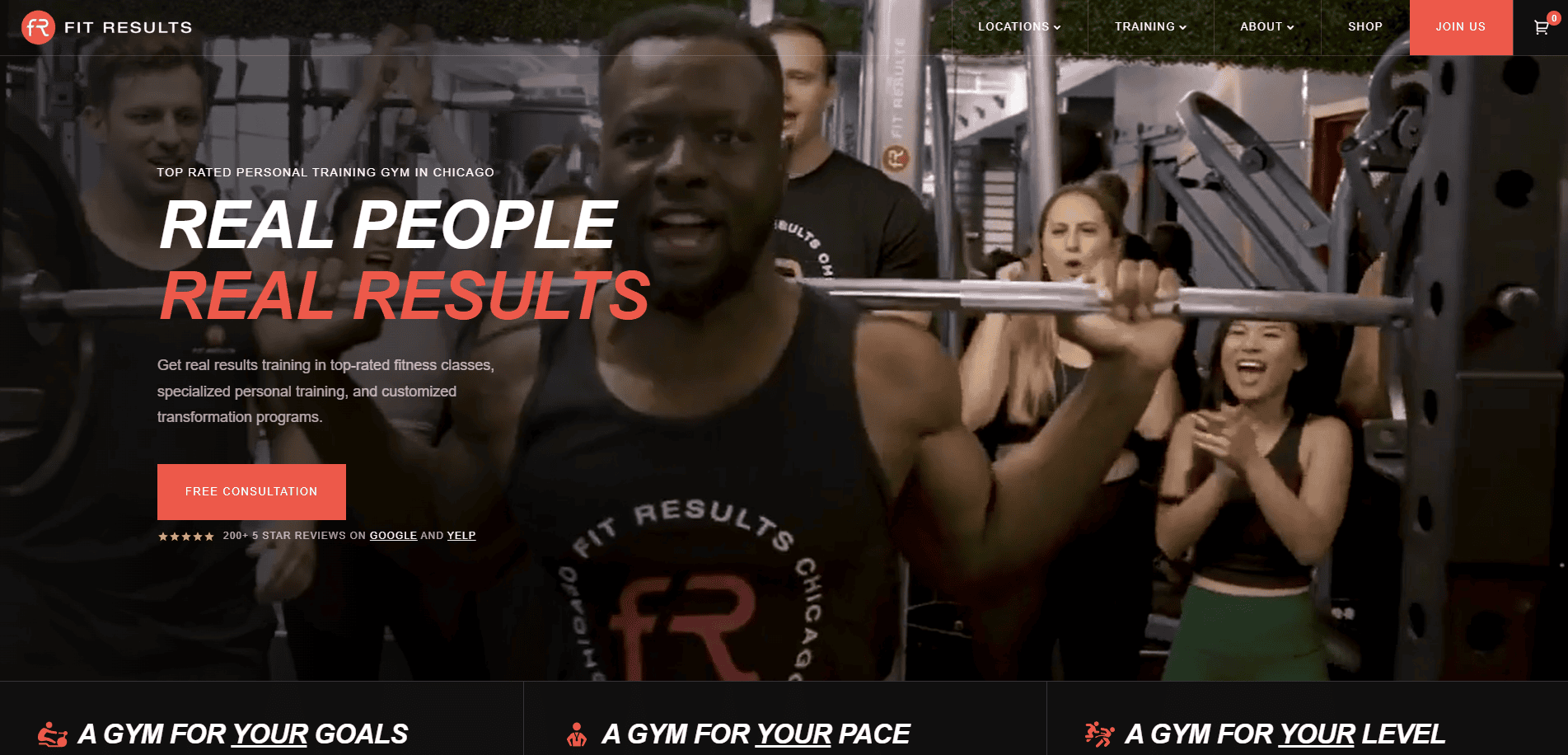
3. Fit Results
Location: Chicago, IL
Key Takeaways:
- Engaging social proof with client testimonials
- Crisp mobile layout optimized for quick bookings
- Emphasis on transformation through visuals
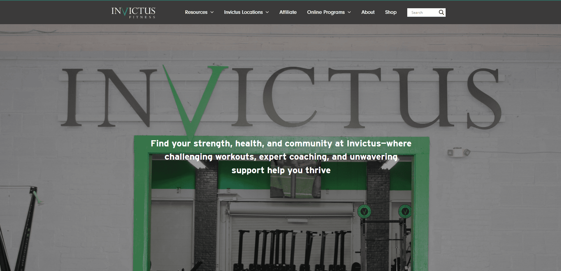
4. CrossFit Invictus
Location: San Diego, CA
Key Takeaways:
- Excellent use of community-driven imagery
- Structured content for multiple training levels
- Resource-rich blog for ongoing SEO and education
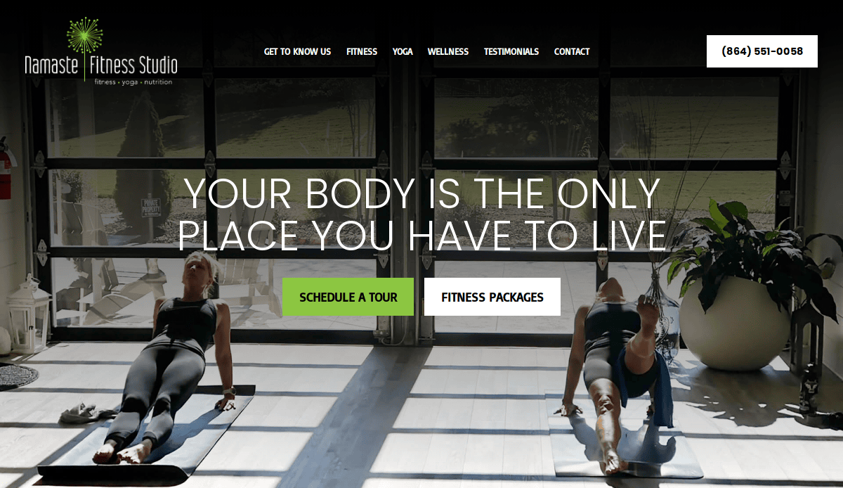
5. Namaste Fitness
Location: Elmhurst, IL
Key Takeaways:
- Inviting visuals that reflect the studio ambiance
- Highlighted class packages and pricing options
- Friendly navigation and soft color palette
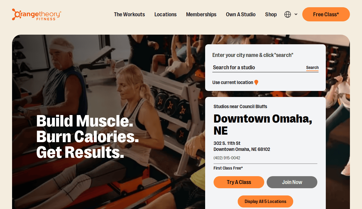
6. Orangetheory Fitness
Location: Boca Raton, FL
Key Takeaways:
- Strong CTA and localized user flow
- Consistent branding across all studio locations
- Video content that communicates training intensity
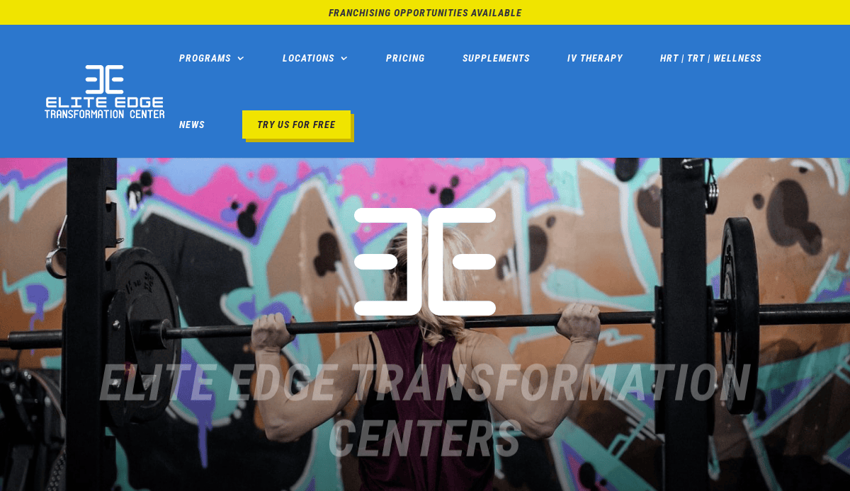
7. Elite Edge Transformation Center
Location: Waukee, IA
Key Takeaways:
- Conversion-focused with challenge programs
- Success stories featured prominently
- Clean site design with bold CTAs
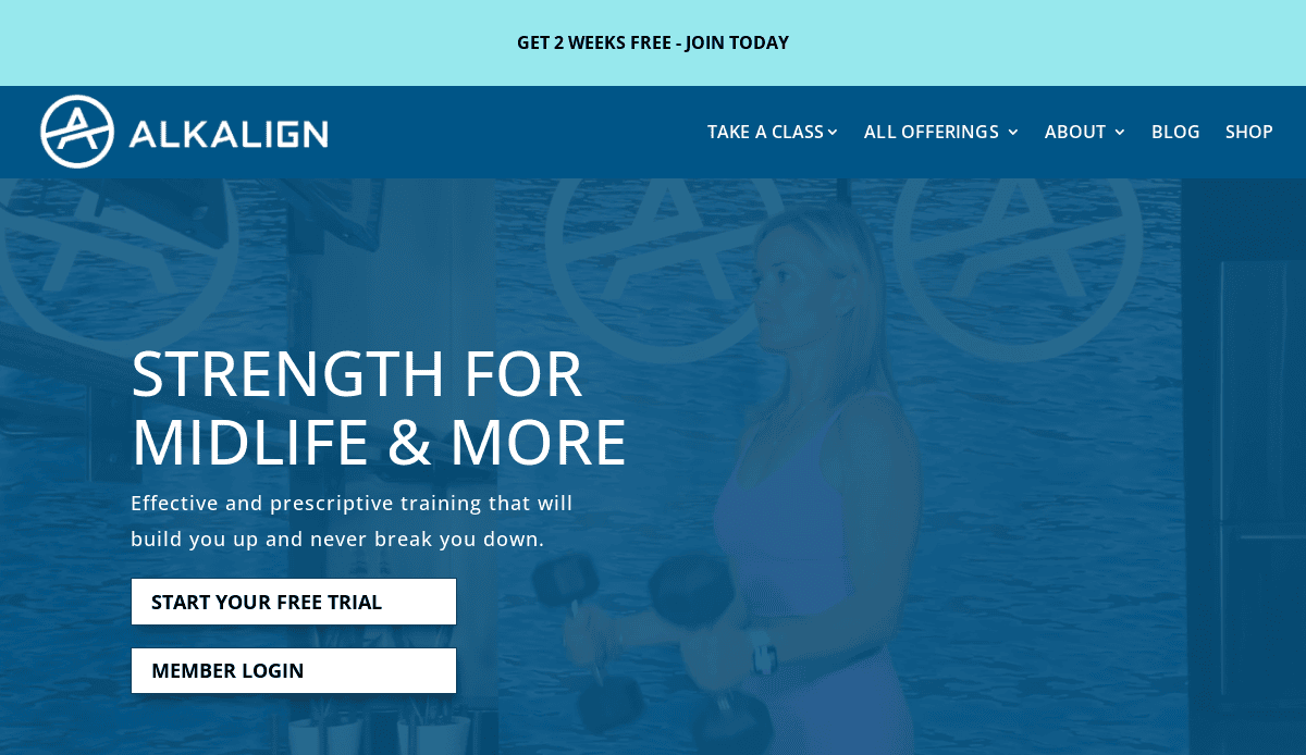
8. Alkalign Studios
Location: Menlo Park, CA
Key Takeaways:
- Strong focus on functional fitness and wellness
- Content that educates on the brand’s unique philosophy
- Simplified membership and booking flow
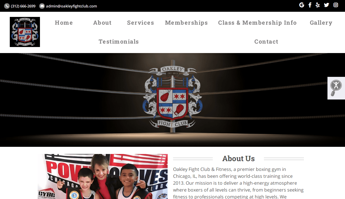
9. Oakley Fight Club & Fitness
Location: Chicago, IL
Key Takeaways:
- Gritty, energetic design that matches the gym’s vibe
- Effective use of parallax scrolling and video backgrounds
- Clear focus on programs and contact conversion
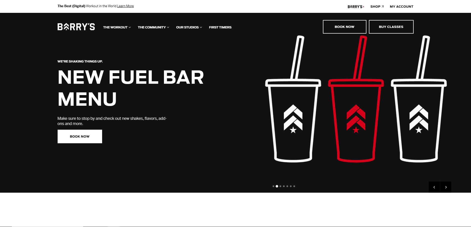
10. Barry’s Bootcamp
Location: Los Angeles, CA
Key Takeaways:
- Iconic red room branding
- Dynamic trainer profiles and class breakdowns
- Smooth transitions and animation effects
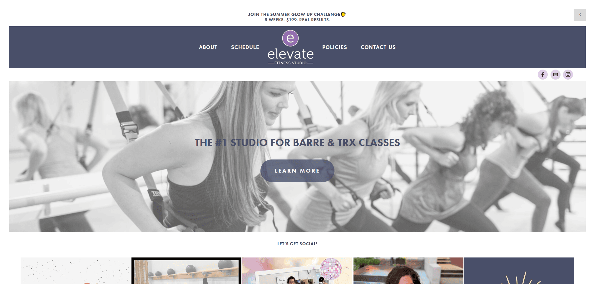
11. Elevate Fitness Studio
Location: Naperville, IL
Key Takeaways:
- Clean design with user-focused scheduling tools
- Emphasis on group and private training options
- Brand-aligned color palette and typography
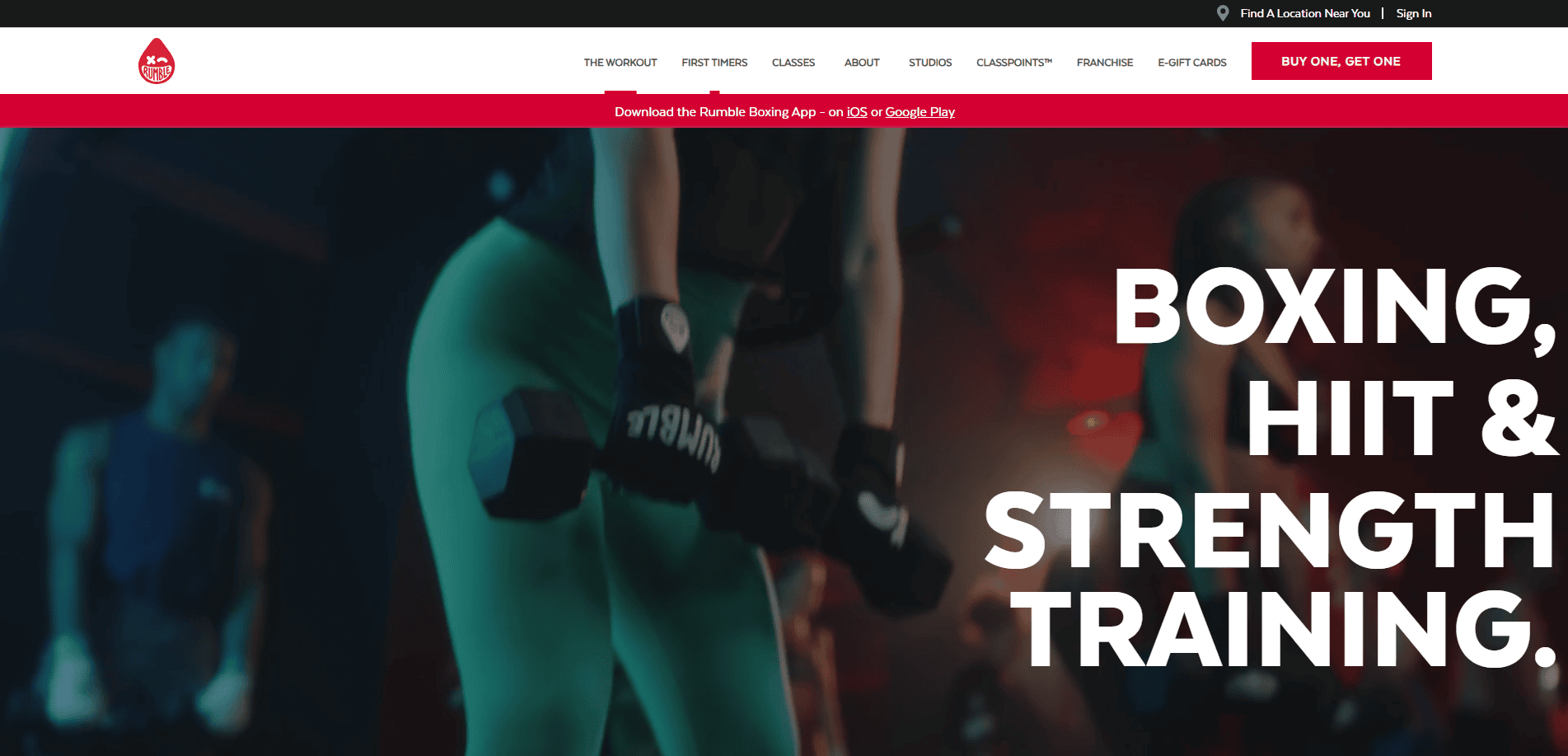
12. Rumble Boxing
Location: New York, NY
Key Takeaways:
- Youthful, high-energy layout
- Bold typography and video loops
- Clear pathways to book and buy classes
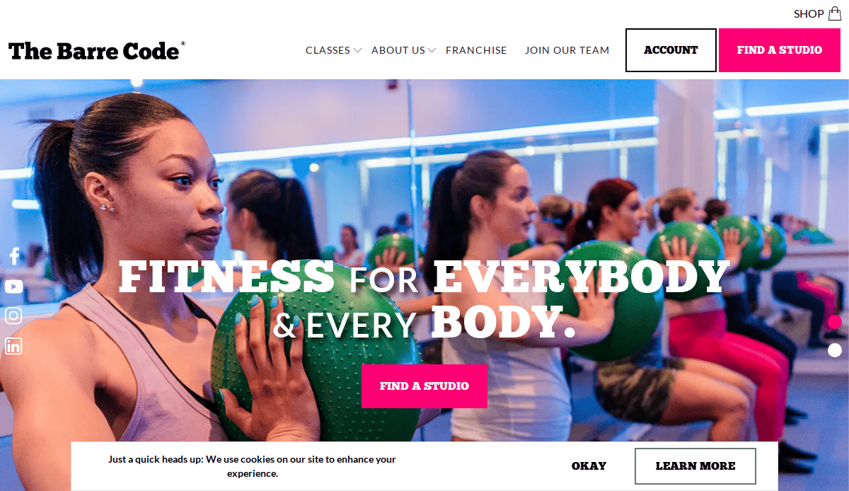
13. The Barre Code
Location: Detroit, MI
Key Takeaways:
- Strong female-focused branding
- Clear value proposition for workouts and programs
- Consistent UI across all locations
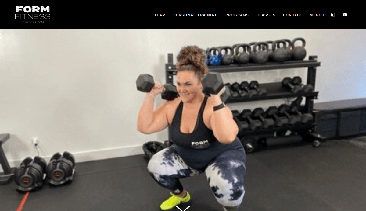
14. Form Fitness
Location: Brooklyn, NY
Key Takeaways:
- Minimalist design with personalized class flows
- Crisp visuals and studio storytelling
- Social media integration enhances reach
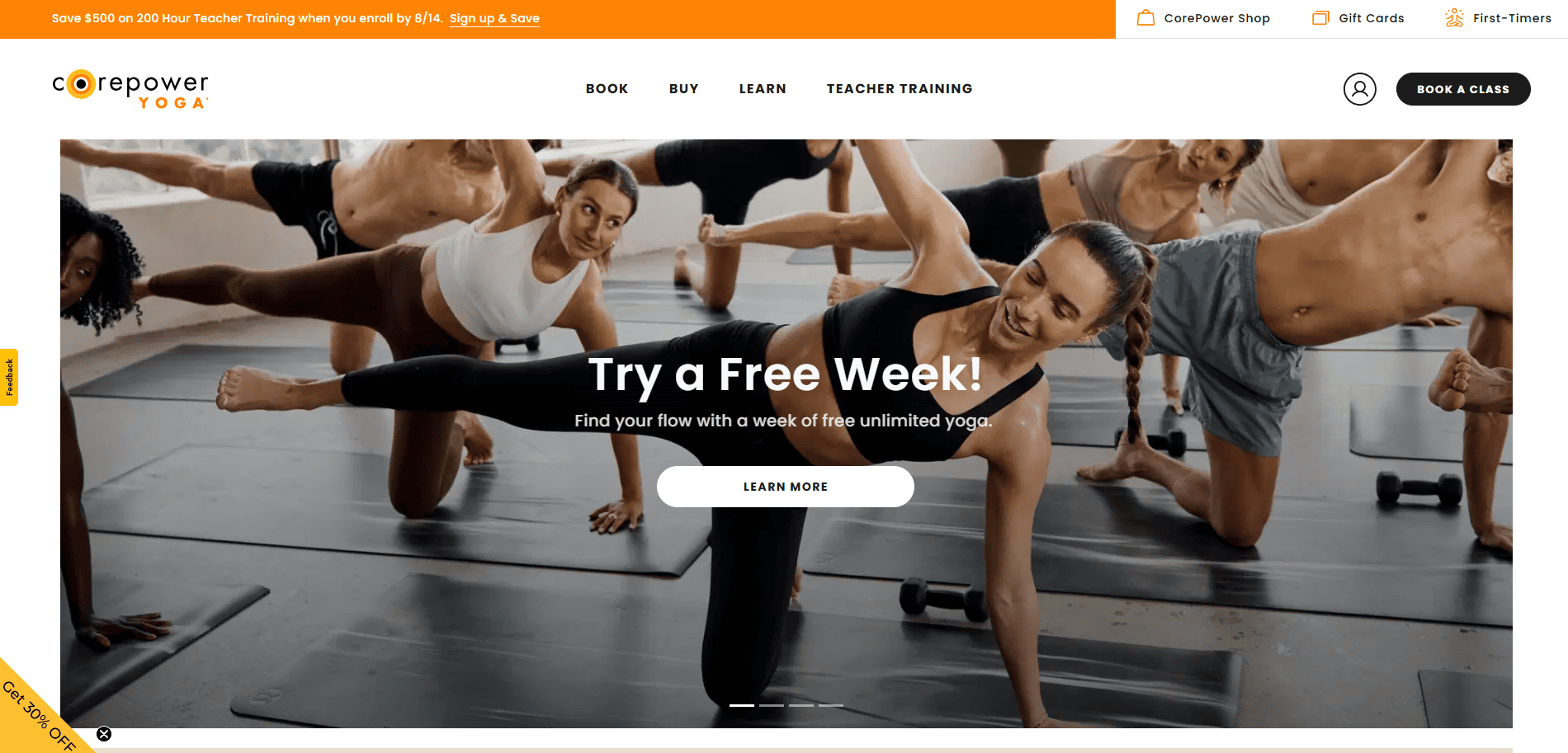
15. CorePower Yoga
Location: Denver, CO
Key Takeaways:
- Filterable class finder for multiple locations
- Bright, motivating design with wellness focus
- Subscription and trial class offers clearly featured
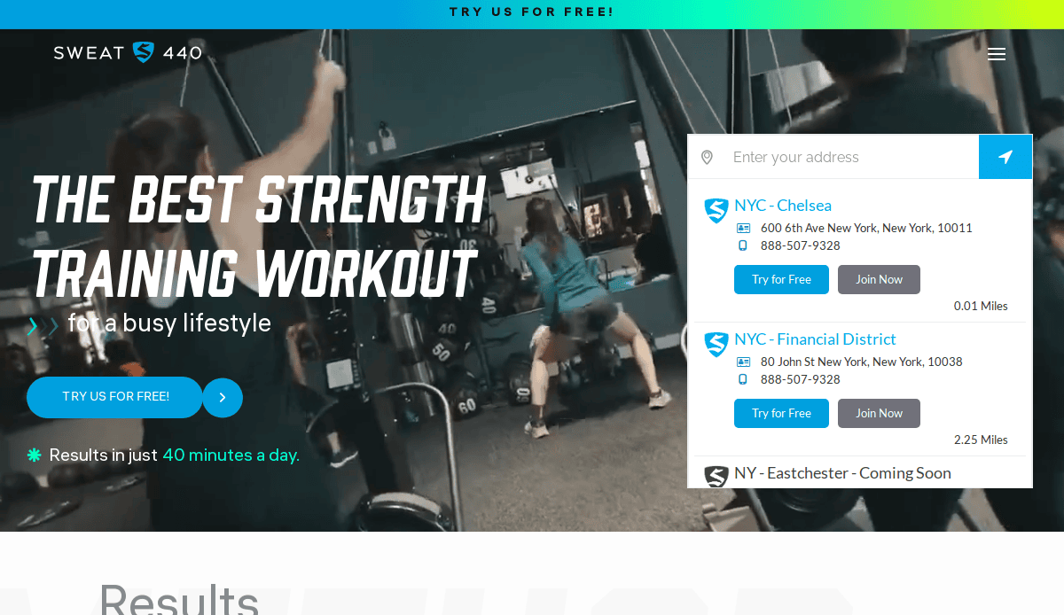
16. Sweat440
Location: Miami, FL
Key Takeaways:
- Class countdown timers add urgency
- Strong focus on location-based class pages
- Smart use of reviews and trust-building content
17. The Training Room
Location: Downers Grove, IL
Key Takeaways:
- Professional design with personalized training focus
- Strong community visuals and messaging
- Seamless lead generation tools
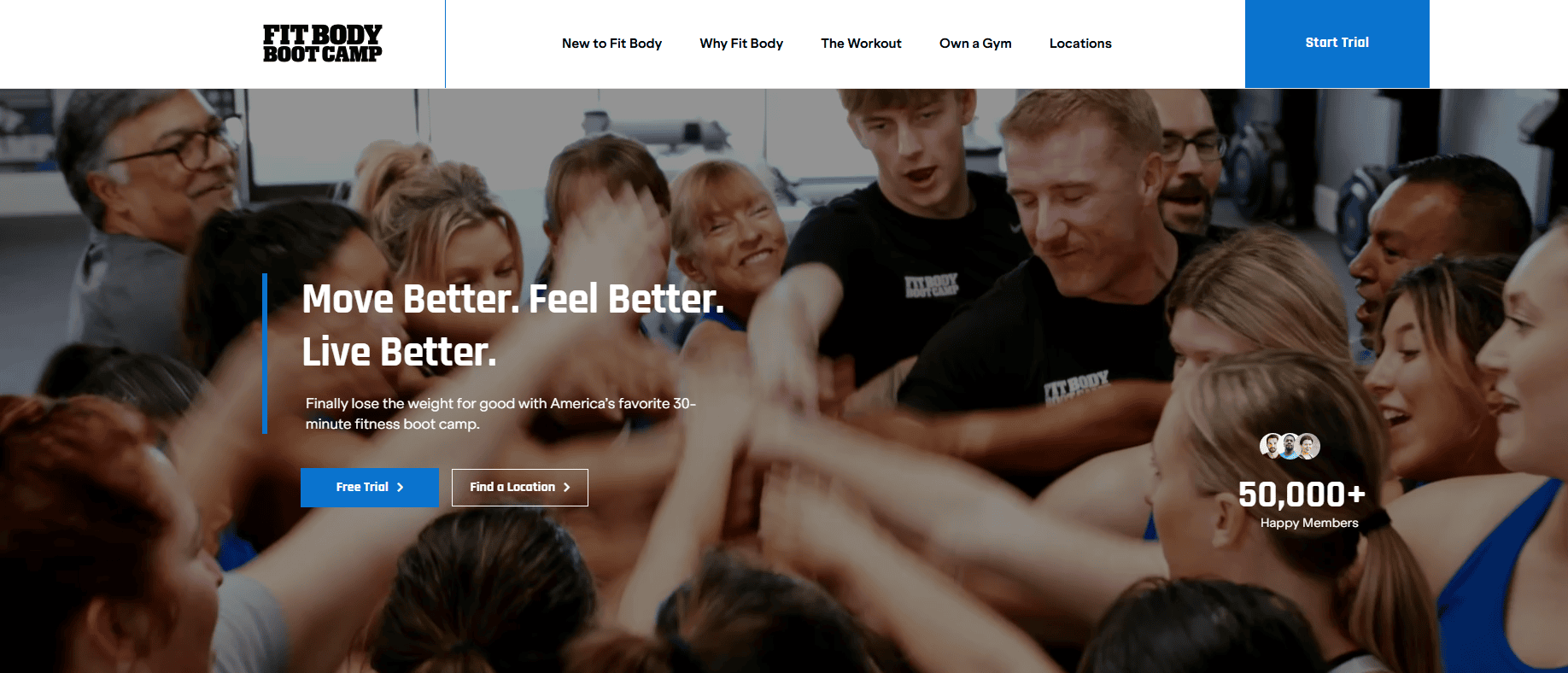
18. Fit Body Boot Camp
Location: Chino Hills, CA
Key Takeaways:
- Conversion-focused homepage layout
- Testimonials and before/after galleries
- Mobile-friendly with strong CTAs
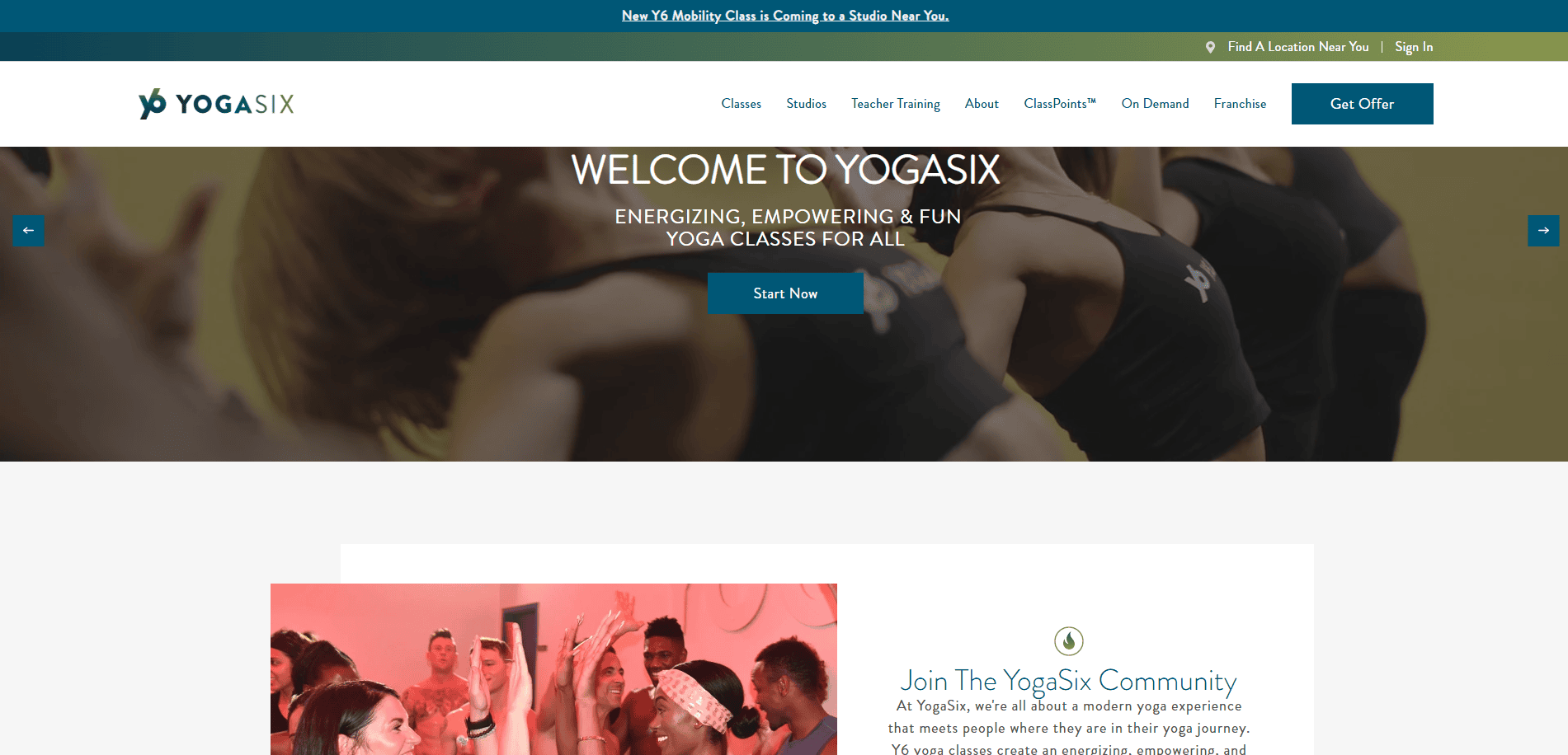
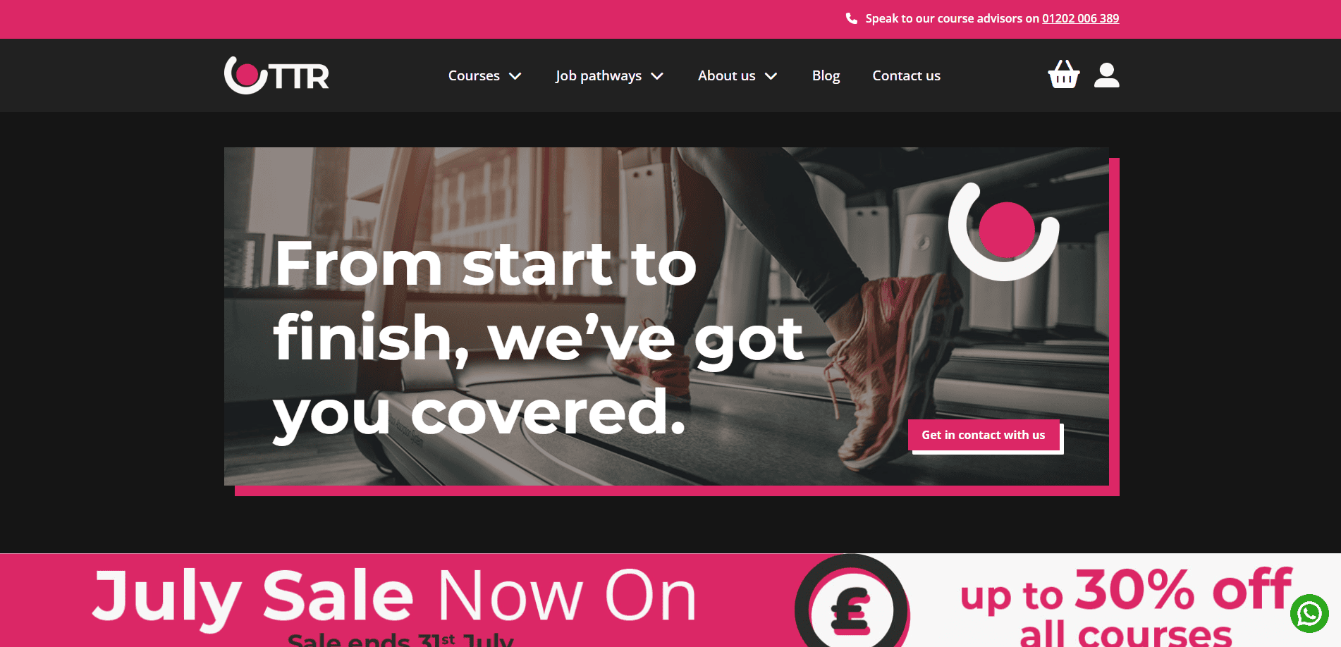
19. YogaSix
Location: Irvine, CA
Key Takeaways:
- Relaxed, wellness-centered visual identity
- Studio location finder for easy access
- Wellness-focused CTAs and content
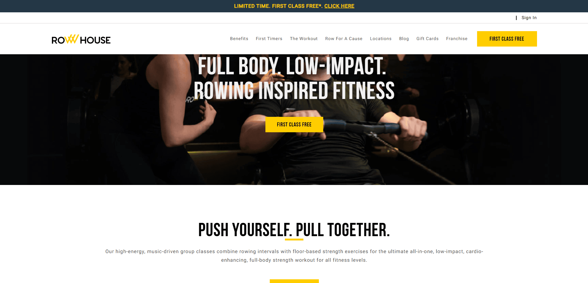
20. Row House
Location: Chicago, IL
Key Takeaways:
- Clean design with immersive hero images
- Clear articulation of rowing benefits
- Dynamic booking and location tools
These examples show the full spectrum of modern fitness website design—from bold, high-energy layouts to calming, wellness-focused branding. Whether you’re a local gym or a national fitness brand, these websites offer ideas for elevating your online presence. Let us know if you’re ready to build or refresh your own fitness site.
Ready to Create a Fitness Website That Works as Hard as You Do?
Whether you run a fitness studio, work as a personal trainer, or sell workout plans through an online store, your website needs to do more than just look good—it needs to convert. This step-by-step guide has outlined everything from planning and design to content strategy and ongoing maintenance, all geared toward helping you create a fitness website that supports your growth and connects with your audience.
Don’t settle for a basic template or one-size-fits-all website builder. Build a site that reflects your brand, showcases your strengths, and drives results.
Ready to build something powerful? Schedule a free consultation with us today and get expert guidance tailored to your business.
Your Common Industry-Focused Site Design Questions, Answered
Why is a website important for gym owners and fitness instructors?
A professional website for fitness professionals helps build credibility, attract new members, and support client retention. Whether you’re a fitness instructor, gym owner, or offer digital fitness solutions, a well-designed website is essential for connecting with your target audience and standing out in a competitive fitness market.
What should I include when I create a website for my fitness center?
A comprehensive fitness site should incorporate features like class schedules, trainer bios, personalized workout plans, a blog, and strong CTAs. If you’re selling fitness products or offering on-demand fitness classes, include an online store. View our fitness website design services for a complete guide on building each component.
How do I choose the right website builder for a fitness brand?
When choosing the right website builder, look for scalability, customization, integration with booking tools, and mobile responsiveness. WordPress is a popular choice among site design experts for its flexibility and powerful plugin ecosystem. Avoid generic templates that limit your ability to tailor your site for your fitness community.
What makes the best gym websites successful?
The best gym websites share key elements: clear branding, visually appealing design, optimized site design for all devices, and compelling fitness themes. They create a user experience that guides visitors toward signing up, exploring services, or making a purchase. Explore our list of the best fitness websites for inspiration.
How do I ensure my website attracts the right audience?
A website that attracts your ideal audience uses targeted messaging, strong visuals, and localized SEO. Design a website that speaks directly to the fitness levels and goals of your clients—whether it’s home fitness enthusiasts, athletes, or those seeking fitness for the first time.
Can a website help me sell products or services online?
Yes, many fitness platforms include built-in e-commerce functionality. You can sell workout plans, branded merchandise, or fitness classes through your site. If you’re just starting, we can guide you in getting your website built from scratch with everything you need to grow your business website.
What are the must-have features for a gym website design?
Essential features for gym website design include mobile responsiveness, an easy-to-use class booking system, engaging trainer profiles, testimonials, and fitness service descriptions. These features are critical for converting visitors and establishing your authority in the fitness industry.
Do I really need a website if I use social media?
While social media supports brand visibility, a website is your owned space for delivering a complete user experience. It serves as the hub for your fitness solutions, allows full control over messaging, and reinforces your professional image across the global fitness landscape.
How does content support a website?
Content such as blog posts, FAQs, and client success stories supports SEO and builds authority. A fitness business that publishes regular, value-rich content will perform better in search results and engage users more effectively. Consider publishing a complete guide or fitness classes breakdown as part of your strategy.
What role does visual design play in a wellness website?
Visual design isn’t just about aesthetics—it’s about usability, credibility, and trust. A visually appealing design helps convey energy, professionalism, and brand identity. It should support navigation, highlight key calls to action, and adapt to all devices. The result is a fitness site that converts and reflects your unique offering throughout your website.
Still have questions? Visit our fitness website design guide or contact us to speak with our team about your project.

