Just looking for our Best Dumpster Rental Website examples list?
Key Takeaways
- Prioritize Local SEO for Visibility: Implementing local SEO strategies, such as optimizing your Google Business Profile and incorporating location-specific keywords, ensures your company appears prominently in local search results, attracting nearby customers seeking your services.
- Enhance User Experience with Responsive Design: A mobile-friendly, fast-loading website with intuitive gateways keeps visitors engaged and reduces bounce rates, which are critical factors for search engine rankings and user satisfaction.
- Integrate Interactive Features for Customer Engagement: Features like interactive service maps, online scheduling tools, and customer portals facilitate user interaction, making it easier for clients to access services and information, thereby improving overall user experience.
- Showcase Sustainability Efforts Transparently: Highlighting your company’s environmental initiatives, such as recycling programs and sustainability reports, builds trust with eco-conscious consumers and sets your brand apart in a competitive market.
- Utilize Data-Driven SEO Strategies: Regularly analyzing website analytics and user behavior helps in refining SEO tactics, ensuring that your content remains relevant and continues to meet the evolving needs of your target audience.
- Maintain Consistent Branding Across All Platforms: A cohesive brand identity, reflected through consistent use of colors, logos, and messaging, enhances brand recognition and conveys professionalism, which is essential for building customer trust.
- Implement Clear Calls-to-Action (CTAs): Strategically placed and well-designed CTAs guide visitors toward desired actions, such as requesting a quote or scheduling a pickup, thereby increasing conversion rates.
- Regularly Update Content to Reflect Current Services: Keeping your website content up-to-date with the latest services, pricing, and company news ensures that visitors receive accurate information, which enhances credibility and user trust.
- Optimize for Accessibility: Ensuring your website is accessible to all users, including those with disabilities, broadens your audience, complies with legal standards, and improves overall user experience.
- Leverage High-Quality Visuals: Using professional images and videos that showcase your services and team can make your website more engaging and help potential customers better understand what your company offers.
Why Website Design Is Crucial for Waste Management Companies
When it comes to waste management, most businesses think first about logistics—routes, equipment, and disposal regulations. But what about your digital presence? In today’s competitive environment, your website is more than just a digital business card. It’s your first impression, your lead generator, and your 24/7 sales rep.
For recycling and waste disposal companies, an outdated or cluttered site can send potential clients running to competitors. A well-structured website with modern web design, clear user pathways, and user-friendly features builds trust and drives conversions. Whether you’re showcasing your reprocessing programs or offering on-demand pickup scheduling, your website should reflect the professionalism and efficiency your clients expect.
This guide is built specifically for management companies in the waste industry. We’ll show you how to design a high-performing site that ranks well in search engines, engages users from the first click, and ultimately grows your business. From essential pages to modern features and SEO best practices, every section is crafted to help you stand out in a crowded market.
Your competitors are investing in better site design. It’s time you did too.
Planning a Purpose-Driven Website for Industry Professionals
Before a single line of code is written or a layout is drafted, successful design begins with a clear understanding of purpose. This planning phase is especially critical. Unlike ecommerce or entertainment sites, your website serves a practical, service-oriented function—it must quickly communicate your offerings, demonstrate trustworthiness, and make it easy for users to take action.
The first step in planning is defining your primary objectives. Are you aiming to increase quote requests for commercial waste disposal? Do you want to promote specific recycling programs? Is online scheduling a priority for residential services? Identifying your business goals early shapes every design and content decision that follows.
Next, consider your audience. Your services often cater to both residential customers and commercial clients, each with different needs. Your site must speak clearly to each group. For example, residential users want quick access to pickup schedules and reprocessing guidelines, while commercial clients look for detailed information about bulk services, compliance, and customized plans.
Another key planning element is outlining the user journey. What should happen when someone visits your site? A well-structured sitemap and intuitive layout ensure users can find what they need in just a few clicks. Every section—from service pages to FAQs—should support your goal of converting visitors into leads or customers.
Planning also includes competitor research and keyword analysis. Understanding what other local or regional management companies are doing allows you to identify opportunities to differentiate. Using targeted keywords like “waste management,” “recycling services,” and “waste disposal solutions” during planning helps structure content that performs well in search engines.
In short, a high-performing website isn’t built on aesthetics alone. It starts with a strategy that aligns your business goals with your users’ needs, ensuring your site becomes a true asset, not just a digital placeholder.
Core Design Principles for High-Impact Websites
Designing an effective website requires more than just a clean layout. It’s about function, trust, and conversion. Every visual and structural element must serve a purpose: making your services clear, building credibility, and guiding users to take action. Below are the core design principles that set high-performing waste management websites apart from generic or outdated alternatives.
1. Clarity and Simplicity
Customers visit your website with a specific goal—usually to find a service, schedule a pickup, or request a quote. A cluttered or confusing layout can derail that intent in seconds. Keep the design simple and clean. Prioritize white space, avoid dense blocks of text, and use clearly labeled buttons for key actions. Every page should quickly answer: who you are, what you do, and how to take the next step.
2. Mobile-First Responsiveness
Over 60% of website traffic comes from mobile devices. A responsive design that adapts seamlessly to phones and tablets is no longer optional. Mobile accessibility is essential, especially for users looking to schedule pickups or check service areas while on the go. Prioritize legibility, load speed, and button sizing to ensure every interaction is smooth, regardless of device.
3. Strong Visual Hierarchy
Effective websites guide the user’s attention with strategic use of color, size, and spacing. For example, use larger, bold headlines to highlight services like commercial waste disposal or repurposing solutions. Contrasting call-to-action buttons—such as “Request a Quote” or “Schedule a Pickup”—should stand out immediately. Visual hierarchy ensures users instinctively understand where to look and what to do next.
4. Consistent Branding
Your website should reflect your company’s identity across every page. From your logo and color palette to the tone of your copy, branding must be consistent. This builds trust and recognition—two crucial factors in a competitive local services market. Consistency also supports SEO by reinforcing your brand across multiple pages and devices.
5. Accessibility and Compliance
If your services are used by everyone, your website must be accessible to all. Follow ADA compliance standards by including alt text on images, using high-contrast color schemes, and ensuring keyboard click support. An accessible site broadens your audience and protects your business from legal risks.
6. Visual Content That Educates
Use images and graphics that look professional and explain your services. Diagrams showing the disposal process, photos of disposal bins in use, or brief explainer videos can improve engagement and reduce the burden on written content. Visual content is also easier to share and repurpose across marketing channels.
When applied strategically, these design principles do more than make your website look good—they improve usability, build credibility, and drive results. Thoughtful web design isn’t cosmetic—it’s essential for converting digital visitors into loyal, long-term customers.
Structuring Website Content and Navigation
Content and navigation are the backbone of any successful website, especially in service-driven industries. Customers come to your site with urgency and intent. If they can’t find what they need quickly, they’ll leave. That’s why your website must be structured with clear, intuitive pathways and content that speaks directly to your audience’s needs.
Create a Content Hierarchy That Reflects User Intent
Start by defining the primary needs of your website visitors. Residential clients might be looking to schedule a pickup, check recycling schedules, or learn what materials are accepted. Commercial clients may be more interested in custom quotes, compliance details, or bulk waste management plans.
Your content hierarchy should reflect these priorities. At the top level of your user pathways, include clearly labeled sections such as:
- Services
- Residential
- Commercial
- Recycling
- Schedule a Pickup
- Contact Us
Within each section, create subpages that offer more detail. For example, under “Commercial Services,” you might include separate pages for construction waste, office repurposing, or dumpster rental. This layered structure improves user experience and helps with SEO by targeting specific keyword phrases.
Keep Navigation Simple and Predictable
The best type of menu is invisible—it just works. Stick to standard conventions like horizontal top menus and mobile-friendly hamburger menus. Use concise, common terms like “Services” instead of jargon like “Solutions Hub.” Avoid nesting too many levels of dropdowns, which can be frustrating, especially on mobile devices.
Your goal is to make it effortless for any visitor—whether a homeowner or a property manager—to locate the information they need without having to dig.
Use Content to Build Trust and Educate
Well-written content doesn’t just inform—it builds credibility. Each page should have a clear purpose, focused messaging, and a call-to-action (CTA). Use concise paragraphs, bullet points, and visual aids to improve readability.
In addition to core service pages, include educational content such as:
- Recycling Guidelines
- How-To Articles (e.g., “How to Prepare Waste for Pickup”)
- FAQs
- Blog Posts that address seasonal services or industry updates
This type of content serves your customers and also boosts your website’s visibility in search engines.
Internal Linking for Seamless Exploration
Use strategic internal links to guide visitors deeper into your site. For example, a link from a general “Recycling Services” page to a more detailed page on electronics recycling. This keeps users engaged and signals to search engines which pages are related and important.
By combining intuitive formatting with purpose-driven content, company websites can provide a seamless experience that builds trust, improves optimization performance, and drives sales. The structure of your site isn’t just about usability—it’s a direct reflection of your professionalism and customer focus.
How Visual Elements Strengthen Web Design
Visual elements shape how users feel about your brand and influence how easily they can engage with your services. Incorporating strong visual design is especially important to communicate professionalism, trustworthiness, and operational clarity in an industry often associated with logistics and manual labor.
Build Trust Through Professional Photography
High-quality, original photos immediately elevate the credibility of your business. Avoid generic stock images that say nothing about your specific services or team. Instead, include photos of your trucks, staff, equipment, and job sites. This visual transparency helps users feel confident that they’re working with a real, reliable provider, not a faceless brand.
Displaying uniformed employees and branded vehicles reinforces your identity and demonstrates operational readiness, which is particularly important in commercial bids or municipal contracts.
Use Icons and Graphics to Simplify Complex Services
Waste management and recycling services can be detailed and technical. Visual icons help simplify service categories and guide users through decision-making. For example, use a recycling symbol for eco-friendly services, a dumpster icon for bulk disposal, or a clock icon next to scheduling options.
Well-designed icons support comprehension, especially for first-time visitors or users scanning content on mobile devices. They also break up text-heavy pages, improving the user experience.
Incorporate Color Psychology for Clarity and Branding
Your color palette should reflect your company’s brand identity while also supporting usability. Commonly used industry colors like green (for sustainability), blue (for trust), and gray (for professionalism) can reinforce your message. Make sure there is enough contrast between background and text colors to ensure readability and ADA compliance.
Use colors strategically to draw attention to calls-to-action (e.g., “Schedule Pickup” or “Request Quote”) without overwhelming the user.
Embed Interactive Visual Tools
Interactive tools like live service area maps or pickup day finders can greatly enhance usability. These visuals turn functional content into engaging experiences, helping users get personalized information with just a few clicks. They also reduce support requests by empowering customers to self-serve.
Support Content With Video
Short videos can be used to explain services, highlight safety protocols, or showcase sustainability efforts. A one-minute video demonstrating your recycling process or a message from your founder can humanize your brand and build a connection.
Maintain Consistency Across All Visuals
All visual elements—photos, graphics, icons, and colors—should align with your overall branding. This visual consistency builds recognition and reinforces your authority across pages. Mismatched styles or outdated imagery can undermine trust and signal neglect, especially in industries where reliability is paramount.
Visuals in any industry must be purposeful. They should support the user journey, clarify services, and reinforce your professionalism. A visually strong website makes your company more memorable, more credible, and more effective at converting visitors into long-term clients.
WordPress is a powerful platform, but like any technology, it must be regularly updated to remain secure and functional. This includes core WordPress updates, theme updates, and plugin patches. Skipping these updates can leave your website vulnerable to hacking, which can result in data breaches, spam infections, or site takedowns.
Given the nature of these services—often involving sensitive customer information like addresses or payment data—security cannot be an afterthought. Routine updates and a strong security plugin help safeguard your site and maintain trust with your visitors.
Regular Backups
Daily or weekly backups ensure that your website can be restored quickly in the event of a crash or hack. A comprehensive backup system should include your entire database, media library, and all site files. This means preserving key data like service request forms, customer inquiries, and recycling guidelines.
Performance Monitoring
A slow website frustrates users and can drive potential customers to competitors. Monitoring site speed and uptime helps keep your site running efficiently. Optimizing image sizes, minimizing unnecessary plugins, and using a content delivery network (CDN) are all part of a solid maintenance plan.
Performance issues often go unnoticed until a complaint is made—by that point, the damage is done. Proactive monitoring keeps things running smoothly in the background.
Content and SEO Updates
Service areas change, policies shift, and customer questions evolve. Your content needs to reflect those changes. Updating service pages, blog posts, FAQs, and local SEO elements like meta tags and location keywords ensures that your site stays accurate and competitive in search results.
Fresh, relevant content also signals to Google that your site is active, boosting rankings and increasing traffic over time.
Plugin Management and Compatibility Checks
Many WordPress sites rely on multiple plugins to handle forms, customer portals, maps, and security. Without regular audits, plugins can conflict with each other or become outdated. Regular maintenance involves checking compatibility and removing any unused or unsupported tools that could introduce vulnerabilities.
Uptime and Error Monitoring
Tools like uptime monitoring and error tracking allow you to identify issues before they affect users. A broken form or a failed script might not be visible at a glance, but could result in lost leads or misrouted service requests. These tools help ensure that the website experience remains seamless for your customers.
In the waste management industry, dependability is everything. Ongoing WordPress maintenance supports your reputation, improves security, and ensures your website continues to function as a trusted tool for your clients and your team. Without it, your site becomes a liability instead of an asset.
20 Examples of Web Design for Waste Management Professionals
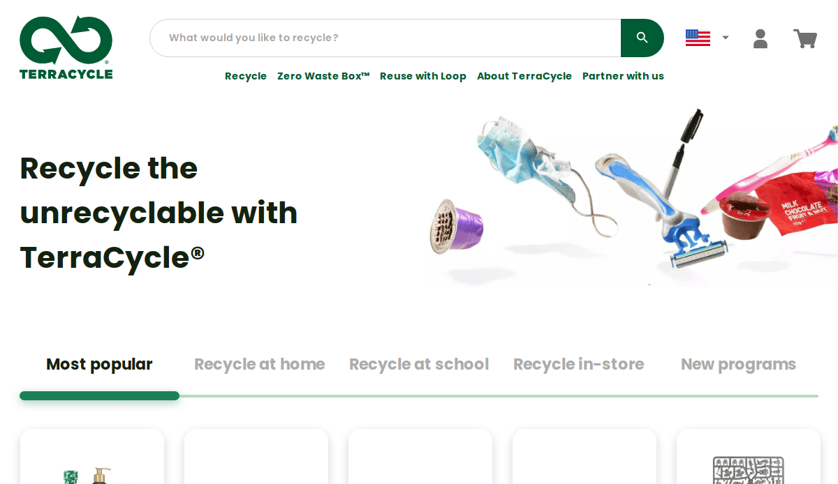
1. TerraCycle
Location City In The US: Trenton, NJ
3 Key Takeaways:
- Innovative Business Model Clearly Explained: The website masterfully communicates its unique approach to recycling traditionally “unrecyclable” waste, using compelling visuals and easy-to-understand language.
- Strong Call to Action for Programs: Features prominent calls to action for joining their free recycling programs or purchasing Zero Waste Boxes, making engagement intuitive.
- Thought Leadership and Education: Rich in content explaining the circular economy, waste solutions, and partnerships, positioning them as pioneers in sustainable waste management.

2. Republic Services
Location City In The US: Phoenix, AZ
3 Key Takeaways:
- Clean and Modern Design: Visually appealing with professional imagery and a streamlined layout.
- Service Finder Tool: Allows users to easily input their address to find available services in their area.
- Clear Call-to-Actions: Prominently displays buttons for “Get a Quote,” “Start Service,” and “Pay Bill,” guiding users effectively.
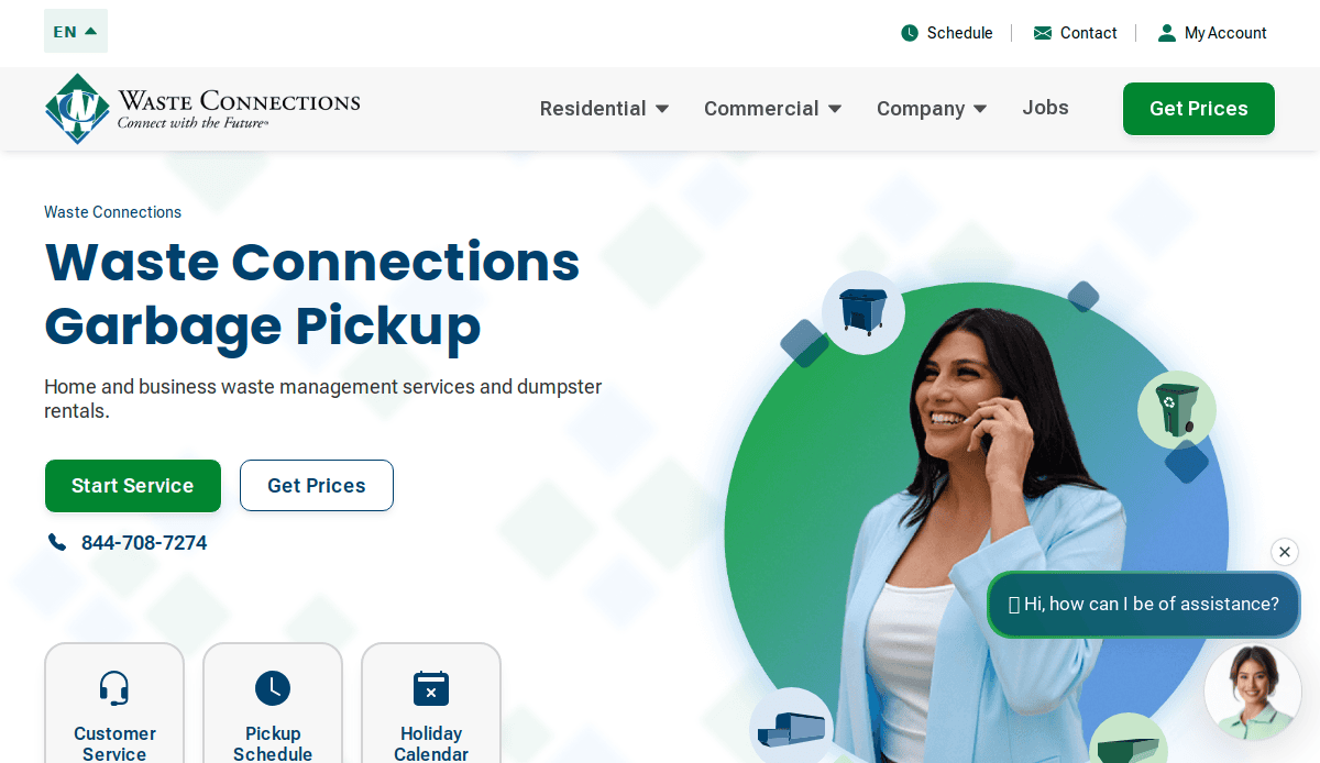
3. Waste Connections
Location City In The US: The Woodlands, TX
3 Key Takeaways:
- Local Focus with Broad Reach: Effectively communicates their widespread presence while emphasizing local service and community involvement.
- Comprehensive Service Listing: Clearly outlines residential, commercial, and industrial services, including dumpster rentals and special waste disposal.
- Responsive Design: Adapts well to various screen sizes, ensuring a consistent user experience across devices.
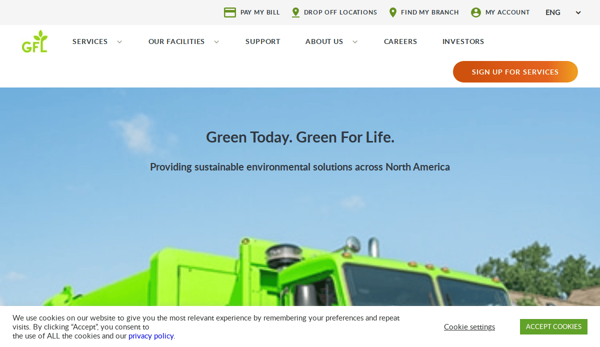
4. GFL Environmental
- Location City In The US: Raleigh, NC (US Headquarters)
- 3 Key Takeaways:
- “Green For Life” Branding: Strong visual and messaging around their commitment to sustainability.
- Diverse Service Showcase: Clearly highlights their wide range of services, including solid waste, liquid waste, and environmental services.
- News and Updates Section: Keeps visitors informed about company achievements and industry news, fostering transparency and engagement.

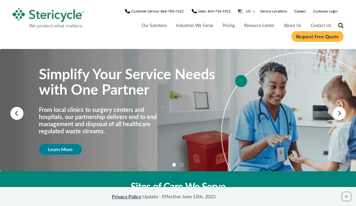
5. Stericycle
Location City In The US: Bannockburn, IL
3 Key Takeaways:
- Specialized Focus Clearly Articulated: Immediately conveys their expertise in medical waste and secure information destruction.
- Emphasis on Compliance and Safety: Design and content reinforce their commitment to regulatory compliance and safe practices.
- Resource-Rich Content: Offers valuable information and resources related to healthcare waste management, positioning them as thought leaders.
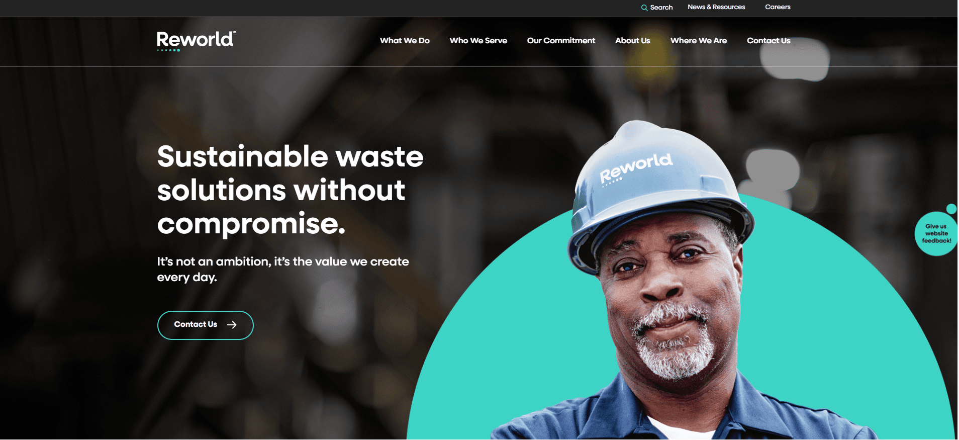
6. Reworld (formerly Covanta)
Location City In The US: Morristown, NJ
3 Key Takeaways:
- Focus on Waste-to-Energy: Clearly highlights their innovative approach to converting waste into renewable energy.
- Impactful Photography and Videography: Uses high-quality visuals to showcase their facilities and technology.
- Strong Environmental Messaging: Reinforces their positive impact on the environment and sustainable solutions.
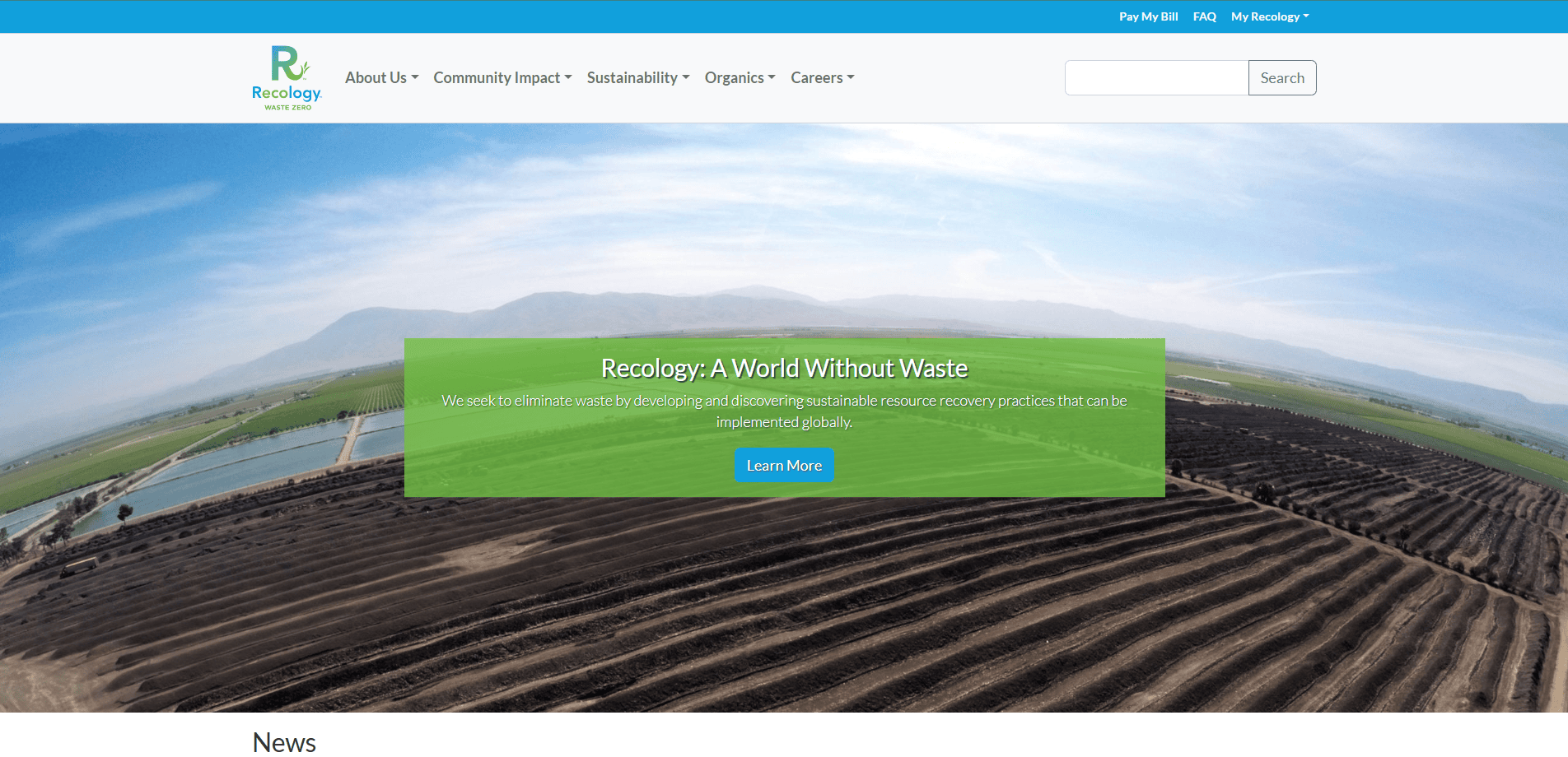
7. Recology
Location City In The US: San Francisco, CA
3 Key Takeaways:
- Community-Oriented Approach: Emphasizes their local presence and commitment to the communities they serve.
- Educational Resources: Provides extensive information on recycling best practices, composting, and waste reduction.
- Bright and Engaging Visuals: Uses vibrant imagery and a friendly tone to make waste management approachable.
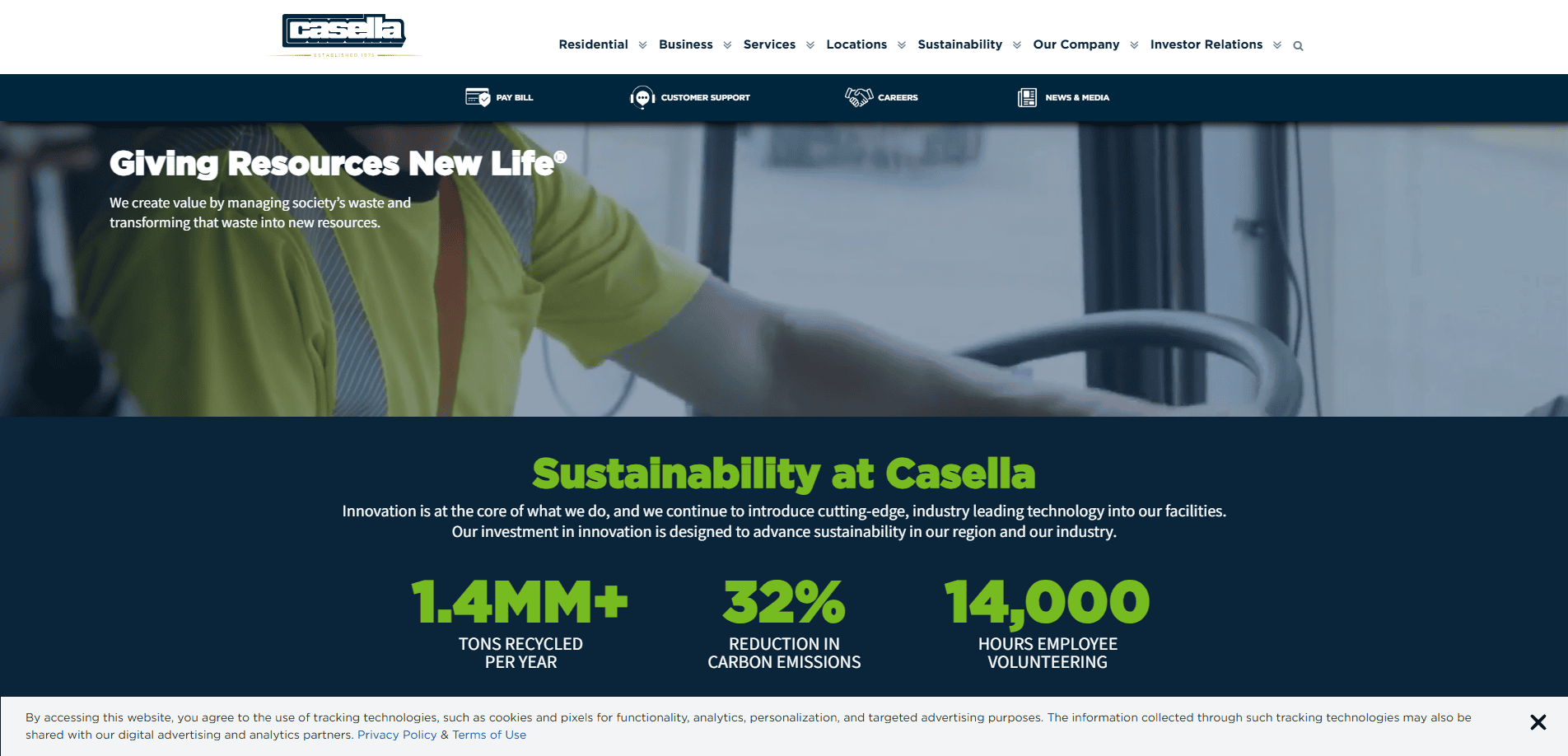
8. Casella Waste Systems
Location City In The US: Rutland, VT
3 Key Takeaways:
- Service Area Locator: Helps users quickly determine if services are available in their region.
- Investor Relations Section: Well-organized information for investors, demonstrating transparency and corporate responsibility.
- Clean Layout with Clear Service Categories: Easy for users to understand the different types of waste management services offered.
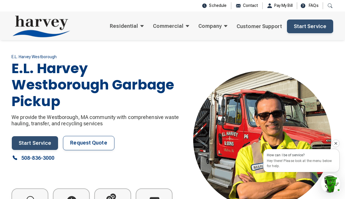
9. E.L. Harvey & Sons
Location City In The US: Westborough, MA
3 Key Takeaways:
- Family-Owned and Operated Feel: The website conveys a sense of trust and long-standing community commitment.
- Detailed Service Descriptions: Provides thorough explanations of their various waste and recycling services.
- Easy Contact Information: Prominently displays contact details for quick inquiries.
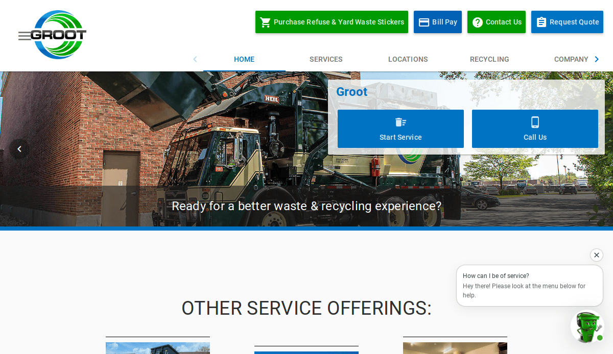
10. Groot Industries
Location City In The US: Elk Grove Village, IL
3 Key Takeaways:
- Local Chicago Area Focus: Immediately establishes their strong regional presence and local expertise.
- Clear Residential and Commercial Sections: Helps different customer types quickly find their relevant information.
- Customer Testimonials: Features positive feedback from clients, building trust and credibility.
11. Advanced Disposal (Now part of Waste Management)
Location City In The US: Ponte Vedra, FL (formerly)
3 Key Takeaways:
- Efficient Service Search: Offered a quick way to find services by zip code.
- Straightforward and Functional Design: Prioritized ease of use and access to information.
- Clear Account Management Options: Enabled customers to manage their services online.

12. Waste Pro USA
Location City In The US: Longwood, FL
3 Key Takeaways:
- “The Right Way. The Green Way.” Messaging: Emphasizes both quality service and environmental responsibility.
- Service Request Forms: Streamlined online forms for various service requests, improving efficiency.
- Community Engagement Focus: Highlights their involvement in local communities.
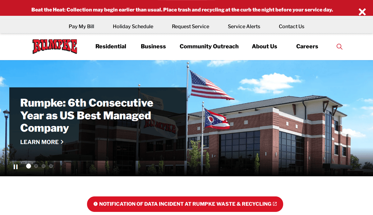
13. Rumpke Waste & Recycling
Location City In The US: Cincinnati, OH
3 Key Takeaways:
- Interactive Service Map: Allows users to easily see their service areas.
- Comprehensive Recycling Guide: Provides detailed information on what can and cannot be recycled.
- Strong Brand Identity: Consistent branding and professional visuals across the site.
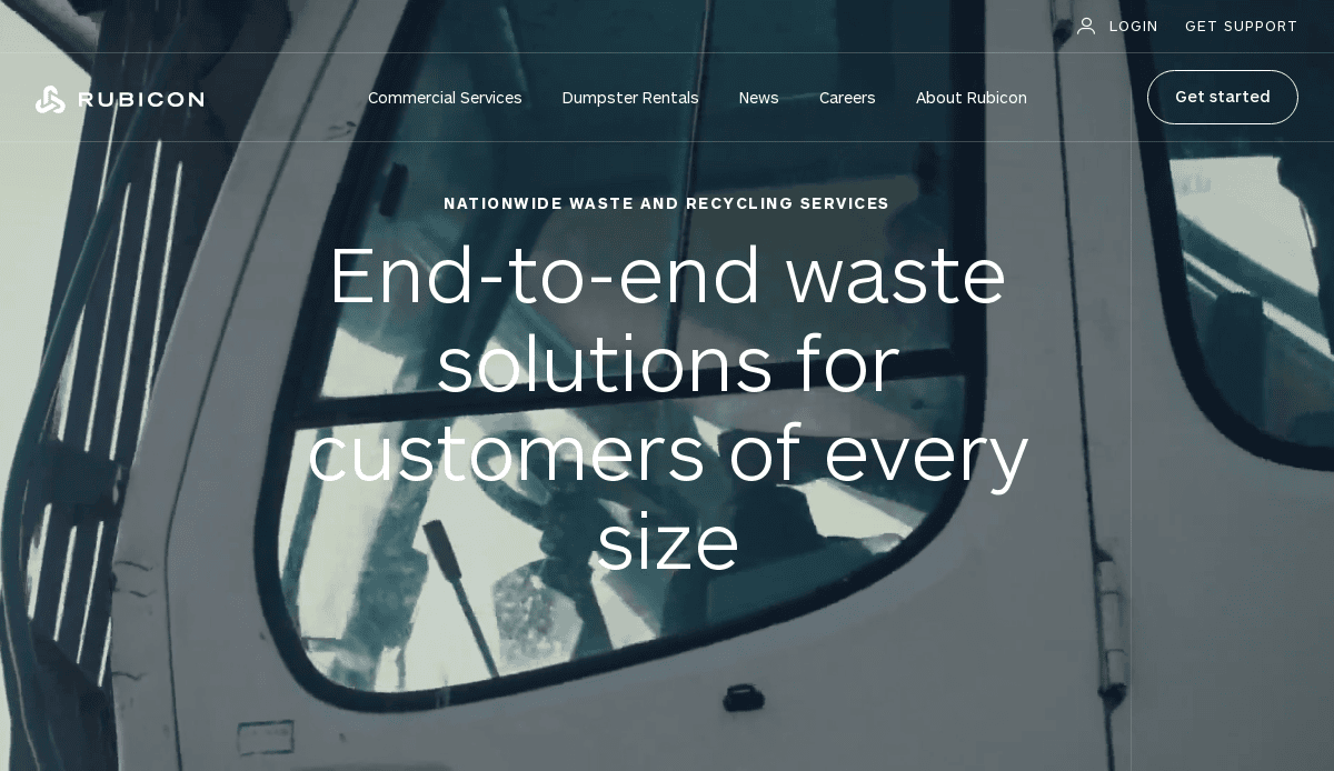
14. Rubicon
Location City In The US: Atlanta, GA
3 Key Takeaways:
- Technology-Driven Approach: Highlights their innovative software and data-driven solutions for waste management.
- Modern and Dynamic Design: Features sleek visuals and animations that convey forward-thinking.
- Focus on Smart Cities and Businesses: Positions themselves as a partner for optimizing waste streams.
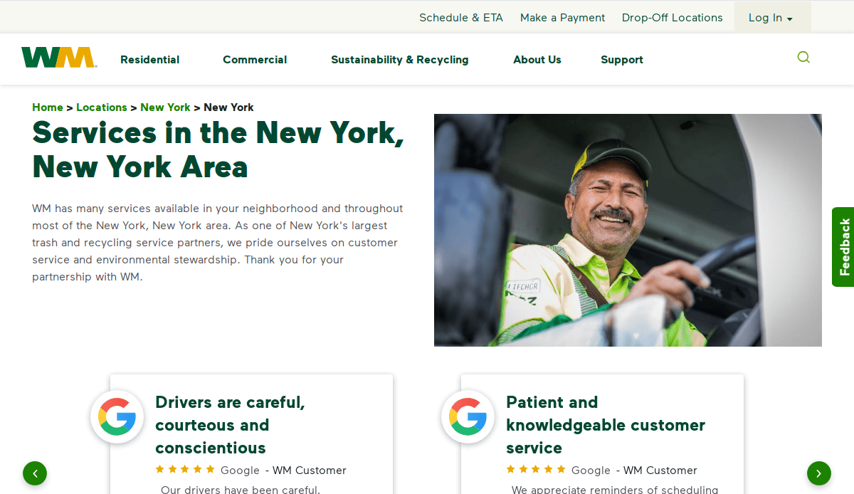
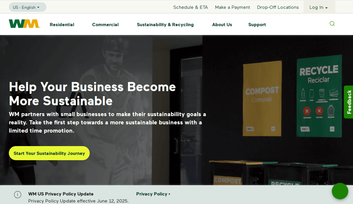
15. WM of New York (Local WM branch example)
Location City In The US: New York, NY
3 Key Takeaways:
- Hyper-Local Service Information: Provides specific details for waste and recycling services within NYC boroughs.
- Clear Regulatory Compliance Information: Addresses specific local regulations and guidelines.
- Simplified Service Request Process: Tailored for the urban environment and its unique challenges.
Waste Management Websites Designed by CyberOptik
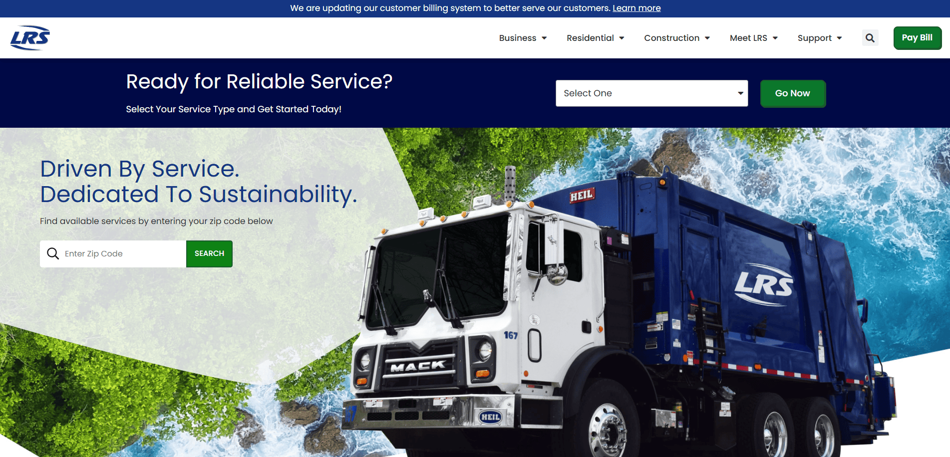
16. Lakeshore Recycling Systems (LRS)
Location City In The US: Rosemont, IL
3 Key Takeaways:
- Modern and Clean Aesthetics: The site is visually appealing with a professional and inviting look.
- Easy-to-Find Service Information: Clear navigation makes it simple for users to explore residential, commercial, and construction services.
- Emphasis on Sustainability Initiatives: Highlights their commitment to environmental stewardship and innovative recycling solutions, aligning with their brand.
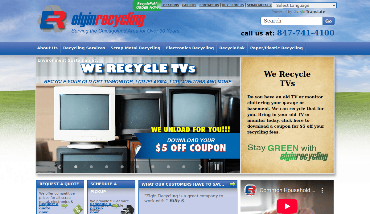
17. Elgin Recycling
Location City In The US: Elgin, IL
3 Key Takeaways:
- Clear Call to Action for Recycling Services: Immediately guides users to learn about what they can recycle.
- Educational Resources on Recycling: Provides valuable information to help users understand recycling processes and benefits.
- User-Friendly Material Categories: Makes it simple to navigate different types of recyclable materials.
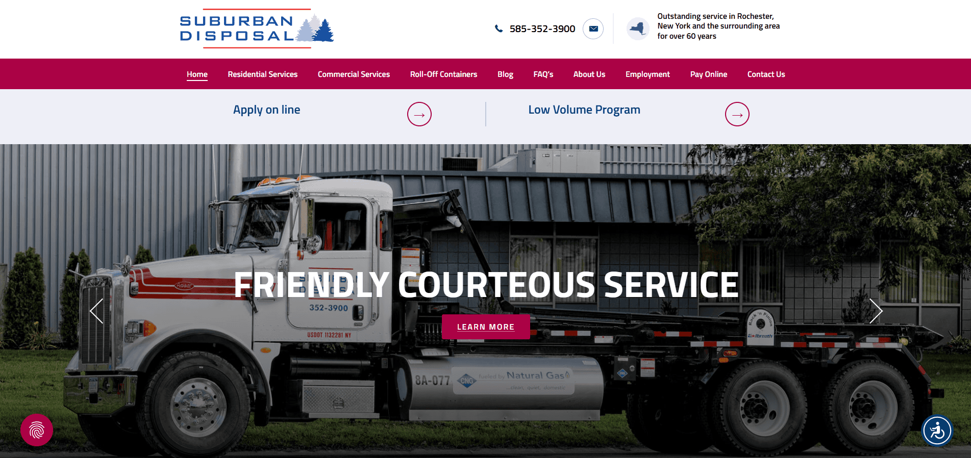
18. Suburban Disposal
Location City In The US: Morris, IL
3 Key Takeaways:
- Straightforward Service Presentation: Clearly outlines residential, commercial, and roll-off dumpster services.
- Accessible Contact Information: Makes it easy for customers to get in touch for quotes or inquiries.
- Community-Focused Messaging: Conveys a local, reliable service provider feel.
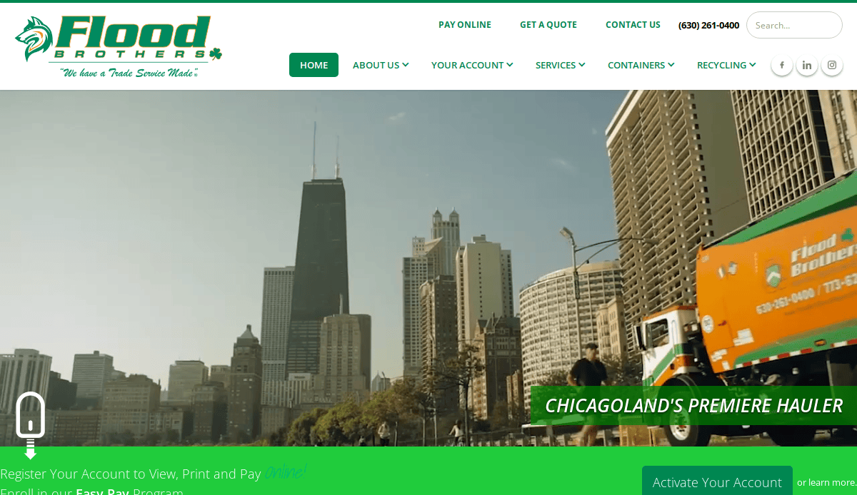
19. Flood Brothers Disposal
Location City In The US: Oakbrook Terrace, IL
3 Key Takeaways:
- Family-Owned and Operated Emphasis: Highlights their multi-generational commitment to service, building trust.
- Comprehensive Service Offerings: Details a wide range of services from residential to commercial and construction.
- Clean and Professional Layout: Easy to navigate with a focus on service information.
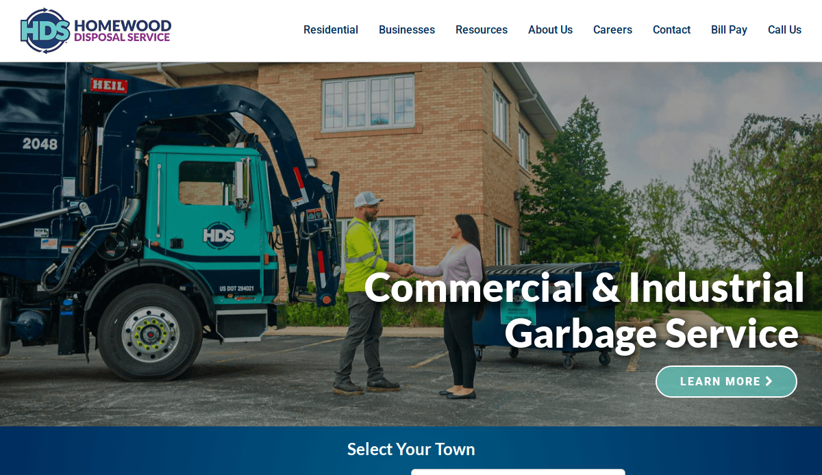
20. Homewood Disposal Service
Location City In The US: Homewood, IL
3 Key Takeaways:
- Clear Service Area Focus: The website immediately establishes its local presence and dedication to serving specific communities in the South Chicagoland area.
- Easy Access to Schedules and Information: Provides straightforward links for residents and businesses to find pickup schedules, holiday changes, and recycling guidelines.
- Professional and Community-Oriented Design: The design balances a professional appearance with a clear commitment to community service, reflecting their long-standing local presence.
Ready to Build a Site To Drive Results for Your Waste Management Firm?
Designing a well-structured website is more than a design trend—it’s a business necessity. Whether your company offers residential and commercial hauling services, specializes in hazardous waste or landfill management, or provides compost and recycling solutions, your website is the hub of your digital marketing strategy. From intuitive landing pages to specialized web page templates that reflect your services and values, your site should do more than inform—it should convert.
Waste management firms face unique challenges, from communicating waste reduction goals to showcasing multiple services and disposal methods. A well-designed website tailored to your company’s specific waste types and customer base helps you rise above competitors. For example, using custom website templates with clean layouts and strong calls-to-action helps you reach environmentally conscious clients and corporate or municipal partners seeking streamlined waste handling solutions.
If you’re ready to reduce waste in your marketing efforts, improve recycling rates, and turn your online presence into a true business asset, we’re here to help. At our top-tier digital marketing agency, we design to improve not just appearances, but performance, with account management, modern design strategies, and templates that make even complex services, like garbage collection and hazardous waste, easy to understand.
Let’s build a custom website for your waste management business that meets your needs and your audience’s expectations. Get Your Custom Web Strategy today and start converting clicks into customers.
Common Questions About Waste Management Website Design
What makes a website for professional companies effective?
An effective website clearly communicates your range of services, from residential garbage collection to hazardous material handling. It should feature strong site structure, fast load times, and intuitive forms for scheduling pickups or requesting quotes. Adding trust elements like a testimonial section and badges reflecting your commitment to sustainability can boost sales significantly.
How should my website help identify and explain different waste streams?
Your content should be organized by waste streams, such as recyclables, compost, hazardous materials, or bulk dumpsters. Creating educational landing pages that break down disposal requirements for each stream helps residential customers and property management teams make informed decisions. This builds trust and demonstrates your expertise in handling complex waste types.
What are the best design features for engaging residential and commercial visitors?
To serve both residential customers and corporate accounts, your site should balance simplicity with detail. Use design features like a service filter, intuitive drag-and-drop page builder layouts, and interactive maps for service zones. Whether your visitors are from a small HOA or a municipal agency, they should be able to quickly find tailored information.
Can my company site support zero-waste and environmental messaging?
Absolutely. A modern design can highlight your commitment to environmental values through sustainability reporting, client education, and green certifications. Embedding statistics about current waste reduction rates and outlining your zero-waste goals can position your company as a forward-thinking leader. This resonates strongly with eco-conscious clients and aligns with your commitment to community and the environment.
How do I overcome content and structure challenges for waste management websites?
One of the top challenges for industry websites is organizing information for multiple audiences: residential, commercial, industrial, and municipal. Start with a sitemap that reflects your service areas, and use a template structure that allows room to grow. Add clear headers, FAQs, and CTAs on every page to improve usability. Our Local SEO services also ensure your content is optimized for each customer segment and service area.
Do I need custom development, or can I use a builder like Instapage?
While builders like Instapage or other drag-and-drop tools can be useful for quick setups, firms with multiple service lines often require a custom website. These sites offer more flexibility, deeper integrations, and are built to scale with your growing operations. Our agency specializes in designing scalable, professional websites that evolve with your business needs.
Should I include frequently asked questions on my website?
Yes. A dedicated frequently asked questions section reduces support inquiries and builds trust by answering concerns upfront. Topics might include what materials are accepted, how to schedule a dumpster drop-off, or what fees apply for special waste handling. Including FAQs also supports optimization by targeting long-tail keywords and user search intent.
How does a website support my commitment to sustainability and community?
Your website is the ideal platform to showcase your company’s impact, from waste reduction efforts to local partnerships. Include sections that highlight your recycling achievements, community clean-up programs, and ongoing environmental campaigns. These elements reinforce your values and differentiate your brand in a crowded market.
How do I structure a site for both current waste services and future offerings?
Start by designing a scalable template that supports modular growth. Organize services by categories, use flexible page layouts, and prepare for adding new features like online billing, route tracking, or service dashboards. This adaptability ensures your digital platform continues to support your long-term business goals.
Where can I find guidance for designing my company website?
For a comprehensive walkthrough, explore our ultimate how-to guide for creating high-performing websites in complex service industries. From planning and content to design strategies and optimization, it’s tailored for business owners ready to turn their website into a growth engine. You can also contact our team for a free consultation to discuss your specific goals.

