In the fast-growing and competitive cannabis industry, having an outstanding online presence is crucial. A well-designed website can distinguish between attracting loyal customers and losing them to competitors. For dispensaries, the website frequently serves as the initial interaction point for potential clients, making it crucial to establish a strong and positive first impression.
A professional dispensary web design enhances the site’s aesthetic appeal and functionality. It improves the user experience and ensures visitors can easily navigate the site, find the necessary information, and purchase. Moreover, a well-structured cannabis website design can help dispensaries showcase their products, share their brand story and build trust with their audience.
Investing in high-quality web design also aids in search engine optimization (SEO), making it easier for potential customers to find your dispensary online. With the correct SEO strategies, including targeted keywords like “dispensary web design” and “cannabis website design,” your website can position better in search engine results, resulting in more organic visitors and increased sales.
Examples of the Best Dispensary Website Designs
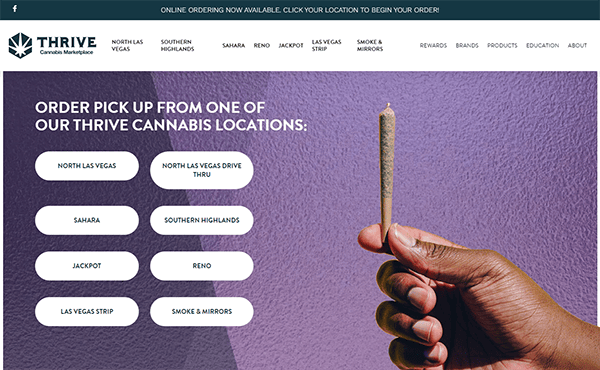
- Thrive Cannabis Marketplace: The website is visually appealing, with a clean, modern design that shows the company’s dedication to quality and innovation. The color scheme uses a minimal palette to create a professional and inviting ambiance. High-resolution photos of items and lifestyle settings are used efficiently to increase visual appeal and promote the brand’s image. The homepage is divided into several areas, including featured products, promotions, and educational tools. This split arrangement allows customers to find the information or products they seek rapidly. The website’s interactive components are skillfully interwoven, contributing to its dynamic and engaging vibe. Hover effects on buttons and graphics add visual feedback, making interactions more intuitive and responsive. The website also has a blog area, a helpful resource for people seeking information on cannabis-related topics. The blog is well-organized and consistently updated, which keeps readers interested and informed.

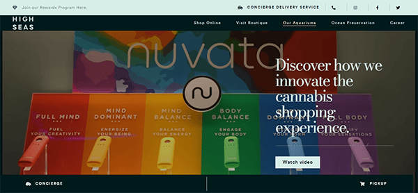
- High Seas: The website’s aesthetic appeal is outstanding. The vibrant, oceanic color palette dominated by deep blues and whites produces a refreshing and engaging environment. The high-quality product photos and lifestyle shots improve the visual appeal, bringing users into the brand’s adventurous spirit. The website’s navigation is simple and easy. The top’s well-organized menu bar allows quick access to various product categories and essential information. The sticky header keeps navigation options within reach, improving the user experience. The website’s content is both engaging and well-crafted. Product descriptions are informative and appealing, emphasizing each item’s unique characteristics and benefits. Clear and adequately positioned call-to-action buttons direct customers to specific actions, such as browsing product categories, signing up for the newsletter, or finishing a purchase.
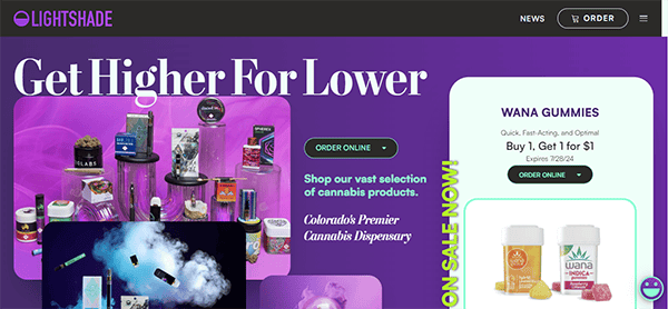
- Lightshade: Its website is a prime example of modern web design, expertly combining visual appeal with user-friendly functionality. The site’s design is supported by a harmonized color palette of vivid tones and greens, resulting in a peaceful and inviting atmosphere that reflects the nature of the items. High-resolution photos and clean, modern font increase the visual appeal, providing readability and a polished appearance. Hover effects and interactive maps for store locations increase engagement, making the browsing experience more dynamic and entertaining. Its website excels at content presentation and user engagement. Detailed product pages with high-quality photographs and customer reviews promote transparency and confidence among potential customers. The instructional component, which includes infographics, videos, and essays, caters to both new and seasoned users, demonstrating its commitment to making informed purchasing decisions. Call-to-action buttons placed strategically, compelling marketing, and a clean blog layout improve user interaction.
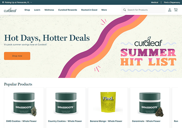
- Curaleaf: Their website has a clean and elegant design, with a harmonious color scheme of greens and whites that complements the brand’s emphasis on health and wellness. The inclusion of high-quality photographs and professional graphics improves the site’s aesthetic appeal, making it more visually engaging for visitors. The website’s layout is straightforward, allowing users to browse its many parts effortlessly. It uses interactive components such as videos, animations, and infographics to engage users and improve their overall experience. The website provides various contact options, including an email address, a service phone number, and a contact form, making it simple for users to seek assistance. Furthermore, a live chat facility provides immediate help, which increases customer satisfaction.
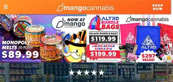
- Mango Cannabis: The visual style of the website is both welcoming and professional. The use of vibrant hues, particularly green and orange, produces a new and lively atmosphere that complements the brand’s character. High-quality photos and graphics increase the website’s visual appeal, making it more visually stimulating. The clean and minimalist layout makes the content the focus point, resulting in a pleasant browsing experience. Whitespace is used carefully throughout the website to keep pages from becoming cluttered. This design option improves readability and directs the user’s attention to crucial points of interest, such as call-to-action buttons and critical information. The website’s navigation is straightforward and user-friendly. The primary menu is well-organized, providing easy access to essential parts. Users can quickly identify specific products or information with the comprehensive search functionality. Furthermore, the website is responsive, ensuring a consistent experience across all devices, whether desktop, tablet, or smartphone.
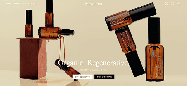
- Mowellens: The website has a clean, modern structure with a refined color palette that conveys peace and wellness. The mix of high-quality photos and elegant typography enhances the site’s overall aesthetic appeal, making it attractive and inviting. The primary menu is basic but comprehensive, allowing customers to locate what they’re looking for. The homepage is meticulously designed, with clear calls to action that direct users through the website. The introduction of a search bar improves usability by providing quick access to particular products or information. The use of clean, uncomplicated design keeps the focus on the products, while the user-friendly shopping cart and checkout process make purchasing simple and hassle-free. The website is entirely suited for mobile devices, guaranteeing a consistent and pleasurable user experience irrespective of the device being used.
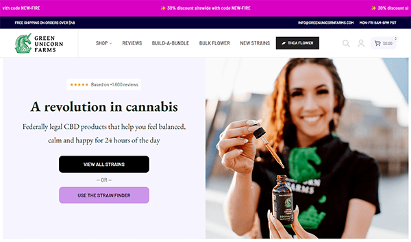
- Green Unicorn Farms: The website’s clean and contemporary design gives visitors an immediate sense of professionalism and trustworthiness. Plenty of white space improves readability and visual attractiveness. A sticky menu enhances the user experience by maintaining a constant position at the top of the screen while visitors scroll downwards. The color palette is balanced, with relaxing greens and neutrals complementing the brand’s natural motif. High-quality photos of CBD products and clear, succinct product descriptions are prominently presented. This graphic approach efficiently highlights the products and ensures the brand image is consistent throughout the site. Trust badges, client testimonials, and certificates are deliberately positioned to inspire trust in prospective buyers. Explicit guidelines regarding shipping, refunds, and product warranties additionally bolster transparency and reliability.
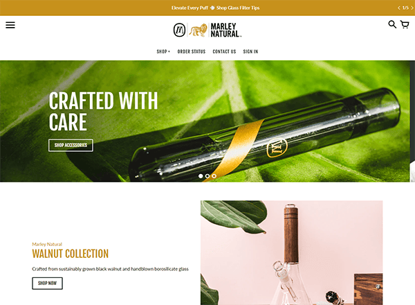
- Marley Natural: The website employs a clean and modern design aesthetic, using a predominantly black-and-white color scheme with subtle accents of gold. This color scheme displays refinement and complements the brand’s identity. The navigation is straightforward, with a well-organized menu that makes surfing easier. The top navigation bar remains stable as you scroll, improving the user experience and providing quick access to essential links like products, about us, and contact information. Products are presented beautifully, with high-quality photos that highlight details and textures. Each product page is well-organized, with clear descriptions, pricing, and supplementary information, allowing customers to understand the options. Strategically placed CTAs encourage users to take action, whether browsing products, learning more about the company, or completing a purchase.
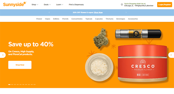
- Sunnyside: The website greets visitors with a clean, modern, welcoming, and professional style. Warm colors and high-quality photography create a pleasant ambiance that complements the brand’s emphasis on wellness and positivity. The primary categories are well-identified, and dropdown menus allow rapid access to subcategories and specific products. It specializes in delivering engaging material that teaches and informs consumers. The product descriptions are comprehensive and informative, offering in-depth information on each item’s benefits and applications. It is committed to accessibility by making the site usable for all visitors, including those with impairments. Features like readable fonts, sufficient color contrast, and keyboard navigation choices improve the site’s accessibility, making it inclusive and user-friendly for various audiences. The “Find a Dispensary” feature improves the site’s functionality by allowing clients to connect with physical facilities easily.
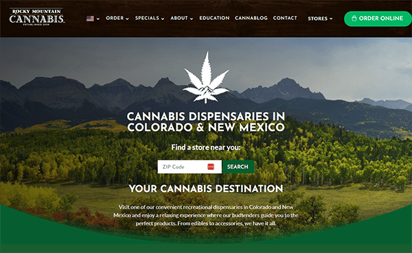
- Rocky Mountain Cannabis: The website has a clean, well-organized layout that makes navigation simple. The homepage is divided into simple sections, allowing users to access essential information. The usage of white space improves reading and lends the site a modern, uncluttered appearance. The color design is vibrant and professional, with earthy tones that capture the website’s natural spirit. High-quality product photos and scenic backgrounds enhance the visual appeal, resulting in a warm and authentic ambiance. The website gives full product descriptions and benefits. This transparency fosters confidence among potential customers. Additionally, the “Search” option is prominently displayed, making it easy for consumers to find the nearest store. Customer reviews are widely displayed on the site, contributing to its legitimacy. Potential purchasers can read personal accounts and testimonials, which can heavily impact their purchasing decisions.
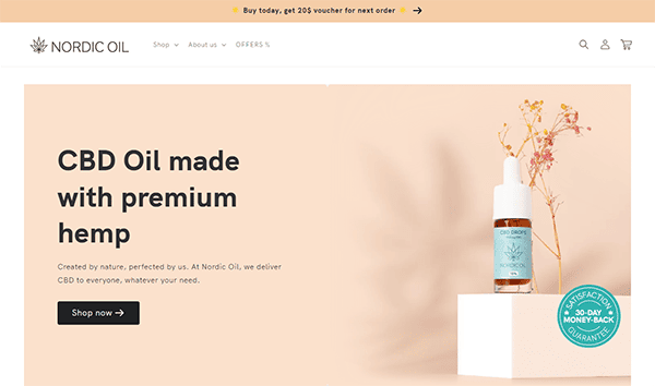
- Nordic Oil: The design provides a pleasant and serene tone, distinguished by its simplicity and appealing photos, which combine to give a sense of professional service. The well-organized menu bar enables users to quickly access various product categories, instructional resources, and customer support alternatives. Products are shown with high-resolution photographs and thorough descriptions, making it simple for shoppers to comprehend what they’re buying. The product pages provide important information, such as ingredients and usage instructions, which increases transparency and trust. The website also highlights unique product qualities, such as vegan or alcohol-free options, to appeal to different customer preferences. The website offers a separate section for customer reviews, which allows new visitors to learn about other people’s experiences and gain confidence in their purchases. The existence of a live chat option guarantees that customers receive immediate assistance if necessary, hence improving the entire customer service experience.
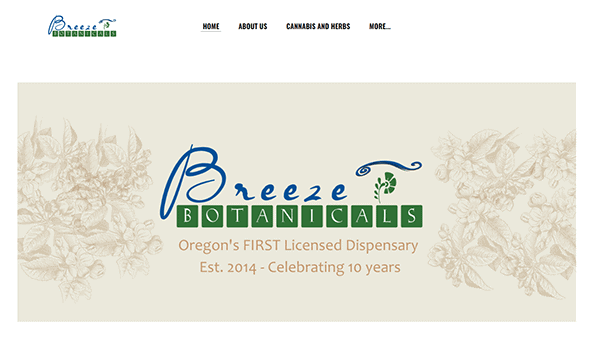
- Breeze Botanicals: The first thing that strikes the eye is the very pleasing design. The color palette is gentle and natural, reflecting the company’s emphasis on botanical products. Its use of large images and bold lettering facilitates seamless navigation, enabling users to locate desired information. The appealing photos enhance the overall user experience, capturing the essence and aesthetics of cannabis culture. The website contains a plethora of helpful information about its goods, services, and the advantages of botanical wellness. Each product page includes thorough descriptions, usage directions, and benefits, allowing shoppers to make more informed judgments. Its clear and compelling CTAs throughout the website direct visitors to desired activities, like purchasing or subscribing to the newsletter. These CTAs are carefully placed and well-designed to stand out without being invasive, increasing conversions.
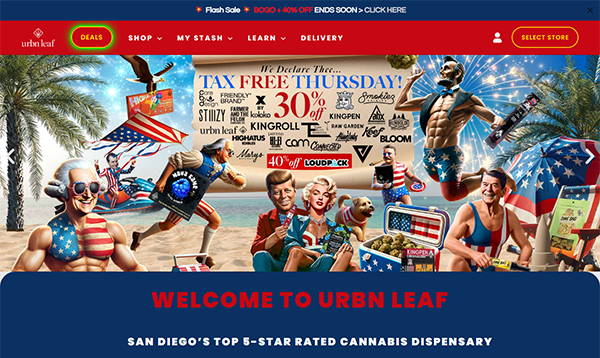
- Urbn Leaf: The website has a visually appealing layout. It uses high-quality photos, professional graphics, and a consistent color palette to create a welcoming and polished appearance. The balance of pictures and text ensures the site is manageable, making it easy to navigate. The site’s usability is improved by its clear and simple navigation. The well-organized menu allows customers to easily navigate product categories, dispensary locations, and educational materials. Each part is built with the user experience in mind, ensuring visitors can quickly discover what they seek. The product pages are impressive, with thorough descriptions, user reviews, and clear price information to assist shoppers in making informed judgments. Another standout feature is responsive design, which allows the website to adjust effortlessly to different platforms, offering a consistent experience whether accessed by desktop, tablet, or smartphone.
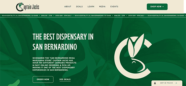
- Captain Jacks: Its website provides an excellent user experience, seamlessly combining functionality with a visually appealing design. The homepage is appealing, with a clean, modern look and simple navigation that takes customers quickly across sections such as product categories, discounts, and educational materials. High-quality photographs and a well-coordinated color palette improve the overall appearance, making browsing more fun and exciting. One of the site’s advantages is its organization. The intuitive user interface enables customers to traverse various effortless product categories like flowers, vaporizers, edibles, and more. The use of calls-to-action (CTAs) such as “Shop Now,” “Join Rewards,” and “Get in Touch” efficiently guides customers across the site, encouraging them to take advantage of various features and offerings. Customer feedback is effortlessly integrated, with reviews on product pages offering vital information and fostering confidence among prospective purchasers.
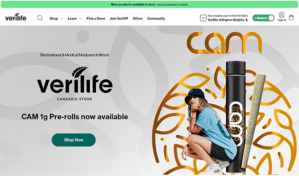
- Verilife: Its website has a clean, modern layout. The use of white space is superb, resulting in a balanced and uncluttered appearance that improves readability and aesthetic appeal. The website’s color palette is both colorful and relaxing, with hues of green, which represent the cannabis industry, and complementing colors. The main menu is prominently shown at the top of the page, with clear labels denoting the contents of each component. Content is organized into relevant categories, allowing users to easily access information about products, services, locations, and educational resources. The website also includes compelling multimedia features like videos and infographics. One notable addition is the strong ‘Find a Dispensary’ option, which allows users to rapidly discover the nearest physical location, hence increasing convenience and accessibility.
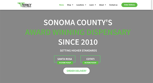
- Mercy Wellness: The website greets visitors with a clean, modern style that exudes expertise and dependability. The menu structure is efficiently structured, facilitating users’ location of desired information, whether browsing products, exploring services, or accessing instructional materials. The inclusion of high-quality photographs of their products and facilities builds credibility and encourages investigation. It specializes in providing detailed information about its products and services. Each extensive product page includes descriptions, potency information, and frequent consumer reviews, allowing potential customers to make informed purchases. The website prominently displays customer reviews, fostering confidence and transparency. Interactive components like the blog and events page are seamlessly incorporated, providing richness to the user experience.
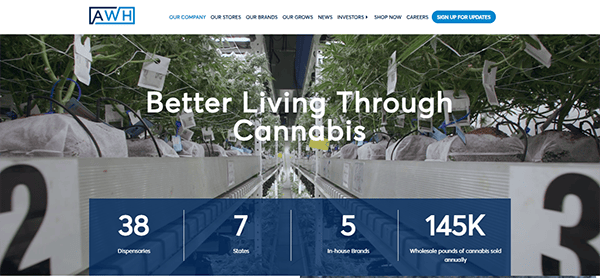
- Ascend Wellness Holdings: Its website impresses with its clean layout and modern aesthetic. The utilization of plenty of white space improves readability and draws attention to crucial areas. The color scheme is harmonious and consistent with the brand’s identity. Consistent usage of colors from the brand palette strengthens brand recognition and creates a consistent visual experience throughout the website. Navigation is simple and user-friendly. The well-organized menu allows users to quickly access precise information about the company’s products and services. High-quality graphics and visuals are employed successfully across the site, increasing the appeal of the items and services available. Interactive components like buttons and forms are well-designed and functional, allowing visitors to navigate and engage seamlessly.
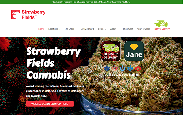
- Strawberry Fields: The homepage’s vibrant and welcoming color design accurately portrays the brand’s identity. High-quality photos of cannabis items and the Colorado countryside enhance authenticity and attraction. The navigation menu is well-organized, so users can easily discover what they want. Important areas such as items, locations, and promotions are prominently presented, which improves usability. Including customer evaluations and testimonials prominently on product pages promotes confidence and trustworthiness among potential customers. Throughout the site, prominent call-to-action buttons direct visitors to essential actions such as browsing products, signing up for newsletters, or exploring discounts. This streamlines the user journey and increases engagement.
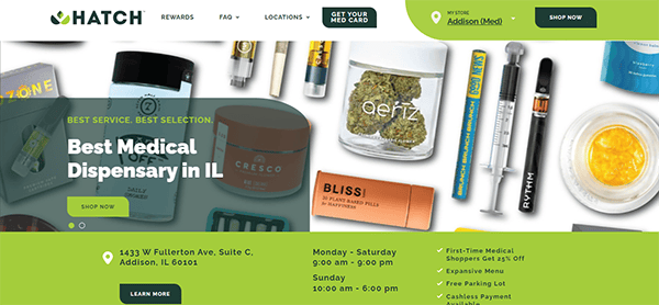
- Hatch: The website’s clean and professional design stands out. The usage of plenty of white space improves reading and provides the site with a modern appearance. The color design, predominantly green and white, is soothing and constant throughout the website, fostering a sense of trust and expertise. The website’s visual hierarchy successfully guides users through the material. Headings and subheadings are clear and distinct, making it simple to scan and comprehend the information presented. The website’s content is both interesting and informative. The webpage effectively communicates the company’s mission and offerings through succinct and appealing language. Calls to action (CTAs) are intentionally positioned to stimulate user participation, such as arranging consultations or exploring more services. The website prominently displays trust signs, such as client testimonials, credentials, and connections.
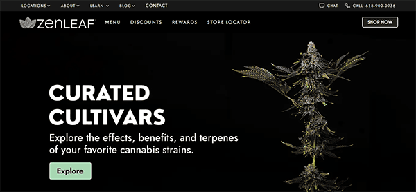
- Zen Leaf Dispensary: The website has a clean, modern design aesthetic. The interface is user-friendly, with a soothing color scheme that complements the brand’s name. The use of whitespace improves readability and user experience, allowing visitors to browse the website effortlessly. Navigation is easy courtesy of a well-organized layout and a persistent menu that remains visible as you scroll. Its website strikes a great blend of visual appeal and relevant content. Product options are shown with high-quality photographs and extensive descriptions, allowing shoppers to make informed decisions. The live chat feature on the website personalizes the user experience. It enables users to communicate directly with customer service experts in real time, quickly resolve questions and product recommendations, and provide assistance throughout browsing and purchasing.
A top-tier dispensary website goes beyond mere aesthetics; it enhances user experience, boosts SEO rankings, and drives sales. Whether you’re a new dispensary looking to develop your internet presence or an established firm that wants to update to refresh your current site, focusing on professional cannabis website design is imperative. The examples provided illustrate how effective web design can significantly impact the cannabis industry.
At CyberOptik, we specialize in creating custom web solutions tailored to the unique needs of dispensaries. Our knowledge of dispensary web design ensures that your website appears fantastic and performs exceptionally well. We understand the specific challenges of the cannabis industry and are committed to helping you overcome them with a standout site.
Ready to elevate your dispensary’s online presence? Contact CyberOptik today for a free consultation about your cannabis website design needs. Let’s work together to create a website that symbolizes your brand and propels your firm towards progress.