Dermatology practices stand to benefit significantly from having a compelling online presence. A skillfully crafted website serves as the digital front door to your practice, offering a first impression that can convert visitors into patients. In an age where patients often begin their treatment journey online, having one of the best dermatology websites can set your practice apart from competitors. It’s not just about aesthetics; a top-notch website enhances user experience, provides essential information, and builds trust through professional presentation and ease of use.
The importance of digital engagement cannot be overstated in the healthcare industry, especially in specialized fields like dermatology. Patients seeking treatment for skin conditions value privacy, convenience, and clear communication, all of which can be facilitated through a sophisticated website design. Websites that feature responsive design, easy navigation, and educative content are more likely to attract and retain patients. By integrating elements such as online appointment scheduling, patient education resources, and virtual consultations, dermatology websites can offer enhanced service that meets the expectations of today’s digital-savvy patients.
Moreover, for dermatologists, a website is a tool for patient engagement and a platform for professional authority. The best dermatology websites often feature before-and-after galleries, detailed descriptions of treatments, and patient testimonials. These elements help in establishing credibility and expertise in the dermatological community. Investing in top dermatology websites can increase patient trust and a more substantial professional reputation, which are critical components in a competitive market.
Examples of the Best Dermatology Website Designs
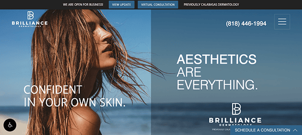
- Calabasas Dermatology Center: The website has a captivating and striking full-page hero image that will instantly draw viewers into the experience. Its visually appealing layout offers a smooth journey, with information readily available via well-organized sections, intuitive thumbnails, and easy navigation. The information on the services available, the team’s expertise, and how to arrange an appointment is persuasive and simply accessible. Beyond hero images, the website uses visually appealing components like graphics, symbols, and illustrations to supplement the content and increase user engagement.
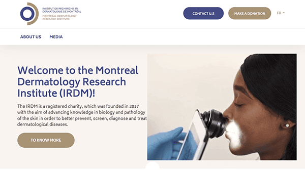
- Montreal Dermatology Research Institute: The website’s muted color palette creates a relaxing atmosphere. Set against a calm white backdrop that dominates the screen, the design features striking buttons that add a modern touch to the layout. Its website carefully uses whitespace to generate a sense of openness, allowing text to breathe while directing users’ attention to key pieces. One standout feature of the web design is its seamless navigation. The navigation is well-organized, making it simple for users to navigate various website sections. Using high-quality photographs and videos adds depth and authenticity to the website, giving potential patients an idea of the institute’s facilities and expertise. Throughout the site, properly positioned CTAs encourage potential clients to take the desired actions, such as making an appointment, learning more about specific therapies, or contacting the institute for additional information.
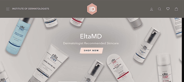
- Institute of Dermatologists: Viewers are met with a clean and professional interface that quickly instills trust in the institute’s knowledge and professionalism. The design is both elegant and informative, and the website has an easy navigation system with plenty of information about board-certified dermatologists. The inclusion of office and doctor photos, along with a custom video, enhances the clinic’s credibility and integrity. One of the website’s most notable features is its visually pleasing design. The thoughtful utilization of whitespace conveys an atmosphere of transparency and elegance, while high-quality photographs and videos show off the institute’s resources and expertise. The color scheme is relaxing and coherent, adding to the overall look.
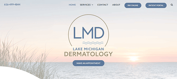
- Lake Michigan Dermatology: The website’s clean, serene, modern design immediately gives visitors confidence. The minimalist layout is easy on the eyes and highlights crucial information without overpowering the user. High-quality photos and graphics are deliberately used to improve the user experience and communicate a sense of confidence and expertise. The integration of online appointment scheduling functionality enhances the patient experience by making it easier to schedule an appointment with a dermatologist at Lake Michigan Dermatology. This helpful tool demonstrates the practice’s commitment to patient-centered treatment and accessibility.
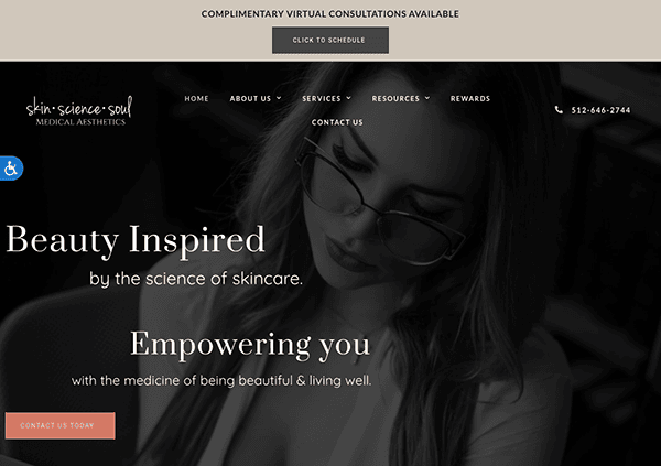
- Skin Science Soul Medical Aesthetics: The choice of black-and-white visuals adds elegance and class to the website, producing a visually appealing impression. These photos, expertly integrated into the header, not only improve the site’s aesthetics but also convey a sense of professionalism and knowledge. Furthermore, strategically placing promotional text for their online dermatology services in the header ensures prominent visibility, attracting visitors’ attention and emphasizing the practice’s commitment to accessible healthcare. Its website promotes a sense of community and connection among patients by including patient testimonials, social media integration, and interactive aspects. The website builds trust and confidence in the practice by emphasizing real patient stories and promoting involvement.
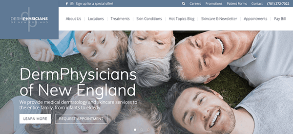
- DermPhysicians: The website’s design achieves an ideal blend of functionality and visual appeal. Crisp and clear photographs highlight the practice’s facilities, staff, and services, while soft colors and subtle textures create an inviting environment. The menu navigation elements on the home page are masterfully constructed to provide quick access to important information. With clear and intuitive labels, visitors can easily discover the necessary information, enhancing the overall user experience. The website excels at providing valuable and educational content to patients. It includes extensive descriptions of dermatological problems and remedies and useful blog postings. These features provide a complete resource for anyone seeking skin health information.
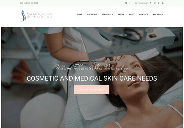
- Smarter Skin Dermatology: Upon accessing the homepage, visitors are welcomed by a visually attractive design that will immediately grab attention. Bright hues and high-quality visual representations establish an appealing ambiance, setting the mood for a favorable exploration encounter. The main menu facilitates convenient access to crucial parts such as services, providers, patient resources, and contact details, guaranteeing visitors to locate the necessary information with minimal exertion swiftly. The main page features a user-friendly contact form encouraging visitors to seek information or inquire. The website’s strategically positioned call-to-action strips function as efficient markers, facilitating users’ navigation effortlessly. These prompts promote active participation and smooth movement, ensuring visitors can easily navigate and explore the different parts and products.
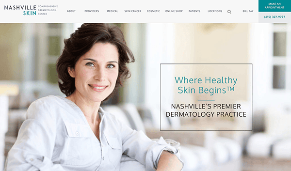
- Nashville Skin: Upon arrival, visitors are promptly welcomed by a visually captivating design that radiates elegance and expertise. The utilization of excellent visual representations and muted hues establishes a welcoming ambiance, alluring visitors to explore the experience further. The website is entirely responsive, guaranteeing the best possible viewing and operation on all devices, such as PCs, tablets, and smartphones. A user-friendly online appointment scheduling function allows patients to conveniently book appointments with the clinic’s proficient dermatologists. The website promotes connection among patients through elements like social media integration and patient testimonials.
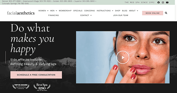
- Facial Aesthetics: Its website, with its fascinating blend of beauty and knowledge, raises the heights of excellence in aesthetic medicine. Visitors are met with a visually appealing design that oozes refinement and luxury, expressing a commitment to enhancing beauty and confidence through personalized treatment. The website’s modern layout, elegant graphics, and straightforward navigation provide a seamless user experience, allowing visitors to explore treatment options easily, learn about the practice’s philosophy, and schedule appointments. It features helpful information and online appointment scheduling. Their website informs, inspires, and positions the clinic as a reliable partner in pursuing eternal beauty and rejuvenation.
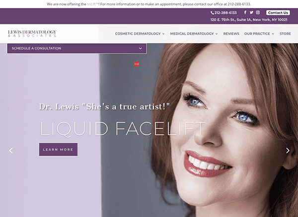
- Lewis Dermatology & Associates: Its website exudes sophistication and professionalism in the field of dermatology. The website’s devotion to excellence in skincare is evident in its sleek design, educational information, and user-friendly navigation. The homepage immediately strikes with its slick structure and visually appealing imagery, conveying a sense of trust and knowledge. Clear navigation choices take visitors smoothly around the site, providing easy access to critical information regarding services, treatments, and the clinic. With a focus on education and community participation, its website is an invaluable resource for patients looking for information and support on their skincare journey. The website provides a fluid and informative experience that reflects the practice’s commitment to delivering exceptional dermatological treatment.
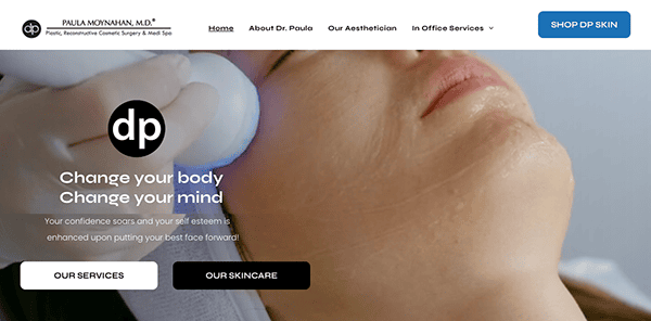
- Paula Moynahan MD: Its website has a relaxing and professional appearance. The use of soft hues, clean lines, and high-quality video and photographs create a pleasant environment that puts visitors at rest. The layout is simple and easy to use, ensuring consumers can quickly find the information they need. The simple and concise menu provides easy access to important pages like services, about, and contact. Its website is rich with useful information about its practice, services, and areas of competence. The compelling call to action effectively communicates to visitors that the website offers an online shop in addition to consulting services.
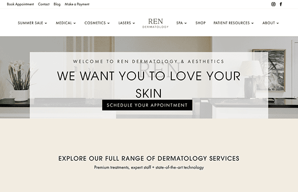
- Ren Dermatology & Laser Center: The clinic’s clean structure and exquisite color choices give it a polished appearance that reflects professionalism. The website’s user-friendly style allows visitors to access the most important information. It contains engaging information that informs and captivates visitors. High-quality photographs highlight the physicians’ expertise and cutting-edge facilities, while educational texts offer helpful insights into a variety of skincare subjects. The provision of convenient online appointment scheduling reflects a dedication to providing patients with a seamless and comfortable experience.
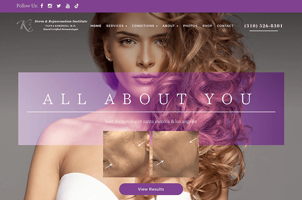
- Tanya Kormeili Dermatology: Their beautiful and inviting website design immediately attracts visitors’ attention. Soothing hues, great artwork, and appropriate writing provide a pleasant environment representing the firm’s quality. The website is jam-packed with helpful content that teaches and empowers users about a variety of dermatological disorders and remedies. The incorporation of before-and-after photographs enriches the educational experience while also highlighting the practice’s expertise. The inclusion of patient testimonials emphasizes the practice’s dedication to providing great results and developing long-term connections with patients.
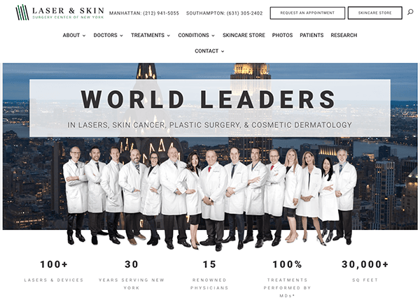
- Laser and Skin Surgery Center: The clean layout, current typeface, and high-quality photos contribute to a sophisticated design representing the practice’s expertise. The website’s rich menu layout allows for seamless navigation. Visitors may locate the information they need, whether it’s about the services provided, the physicians’ competence, or patient resources. The straightforward layout allows visitors to easily navigate to the relevant segment, improving the overall user experience. The website offers excellent insights into skincare, including detailed descriptions of laser procedures and insightful articles and videos. Patient testimonies and before-and-after images increase trustworthiness and help prospective patients make informed selections.
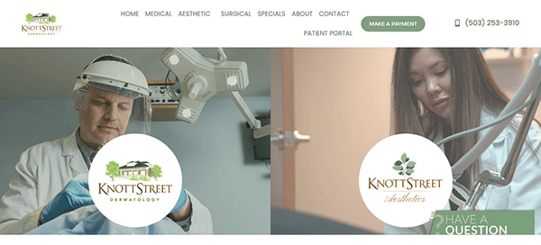
- Knott Street Dermatology: Its website has a modern design with a relaxing color palette and easy navigation, inviting visitors to discover its plethora of educational material. The website is an excellent educational resource, including extensive information on dermatological disorders and patient testimonies. Its responsive design provides a consistent experience across all devices, demonstrating the practice’s commitment to accessibility and patient satisfaction. It also promotes patient-centric care, instilling trust and confidence in visitors seeking high-quality skincare services.
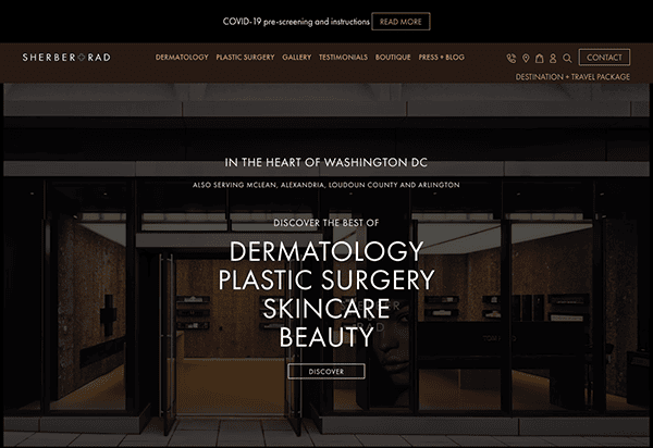
- Sherber + Rad: The website’s design is sleek and classy. The basic layout, subtle colors, and high-quality pictures result in a visually attractive appearance. The menu is well-organized and has a user-friendly interface. Whether you want to learn about the services provided or the team of professionals or schedule an appointment, all this information is easily accessible with just a single click. The website also provides valuable content that educates and empowers visitors regarding a range of dermatological procedures and treatments. The website sets a standard for dermatological clinics seeking to develop an effective online presence with its sophisticated design, user-friendly navigation, educational content, and client-focused attitude.
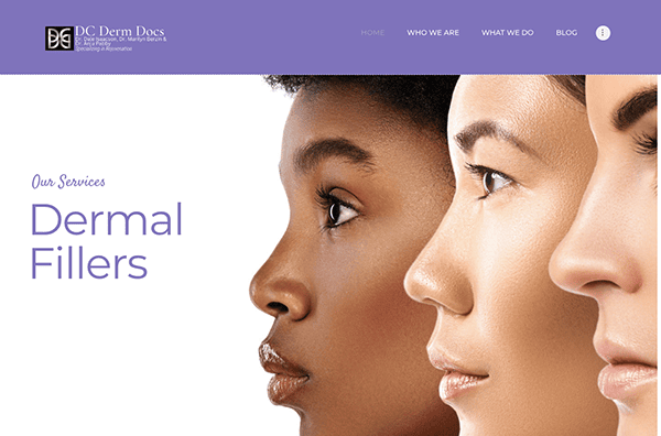
- DC Derm Docs: The website’s design is attractive and professional. The homepage welcomes visitors with a simple style and high-resolution graphics that express warmth and confidence. The color scheme exudes professionalism with its relaxing tones of purple and white. The website’s emphasis on expertise is noteworthy. Whether it’s laser therapy, injectables, or personalized skincare regimes, the graphics invite visitors to explore the full range of services offered. Furthermore, the presence of patient testimonials provides an important element of legitimacy. Reading about real-life experiences and transformations boosts visitors’ confidence while cultivating an impression of community.
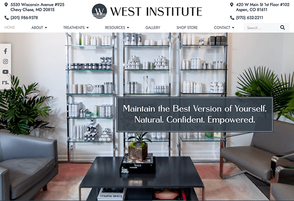
- The West Institute: The homepage greets visitors with an impressive visual design. It displays top-notch photographs highlighting the clinic’s modern facilities and innovative therapies. Gentle and alluring hues establish a tranquil ambiance, laying the foundation for a serene and pleasurable browsing encounter. The navigation is smooth and effortless, facilitated by the user-friendly menu that directs users to different sections, including services, products, and patient resources. One of the website’s distinguishing aspects is its emphasis on education and transparency. The “Treatments” section contains in-depth information about each operation, such as how it works, what to expect, and probable outcomes.
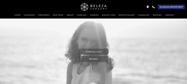
- Beleza Med Spa: The first thing that stands out on their website is the gorgeous visual imagery. The site features a fascinating video banner that captures attention promptly and a prominent call-to-action button in the center, assuring engagement from the start. High-quality images of patients and procedures in the gallery section reveal the transformational potential of cosmetic surgery and non-invasive treatments, laying the groundwork for an inspirational journey ahead. The website also features specialized sections for key dermatology categories and important information such as the clinic’s achievements and affiliations with prestigious dermatology associations. This provides a thorough understanding of our expertise and dedication to excellence.
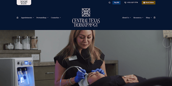
- Central Texas Dermatology: The site captivates with its simple style and attractive color palette, laying the groundwork for an enjoyable surfing experience. High-quality photographs and videos highlight the clinic’s tranquil environment and advanced technology, instilling trust in visitors from the outset. The website’s navigation is simple, and the information provided is carefully sorted into relevant categories, allowing visitors to browse and find what they seek. The website is flawlessly designed for maximum speed across all devices and browsers. The website also features convenient online booking functionality, allowing visitors to schedule appointments with just a few clicks.
As we explore various top dermatology websites, it becomes clear that the best designs share a few common features: aesthetic harmony, functional ease, and comprehensive content. These sites visually reflect the professional standards expected in dermatology and ensure patients can find information swiftly and schedule appointments without hassle. Whether through seamless navigation or the strategic use of visuals and text, these websites make patient interaction as smooth as possible.
Following the showcase of exemplary website designs, reflecting on how these elements contribute to a practice’s success is essential. A top-tier dermatology website supports a practice’s operational efficiency by automating patient intake, providing FAQs, and offering direct communication channels. This not only saves time for both staff and patients but also improves the overall patient experience. Furthermore, by regularly updating the content and maintaining SEO best practices, dermatology websites can achieve higher visibility and attract more patients.
The digital landscape for dermatology is one where innovation and user-centered design can substantially benefit both practices and patients. Integrating straightforward, informative content with functional design elements can transform an essential website into a powerful tool for patient engagement and professional growth.
For dermatologists looking to either build a new website or revamp an existing one, CyberOptik offers specialized web design services expertly customized to meet the unique requirements of the dermatology industry. Contact us today for a free consultation on how we can help elevate your online presence and ensure your website ranks among the best dermatology websites.

