The daycare industry plays a crucial role in supporting working families and ensuring that children receive a safe, educational, and nurturing environment. Having a strong online presence is increasingly important as parents turn to the internet to research and compare different daycare centers. A well-designed website can help you stand out in a crowded marketplace while giving families the confidence they need to choose your services. To learn more about building a professional daycare site, click here.
When you’re brainstorming daycare website design ideas, it’s vital to consider how parents and caregivers will interact with your site. Factors like clear navigation, vibrant imagery, and detailed program information all play a big part in helping visitors connect with your center. By prioritizing user-friendly layouts and engaging content, you can create an online experience that reflects the nurturing environment parents hope to find for their children.
A well-rounded daycare website design also needs to highlight your center’s unique selling points and make important information—like enrollment processes, curriculum overviews, and contact details—easily accessible. In this post, we’ll showcase 20 of the best daycare website designs from around the web to inspire your next redesign or help you build a site that resonates with parents from day one.

Examples of the Best Daycare Website Designs
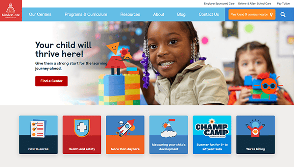
- KinderCare: KinderCare’s website features a bright, playful design that is immediately welcoming to parents seeking a nurturing environment. The homepage highlights smiling children and staff members, setting a friendly tone that carries throughout the site. Each section is well-organized, making it easy to find information on programs, locations, and health & safety measures. A simple menu structure ensures parents can navigate quickly, while well-written content addresses frequent concerns about child development and daily schedules. Overall, the cheerful colors and child-centric imagery create a trustworthy atmosphere.

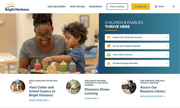
- Bright Horizons: Bright Horizons stands out with a sleek yet colorful layout that showcases its commitment to child development and family engagement. The site’s header displays easy-to-find links for center locations, tuition, and program details. Testimonials and success stories from parents add credibility and help guide new visitors toward enrollment. The color palette is carefully balanced—soft tones that are child-friendly without overwhelming the user. Each page flows logically, guiding parents through curriculum information and special offerings. The combination of strong visuals and concise text creates a comforting, professional impression.
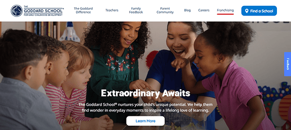
- The Goddard School: With a modern design that incorporates professional photos, The Goddard School website exudes warmth and credibility. The navigation bar is thoughtfully organized into clear categories like “Curriculum,” “Admissions,” and “Our Story,” ensuring that parents can locate critical information in seconds. The homepage features an engaging slider showcasing happy children in their learning environments, immediately illustrating the school’s emphasis on quality education and care. Subtle animations and hover effects add polish without distracting from core content. Each location’s page includes practical details like schedules, fees, and contact information, offering a personalized user journey.
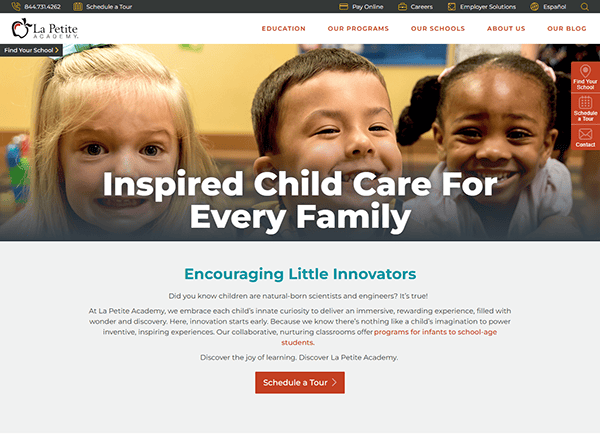
- La Petite Academy: La Petite Academy’s site uses a bright, colorful theme that matches the playful nature of a daycare environment. Organized sections ensure that parents can explore different programs, read about curriculum highlights, and learn about safety protocols effortlessly. Customer reviews, along with staff qualifications, lend credibility, providing visitors the confidence they need to learn more about enrollment. The consistent use of visuals—smiling children and welcoming educators—keeps the site engaging. The layout ensures that essential information, such as tuition, location, and schedule details, is always within reach, reinforcing transparency and building trust with prospective families.
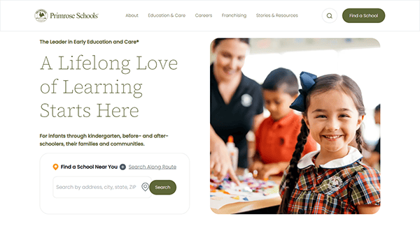
- Primrose Schools: Primrose Schools showcase their commitment to early education with a clean, structured layout and a refined color scheme. The hero section on the homepage features an inspiring tagline and a call to action that directs parents to learn more about the curriculum. Well-defined sections highlight developmental milestones, educational philosophies, and safety measures. The navigation is intuitive; parents can easily access blog articles on child-rearing tips and success stories from other families. Engaging images of children’s activities make the site feel personal and genuine, reflecting the warm atmosphere of their physical locations.
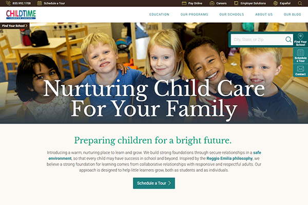
- Childtime: Childtime’s site perfectly balances warm images, real parent testimonials, and straightforward design elements. The homepage shares a glimpse of daily life at their daycare centers with slideshows of learning environments and interactive sessions. Drop-down menus categorize programs by age range, ensuring parents can jump directly to what applies to their child’s needs. A friendly color palette emphasizes a child-centric focus while maintaining a polished, professional feel. Parents can view staff qualifications, center philosophies, and safety protocols, helping them make an informed decision. The layout lends itself to quick scanning while retaining enough depth for deeper exploration.
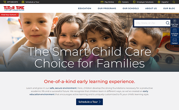
- Tutor Time: Tutor Time impresses visitors with a design that merges a playful theme and an easy-to-navigate interface. Vibrant images show children engaged in educational play, emphasizing the center’s focus on development and fun. The website neatly organizes content into age-based categories, making it easy for parents to learn about relevant programs. Informative sections detail curriculum approaches, nutritional guidelines, and safety policies, reflecting Tutor Time’s holistic approach. The site also includes a convenient location-finder tool, enabling prospective parents to identify a center close to home or work.
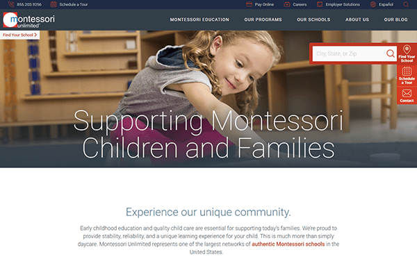
- Montessori Unlimited: Montessori Unlimited features a minimalist design that aligns with the philosophy of simplicity and hands-on learning. The subdued color palette highlights vivid photographs of calm, purposeful classroom spaces. Each age group section outlines program goals and developmental benefits, giving parents insight into the Montessori approach. Smooth scrolling reveals details about specialized teachers, materials used, and safety procedures. The site also has a robust FAQ section tailored to prospective parents. This balance of aesthetic appeal and thorough information helps Montessori Unlimited communicate trustworthiness and expertise to anyone exploring childcare options.
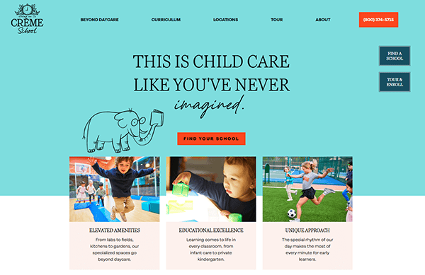
- Crème de la Crème: Crème de la Crème’s website highlights an upscale, forward-thinking childcare experience. Large, high-resolution photographs reflect the modern facilities and advanced learning tools the centers provide. Bold typography on headers draws attention to important information, such as programs, unique features, and enrollment processes. The smooth site navigation also includes a convenient location search, ensuring parents can find the center that best meets their needs. Testimonials from satisfied families lend authenticity and help establish trust, while well-structured descriptions of each program level make it easy for parents to understand the progression of their child’s learning journey.
- The Learning Experience: The Learning Experience’s site features vibrant animations and a captivating mascot to greet visitors in a playful, child-friendly fashion. Beneath the whimsical visuals, the site maintains a well-organized structure, directing parents to different age-based programs, enrichment courses, and franchising opportunities. Program pages break down learning objectives and include short video clips demonstrating classroom activities. The top menu includes a clear link to center locations and tuition details, helping parents get essential information quickly. The distinct branding, paired with easy navigation, ensures that families feel engaged and informed as they explore enrollment options.
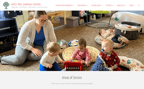
- Apple Tree Learning Centers: Apple Tree Learning Centers uses a warm color scheme and cheerful imagery to create an inviting digital space for parents. The homepage engages viewers by spotlighting different child age groups, each with its own set of unique learning objectives and fun activities. A dedicated parent resource section houses necessary forms, calendars, and contact details, making communication easy. The site layout benefits from plenty of white space, keeping the focus on mission statements, educational philosophies, and staff credentials. Overall, Apple Tree blends a friendly, family-focused vibe with practical organization to guide prospective families toward a confident decision.
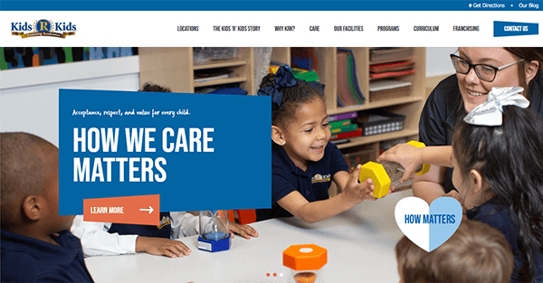
- Kids ‘R’ Kids: Kids ‘R’ Kids employs a bold, energetic design, emphasizing the active learning environment it provides. Bright accents and photography immediately draw visitors in, showcasing classes, play areas, and special events. The site’s main navigation makes it simple for parents to learn about infant care, preschool options, after-school programs, and beyond. Location pages include virtual tours, teacher bios, and schedules, giving parents a behind-the-scenes look before scheduling a visit. By presenting a consistent brand identity across each section, the website builds trust and communicates the center’s commitment to nurturing young minds and fostering parental engagement.
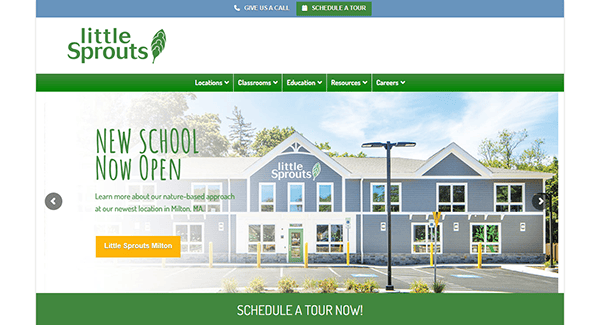
- Little Sprouts: Little Sprouts’ website embodies a tranquil, nature-inspired aesthetic that resonates with its name. Soft greens and earth tones help differentiate program categories, each described with child-friendly language. Large, high-quality photographs illustrate the center’s play spaces, garden areas, and community involvement, conveying a sense of growth and exploration. The site provides comprehensive overviews of daily schedules, nutritious meal plans, and certifications, underscoring the center’s emphasis on holistic development. Subtle animations guide the user through each section, making the overall navigation experience pleasant and intuitive. This balanced blend of visuals and content makes Little Sprouts stand out.
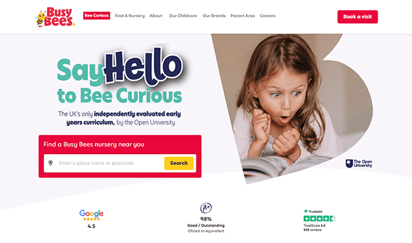
- Busy Bees: Busy Bees has a bright, inviting homepage with a bee-themed design that instantly grabs the attention of parents and children alike. The layout places essential details—like child age ranges, curriculum information, and safety practices—front and center. A rotating banner showcases the center’s interactive activities, healthy meal plans, and parental testimonials. Visitors can easily explore each classroom level, with age-specific resources helping them understand the focus at each stage of development. This user-friendly approach, coupled with energetic branding, helps Busy Bees convey a nurturing, playful environment where children can learn and grow.
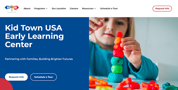
- Kidstown USA: Kidstown USA’s site combines a simple layout with eye-catching pops of color to create a fun, lively atmosphere. A prominent call-to-action button on the homepage invites parents to schedule a visit or request more information immediately. Illustrated sections describe the center’s daily routines, allowing parents a glimpse into their child’s potential experiences. The website also boasts a helpful parent portal for streamlined communication, event updates, and payment options. Kidstown USA’s emphasis on community engagement is clear from the many photos of group activities, field trips, and celebrations, all woven seamlessly into the design.
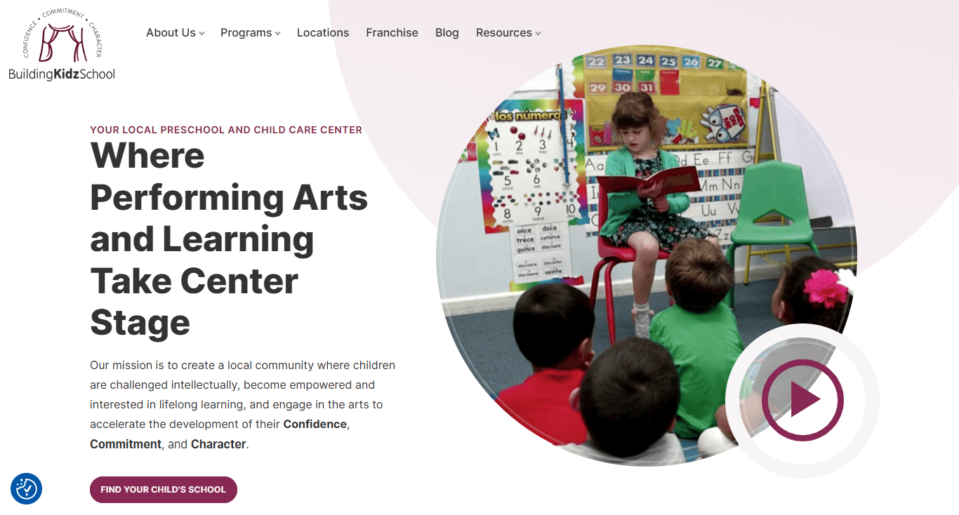
- Building Kidz: Building Kidz takes a modern approach to daycare website design, emphasizing artistic expression and performing arts as part of its curriculum. The homepage displays vivid imagery and event highlights, showcasing children immersed in music, dance, and theater. Detailed program pages describe how creative activities support academic growth, fine motor skills, and emotional development. Parents can explore location-specific sections offering schedules, tuition information, and staff bios. This creativity-focused design is complemented by a clean, intuitive interface, ensuring that users stay engaged and informed without feeling overwhelmed by overly flashy elements or text blocks.
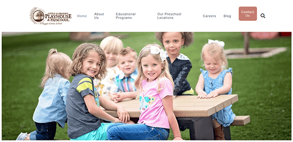
- Little Sunshine’s Playhouse: Little Sunshine’s Playhouse immediately sets a whimsical tone with playful graphics and a pastel palette. The website’s design centers on storytelling, showcasing different learning themes and interactive activities that spark curiosity. Navigation is straightforward: parents can browse by age group, explore a community blog, or dive into specific educational philosophies. Subpages outline the center’s unique Reggio-inspired approach, featuring real-life classroom photos. Parental testimonials and highlight videos reinforce trustworthiness. This storytelling-driven approach ensures that parents not only understand what the program offers but also feel emotionally connected to the center’s nurturing environment.
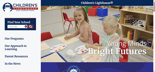
- Children’s Lighthouse: Children’s Lighthouse uses a bright and airy design that guides visitors through its programs and philosophies with ease. The hero section features a clean banner that introduces the center’s commitment to educational excellence. As parents scroll, they discover details on curricula, values-based learning, and the center’s approach to building leadership skills. Each page is designed to be concise yet informative, offering parents valuable insights into facility certifications, staff training, and community involvement. User-friendly icons highlight key features like extended hours and meal plans, ensuring parents can quickly evaluate whether the center fits their needs.
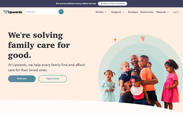
- Upwards: It distinguishes itself with a platform-style website that connects parents to a wide network of home daycare providers. Despite its broader scope, the design remains highly approachable. Its soft color palette appeals to parents, while bold headings guide users to search by zip code, read reviews, or learn about program specifics. Each daycare listing has a dedicated page featuring photos, schedules, licensing details, and transparent pricing. Its emphasis on the local community and personalized child care experiences is evident, providing a reliable place for busy parents to find trustworthy, high-quality options with minimal hassle.
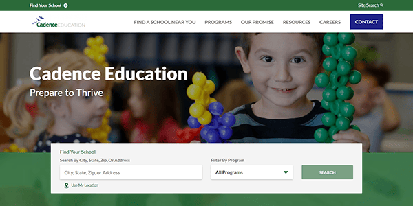
- Cadence Education: Cadence Education’s site greets visitors with a video loop of children engaged in lively educational play, setting the tone for a dynamic and engaging user journey. The top menu organizes programs by age, making it simple for parents to find the right fit. Each section covers learning activities, teacher qualifications, and center-specific benefits. The color scheme combines gentle pastels with vibrant accent hues, striking a professional and child-friendly balance. Testimonials and parent resources are clearly labeled, creating a supportive, informative environment that speaks directly to the needs of modern families.
Building or redesigning a daycare website involves more than throwing together colorful images and fun graphics. These examples highlight strategies that can help you better engage parents and establish trust. From mobile-friendly layouts to clear calls to action, every design element should be thoughtfully chosen to reflect the caring, educational environment you strive to create.
Whether you’re looking to overhaul your online presence or you’re brand-new to the market, these standout examples can help guide you toward designing a website that showcases your strengths and welcomes families into your daycare community. By focusing on approachable design, comprehensive program information, and effortless navigation, you will make a lasting impression on prospective parents.
Take the time to refine your core messaging, collect genuine testimonials, and invest in high-quality images or videos that show off your daycare’s environment. Combining these elements with a user-centered approach to design is key to achieving an online presence that resonates with today’s parents.
Top 10 Most Important Aspects of a Daycare Website
- Easy-to-Use Navigation: Straightforward menus and clear section headings help parents quickly find the necessary information, reducing frustration and encouraging exploration.
- Mobile Responsiveness: An adaptable layout ensures that your site displays beautifully on smartphones and tablets, meeting the needs of busy parents on the go.
- Engaging Visuals: High-quality photos or videos of classrooms, play areas, and staff interacting with children convey the welcoming atmosphere of your center.
- Transparent Program Information: Comprehensive descriptions of age-based programs, curricula, and schedules help parents make informed decisions about your daycare.
- Safety and Security Details: Explaining security measures, child check-in procedures, and health protocols will reassure parents about their children’s well-being.
- Parent Testimonials: Quotes or short stories from satisfied families foster trust and make your program’s benefits more relatable to prospective clients.
- Staff Credentials: Highlighting teacher certifications, experience, and passion for childcare can reassure parents that their children are in capable hands.
- Convenient Contact Options: A dedicated contact form or clear phone and email information encourages inquiries and makes scheduling visits easy for parents.
- Online Resources: Parent portals, event calendars, and downloadable forms make it simpler for enrolled families to stay engaged and informed.
- Consistent Branding: A cohesive color scheme, logo placement, and tone of voice convey professionalism and help set your daycare apart in the marketplace.
Frequently Asked Questions About Daycare Web Design
How can I make my daycare website stand out from competitors?
Focus on authentic storytelling, high-quality visuals, and user-friendly navigation. Personal elements like staff bios and parent testimonials help create a memorable impression.
What platform is best for building a daycare website?
WordPress is a popular choice because it’s user-friendly, flexible, and offers a wide range of themes and plugins tailored to childcare services.
How much does it typically cost to design a daycare website?
Basic daycare websites can begin around $2,000 and increase from there based on features like custom design elements, parent portals, and advanced functionalities.
How often should I update my daycare website?
Regularly update your site with genuinely valuable content, such as event announcements or parent resources. Avoid making changes only to appease search engines; new content should enhance the user experience.
What content should I prioritize on my daycare website?
It’s vital to include program details, safety protocols, staff qualifications, and vibrant images or videos. This ensures parents understand your daycare’s benefits and environment at a glance.
Ready to elevate your daycare’s website? Contact CyberOptik for a free proposal for your new daycare website design and set your business up for success.