The importance of robust cybersecurity cannot be overstated. A well-designed website plays an essential responsibility in establishing the credibility and authority of cybersecurity firms. It serves as the frontline representation of your brand and as a critical tool in educating and engaging potential clients about the importance of cybersecurity solutions. The best cybersecurity websites effectively communicate trust, expertise, and cutting-edge technology through their design and functionality, making them essential components of a cybersecurity company’s success.
Today’s digital landscape demands that cybersecurity websites go beyond mere aesthetics. They need to be fortified with the latest security features, showcase thought leadership through high-quality content, and offer intuitive navigation to help users swiftly find the information they need. A great website design can significantly enhance user engagement and convert visitors into clients by providing them with a seamless and informative experience. Furthermore, a website that mirrors the latest trends in cybersecurity website design not only sets a company apart from its competitors but also reinforces its reputation as a leader in the industry.
Choosing the correct design elements, content strategy, and user interface can transform a cybersecurity website into a powerful business tool. It’s not just about looking good — it’s about building a secure, accessible, and compelling online presence that resonates with your audience. With cybersecurity threats becoming more sophisticated, your website’s design and functionality must reflect your capability to protect and inform your clients.
Examples of the Best Cybersecurity Website Designs
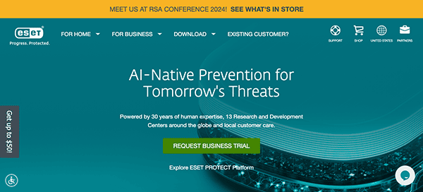
- ESET Protect Advanced: The website boasts an elegant and professional design. The layout is simple and straightforward, smoothly taking visitors through the many areas without overwhelming them. The use of white space improves readability and makes crucial parts stand out, resulting in a pleasant browsing experience. The website’s well-organized structure and user-friendly interface make it easy to navigate. The intuitive fixed menu structure and clear call-to-action buttons simplify the user experience, making it simple to explore items, access support resources, and learn more about the firm. The chat box adds another layer of accessibility and convenience to the website, improving the entire user experience and making it even easier for visitors to interact with the organization.
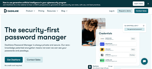
- Dashlane: The website features a modern and visually appealing design that could capture the visitor’s interest. The bold colors, high-quality photos, and crisp writing produce a polished and professional appearance. The color palette is carefully chosen to instill confidence and dependability, and the layout deliberately emphasizes vital elements such as features, benefits, and pricing information. The design is well-organized, with simple navigation that efficiently takes users across the site’s many aspects. The homepage successfully communicates the product’s advantages, making it easier for visitors to understand its value proposition. Clear call-to-action buttons prompt customers to sign up or learn more, creating a seamless transition from discovery to action.
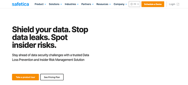
- Safetica: The layout is clean and easy to navigate, with a refined color palette and clearly organized segments. Using abundant photography, streamlined graphics, and a cohesive color scheme creates an aesthetically pleasant atmosphere that draws attention and instills confidence and reliability. Upon arrival at the homepage, users are greeted by an aesthetically beautiful interface that exudes professionalism and reliability. It stands out for its ability to provide educational and engaging information geared at educating visitors about data security and compliance. It also includes testimonials, which highlight input from delighted customers. These testimonials offer valuable insights into people’s positive experiences with their products and services.
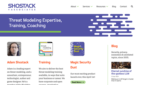
- Shostack: The website’s clean and minimalist design immediately captivates visitors. Its simple and well-organized layout, sophisticated color palette, and well-chosen font improve readability and provide a visually appealing experience. High-quality images, minimalist graphics, and a cohesive color palette create an aesthetically pleasing atmosphere that effectively engages visitors. It specializes in creating engaging educational material that teaches visitors cybersecurity and risk management. The website provides helpful information for businesses and organizations, from extensive service descriptions and case studies to informative blog articles and resources. The layout and design of the website are intuitive and user-friendly. The comprehensive and straightforward navigation menus and call-to-action buttons direct users to learn more about the services or get in touch.
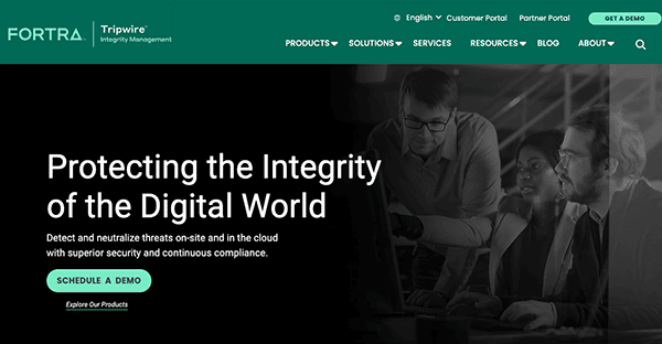
- Tripwire: The design is refreshingly clean, with plenty of white space to keep visitors from feeling overwhelmed. Using vibrant accent colors provides visual interest and keeps the core message distinct. It prioritizes user experience, with simple navigation options that make it easy to discover information. The content is methodically arranged, with categories for products, solutions, resources, and insights. The website’s design follows the brand’s identity, with consistent typeface, color palette, and imagery throughout. The website efficiently combines design and function, giving users a seamless browsing experience while presenting the company’s expertise and offers.
- Gartner: The website’s appealing layout features a clean, easy interface that blends flawlessly with an adequately organized menu. The elegant typography and sophisticated color palette reflect the company’s unwavering dedication to professionalism and excellence. Navigating the site is straightforward because the primary goal is to direct users to the information they want. Furthermore, the website’s comprehensive search button allows users to find relevant reports, articles, and insights promptly.
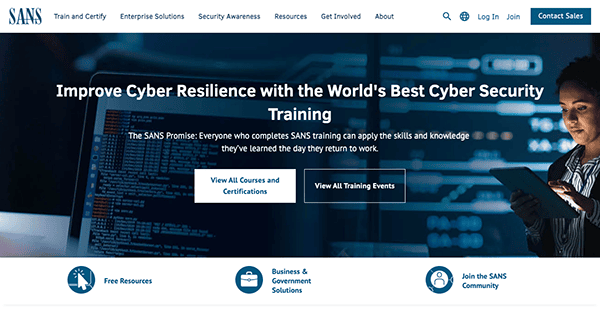
- SANS: The website greets visitors with a sleek, modern interface that immediately grabs their attention. With a well-organized layout and straightforward navigation, finding relevant courses, resources, and events is a seamless experience. The consistent typography, color schemes, and graphic design help to reinforce the institute’s position as an authority in cybersecurity education. The design conveys professionalism and dependability, inspiring tourists and students alike. The website’s information is meticulously vetted and updated regularly to ensure relevancy and accuracy. It also emphasizes accessibility and responsiveness, ensuring all users could access and interact with the website regardless of device or ability.
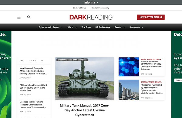
- Dark Reading: Its website greets visitors with a visually appealing design that takes them right into the world of cybersecurity. The layout is intelligently designed to highlight recent news, analysis, and expert perspectives. With eye-catching headlines and appealing visuals, the website captivates users from arrival. The website’s visual branding is consistent and striking, displaying its dedication to professionalism and credibility. Using bold writing, dark hues, and high-quality pictures results in a consistent and visually appealing look. Its engaging layout, substantial content coverage, user-friendly navigation, and excellent visual branding make it a must-visit destination for professionals seeking timely and relevant information.
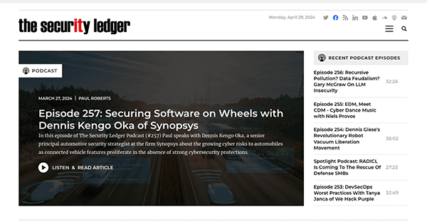
- The Security Ledger: The website design has a clean and intuitive system, making it easy to navigate and find the latest news, analysis, and opinion pieces on cybersecurity. With captivating imagery and well-organized content, the website ensures an engaging browsing experience for visitors. Its diversified content ensures something to benefit everyone in the cybersecurity field. Its user-friendly menu structure and search functionality have made navigation easier. Clear font, color palette, simple layout, and photography create a unified and professional design that enhances the website’s brand identity.
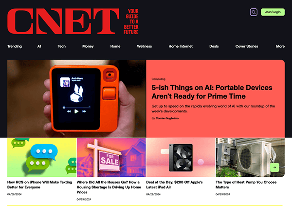
- CNET: Its website is a shining example of professionalism in the field of technology news and reviews, with a seamless blend of educational information and user-friendly design. Visitors are seamlessly guided through a wide range of tech topics, from breaking news to in-depth product reviews and analysis, from the minute they land on the clean and accessible design. The use of brilliant colors, high-quality graphics, and modern typography resulted in a more visually appealing approach. The website’s comprehensive coverage appeals to IT enthusiasts and experts with multimedia content to enhance the browsing experience. With strong visual branding and a commitment to accessibility, it provides a consistent and engaging experience across platforms, making it a trusted destination for tech fans worldwide.
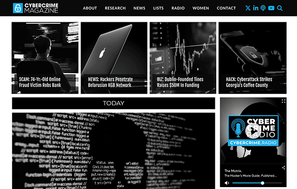
- Cybersecurity Ventures: The website’s design is sleek and modern elegance. From the minute viewers arrive at the homepage, it presents a clean, simple layout that stresses ease of navigation and aesthetic appeal. The color design, which is mainly blue, black, and white, conveys a sense of trust and professionalism, which is essential for a cybersecurity-focused website. The well-organized navigation at the top lets viewers quickly navigate to various sections such as research, reports, news, and more. The homepage strikes an ideal balance between relevant content and eye-catching imagery, ensuring visitors are engaged. The responsive design guarantees the site looks fantastic and works seamlessly across all devices, from desktops to smartphones.
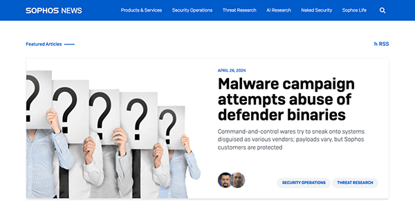
- Naked Security: The layout is well-organized, focusing on delivering news content understandably and concisely. A primarily white background with minor blue accents generates a visually appealing and easy-to-read design. At the same time, the strategic positioning of photographs and headlines draws the reader’s attention to essential articles. The homepage features a dynamic mix of the most recent news headlines and editor’s picks, ensuring users are always up to speed on the most relevant material. The content is well-researched, appropriate, and presented in a clear and accessible style, allowing visitors to understand even complex issues.
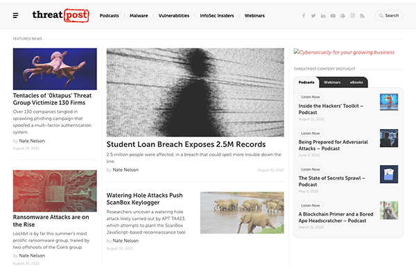
- Threat Post: The website draws in visitors with its sleek and stylish design, which effortlessly blends cutting-edge cybersecurity news with an easy-to-use interface. Upon arrival, customers are met with an elegant layout that emanates professionalism and encourages investigation. The website’s design approach prioritizes content while retaining a visually pleasing look. Ample white space and minimalist design features help create a clutter-free interface, allowing news items, analytical pieces, and opinion columns to take center stage. Inclusion of multimedia elements such as videos and podcasts creates an immersive experience that improves the user’s knowledge of complicated cybersecurity subjects.
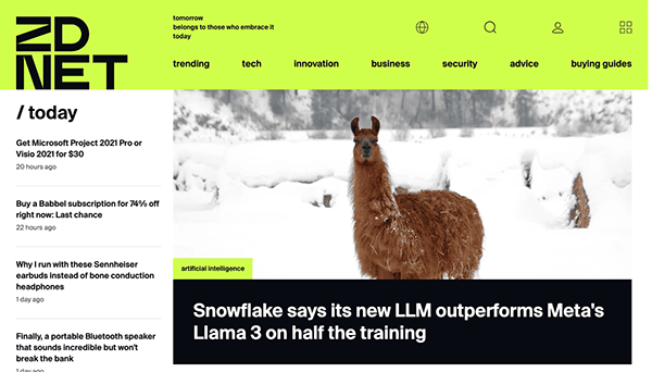
- ZDNet: The layout is sleek and well-organized, emphasizing providing a seamless user experience. Using a primarily white background with blue and gray accents results in a modern and professional output that is compelling and easy to browse. The user-friendly navigation structure and well-defined categories make it easy to navigate through various parts, allowing users to find new material. Extensive white space and minimalist design components create a distraction-free interface that keeps content at the center of the user’s journey. Strategically placed headlines, enticing graphics, and intentional call-to-action buttons attract users’ attention and skillfully guide them through the site’s contents.
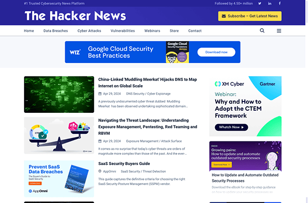
- The Hackers News: Their website shines in the cybersecurity world with compelling intelligent content and professional web design. Its simple navigation mechanism enables visitors to easily explore various cybersecurity issues, from breaking news to expert analysis. The design strategy promotes content visibility while keeping a visually appealing appearance by incorporating white space and minimalist components. This technique improves readability and allows users to focus on acquiring a vast amount of cybersecurity knowledge. Engaging images and interactive features, such as eye-catching headlines and multimedia elements, draw users in and direct them through the website. The website’s responsiveness delivers a consistent browsing experience across all devices while retaining functionality and visual appeal.
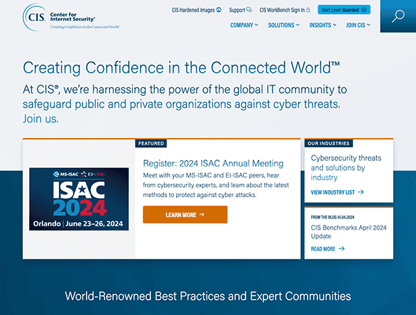
- Center for Internet Security: The website strikes an outstanding balance of professionalism and engagement. Its clean style, complemented by a soothing color scheme, immediately instills trust in the organization’s expertise and commitment to cybersecurity. Notably, the appropriate utilization of white space allows for easy navigation, preventing visitors from feeling overwhelmed. Furthermore, drop-down menus provide quick access to various parts, ensuring users can easily find the necessary information. Navigation is fluid, guided by a well-organized menu and prominently placed call-to-action buttons, delivering a user-friendly experience.
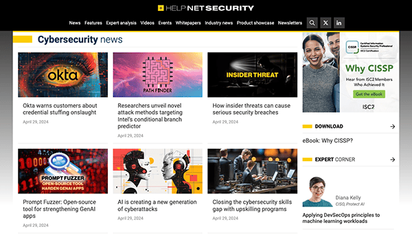
- Help Net Security: The website uses brilliant colors and gentle gradients to create a pleasing visual look while maintaining a refined tone fit for the cybersecurity emphasis. The organization is tidy and orderly, allowing visitors to find the necessary information quickly. Navigation is simple, with a well-organized menu that allows easy access to various website sections. Drop-down menus improve navigation efficiency by enabling users to quickly access certain subjects or resources. Furthermore, prominently visible search and subscription capabilities provide ease, allowing users to find relevant material while staying current on the latest cybersecurity advances and insights.
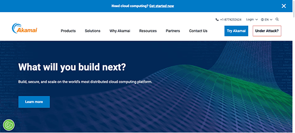
- Akamai: The website’s slick design and polished appearance convey sophistication and professionalism. The homepage’s clean structure and striking pictures immediately draw the viewer in. The menu is well-organized, quickly linking to significant categories, including solutions, goods, and resources. A chat box improves the browsing experience by allowing visitors to communicate with support or sales professionals in real-time for rapid assistance or inquiries. The information is provided straightforwardly and briefly, making it simple to learn and absorb. The website’s responsiveness delivers a consistent browsing experience across all devices while retaining functionality and visual appeal.
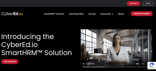
- CyberEd: Their website highlights itself as a prominent hub for cybersecurity education, with an eye-catching and user-friendly design combined with a website design characterized by a striking black, white, and red color scheme. When users arrive at the homepage, they are greeted with a clean and contemporary layout that exudes expertise and class. It stands out for enticing user participation with interactive features and multimedia material. With eye-catching images, appealing headlines, and carefully placed call-to-action buttons, the website efficiently captures customer attention and guides them through various options.
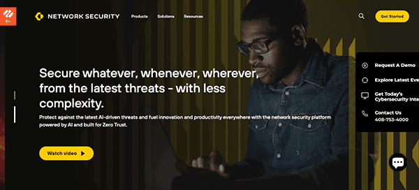
- Palo Alto Networks: Its website sets a standard for modern website design by smoothly combining usefulness and visual appeal. Visitors are greeted with a sleek, accessible interface that exudes expertise and class. The navigation is simple, taking visitors through numerous parts and products linked to network security solutions, catering to cybersecurity specialists seeking technical insights and business executives looking for personalized solutions. The design ethos promotes clarity and simplicity while keeping a visually appealing look with bold images, crisp writing, and a consistent color palette that reflects the brand’s dedication to quality. Furthermore, the website succeeds in engaging consumers through interactive features and multimedia material. Engaging images, instructive videos, and interactive demos create a diverse experience, allowing visitors to learn about the capabilities of its network security solutions firsthand.
The role of an effectively designed website in the cybersecurity industry cannot be underestimated. It’s essential to build trust and convey the seriousness and proficiency of your cybersecurity solutions. Websites that stand out in the cybersecurity sector are those that not only look professional but also offer comprehensive information and easy-to-navigate solutions. They reflect the company’s commitment to security and efficiency, encouraging potential clients to choose them as their trusted cybersecurity providers.
A superior cybersecurity website design ensures that all digital interactions are secure, reinforcing the company’s dedication to protecting client data and systems. Companies could significantly boost their online presence and credibility by incorporating the best practices in cybersecurity website design. This is crucial in an industry where trust and expertise are the cornerstones of customer relationships.
If you want to develop or enhance your cybersecurity website, consider contacting the experts. We specialize in creating custom websites that embody the best cybersecurity website design at CyberOptik. Contact CyberOptik today for a free consultation on how we can help you build a website that meets the best cybersecurity standards and optimally represents your brand in this crucial industry.

