In the highly competitive world of Certified Public Accountants, having a professional and trustworthy online presence is critical to attracting clients and building credibility. Every aspect of your website, from the initial layout to the final call to action, affects how potential clients perceive your firm’s expertise and quality of service. By leveraging modern web design principles and best practices, your CPA website can convey professionalism, establish authority, and highlight what makes your firm stand out.
When considering a CPA website design, it’s important to keep your target audience in mind. Prospective clients often look for user-friendly navigation, clear explanations of services, and an easy way to get in touch. A robust design for CPA websites not only needs to convey professionalism but also transparency in how you handle finances and ensure compliance. Striking the right balance between visuals, usability, and informative content is the key to a winning website.
A CPA website serves as the digital face of your firm. With the right approach, you can deliver a powerful first impression and clearly communicate your firm’s values and expertise. By taking advantage of strategic design elements—from intuitive navigation to thoughtful calls to action—you can ensure potential clients can find the information they need and are motivated to engage with your services.

Examples of the Best CPA Website Designs
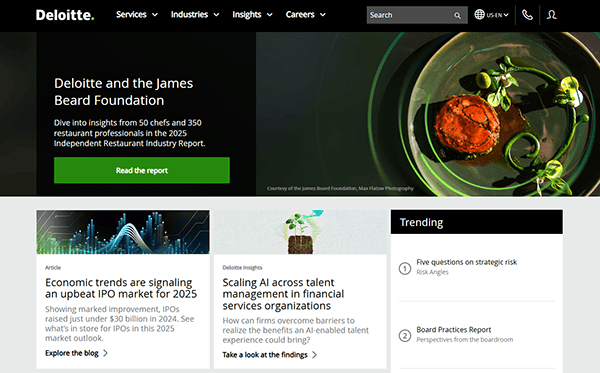
- Deloitte: Deloitte’s website combines corporate professionalism and approachability in a single layout. The home page features intuitive navigation that leads visitors directly to the services and insights they need. Deloitte leverages consistent branding with its signature colors, giving the site a cohesive feel from top to bottom. In addition, the wealth of content is organized in a way that feels neither cluttered nor overwhelming. From thought leadership articles to in-depth service pages, everything is easily searchable and beautifully displayed.

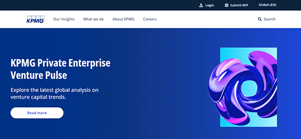
- KPMG: KPMG’s website stands out for its emphasis on clear navigation menus and well-organized content. The color palette is light and inviting, which pairs nicely with bold text and blocks of informative copy. Their homepage quickly directs potential clients to the most relevant areas: insights, industries, and services. Beyond that, KPMG also highlights its global reach, allowing visitors to pick the region or country that matters most to them. This localized approach helps improve the user experience across different markets. Their site truly illustrates how the best modern CPA website design can seamlessly present both global and local solutions.
- Ernst & Young (EY): EY’s website employs striking imagery and large, straightforward headlines to guide users through their offerings. Despite having a vast range of services and resources, the site’s layout remains sleek and intuitive. Visitors are greeted with important announcements and trending insights right away, making it easy to stay on top of industry changes. The site integrates interactive content, such as videos and animated graphics, which serve to simplify complex financial topics. It’s a shining example of how cpa website design can handle substantial content volumes without compromising on style and user experience.
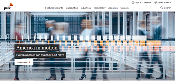
- PwC (PricewaterhouseCoopers): PwC’s website features a contemporary approach that merges a straightforward design with impactful visuals. The site is structured around guiding visitors to find the specific insights or services they need—whether it’s related to audits, consulting, or tax. PwC also emphasizes case studies, industry reports, and research findings, all neatly housed in dedicated sections that are easy to navigate. The overall design is balanced with a cohesive color scheme and typography that underscores the professional nature of a CPA firm.
- BKD: BKD’s website offers a welcoming layout that guides potential clients through various services with minimal clicks. The top-level menu is clean and user-friendly, making it easy to navigate among advisory, tax, and audit categories. Each section features sub-pages organized around client needs, providing crucial information without overwhelming the visitor. The consistent branding is anchored by a color palette that reinforces credibility and professionalism. BKD also makes excellent use of testimonials and client success stories to build trust.
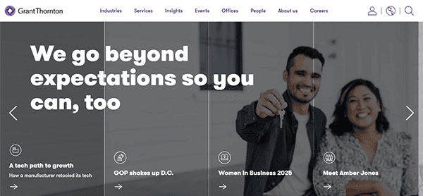
- Grant Thornton: Grant Thornton’s website incorporates a minimalistic, modern design with layered visuals to create an engaging user experience. Their homepage focuses on guiding visitors to deeper content, with large, clickable sections and concise calls to action. The site also capitalizes on bold typography and ample white space to effectively highlight key services. Each internal page is structured in a way that presents complex topics in a clear, digestible format. Videos and graphics are used strategically to break up text-heavy pages, ensuring the reader remains engaged.
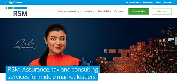
- RSM US: RSM’s website design perfectly balances informational depth and accessibility. Right from the homepage, users are introduced to major focus areas, such as audit, tax, and consulting, making it easy to navigate to the desired section. The site’s use of clear headings and an uncluttered layout ensures that large amounts of content remain organized. RSM’s color palette and typography project confidence and trustworthiness, aligning well with their brand identity. Client success stories and thought leadership are strategically placed to reinforce expertise.
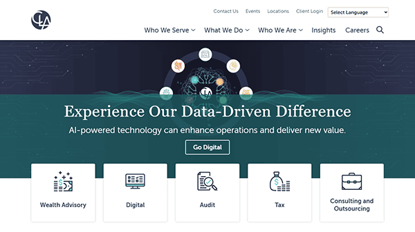
- CliftonLarsonAllen (CLA): CLA’s website fosters an immediate sense of professionalism through minimalistic design choices and careful use of branding elements. The structure of the website prioritizes quick navigation, with prominent links to services, industries, and insights right in the header. Each internal page is enriched with carefully curated images and short paragraphs that provide clarity on complex financial matters. CLA also includes a resources section packed with articles and webinars that are neatly categorized for easy discovery.
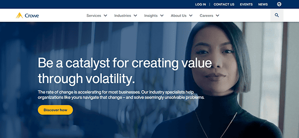
- Crowe: Crowe’s site welcomes users with a clean interface that prioritizes quick action. The homepage highlights top services, industry specializations, and thought leadership pieces, guiding visitors to relevant information rapidly. Bright accent colors throughout the site make calls to action and important links stand out, encouraging user engagement. Their use of micro-animations and subtle transitions gives a polished feel to each page. Additionally, Crowe’s well-structured blog showcases financial and consulting trends, offering further resources. The result is a user-focused design that demonstrates how forward-thinking cpa firm website design can be.
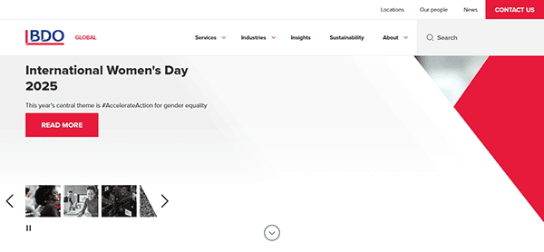
- BDO: BDO’s website uses a simple and organized layout to present its global expertise. Large, bold visuals on the homepage help convey key messages about trust, data-driven insights, and broad service offerings. The navigation is split into essential areas, such as insights, industries, and locations, ensuring visitors can quickly filter to the content they need. BDO also features a prominent search function that retrieves content from a vast library of resources and publications.
- Freed Maxick: Freed Maxick’s website embraces a bright color scheme and modern layout, instantly giving the brand a friendly, approachable feel. The homepage features client-focused messaging and intuitive site navigation, directing visitors to learn more about specific services like accounting, auditing, and consulting. On each service page, Freed Maxick includes tangible examples of past client successes to highlight expertise. Their blog further strengthens authority, providing in-depth guides and updates on accounting regulations. With crisp typography and well-placed imagery, Freed Maxick demonstrates that competitive cpa website design can reflect both competence and warmth.
- CohnReznick: CohnReznick’s website stands out for its refined user interface that gives each section a distinct visual identity while still maintaining cohesive branding. The homepage balances a mix of articles, service overviews, and a rotating banner that highlights the latest firm news. Each service page provides a deep dive into sector-specific offerings and includes contact forms for immediate assistance. CohnReznick also provides a helpful events calendar, guiding visitors to upcoming webinars and live sessions.
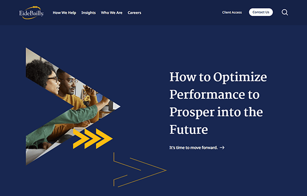
- Eide Bailly: Eide Bailly’s website adopts a crisp, modern design that helps communicate the brand’s emphasis on technology and innovation in accounting services. The homepage greets visitors with a succinct introduction and directs them to specialized areas such as tax, audit, advisory, and technology solutions. The site utilizes engaging graphics and bold headings that make their offerings clear. Each service page dives deeper into the benefits of working with Eide Bailly, supplemented by client testimonials.
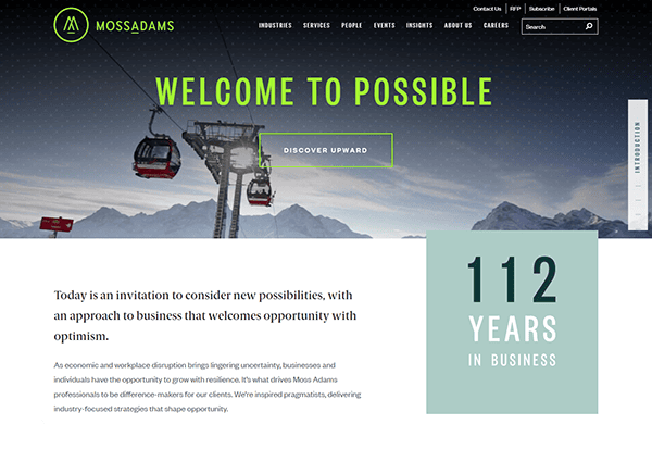
- Moss Adams: Moss Adams presents an organized layout paired with elegant imagery and modern typography, reflecting a thorough attention to design detail. Their content is strategically portioned into digestible sections, whether it’s addressing assurance, consulting, or wealth services. The dropdown menu is effortless to navigate, and important pages are only a click or two away. Moss Adams also effectively highlights thought leadership by emphasizing articles and whitepapers on trending industry topics.
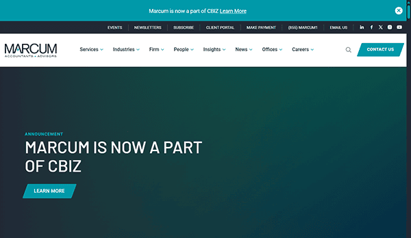
- Marcum: Marcum’s website stands out with a bold color scheme, featuring strong accent colors that highlight calls to action. The design is visually stimulating yet remains professional, providing a welcome environment for potential clients seeking tax, accounting, or advisory services. Marcum includes icons and charts within content sections to convey complex ideas more simply, making visitors more inclined to explore. The firm’s blog section is robust, featuring timely articles and media insights.
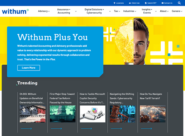
- Withum: Withum’s website takes a personable approach, showcasing the firm’s culture and values with ample imagery of team members. The structure centers on helping visitors quickly identify the services they need, whether it’s assurance, tax, or advisory. A subtle but effective color scheme underscores the site’s professional tone, and callouts to different service lines stand out without being overpowering. The website also features regularly updated blogs, videos, and podcasts, showing an active presence in the accounting community.
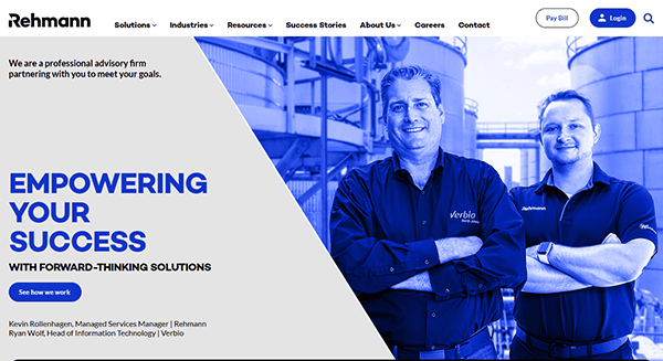
- Rehmann: Rehmann’s website brings together timeless design principles with easy navigation to guide users. The homepage features a slideshow that highlights key services and breaking industry news, instantly engaging visitors. Rehmann organizes its service offerings into intuitive categories, such as accounting, advisory, and wealth management, each with thorough subpages and resources. With a unified color scheme, the site maintains consistency across all pages, reinforcing brand identity. Testimonials are highlighted to showcase client successes, further establishing trust.
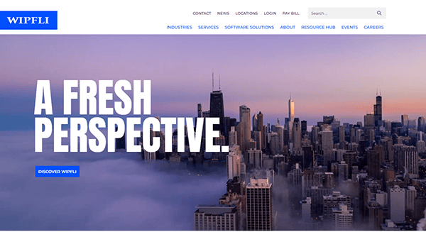
- Wipfli: Wipfli’s website is marked by its understated sophistication, combining large banner images with concise, high-level copy for an immediate brand impression. Visitors can delve deeper via straightforward calls to action, with each service page outlining solutions for specific business sizes and industries. Wipfli’s color palette and typography choices reflect traditional corporate design, enhancing trust and credibility. Resources like whitepapers, webinars, and on-demand videos are carefully placed to ensure potential clients discover them naturally.
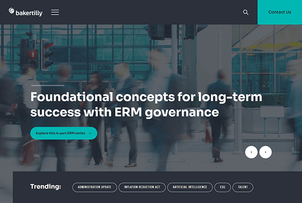
- Baker Tilly: Baker Tilly’s website stands out for its clean aesthetic and careful organization of services, industries, and thought leadership materials. The landing page shows a carousel of featured topics, promoting timely and relevant information. Users can swiftly navigate to any area of interest, thanks to concise drop-down menus and strategic page links. Engaging visuals and consistent branding help present the firm’s global capabilities without overloading the visitor. Detailed case studies bring the services to life, demonstrating practical applications of Baker Tilly’s expertise.
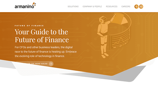
- Armanino: Armanino’s website embraces a dynamic structure that leads with bold calls to action and high-resolution imagery. The homepage provides immediate insight into the firm’s unique approach, featuring highlighted segments dedicated to technology, advisory services, and innovative solutions for modern businesses. A well-placed top menu includes easy navigation to services, industries, and insights. This ensures potential clients can find exactly what they’re seeking quickly. Armanino’s commitment to innovation is evident throughout the site’s layout, making it a noteworthy example of modern cpa website design that caters to a tech-savvy audience.


In an ever-evolving financial landscape, it’s imperative for CPAs to maintain a website that not only looks professional but also adapts to changing client needs. From interactive content to robust resource libraries, the best CPA website designs incorporate elements that build trust, demonstrate expertise, and foster meaningful client engagement.
Keeping up with digital trends—such as responsive design and thoughtfully integrated multimedia—can give your CPA firm a considerable edge. In today’s online ecosystem, your website often serves as the first interaction a client will have with your brand, and it’s essential to make a strong first impression.
Investing in a professional cpa website design can help convey the reliability and expertise clients expect. By combining compelling visuals, clear navigation, and up-to-date content, you can position your firm as a leader in the accounting world.
Top 10 Most Important Aspects of a CPA Website
- Clear Navigation: Straightforward menus and clearly labeled sections help visitors find what they need without confusion.
- Mobile Responsiveness: Ensuring that your site adjusts seamlessly on different devices keeps potential clients engaged no matter where they access it from.
- Strong Branding: Consistent color schemes, fonts, and logos reinforce brand recognition and build trust.
- Client Testimonials: Reviews and success stories lend credibility, helping potential clients feel comfortable reaching out.
- Up-to-Date Content: Regularly publish articles and industry news, showing you’re on top of current developments.
- Services Overview: Listing services and specializations ensures that prospects understand the areas in which you can help.
- Easy Contact Options: Prominent phone numbers, online forms, and chat widgets encourage direct communication with your firm.
- Educational Resources: Blogs, whitepapers, and infographics provide additional value to visitors and position you as a thought leader.
- Security Features: SSL certificates and secure data-handling practices are critical for an industry dealing with sensitive financial information.
- Visual Appeal: Eye-catching design elements and high-quality images engage users and encourage them to explore your site further.
FAQs About CPA Web Design
How can I make my CPA website stand out from competitors?
Focus on user-friendly design, unique branding elements, and well-organized content. Include case studies or testimonials to demonstrate expertise and reliability.
What platform is best for building a CPA website?
WordPress is a popular choice due to its flexibility, large community support, and extensive plugin library that can cater to various CPA firm needs.
How much does it typically cost to design a CPA website?
Basic websites can begin around $2,000 and increase from there based on the complexity of features and custom development, ensuring each site meets unique requirements.
How often should I update my CPA website?
Frequent updates keep content relevant and credible, but don’t add content just for search engines. Ensure each update has value for your visitors.
How important is responsive design for CPA websites?
Responsiveness is crucial because many clients research services on their phones or tablets, so a responsive layout ensures a positive experience across devices.
Ready to elevate your CPA’s website? Contact CyberOptik for a free proposal for your new CPA website design and set your business up for success.