Just looking for our Best Chimney Sweep Website examples list?
Key Takeaways:
- Your Website is Your Most Valuable Sales Tool: A professional, well-structured website builds trust instantly, showcases your craftsmanship, and drives qualified leads for chimney repair, masonry services, and fireplace work.
- Visual Proof Sells More Than Words: High-quality photos of your completed work—especially before-and-after shots—boost credibility and help potential customers feel confident hiring you for chimney or masonry projects.
- Clear Navigation Converts More Visitors: Simple, service-focused navigation helps users quickly find what they need and makes your site easier to use on both desktop and mobile.
Why Your Chimney and Masonry Website Design Matters More Than Ever
Today, your website is more than just a digital brochure—it’s your hardest-working employee. For chimney and masonry businesses, a high-performing site doesn’t just look good; it fuels higher search results, drives customer inquiries, and reinforces the quality of your craftsmanship from the first click.
Homeowners looking for your premium services aren’t browsing for fun. They have a problem to solve—and they’re searching online for a trusted local expert. If your site looks outdated, loads slowly, or buries key information behind confusing navigation, you’re likely losing those potential customers to competitors who have invested in professional web design and SEO.
This guide will show you how to build a website that reflects the credibility of your work, speaks directly to homeowner concerns, and is optimized to capture local search traffic. Whether you specialize in fireplace restoration, chimney cleaning, or full-scale masonry construction, the right design principles will help your site turn visitors into leads—and leads into long-term clients.
Website Planning & Purpose for Chimney and Masonry Businesses
Before laying a single pixel, the foundation of every successful website starts with strategic planning. This phase defines the website’s purpose, audience, goals, and functional requirements, transforming what could be just a digital brochure into a lead-generating, search-visible asset that supports business growth.
Why Planning Matters in This Industry
Chimney and masonry businesses often rely on trust, local reputation, and seasonal service demand. But without a professionally planned website, many firms miss out on converting potential customers who start their search online. Planning ensures that every design decision aligns with business objectives: increasing visibility, educating homeowners, and driving conversions for your services.
Key Questions During Planning
- What services are most profitable or in demand?
A strong website will prioritize high-margin services like chimney repair or custom masonry builds, integrating them into the site’s navigation and visual hierarchy. - Who is the target audience?
Most clients are homeowners looking for reliability, safety, and expertise. Planning defines buyer personas—such as cautious first-time homeowners or property managers looking for long-term vendors—to shape messaging and calls to action. - What actions do we want visitors to take?
Whether it’s scheduling a chimney sweep or requesting a masonry quote, the planning phase outlines clear conversion goals supported by intuitive design and persuasive copy. - How will we track success?
Setting up goals for phone calls, form submissions, and keyword visibility allows businesses to measure ROI from day one.
Planning for SEO & Visibility
Planning isn’t just about aesthetics. It includes research to identify the right keyword opportunities (e.g., “chimney cleaning near me,” “brick tuckpointing Chicago,” “fireplace repair Elmhurst”), sitemap structure for crawlability, and on-page strategies to improve search engine visibility. An SEO-aligned structure ensures your website doesn’t just look good—it gets found.
Conversion-Ready Architecture
An effective website guides the user from discovery to decision. This means planning clear paths through service pages, trust-building sections (like testimonials or licensing badges), and strategically placed contact buttons. By integrating SEO and user experience from the ground up, your site becomes a digital sales rep that works 24/7.
Planning is where strategy meets creativity. In this competitive industry, it’s the difference between having an online presence and having an online advantage. Let’s move to how design principles bring this planning to life in the next section. Ready?
Design Principles for Effective Chimney and Masonry Websites
In this industry, credibility is everything. Homeowners are looking for a company they can trust to protect their homes, improve safety, and deliver long-lasting work. That trust starts with web design.
A well-executed design isn’t about flashy visuals. It’s about communicating professionalism, making navigation effortless, and aligning the site’s appearance with the quality of service your business provides. These design principles set the standard for an effective chimney and masonry website.
1. Visual Trust Signals Are Non-Negotiable
From the moment a visitor lands on your homepage, the design should immediately establish credibility. This includes prominently displaying:
- Before-and-after photos of past chimney or masonry jobs
- Industry certifications or local licensing
- Verified customer testimonials
- “As seen in” or affiliation logos, if applicable
High-resolution images of real work—especially on masonry projects—build trust better than stock photography. They also allow homeowners to envision your craftsmanship in their own spaces.
2. Mobile-First Design
A growing number of homeowners search for services like chimney cleaning or fireplace repair from their smartphones. Your site must load fast, look great, and function flawlessly on smaller screens. This includes:
- Tap-friendly phone numbers and buttons
- Collapsible menus for clean navigation
- Mobile-optimized service pages
Failing to deliver a strong mobile experience can cost you leads, especially when urgent services are being searched in real time.
3. Clean, Intuitive Navigation
Your navigation should guide users logically from one service to another, with clear labels like:
- Chimney Cleaning
- Masonry Repair
- Fireplace Installation
- About Us
- Contact
Cluttered menus or vague terms lose visitors fast. Each link should match how your customer thinks about your services, not how your internal team categorizes them.
4. Brand Consistency and Layout Hierarchy
Strong brands are built on consistent design elements: a defined color palette, a bold but legible font, and repeated visual patterns that make the business memorable. A well-structured layout also ensures:
- Hero sections feature one clear call-to-action
- Key content is placed above the fold
- Service details are broken into skimmable sections with headers
This structured hierarchy keeps users engaged and makes your message stick.
5. Conversion-Optimized CTAs
Great design supports action. Every page—especially service and landing pages—should have clear calls to action such as:
- “Schedule a Chimney Inspection”
- “Get a Masonry Quote Today”
- “Book a Fireplace Cleaning”
These buttons should be strategically placed within service descriptions and page footers, using contrasting colors that grab attention without overwhelming the design.
6. Local Visual Cues
Feature photos from recognizable neighborhoods or landmarks in your service area. If your business serves the Chicago suburbs, showing real local homes builds familiarity. Use maps, localized badges (like “Serving Elmhurst Since 2002”), and geo-optimized content to reinforce your regional authority.
For additional design inspiration across service-based industries, explore our Home Builder Website Design Guide. Many of the same trust-building and conversion-focused design principles apply.
Content & Navigation: Structuring for Conversion and Clarity
Content and navigation aren’t just functional in site design; they are strategic. Homeowners visiting your site are often dealing with a specific need or concern, whether it’s smoke backing up into their home or deteriorating brickwork. The structure of your content and the clarity of your navigation will determine how easily visitors find what they need, trust your expertise, and take action.
Prioritize Service-Centric Navigation
Your primary navigation bar should reflect how customers search for your services, not how your team organizes them internally. The top navigation should include clear, standalone links such as:
- Chimney Cleaning
- Chimney Repair
- Masonry Services
- Fireplace Services
- About
- Contact
Avoid vague terms like “Solutions” or “Portfolio” unless they’re paired with a sub-navigation or explained clearly. Use dropdown menus to consolidate related services under logical categories like “Chimney Services” or “Brick & Stone Work” to avoid clutter while keeping options accessible.
Use a Clear, Hierarchical Content Structure
Each service page should follow a consistent and conversion-focused content flow:
- Header: Keyword-rich H1 that clearly states the service (e.g., “Chimney Repair in Elmhurst, IL”)
- Intro Paragraph: Brief description of what the service is and why it matters
- Common Problems Solved: A bulleted list of specific issues clients may be experiencing
- Our Process: A Clear explanation of how your team handles this service
- Why Choose Us: Trust signals like certifications, years of experience, and testimonials
- Call to Action: Encouraging the next step (e.g., “Schedule Your Inspection”)
Breaking content into sections with H2 and H3 subheadings makes it easier for users to scan and for search engines to understand your content.
Align Content with Local SEO Goals
Each service page should include geo-specific language to improve local search engine rankings. For example, use “licensed chimney inspection for Chicago homeowners.” This strengthens your local relevance and helps attract high-intent traffic.
Strategically Link Between Pages
Internal links guide users deeper into your site and help search engines crawl it effectively. Use contextual anchor text to link between service pages. For example, a paragraph on one repair service offering can include a link to your chimney cleaning page with anchor text like “complement this repair with annual chimney cleaning.”
Provide Trust and Proof Near Key Decision Points
Intersperse trust-building content throughout your pages—not just on a separate “Testimonials” page. Include quotes from customers or star ratings near calls to action, and repeat key trust signals in sidebars or just above your footer. The goal is to reinforce confidence at every stage of the user’s journey.
Plan for Mobile-First Navigation
Navigation menus should be streamlined and collapsible on mobile. Sticky headers or fixed contact buttons can ensure users on smartphones always have access to “Call Now” or “Request Estimate” options, no matter where they are on the page.
A website designed with smart content architecture and intuitive navigation doesn’t just inform—it performs. It turns online visitors into real-world customers by making the entire experience easier, faster, and more reassuring from the first scroll to the final click.
Visual Elements: Showcasing Craftsmanship and Building Trust
Your work speaks volumes—but only if people can see it. The right visual elements turn a well-built website into a high-converting one by capturing attention, enhancing credibility, and guiding users toward action. For homeowners evaluating potential contractors, what they see is often the deciding factor.
Use Real Photos to Showcase Workmanship
Nothing builds trust faster than authentic images of completed jobs. Avoid generic stock photography, which can make your business feel impersonal or even misleading. Instead, feature:
- High-resolution photos of chimney repairs, masonry projects, and fireplace installations
- Before-and-after images to highlight transformation and skill
- Job site images with technicians in branded uniforms
- Local projects to reinforce your regional authority
These visuals not only validate your quality of work but also help prospective clients picture the end result in their own homes.
Consistent Branding Builds Recognition
Your visual brand should be cohesive across every page. This includes:
- A consistent color palette that reflects professionalism and warmth (earth tones work well for masonry)
- Typography that is clear, modern, and accessible
- Uniform iconography and button styles
This visual consistency reinforces your brand identity and makes your site easier to navigate, especially for first-time visitors.
Support Navigation with Visual Cues
Use icons and imagery to support service descriptions and improve scannability. For instance:
- A chimney icon for chimney sweep services
- A flame or hearth symbol for fireplace restoration
- Brick imagery for tuckpointing or masonry repair
These cues help users quickly understand what you offer without having to read every word.
Incorporate Video Strategically
Short video clips of your team in action—like inspecting a chimney or applying mortar to brick—can personalize your brand and showcase professionalism. A homepage welcome video or an explainer video on your “About” page can differentiate your business and keep users engaged longer.
Use Visuals to Direct Attention
Design should guide users to key actions using visual hierarchy:
- Hero images with centered calls to action (“Schedule a Chimney Inspection”)
- Arrows or lines subtly pointing toward quote forms or contact buttons
- Differentiated backgrounds to break up sections and lead users down the page
Good visual flow ensures that users don’t just admire your site—they take action.
Build Trust with Visual Proof
Visuals are a powerful tool for trust-building. Consider embedding:
- Google or Yelp star ratings next to testimonials
- License or association badges (e.g., National Chimney Sweep Guild)
- Press mentions or community awards
These elements, when placed near service descriptions and CTAs, reinforce that your company is the real deal.
Visual elements are functional, persuasive, and essential to making a website perform. Done right, they convert curiosity into confidence and visitors into paying clients. In the next section, we’ll explore how SEO strategies elevate your brand so more potential customers find your site in the first place.
Ongoing WordPress Maintenance: Keep Your Chimney and Masonry Website Safe, Fast, and Reliable
A website isn’t a one-time project—it’s an ongoing business asset that needs regular upkeep. Just like a neglected chimney can become a fire hazard, an outdated or poorly maintained WordPress website can harm your online visibility, frustrate potential clients, and even compromise your company’s reputation.
Why Regular Maintenance Matters
Homeowners searching for repair services expect a website that loads quickly, displays correctly on mobile devices, and offers up-to-date information. Behind the scenes, your site needs ongoing attention to ensure it functions reliably and safely. Without regular updates and monitoring, you’re at risk for:
- Website crashes or slow load speeds
- Security breaches and malware infections
- Broken forms or outdated content
- SEO penalties for poor performance
For a service-based business that relies on online leads, even a few days of downtime or a hacked site can translate to lost revenue and diminished trust.
Core Components of Effective WordPress Maintenance
- Plugin and Theme Updates
WordPress plugins power much of your website’s functionality—from contact forms to image galleries. But they’re also common entry points for hackers if left outdated. Ongoing maintenance ensures your plugins, themes, and core WordPress files are updated without breaking your site. - Security Monitoring and Backups
Routine security checks help detect suspicious activity, outdated passwords, or malicious scripts. Paired with automated daily backups, this ensures you can quickly restore your site in the event of a crash or compromise. - Performance Optimization
Your site’s speed impacts everything from user experience to search engine rankings. Maintenance should include image compression, database cleanup, and cache management to keep load times fast. - Broken Link and Form Testing
Websites often rely on forms for quote requests or inspection bookings. If a form stops working or a phone number link breaks, leads are lost. Regular testing ensures key elements always function as expected. - Content and SEO Updates
Service offerings, service areas, or team members change over time. Keeping content fresh—and updating metadata and keywords—supports long-term SEO performance and keeps your business information accurate for local searchers.
Industry-Specific Considerations
Your primary services are often seasonal, and a neglected website can result in missed opportunities during peak months. A well-maintained site can:
- Promote seasonal services (e.g., winter chimney inspections or spring masonry repair)
- Improve Google visibility in specific cities or neighborhoods
- Maintain client trust through consistent uptime and professional presentation
Ongoing WordPress maintenance isn’t just about keeping the lights on—it’s about supporting a high-performing digital presence that helps your business grow steadily and safely.
Best Chimney and Masonry Company Website Examples
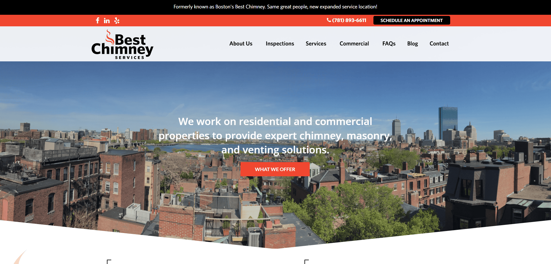
1. Boston’s Best Chimney
Location: Boston, MA
Key Takeaways:
- Clean, professional layout with intuitive navigation.
- Prominent customer testimonials enhance credibility.
- Clear calls-to-action facilitate easy contact.
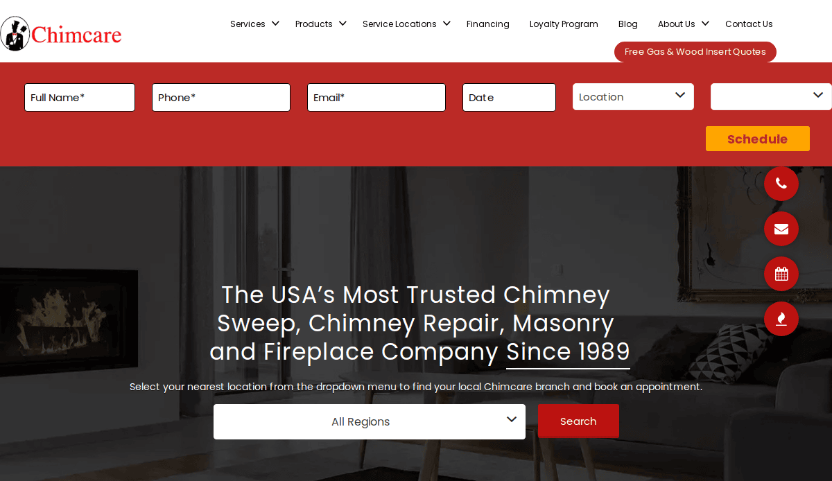
2. Chimcare
Location: Portland, OR
Key Takeaways:
- Comprehensive service offerings with detailed descriptions.
- Trust signals like certifications and affiliations are prominently displayed.
- User-friendly design with easy scheduling options.
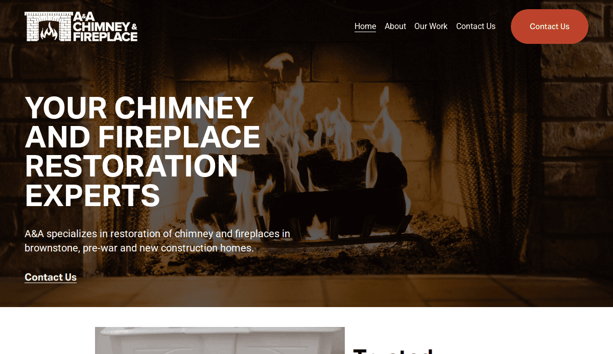
3. A&A Fireplace and Chimney
Location: Brooklyn, NY
Key Takeaways:
- Focus on restoration services with before-and-after visuals.
- Simple navigation highlighting core services.
- Strong emphasis on customer satisfaction and trust.
4. Best Way Chimney
Location: Levittown, NY
Key Takeaways:
- Clear presentation of services with detailed explanations.
- Emphasis on safety and maintenance tips.
- Easy-to-find contact information for quick inquiries.
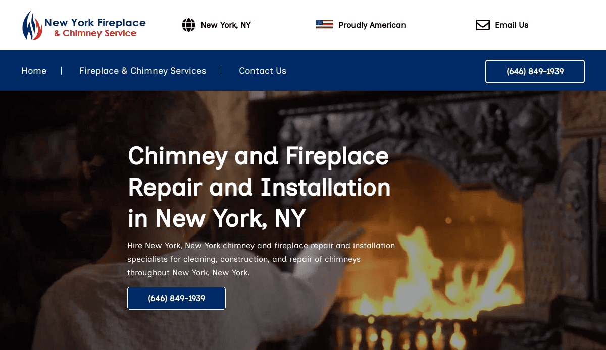
5. Chimney and Fireplace Repair NYC
Location: New York, NY
Key Takeaways:
- Comprehensive list of services with detailed descriptions.
- Emphasis on affordability and quality workmanship.
- Easy navigation with clear contact options.
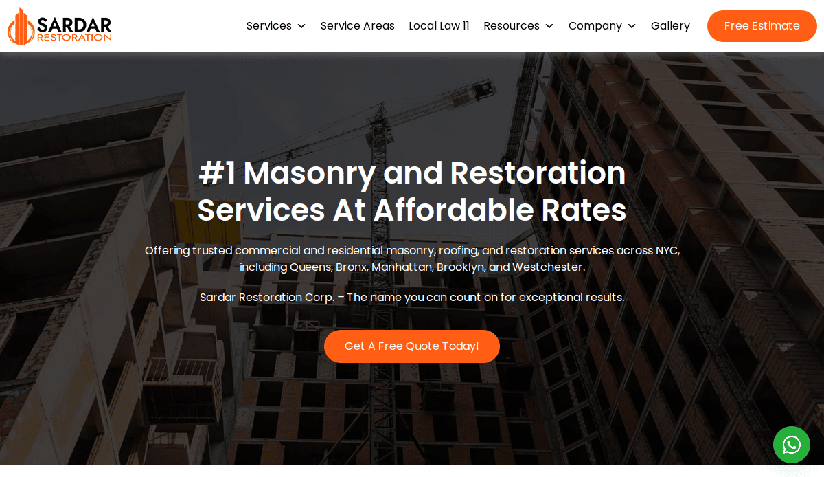
6. Sardar Restoration Corp
Location: Bronx, NY
Key Takeaways:
- Specializes in masonry restoration with detailed service pages.
- Showcases a portfolio of completed projects.
- Emphasis on customer testimonials and satisfaction.
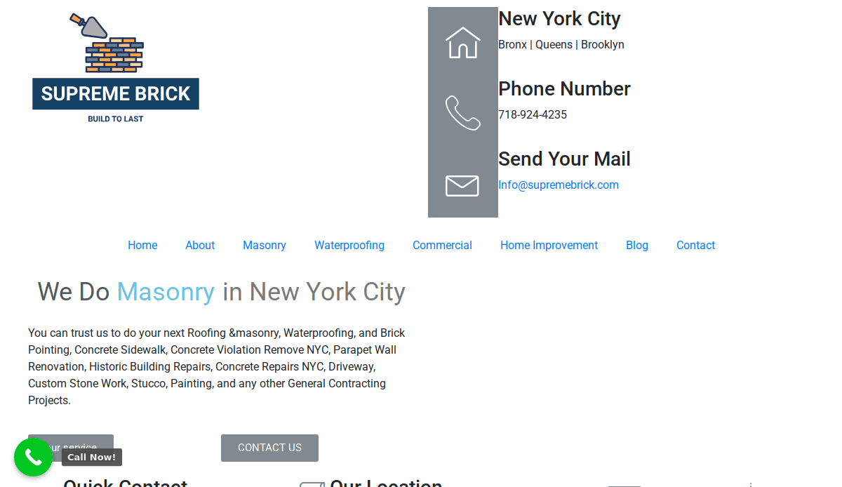
7. Supreme Brick
Location: Elmont, NY
Key Takeaways:
- Offers a range of masonry services with clear descriptions.
- Highlights expertise in brick pointing and waterproofing.
- Simple, straightforward website design.
8. Next Level Chimneys
Location: Chicago, IL
Key Takeaways:
- Focus on chimney inspections and repairs.
- User-friendly design with easy navigation.
- Emphasis on customer reviews and satisfaction.
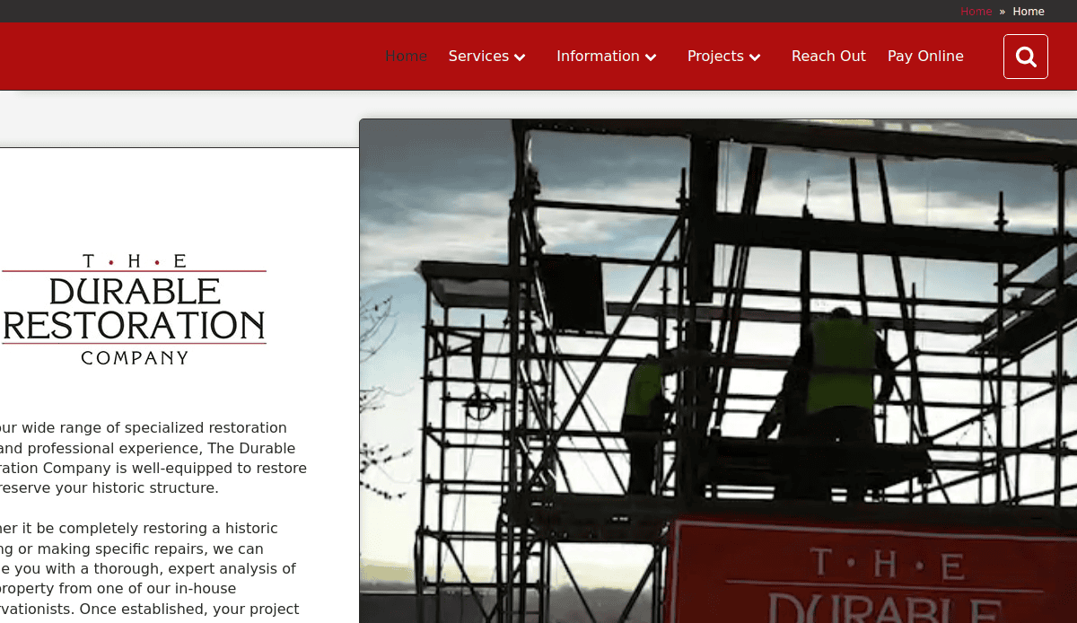
9. Durable Restoration Company
Location: Columbus, OH
Key Takeaways:
- Specializes in historic building restoration.
- Detailed explanations of restoration processes.
- Showcases a portfolio of past projects.
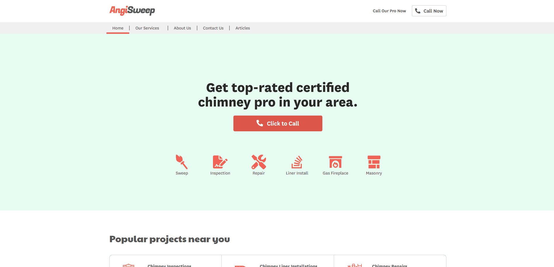
10. Angi Sweep
Location: Multiple Locations, USA
Key Takeaways:
- Offers a wide range of chimney services.
- Emphasis on safety and regular maintenance.
- Easy-to-navigate website with clear service listings.
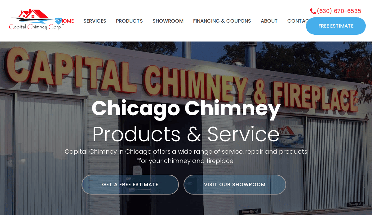
11. Capital Chimney Corp
Location: Chicago, IL
Key Takeaways:
- Modern design with strong branding elements.
- Clear service descriptions and easy navigation.
- Prominent calls-to-action for scheduling services.
12. Golden Gate Chimney
Location: San Francisco, CA
Key Takeaways:
- Sleek design with a focus on user experience.
- Detailed service pages with informative content.
- Strong visual elements showcase completed projects.
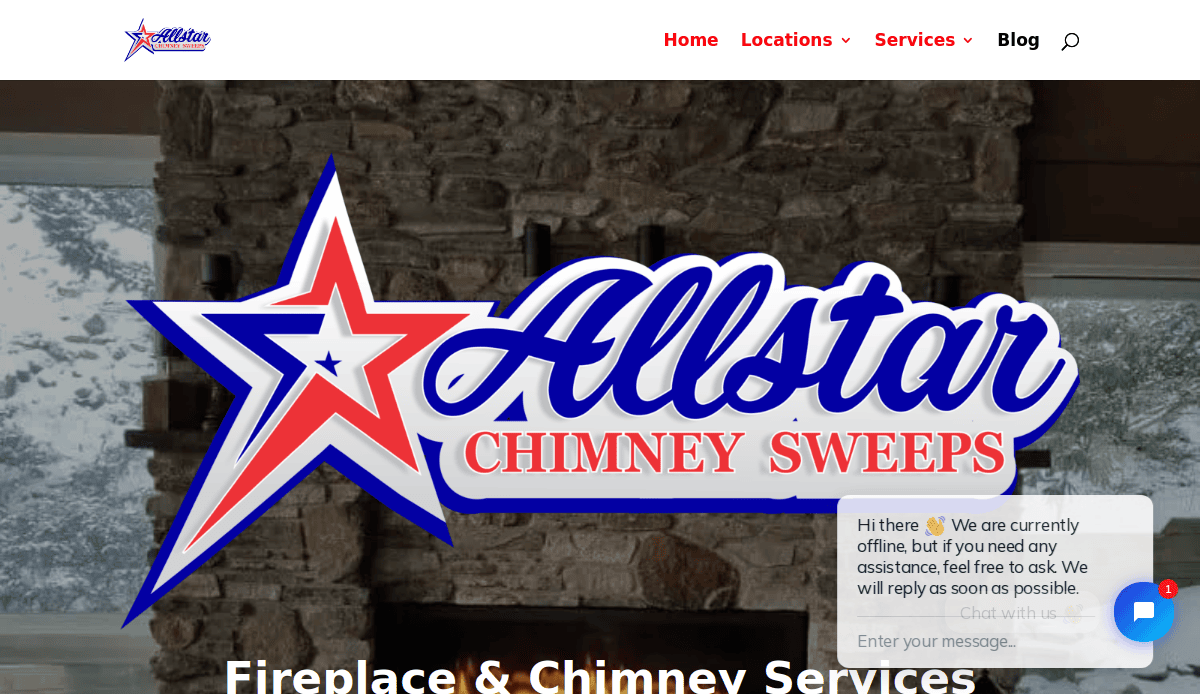
13. Allstar Chimney Sweeps
Location: Birmingham, AL
Key Takeaways:
- Comprehensive service listings with clear descriptions.
- Emphasis on safety and regular maintenance.
- User-friendly design with easy navigation.
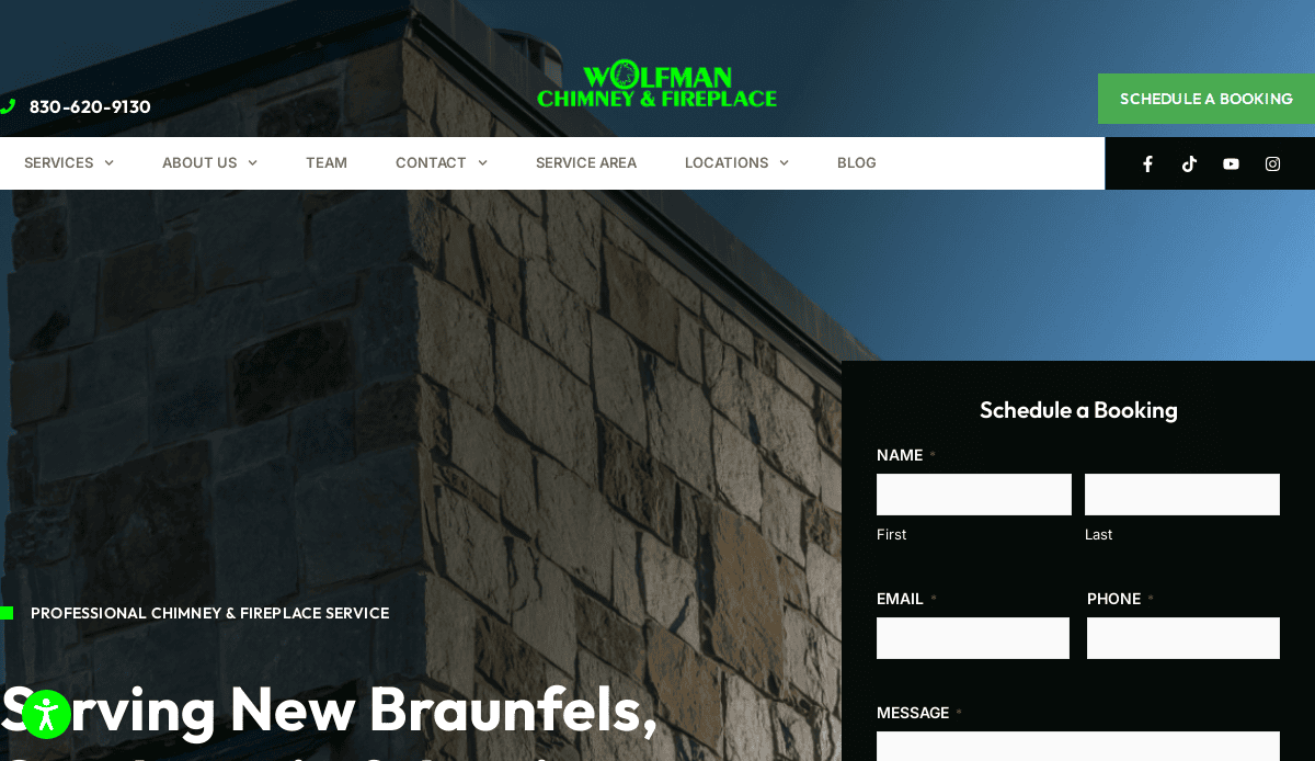
14. Wolfman Chimney and Fireplace
Location: San Antonio, TX
Key Takeaways:
- Unique branding with engaging visuals.
- Offers both chimney and wildlife removal services.
- Clear calls-to-action and contact information.
15. Brick & Mortar Ventures
Location: San Francisco, CA
Key Takeaways:
- Innovative design with engaging content.
- Highlights a wide range of masonry services.
- Emphasis on craftsmanship and quality.
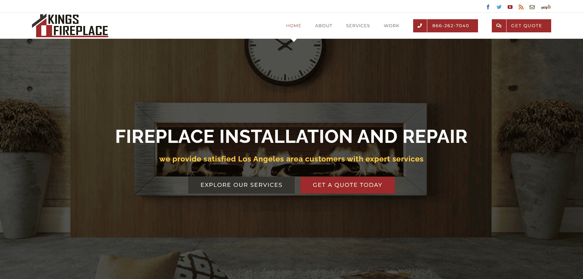
16. King’s Fireplace
Location: Denver, CO
Key Takeaways:
- Specializes in fireplace repair and design.
- Clean layout with easy navigation.
- Showcases a portfolio of completed projects.
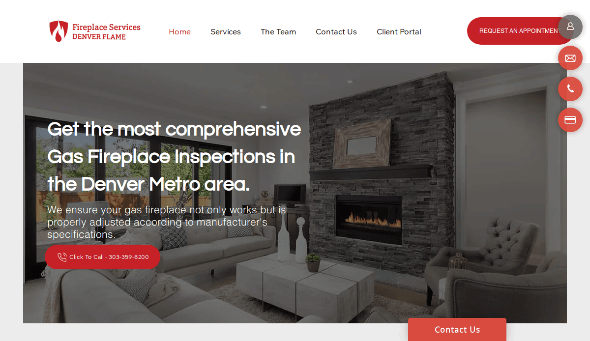
17. Denver Flame
Location: Denver, CO
Key Takeaways:
- Focus on chimney and fireplace services.
- User-friendly design with clear service listings.
- Emphasis on customer satisfaction and safety.
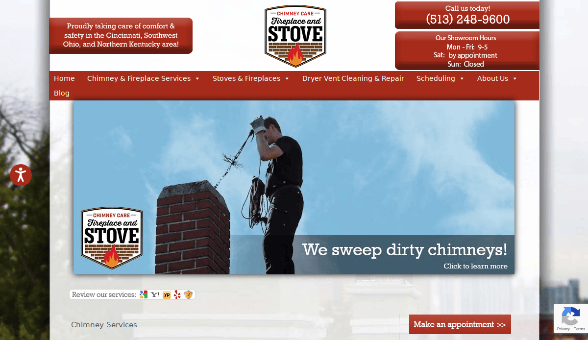
18. Chimney Care Company
Location: Cincinnati, OH
Key Takeaways:
- Offers a range of chimney and fireplace services.
- Highlights certifications and affiliations.
- Easy-to-use website with clear contact options.
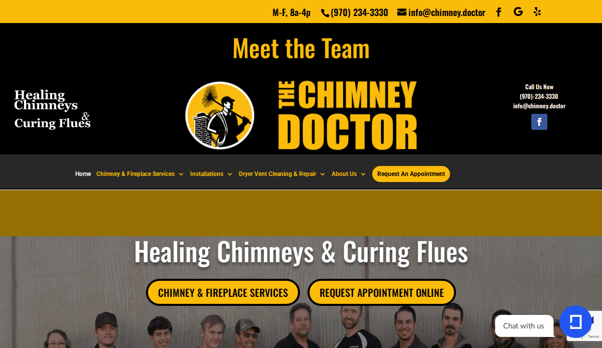
19. The Chimney Doctor
Location: Grand Junction, CO
Key Takeaways:
- Specializes in chimney inspections and repairs.
- Emphasis on education and safety.
- Clean design with informative content.
Ready to Build a Better Chimney and Masonry Website?
You’ve seen what it takes to create a high-performing website that looks professional and generates leads and builds long-term trust. From structure and design to responsive layout and ongoing updates, every element must align with how today’s customers search for and select chimney and masonry services. In an industry where reputation is everything, your website must be built to reflect the quality and reliability of your work.
If you’re serious about improving your search engine results and want a strategic partner who understands the chimney and masonry market, our full-service digital marketing agency can help. Our team specializes in professional web design and SEO services for chimney and masonry businesses that want results, not guesswork. With a focus on strategy, conversion, and user experience, we tailor every site to outperform the competition in both design and rankings.
Let’s build your custom strategy today.
Common Chimney and Masonry Website Design Questions & Answers
1. What pages are essential for a chimney and masonry website?
A professional website should include clearly defined pages for all core services: chimney repair services, chimney construction, masonry work, and advanced cleaning. Additional must-haves include testimonials and a service area page, a blog with informative articles on chimney maintenance and safety, and a contact page with a service area map for local SEO.
2. How does SEO for industry-specific businesses work?
SEO focuses on optimizing each page for specific target keywords (like “brick masonry in [city]” or “chimney sweep near me”), improving load speed, mobile responsiveness, and enhancing visibility in search engine results. It also includes on-page content, metadata, and off-page tactics like link building and business citations.
3. What role do customer reviews play in website design and SEO?
Customer reviews help build trust with new visitors and enhance local SEO performance. Featuring reviews throughout your site, not just on a dedicated page, sends strong trust signals. Tools like Google Reviews and Clutch can be embedded for added social proof.
4. Why is responsive design critical for professional websites?
Responsive design ensures your website looks and functions well on all devices, especially smartphones, where most users search for home repair services. It’s also a Google ranking factor, meaning a mobile-friendly site directly impacts your search visibility.
5. Should chimney and masonry enterprises blog regularly?
Yes. Blogging with articles on chimney systems, building codes, and safety, or seasonal tips improves your site’s topical authority. It helps attract long-tail search traffic, educates potential customers, and supports effective SEO strategies when combined with internal linking and proper keyword placement.
6. How do I optimize my chimney sweep website for local SEO?
Include geo-specific keywords, embed a service area map, and list city pages if you serve multiple areas. Claim your Google Business Profile and encourage satisfied customers to leave reviews. Internal pages should mention the neighborhoods or suburbs your team covers to strengthen SEO for masonry and chimney services locally.
7. Can I showcase different services like stone masonry and vertical chimney work?
Absolutely. Each unique service should have its own landing page optimized for relevant keywords. This helps users and search engines clearly understand what you offer, improves user experience, and supports conversion optimization.
8. What are the most effective SEO strategies for chimney and masonry businesses?
The six essential SEO tactics include:
- Optimizing title tags and headers with keywords
- Creating service-specific pages
- Writing location-based content
- Building backlinks from trusted home service directories
- Using schema markup for services
- Regularly updating blog content for seasonality
These approaches boost your visibility in search engine results and support lead generation.
9. How should testimonials and service areas be presented?
Include testimonials throughout service pages and near calls to action—not just on a separate page. Use a dedicated “Service Areas” section or page to showcase cities or neighborhoods you serve. This supports user trust and helps with location-based SEO.
10. Do I need an SEO agency for my industry-specific website?
Partnering with an SEO agency that understands the industry can fast-track your results. Experts can implement strategies for chimney and masonry that go beyond basic optimizations, like technical SEO, backlink audits, content strategy, and competitive keyword analysis. Agencies like ours specialize in providing tailored SEO for masonry and chimney service providers.

