Just looking for our Best Chimney Cleaner Website examples list?
Key Takeaways:
- Your website is your top sales tool—make it count.
Most potential customers will judge your chimney cleaning business by your website before they ever pick up the phone. A fast-loading, mobile-friendly site with clear contact information and localized service pages builds instant credibility. - Local SEO is essential for chimney services.
To compete in local markets, your chimney sweep website must be optimized with geographic keywords, embedded maps, localized meta descriptions, and a well-managed Google Business Profile. - Design directly impacts trust and lead generation.
The best chimney websites integrate real project photos, service badges (like CSIA certifications), and seasonal content that shows expertise. These trust signals help build confidence and drive conversions. - User experience matters more than design trends.
Streamlined navigation, easy-to-access chimney repair and inspection pages, and prominent call-to-action buttons reduce friction and guide visitors toward booking your service. - Educational content builds authority and drives traffic.
A chimney service blog with answers to seasonal questions, safety tips, and maintenance checklists supports SEO and positions your brand as the go-to expert in your area. - DIY templates won’t cut it in competitive markets.
If your chimney sweep business operates in a region with strong competition, a generic site won’t win clicks or customers. A professionally built, locally optimized website outperforms every time. - Designing for ROI isn’t optional—it’s strategic.
The right design turns casual browsers into booked jobs. Every section—from your homepage to your contact form—should support your marketing efforts and drive measurable results.
Why Your Chimney Cleaner Website Design Matters More Than Ever
If your chimney sweep website looks like it hasn’t seen a spark since the early 2000s, chances are your business is missing out on more than just aesthetics—you’re losing leads. In this hyper-competitive market, your website is your storefront, your business card, and your #1 salesperson all rolled into one. And for chimney cleaning professionals, who depend on local trust and seasonal visibility, that online presence is mission critical.
The truth is, homeowners looking for chimney repair or chimney sweep service aren’t flipping through the Yellow Pages—they’re searching online. What they find in that moment determines whether you earn their call or fade into the background. That means your site has to work harder than ever: load fast, look credible, speak clearly, and guide visitors effortlessly to your contact information. Great website design doesn’t just build trust—it drives action.
In this guide, we’ll show you how to transform your chimney sweep business website into a high-performing, lead-generating powerhouse. From optimizing user experience and enhancing local SEO to designing for conversion and credibility, you’ll walk away knowing exactly what separates the best chimney websites from the rest—and how yours can rise above the smoke.
Website Planning & Purpose: Laying the Right Foundation
Before diving into design tools or choosing fonts, the success of your website begins with a well-defined strategy. Website planning for a chimney cleaning business isn’t just about aesthetics—it’s about crafting a tool that converts visitors into leads and builds long-term trust with homeowners in your service area.
At the core of this planning phase is understanding your audience. A homeowner with a leaking flue or a blocked chimney isn’t browsing casually. They’re searching with urgency, and your website needs to meet them with answers, authority, and a frictionless path to schedule a service. That starts with identifying your business goals—whether it’s driving more inspection requests, showcasing your capabilities, or highlighting seasonal promotions.
Next comes content structure. Chimney cleaning websites benefit from clear navigation that segments your services—such as sweep, inspection, repair, and installation—and pairs each with localized SEO strategies. A strong sitemap and wireframe ensure every page supports a specific purpose, from educating first-time visitors to guiding returning customers to take action. For example, your homepage should build immediate trust with real photos and service badges, while your service page should clearly outline what’s included, why it matters, and how to book.
If you’re not sure how to map all of this effectively, this website organization guide breaks down how to structure your site content so it’s both user-friendly and optimized for search engines.
Ultimately, this stage is where great websites are made—or missed. Without planning, you risk launching a pretty site that underperforms. With a purpose-driven plan, your website becomes a 24/7 asset that consistently drives qualified leads and supports your marketing goals.
Design Principles: What Makes a Website Stand Out
A well-designed website does more than look good—it builds trust, communicates expertise, and guides visitors to take action. Homeowners searching for chimney cleaning or repair services often make decisions quickly, so your design must deliver a professional first impression and a seamless user experience.
One of the most important design principles is visual clarity. Avoid cluttered layouts or competing elements. Instead, use whitespace to draw attention to key areas like service descriptions, customer testimonials, and call-to-action buttons. This keeps visitors focused on what matters: your chimney sweep service offerings and how to contact you. Clear, bold headlines and bullet-point service lists make it easier for potential customers to scan for the information they need.
Consistency across branding elements—like colors, fonts, and photography—reinforces your professionalism. Earth tones like deep reds, charcoal grays, or warm browns reflect the nature of chimney work and convey reliability. Your logo should be visible across all pages, and every call-to-action should stand out with contrasting color and persuasive language.
Mobile optimization is no longer optional. A large portion of homeowners search for local services from their smartphones, especially during emergencies like chimney leaks or smoke backups. Your site must load quickly, scale properly, and make it easy to click to call, book online, or find directions.
Trust is another core principle. Use real images of your team and completed work—not stock photos. Include trust badges like certifications from the Chimney Safety Institute of America (CSIA), insurance verification, and local affiliations. Displaying recent reviews prominently on your homepage and service pages further builds authority.
Above all, the design should serve your business goals. Every page should lead visitors closer to booking a service, whether through “Schedule Now” buttons or a streamlined contact form.
By following these design principles, your website will convert visitors into long-term customers and set you apart from competitors who still rely on outdated layouts or generic templates.
Content & Navigation: Guiding Homeowners from Interest to Action
When it comes to site design, content and navigation aren’t just support elements—they’re strategic tools for building trust and driving conversions. Visitors come to your site with specific needs, often under time-sensitive circumstances, so the structure of your content and how they find it must be both intuitive and purposeful.
Start with the main navigation menu. Keep it simple and aligned with what your audience is searching for. Standard top-level pages should include: Home, Services, About, Reviews, Blog, and Contact. Under Services, offer subpages for each core offering: Chimney Cleaning, Inspection, Repair, Cap Installation, and Dryer Vent Cleaning if applicable. This structure improves usability and supports local SEO by giving each service its own optimized landing page.
Homepage content should immediately address what you do, who you serve, and how to get started. Lead with a benefit-driven headline, followed by a short paragraph about your chimney sweep business. Include a visible call-to-action, a few trust elements (like certifications or customer reviews), and visual proof of work. Don’t bury important details—make it easy for visitors to find what they’re looking for within seconds.
Service pages should follow a proven framework: what the service includes, why it matters, signs it’s needed, what sets your approach apart, and how to schedule. Use bullet points for clarity and break long sections into scannable chunks. Highlight seasonal relevance, like why inspections are critical before winter, and include FAQs to reduce hesitation.
Your About page should humanize your business with team photos and a short narrative about your experience and community involvement. The Reviews page reinforces authority with real testimonials. On every page, make sure your phone number and scheduling options are visible without scrolling.
For deeper user engagement and SEO traction, build out a blog with seasonal tips, homeowner safety guides, and maintenance checklists. These support long-tail keyword targeting and showcase your expertise. If you’re looking for additional inspiration on how service-based companies structure their content and site flow effectively, this remodelling company site design breakdown offers practical examples that apply directly to chimney businesses.
When done right, thoughtful content paired with strategic navigation leads homeowners effortlessly from curiosity to conversion—and ensures they remember your name when their chimney needs service.
Visual Elements: Building Credibility Through Design That Speaks
For chimney sweep businesses, visual elements play a vital role in how potential customers perceive your expertise and trustworthiness. Unlike text-heavy industries, home services rely heavily on visual cues to establish confidence. The images, icons, layout, and colors you choose directly affect the user experience and how quickly a visitor decides to contact you or move on.
Start with photography. Real photos of your team on the job—sweeping chimneys, climbing rooftops, or interacting with clients—make an instant impression. Avoid stock imagery wherever possible. Homeowners want to see who they’re letting into their home. Feature high-resolution before-and-after images of completed repairs, cleanings, or cap installations. These visual proofs act as mini case studies that show the quality of your work without needing a single word.
Use consistent iconography to reinforce key sections. For example, a small fire icon next to “Chimney Cleaning” or a wrench beside “Chimney Repair” adds instant clarity and helps users scan pages more easily. Icons should align with your brand colors and remain consistent across your site.
Color scheme and typography also play critical roles. Earthy tones like deep reds, charcoals, and warm browns reflect the nature of the work and evoke safety and professionalism. Your fonts should be modern, clean, and easy to read on all devices. Headings should stand out without being overwhelming, and body text must be legible on both desktops and mobile screens.
Layout matters too. Use grid-based structures to keep content organized, allowing enough space between sections so users don’t feel overwhelmed. Each service section should include a call-to-action, supported by visual hierarchy—such as a bolder button or contrasting background. Testimonials with headshots, trust badges like CSIA certification, and embedded maps all support user confidence while visually guiding their path.
Finally, video can be a powerful tool. A quick clip showing your team performing a sweep or walking through your process builds familiarity and trust. Even a short explainer on how your inspection process works can keep users on your site longer and more likely to book.
In a service-driven industry like chimney care, visual elements aren’t just design choices—they’re trust builders. A polished, professional presentation that feels genuine helps homeowners feel safe, informed, and confident in choosing your team.
Ongoing WordPress Maintenance: Keep Your Website Safe, Fast, and Working for You
Building a strong website is just the beginning—keeping it updated, secure, and optimized is what ensures it keeps performing over time. WordPress powers your website behind the scenes, but without consistent maintenance, even the best-designed site can fall behind on speed, security, and functionality.
Chimney cleaning companies often operate on tight seasonal schedules, which means your website needs to work smoothly even during your busiest times. That includes fast load times, reliable contact forms, and a booking system that never crashes. Regular plugin and theme updates help prevent conflicts that could break your layout or cause security vulnerabilities. WordPress is constantly evolving, and these updates patch known issues and keep your site compatible with the latest browsers and devices.
Security is another critical factor. A website typically collects contact information through inquiry forms, which means protecting that data is a priority. Ongoing maintenance includes setting up automatic backups, installing firewalls, and running malware scans to reduce the risk of hacks or outages. Without these layers of protection, even a minor breach can result in downtime, data loss, or a loss of customer trust.
Speed optimization is equally important. A slow-loading website will lose mobile users before they even see your services. Maintenance tasks like compressing images, updating caching settings, and removing outdated plugins help ensure your site performs at its best.
SEO benefits from regular maintenance too. Updating content, fixing broken links, and ensuring your sitemap is clean all signal to search engines that your site is active and relevant. This improves your website’s chances of ranking well locally—especially during high-demand seasons like fall and winter.
Even small visual bugs, like a shifted image or broken testimonial slider, can cause a drop in credibility. Monthly audits help catch those issues before your customers do. And if your business expands to new locations or adds services, having a team ready to implement those changes ensures your site keeps pace with your growth.
For chimney sweep businesses, a well-maintained WordPress website isn’t just a technical necessity—it’s a core part of your customer experience and lead generation strategy. Consistent updates, security checks, and performance tuning help your site stay reliable, visible, and effective long after launch.
Best Chimney and Masonry Site Design Examples
Here are actual chimney sweep and masonry websites highlighting effective design, UX, SEO, and conversion features, some designed by our experts.
1. Lupini Construction
Location: Utica, NY
- Minimal, elegant layout keeps content focused
- High‑res project imagery builds trust
- Call-to-action in header encourages instant engagement
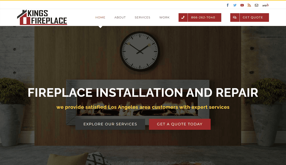
2. King’s Fireplace
Location: Baltimore, MD
- Strategic whitespace for product showcase
- Neutral tones evoke warmth and professionalism
- Menu structure supports intuitive service navigation
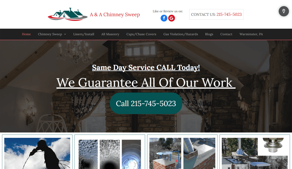
3. A & A Chimney Sweep
Location: Columbus, OH
- Bold satisfaction guarantee front and center
- Premium visuals create strong first impression
- Clear CTA buttons throughout drive conversions
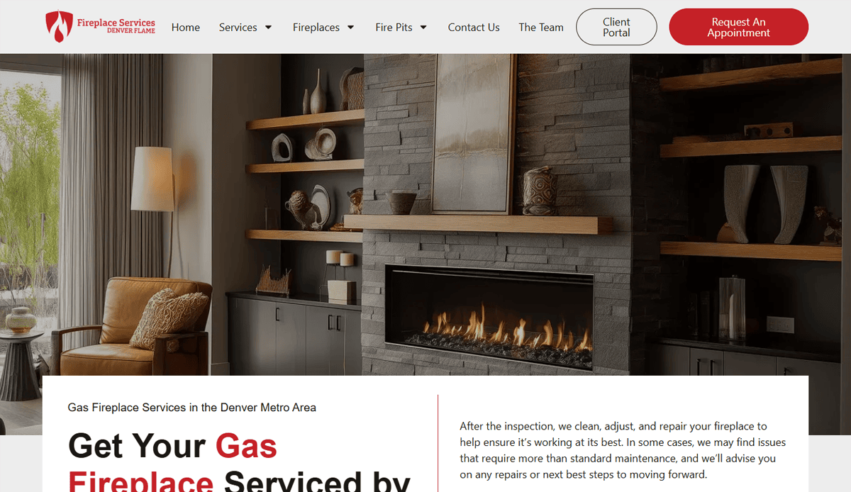
4. Denver Flame
Location: Denver, CO
- Informative header features tips & services
- Service area map + testimonials offer credibility
- Integrated blog supports ongoing SEO
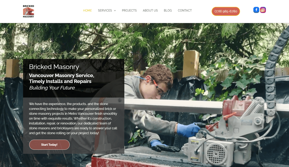
5. Bricked Masonry Co.
Location: Canada
- Clean neutral palette enhances authority
- Homepage testimonials highlight trust
- Service categories streamlined for ease of use
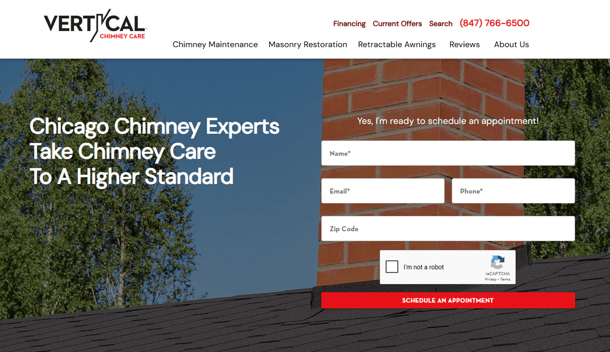
6. Vertical Chimney Care
Location: Chicago, IL
- Bold safety messaging + real team photos
- Above‑the‑fold contact form boosts leads
- Clear layout reinforces professionalism
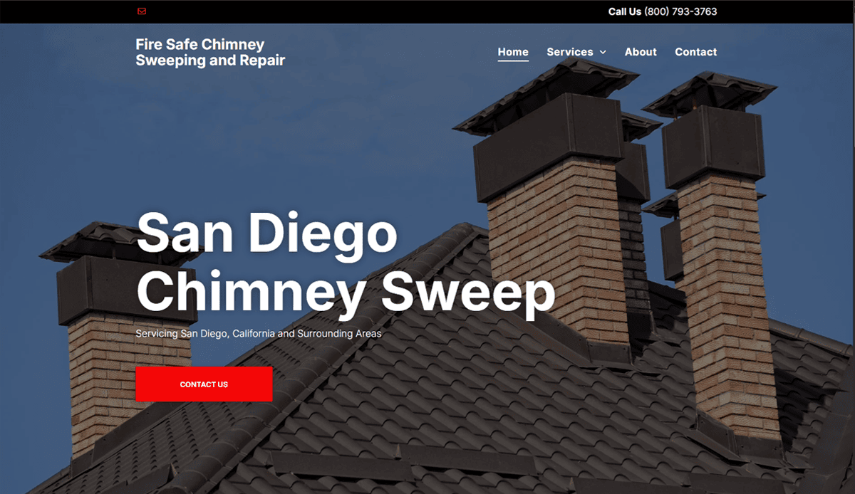
7. Fire Safe Chimney Sweeping and Repair
Location: San Diego, CA
- Separate pages for cleaning, inspection, repair improve SEO
- Phone number clearly prominent in header
- Detailed service breakdown builds trust
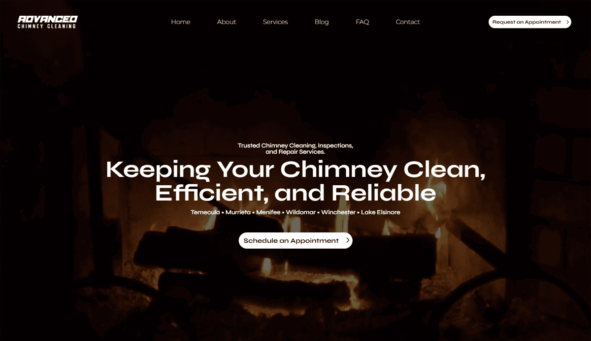
8. Advanced Chimney Cleaning
Location: Temecula, CA
- Certification badges displayed for credibility
- Hovering Google Reviews widget adds dynamic social proof
- Warm imagery creates an inviting feel
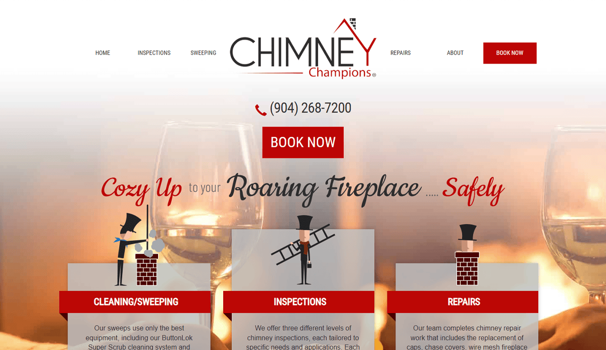
9. Chimney Champions
Location: Jacksonville, FL
- Animated mascot adds personality
- Vivid CTAs increase engagement
- Organized menu enhances navigation
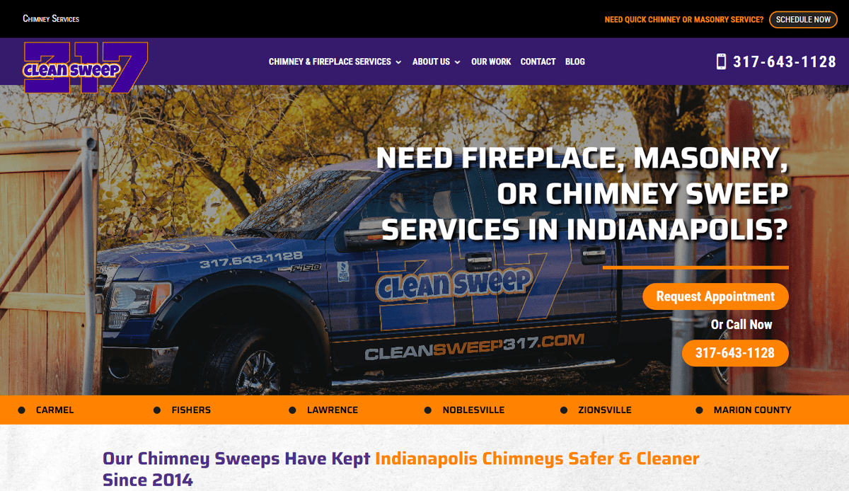
10. Clean Sweep 317
Location: Indianapolis, IN
- Industry certifications featured upfront
- Safety-focused educational copy builds authority
- Trust badges reinforce credibility
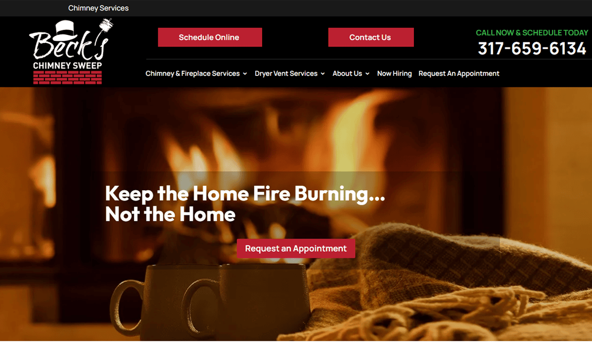
11. Beck’s Chimney Sweep
Location: Portland, OR
- Animated hero background captures attention
- Service map clarifies coverage
- Dark/light contrast supports readability
12. Texas Chimney
Location: Houston, TX
- Subtle animations bring polish
- Logo + header layout instill regional identity
- Q&A section educates visitors organically
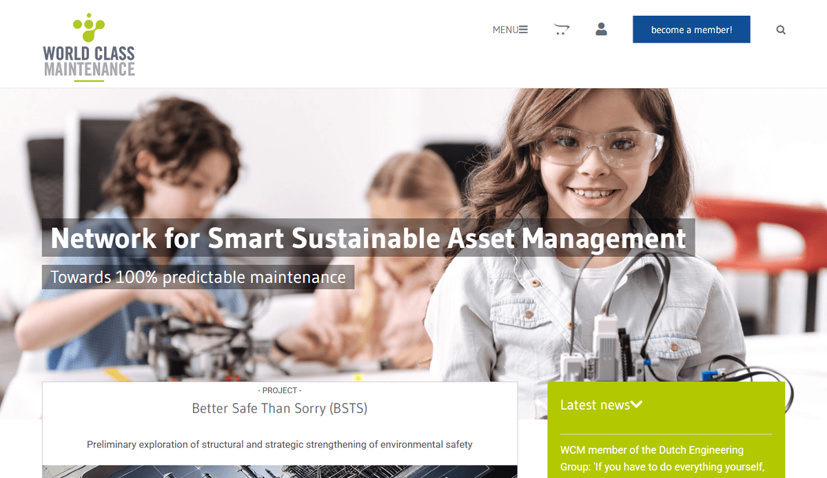
13. World Class Maintenance
Location: Anaheim, CA
- BBB A+ rating displayed for reputational strength
- Emphasis on honesty and transparency in copy
- Clear contact CTA drives action
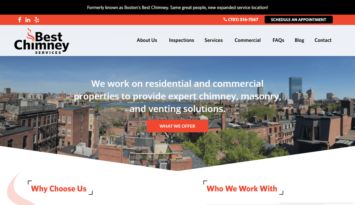
14. Boston’s Best Chimney
Location: Boston, MA
- Family‑owned brand story appeals to trust
- 24/7 service and modern venting solutions highlighted
- Professional team visuals enhance reliability
15. C&C Chimney
Location: Charlotte, NC
- Certifications (CSIA, CDET) shown prominently
- Combined chimney + duct services highlight full‑service scope
- Clear CTA for scheduling
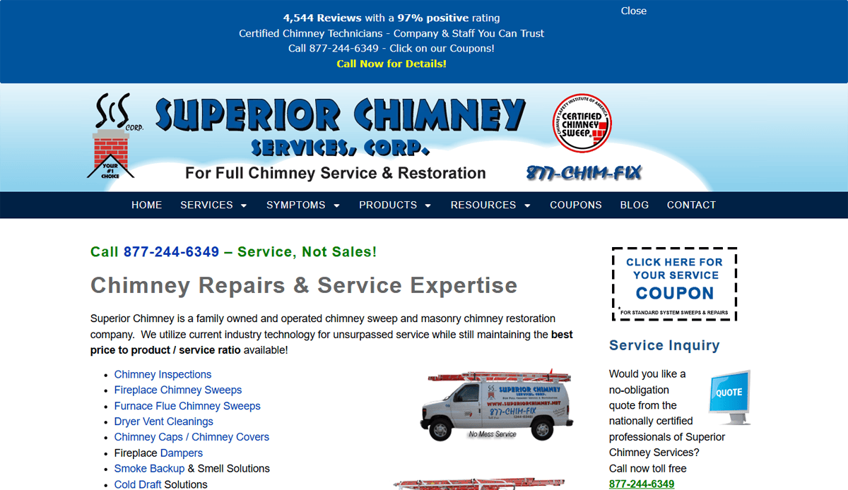
16. Superior Chimney Services
Location: Chicago, IL
- Industry tech usage emphasized (restoration expertise)
- Blog section educates on maintenance practices
- Family‑owned narrative builds connection
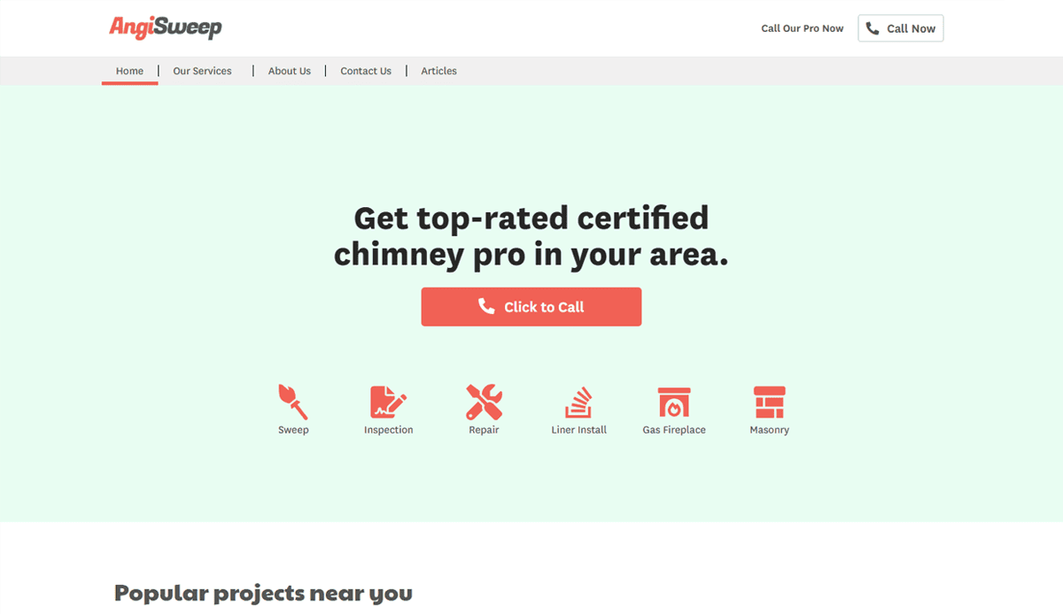
17. Angi Sweep
Location: Nationwide
- Instant booking and upfront pricing improve UX
- Satisfaction guarantee increases trust
- Helpful blog educates on inspections and repairs
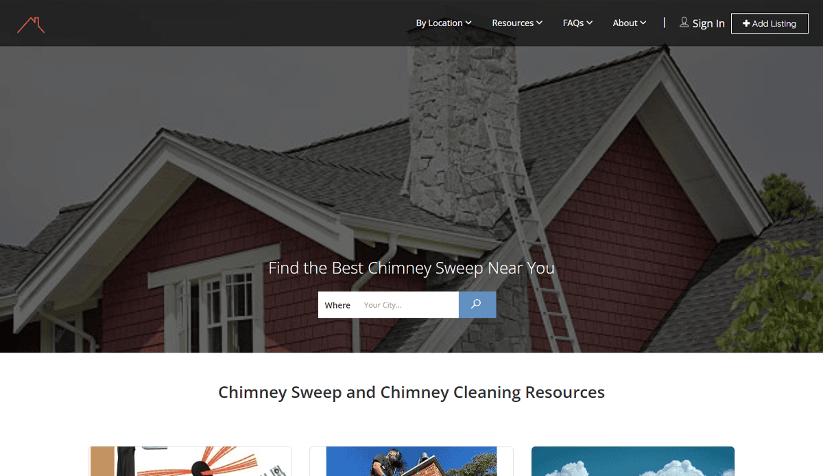
18. Chimney Sweeps
Location: Nationwide Directory
- 5+ star directory enhances credibility
- Listings include maps and contact info for easy access
- FAQ section addresses common homeowner questions
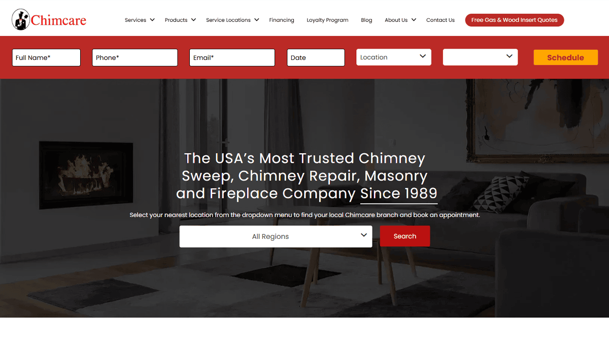
19. Chimcare Chimney Sweep Company
Location: Pacific Northwest (WA/OR)
- Loyalty program with lifetime pricing and scheduled chimney maintenance builds long-term customer relationships
- Prominently featured CSIA certification and National Chimney Sweep Guild membership reinforce expertise
- Clear “Find Your Closest Location” widget supports fast local bookings
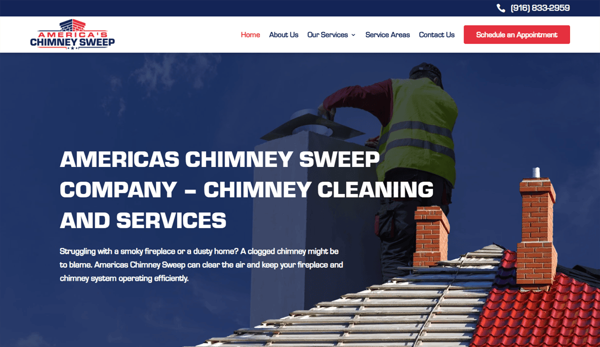
20. America’s Chimney Sweep Company
Location: Grass Valley / Nevada County, CA
- Comprehensive service menu includes chimney inspection, cleaning, repair, cap installation, and dryer vent cleaning—all under one professional roof
- Prominent online booking form and clear call-to-action support immediate scheduling
- Local service area map and focused copy on chimney maintenance enhance trust and local SEO
These 20 examples combine real-world chimney sweep and masonry businesses with innovative features like online booking, certification displays, animated design elements, and strong local branding, offering a rich source of inspiration for building or improving your own high-performing website.
Ready to Build a High-Performing Chimney Sweep Website?
Creating a great chimney sweep website is more than just checking a box—it’s an investment in how your business earns trust, captures leads, and grows year after year. From showcasing your chimney cleaning and related services to ensuring your site is fast, secure, and optimized for mobile, every design element should work together to elevate your brand and drive results.
Whether you’re launching a new website or revamping an outdated one, having a partner who understands the chimney sweep industry and knows how to apply best practices for chimney sweep SEO, responsive design, and marketing strategies can make all the difference. If your chimney sweep company is ready to increase website traffic, improve their online visibility, and convert more website visitors into booked jobs, now is the time to act.
Start your custom chimney sweep web strategy today—Contact our team of professionals today to schedule your consultation.
FAQs About Chimney Sweep Website Design
What should a website for your chimney sweep business include?
A website for your chimney sweep should include clear service pages for chimney cleaning service, chimney inspection, and chimney repair services. It should feature real photos, online booking options, customer testimonials, and content related to chimney maintenance. A user-friendly website also needs fast loading times, mobile responsiveness, and visible contact information to help convert website visitors into customers. For help with structure, check out our website organization guide.
Why is SEO important for chimney cleaning websites?
SEO for chimney helps your site rank higher in local searches for terms like “professional chimney services” or “chimney sweep near me.” This boosts website traffic and ensures your business appears when local homeowners are searching for services like chimney cleaning. Optimizing website content with localized keywords, fast load times, and schema markup improves visibility and trust. For advanced strategies, read our insights on contractor website design.
How can I showcase my expertise in chimney services through my website?
Highlight your chimney sweep company’s experience, certifications, and before-and-after project photos. Include blog content about chimney maintenance, the cleaning process, and seasonal safety tips to show your depth of knowledge. Client reviews and references to respected names like Clean Sweep 317, Midtown Chimney Sweeps, or Golden Gate Chimney can also add authority.
What makes a professionally designed website better than a DIY site?
Professionally designed websites are built for performance, trust, and lead generation. They use proven design elements, are optimized for SEO, and provide a seamless user experience. DIY sites often lack features like mobile responsiveness, proper structure, and optimization for the cleaning industry, especially for services such as chimney cleaning. A professionally built repair website ensures your chimney offers are clearly presented and your site is working 24/7 to generate leads.
How do I add online booking to my website?
Online booking is a must-have for any cleaning services site today. You can use plugins or integrations to allow customers to schedule a chimney cleaning service or chimney inspection directly from your site. This reduces friction and increases conversions. Look for systems that sync with your calendar and send automatic confirmations. Adding this feature signals you’re a clean sweep operation with modern customer service.
What content helps improve rankings for websites in the chimney industry?
Focus on optimizing website content with location-specific terms, blog articles about chimney maintenance, and FAQs addressing services like chimney cleaning. Include structured service pages that target keywords like “advanced chimney cleaning” or “vertical chimney repair.” Reference local chimney regulations or seasonal tips to show relevance and timeliness. Internal linking to pages about cleaning process and marketing strategies also supports rankings.
How do I market my website effectively?
Effective chimney sweep marketing includes local SEO, pay-per-click ads, email campaigns, and Google Business Profile optimization. Content marketing—like blogs and FAQs related to chimney care—can establish your brand as the best chimney sweep in your area. Showcase examples of the best chimney work you’ve done and request reviews from satisfied clients to enhance trust. Don’t overlook social proof and consistent branding across all online channels.
How often should I update my website?
Your site should be updated regularly with seasonal promotions, fresh blog content related to chimney safety or maintenance, and customer testimonials. This keeps the site relevant for search engines and shows visitors your business is active and professional. If you’ve expanded your services such as chimney cleaning or added new certifications, reflect that promptly on your site.
Can I target multiple service areas on my chimney cleaning website?
Yes, create localized landing pages for each service area. For example, if you serve multiple local chimney markets, dedicate pages to each city or neighborhood with custom content about the services you provide. This helps with SEO for chimney-related keywords in those areas and increases visibility where it matters most.
What are examples of the best industry websites?
The best industry websites use clean layouts, strong service descriptions, high-quality imagery, and features like online booking and testimonials. They’re fast, secure, and optimized for mobile. Sites built for businesses like chimney services often highlight expertise, showcase reviews, and make scheduling a clean sweep effortless. Want a breakdown of what works? Review our post on remodelling company website design for transferable best practices.

