Just looking for our Best Charity Website examples list?
Key takeaways:
Design Drives Engagement and Trust
A professional charity website that reflects your mission, uses consistent branding, and showcases real impact builds credibility and encourages visitors to become donors, volunteers, or advocates.
Content and Navigation Must Serve a Purpose
Structuring your site around clearly defined website goals—like driving donations or building your email list—ensures every page supports conversion and guides users seamlessly through the experience.
Visuals and Performance Are Strategic Tools
A visually appealing design combined with fast page load time and responsive layout enhances the user experience and strengthens your organization’s ability to engage supporters and grow web traffic.
Planning and Maintenance Are Critical for Long-Term Success
Website development doesn’t stop at launch. Aligning internal goals in the planning phase and investing in ongoing WordPress maintenance ensures security, performance, and scalability for your nonprofit’s future.
The Right Design Can Multiply Your Impact
By applying nonprofit web design best practices—supported by real-life examples—your organization can create a site that looks good and inspires action, builds a community, and amplifies your mission.
Why Design Matters: The Strategic Advantage of a Great Charity Website
In the world of nonprofits, a compelling website is the engine behind donor engagement, donations online, and long-term sustainability. Whether you’re an established organization or a growing cause, your charity’s website is often the first impression for a potential donor. And as any seasoned fundraiser knows, first impressions can make or break a contribution.
Designing a high-performing nonprofit website goes far beyond choosing a popular template or slapping a donation form on your homepage. It’s about building a user-friendly experience that invites trust, simplifies navigation, and emotionally connects visitors to your mission. It’s about making every click count, especially on critical touch points like your donation page or newsletter signup.
Today’s donors are browsing from a mobile device, scanning quickly, and making split-second decisions. That means your nonprofit website needs to load fast, communicate clearly, and guide visitors toward action with seamless UX design. Strategic elements like testimonials, optimized donation flows, and smart layout decisions all contribute to more conversions and deeper engagement.
In this guide, we’ll walk you through what makes a website not just good, but great. From homepage design to donation optimization, you’ll learn how thoughtful design can turn curiosity into commitment and visits into meaningful fundraising momentum.
Website Planning & Purpose: Building with Intention
Effective website design doesn’t begin with picking a color palette or selecting a website builder—it starts with strategic planning rooted in purpose. Nonprofit organizations must first define the core objective of their digital presence before any design or content decisions are made. Is the primary goal to increase donations online? Boost volunteer sign-ups? Educate the public? Build a subscriber base for your newsletter? These decisions shape every element that follows.
During the planning phase, stakeholders should collaborate to clearly outline their audiences—donors, potential donors, volunteers, beneficiaries, and media partners—and the specific actions they want each group to take. Once audience intent is mapped, the user journey must be streamlined to support it. This means reducing unnecessary steps in the donation process, ensuring that calls to action are visible across the homepage and beyond, and structuring content that resonates with empathy and clarity.
Equally critical is content strategy. Many nonprofits struggle to communicate their value effectively, often defaulting to vague mission statements. Instead, this phase should include developing impactful messaging and prioritizing conversion-driven content like donor testimonials, success stories, and community impact metrics. For guidance on how to develop strong messaging that connects with your audience, explore our detailed article on mastering copywriting for nonprofits.
Planning also includes technical and operational considerations, such as deciding on the right content management system, ensuring mobile responsiveness, and outlining accessibility requirements. By aligning internal teams early and grounding every choice in the organization’s mission, nonprofits can avoid scope creep, keep budgets in check, and ensure the final product drives measurable impact.
Ultimately, a well-planned website becomes a growth engine, not just a brochure. It serves your community better, raises more funds, and scales your mission with digital precision.
Design Principles: What Makes a Nonprofit Website Truly Effective
Design is more than aesthetics—it’s a strategic tool for nonprofits to build trust, guide action, and communicate purpose. A well-designed site must combine emotional storytelling with usability, ensuring that visitors feel inspired and also guided to take action.
Clarity is the cornerstone of effective nonprofit design. Every element, from your homepage headline to the placement of your donation form, should reflect your mission and make it immediately clear what you do, who you serve, and why it matters. Avoid clutter and distraction. Instead, use whitespace, strong typography, and simple layouts to create breathing room and direct attention toward key calls to action like “Donate Now” or “Join Our Newsletter.”
Visual hierarchy is another fundamental principle. Organize your content so users can intuitively scan and understand it. Use larger fonts for primary messages, contrasting colors for call-to-action buttons, and consistent navigation to ensure a seamless user experience. This matters even more for users arriving from a mobile device, where space and attention spans are limited.
Authenticity also plays a huge role in design for this sector. Stock photos and generic graphics often undermine trust. Instead, showcase real images of your team, your impact in the field, and the communities you serve. Incorporate real testimonials to add emotional weight and credibility. Video can also be a powerful asset when used strategically.
Finally, accessibility and performance should never be afterthoughts. Your website must be designed to load quickly, perform well on all screen sizes, and meet accessibility standards to ensure inclusivity. This reflects your values and broadens your reach.
To ensure these principles are executed with intention, every nonprofit should follow a structured web design process that brings clarity to each phase, from discovery to launch. Explore our full step-by-step guide to the web design process to see how a proven framework can transform your ideas into a results-driven site.
Content & Navigation: Structuring for Simplicity, Impact, and Action
For all websites, content and navigation must be intuitive, goal-driven, and emotionally engaging. Unlike e-commerce or commercial platforms, charity websites must do more than inform—they need to inspire belief, prompt action, and build long-term relationships. That only happens when content is structured thoughtfully and the navigation experience removes all barriers to access.
Start by thinking through your content hierarchy. What does a first-time visitor need to see and understand within the first 10 seconds? Typically, this includes your core mission, who you help, and how people can get involved. That messaging should be front and center on your homepage, supported by concise value statements and clear calls to action that encourage online donations or newsletter signups.
From there, each key section of your website—like “About Us,” “Programs,” “Donate,” and “Impact”—should have its own dedicated page, written in plain, emotionally resonant language. Each page must guide the user toward an action: learning more, donating, volunteering, or sharing. Overloading users with blocks of text or unnecessary jargon often results in friction and drop-offs. Break content into digestible sections using headlines, subheadings, and bullet points. Support it with images, testimonials, and infographics to keep readers engaged.
Navigation must mirror this simplicity. Every link in your main menu should support a clear user path. Avoid overwhelming visitors with too many choices. Group content logically—your donation page should be easily accessible from every page, and the same goes for volunteer opportunities or contact details. Don’t bury important pages three clicks deep. For most nonprofits, the ideal primary menu includes: Home, About, Our Work, Get Involved, Donate, and Contact.
It’s also vital to ensure these two components scale across devices. A growing number of users will access your site from a smart device, so dropdown menus must be responsive, and buttons should be easily tappable.
To go deeper on how to structure an effective site, including how to align your sitemap with user behavior and SEO goals, read our full website organization guide. A strong structure doesn’t just improve user experience—it directly contributes to better engagement, more donations, and lasting support.
Visual Elements: Building Emotional Connection and Trust Through Design
In website design, visual elements do more than make a site attractive—they serve as a direct extension of your mission and a catalyst for user engagement. Every photo, video, icon, and color choice shapes how visitors perceive your organization, trust your message, and choose to act. For charities in particular, visual storytelling is one of the most powerful tools available.
Start with photography. Avoid generic stock images that dilute authenticity. Instead, use real, high-quality photos that reflect your programs in action, your community, and the people you serve. A single image of a beneficiary’s smile or a volunteer at work can often say more than a paragraph of text. These images should support your content, not distract from it. Place them strategically near calls to action or success stories to increase emotional resonance and drive conversions.
Color and typography also carry weight. Colors should reflect your brand identity while supporting accessibility. For example, a calming blue or vibrant green can evoke trust or energy, but contrast and legibility must always come first. Typography should be clean, easy to read, and consistent throughout the site. Avoid mixing too many fonts or using overly stylized text that could confuse visitors or slow reading speed.
Video is another impactful visual tool, particularly for showcasing impact, introducing leadership, or telling a donor story. Short, captioned videos that autoplay without sound can draw users in without overwhelming them. Use these sparingly and intentionally, especially on your homepage, donation page, or about page.
Icons and illustrations can simplify complex ideas and guide navigation. Use them to break up long sections of content or highlight features such as donation options, event details, or contact information. But keep them consistent with your brand’s tone and visual style.
Lastly, ensure all visual elements are optimized for performance. Compress images for fast loading and test display across devices. A mobile user who encounters a slow site or distorted image is unlikely to stay engaged or complete a donation.
When visual elements are aligned with your brand and purpose, they do more than decorate—they clarify, connect, and convert. A strong visual identity builds recognition, reinforces professionalism, and ultimately deepens your audience’s trust and commitment.
Best Charity Website Examples
Here are 20 outstanding nonprofit websites from across the U.S., including five designed by our experts. Each example highlights key features that make these sites effective in engaging supporters, communicating missions, and driving action.
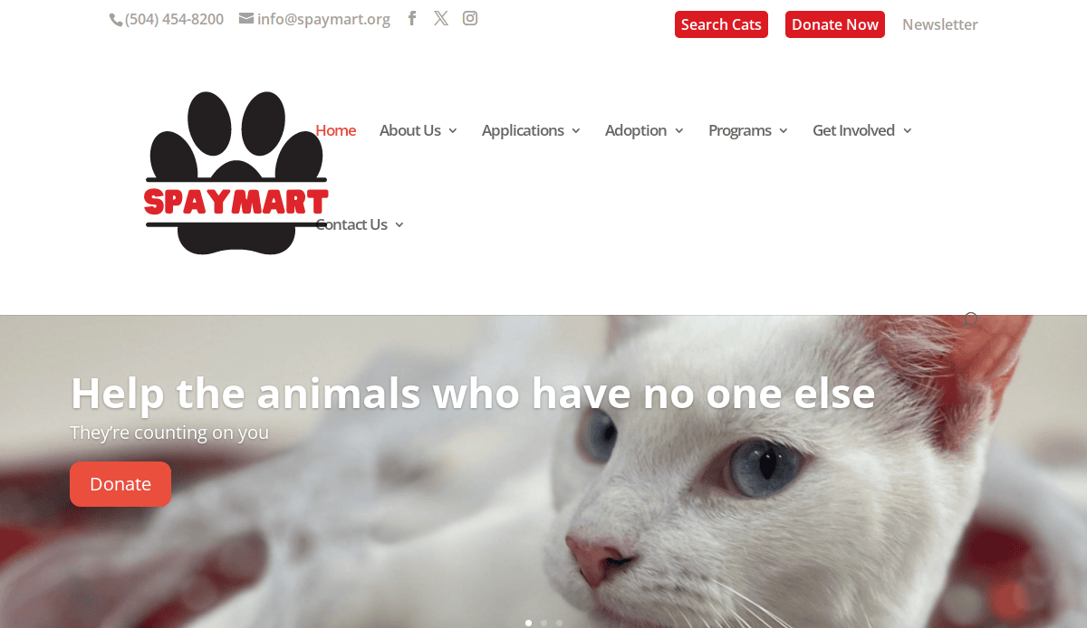
1. SpayMart
Location: New Orleans, LA
Key Takeaways:
- Clean layout with intuitive navigation enhances user experience.
- Prominent donation call-to-action encourages contributions.
- Responsive design ensures accessibility across devices.
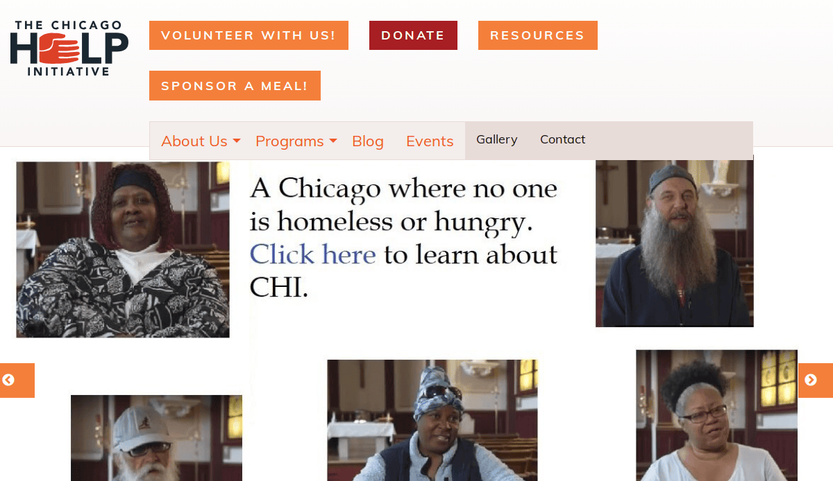
2. The Chicago Help Initiative
Location: Chicago, IL
Key Takeaways:
- Engaging visuals and storytelling convey mission effectively.
- Event calendar keeps the community informed and involved.
- Easy-to-use volunteer sign-up forms facilitate participation.
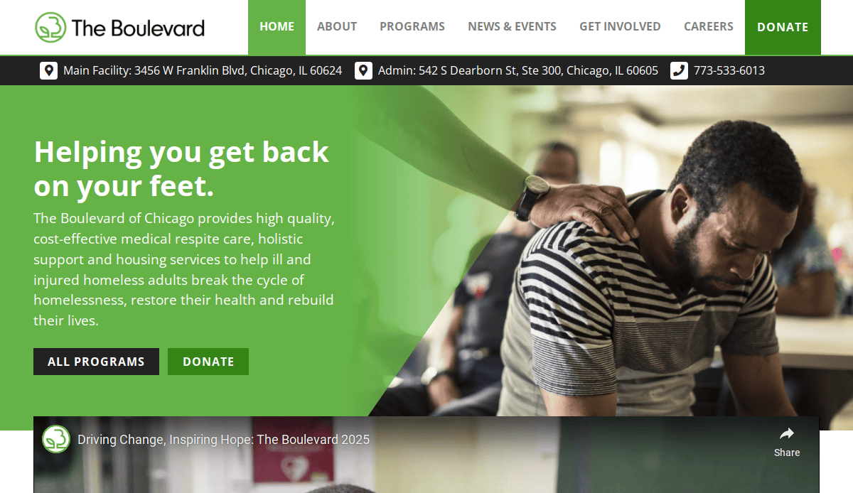
3. The Boulevard
Location: Chicago, IL
Key Takeaways:
- Compelling imagery and success stories build emotional connection.
- Clear navigation directs users to key information effortlessly.
- Integrated donation platform simplifies the giving process.
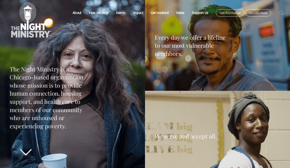
4. The Night Ministry
Location: Chicago, IL
Key Takeaways:
- Dynamic homepage highlights urgent needs and initiatives.
- Mobile-friendly design ensures accessibility on all devices.
- Robust blog section keeps supporters informed and engaged.
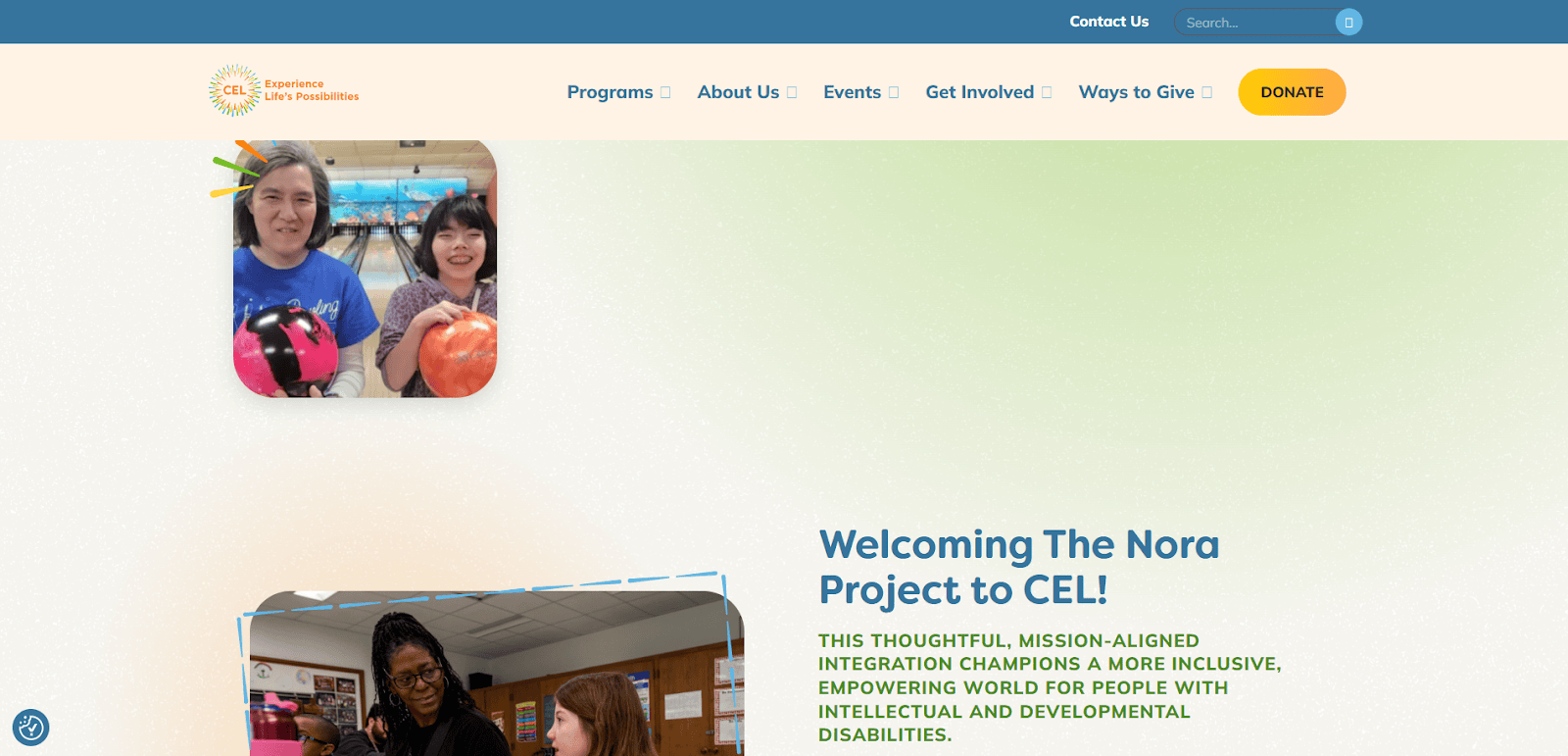
5. The Center for Enriched Living
Location: Riverwoods, IL
Key Takeaways:
- Vibrant color scheme reflects the organization’s inclusive spirit.
- Interactive program listings provide detailed information.
- Accessible design accommodates users with disabilities.
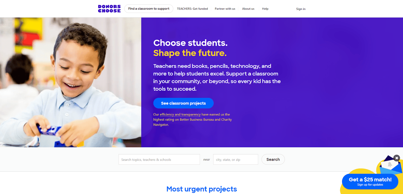
6. DonorsChoose
Location: New York, NY
Key Takeaways:
- User-friendly platform connects donors directly with classroom projects.
- Transparent budgeting builds trust with contributors.
- Impact statistics showcase organization’s effectiveness.
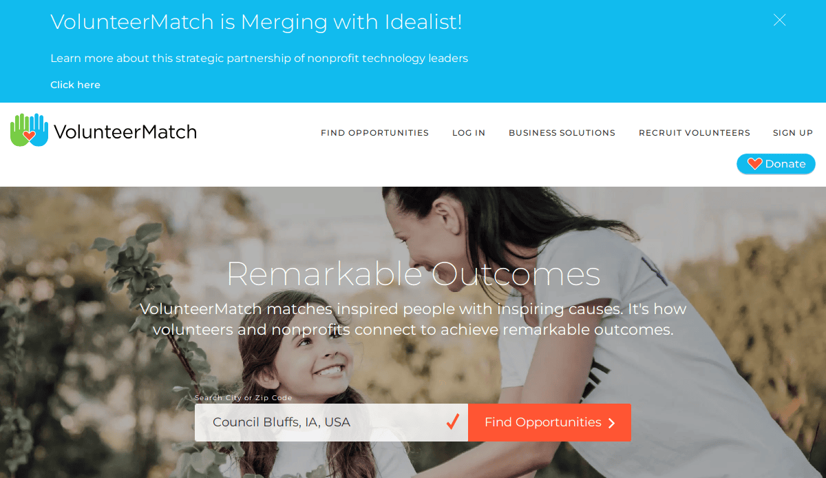
7. VolunteerMatch
Location: Oakland, CA
Key Takeaways:
- Comprehensive database matches volunteers with opportunities.
- Streamlined search functionality enhances user experience.
- Responsive design ensures accessibility across devices.
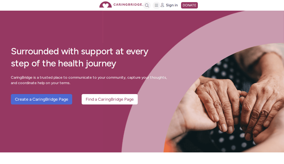
8. CaringBridge
Location: Eagan, MN
Key Takeaways:
- Personalized pages allow individuals to share health updates.
- Secure platform protects user privacy and data.
- Mobile-friendly design ensures ease of use on all devices.
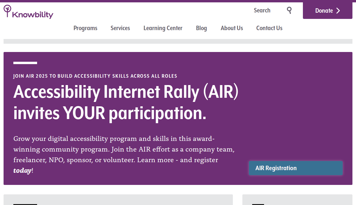
9. Knowbility
Location: Austin, TX
Key Takeaways:
- Focus on digital accessibility promotes inclusive web design.
- Educational resources support community learning.
- Clean, straightforward layout enhances usability.
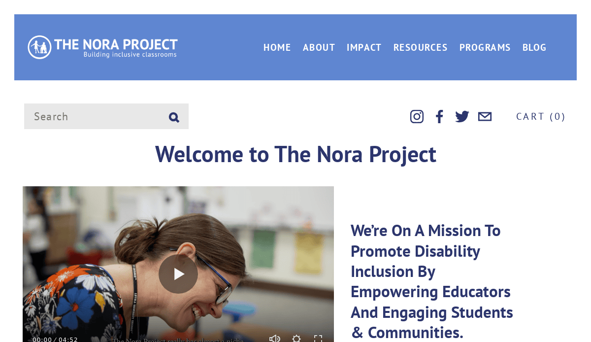
10. The Nora Project
Location: Oak Park, IL
Key Takeaways:
- Empathy-driven messaging and inclusive visuals reflect core values.
- Clean layout with intuitive navigation supports ease of access.
- Educator resources and program details are organized and easily discoverable.
11. Girls Who Code
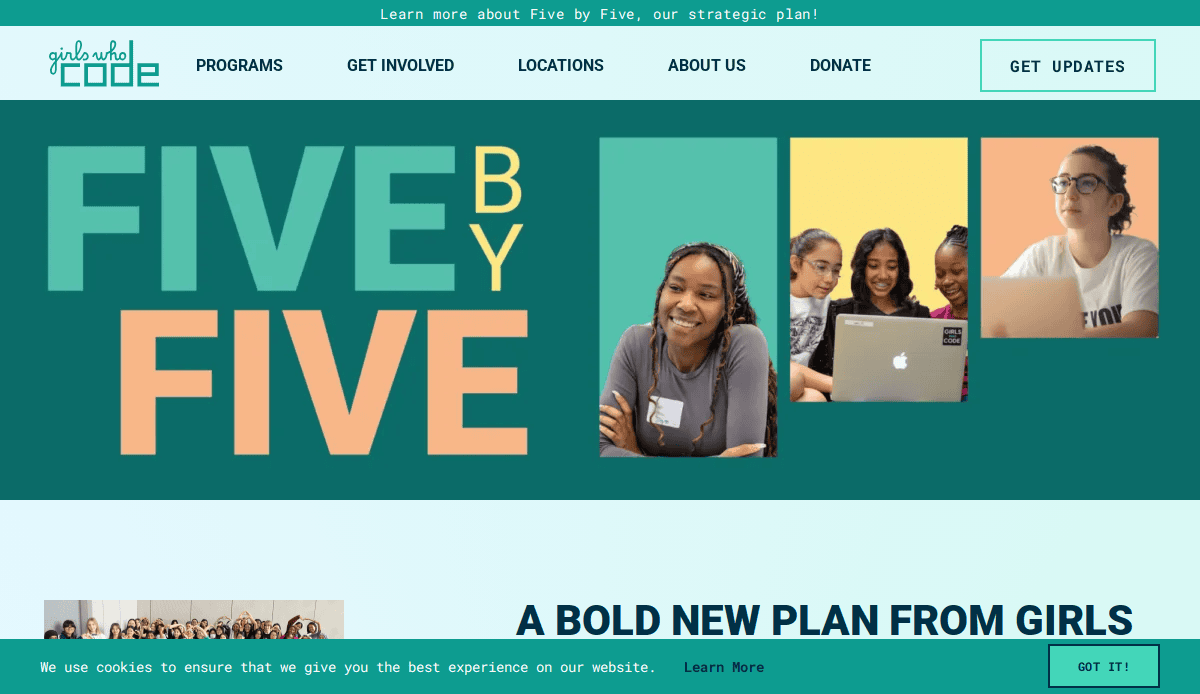
Location: New York, NY
Key Takeaways:
- Bold visuals and messaging inspire young women in tech.
- Clear program pathways guide user engagement.
- Responsive design ensures accessibility across devices.
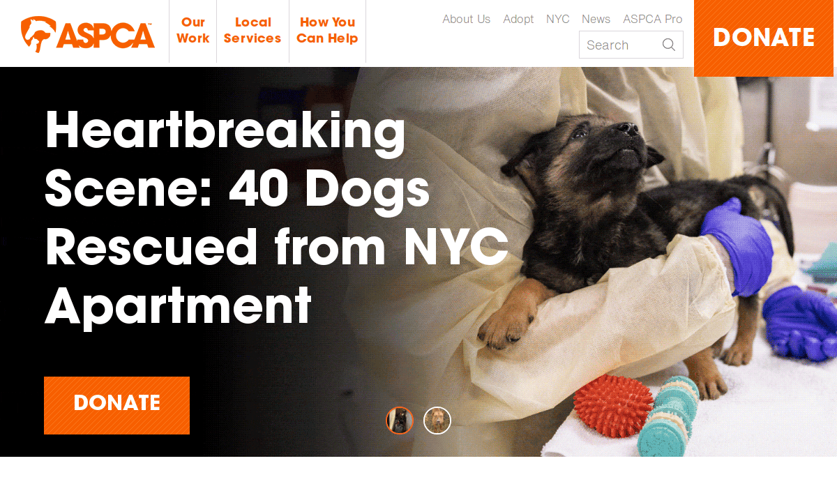
12. ASPCA
Location: New York, NY
Key Takeaways:
- Heartfelt imagery connects visitors to animal welfare missions.
- Prominent donation buttons facilitate contributions.
- Educational content informs and engages supporters.
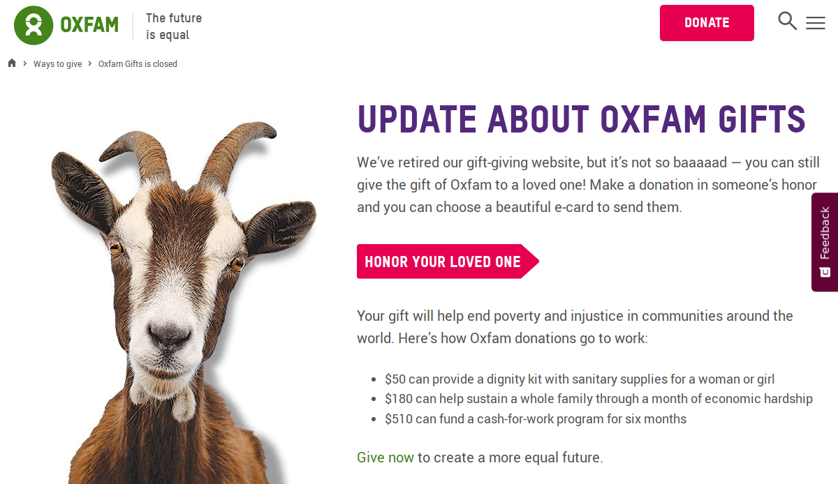
13. Oxfam Unwrapped
Location: Boston, MA
Key Takeaways:
- Interactive gift catalog offers unique donation options.
- Storytelling elements highlight global impact.
- User-friendly design simplifies use.
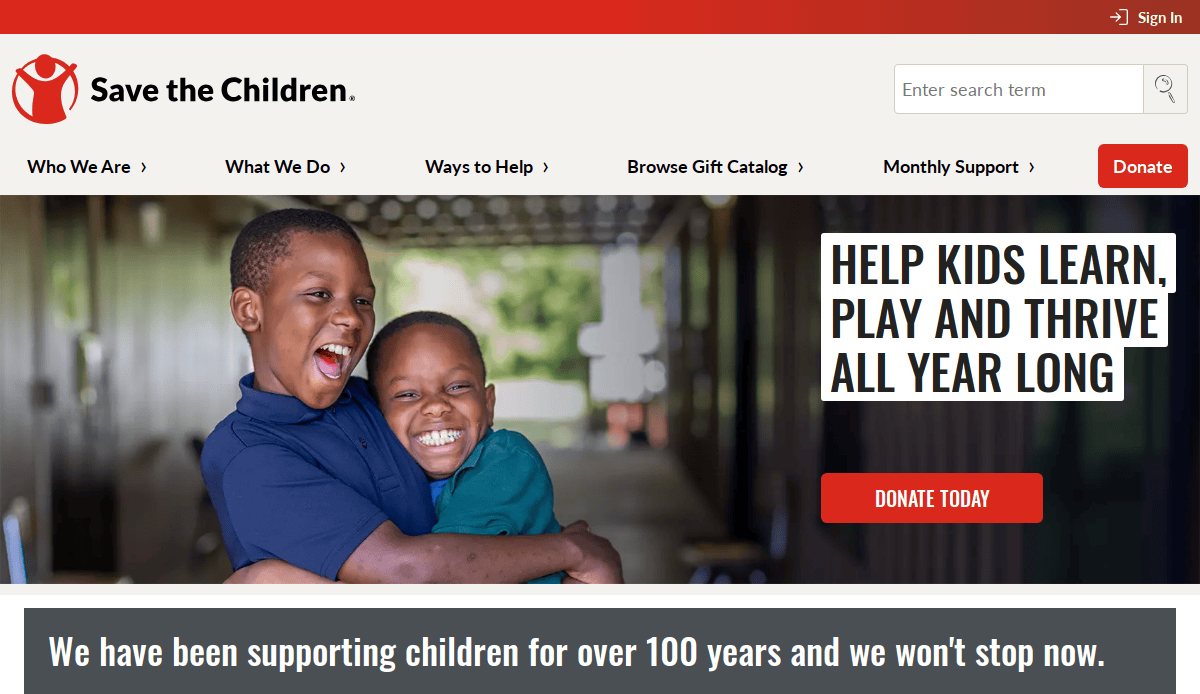
14. Save the Children
Location: Fairfield, CT
Key Takeaways:
- Compelling visuals and narratives showcase child-focused initiatives.
- Clear calls-to-action drive donations and involvement.
- Mobile-optimized design enhances UX.
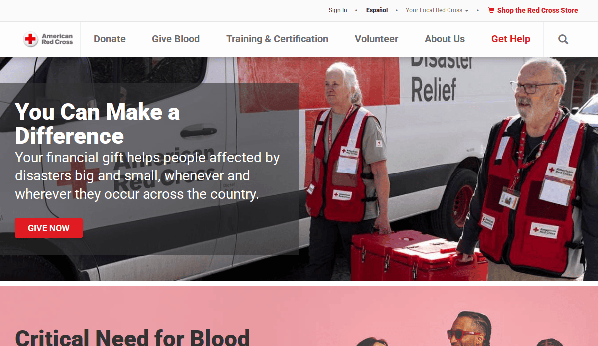
15. American Red Cross
Location: Washington, D.C.
Key Takeaways:
- Real-time disaster updates inform and engage visitors.
- Streamlined donation process encourages support.
- Comprehensive resources provide valuable information.
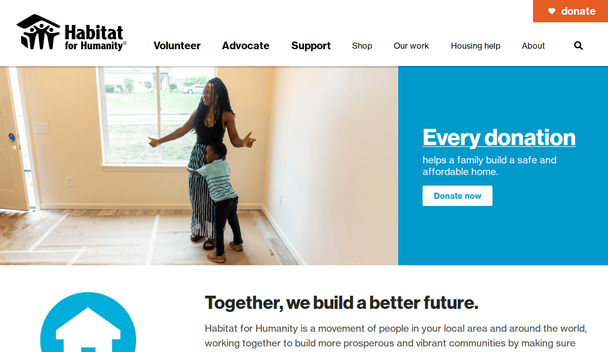
16. Habitat for Humanity
Location: Atlanta, GA
Key Takeaways:
- Impact stories and visuals highlight housing initiatives.
- Volunteer opportunities are prominently featured.
- Responsive design ensures accessibility on all devices.
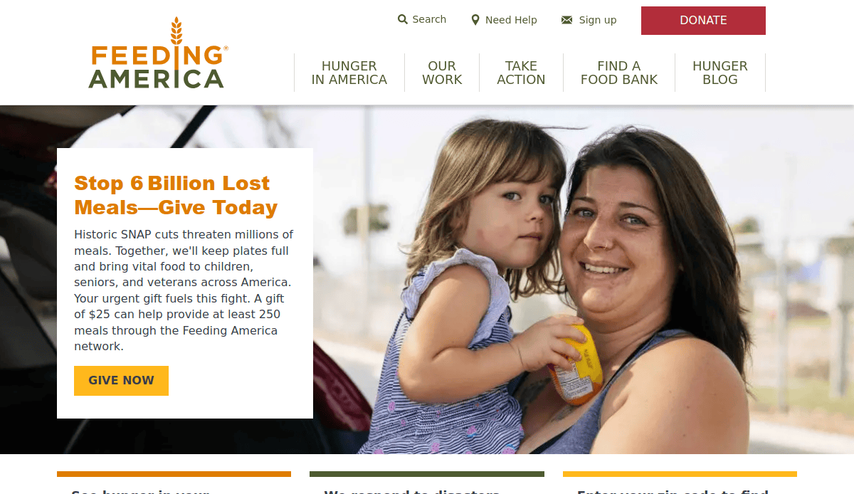
17. Feeding America
Location: Chicago, IL
Key Takeaways:
- Interactive maps display food bank locations.
- Donation options are clearly presented.
- Educational content raises awareness about hunger issues.
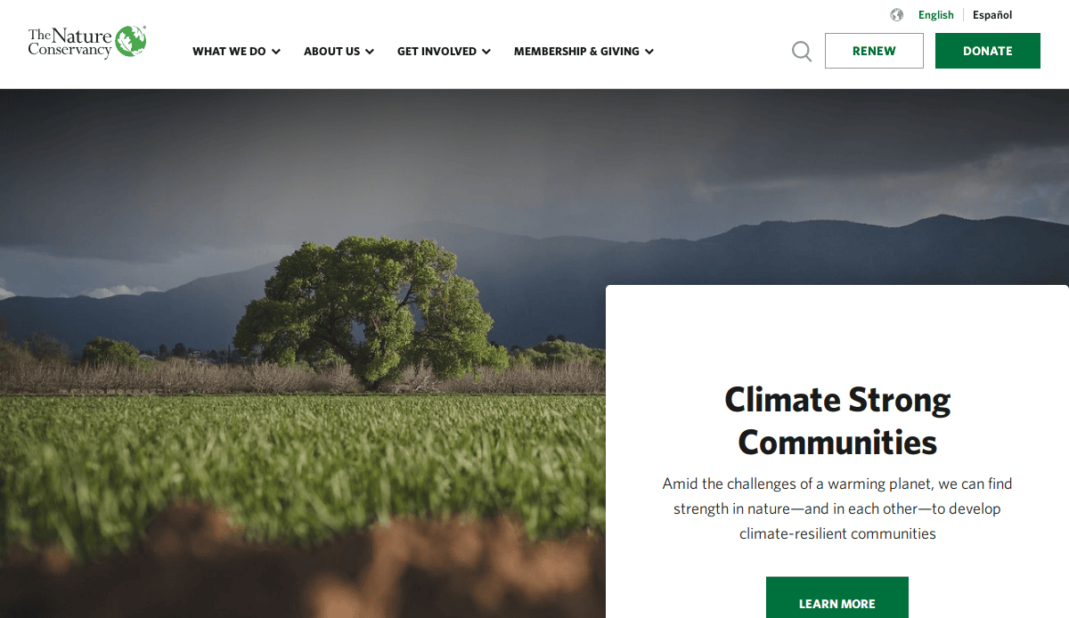
18. The Nature Conservancy
Location: Arlington, VA
Key Takeaways:
- Stunning visuals showcase conservation efforts.
- Informative content educates visitors on environmental issues.
- Donation and membership options are easily accessible.
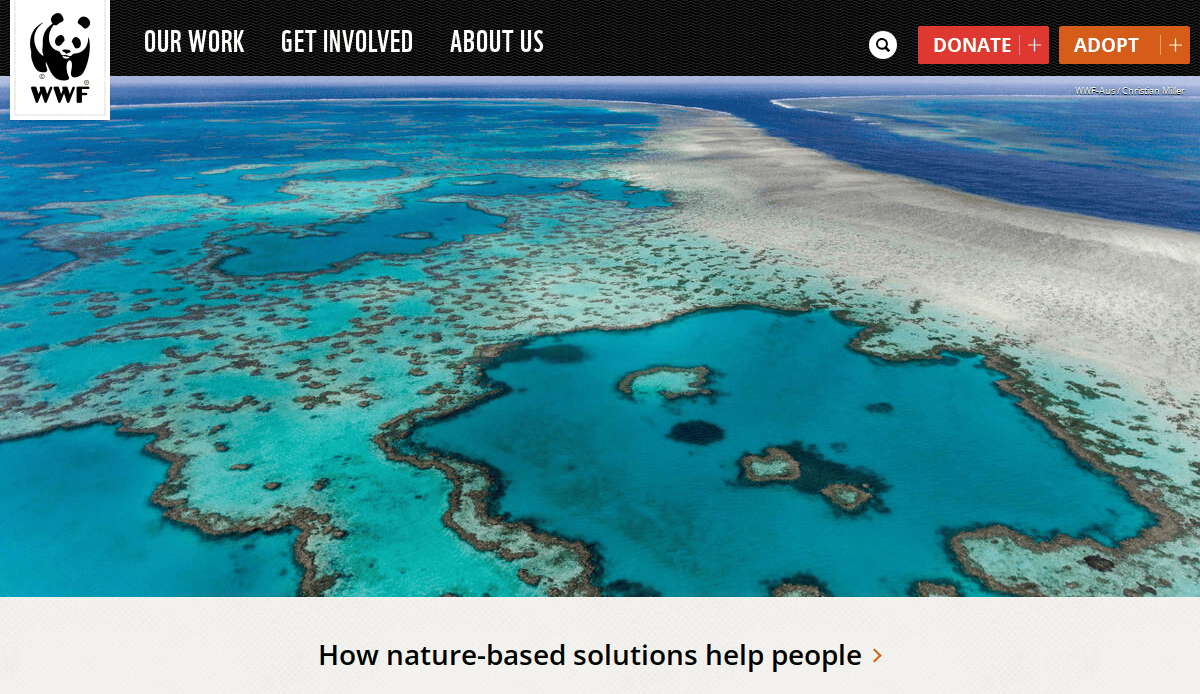
19. World Wildlife Fund
Location: Washington, D.C.
Key Takeaways:
- Engaging multimedia content highlights wildlife conservation.
- Adoption and donation programs are prominently featured.
- User-friendly design enhances the design.
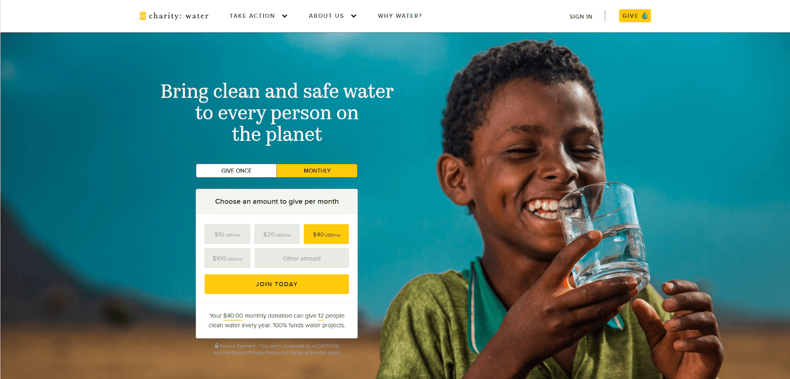
20. Charity: Water
Location: New York, NY
Key Takeaways:
- Impactful storytelling illustrates clean water initiatives.
- Transparent reporting builds donor trust.
- Modern, minimalist design enhances visitor experience.
These examples demonstrate the importance of clear messaging, user-friendly design, and engaging content in creating effective nonprofit websites. Whether you’re looking to redesign your site or seeking inspiration, these organizations offer valuable insights into successful online presence strategies.
Take the Next Step Toward a Website That Inspires Action
Designing and building an impactful charity website is a strategic investment that amplifies your mission, drives recurring donations, and builds a community of lifelong supporters. With the right foundation, design, and content, and ongoing care, your non-profit website becomes a powerful tool for outreach and results. Whether you’re planning your first build or looking to refresh your current site, aligning your website goals with nonprofit web design best practices is essential for long-term success.
From responsive design to optimizing page speed and integrating essential information like CRM tools, upcoming events, or email marketing, the difference between a good site and a great one comes down to clarity, consistency, and connection. A professional website that delivers strong search engine performance and provides ease of use across all devices can help you grow web traffic and deepen donor trust.
If you’re ready to create a successful charity website that reflects your values and inspires real action, our team is here to help. Start your journey with our team of experts today, and let’s take your website to the next level.
Common Questions About Nonprofit Site Design, Answered
What makes a website visually appealing?
A visually appealing nonprofit website uses consistent branding, emotionally resonant imagery, and thoughtful layout choices that align with your mission. Clean typography, high-contrast color palettes, and professional design elements improve aesthetics and help engage supporters by making the content more accessible and credible.
Why is page load time important?
Fast page load time directly impacts user experience, search rankings, and donation conversion rates. If your site takes too long to load, potential donors may leave before they engage. Optimizing image sizes, minimizing unnecessary plugins, and using reliable hosting are all part of smart web development strategies to improve speed and performance.
What’s the difference between website building and website development?
Website building often refers to using tools or platforms like WordPress or drag-and-drop editors to assemble your site, while website development involves more advanced customization, coding, and backend functionality. For nonprofits needing custom integrations or CRM functionality, professional web development ensures long-term scalability and reliability.
How do I maintain consistent branding across my site?
A style guide is essential for maintaining consistency. It should include logo usage, typography, color schemes, and tone of voice. This ensures that your nonprofit’s look and feel remains unified across all pages, helping build trust and reinforce recognition with every visitor.
How can I create content that connects with donors?
Focus on storytelling and outcomes. Show real-life examples of your impact, include testimonials, and make it easy for visitors to understand how their support translates into change. Content should be structured around your audience’s values and supported by calls to action that are clear and compelling.
What should a nonprofit prioritize in early website planning?
Early planning should center around clearly defined goals—whether that’s increasing donations, expanding volunteer engagement, or sharing program updates. Align your content strategy, technical features, and user paths with those goals to ensure your site is both functional and mission-driven.
Is a guide to creating a nonprofit website really necessary?
Yes, a step-by-step guide to creating your website helps avoid common mistakes and ensures nothing critical is overlooked. From choosing the right platform to structuring your content and ensuring accessibility, a comprehensive guide supports effective decision-making throughout the process.
How can I make sure my website encourages visitor action?
Design your site to guide users intuitively—use prominent buttons, clear headlines, and easy user gateways. Each page should support a specific action, such as donating, subscribing, or attending an event. A strong focus on user experience helps increase conversions and keeps your audience engaged.
Why should nonprofits invest in professional web development?
Professional web development gives nonprofits greater flexibility, better performance, and a site that’s built to grow with the organization. It ensures your website meets modern standards for security, accessibility, and responsiveness—while giving you the tools to evolve and scale your digital presence effectively.
How do I choose the right design for my nonprofit site?
Start by identifying your audience, your goals, and the emotions you want to evoke. A good design balances functionality with storytelling, creating a user-friendly experience that drives engagement. Referencing real-life examples from successful nonprofit sites can help inspire the right approach.

