In the rapidly growing CBD industry, having a standout website is crucial for success. As the market becomes more competitive, your website is the primary point of contact between your brand and potential customers. A well-designed CBD website can establish trust, showcase your products effectively, and convert visitors into loyal customers.
The best CBD website design incorporates user-friendly navigation, high-quality visuals, and informative content that educates visitors about your products. With an increasing number of people turning to online sources for CBD products and information, it’s important to have a website that attracts and retains visitors. This means creating a seamless shopping experience, providing detailed product descriptions, and ensuring your site is mobile-friendly.
Partnering with a specialized CBD web design company can significantly improve your website’s performance. These experts understand the unique challenges and opportunities in the CBD industry, from regulatory compliance to highlighting product benefits. A professional CBD website design company will ensure your website is designed to be search engine optimized, giving you a competitive advantage in this rapidly growing sector.
Examples of the Best CBD Website Designs
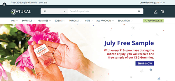
- Zatural: The website’s overall design is clean, modern, and appealing. The color design of the website is calming and complements the brand’s natural and health-focused concept. The combination of greens and earth tones strengthens the company’s identity and improves the site’s visual attractiveness. The usage of white space enhances the product images and content. The navigation menu is well-organized, with clear categories and subcategories to help users find specific products. The search bar is prominently displayed, which improves the user browsing experience by providing easy access to desired products. It has well-written and helpful material, including product descriptions, blog entries, and FAQs. The calls to action (CTAs) are well-placed and stand out without being invasive. They smoothly guide customers through purchasing, from adding products to their cart to the checkout completion. The presence of customer evaluations and testimonials increases legitimacy and fosters trust among potential purchasers. Positive feedback from previous customers might be an essential consideration for prospective visitors.

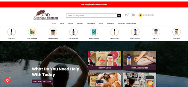
- CBD American Shaman: The website’s visual design is clean and inviting. The color scheme, which is dominated by soothing greens and whites, effectively conveys a sense of tranquility and trustworthiness—qualities that are critical for a CBD-focused brand. High-quality photos and graphics are used throughout the site, giving it a more professional appearance. One of the website’s most notable qualities is its user-friendly navigation. The top navigation bar is well-organized, with well-defined categories. The website does more than sell things; it also functions as an instructional resource. The “About CBD” section is extensive, providing vital information about CBD, its benefits, and how it works. The emphasis on customer service is apparent throughout the website. Features such as the live chat option, clear contact information, and an extensive FAQ section make it easy for users to get assistance. This emphasis on customer service demonstrates the brand’s dedication to creating a pleasant buying experience.
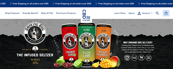
- CBD Living: The website provides an excellent user experience because of its sleek and modern design. The CBD Living website’s navigation is simple and easy to use. The well-organized primary menu lets users quickly locate the necessary information, such as specific items, educational resources, or corporate information. The search function is visible and efficient, allowing users to find products or information rapidly. Product pages are a notable component of the website. High-quality photos, thorough descriptions, and transparent information on benefits, usage, and ingredients accompany each product. The addition of customer feedback and ratings increases trust and trustworthiness. Furthermore, the easy-to-read fonts and well-organized layout improve readability and user engagement. The website’s mobile version is equally impressive. It preserves the same simple appearance and functionality, allowing for a consistent surfing experience across all platforms. This responsiveness matters greatly in today’s mobile-first market and reflects on the brand’s attention to detail and user experience.
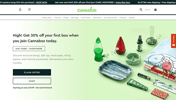
- Cannabox: The website’s vivid and modern design draws visitors in right away. The combination of dazzling colors and high-quality images produces a vibrant and appealing ambiance ideal for its intended audience. The website’s navigation is simple and well-organized, allowing visitors to find their way around easily. The website has entertaining and well-written information, including blog articles, product descriptions, and FAQs. The checkout process is easy and secure, with clear instructions and a range of payment choices. The emphasis on security during transactions increases customer confidence and improves the purchasing experience. The calls to action (CTAs) are carefully placed and visually distinct, directing consumers through the purchasing experience. Whether adding products to your cart or signing up for a membership, the CTAs are simple and appealing.
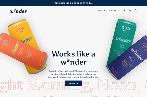
- Winder: The design is modest but classy, with a monochrome color scheme that conveys elegance and sophistication. High-quality graphics and gentle animations improve the overall appearance without becoming distracting. Each product page includes high-resolution photographs, extensive descriptions, and essential information to help shoppers make informed decisions. The layout is straightforward, emphasizing the products efficiently. Furthermore, the inclusion of customer evaluations and ratings builds confidence and credibility, encouraging potential customers to make a purchase. Customer support is another area in which the website excels. It has a readily accessible contact page with various ways to get in touch, including email and social media links. A detailed FAQ section answers typical questions and provides quick solutions to probable concerns.
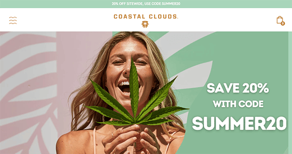
- Coastal Clouds: The website’s visual design is clean and inviting. The selection of a relaxing color scheme characterized by natural tones represents the brand’s dedication to well-being and tranquillity. High-quality photographs and graphics are strategically positioned to properly showcase the products, creating a visually appealing and engaging website. The site’s navigation is simple and intuitive. The well-organized menu allows customers to effortlessly navigate different product categories and locate what they’re looking for with little effort. It also excels at delivering thorough and informative content. Each product page is extensive and includes clear descriptions and usage instructions. The call-to-action buttons are visible and well-designed, urging users to take action without being invasive. The checkout experience is streamlined and user-friendly, which reduces friction and increases conversion rates.
- Kazmira: Its website welcomes visitors with a visually appealing interface. The color combination is refined but vivid, providing a welcoming environment. High-quality photos and slick designs improve the overall visual appeal, making the website beautiful and professional. The website’s easy navigation enhances the user experience. The menu is straightforward. Its clear headings and well-organized material guarantee that users can easily traverse the website. The content is captivating and well-written. Each component is carefully planned to deliver helpful information to the audience. The written and visual content blend keeps users engaged and pushes them to learn more about the brand and its offers. The website uses strategically placed and visually appealing call-to-action (CTA) buttons. These CTAs direct visitors to take desired actions, such as completing a purchase, subscribing to a newsletter, or contacting the business. This intelligent design element improves conversion rates.

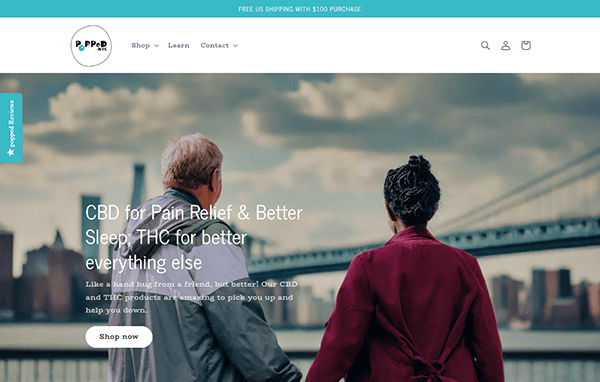
- Popped NYC: The website’s vibrant and dynamic design reflects the brand’s engaging and approachable personality. The combination of bright colors combined with clean whites creates a dynamic and visually appealing environment. The homepage stands out with eye-catching graphics and clear writing describing the brand’s distinguishing attributes. The navigation is basic, with a well-organized menu that makes researching items, learning about the company, and contacting customer service quick and easy. The addition of customer reviews and FAQs boosts confidence and enhances the user experience. Hover effects and dynamic transitions are two examples of interactive elements that add a modern touch without overwhelming the site’s functionality.
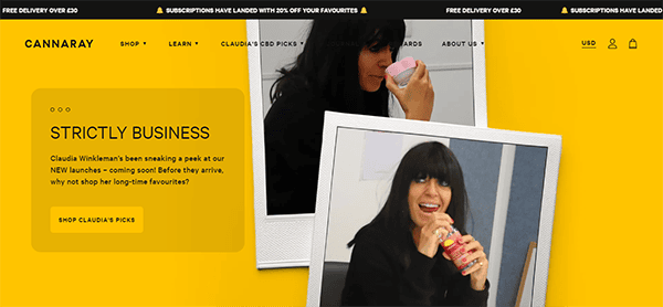
- Cannaray: When visitors arrive on the website, they are welcomed with a clean and elegant design. The color scheme, dominated by gold highlights and browns, immediately conveys a sense of calm and confidence. High-quality product photographs and lifestyle shots are effortlessly blended, resulting in a visually appealing and engaging user experience. The primary menu is prominently displayed at the top, providing quick access to essential aspects, including items, perks, and their story. It also succeeds in presenting its content in an ordered and appealing format. The product pages are thorough, with clear descriptions, benefits, and usage instructions. Including customer reviews and FAQs improves the user experience by giving additional information and increasing credibility. The website effectively conveys trust and transparency. The “Our Story” part is emotional and authentic, communicating the brand’s mission and values. Furthermore, thorough information on sourcing, manufacturing, and lab testing is easily accessible, emphasizing the brand’s dedication to quality and safety.
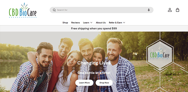
- CBD BioCare: The website’s visual style is simple, professional, and inviting. The color palette, predominantly green and white, complements the brand’s emphasis on natural health and wellness. High-quality photos and graphics are employed across the site to improve the overall appearance while not overwhelming the viewer. The menu is well-organized and divided into clear categories, helping users quickly discover what they are looking for, whether specific items, CBD information, or customer service. The addition of CBD-related educational tools, such as blog entries and FAQs, shows a dedication to informing and empowering clients. It also effectively engages with its clients across several touchpoints. The customer reviews and testimonials are featured on the website, adding authenticity and helping to establish confidence. The e-commerce capability is comprehensive and practical. Product pages are well-designed, with obvious pricing, options for size or quantity, and simple “Add to Cart” buttons.
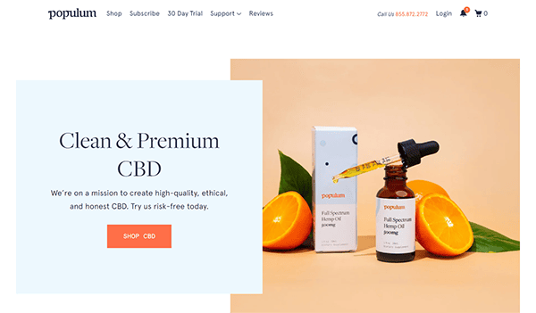
- Populum: The website’s design is clean and modern, with a white background conveying tranquility and cleanliness. This minimalist design highlights the brand’s emphasis on quality and well-being by allowing high-quality product and lifestyle imagery to stand out. The website’s color scheme is relaxing and natural, representing the organic nature of their products. Gentle blues, oranges, and whites provide a welcoming environment. The high-resolution photographs featured on the site are visually appealing and professional. The website’s design features are compatible with its brand identification. The color scheme, typography, and images are all consistent with the brand’s message of supporting wellness and natural healing. This consistency boosts brand recognition and leaves a lasting impression. The site contains carefully placed engaging CTAs that encourage users to browse items, sign up for newsletters, and learn more about CBD. These CTAs are visually appealing and intriguing, resulting in increased user involvement and conversion.
- Plain Jane: The website welcomes visitors with a sleek, modern design with a harmonious color scheme and clear lines. The usage of white space is especially useful in conveying openness and ease of navigation. The menu is well-organized, with clear categories and subcategories that make it easy for consumers to find what they want. The website has several features meant to improve the user experience. A prominent search bar facilitates product discovery, while the FAQ section provides quick answers to typical questions. The simple contact form option provides immediate customer service, which enhances the entire user experience. Practical call-to-action buttons are strategically positioned throughout the site, urging customers to take the next step, whether adding a product to their cart, signing up for the newsletter, or looking into related products. These prompts are direct and persuasive without being obtrusive. The website’s responsive design ensures it appears and works well on all devices, including desktops and mobile phones.
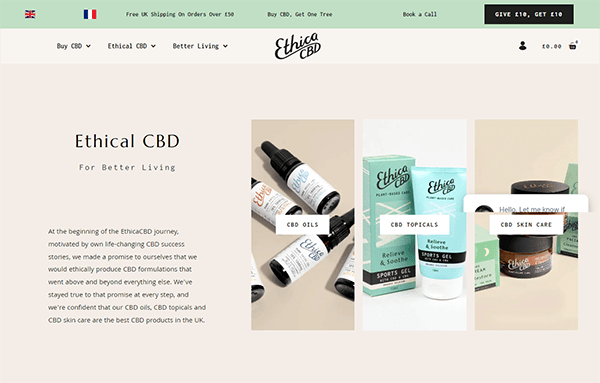
- Ethica CBD: The visual attractiveness of the website is impressive. The use of high-quality photos and a soothing color scheme provides a welcoming and relaxing environment. The site makes excellent use of white space, making the text easy to read and less overwhelming. Subtle movements and transitions offer refinement without becoming distracting. The website’s straightforward appearance and well-organized navigation make it easy to navigate. The categories are well-defined, allowing users to easily discover what they’re looking for. The product pages are thorough, offering all relevant information without feeling cluttered. The addition of customer evaluations and FAQs improves the user experience by addressing any issues and complaints directly about the product. The website’s content is both instructive and engaging. The brand’s commitment to quality and openness is evident from the thorough explanations and educational tools accessible.
- Cann: Its website’s slick and modern design draws attention right away. The website’s clean and minimalist look appeals to its target audience. The bold and earthy hues match the brand’s identity while highlighting the product’s natural and refreshing character. High-quality photos and engaging visuals provide a visually appealing experience that encourages visitors to explore deeper. The well-organized menu lets users quickly access information about items, brands, and other relevant stuff. The layout remains consistent throughout the site, ensuring a smooth browsing experience. The usage of a sticky header guarantees that the primary navigation options are constantly available, increasing user ease. The website has interactive components to increase user interaction. Product sliders, hover effects, and animated transitions provide a dynamic touch. The “Find Us” function, which lets customers find nearby establishments that sell Cann products, is especially valuable and exhibits careful consideration of user needs.
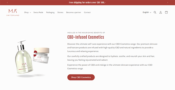
- MA True Cannabis: The website’s minimalist design, which includes plenty of white space, high-quality photos, and a limited color palette, exudes luxury and refinement. This clean and uncomplicated structure allows visitors to navigate and focus on the gorgeous graphics and important information provided. The use of high-resolution photographs and videos across the website effectively conveys its beauty and charm. The intuitive navigation mechanism allows users to traverse the site easily. The menu is simple and well-organized, with distinct categories and subcategories that effortlessly direct users to the information they want. The content is well-written, informative, and interesting, giving visitors excellent insight into the experiences and services available. The website’s responsive design guarantees that it looks and operates well on all devices, including desktop computers and smartphones. This versatility is critical to ensuring a consistent user experience regardless of the device.
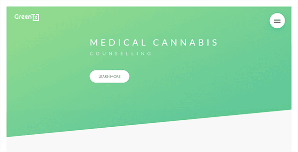
- GreenTx: Its website has a slick and professional design that successfully conveys its business identity. The homepage quickly draws attention with its clean structure and soothing color scheme, reflecting the company’s sustainability commitment. The use of green tones throughout the site complements the nature-inspired motif, producing a relaxing and welcoming ambiance. Navigation is simple, with a well-organized menu that allows customers to quickly explore various aspects such as products, services, and resources. The typography is crisp and legible, which improves readability across multiple devices. The usage of high-quality photos and graphics improves visual appeal while also effectively conveying the brand’s message. Contact information and calls to action are deliberately placed to encourage visitors to interact further with the site.
- Cigalar: The website’s basic yet beautiful design fascinates visitors. The color palette of black, white, and gold oozes elegance and refinement, ideally suited to the market it serves. The way products are presented is both visually appealing and valuable. High-quality photographs and informative descriptions provide a comprehensive perspective of each product, allowing potential customers to make informed purchases. The primary menu is simple and concise, allowing users to navigate different website sections without difficulty. The way products are presented is both visually appealing and functional. High-quality photographs and informative descriptions provide a comprehensive perspective of each product, allowing potential customers to make informed purchases. It effectively communicates its brand story through engaging content and imagery. This contributes to establishing a connection with visitors, confirming the brand’s identity and values. Customers may easily access customer assistance through a dedicated help page, a live chat function, or prominently displayed contact information, ensuring they feel supported throughout their experience.
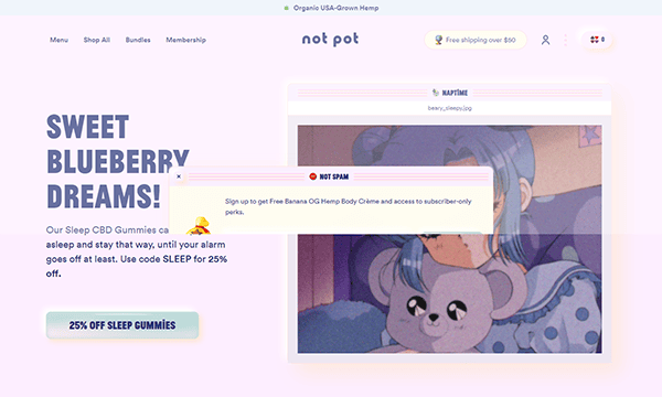
- Not Pot: The website’s design is a beautiful combination of inventiveness and user-friendly functionality. The homepage features a pleasant, whimsical design that immediately establishes the company’s tone. Soft pastel hues and playful graphics provide a welcoming and approachable ambiance that complements the company’s identity. The navigation is simple, with a well-organized style that leads users through numerous categories such as items, FAQs, and the brand’s story. Each page has a similar look, with a clean font and enough white space, which improves reading and visual appeal. Product pages are visually appealing, with high-quality photos and clear descriptions highlighting each item’s benefits. The checkout process is straightforward, offering a hassle-free buying experience. Customer evaluations and endorsements are examples of social proof features that help to promote trust and legitimacy.
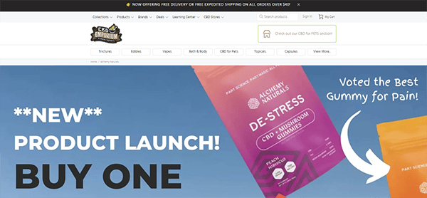
- CBD Emporium: The website features a simple style with plenty of white space, improving reading and highlighting crucial aspects like product photographs and descriptions. High-quality photos are used throughout the site to highlight CBD items, resulting in a visually appealing experience that increases the perceived value of the products. The utilization of lifestyle pictures also helps potential clients see the benefits of CBD in their daily lives. The brand’s color palette complements its identity and elicits the desired emotional response from visitors. It uses soothing, natural tones that complement its CBD product offerings. Contact information and customer support options are immediately accessible, ensuring clients that assistance is available if necessary.
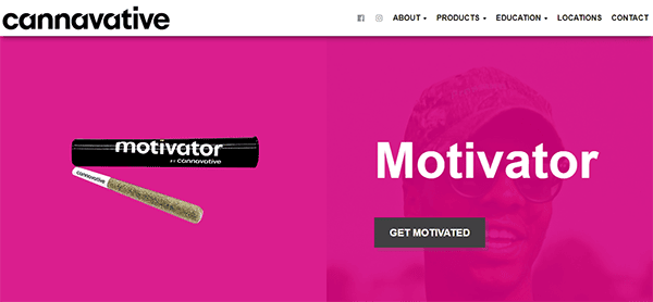
- Cannavative: Its website design has a professional and polished appearance that complements its position in the cannabis market. The homepage welcomes visitors with a clean, modern layout and high-quality photos of their products and facilities. The color design, primarily bright hues, promotes the brand’s attachment to nature and wellness. The navigation is simple, with a well-organized menu that guides users through various parts such as products, about us, news, and contact information. The typography is crisp and legible, ensuring readability on multiple devices and screen sizes. The strategic use of icons and buttons guides visitors to vital information and calls to action. CTAs are strategically positioned throughout the site, encouraging users to browse products, sign up for newsletters, or follow the firm on social media.


A top-tier CBD website design does more than just look good—it enhances the user experience and builds credibility for your brand. By focusing on clear calls to action, intuitive navigation, and engaging content, your website can drive higher conversion rates and foster customer loyalty. It’s also crucial to integrate secure payment options and precise shipping information to boost customer confidence in your brand.
The importance of partnering with a CBD web design company cannot be overstated. These specialists not only bring design expertise but also understand the nuances of CBD marketing. They can help you create a compliant, aesthetically pleasing, and highly functional website that meets the specific needs of your business and your customers.
Ready to elevate your CBD business with a stunning new website? Contact CyberOptik, the leading CBD web design company, for a free consultation. We’ll help you create a website that captures the essence of your brand and drives growth and success in the competitive CBD industry.