The candy industry is a dynamic market filled with fun, innovation, and a never-ending quest for delicious treats. From small artisan shops to global brands, candy companies rely on vibrant visuals, clever storytelling, and user-friendly interfaces to connect with audiences worldwide. A well-designed candy website can entice visitors to explore product lines, learn about new flavors, and share in the excitement of sweet indulgences.
Because consumers increasingly turn to the internet to discover and purchase their favorite treats, having a compelling online platform is essential. Whether you’re looking to showcase unique confections or expand your brand outreach, a thoughtfully crafted website can make all the difference. For more on crafting a site that stands out, explore website services here.
A strong online presence can transform a candy business from a local favorite to a global phenomenon. From bright, interactive elements to mouthwatering product showcases, the best candy websites use strategic design to invite visitors into a sugary wonderland they won’t want to leave. Below are 20 standout examples of how to blend captivating visuals, streamlined navigation, and engaging content in the confectionery realm.

Examples of the Best Candy Website Designs
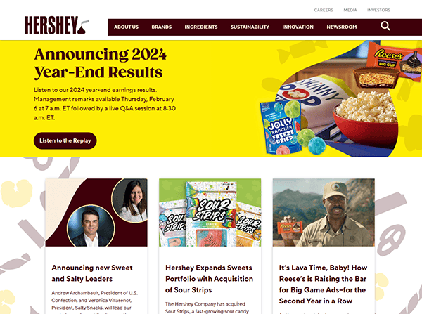
- Hershey’s: Hershey’s website centers on storytelling, brand heritage, and a sleek layout that quickly captivates visitors. From the homepage, users can discover everything from popular candy bars to upcoming community events, all presented in a well-organized and visually appealing manner. The site employs rich imagery, showcasing the chocolate-making process and mouthwatering product shots. A balanced mix of information and fun highlights the brand’s long history while letting visitors easily find promotions and purchase gifts. Overall, Hershey’s demonstrates how tradition meets modern design, offering an immersive chocolate experience with clear calls to action.

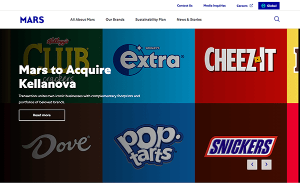
- Mars: Mars’s website offers an engaging, modern interface that immediately conveys the company’s scale and variety of confectionery products. Bold headers and quick-access navigation tools let visitors explore Mars’s numerous brands with ease. The design also prominently features stories about sustainability and global initiatives, reflecting the company’s social and environmental commitments. Product images are high-quality and inviting, ensuring that both potential partners and candy enthusiasts get a taste of the brand’s diverse lineup. With an integrated approach to corporate responsibility and fun candy content, Mars’s website is a testament to effective branding and an appealing user experience.
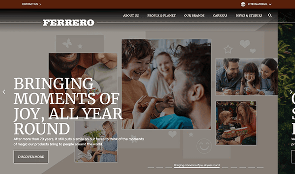
- Ferrero: Ferrero’s site combines sophistication with playful elements to mirror its high-end chocolates and sweet treats. The homepage uses elegant typography and clean layouts to immediately convey a premium feel. Subsections guide visitors through Ferrero’s brand history, product lines, and commitments to quality sourcing. The website’s color palette features warm hues reminiscent of chocolate and hazelnuts, enhancing the browsing experience. Each product has dedicated pages featuring mouthwatering visuals and detailed descriptions. By balancing modern design trends with Ferrero’s rich heritage, the website manages to inform, intrigue, and delight simultaneously.
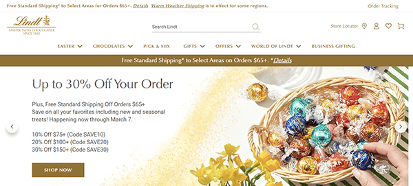
- Lindt: Lindt’s website presents a luxurious world of premium chocolate where every page evokes quality and indulgence. The homepage highlights beautiful product photography, showing glossy truffles and bars in mouthwatering displays. User-friendly menus guide visitors to specific product collections, gifting options, and seasonal specialties. Lindt also incorporates a rich brand narrative, providing insight into its master chocolatiers, the craftsmanship behind its recipes, and the company’s global legacy. By blending high-end design with clear product storytelling, Lindt’s website sets the stage for a refined candy shopping experience that inspires visitors to treat themselves.
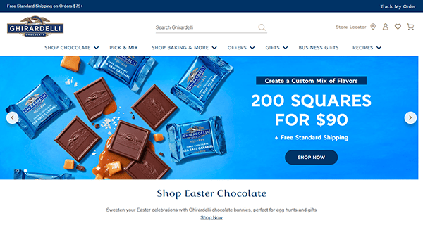
- Ghirardelli: Ghirardelli’s online platform emphasizes both heritage and innovation in the realm of fine chocolate. The homepage greets visitors with vibrant imagery and rotating banners advertising seasonal favorites. Its straightforward navigation helps customers locate everything from classic squares to baking essentials. Detailed product pages include flavor descriptions, ingredient lists, and pairing suggestions, enhancing the sense of discovery. Ghirardelli also offers recipes and gifting tips, reflecting the brand’s dedication to culinary creativity. The result is a sophisticated yet friendly website that educates visitors on how to get the most out of their chocolate cravings.
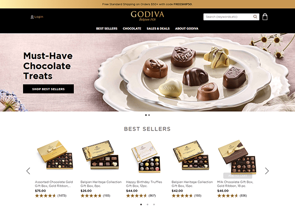
- Godiva: Godiva’s website captures an air of opulence right from the start. Strong, elegant visuals draw visitors in, showcasing pristine chocolate boxes and carefully curated gift sets. The color scheme—often featuring gold, black, and deep browns—complements the brand’s premium positioning. Each product page includes mouthwatering images, thorough descriptions, and even pairing recommendations, reflecting a refined sense of taste and sophistication. Site navigation is seamless, guiding users through categories like gifts, truffles, and special collections. For those seeking a luxurious candy experience, Godiva’s website successfully sets the stage for indulgence.
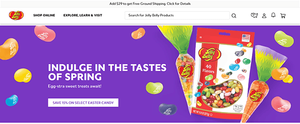
- Jelly Belly: Jelly Belly’s website is a colorful adventure designed to reflect the whimsical spirit of its jelly beans. From the swirling candy imagery to animated elements, every page exudes fun and excitement. Vibrant calls to action direct users to explore flavors, create custom mixes, or check out novelty candy products. The brand’s interactive flavor finder tool helps visitors locate their favorite varieties or discover new tastes. This playful design approach, paired with easy navigation and bright visuals, succeeds in delighting candy lovers of all ages—making Jelly Belly’s site a standout.
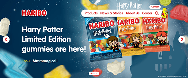
- Haribo: Haribo’s website greets visitors with a cheerful, family-friendly design that celebrates its iconic gummy bears and other sweet treats. Lively colors, joyful images, and a simple layout help users find product lines, brand stories, and fun activities. Haribo’s emphasis on heritage is particularly evident in the “About Us” section, where the company’s century-long history is showcased alongside vintage imagery. Interactive elements, such as flavor introductions and kid-friendly games, keep users engaged. This blend of nostalgia, playfulness, and solid user experience makes Haribo’s site a memorable destination for gummy enthusiasts.
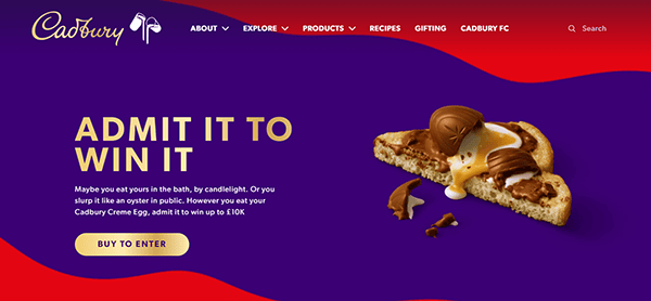
- Cadbury: Cadbury’s site focuses on its famous chocolate bars, seasonal favorites, and heritage dating back to the 1800s. The homepage features large visuals of popular products, often tied to current campaigns or holidays. User-friendly navigation points to sections about brand history, ethical sourcing, and new product launches. Cadbury also showcases recipes and social media collaborations, creating a sense of community among fans. This mix of brand nostalgia, clear product focus, and marketing-savvy presentation ensures Cadbury’s website both informs and entertains candy lovers looking for that signature smooth chocolate taste.
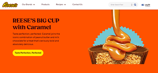
- Reese’s: Reese’s online presence captures the brand’s playful spirit and iconic orange branding throughout its design. The homepage displays rotating banners highlighting classic peanut butter cups, limited-edition items, and fun recipe ideas. Bold typography and a bright color palette reflect Reese’s energetic marketing style. Interactive elements allow visitors to learn about new product variations or take part in brand-themed activities. In addition, the site often features videos and creative content that celebrate peanut butter and chocolate pairings. With its straightforward navigation and lively visuals, Reese’s website ensures fans stick around for plenty of sweet inspiration.
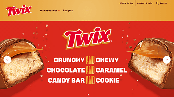
- Twix: Twix’s website offers a witty, playful look at this popular chocolate-and-cookie bar. From the offset, visitors are treated to fun taglines, short animations, and a minimalist design that keeps the focus on Twix’s unique shape and taste. Quick navigation allows candy lovers to find product variations—like Left vs. Right Twix—and limited-edition offerings. The brand’s personality comes through in every detail, from the copy to the comedic illustrations. By blending humor with streamlined visuals, Twix’s website effectively connects with a younger audience while maintaining broad appeal.
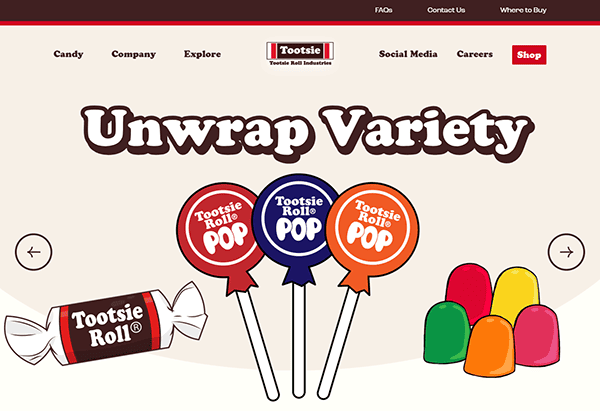
- Tootsie: Tootsie’s website puts a spotlight on its classic candies—like Tootsie Rolls and Tootsie Pops—through lively imagery and nostalgic flair. The site offers a glimpse into the company’s storied history, with legacy branding elements weaving throughout the modern design. Bright color accents guide visitors to information about new flavors, seasonal treats, and promotional offerings. Product details include appealing photography and concise descriptions to help visitors identify their favorite sweets. The layout makes it easy to navigate between Tootsie brand lines, ensuring users can quickly locate exactly what they crave.
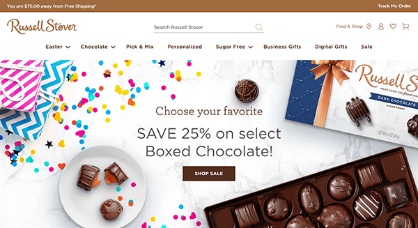
- Russell Stover: Russell Stover’s website exemplifies a mix of tradition and innovation. Creamy whites and muted browns in the color scheme convey a warm, inviting atmosphere, while tasteful photography highlights beautifully packaged confections. The site highlights the brand’s artisanal roots and craftsmanship, with sections detailing how candies are made and the importance of quality ingredients. Navigation is straightforward, funneling visitors to product categories like chocolates, truffles, and sugar-free options. In addition, special collections and seasonal offerings are easy to find, ensuring that anyone can indulge in Russell Stover’s wide array of sweet treats.
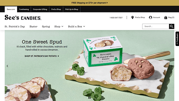
- See’s Candies: See’s Candies’ website pays homage to its long heritage while incorporating modern e-commerce features. From the iconic black-and-white motif to the vintage-themed imagery, the design exudes a timeless elegance. Each page showcases the carefully crafted candies in enticing layouts, with thorough product details and easy-to-use ordering options. The brand’s history section underscores See’s commitment to quality, while gift guides and seasonal offerings cater to special occasions throughout the year. Overall, the website merges classic branding with user-friendly navigation, creating an experience that keeps visitors coming back for more.
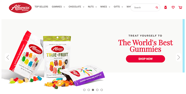
- Albanese Candy: Albanese Candy’s website bursts with color, reflecting the company’s wide selection of gummies, chocolates, and other confections. The homepage features rotating banners that showcase new products, flavor highlights, and promotions. Clear calls to action direct users to shop or explore specific candy categories, such as gummy worms or chocolate-covered nuts. Bright product photos take center stage, emphasizing the variety of sizes and flavor assortments. The site also provides helpful information about the company’s commitment to quality and flavor innovation. Through its vibrant design, Albanese Candy manages to make online candy shopping fun and straightforward.
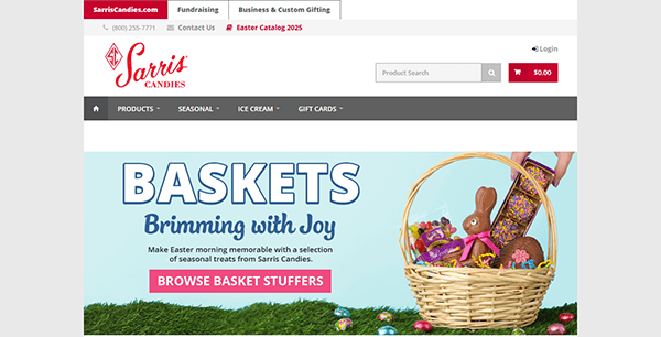
- Sarris Candies: Sarris Candies’ website balances a modern ecommerce layout with traditional candy shop charm. Warm tones and high-resolution product images give a sense of old-fashioned confectionery updated for the digital age. Visitors can explore product categories that include boxed chocolates, custom orders, and fundraising options. Each product page lists ingredients, sharing suggestions and photos that highlight texture and packaging. The brand’s story is woven throughout, underscoring its commitment to authenticity and superior taste. Sarris Candies proves that an engaging, well-designed site can reflect both heritage and forward-thinking appeal.
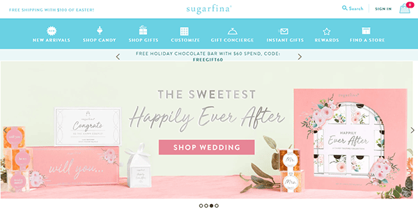
- Sugarfina: Sugarfina’s website brings a luxurious boutique feel to the candy world. Crisp white backgrounds, refined typography, and subtle color splashes present a clean, upscale design aesthetic. The site focuses on premium candy collections like Champagne Bears and rosé-infused gummies. Product pages detail flavor profiles, packaging sizes, and the unique stories behind each collection, appealing to candy connoisseurs and gift shoppers alike. Navigation is straightforward, and the brand places emphasis on gift sets, curated tasting boxes, and limited-edition collaborations. Sugarfina demonstrates that candy can be both whimsical and sophisticated when done right.
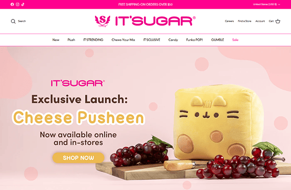
- IT’SUGAR: IT’SUGAR stands out with its bold, playful, and slightly irreverent approach to candy. The website showcases oversized candy and novelty items, using bright pinks, yellows, and blues to create a high-energy vibe. Large banners highlight sales, new arrivals, and fun categories like giant candy bars. Product pages blend humorous descriptions with clear information, maintaining a lighthearted shopping experience. Specially curated gift sets and brand collaborations are frequently featured. IT’SUGAR’s design captures the fun of a candy store visit, ensuring visitors can’t help but smile while browsing.
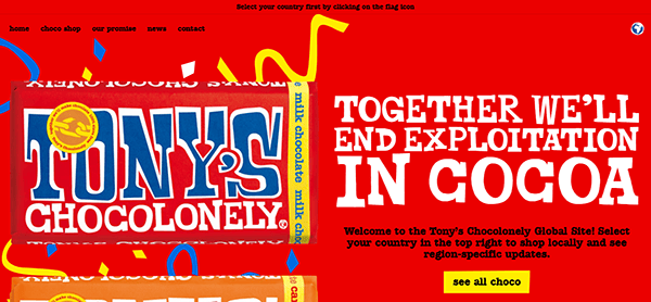
- Tony’s Chocolonely: Tony’s Chocolonely uses a vibrant, story-driven design to spotlight its mission of creating fair, ethical chocolate. Energetic color blocks, bold typography, and whimsical patterns convey a sense of warmth and optimism. The website details the brand’s dedication to eliminating slavery in the chocolate supply chain, educating visitors on the importance of ethical sourcing. From a product perspective, large images show off colorful packaging and unique flavor combinations. Tony’s Chocolonely blends serious messaging with a joyful user experience, making it informative and fun to explore.
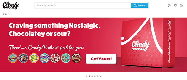
- Candy Funhouse: The Candy Funhouse website offers a delightful and engaging user experience, capturing the essence of a vibrant candy store. Its intuitive navigation allows visitors to explore a vast selection of candies, chocolates, and snacks worldwide. The site’s colorful and playful design elements evoke a sense of nostalgia and excitement, appealing to candy enthusiasts of all ages. High-quality product images and detailed descriptions clearly understand each item, enhancing the online shopping experience. Additionally, the website features a blog section with updates on new arrivals and collaborations, fostering a sense of community among its users. Overall, Candy Funhouse’s website combines functionality with a fun, immersive design that entices visitors to indulge their sweet tooth.
A compelling candy website doesn’t just look good—it forges a connection between sweet treats and the people who love them. Each of the examples above uses design elements, brand storytelling, and interactive features to highlight the unique qualities of their confections. Whether focusing on legacy, sustainability, or whimsical fun, these sites keep the spotlight on delighting visitors.
Creating a standout web presence is an integral piece of any candy brand’s growth strategy. By investing in user experience, vivid imagery, and clear navigation, these companies effectively share their passion for candy with a global audience. From mouthwatering chocolate photography to bright gummy themes, there are countless ways to showcase confections and build excitement.
When developing or revamping your own candy website, it’s crucial to strike a balance between creativity and functionality. Enhance your pages with high-quality visuals and fun content without sacrificing load speed or clarity. Great storytelling, intuitive design, and genuine enthusiasm for sweets will make your site a memorable online destination. The real magic happens when your brand’s essence shines through every pixel.
Top 10 Important Aspects of a Candy Website
- High-Quality Product Photography: Vibrant, clear images capture a candy’s appearance and texture, instantly drawing in potential customers.
- Brand Storytelling: Share the history, mission, or fun facts about your confections to build an emotional connection with visitors.
- Easy Navigation: Organize your categories, feature sections, and menus so customers can quickly locate specific candies or gift ideas.
- Mobile Responsiveness: Ensure your site’s layout and functionality work seamlessly on smartphones and tablets for on-the-go shoppers.
- Engaging Calls to Action: Encourage visitors to explore new flavors, sign up for newsletters, or make purchases using clear, clickable prompts.
- Detailed Product Descriptions: List ingredients, flavor profiles, and potential uses or pairing suggestions so customers know exactly what they’re buying.
- Seasonal and Limited-Edition Highlights: Prominently display holiday chocolates, unique collaborations, or limited releases to generate buzz and urgency.
- User-Friendly Checkout Process: Simplify cart functions and allow guest checkout options to reduce friction and increase conversions.
- Interactive Elements: Gamify flavor discovery or incorporate quizzes that help visitors find the perfect candy match, boosting engagement.
- Customer Reviews and Testimonials: Showcase positive feedback to build trust and help visitors feel confident in their purchase decisions.
FAQs About Candy Web Design
How can I make my Candy website stand out from competitors?
Focus on high-quality visuals, engaging storytelling, and an intuitive user experience. Emphasize what sets your brand apart, whether it’s artisanal recipes or unique packaging, and present it in a compelling way.
What platform is best for building a Candy website?
WordPress is often recommended for its versatility, ease of use, and wide range of customization options. It can handle everything from simple blogs to full-fledged ecommerce sites.
How much does it typically cost to design a Candy website?
A basic website can begin at around $2,000, with costs increasing based on design complexity, ecommerce features, and additional functionality. Each project’s scope and requirements ultimately determine the final price.
How often should I update my Candy website?
Regularly adding fresh content, new products, and timely promotions keeps your site current and appealing to visitors. However, don’t update just for the sake of search engines; ensure all changes provide genuine value.
Ready to elevate your Candy’s website? Contact CyberOptik for a free proposal for your new Candy website design and set your business up for success. Let’s make your brand the sweetest online destination in the industry!