The cafe industry has always been about more than just coffee—it’s about crafting a warm, inviting atmosphere that keeps customers coming back. In today’s digital age, a strong cafe website is just as crucial as the ambiance of the physical space. With so many competitors in the market, cafes need a unique online presence that perfectly captures their personality and offerings.
Whether it’s highlighting the story behind each cup or displaying mouthwatering pastries, a cafe website should seamlessly blend aesthetic appeal with practical functionality. From interactive menus to location-based store finders, these elements ensure that visitors have an easy and enjoyable online experience. Want to learn more about how you can elevate your cafe’s web presence? Check out this link for further insights and inspiration.
A well-crafted cafe website goes beyond merely listing products. It’s a digital extension of your brand, combining storytelling, design, and convenience. Effective cafe websites showcase the cafe’s culture and menu while making it easy for customers to engage with the brand. Below are 20 impressive examples of the best cafe websites that set the bar high in design, functionality, and branding.

Examples of the Best Cafe Website Designs
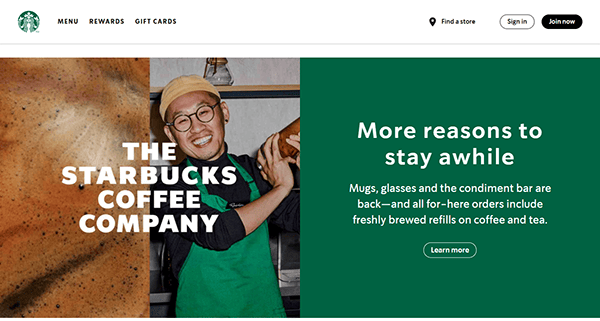
- Starbucks: Their website brilliantly reflects the brand’s global presence while maintaining a friendly, personalized feel. Not only does it feature a straightforward layout, but it also includes customizable drinks, location finders, and loyalty rewards. The homepage welcomes users with vibrant images highlighting seasonal drinks, limited-time offers, and community impact initiatives. Each page is intuitively laid out, ensuring visitors can easily navigate menus, shop merchandise, or learn about coffee sourcing. Overall, the Starbucks site is a prime example of how to blend corporate polish with genuine warmth.

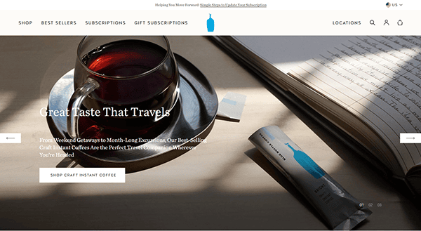
- Blue Bottle Coffee: Its website’s minimalist design mirrors the cafe’s commitment to clarity and quality. Crisp photography focuses on freshly roasted beans and elegantly prepared beverages, drawing users in to explore more. The straightforward navigation enables potential customers to discover subscription options, cafe locations, and blog posts on brewing methods. By centering on storytelling, Blue Bottle’s site effectively communicates its passion for artisanal coffee, eco-friendly sourcing, and hands-on brewing processes. This clean, user-centric approach makes it one of the best cafe websites for coffee aficionados looking for an immersive digital experience.
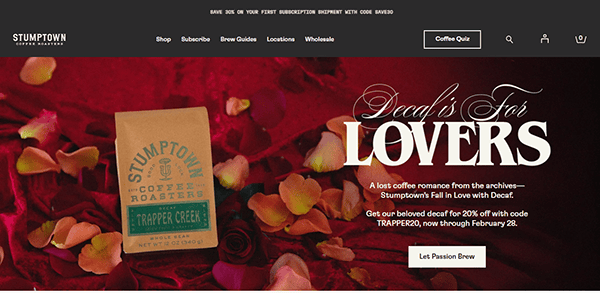
- Stumptown Coffee Roasters: Stumptown Coffee Roasters offers a visually striking layout packed with large, bold images and vibrant colors. Their homepage showcases featured roasts and limited-edition blends, immediately capturing the user’s attention. Navigating through their pages, visitors can explore detailed coffee profiles, roasting methods, and brewing guides, all presented in an organized manner. Their blog adds a human touch with stories about farmers, behind-the-scenes roastery tours, and tips for the perfect cup. Stumptown’s site balances brand storytelling with a practical e-commerce experience, reflecting the brand’s flair for innovation and craftsmanship.
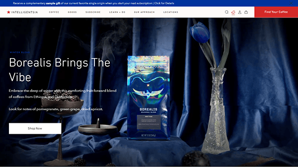
- Intelligentsia Coffee: Intelligentsia Coffeecaptivates with an aesthetically pleasing and carefully structured design. The website’s color palette and prominent imagery underscore its sophisticated identity, inviting users to delve into the world of specialty coffee. The detailed product pages provide tasting notes and origins for each roast, enhancing the educational aspect. Intelligentsia’s commitment to direct trade and transparency shines through with featured farmer stories and in-depth descriptions of sourcing practices. The site also includes brew guides and courses for those interested in learning more. This balance of visual appeal and thorough content makes it a compelling digital destination.
- The Coffee Collective: The Coffee Collective is based in Denmark and combines Scandinavian design aesthetics with a passion for top-tier coffee. Neutral tones, sleek fonts, and ample white space set a calm, inviting stage for the brand’s stories and products. By focusing on the origins of each coffee bean, The Coffee Collective emphasizes sustainability and ethical sourcing. Browsing their online shop feels like an educational journey, thanks to detailed descriptions and brewing tips. Even though the layout is refreshingly minimalistic, visitors can easily locate stores, purchase subscriptions, or read blog posts. This understated sophistication is what makes their cafe website so effective.
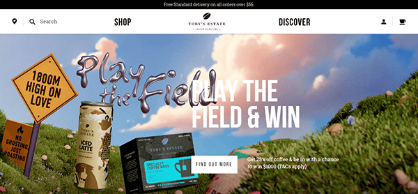
- Toby’s Estate Coffee: Toby’s Estate Coffe represents a modern, metropolitan vibe that reflects its bustling New York City presence. Large hero images greet you upon entry, highlighting new roasts, upcoming events, and company news. The site is exceptionally user-friendly, funneling visitors to products, cafes, or courses with concise menu labels. Each product page delves into origin, roast level, and tasting notes, making it easy to choose the perfect blend. There’s also a dedicated section for brewing guides, which underscores Toby’s Estate’s commitment to empowering customers. The combination of city-chic design and informative content perfectly captures their brand essence.
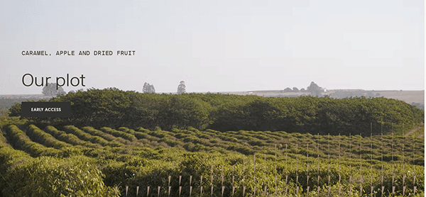
- Tim Wendelboe: Tim Wendelboe showcases the meticulous approach of its namesake barista champion. The layout is clean and navigable, highlighting carefully curated coffee selections and the brand’s educational resources. Crisp images of coffee plantations and detailed process explanations reinforce Tim Wendelboe’s unwavering dedication to quality and authenticity. Beyond selling beans and equipment, the site also offers coffee consulting and courses, illustrating their desire to foster a knowledgeable coffee community. Throughout the site, each detail reflects thoughtful design and top-notch functionality, making it an inspirational platform for those seeking the best cafe websites with an emphasis on expertise.
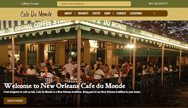
- Café du Monde: Café du Monde is a New Orleans icon known for its chicory coffee and beignets. Their website embraces a vintage feel, using nostalgic imagery and traditional fonts to convey the cafe’s storied history. Visitors can find a wealth of information on heritage, menu offerings, and online shopping options for coffee and merchandise. The straightforward interface includes recipes and tips for recreating the Café du Monde experience at home. By blending authenticity with functionality, their site appeals to both first-time visitors and loyal fans. It’s a beautiful demonstration of how a brand can preserve cultural roots within a modern online format.
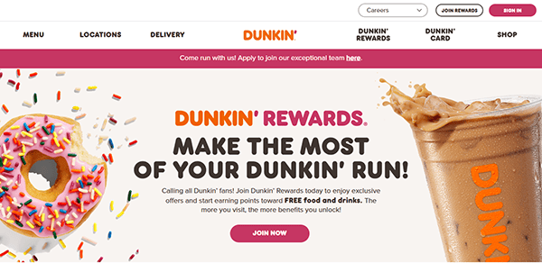
- Dunkin’: Dunkin’(formerly Dunkin’ Donuts) presents an energetic color palette that’s instantly recognizable and resonates with its longtime branding. Large, rotating banners highlight new menu items, current promotions, and seasonal specials. The site’s layout is user-friendly, quickly leading visitors to find store locations, order online, or view nutritional information. Dunkin’s reward program and mobile app are also featured, reflecting the company’s shift towards digital engagement. With a playful but functional design, this cafe website successfully bridges the gap between an iconic brick-and-mortar presence and a modern, tech-driven experience.
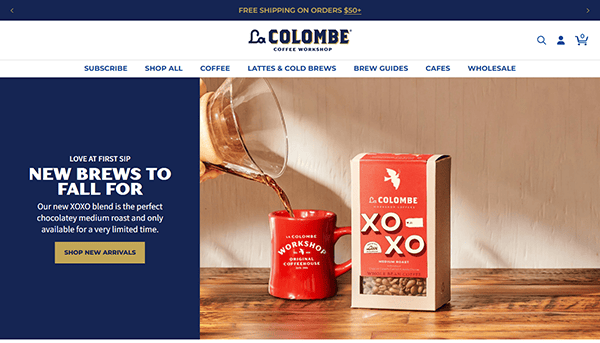
- La Colombe Coffee Roasters: Its website merges stylish, image-focused design with robust e-commerce functionality. New coffee releases and cold brew innovations occupy center stage on the homepage, urging visitors to explore further. Clear, concise navigation bars facilitate shopping and cafe location searches with ease. Each coffee product page offers in-depth descriptions, roast profiles, and recommended brew methods. Meanwhile, aesthetically appealing photography underscores the brand’s artisanal ethos. Articles and stories featuring coffee farmers and sustainability efforts enrich the experience. This storytelling and modern design harmony helps La Colombe stand out in the competitive cafe website landscape.
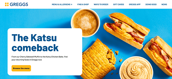
- Greggs: Greggs may be known more for its bakery items, but the site’s cafe-inspired sections look into fresh coffee, sandwiches, and quick bites. Their website sports a friendly, casual design with bright graphics and straightforward text. The “Find a Greggs” function uses a practical locator tool, effortlessly guiding customers to the nearest branch. Menu tabs are well-categorized, including nutritional information and allergen details, ensuring clarity for all visitors. Seasonal campaigns and promotions are flagged on the homepage, adding excitement for loyal followers. Greggs’ approach exemplifies accessibility and user-centric design.
- Peet’s Coffee: Peet’s Coffee has a website that neatly balances rich brand heritage with a modern visual layout. The homepage emphasizes current roasts and unique offerings, pulling users in with striking imagery. Intuitive menus direct shoppers to various coffee, espresso, and tea categories, while comprehensive product pages detail flavor notes and brewing tips. Peet’s also highlights its subscription services and sustainability initiatives, making it simpler for customers to align with eco-friendly choices. The overall design is accessible yet refined, reinforcing their legacy as a pioneer in craft coffee. It’s a powerful example of how thoughtful design can elevate a cafe’s website.
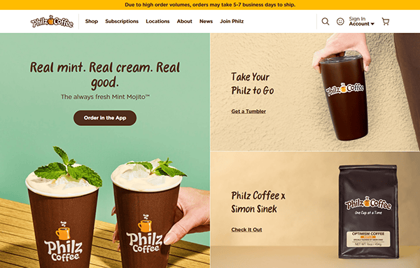
- Philz Coffee: Its website exudes a personal touch that aligns with the brand’s philosophy of handcrafted brews. Engaging visuals and a story-driven narrative invite visitors to learn about founder Phil Jaber’s vision. Each coffee variant is showcased with tasting notes and recommended blends, reflecting the brand’s commitment to customization. Navigating the site is a breeze, thanks to clear headings and straightforward categories for beans, merchandise, and store locations. The “Philz Way” page educates coffee lovers on the brand’s method, further differentiating their approach. By placing authenticity at the forefront, Philz Coffee’s digital presence resonates with customers seeking a tailored coffee journey.
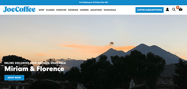
- Joe Coffee Company: Joe Coffee Company reflects a community-centric ethos, offering a welcoming design and warm color palettes. Large-scale photography of baristas in action and coffee beans being roasted sets the tone. Their site neatly divides sections for beans, brewing equipment, subscriptions, and educational resources, ensuring visitors can quickly find what they need. Informative product pages detail flavor notes and recommended brewing methods, while behind-the-scenes blog articles add depth. The straightforward e-commerce functionality means you can purchase beans or sign up for a subscription in just a few clicks. It’s the perfect blend of inviting visuals and user-friendly features.
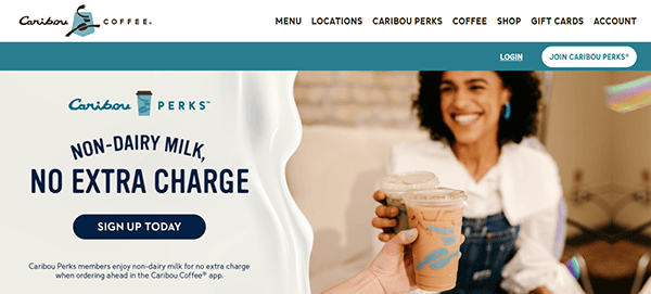
- Caribou Coffee: Its website features a vibrant, nature-inspired color palette that hints at its passion for adventurous and ethically sourced beans. Interactive elements, such as store locators and loyalty program sign-ups, greet users right on the homepage. Menu categories are clearly labeled, offering everything from classic espresso drinks to flavored beverages. Users can seamlessly browse nutritional facts, promotions, and brand updates. Caribou also showcases its environmental and social responsibility efforts, giving visitors a glimpse into its values. By integrating a lively design with important brand messages, they create a cafe website that is both engaging and earnest.
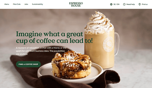
- Espresso House: Espresso House is a Scandinavian coffee chain with a rustic yet modern layout. High-resolution images display cozy interior designs, tempting pastries, and steaming mugs of coffee, immersing visitors in a warm atmosphere. The main menu is simple and leads to pages on menus, gift cards, and loyalty programs. Through blog posts and behind-the-scenes features, Espresso House emphasizes its core values, such as sustainability and quality. The welcoming look and straightforward interface ensure guests feel at home exploring the brand’s story. In a crowded market, this blend of charm and clarity sets Espresso House apart.
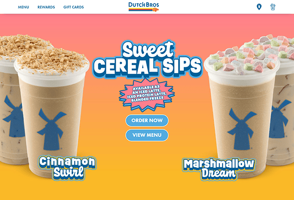
- Dutch Bros Coffee: Their website delivers an upbeat vibe that mirrors the brand’s lively drive-thru culture. The site’s bright colors and playful icons reflect a youthful energy. Visitors can explore the latest featured drinks, learn about the Dutch Bros app, and locate the nearest drive-thru. The brand also emphasizes community involvement, showcasing charity events and local outreach initiatives. Each page is brief but well-structured, allowing for quick navigation. By focusing on a fun user experience and direct communication of promotions, Dutch Bros offers a cafe website that appeals to both loyal fans and new customers looking for something fresh.
- Counter Culture Coffee: Counter Culture Coffee appeals to coffee purists with its clean design emphasizing transparency and education. Large banners highlight seasonal offerings and upcoming training events, while sub-menus guides users to beans, brewing tools, and educational articles. The brand’s commitment to ethical sourcing and direct relationships with farmers is woven throughout the site, adding an authentic layer to its storytelling. Detailed roast profiles and tasting notes showcase their meticulous approach. The minimalist design ensures that the vibrant product images and brand narrative remain front and center, capturing the essence of specialty coffee culture.
- Tom’s Coffee Corner: It is a (fictional example for illustrative purposes) small-town gem that has fully embraced modern design to reach a wider audience. Soft color schemes and whimsical illustrations give the site a friendly feel. Visitors can read about the cafe’s origin story, view the menu, and check out upcoming community events. An embedded map helps travelers easily locate the shop, and an online store offers limited-edition merchandise. The site also includes a testimonials section, reinforcing how local support has shaped the business. It’s proof that even smaller cafes can create a professional, inviting digital footprint.
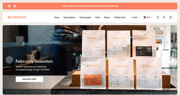
- Yardstick Coffee: Yardstick Coffee operates out of Manila and impresses visitors with its bold layouts and eye-catching photography. The site conveys a modern aesthetic that reflects the cafe’s youthful energy and dedication to high-quality beans. A blog section delves into coffee origins, brewing experiments, and collaborative events with local artists. The online shop offers a curated selection of beans, gear, and apparel, all showcased with professional images and clear descriptors. Videos highlighting barista techniques add a dynamic touch, further engaging curious customers. Yardstick’s user-friendly interface and creative flair encapsulate the spirit of the brand and stand out in the world of cafe websites.
These best cafe websites exemplify the myriad ways a cafe can translate its in-store experience into an online platform that feels equally inviting, efficient, and true to its brand. From vivid graphics that highlight specialty drinks to blog posts that celebrate the journey from bean to cup, each of these websites puts its own unique spin on digital hospitality.
The sheer variety among these examples demonstrates there’s no single blueprint for success. Whether it’s a minimalist Scandinavian approach or a lively, color-rich design, a strong cafe website must tap into what makes the cafe memorable in real life. Incorporating interactive features—like online ordering, loyalty programs, and store locators—helps bridge the gap between the physical and virtual realms.
Ultimately, a cafe’s website should be as welcoming online as its baristas are in-store. A well-designed site that tells a compelling story shares practical information, and fosters customer engagement can serve as a growth engine for both local favorites and global brands.
Top 10 Most Important Aspects of a Successful Cafe Website
- Brand Identity: Every successful cafe website aligns with the cafe’s branding. Fonts, colors, and images should reflect the ambiance and ethos customers expect in-store.
- High-Quality Visuals: Crisp, appealing photographs of coffee, pastries, and the cafe interior help set the tone, inviting visitors to engage and explore further.
- Intuitive Navigation: Straightforward menus and clear call-to-action buttons allow users to find essential information—like the menu or online ordering portal—quickly.
- Mobile Responsiveness: With many customers browsing on smartphones, a cafe’s website must adapt seamlessly to different screen sizes for an optimal user experience.
- Storytelling: Sharing the backstory of your beans, community initiatives, or founder’s journey can connect with customers on a deeper, more personal level.
- Online Ordering & Reservations: Allowing users to order coffee or book a table enhances convenience and helps drive sales, especially for customers on the go.
- Social Media Integration: Embedding social feeds and sharing icons encourages community engagement and helps your audience stay updated with the latest news.
- Loyalty Programs: Highlighting reward programs or membership benefits on your website can increase repeat visits and customer retention.
- Easy Location Finder: A clear and interactive map or locator helps potential customers quickly discover nearby branches or plan visits during travel.
- Contact & Support: Providing readily accessible contact details, operating hours, and FAQ pages ensures customers can get help and information fast.
Frequently Asked Questions about Cafe Web Design
How can I make my cafe website stand out from competitors?
Focus on showcasing your unique brand story, high-quality imagery, and user-friendly features such as online ordering or loyalty programs. Authenticity and engaging content help differentiate you from others.
What platform is best for building a cafe website?
WordPress is often the top choice for cafe owners because it’s customizable, has numerous plugins for added functionality, and offers a user-friendly interface.
How much does it typically cost to design a cafe website?
A simple cafe website might start around $2,000, but costs can increase based on custom features like online ordering, reservation systems, or loyalty integrations.
How often should I update my cafe website?
Fresh, relevant updates keep your audience engaged but avoid random changes just to rank higher on search engines. Each update should offer value to your visitors.
Should I integrate online ordering or reservations into my cafe website?
Yes, if it aligns with your business model. Online ordering or reservations can significantly enhance customer convenience and boost sales, especially in competitive markets.
Ready to elevate your cafe’s website? Contact CyberOptik for a free proposal for your new cafe website design and set your business up for success.