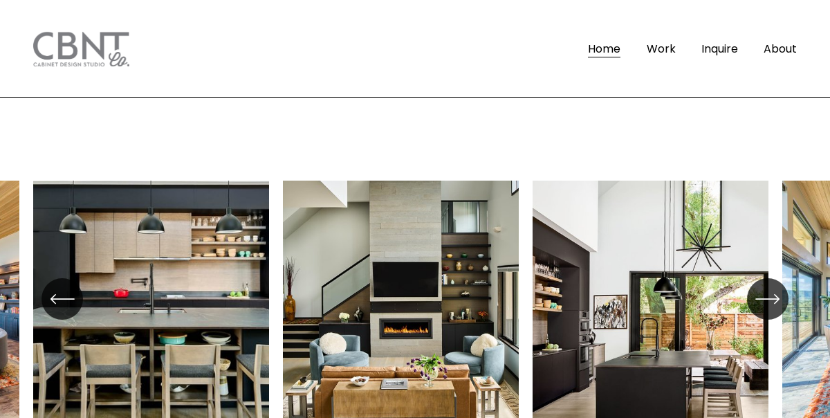
Just looking for our Best Cabinet Maker Website examples list?
Key Takeaways: Building a High-Impact Website
- Professional Branding and Visual Appeal: A cohesive brand identity, including consistent use of logos, color schemes, and typography, establishes credibility and recognition. High-quality images and videos showcasing your craftsmanship can significantly enhance the visual appeal of your website.
- User-Friendly Navigation and Responsive Design: Ensure your website is easy to navigate with clear menus and an intuitive design. An intuitive design that adapts to various devices, including smartphones and tablets, provides a seamless user experience, which is crucial for retaining visitors.
- Search Engine Optimization (SEO) Strategies: Implementing effective SEO practices, such as optimizing for relevant keywords, improving page load speeds, and utilizing meta tags, enhances your website’s visibility in search engine results, driving more organic traffic.
Why Great Cabinet Maker Website Design Isn’t Optional—It’s Essential
Today, your website is the cornerstone of your business’s success. For cabinet makers, a thoughtfully designed website doesn’t just showcase your custom cabinet work; it builds trust, attracts qualified leads, and converts visitors into paying customers. The right design, combined with intuitive functionality, tells a compelling visual story of your craftsmanship before a client ever picks up the phone.
A high-performing website does more than look good. It’s responsive across all devices, optimized for SEO, and designed to deliver a seamless user experience. In a field where reputation is everything, your online presence must reflect the precision and quality of your cabinetry. Whether you’re an established shop looking to modernize your site or a new business ready to make a powerful first impression, optimizing your website design is one of the smartest investments you can make.
This guide will walk you through every element that turns a generic site into a lead-generating powerhouse—so you don’t just get clicks, you get clients.
Website Planning & Purpose: Laying the Groundwork for Success
Before a single pixel is designed or a line of code is written, successful websites begin with a clear, strategic plan. This phase isn’t just about deciding what colors to use or what pages to include—it’s about aligning your website’s purpose with your business goals, your audience’s needs, and your brand’s unique strengths.
The planning stage is especially crucial because the website must serve multiple roles: it needs to act as a visual portfolio of custom cabinet work, an informative hub for potential clients, and a lead generation engine that drives inquiries and consultations.
Start by defining your goals. Are you looking to attract more local clients for kitchen remodels? Do you want to showcase a specific line of high-end cabinetry? Are you aiming to educate potential customers about your craftsmanship and materials? Clear objectives guide every design and content decision that follows.
Next, understand your audience. Most visitors won’t be industry experts—they’re homeowners, interior designers, or contractors looking for skilled cabinet makers. Your site must quickly communicate your capabilities, process, and the quality of your work in a way that’s clear and approachable.
Equally important is mapping out the structure of your website. Plan a design that makes it easy for users to navigate—from learning about your services to viewing your portfolio to contacting you. This structure should also support SEO optimization so that your site ranks well for relevant searches like “custom cabinet design near me” or “cabinet maker in [Your City].”
By investing time in this upfront planning, you’ll ensure your website does more than just look good—it will function as a high-performance sales tool that reflects the precision and professionalism of your cabinetry business.
Design Principles That Make Websites Work
Effective site design isn’t just about aesthetics—it’s about function, clarity, and aligning the site’s visual elements with the craftsmanship behind your work. Great design communicates trust, professionalism, and attention to detail—all qualities that matter deeply to homeowners and designers seeking custom cabinetry.
1. Visual Hierarchy
Establishing a clear visual hierarchy ensures visitors know where to look first. Use large, bold headlines to draw attention to your key messages—like your services or a featured project—while supporting visuals and descriptions guide the user deeper into the site. Prioritize clean typography and whitespace so your portfolio can shine without distractions.
2. Consistency Across Pages
From your homepage to your contact form, every page should maintain consistent branding. Stick to a defined color palette, use the same fonts throughout, and ensure buttons and navigation elements follow the same style. This creates a seamless user experience and reinforces your credibility.
3. Responsive Design
More than half of website traffic now comes from mobile devices. That means your site must look and perform just as well on a smartphone or tablet as it does on a desktop. Adaptive design ensures images scale correctly, menus remain intuitive, and all content remains readable and accessible.
4. Showcase-Driven Layouts
Cabinet makers rely heavily on visuals. Your website should prioritize large-format imagery and galleries that highlight the detail, texture, and quality of your work. Use before-and-after comparisons, zoom features, and captions to tell the story behind each project.
5. Clear Calls-to-Action
Whether it’s “Request a Quote” or “View Our Portfolio,” your site must include well-placed calls-to-action (CTAs) that guide visitors toward the next step. These should be visually distinct and repeated at logical points throughout the user journey.
6. Fast Load Times
High-resolution images are essential, but they must be optimized to avoid slow page speeds. Compress images and streamline your backend to keep load times under three seconds—a key factor for both user experience and SEO.
By applying these design principles, professionals in this industry can ensure their website is more than just a digital brochure—it becomes a powerful business tool that builds trust, highlights skills, and turns interest into action.
Content & Navigation: Structuring for Clarity and Conversion
When designing a website, structure is just as important as style. Visitors should immediately understand who you are, what you do, and how to take the next step. That clarity starts with intuitive navigation and purpose-driven content, each working together to guide users from first click to contact.
1. Define Core Navigation Menus
Your main navigation should be concise and easy to scan. Aim for no more than 5–7 top-level items. The ideal structure often includes:
- Home
- About Us
- Services
- Portfolio
- Testimonials
- Contact
Each link should lead to a page with a clear purpose. Avoid dropdowns overloaded with sub-options—visitors will get overwhelmed and leave before they click.
2. Prioritize Clear, Client-Focused Content
Every page should speak directly to the client’s goals, pain points, and decision process. On the Services page, explain the types of custom cabinet work you offer, your design process, materials used, and why your approach stands out. Use short paragraphs, bullet points, and client-friendly language—skip the jargon unless you explain it.
3. Use Content Hierarchies
Each page should have a defined hierarchy: main headline, subheadings, body content, and calls-to-action. This makes it easy for visitors to scan and find what they need. Use H2 and H3 tags properly to help with both readability and SEO.
4. Guide Users with Internal Links
Strategic internal linking helps guide visitors through your site while supporting SEO. For example, link your “Portfolio” to relevant service pages or case studies. This creates pathways for users to explore more deeply and encourages longer site engagement.
5. Include Trust-Building Elements Throughout
Integrate testimonials, certifications, and awards across multiple pages—not just one dedicated section. Place trust signals where they naturally support the content, such as a glowing client review beside your service process or a star rating near a contact form.
6. Footer Navigation for Completeness
Use your footer to reinforce navigation and offer utility links like social media, privacy policies, and your Google Business Profile. This section helps with SEO and provides users another way to explore your content.
A well-structured website doesn’t just inform—it leads. With clear navigation and content crafted to reflect your expertise and value, your site becomes a tool that educates, builds trust, and generates leads.
Visual Elements: Bringing Site Craftsmanship to Life
Visual elements are not just design flourishes—they are essential storytelling tools. Your website must instantly communicate the quality, precision, and creativity behind your custom cabinet work. The right use of images, video, icons, and theme supports both user experience and brand perception.
1. High-Resolution Photography
The backbone of any professional’s website is high-quality imagery. Your portfolio should feature well-lit, professionally shot photos that showcase detail, finish, and design variety. Include a mix of wide-angle room views and close-ups to highlight craftsmanship. Poor image quality can undermine even the best design, making photography a top priority.
2. Interactive Galleries and Slideshows
Visuals should be more than static images. Use interactive galleries or sliders that allow visitors to browse by room type, style, or material. Organize projects into categories—kitchens, bathrooms, built-ins—to help users find what’s most relevant to them. Include captions or brief descriptions to explain the challenge, design choices, or materials used.
3. Consistent Visual Style
Establish a visual identity that aligns with your brand. Whether your style is rustic, modern, or transitional, your website’s colors, image filters, and graphic elements should reflect that aesthetic. This consistency builds brand recognition and reinforces the professionalism of your business.
4. Video Walkthroughs and Process Demos
Short video clips can add tremendous value. Consider including a behind-the-scenes look at your workshop, a client testimonial, or a walkthrough of a finished project. These videos offer transparency, build trust, and keep visitors engaged longer.
5. Icons and Visual Cues
Use custom icons to break up text and draw attention to key features, such as “free consultations,” “locally made,” or “eco-friendly materials.” Icons improve scannability and reinforce messages in a visually engaging way.
6. Whitespace and Balanced Layout
Don’t overload pages with too much imagery or text. Use whitespace strategically to give your content room to breathe. A balanced layout helps guide the user’s eye and makes the site easier to navigate and understand.
Visuals are your most persuasive sales tool. When used correctly, they help users envision your work in their own spaces, instill confidence in your capabilities, and ultimately influence the decision to reach out. The right visual strategy turns website visitors into future clients.
Ongoing WordPress Website Maintenance
A beautifully designed website built on WordPress is only effective if it remains secure, fast, and fully functional. Ongoing maintenance isn’t optional—it’s critical for ensuring your online presence continues to support your business goals, generate leads, and reflect the quality of your craftsmanship.
1. Regular Software Updates
WordPress core files, themes, and plugins must be updated frequently to maintain performance and security. Outdated components can expose your site to malware, break critical features, or reduce speed, all of which hurt user experience and SEO rankings.
2. Website Backups
Backups are your safety net. A proper maintenance plan includes automatic, daily backups stored off-site. This ensures that if your site goes down or becomes compromised, it can be quickly restored without data loss or long downtime.
3. Security Monitoring
Hackers often target small business websites, assuming they’re less protected. Real-time security monitoring detects suspicious activity, prevents brute-force login attempts, and alerts you to vulnerabilities. Installing tools like firewalls and SSL certificates adds another layer of protection for both you and your visitors.
4. Speed and Performance Optimization
Company websites with rich imagery require performance tuning. Maintenance includes optimizing image sizes, caching files, and reducing unnecessary scripts to keep load times under three seconds. This directly impacts user retention and SEO effectiveness.
5. Broken Link and Error Checks
A broken portfolio link or malfunctioning contact form can cost you leads. Ongoing maintenance includes scanning for 404 errors, validating contact form functionality, and ensuring all site pages load correctly. This preserves trust and reduces bounce rates.
6. SEO Health and Analytics Tracking
Maintaining strong visibility in search results requires monitoring your SEO performance. Maintenance plans should include analytics tracking, keyword ranking reviews, and regular updates to on-page SEO elements like meta tags and alt text.
7. Plugin and Theme Compatibility Reviews
WordPress plugins and themes frequently release updates that can conflict with one another. Compatibility reviews help identify and fix issues before they affect site functionality, ensuring a seamless browsing experience for your visitors.
Maintaining your WordPress site is about consistently delivering a professional, optimized experience that reflects the high standards of your cabinet business. With a proper maintenance plan in place, your website will continue working just as hard as you do.
Best Cabinet Maker Website Design Examples
A well-designed website is essential for professionals to showcase their craftsmanship, attract potential clients, and stand out in a competitive market. Below are 20 exemplary websites from across the United States in this industry, each demonstrating effective design principles and user engagement strategies.
1. Merit Kitchens
Location: Seattle, WA
Key Takeaways:
- Clean, minimalist design with ample white space.
- High-quality imagery showcasing craftsmanship.
- Informative blog section covering cabinetry and interior design topics.
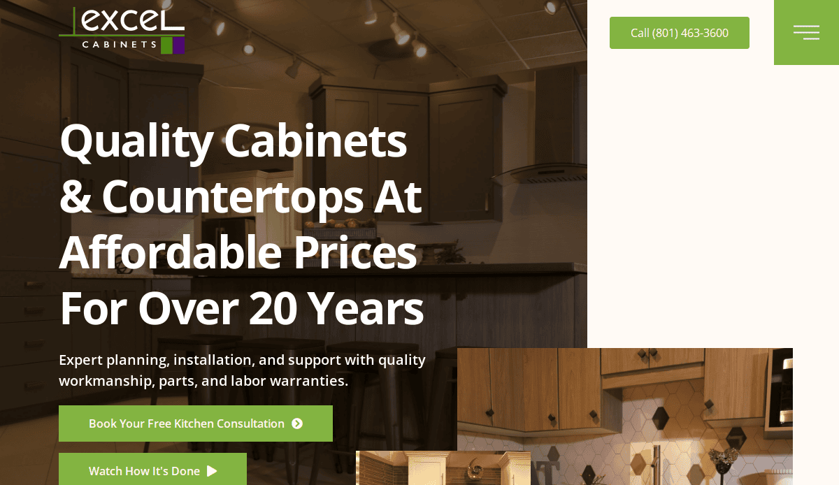
2. Excel Cabinets
Location: Reno, NV
Key Takeaways:
- Concise content highlighting service advantages.
- Comprehensive portfolio with high-resolution images.
- Straightforward navigation enhancing user experience.
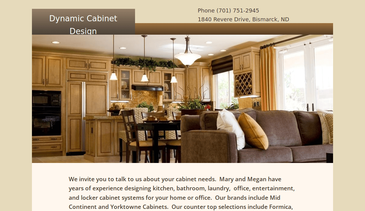
3. Dynamic Cabinet Designs
Location: Bismarck, ND
Key Takeaways:
- Simple design with prominent visuals.
- Easy-to-find links directing to key information.
- Regularly updated blog with relevant articles
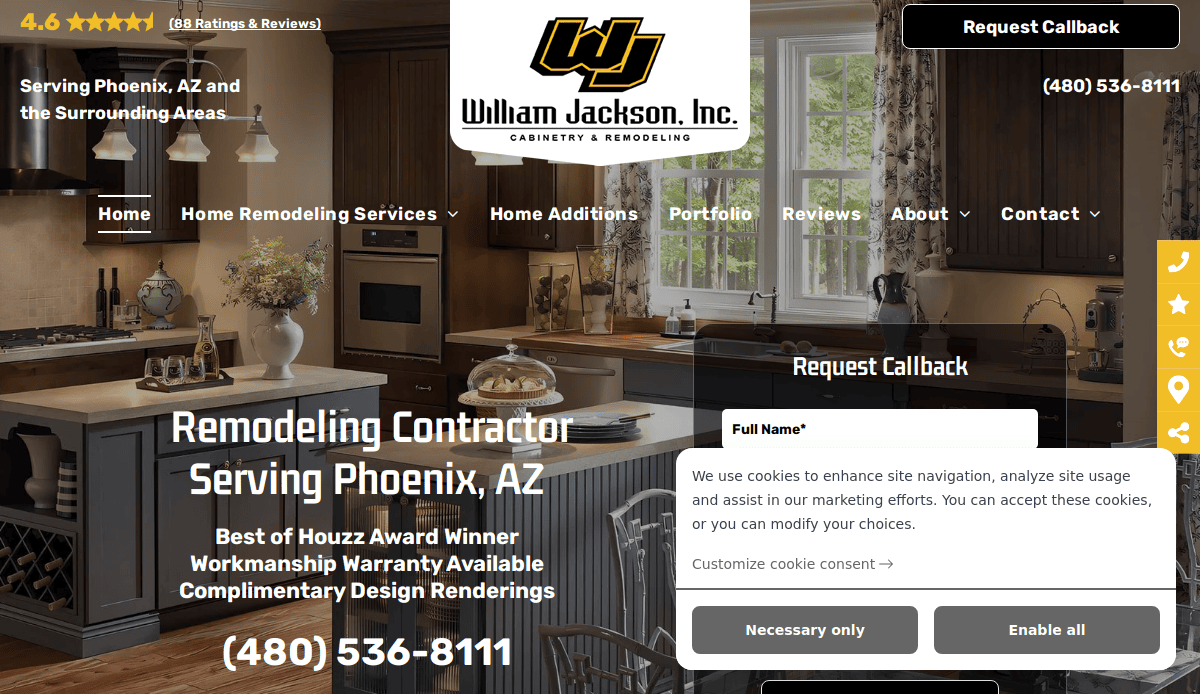
4. William Jackson Cabinetry
Location: Austin, TX
Key Takeaways:
- Bold color scheme with modern aesthetics.
- Prominent “Get a Free Quote” call-to-action.
- Detailed portfolio showcasing diverse projects
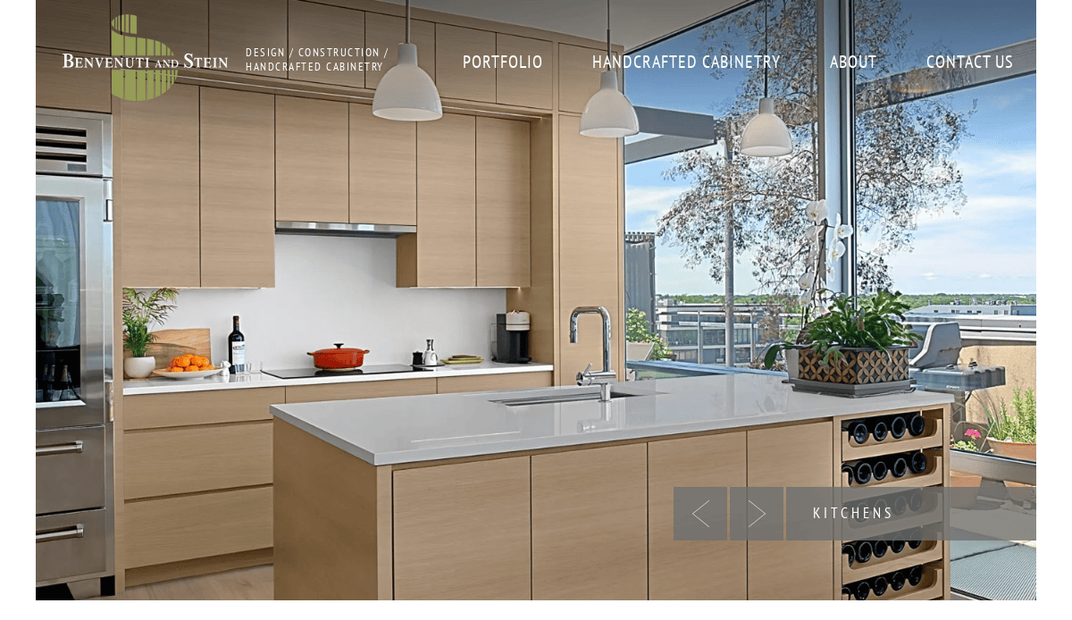
5. Benvenuti and Stein
Location: Evanston, IL
Key Takeaways:
- Elegant design with high-quality kitchen images.
- Authentic project photos enhancing credibility.
- User-friendly navigation with clear portfolio access
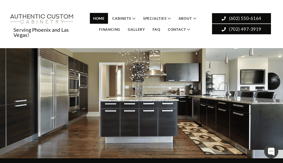
6. Authentic Custom Cabinetry
Location: Los Angeles, CA
Key Takeaways:
- Bold design with contrasting backgrounds.
- Clear list of service locations.
- Informative blog covering cabinetry topics.
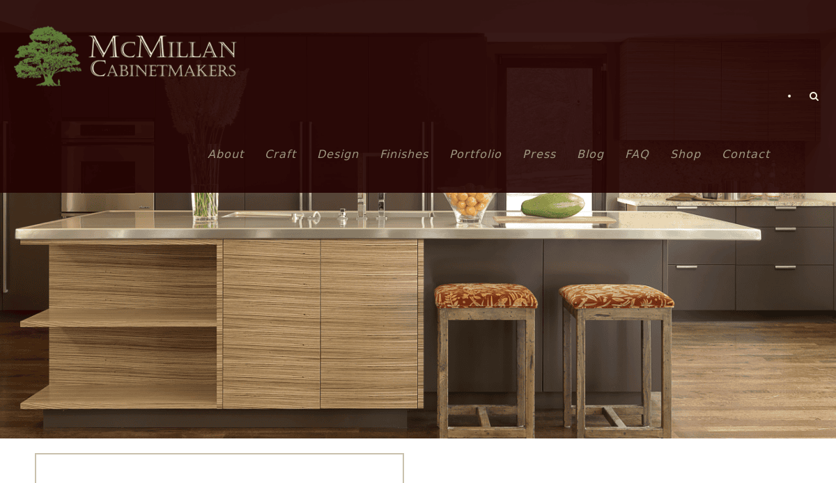
7. McMillan Cabinetmakers
Location: Atlanta, GA
Key Takeaways:
- Traditional design elements reflecting craftsmanship.
- Live social media feeds for real-time engagement.
- Comprehensive portfolio with detailed project images
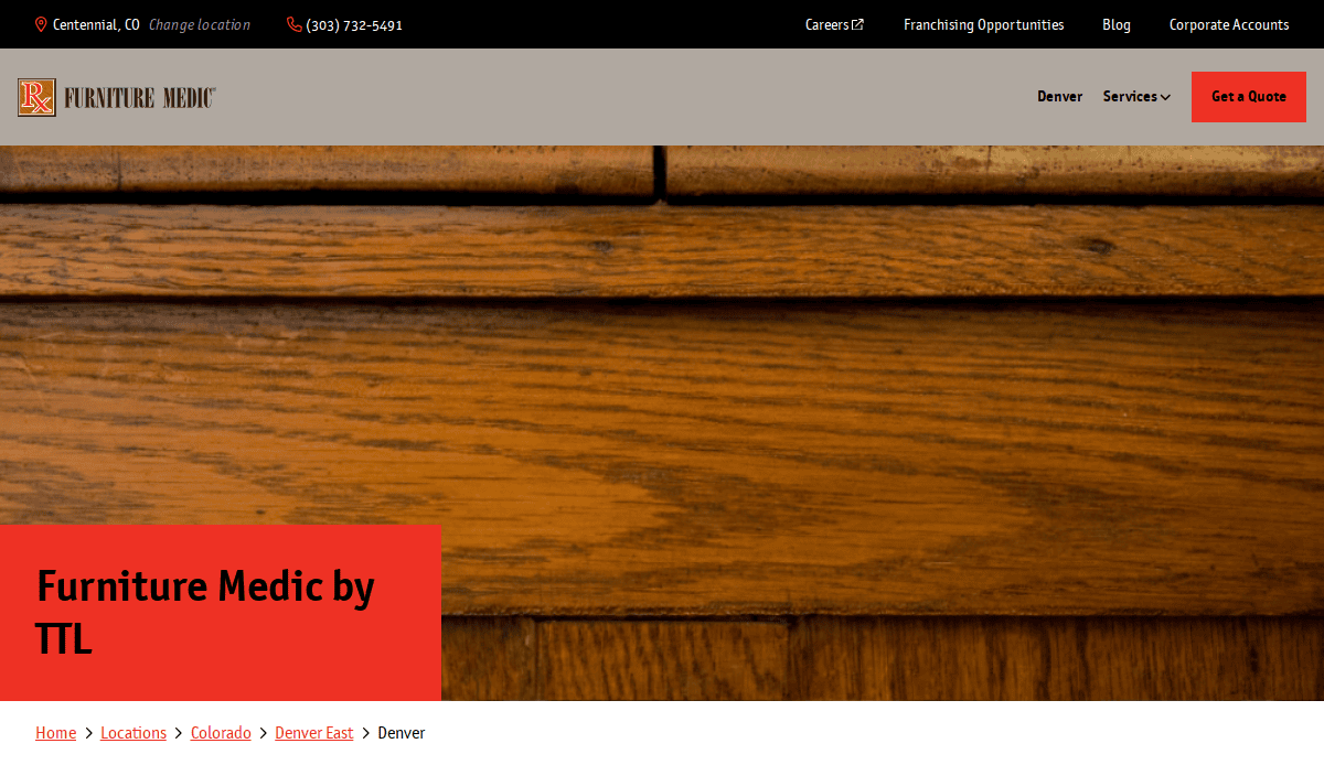
8. Furniture Medic
Location: Denver, CO
Key Takeaways:
- Modern design with concise feature list.
- Direct contact information for easy communication.
- High-quality images showcasing restoration work
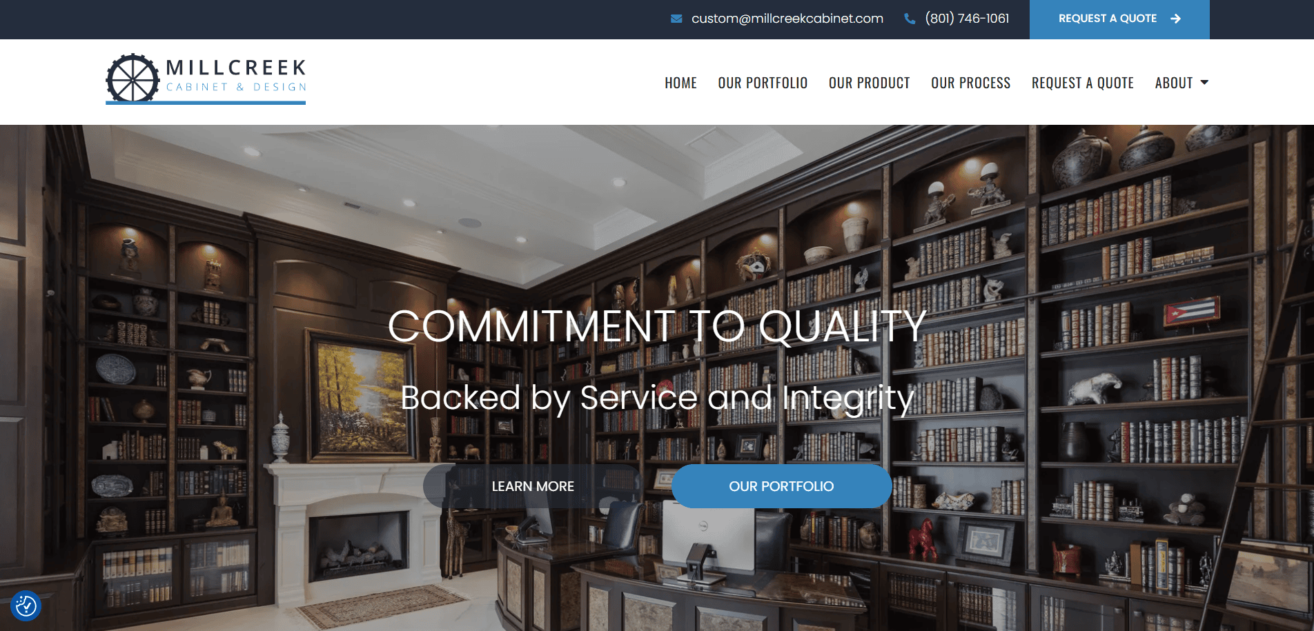
9. Millcreek Cabinet
Location: Salt Lake City, UT
Key Takeaways:
- Prominent logo and customer reviews on homepage.
- Visual portfolio of recent projects.
- Informative blog with cabinetry insights
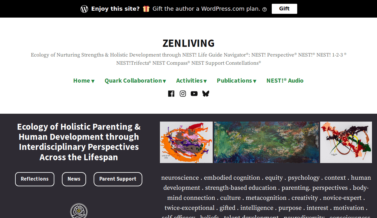
10. Zen Living
Location: San Diego, CA
Key Takeaways:
- Clean, modern design with intuitive navigation.
- High-quality photographs highlighting craftsmanship.
- User-friendly interface enhancing browsing experience
11. Cabinets.com
Location: Tampa, FL
Key Takeaways:
- Sleek design combines aesthetics and functionality.
- Interactive “Room Visualizer” tool.
- Product filters enhancing user experience
12. Cabinets R Us
Location: Phoenix, AZ
Key Takeaways:
- Straightforward structure with high-quality photos.
- Balanced content providing valuable information.
- Easy navigation guiding users to key sections
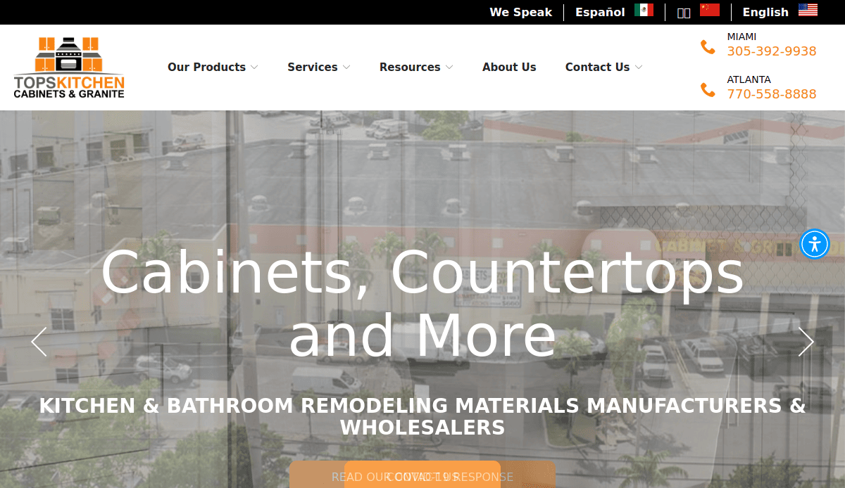
13. Tops Kitchen Cabinet
Location: Miami, FL
Key Takeaways:
- Visually appealing color scheme.
- Customer testimonials enhancing credibility.
- Strategically placed calls-to-action.
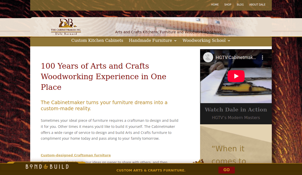
14. The Cabinetmaker Inc.
Location: Portland, OR
Key Takeaways:
- Unique blend of custom furniture and woodworking classes.
- Detailed descriptions of services offered.
- Comprehensive portfolio showcasing craftsmanship
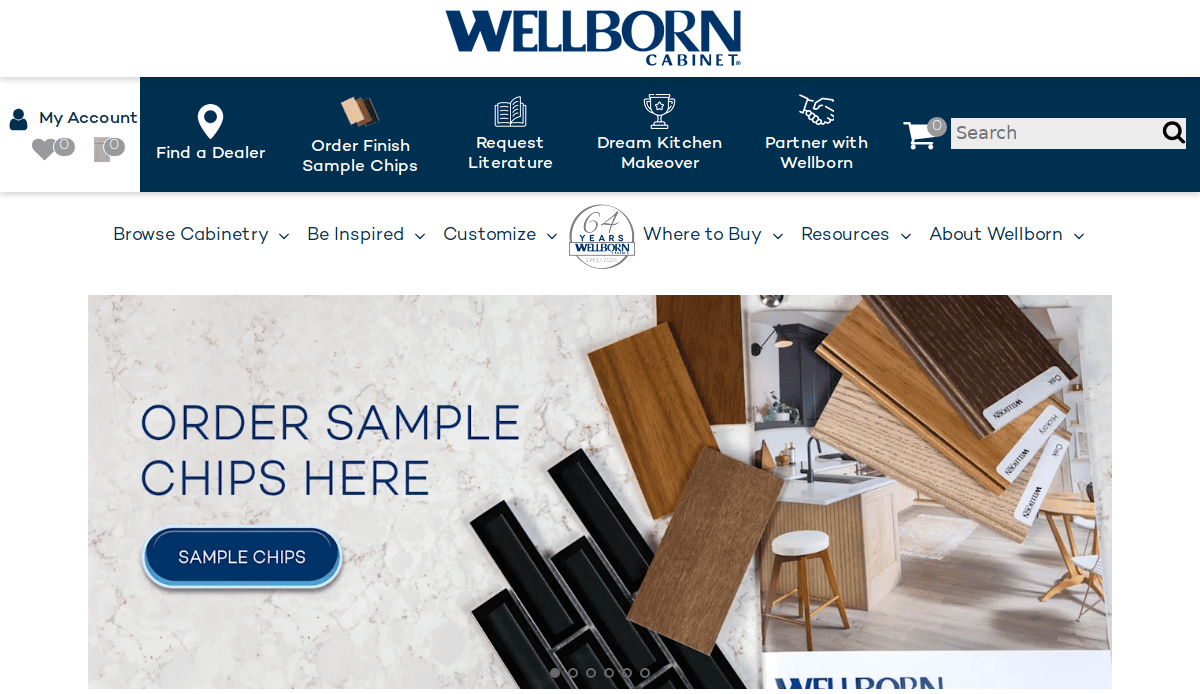
15. Wellborn Cabinet
Location: Ashland, AL
Key Takeaways:
- Extensive range of styles and finishes.
- Comprehensive product descriptions.
- Superior photos aiding buyer decisions
16. Cabinet Design Studio of Omaha
Location: Omaha, NE
Key Takeaways:
- Straightforward design with clear ordering process.
- Detailed service information.
- User-friendly navigation enhancing experience.
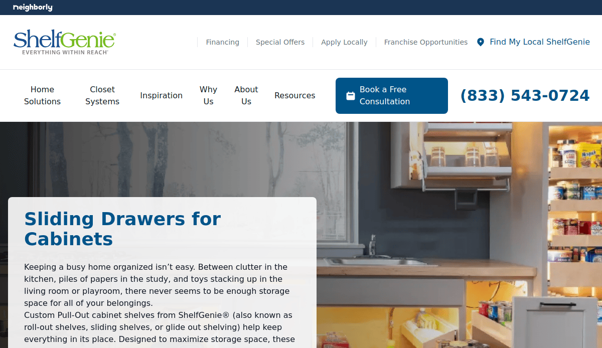
17. ShelfGenie
Location: Atlanta, GA
Key Takeaways:
- Clean design with intuitive layout.
- Detailed product information.
- Easy scheduling for consultations
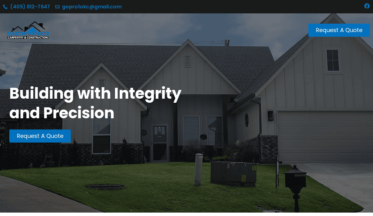
18. GoPro Custom Cabinetry
Location: Houston, TX
Key Takeaways:
- Modern design with high-resolution images.
- Comprehensive service descriptions.
- Clear calls-to-action guiding user engagement
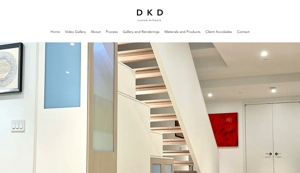
19. DKD Custom Cabinets
Location: Las Vegas, NV
Key Takeaways:
- Elegant design with user-friendly navigation.
- Detailed portfolio showcasing diverse projects.
- Informative blog with cabinetry insights
20. Cabinet IQ
Location: Austin, TX
Key Takeaways:
- Sleek design with interactive elements.
- Comprehensive service offerings.
- High-quality visuals enhancing user experience.
These websites exemplify best practices in web design, combining aesthetic appeal with functionality to effectively engage visitors and convert them into clients.
Ready to Build a Professional Website That Works as Hard as You Do?
Your website is often the first impression a customer has of your cabinet-making business. From showcasing the quality of your work to generating new leads, a website that reflects your brand and skills is essential for cabinet makers to showcase their craftsmanship and services. Whether you’re a seasoned cabinet manufacturer or just expanding into kitchen cabinet projects, your site should integrate best practices in web design for cabinets to attract potential clients and improve conversion rates.
The right strategy, content, layout, and visual elements help build trust with potential customers and set you apart in the competitive cabinet-making industry. With thoughtful planning and a focus on customization, functionality, and visual appeal, your site becomes more than a portfolio—it becomes a key player in your marketing campaign.
If you’re ready to establish a strong online presence and build a professional site that supports your goals, we’re here to help.
Contact us today to get started on your custom cabinet maker website.
Common Questions About Cabinet Maker Website Design
1. Why is a strong web presence crucial for cabinet makers?
A strong web presence is crucial for cabinetmakers because it establishes credibility, attracts new leads, and showcases your cabinet-making expertise. Today’s customers expect to find comprehensive information online, including examples of past projects, services offered, and how to contact you. Without a modern website, you’re missing out on valuable digital marketing opportunities and visibility in search engines.
2. What features should a cabinetmaker’s website include?
Essential website features include a mobile-friendly design, high-quality project images, clear service descriptions, compelling calls to action, and an easy-to-navigate structure. Other must-haves include landing pages for specific services, an About page that builds trust, and a contact form. For those who sell products online, integrating an eCommerce setup with detailed product pages and a secure checkout is also beneficial.
3. How can cabinet makers improve their site’s visibility on Google?
Visibility starts with search engine optimization best practices: optimize your web pages with relevant keywords like “custom cabinetmaker” or “cabinet manufacturing,” use descriptive alt text on images, and build high-quality backlinks from reputable websites. Publishing helpful blog content, answering frequently asked questions, and using tools like Google Analytics can help track performance and refine your strategy.
4. What role does cabinet design software play in a website?
While cabinet design software like Cabinet Vision or CNC-compatible platforms isn’t embedded directly into most sites, showcasing your use of such tools through case studies, video demonstrations, or service descriptions demonstrates expertise. Highlighting the use of industry tools can enhance the user experience and appeal to homeowners and contractors alike.
5. How do I showcase my woodworking skills online effectively?
A comprehensive portfolio with before-and-after images, client testimonials, and descriptions of materials and tools used (like CNC machines) helps highlight your quality of work. You should also include project categories—kitchens, built-ins, vanities—to let visitors filter based on their interests. This content can improve SEO and help visitors make informed decisions.
6. Can I build a website myself?
You can easily create a basic site using drag-and-drop builders like Wix or Squarespace, but for serious lead generation and professionalism, a custom WordPress site built by experts is recommended. DIY platforms often lack the flexibility, performance, and SEO capabilities that are crucial for cabinet businesses looking to grow online.
7. How do backlinks from other websites help my site?
Links from other websites—especially industry-specific ones—signal to search engines that your site is trustworthy and authoritative. Aim to be listed in directories related to woodworking or cabinet making, partner with local suppliers, and request links from satisfied clients. These backlinks boost your SEO and increase brand loyalty.
8. How do I ensure my site works on both desktop and mobile?
Choose an intuitive design that adapts to all screen sizes. Whether on desktop or mobile, your site should load quickly, images should scale properly, and text should remain easy to read. Responsive sites enhance the user experience and are also favored by Google in search rankings.
9. What is the benefit of having a custom domain?
A custom domain (like www.yourcabinetbrand.com) reinforces professionalism and brand identity. It makes your URL easy to remember, builds trust with potential customers, and supports your marketing efforts. Avoid free subdomains, as they can undermine your credibility.
10. How do I use content and online advertising together?
Publishing blog posts, project highlights, or FAQs helps establish authority and improves SEO. Combine this content strategy with targeted online advertising—like Google Ads or social media campaigns—to drive traffic to high-converting landing pages. When done right, this combination builds cabinet maker visibility, drives conversions, and supports long-term growth.
Looking to enhance your cabinetmaking website with all the right features and strategy? Explore our digital marketing services to boost your online presence.


