The importance of a well-crafted website cannot be overstated. As the nexus between cutting-edge research and its application in the real world, biotech companies are at the forefront of innovation. Their websites, therefore, must reflect this position of leadership and advancement. A great biotech website is a platform for showcasing groundbreaking products and services and a vital tool for engaging with various stakeholders. From investors and researchers to potential partners and the end-users of biotech innovations, the best biotech websites communicate complex information in an accessible and compelling way.
The digital presence of a biotech company is pivotal in establishing its brand in the global marketplace. With the sector’s inherent complexity and the critical nature of its offerings, a website must balance technical information with user-friendly design. This balance ensures that the site is accessible to a broad audience, including those without a deep understanding of biotechnology. The best biotech websites convey the company’s scientific expertise, commitment to innovation, and impact on health and the environment, all while providing a seamless user experience. In doing so, they inform and inspire trust and confidence among users.
Moreover, a standout website can be a significant differentiator in an industry characterized by fierce competition and rapid technological advancement. It’s not just about listing products or services; it’s about telling a story that resonates with visitors and leaves a lasting impression. The best biotech websites create an immersive digital experience through engaging content, interactive features, and thoughtful layouts. This experience helps to cultivate a sense of community and belonging among users, fostering loyalty and driving engagement. A top-tier website is a strategic asset for any biotech company, amplifying its reach and impacting its strategies that traditional marketing channels cannot match.
Examples of the Best Biotech Website Designs
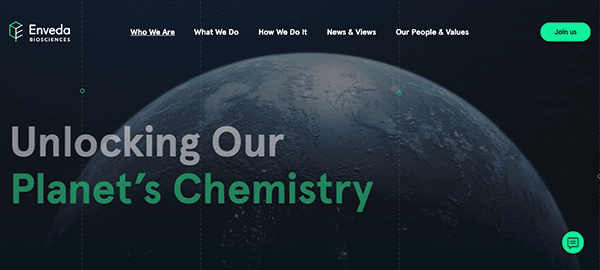
- Enveda: The website exudes a sense of structured elegance, featuring sleek visuals and fluid movements that elevate the user experience. The content is well-written, engaging, and precisely arranged, ensuring that even the most complex subjects are presented in an understandable format. This careful approach improves the overall user experience, making the material accessible and exciting for a large audience. These elements converge to deliver a truly exceptional and unforgettable browsing experience. The layout is user-friendly, with simple navigation menus and carefully positioned call-to-action buttons that direct visitors around the site.
- Biomeriux: The website’s design strikes a balance between elegance and usability, with a clean structure that allows for easy navigation. Whether you’re a healthcare professional looking for information on diagnostic solutions or an enthusiastic individual interested in biotechnology, the site’s interface is designed to be easy and appealing, catering to a wide range of audiences with ease. The website’s commitment to accessibility is evident in its innovative layout decisions. Clear navigation menus, alt text for photos, and screen reader compatibility are just a few of the features incorporated to guarantee that all users, regardless of ability, can easily access the information they need. This commitment to inclusivity represents its principles and emphasizes its mission of serving various populations and contributing to global health efforts.
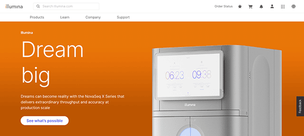
- Illumina: The website’s design is both exquisite and highly efficient. Its minimalist aesthetic and intuitive navigation system ensure that finding information is effortless. With a logical organization, users can seamlessly navigate the site and are encouraged to delve deeper into the content. The combination of stunning photography, graceful animations, and contemporary typography creates an immersive experience that captivates visitors from the moment they land on the homepage. The call-to-action buttons are prominently displayed throughout the website, guiding every potential user to engage with the company’s offers and services.
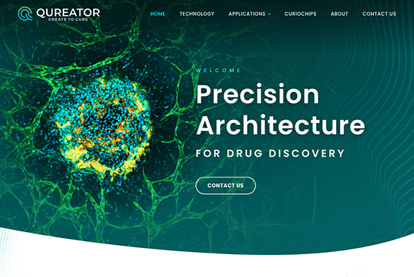
- Qureator: Their website is a fine example of balance and innovation, perfectly combining stunning photography with elegant design features. The current logo design, combined with a carefully chosen color palette that compliments their offers, is boldly displayed and visually appealing. This beautiful combination of aesthetics improves the overall experience with a lasting impression on visitors. Despite its extensive design capabilities, its website retains a completely intuitive layout that simplifies the website design process for users of all ability levels.
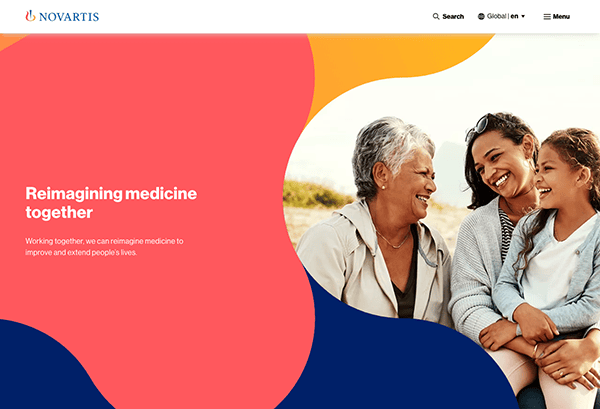
- Novartis: The website’s sleek design and captivating imagery beckon visitors with an enticing invitation to cutting-edge healthcare and scientific innovation. It excels at providing a user-focused navigation experience that assures seamless exploration. With clear menu structures and intuitive search capability, locating relevant content is simple. The website supports many languages and has localization tools, allowing users to access content in their favorite language while giving a personalized experience pertinent to their location. It also strategically places compelling calls-to-action (CTAs) throughout the website. It encourages users to take important actions like researching clinical trials, learning about patient support programs, or connecting with the company through social media platforms.
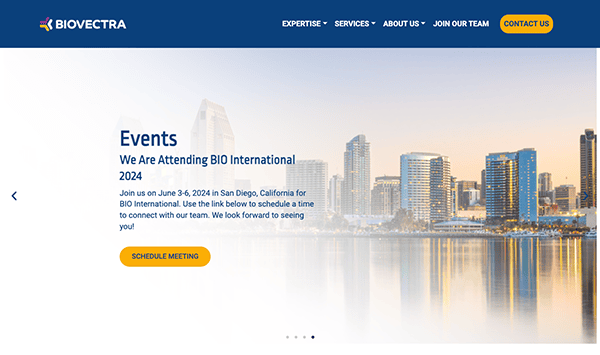
- Biovectra: The website’s modern style and fascinating images through the slider immediately capture attention, providing a glimpse into cutting-edge biotechnological discoveries and breakthroughs. The website is precisely designed with a clean structure, brilliant colors, and custom graphics, resulting in an inviting, dynamic, and personalized platform for the biotechnology business. The website’s mix of videos, articles, and interactive content helps users engage more deeply and understand its role in biotechnology. Compelling calls to action (CTAs) are strategically established throughout the website, inspiring visitors to take meaningful steps, such as examining the varied range of product offerings or exploring the company’s services and expertise.
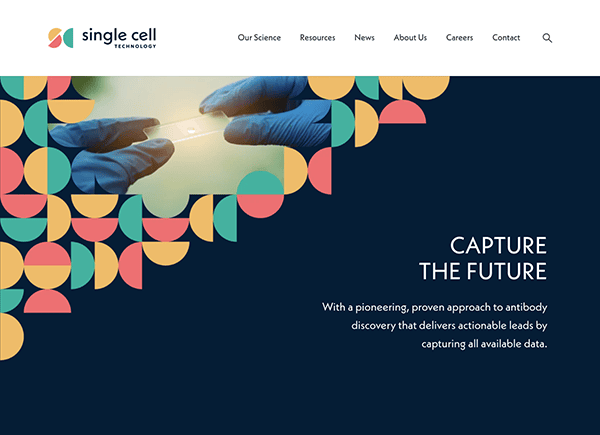
- Single Cell Technology: Upon entering the site, users are greeted with stunning visuals that immerse them in the world of single-cell analysis. Its sleek style and outstanding visuals create an appealing ambiance that immediately captures one’s attention. The website’s design has a distinct aesthetic that complements the concept of the biotechnology sector, resulting in a unified and visually engaging experience. The website succeeds in providing a user-friendly navigation experience, allowing users from all backgrounds to explore seamlessly. Because of clear menus and intuitive navigation, finding relevant content is simple and pleasant. The website’s adaptive design offers optimal viewing and operation on all screen sizes, allowing users to easily access vital information regardless of their preferred device.
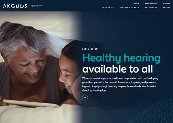
- Akouos: The website’s clean, elegant design and gorgeous graphics immediately draw you in, giving you a glimpse of the groundbreaking work done to combat hearing loss and related illnesses. It provides a user-centric navigation experience, allowing visitors from all backgrounds to explore easily. Whether you’re a patient, a healthcare practitioner, or an investor, the website’s user-friendly structure makes it easy to find the information you need. Straightforward navigation and brief content make locating relevant resources simple and fun. The website contains appealing calls-to-action (CTAs) that are purposefully placed to prompt visitors to take specific actions.
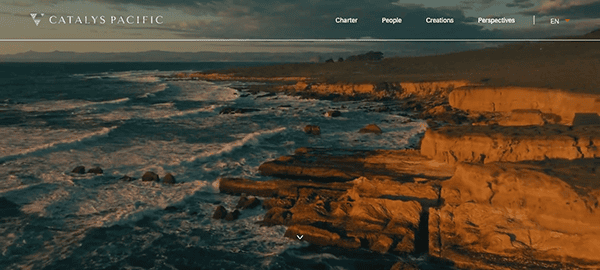
- Catalys Pacific: This biotech website has a brilliant, relevant, and quite catchy hero background video that immediately immerses visitors in the fascinating area of genetic medicine. Clear navigation menus and concise content improve the browsing experience, making it easier and more exciting for visitors to find relevant resources. The website presents an abundance of information detailing the company’s mission, services, and unwavering commitment to sustainability. Users can discover strategically placed calls-to-action (CTAs) throughout the website designed to encourage and take meaningful steps. Whether it’s exploring sustainable solutions, reaching out for collaboration opportunities, or engaging with the community on social media, these CTAs guide users toward valuable interactions.
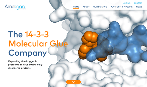
- Ambagon Therapeutics: Upon entering the website, visitors are greeted by lively and dynamic animations that seize their attention immediately and direct them to specialized pages that elaborate on the scientific principles and technological infrastructure of the therapeutics presented. The site’s intuitive and user-friendly interface allows for easy navigation. Beyond its engaging design, this biotech website provides much more: an immersive visual experience, a comprehensive content hub, responsive design, accessibility features, worldwide reach, and compelling calls-to-action.
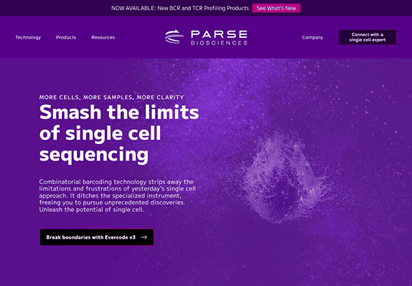
- ParseBiosciences: The website’s sleek design draws attention to single-cell revenues at any scale. Its elegant design and high-resolution photos emphasize innovation, while on-site graphs provide additional information. Custom graphics improve the user experience by ensuring that every journey stage is visually appealing. It employs an elegant color palette to emphasize the precision and inventiveness inherent in genome sequencing research. Purple and red tones convey a sense of trust, dependability, and progress, while white accents add clarity and emphasis. One significant feature is the interactive chat window, which gives visitors real-time guidance and support.
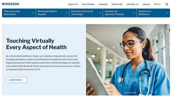
- McKesson: The website features a modern, intuitive, minimalist design with unique graphics, providing easy access to various healthcare solutions and services. The color choice is classy, reflecting the brand’s expertise and dependability. Blue shades indicate trust, stability, and expertise, whereas white accents provide clarity and emphasis. Visitors are invited to learn about the company’s dedication to improving patient quality care, optimizing operations, and driving healthcare ahead through innovative technology and industry experience. The website’s minimal and simple design reflects the company’s commitment to generating significant outcomes
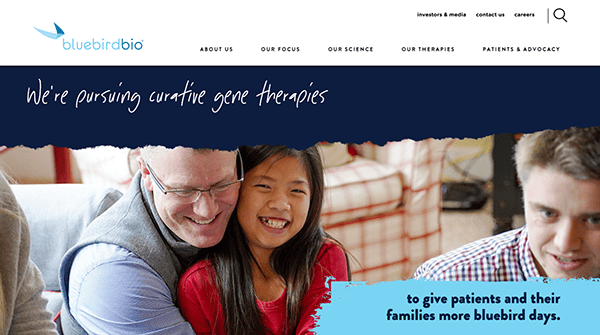
- Bluebirdbio: The website’s contemporary design, complemented by appealing visuals and dynamic animations, creates an immersive environment that provides a glimpse into the transforming possibilities of gene and cell therapy. The website emanates comfort and inclusivity by using brilliant image selection and different font choices, catering to a large audience. The harmonizing color palette, primarily blue with white accents, enhances the visual attractiveness and user experience while instilling confidence and reliability. Furthermore, appropriately placed calls to action (CTAs) improve user engagement by encouraging interaction and collaboration. These CTAs play an essential role in building meaningful interactions and advancing the purpose of gene and cell therapy by directing visitors to clinical trials, patient resources, or contact forms.
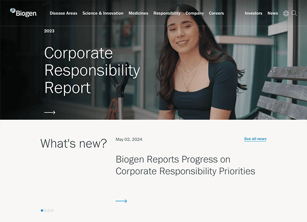
- Biogen: The website’s modern style, appealing visuals, and dynamic animations produce an immersive experience that reveals the transforming potential of gene and cell therapy. The chosen color scheme with blue hues evokes a sense of trust, reliability, and peacefulness, while accents of white bring clarity and emphasis. The website distinguishes itself by its user-centric approach, which includes interactive features, helpful patient resources, and captivating stories about people who have benefited from its medicines.
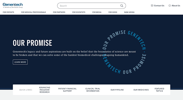
- Genentech: The website has been highlighted for its smooth design, easy navigation, and insightful content about revolutionary research and biotech advancements. The color scheme, which mainly consists of soothing blue and white tones, instills a sense of trust and peace, perfectly reflecting the precision and dependability associated with the discipline of biotechnology. Its unique, minority-centric, and sometimes comical graphic design approach excels and makes it genuinely stun. Furthermore, the appealing calls to action and easily accessible contact information enable potential users to interact with the website’s goods and advancements.
- Strateos: The website’s color scheme harmoniously combines cool blues, crisp whites, and subtle greens to create an airy and sophisticated environment. The website exuded a noticeable ambiance of forward-thinking innovation and uniqueness, enticing visitors with its distinctive and captivating presentation of modern technology. Its website excels at content delivery. The website thoroughly grasps the platform’s capabilities and advantages through informative articles, case studies, and product descriptions. Interactive features such as appealing CTAs and virtual tours allow visitors to interact directly with the team, building meaningful connections and sparking forward-thinking discussions.
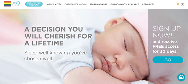
- Xytex: Their website emanates pure calm and provides users with a pleasant browsing experience. Its soothing color palette and intuitive layout create a welcoming atmosphere for visitors. The site offers comprehensive resources on donor selection, fertility treatments, and support services. Through transparent donor profiles and educational content it enhances users to make informed decisions about their fertility options. Its warm and supportive tone fosters a sense of community and understanding. With a diverse range of exciting information, it easily entices visitors to delve further into its offerings. Every element has been deliberately constructed to engage, promising a fascinating journey of discovery.
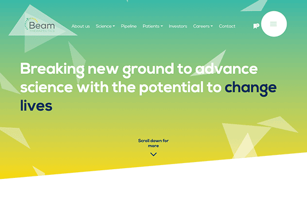
- Beam Therapeutics: The layout is fresh and well-designed. Also, it offers visitors a simple, accurate tour through the complexity of genetic therapies. The color scheme commands attention with its sharp contrasts and simultaneously manages to be warm and approachable. It is both bold and inviting. The website vividly illustrates genetic medicine’s transforming potential through captivating storytelling and authentic patient testimonies, igniting hope and fostering faith in the company’s goal.
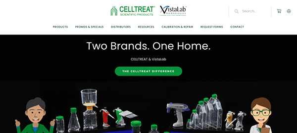
- CELLTREAT: The website delivers a professional and user-friendly platform for laboratory research needs. Its appealing color design inspires faith in the scientific products’ quality. The navigation is simple, providing quick access to a wide range of laboratory essentials. The website offers essential information for researchers, such as product guides and technical specifications, to aid their investigations. Customer support is emphasized through instructional articles and frequently asked questions, which fosters a sense of community.
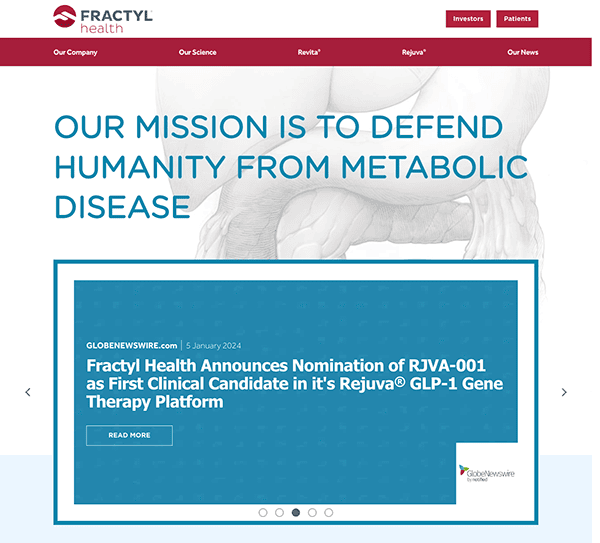
- Fractyl Health: The site captivates users with an engaging header and breathtaking illustrations, drawing them into a world of information and discovery. As visitors browse, they seamlessly move to thorough information about type 2 diabetes and various treatment alternatives. The simplified top-bar navigation improves user experience by providing quick access to information-rich pages with high-quality graphics. This streamlined approach guarantees that users may easily traverse the site and delve deeper into the vast knowledge offered.
As we delve into biotech, it’s clear that the industry’s dynamism and innovation reflect the digital spaces it occupies. The best biotech websites stand as testaments to the fusion of science and technology, offering more than just a glimpse into their offerings. They provide a portal into the future of healthcare, agriculture, and environmental solutions, presenting complex ideas in an engaging and digestible format. These websites are not merely informational; they are experiential, inviting users on a journey through biotech’s possibilities to our world.
In conclusion, a compelling website is indispensable for biotech companies aiming to mark their presence and authority in the industry. The digital age demands visibility, engagement, interaction, and a narrative that connects with the audience personally. The best biotech websites rise to this challenge, crafting digital experiences as innovative as the technologies they represent. They are crucial in translating biotech’s potential into tangible realities that captivate and inspire, laying the groundwork for a future shaped by biotechnological advancement.
If you’re in the biotech sector and looking to enhance your online presence, CyberOptik is ready to propel your digital footprint forward. Specializing in crafting bespoke website solutions that resonate with your brand’s mission and the dynamic demands of the biotech market, CyberOptik understands the power of a great website. Contact us today for a free consultation on how to steer your biotech website into the fast lane of digital innovation. Let’s collaborate to showcase your contributions to biotechnology with a website that stands out in the digital ecosystem.

