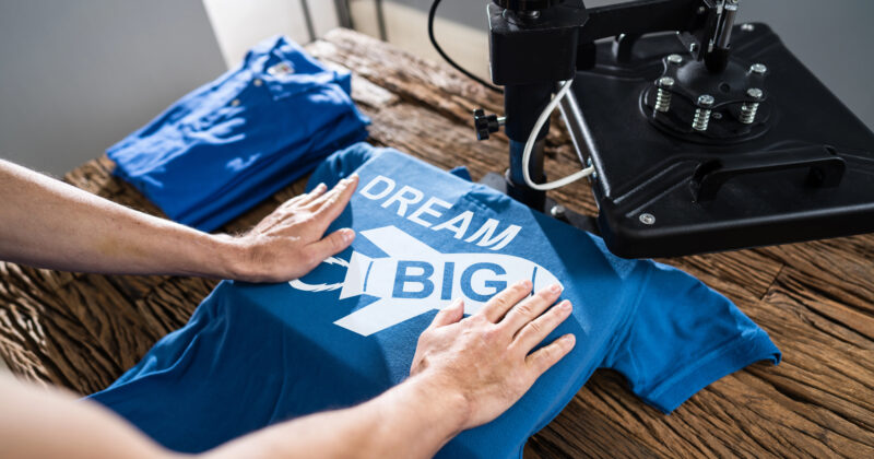
Beverage distributors play a crucial role in bringing a diverse range of drinks—from local craft brews to global favorites—into stores, bars, and restaurants everywhere. In such a dynamic market, having a user-friendly, informative, and visually engaging website can make all the difference in attracting new clientele and retaining loyal customers. If you’re looking to build a standout digital presence for your beverage distribution business, check out CyberOptik for professional guidance.
A quality online presence not only highlights your offerings but also builds trust and credibility within the industry. By showcasing the origins of your beverages, emphasizing quality control standards, and offering convenient ways to place orders, your site can help you connect with both existing and prospective customers. Moreover, a strong online presence ensures that your brand stands out, even in a crowded field.
With effective beverage distributor website design, you can provide an intuitive browsing experience that caters to the needs of retailers, restaurants, and consumers alike. From seamless navigation to high-quality imagery, there are many components that help beverage distributors flourish on the web. Below, we’ve compiled 20 of the best beverage distributor websites to inspire your design.

Examples of the Best Beverage Distributor Website Designs
- Southern Glazer’s Wine & Spirits: Southern Glazer’s Wine & Spirits offers a streamlined website that showcases its extensive beverage portfolio, vendor partnerships, and nationwide reach. The homepage quickly communicates the company’s size and expertise, featuring a prominent navigation bar that directs visitors to comprehensive product information and industry insights. Their design deftly incorporates bold imagery of vineyards and upscale beverage presentations, aligning with the premium nature of their offerings. Additionally, the site’s emphasis on responsible consumption underscores a commitment to social responsibility. By balancing aesthetics with easy-to-use resources, Southern Glazer manages to engage both consumers and trade partners effectively.

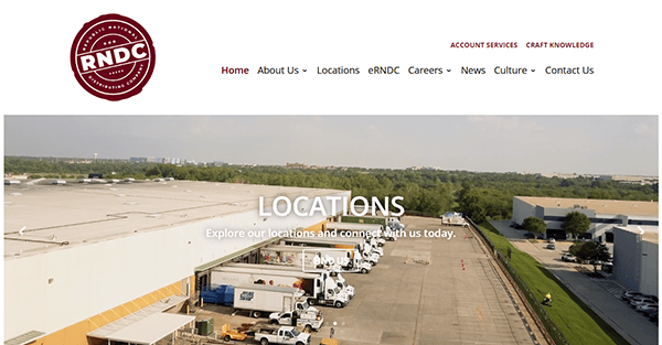
- Republic National Distributing Company: Republic National Distributing Company’s website immediately draws attention with vibrant visuals and polished branding. The top menu provides direct access to services, brand highlights, and career opportunities, reflecting the company’s dedication to transparency and growth. Users can easily navigate through a structured layout that spotlights various beverage categories, supplemented by informational content on market trends. The crisp color scheme and modern font choices create a clean, contemporary look, emphasizing a forward-thinking approach. Their “Newsroom” section offers ongoing updates and insights that keep visitors informed and engaged with the evolving world of beverage distribution.
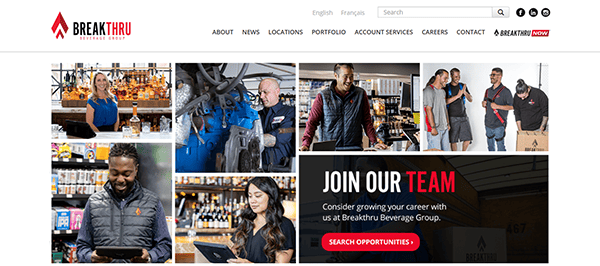
- Breakthru Beverage: Breakthru Beverage’s website stands out due to its intuitive interface and strong focus on storytelling. High-resolution images paired with succinct copy allow visitors to explore the company’s brand partners, regional coverage, and community initiatives. One of the key features is an interactive map that helps potential clients find distribution information based on location. The site also provides numerous resources for suppliers and retailers, illustrating the brand’s commitment to fostering successful partnerships. With a balanced mix of corporate professionalism and creative flair, Breakthru’s online presence captures the essence of modern beverage distribution.
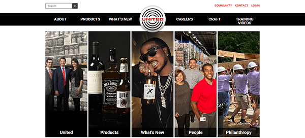
- United Distributors, Inc.: United Distributors, Inc. immediately showcases its heritage and commitment to quality through a clean design and well-organized menu. The homepage banner rotates through eye-catching product imagery, while brief but informative text snippets highlight the company’s core values. A “Community” section details charitable initiatives and sustainability efforts, emphasizing their dedication to responsible distribution. The overall design uses subtle color gradients, making the navigation process both visually pleasing and straightforward. By balancing tradition with modern website practices, United Distributors, Inc. appeals to clients searching for a trusted partner in a competitive marketplace.
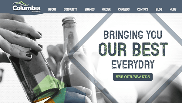
- Columbia Distributing: Columbia Distributing’s site employs a bold use of color and large-scale photography to introduce its broad beverage portfolio. Visitors find a clear-cut menu at the top of the page, guiding them to learn about the company’s history, services, and extensive brand lineup. Testimonials from partners lend credibility, further complemented by a strong emphasis on community involvement and career opportunities. The “Our Brands” page displays product categories with clickable tiles, creating an interactive approach to exploring what the distributor offers. Overall, the design fosters an engaging user experience by seamlessly merging brand storytelling with functional navigation.
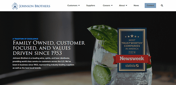
- Johnson Brothers: Johnson Brothers’ website gives off a refined and welcoming vibe. With crisp lines and neutral color palettes, the design appeals to a wide range of visitors, from retail to on-premise customers. Organized tabs direct users to sections detailing supplier partnerships, brand assortments, and community outreach efforts. The layout keeps important information accessible, reducing clutter and streamlining the viewer’s journey. By highlighting local markets and their specialized offerings, Johnson Brothers emphasizes the value of localized service in a globalized industry. Their approach underlines that a powerful online presence can strengthen client trust and brand loyalty.
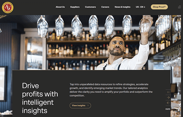
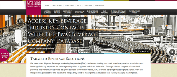
- Beverage Marketing: Beverage Marketing’s site immediately positions the company as a leader in the beverage industry by blending analytical data with eye-catching visuals. The homepage features brief summaries of their services, each accompanied by relevant graphics or icons. Clear “Learn More” buttons invite visitors to delve deeper into market research, consulting, and more. Social proof is provided through client success stories, lending further credibility. Their choice of typography offers a modern yet professional feel, ensuring that potential partners view the company as both approachable and highly knowledgeable. This combination of data-driven content and appealing design is particularly effective in beverage distribution.
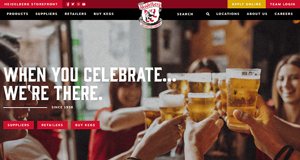
- Heidelberg Distributing: Heidelberg Distributing’s online platform welcomes visitors with vivid photography that showcases a wide array of beverage products in social settings. The navigation menu is straightforward, guiding users to separate sections for beer, wine, and spirits. Each category page features product highlights and background information, helping potential buyers quickly identify relevant items. The use of community stories, such as supporting local events and businesses, creates a relatable aspect that resonates with both retailers and end consumers. By focusing on high-quality imagery and clear communication, Heidelberg effectively conveys its position as a leading distributor.
- Ben E. Keith: Ben E. Keith’s beverage division website stands out with polished, well-structured content complemented by engaging visuals. The site outlines its history, distribution territories, and product categories in a user-friendly manner. Each section employs concise text blocks paired with relevant imagery or infographics, ensuring viewers can easily digest information without being overwhelmed. Additionally, the site includes a section dedicated to potential careers, demonstrating a commitment to professional growth. By balancing corporate identity with an approachable tone, Ben E. Keith’s design appeals to a broad audience seeking a reliable partner in beverage distribution.
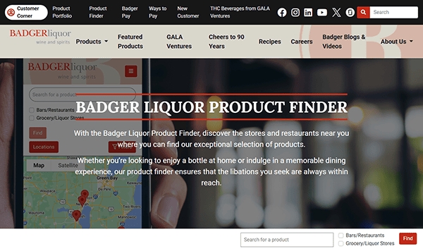
- Badger Liquor: Badger Liquor’s website combines rustic charm with modern functionality. From the moment visitors land on the homepage, large banners showcase the variety of beer, wine, and spirits available, paired with helpful descriptions about each product category. The “Who We Are” section features a succinct company history, while the “Customer Resources” page offers valuable tools and order-tracking capabilities. The site also weaves in stories of brand success and local community involvement, reinforcing that they are more than just a distribution company—they’re a committed partner in fostering relationships between producers, retailers, and consumers.
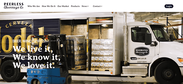
- Peerless Beverage: Peerless Beverage’s approach to online design highlights elegance and professionalism. The homepage provides immediate insight into product offerings, with rotating banners spotlighting signature drinks and promotions. A well-organized “Brands” section further breaks down their extensive portfolio, allowing users to filter by beverage type. The site’s use of bold photography and consistent color schemes tie each page together, making for an uncluttered, cohesive experience. Clear calls to action encourage retail partners to reach out for more information, while a dedicated news section ensures visitors remain informed about the latest product releases and industry trends.
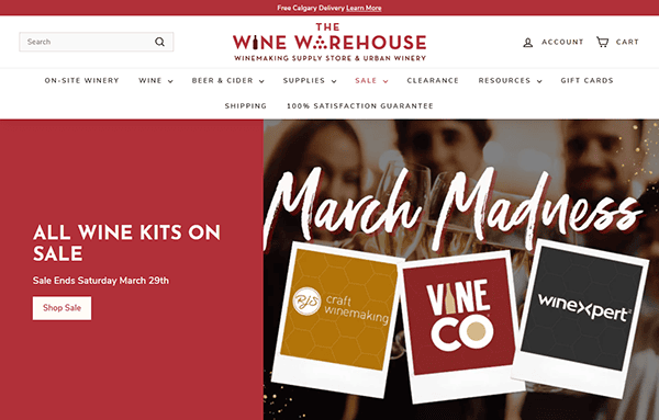
- Wine Warehouse: Wine Warehouse caters to a more specialized niche within the beverage distribution field, yet its website manages to appeal to a broad audience. Users can seamlessly browse through wine, beer, and spirits categories, each showcasing detailed product descriptions and tasting notes. The design incorporates rich colors and tasteful typography, reflecting the sophisticated nature of the products. A specialized “Our Services” section outlines logistical offerings and marketing support, ensuring brand partners understand the full suite of capabilities. By weaving storytelling elements into a streamlined layout, Wine Warehouse demonstrates how a focus on brand identity can enhance online engagement.
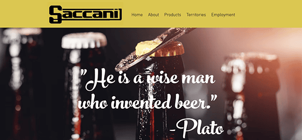
- Saccani Distributing: Saccani Distributing’s website brings a warm, inviting approach to beverage distribution. Each product category, whether beer, wine, or non-alcoholic beverages, has a dedicated page featuring brand logos and brief descriptions. The site also introduces the company’s history and key leadership, helping put faces to the brand. This personal touch extends to the “Community & Events” section, where Saccani highlights involvement in local charities and festivals. Subtle animations and hover effects add a modern element, ensuring the overall experience feels polished without being overwhelming. It’s an excellent example of blending personal storytelling with a professional online presence.
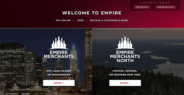
- Empire Merchants: Empire Merchants’ website commands attention with impactful imagery that immediately communicates the scale and variety of its distribution network. A top navigation bar directs users to details about the company’s leadership, operational footprint, and product array. Links to partner resources facilitate easy ordering and inventory management, ensuring that retailers have everything they need at their fingertips. The consistent use of brand elements, such as a cohesive color palette and distinct font choices, enhances recognition. Empire Merchants showcases how a meticulously structured website can reflect the efficiency and reliability needed in a highly competitive industry.
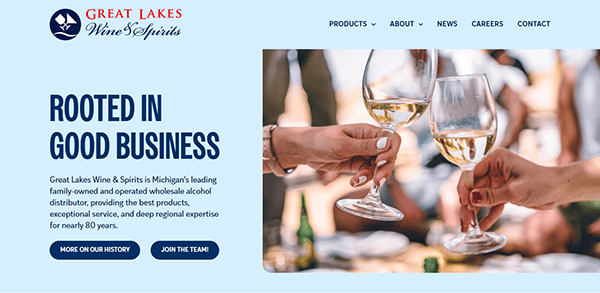
- Great Lakes Wine & Spirits: Great Lakes Wine & Spirits frames its story within the context of regional pride and a commitment to excellence. The homepage instantly introduces viewers to its vast product selections while highlighting the company’s role in supporting local businesses. Careful use of color gradients and eye-catching banners help categorize the website’s content, making it simple to navigate. Their “On-Premise” and “Off-Premise” sections detail specialized services for different customer segments, underscoring a flexibility that caters to diverse needs. With a blend of engaging copy and thoughtful design, Great Lakes Wine & Spirits exemplifies a regionally focused yet forward-thinking distributor.
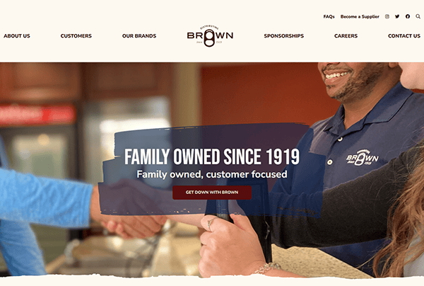
- Brown Distributing: Brown Distributing’s website is a prime example of a classic layout done right. A well-placed slider at the top offers quick insights into featured brands, awards, and community events. Each category—beer, wine, spirits, and non-alcoholic—receives its own dedicated section, replete with brand profiles and product details. Throughout, visitors encounter short, impactful statements that emphasize the company’s values, expertise, and service quality. The consistent use of high-resolution imagery and a coherent color scheme ties everything together. Overall, Brown Distributing shows how consistent branding and easy-to-digest content can immediately convey reliability and passion.
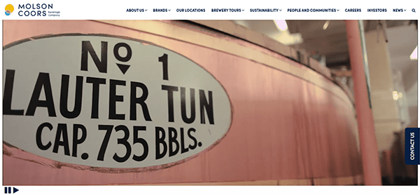
- Molson Coors: It showcases its industry footprint through a user-friendly website highlighting the beverages distributed and the people behind the operation. Visitors will find an “About Us” section that introduces the leadership team and explains the company’s commitment to community involvement. The “Brands” page features a grid of logo tiles, each clickable for more detail, creating a visually appealing catalog of products. Soft color accents guide visitors’ eyes, making the browsing process intuitive. This site excels in balancing informative content with a personal touch, making it inviting for both retailers and producers.
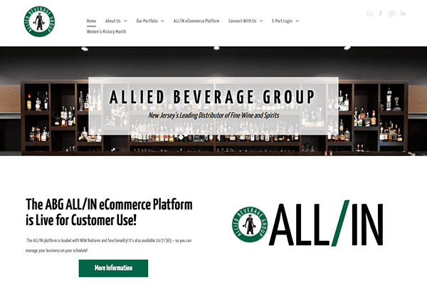
- Allied Beverage Group: Allied Beverage Group’s website focuses on professionalism, using sleek design elements to convey expertise and scale. A prominently placed navigation bar helps visitors jump to key sections such as services, brand lineup, and career opportunities. Each page is broken down into smaller, digestible segments, often paired with relevant images or infographics to keep interest high. The site also includes client testimonials, which add an element of trust. With strategic whitespace and a modern layout, Allied Beverage Group ensures that the user experience remains fluid and uncluttered, perfectly capturing the spirit of a forward-looking distributor.
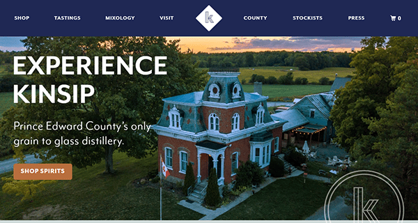
- Kinsip: Its website exudes an air of luxury and exclusivity from the moment visitors land on the homepage. High-quality photography and a dark, sophisticated color scheme reflect the company’s focus on premium beverages. Detailed tasting notes and brand histories elevate the user experience, catering to aficionados seeking in-depth information. Site visitors can also explore curated collections, which introduce a storytelling element to the shopping process. Each feature is designed to be both visually striking and practical, making it straightforward to connect with sales representatives or learn more about specific products.
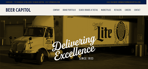
- Beer Capitol Distributing: Beer Capitol Distributing’s website centers on a lively, energetic aesthetic. Vibrant graphics and bold font choices echo the fun atmosphere of beer culture while clearly labeled menu options guide visitors through everything from product listings to community events. The “Brands” page leverages a simple yet organized layout to display a sizable portfolio, ensuring potential clients can quickly identify relevant offerings. A dedicated “Community” section showcases philanthropic efforts, while career information highlights job openings and growth opportunities. With an emphasis on user engagement, Beer Capitol Distributing keeps site visitors informed, entertained, and inspired to learn more.

A well-crafted beverage distributor website can be the cornerstone of a successful operation. From showcasing vast product offerings to detailing the logistics services that keep supply chains flowing, these sites illustrate the potential to captivate retailers, suppliers, and consumers alike. By incorporating essential elements like intuitive navigation, compelling visuals, and transparent information, beverage distributors can demonstrate professionalism and earn trust at first click.
Whether you’re distributing local craft beers or international wines, the overall goal remains the same: make it easy for businesses and consumers to learn about and access your products. The best websites are those that consistently balance the need for detailed information with user-friendly design, ensuring that prospective clients feel confident in reaching out. Moreover, each of these top sites underlines how telling your brand’s story—from origins to community engagement—can help differentiate you in a competitive market.
If you’re aiming to refine your online footprint, consider these examples as inspiration. Above all, remember that each design choice, from color scheme to content layout, shapes how your brand is perceived. Invest in a design strategy that resonates with your target audience, aligns with your corporate values, and positions your business for long-term growth.
10 Most Important Aspects of a Beverage Distributor Website
- Clear Navigation: A simple and intuitive menu helps users find products, services, and company information quickly and efficiently.
- High-Quality Imagery: Showcasing drinks, events, and behind-the-scenes activities in high-resolution visuals creates a lasting impact and enhances brand appeal.
- Responsive Design: Ensuring that your website is mobile-friendly caters to on-the-go users who frequently browse or place orders via phones and tablets.
- Comprehensive Product Listings: Provide detailed product information, including tasting notes and origin details, for prospective retailers and consumers.
- Brand Storytelling: Sharing company history, values, and community involvement fosters a more authentic connection with site visitors.
- Easy Contact & Ordering: Prominent contact forms or distributor portals allow for seamless communication and order placement, boosting conversion rates.
- Engaging User Experience: Balanced layouts with modern features like sliders or interactive maps keep visitors engaged while highlighting key information.
- Testimonials & Case Studies: Featuring quotes or success stories from satisfied clients helps build credibility and trust in your offerings.
- Social Responsibility: Emphasizing responsible consumption and sustainability practices resonates with today’s conscientious consumers and partners.
- Up-to-date News & Events: Regularly posted updates signal that the distributor remains current with market trends and industry developments.
FAQs About Beverage Distributor Web Design
How can I make my beverage distributor website stand out from competitors?
Focus on authentic storytelling, high-quality visuals, and user-friendly navigation. Demonstrating your unique product range and values can also differentiate you from others.
What platform is best for building a beverage distributor website?
WordPress is a popular choice for its flexibility, wide range of plugins, and user-friendly interface, making it ideal for both beginners and experienced developers.
How much does it typically cost to design a beverage distributor website?
A basic website can start around $2,000, with costs rising for additional features such as e-commerce capabilities, custom integrations, and detailed content strategies.
How often should I update my beverage distributor website?
Consistency is key, but content updates should add value rather than be done solely for search engine rankings. Focus on meaningful updates like new product releases or industry insights.
Why is mobile responsiveness important for beverage distributor websites?
Many users browse and place orders from their phones or tablets, so a mobile-friendly site ensures a seamless experience, boosting satisfaction and conversions.
Ready to elevate your beverage distributor’s website? Contact CyberOptik for a free proposal for your new beverage distributor website design and set your business up for success.