In the competitive field of bathroom remodeling, an exemplary website is not just a luxury but a necessity. A well-designed website is a potent tool that showcases your expertise, craftsmanship, and the quality of your work. It also attracts potential clients, builds credibility, and fosters trust. These fundamental elements can turn visitors into loyal customers, making a well-designed website a crucial investment for your business.
A great website for bathroom remodelers must highlight your unique selling points, such as innovative design solutions, superior materials, and exceptional customer service. It should offer an engaging user experience with straightforward navigation, high-quality images, and detailed descriptions of your services. This helps potential clients visualize the transformation you can bring to their homes.
Furthermore, a website that is effectively optimized for search engines is a game-changer. It ensures that your business is prominently displayed at the topmost of search results when potential clients are searching for the best bathroom remodelers. By incorporating SEO strategies, you can significantly enhance its online presence traffic attraction and generate more leads and sales for your business.
Examples of the Best Bathroom Remodelers Website Designs
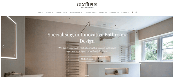
- Olympus Bathrooms: The website’s sleek, modern design offers an exceptional user experience. The homepage captivates visitors with high-quality photos showcasing various bathroom designs, instantly sparking curiosity. The general layout is neat and organized, with generous white space that improves legibility and directs attention to vital components. Easy-to-use navigation ensures that exploring their comprehensive offerings, including design, supply, and installation, is effortless. Key strengths include thorough sections on their design process, customer testimonials, and a portfolio of finished projects, all of which help to establish confidence and trustworthiness. The contact information is prominently displayed, and the call-to-action buttons are appropriately placed to increase user involvement.
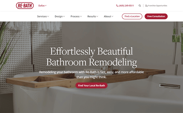
- Re-Bath: The website boasts superb design, featuring a clean, modern appearance and eye-catching images. The homepage effectively highlights essential services and call-to-actions, making it easy for consumers to schedule consultations or explore remodeling options. This visual appeal is complemented by an intuitive navigation structure, allowing users to seamlessly access various sections such as services, design styles, and customer reviews. The layout is meticulously designed, with straightforward typography and judicious white space, improving readability and engagement. This user-friendly interface demonstrates its commitment to accessibility and ease. The website’s rich and engaging content features detailed service descriptions, an extensive gallery of past projects, and informative blog posts. These elements collectively offer valuable insights and inspiration for potential clients, helping them envision their remodeling projects and understand the full range of services available.
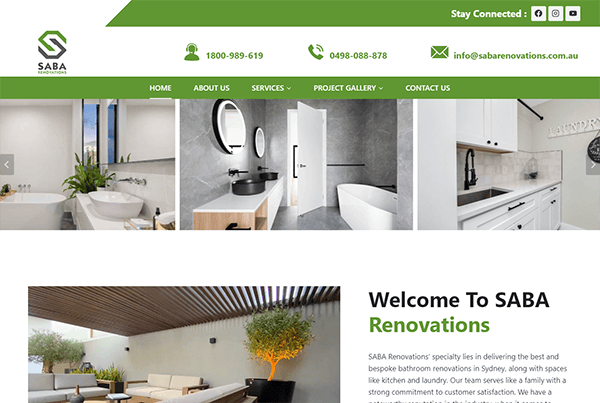
- Saba Renovations: The website features a clean and modern aesthetic, with a thoughtfully chosen color scheme that instantly conveys professionalism and elegance. High-quality images of their renovation projects enhance the visual appeal, effectively showcasing their expertise and craftsmanship. The site’s navigation is simple and intuitive. The well-organized menu makes it simple to learn about their services, browse their portfolio, and contact them. This ensures a consistent user experience, critical for maintaining visitor engagement. Adding client testimonials and a portfolio of previous projects demonstrates their expertise and their clients’ happiness. The portfolio features various remodeling projects, displaying their adaptability and ability to provide high-quality results across multiple designs and specifications.
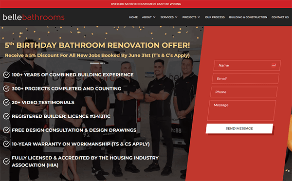
- Belle Bathrooms: The website’s sleek and modern design immediately captures attention. The strategic use of colors, typefaces, and high-resolution photos of completed projects creates a visually appealing and professional appearance. The website is highly user-friendly and has well-organized navigation, allowing users to effortlessly find information about services, browse the gallery, and read client reviews. It does a great job of describing its offerings. Each service page contains detailed information on its offerings, including processes and benefits. This transparency enables potential clients to grasp the value and scope of what it can offer. Throughout the site, clear calls to action direct users to the following actions: getting a price, scheduling a consultation, or learning more about its services.
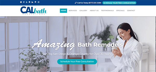
- CALbath Renovations: The website welcomes visitors with a modern, clean design that communicates expertise and attention to detail. The color design is soothing and visually appealing, and the high-quality photographs highlight their restoration work nicely. This design choice effectively communicates the elegance and quality of its services. The usage of dropdown menus and a sticky navigation bar improves accessibility by allowing visitors to navigate different sections of the site without getting lost. The website excels in providing both extensive and engaging content. Each service page offers complete descriptions of the many remodeling services available, along with related photographs and case studies. It strategically positioned CTAs to direct visitors towards certain activities, such as getting a price or booking a consultation.
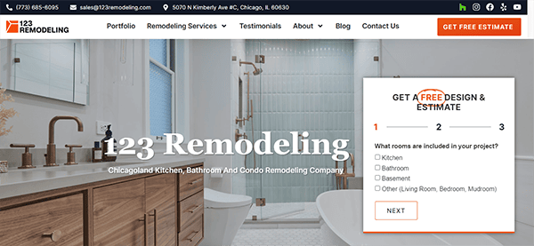
- 123 Remodeling: The visual design is simple but striking and appealing. The use of high-quality photographs of finished projects emphasizes the company’s skill and attention to detail. The black-and-white color scheme is sophisticated and consistent with the brand’s identity, providing the site with a professional and elegant look. The website’s navigation is accessible and user-friendly. The top menu is well-organized, with well-defined categories that direct readers to the information they need. The usage of a sticky header ensures that navigation options are constantly available, improving the user experience. The information provided is both entertaining and informative. The project galleries are particularly excellent, allowing potential clients to view the breadth and quality of the company’s output. The inclusion of testimonials and case studies enhances confidence and credibility. Furthermore, the blog offers essential insights and suggestions, establishing you as an authority in the renovation sector.
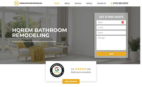
- HQREM Bathroom Remodeling: The website’s visual design is modern and attractive, accurately reflecting the quality of services provided. The color scheme is elegant and harmonious, which improves the overall aesthetic appeal. High-resolution photos of tastefully restored bathrooms are prominently displayed, giving visitors a quick impression of the company’s artistry and attention to detail. The well-organized menu has clear categories and a navigation bar that persists as you scroll, allowing users to find the information they seek. It has implemented effective calls to action strategically positioned throughout the site. These CTAs direct users to essential steps such as getting a price, examining the portfolio, or contacting the company. They are visually noticeable, making them easy to find and encouraging user interaction.
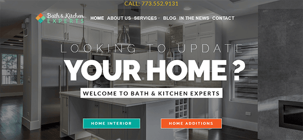
- Bath and Kitchen Experts: The sleek, modern look quickly draws attention, with high-quality photos of elegantly remodeled interiors. The professional imagery depicts tastefully remodeled kitchens and bathrooms, demonstrating the company’s expertise and attention to detail. The homepage clearly describes their services, which include bathroom and kitchen remodeling, home extensions, and commercial projects, making it simple for customers to find what they need. It has gained multiple awards, including the prestigious “Best of Houzz” title. These accolades are also prominently highlighted on the homepage, along with outstanding client testimonials contributing to the company’s trust and dependability. In addition, the smooth incorporation of contact details and a blog area offers significant resources and effortless connections for prospective clients.
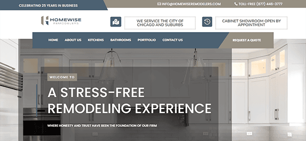
- Homewise Remodelers: The website has a clean, modern style and high-quality photos that successfully highlight the company’s remodeling efforts. The website’s navigation is simple and basic, with categories including About Us, Kitchens, Bathrooms, Portfolio, and Contact Us. This structure guarantees that users may rapidly get the information they require. The site’s content is significant and well-structured. Detailed descriptions of services, including kitchen and bathroom remodeling, are available. The site prominently shows numerous positive reviews and testimonials from delighted consumers, strengthening trust and reliability. Furthermore, the company’s long-standing presence and experience in the Chicago area are emphasized, bolstering its credibility. The contact information and forms are readily available, offering many means of contact, such as phone numbers and email addresses.
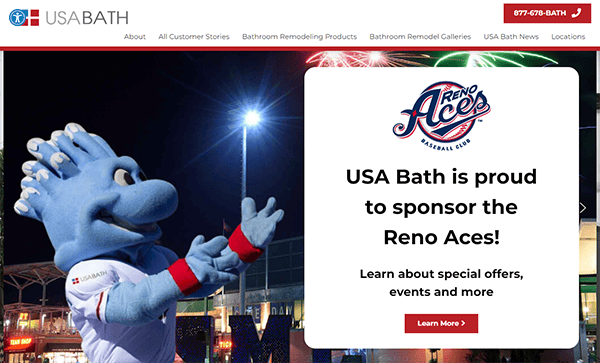
- USA Bath: The website provides an excellent user experience with a clean, modern design that successfully promotes its products and services. It has an outstanding image slider on the homepage, which dramatically improves the user experience. This slider displays a variety of high-quality photographs of bathroom remodels as well as information about the company’s services, successfully emphasizing the craftsmanship and diversity of design alternatives. One of the website’s most notable features is the full description of the bathroom remodeling procedure. This section provides step-by-step guidance to help potential clients understand what to expect from their refurbishment project. The customer testimonials are prominently displayed, including both written and video feedback from delighted customers. This provides a personal touch and acts as significant social proof of the company’s commitment to client happiness and excellent service.
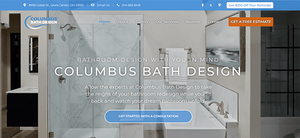
- Columbus Bath Designs: The visual design is striking, with a clean, minimalist aesthetic emphasizing the company’s dedication to quality and style. The use of high-resolution photographs, particularly in the gallery sections, beautifully displays their work, providing possible clients with a clear picture of what to expect. The color scheme is appealing and professional, combining whites with subtle shades of blue and grey that are calming and signify cleanliness and freshness—essential qualities for a bath design company. The content is well-organized and carefully designed, allowing visitors to assimilate information directly. The addition of sticky navigation enables users to navigate the menu from anywhere on the page, improving overall usability. The responsive website looks remarkable and works well on all devices, including desktops and smartphones. Effective calls to action (CTAs) are carefully positioned throughout the website for an increase in user engagement and conversions.
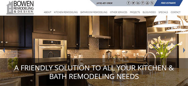
- Bowen Remodeling: The sleek and elegant design emits a sophisticated yet appealing visual presence. The use of high-quality photographs across the website, particularly in the project galleries, emphasizes the company’s impressive work. The color scheme, which consists primarily of warm tones and neutrals, produces a pleasant and professional environment. This color scheme complements the company’s brand identification, conveying dependability and competence in home remodeling. The website’s navigation is straightforward and structured. The content is presented in a clear and consumable manner. The website uses whitespace appropriately, improving reading and ensuring that important content shines out. The interactive chat box is a distinctive element of the website. It increases customer engagement and provides instant support. The chat box is prominently accessible and straightforward, providing a direct line of connection with the organization.
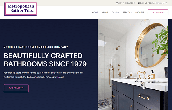
- Metropolitan Bath & Tile: The website has a modern and appealing visual style. The color scheme, primarily consisting of relaxing blue and white colors, improves the site’s aesthetic appeal. It has a simple and modern layout with easy navigation, giving visitors an entertaining and informative experience. The content is presented straightforwardly and organized, emphasizing usability and readability. Testimonials and client reviews are prominently presented, lending authenticity and trustworthiness to the company’s image. The website seamlessly integrates engaging calls to action (CTAs) and contact forms across the user journey. “Get Started” buttons are strategically positioned to urge visitors to take the next step. These features are designed to be easily used by users and strategically placed to motivate visitors to seek additional information or arrange a consultation.
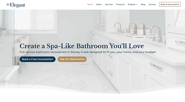
- Elegant Bathrooms: The website’s design is truly stunning. The minimalist approach ensures that the attention is on the products themselves. The color choice of white and gentle blues, with gold accents, radiates refinement and luxury, which complements the high-end quality of their services. It features a clean structure and a user-friendly interface; its website offers a fluid browsing experience for users looking for luxury bathroom fittings and design ideas. The website utilizes plenty of white space, resulting in a clean and uncluttered appearance, allowing the projects to shine. It uses high-resolution photographs to highlight the beauty and skill of its refurbishment projects. CTAs are deliberately positioned around the site, prompting consumers to make a purchase or contact customer service.
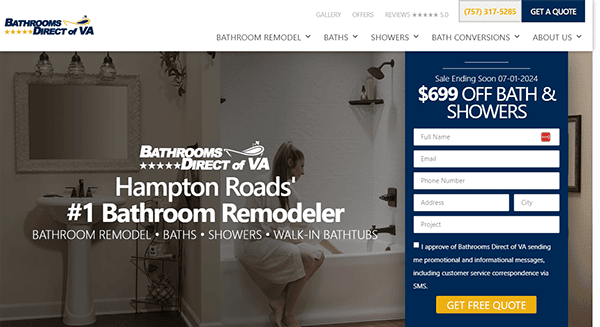
- Bathrooms Direct of Virginia: The website design is simple, modern, and visually attractive. It has a predominantly white background, which improves readability and highlights the products. The use of subtle gray accents and high-quality photos of bathroom fixtures and accessories lends a classy and elegant atmosphere. The color scheme is soothing and cohesive, with a predominant use of white, gray, and black, reinforcing the clean and modern aesthetic and ensuring accessibility. The website’s content is comprehensive and entertaining, with precise service descriptions, a vast gallery of previous projects, and insightful blog postings. These features, taken together, provide vital information and inspiration for potential clients, allowing them to visualize their remodeling projects and grasp the complete spectrum of services offered.
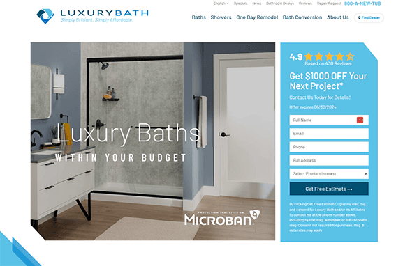
- Luxury Bath: The website’s clean and modern design conveys an initial sense of luxury consistent with the brand. Users can discover promptly the information they need because of the convenience of navigation. The combination of gentle blues and whites is peaceful and refined, enriching the overall user experience. One of the most remarkable parts of its website is the amazing photography that appears throughout. High-resolution photographs exhibit wonderfully constructed bathrooms, showing the company’s craftsmanship and attention to detail. It also succeeds in delivering extensive information about its services and products. Each service is thoroughly explained, with engaging visuals and user testimonials to boost credibility. The website features a user-friendly contact form and prominently displayed call-to-action buttons, carefully positioned to effectively guide users throughout their journey.
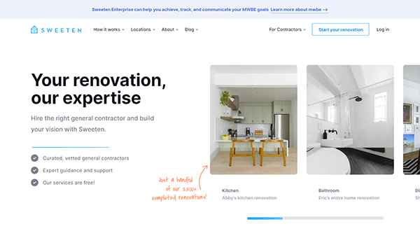
- Sweeten: The website’s slick and modern design quickly draws the user’s attention. The utilization of white space and minimalist design components results in a clean and orderly appearance, which is necessary for a positive user experience. The color scheme is relaxing and professional, which improves reading and overall visual appeal. It excels in user experience with its straightforward navigation layout. Visitors can simply locate information about services, explore exciting project galleries, and read intelligent blog pieces. The concise navigation menu ensures visitors can rapidly obtain the information they need without extra clicks. The website plainly explains the process of working with the company from initial consultation to project completion. Potential clients can simply grasp what to expect at each stage. Testimonials from delighted clients are displayed, offering social proof and validating the reliability and quality of its services.
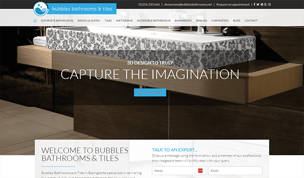
- Bubble Bathrooms: Visitors to the site are welcomed with a clean and user-friendly interface. The well-organized menu makes it easy to find what you’re looking for. The usage of whitespace improves readability and directs attention to the products and services. The website includes high-quality photos of their products and finished projects, allowing potential consumers to see the level of craftsmanship and attention to detail that can be expected. The images are clear and well-lit, making them an outstanding depiction of the products. It prominently displays client testimonials and reviews throughout the site, adding legitimacy and reassuring potential consumers about its exceptional service and quality. Its contact information is freely available, and there are several ways to get in touch, including a contact form and direct email addresses.
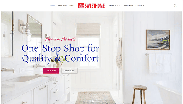
- Sweet Bathrooms: The website has a clean and modern style that quickly grabs your attention. High-quality photos of bathrooms and fixtures create an inviting environment, making it simple to see how their items could alter your area. Navigation is simple, with a well-organized menu that takes you fluidly across different categories and goods. The website’s color palette is warm and pleasant. It also excels in providing detailed information about its products. Each item contains a thorough description and characteristics and frequently includes customer evaluations, which are helpful in making informed choices. The blog area is fantastic, with informative articles on bathroom trends, design recommendations, and maintenance advice.
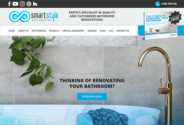
- Smart Style Bathrooms: The website’s clean and modern design reflects the company’s commitment to quality and innovation in bathroom renovations. The color design is relaxing and professional, with a decent balance of white space and carefully selected photos that highlight their work. The layout is intuitive, allowing users to explore and access information quickly. The use of high-quality photographs of completed projects will enable users to see the potential of their services. The call-to-action buttons are strategically positioned across the website, inviting users to contact us for consultations or a price. This direct approach effectively converts visitors into potential clients. The website is responsive, quickly adapting to multiple screen sizes and devices. This offers a consistent and user-friendly PC, tablet, and smartphone experience.
Exploring the best bathroom remodelers’ websites can provide inspiration and insights into what makes a website successful in this industry. These examples often feature stunning galleries of completed projects, customer testimonials, and comprehensive information about the services offered. The best websites also prioritize design that is user-friendly, making it easy for visitors to find the information they need and contact the remodeler for a consultation.
Having a top-notch website is not just about aesthetics but functionality and results. A professional website can streamline your marketing efforts, allowing you to hit a wider audience and engage potential clients more effectively. Features like an online portfolio, client reviews, and a blog with tips and trends in bathroom remodeling can position you as an authority in the industry.
Investing in a high-quality website also means investing in your business’s future. As more homeowners turn to the internet to find and compare services, your online presence becomes critical to your success. A website that reflects your brand’s values and competence will help you stand out in a crowded market and attract clients looking for top-tier bathroom remodeling services.
At CyberOptik, we specialize in creating stunning, effective websites tailored to the needs of bathroom remodelers. Our team understands this industry’s unique challenges and opportunities and is ready to help you build a website that drives growth and success. Contact us today for a free consultation about your bathroom remodeling website, and let’s transform your online presence together.

