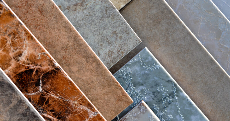
In the world of bathroom cabinets, having a remarkable website is vital for success. Your website is your digital showroom, often serving as potential customers’ first impression of your business. A well-crafted site showcases your products effectively and builds trust and credibility with your audience. In an industry where quality and design are essential, your website must reflect the excellence of your offerings.
A great bathroom cabinets website should highlight your product’s unique features and benefits. High-quality images, detailed descriptions, and customer testimonials are essential to create a compelling narrative. In addition, a user-friendly interface and a smooth user experience maintain viewers’ interest and motivate them to explore your catalog further. With numerous options, a standout website can make all the difference in captivating potential customers to your business over competitors.
Moreover, an optimized website can greatly enhance your search engine rankings, making it easier for potential clients to find you. You are investing in a professional, visually appealing, and functional bathroom cabinet company website that positions your business as a bathroom cabinet leader.
Examples of the Best Bathroom Cabinets Website Designs
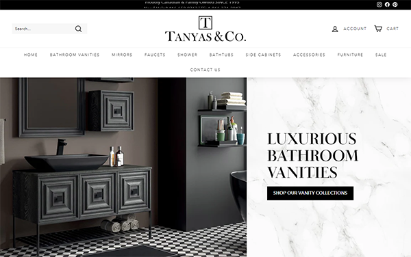
- Tanyas & Co.: The homepage has a minimalist design with plenty of white space, making it easy to focus on product choices. This minimalist layout helps to reduce clutter and improve user navigation. High-resolution photos of products are prominently displayed, providing a clear picture of the things. The usage of professional photos enhances the website’s visual appeal and credibility. The navigation menu is simple, with categories that include vanities, faucets, and accessories. This enables users to locate the products they are interested in rapidly. Customer testimonials and a useful blog give a human touch, which builds trust and engagement. The prominent call-to-action buttons are placed strategically to improve the purchasing experience.

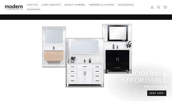
- Modern Bathroom: The website has a sleek, contemporary style and high-quality photographs highlighting their items. Professional photography enhances the product’s charm and desirability. The navigation menu is well-organized, with apparent divisions for vanities, linen cabinets, backlit mirrors, and accessories. This layout enables people to locate what they are looking for readily. The search box is prominently displayed and highly efficient, returning prompt and relevant results to user requests. This functionality improves the user experience by making it easier to locate specific products. The site offers a section for client testimonials, which increases credibility and confidence. It is entirely responsive, ensuring a great user experience on both desktop and mobile. This versatility means that clients can easily browse and shop from any device.
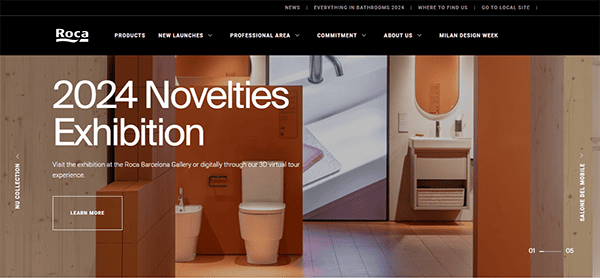
- Roca: The website has a clean, contemporary style with high-resolution photos and appropriate white space. The homepage welcomes visitors with high-quality photographs of their most recent collections, emphasizing beauty and functionality. The navigation is fluid, with well-organized sections that simplify discovering items, company information, and professional resources. The website also underscores its commitment to sustainability and innovation with thorough descriptions and engaging multimedia content. The site contains exciting components such as a product gallery, news releases, and detailed collection sections that provide information about the brand’s inventions and design ideas.
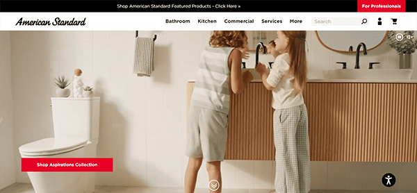
- American Standard: The website has a clean, contemporary style that complements the brand’s high-quality products. The choice of a neutral color scheme and professional photographs gives the site an intelligent and inviting appeal. The well-organized structure allows visitors to browse through the many sections without becoming overwhelmed. The website’s navigation is intuitive and user-friendly. The primary menu is prominently displayed, allowing customers to navigate product categories and services rapidly. The robust search functionality produces accurate results, allowing users to discover exactly what they need with little effort. Each product page is deliberately created to contain extensive information, such as thorough descriptions, specifications, and high-quality photos. It excels at providing exceptional customer service via its website. The support section has a comprehensive FAQ, installation guidelines, and maintenance recommendations. Furthermore, users may reach customer support by live chat, email, or phone, guaranteeing that assistance is always available.
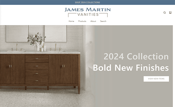
- James Martin Vanities: The homepage has a dynamic slider with high-resolution photos that immediately attract attention. The entire design is clean and modern, with a sophisticated color scheme and excellent typography. Navigation is simple, with a well-organized menu and effective search capabilities. Product pages are informative, with substantial information, specifications, and high-quality images. The website also has a collection gallery, allowing consumers to browse numerous product collections effortlessly. It provides excellent customer service and several contact options, including email and social media. The extensive support area includes FAQs, installation tutorials, and maintenance recommendations to help users with inquiries or issues. Strategically positioned call-to-action buttons provide clear guidance to consumers as they navigate and purchase on the website.
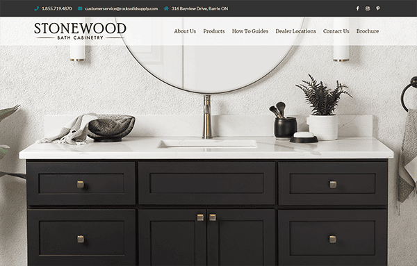
- Stonewood Bath Cabinetry: The website’s sleek and elegant design mirrors the products’ quality. The color palette of white and wood tones produces a relaxing ambiance, ideal for a bath goods website. The navigation is logical and user-friendly, allowing users to explore different product categories easily. The well-organized menu has dropdown options for rapid access to specific product lines. The high-resolution photos throughout the website highlight the craftsmanship and detail of the products. This allows potential consumers to see how these expensive products fit into their spaces. Clear contact information and support options are readily available, making it easy for customers to contact us with inquiries or concerns. Live chat support is a particularly nice touch, providing immediate assistance.
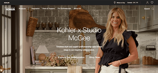
- Kohler: The website’s design is fantastic, with a modern and clean look that complements the refinement of Kohler’s offerings. The utilization of white space and a balanced color palette improves reading and navigational clarity. The website includes high-resolution photographs and videos highlighting the products’ craftsmanship and design elements. This immersive visual content helps customers envision the products in their own homes. Each product page is painstakingly designed and provides detailed information about the product’s specifications, features, and benefits. Multiple high-resolution photographs from various angles help clients better comprehend the product and visualize how it will fit in their homes.
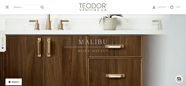
- Teodor: The website welcomes visitors with a clean and sophisticated design that reflects the luxurious quality of the products. High-quality photographs, videos, and a minimalist color palette add to the visual appeal, making it easy to navigate and visually attractive. The well-organized menu structure allows users to quickly locate what they are looking for, whether it is bathroom vanities, mirrors, or accessories. The presence of a search bar improves usability by allowing consumers to find specific products rapidly. It appreciates the value of customer service, as evidenced by the website’s provision of contact information, FAQs, and a simple purchase process. Including customer reviews and testimonials increases trust and confidence in the brand. Strategically positioned call-to-action buttons encourage visitors to proceed to the next stage, be it browsing products, reaching out to customer support, or completing a purchase, thus improving the entire user experience.
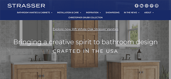
- Strasser: Its website provides a great user experience while displaying its exquisitely constructed bathroom vanities and cabinets. The website has a clean, modern design and intuitive navigation, making browsing their different product choices simple. Each collection’s high-quality photographs and extensive descriptions highlight the products’ craftsmanship and refinement. The site also contains valuable materials, including installation guides, care tips, and a photo gallery for inspiration. The emphasis on sustainability and American-made excellence adds to the brand’s attractiveness. The website includes social proof components such as user reviews, ratings, and certifications to reinforce the reliability and quality of its products. Trust badges and safe payment indicators help to increase trustworthiness.
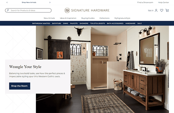
- Signature Hardware: The website displays excellent e-commerce design. The sleek, modern layout blends high-quality graphics with easy navigation, resulting in a seamless buying experience. The homepage efficiently displays new arrivals and popular products, attracting customers. Product pages are detailed, with plenty of filters and good classification, making it easy to find specific things. Furthermore, the site’s responsive design offers a consistent and user-friendly experience on all devices. Signature Hardware is a market leader in online home decor retail due to its aesthetic appeal and functional effectiveness. One prominent feature is the live chat window, which improves customer service by giving instant assistance. This real-time contact enables users to receive prompt responses to their questions, providing a pleasant purchasing experience and enhancing customer satisfaction.
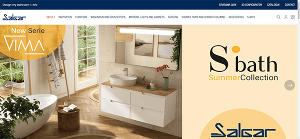
- Salgar: The website’s design is modern and visually appealing. It uses a clean, minimalistic layout with plenty of white space, making the material easy to read and navigate. The high-quality photographs of their products are prominently displayed, making them visually appealing to users. Its webpage is simple and uncomplicated. The primary menu is well-organized, with distinct categories that help users quickly discover what they want. The usage of dropdown menus improves the user experience by allowing easy access to subcategories without cluttering the main page. Every product page is painstakingly created, with high-resolution photographs, detailed descriptions, and specifications. The presence of several photos for each product helps users view products from various perspectives, providing a more complete understanding of what they are purchasing. The responsive website offers a consistent experience across all devices accessed via desktop, tablet, or smartphone. This adaptability is critical in today’s digital world, where users can switch between devices during their shopping experience.
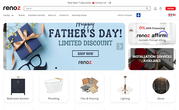
- Renoz: The website has a modern, streamlined style. High-quality photos and a simple color palette create a sophisticated and welcoming ambiance. Each product category is illustrated with clear, appealing pictures that entice users and provide a realistic picture of what to expect. The search box is prominently displayed and extremely useful, providing easy access to certain products. The navigation is straightforward, with clearly labeled categories and user-friendly dropdown menus. Engaging features include a 5% discount for new subscribers, a best-sellers area, detailed brand descriptions, and positive customer comments, all of which improve the purchasing experience. The product pages are thorough, and the mobile-responsive design offers a consistent experience across all devices. The website ensures that contact information is readily available and guarantees prompt and efficient customer care, which is advantageous for addressing any inquiries before or after purchasing.
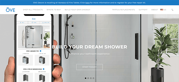
- Ove Decors: The website has a modern, sleek, clean design. High-resolution product photographs are prominently displayed, creating a realistic and appealing impression. Using white space and a consistent color palette improves the visual experience, leaving the site feeling uncluttered and intelligent. The site’s navigation is simple, with categories including Plumbing Fixtures, Lighting, and bathroom furniture. The well-organized dropdown menus allow visitors to navigate subcategories and precisely locate their needs quickly. The search functionality is efficient, allowing for easy access to certain products. Each product page contains vast information, including specifications, several high-quality photos, and customer reviews, giving users all the information they need to make informed judgments.
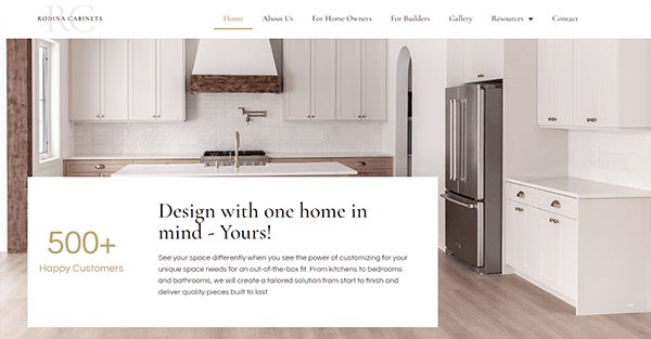
- Rodina Cabinets: The visual design is fantastic. The color scheme is harmonious, with various warm tones that convey a sense of quality and craftsmanship. High-quality photographs of their cabinets and installations add to the premium atmosphere of their items. The user interface is elegant and straightforward, allowing visitors to locate what they’re looking for effortlessly. The navigation is primary, with a well-organized menu that will enable visitors to explore various categories easily. The website is highly functional, with each page intended to increase user involvement and enjoyment. Product pages are thorough, with information on each cabinet style, including measurements, materials, and customization choices. The call-to-action buttons are carefully positioned across the website, encouraging users to request a quote, arrange a consultation, or investigate further product choices.
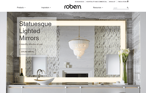
- Robern: The company’s website design reflects its devotion to elegance and innovation. The sleek, minimalist design immediately conveys a sense of refinement and high-quality craftsmanship. It uses hero page slider photos to provide a visually attractive and educational experience that is consistent with its brand identity and increases user engagement. It also excels in displaying its items using high-resolution images that emphasize every feature. The utilization of these graphics throughout the site provides clients with a complete view of each product, resulting in an immersive buying experience. Each product page is well-organized and contains all the information clients require to make informed judgments. It provides potential buyers with everything they need, including extensive specifications and features, installation options, and customization details.
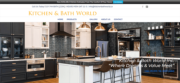
- Kitchen & Bath World: The clean layout has a sophisticated color scheme that conveys quality and professionalism. The navigation is straightforward, making finding precisely what you’re searching for is simple. The imagery on the website is beautiful. High-resolution photographs display their kitchen and bath products in lovely surroundings, allowing clients to envision them in their homes. The client testimonials and reviews are posted on the website. Genuine customer feedback provides valuable information and reassurance to future purchasers, bolstering its credibility as a reputable shop. Contact options are readily available, and persuasive CTAs provide fast assistance. This responsiveness is a significant advantage for anyone who requires immediate answers or support.
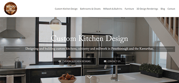
- Wood by Design: The website’s design is exquisite and timeless. The layout is sleek and uncluttered and beautifully displays their exquisite wood products. The color pattern is warm and inviting, which complements their artistry nicely. The well-organized menu makes navigating the various product categories and collections easy. Each product listing includes complete information such as measurements, materials used, and care recommendations. This attention to detail is critical for customers seeking high-quality, long-lasting wood goods. It values client feedback and prominently displays testimonials and reviews from delighted customers. This increases the reputation of its items and gives potential consumers confidence in purchasing.
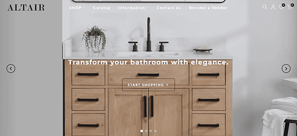
- Altair: The website design is simple, modern, and visually attractive. The color scheme is harmonious, with a palette that complements the brand. White space is extensive, producing a sense of spaciousness and clarity. The navigation is straightforward and user-friendly. The menu is displayed at the top, allowing you to discover information rapidly. The dropdown menus are well-organized and present a clear hierarchy of content. Images and graphics are carefully chosen to enhance the content and add visual interest. They’re high-quality and help to reinforce the brand’s message and identity. The website blends aesthetic appeal with practical functionality, creating a pleasant and efficient user experience. The integrated chat box functionality improves the website’s usability and client engagement while setting a high standard for online presence.
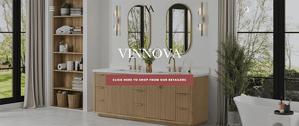
- Vinnova: The website’s sleek, modern, and visually attractive design. The color design is harmonized with white, gray, and brown tones, providing a relaxing and professional ambiance. Using high-quality photos enhances the visual appeal while reinforcing the brand’s reputation as a design-focused organization. The content is organized into sections with distinct headings and subheadings. This layout guides readers through the content and allows them to easily access different areas of interest. The utilization of plenty of white space improves readability while reducing visual clutter. High-quality photos and graphics are utilized to promote products and initiatives effectively. Throughout the browsing experience, visitors will notice various contact options, including a live chat facility for fast help. This timeliness demonstrates a dedication to customer pleasure and guarantees that assistance is always available.
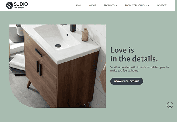
- Sudio Design: The homepage greets visitors with a visually appealing hero picture slider that reflects its creative ethos. The color palette is sophisticated and elegant, demonstrating a great understanding of design concepts. The typeface is crisp and easy to read, moving users seamlessly through the material. The navigation is easy and user-friendly, with a well-organized menu that allows users to explore many parts of the company’s portfolio and services. The use of hover effects and subtle animations provides an air of refinement. The content is concise but instructive, with enough detail to excite attention and encourage further study. The website’s standout feature is the collection area, which displays a selection of projects demonstrating variety and expertise across multiple disciplines. Each project has high-resolution photographs and a brief narrative, giving visitors a thorough idea of its potential.
Creating the best bathroom cabinets website involves strategic design, compelling content, and technical excellence. It’s about more than just having a digital space: crafting an experience that resonates with your audience and meets their needs. As the bathroom is a personal sanctuary, your website should reflect the care and craftsmanship that goes into your products.
Investing in a high-quality website is more than just a necessity. It’s a gateway to your business’s future success. It attracts and retains customers and distinguishes you in a crowded market. With the right strategy, your website can showcase your expertise and drive business growth, opening up new possibilities for your brand.
At CyberOptik, we specialize in creating stunning, effective websites tailored to your industry needs. If you’re all set to enhance your online presence and become the best bathroom cabinets website, contact us for a free consultation. Let us help you design a website that truly reflects the quality and uniqueness of your brand.